

The Focus
Reliance Brands acquired the rights for manufacturing and distributing the iconic snack Bugles in India
This was seen as the perfect entry into the Premium Western Snacks category in India and become the favourite choice for snack-fanatics
Team Elephant was approached to provide a packaging design and system that amplifies the fun legacy that Bugles comes with, in addition to helping it stand out on shelves, replete with its international appeal
The Design
The team opted for a synthesis of two key themes to develop the packaging design: vivid overtones of play with the iconic shape of Bugles, combined with a ‘call for hunger’
Infused the packaging with a metallic sheen in addition to using black to add a premium look-and-feel, generate excitement combined with aspirational value
With Elephant’s design solution, Bugles will attract snack lovers with its promise of fun from the vivid, shape-enhancing visuals combined with a distinct packaging system that brings out the richness of each flavour and ingredient
The Story

Bugles are a popular corn-based snack that have been enjoyed by people all over the world for decades. The snack was first introduced in 1964 and was originally marketed as a "crispy corn snack with a unique shape." The name "Bugles" was chosen to reflect the snack's cone-like shape, reminiscent of the horns played by medieval buglers. Tooting your own horn now had a whole-new snacky meaning!
Over the years, Bugles have become a staple in the snack food industry, with a wide variety of flavours and variations being introduced to suit different tastes around the world. Their distinctive shape and satisfying crunch continue to make them a fan favourite, where Bugles appears in iconic TV shows like Mad Men and is very much the originator of the ‘hip-and-trendy’ appeal for snacking.
“Reliance Brands wishes to sound the Bugle in India, and they approached the team at Elephant to help them with its packaging design, apart from establishing a system for other variants and flavours, where they would hit the Premium Western snack niche within the growing, profitable snacks market. ”

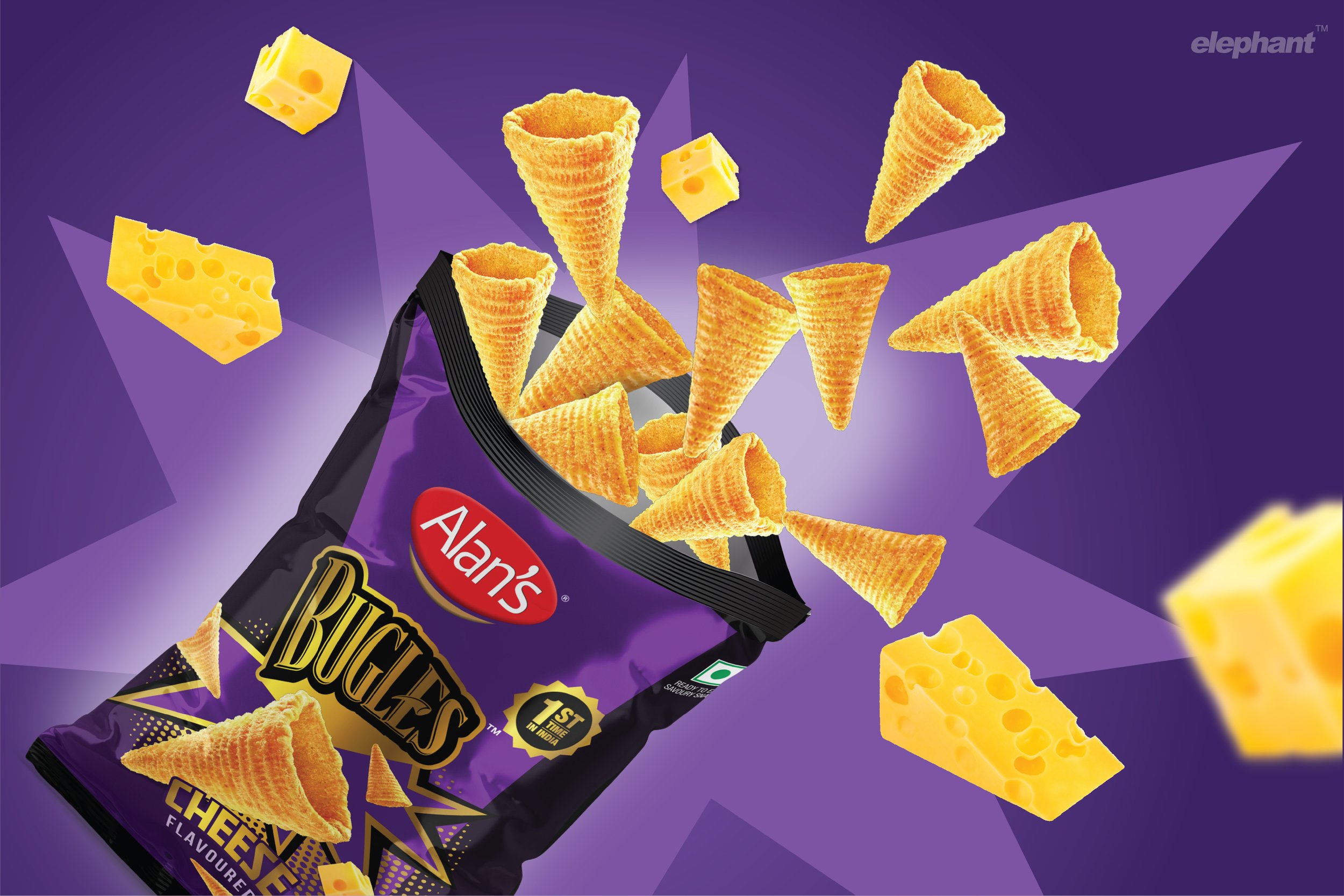
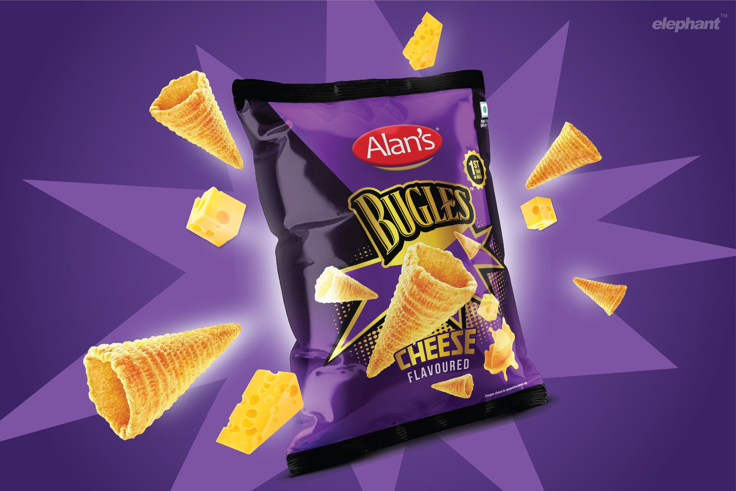
“The team opted for deeper colours like purple to highlight the superior offering, which is supplemented by the package’s metallic overtones. There is an attempt to build an otherworldly appeal: Bugles has been dropped from the reaches of outer space onto the shelf, so who knows what lies within?”
Reliance Brands wishes to sound the Bugle in India, and they approached the team at Elephant to help them with its packaging design, apart from establishing a system for other variants and flavours. The goal was to hit the Premium Western snack niche within the growing, profitable snacks market with Bugles. The design solution would distinguish it from the competition and help Bugles become a snacking favourite for their young Indian target audience.
The Call for Hunger
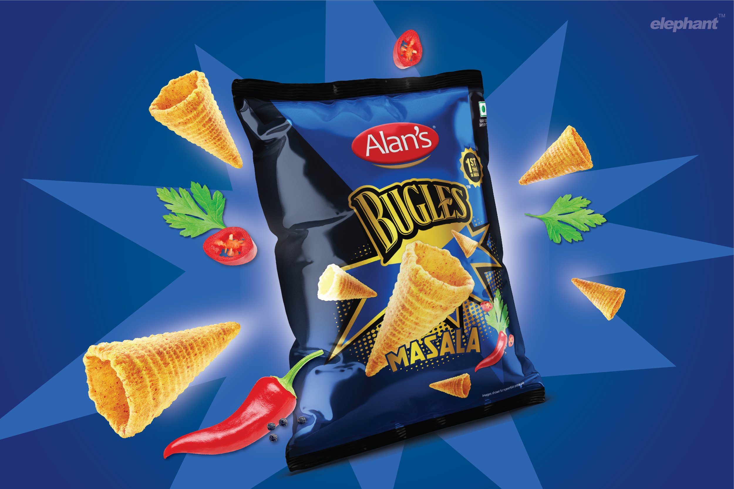
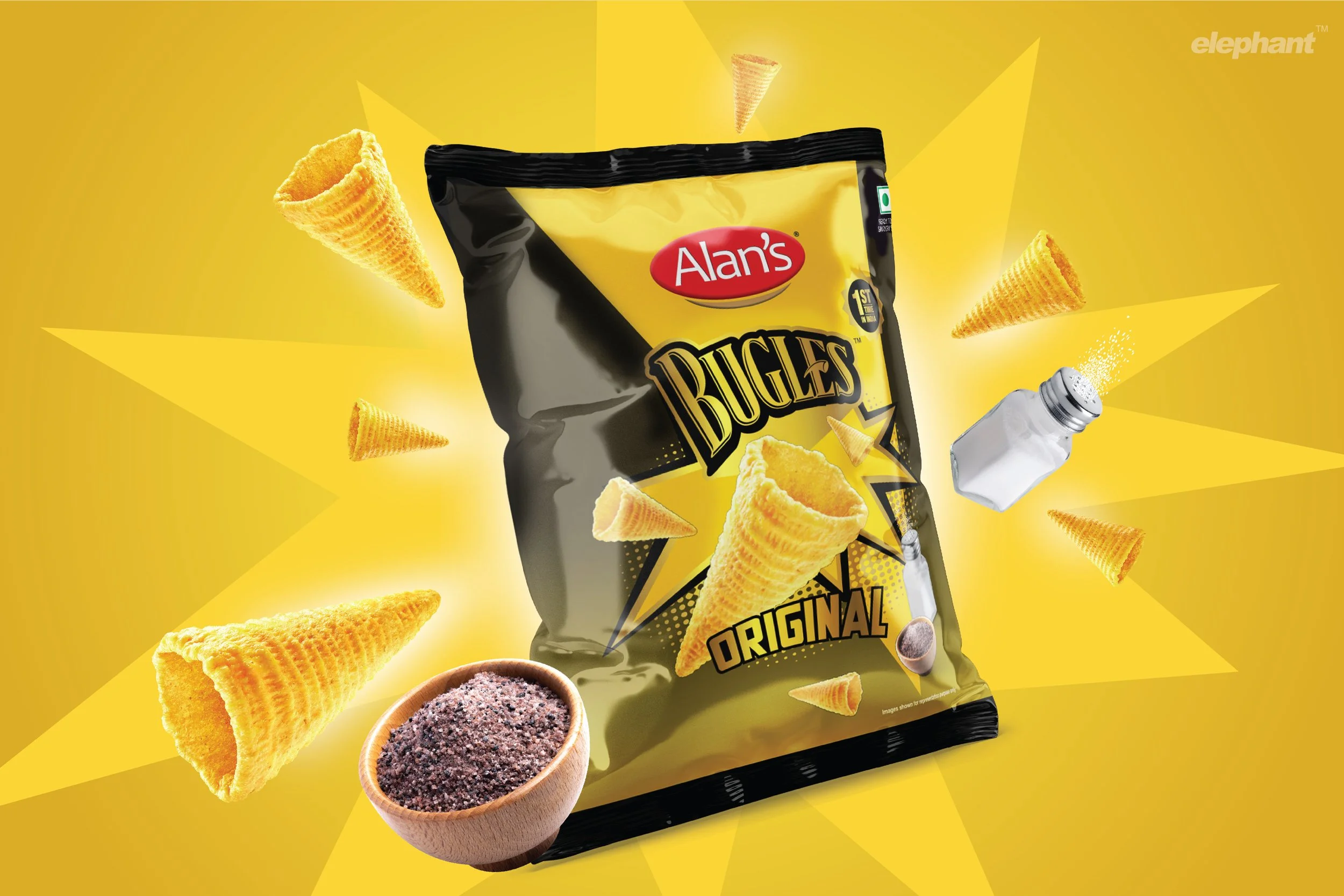
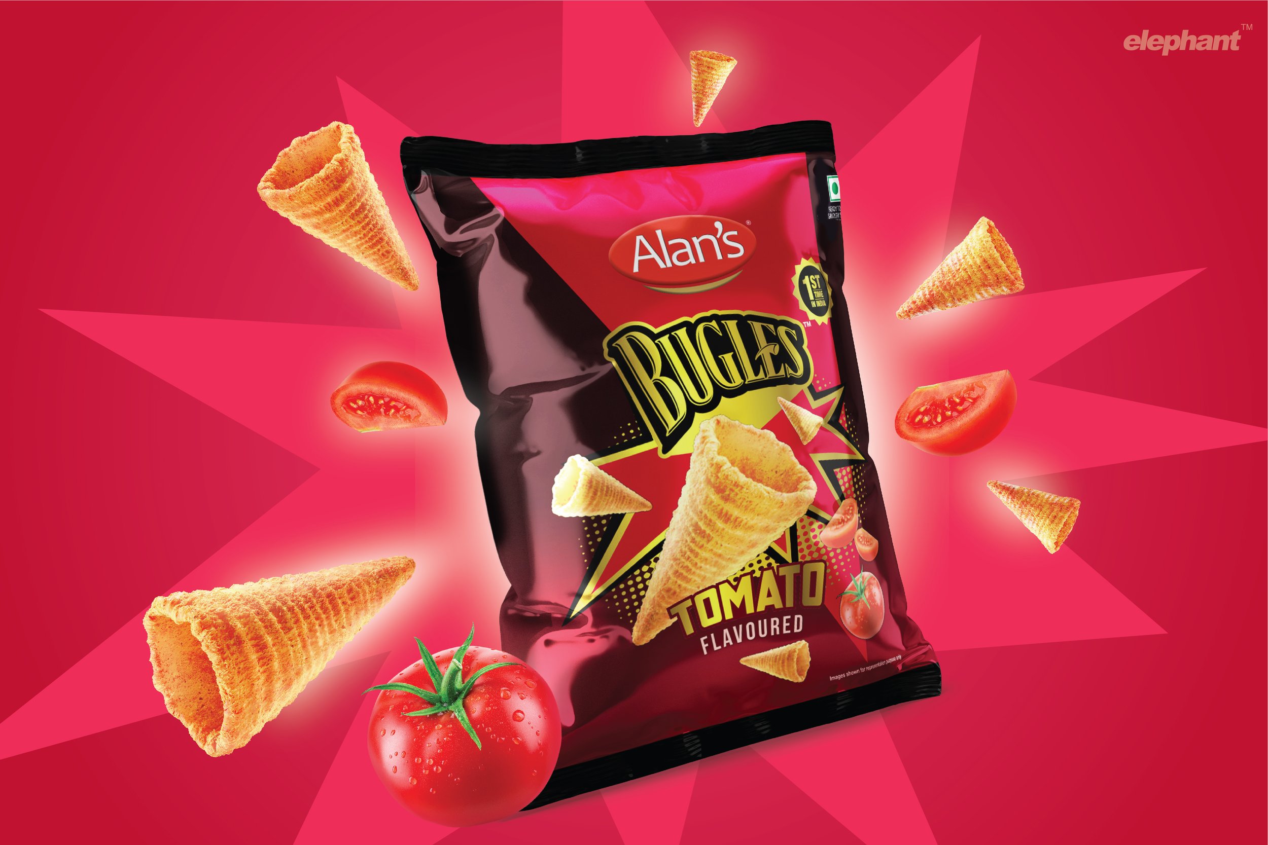
“Sounding the horn” has several implications, and the “Call for Hunger” concept is derived from there. The front of the pack calls out to people to quell their snacking urges. Its international legacy, which is also a novelty in the Indian snacking landscape, has been given prominence on the pack.
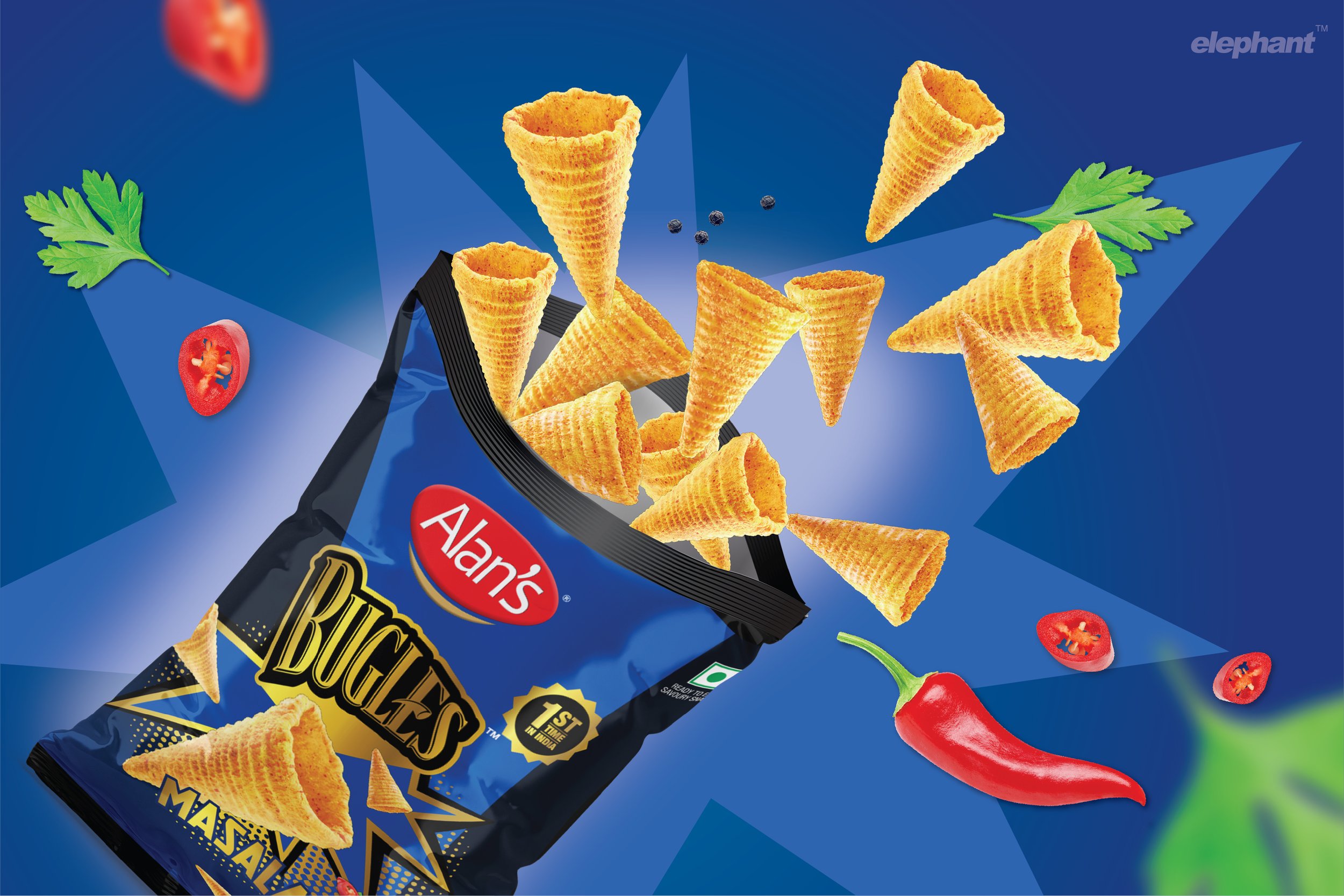
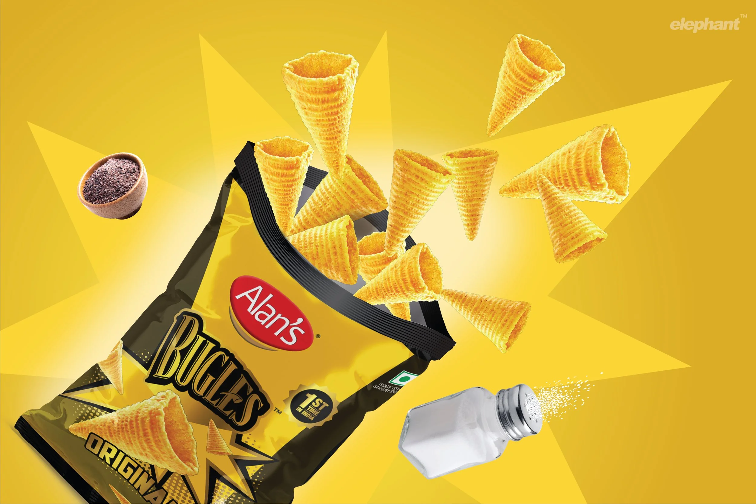
An ingredient focus puts forth the promise of a strong, satiating, vivid flavour in each bite. The cone visuals, along with the secondary colours of the pack change with each flavour variant, differentiating them and tying them into a cohesive packaging system.
“Play comes in the form of several elements on the back-of-pack where its conical shape calls for unique serving suggestions and inventive ways to ‘play’ with the snack, attracting younger audiences. In this story of inventive snacking, every other snack would simply appear dull.”
The team opted for deeper colours like purple to highlight the superior offering, which is supplemented by the package’s metallic overtones. Consumers expect a premium, western snacking brand to appear a certain way: Bugles packaging surpasses that. There is an attempt to build an otherworldly appeal: dropped from the reaches of outer space onto the shelf, so who knows what lies within?
The use of an illustrative, poster-style type for the flavour with the iconic Bugles logo serves as a call to action, adding urgency to the promise of crunch & taste.
Playfully International Parties
The team wanted to deviate from the typical approach in the category. This approach often translates to solely heightening flavour or other cues that amplify the taste or texture of the snack within. For the team, Bugles wasn’t simply about those things: the unique shape meant that we could break the mould and try something different by adding a story.
The idea was: Can snacking be boring? Well, yes, if all you must consume is the typical chip or stick or any of the other standardized formats. Having fun in the process is important!
“Design is more than just a few tricks to the eye. It’s a few tricks to the brain.”
This comes in the form of several elements on the back-of-pack where its conical shape calls for unique serving suggestions and inventive ways to ‘play’ with the snack, attracting younger audiences. The pack also has typical party-hat geometry woven into it, with triangles and explosion pops on the front that make this an ideal snack for social events. In this story of inventive snacking, every other snack would simply appear dull.
In summation, our packaging design solution for Bugles aims for the brand’s launch in India to make a decisive splash within its premium category. The use of unorthodox colours and typography distinguishes it from other brands on the shelf. It also invites consumers to look at snacking beyond simply satiating one’s cravings, and having fun with your food since it is designed for it!