
Epigamia
Establishing a Guilt-Free Snacking option
How many times have you reached out for an afternoon snack and instantly felt guilty about how unhealthy it was? We know the feeling. So when Epigamia approached us to redo the packaging for their greek yogurts, we were delighted to be able to make a difference!
Already in the market, they needed a visual overhaul to boost their visibility and create credibility as a healthy snacking portion.
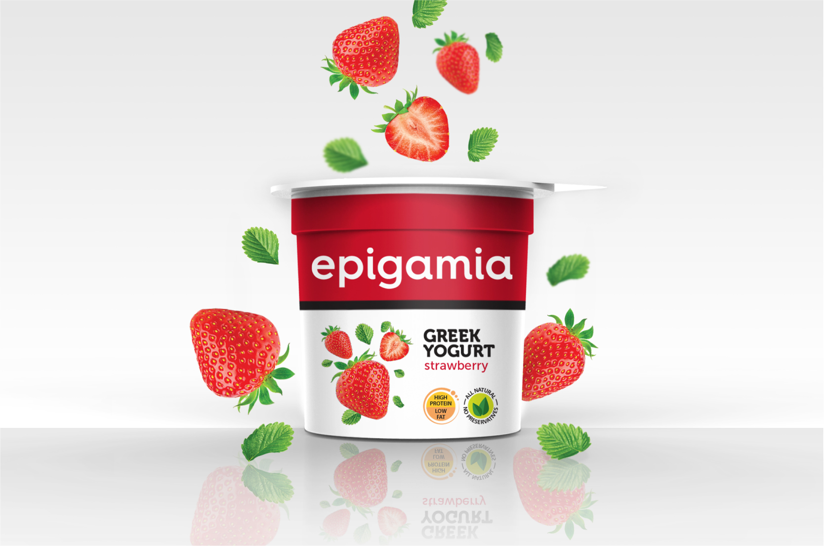
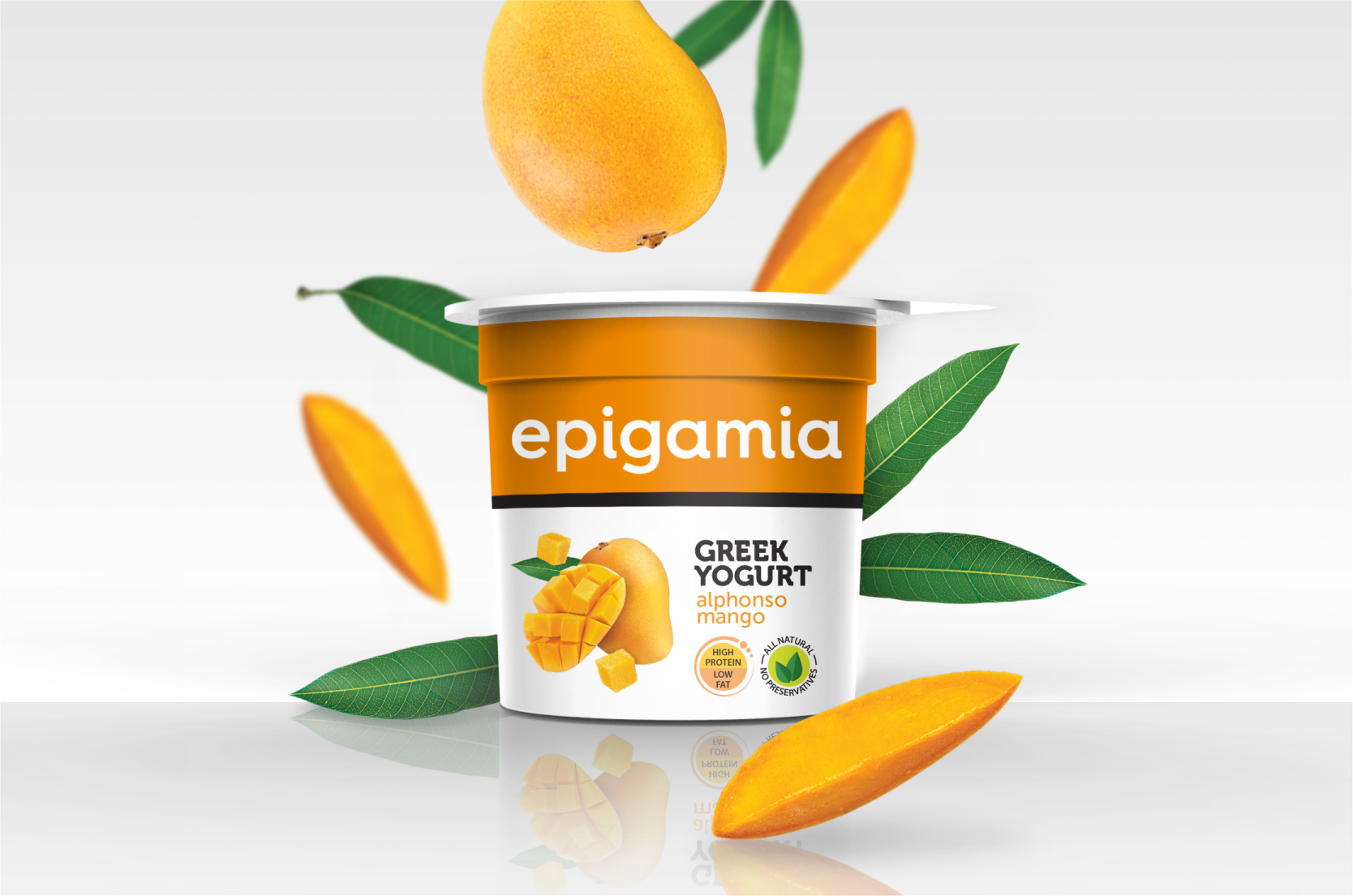
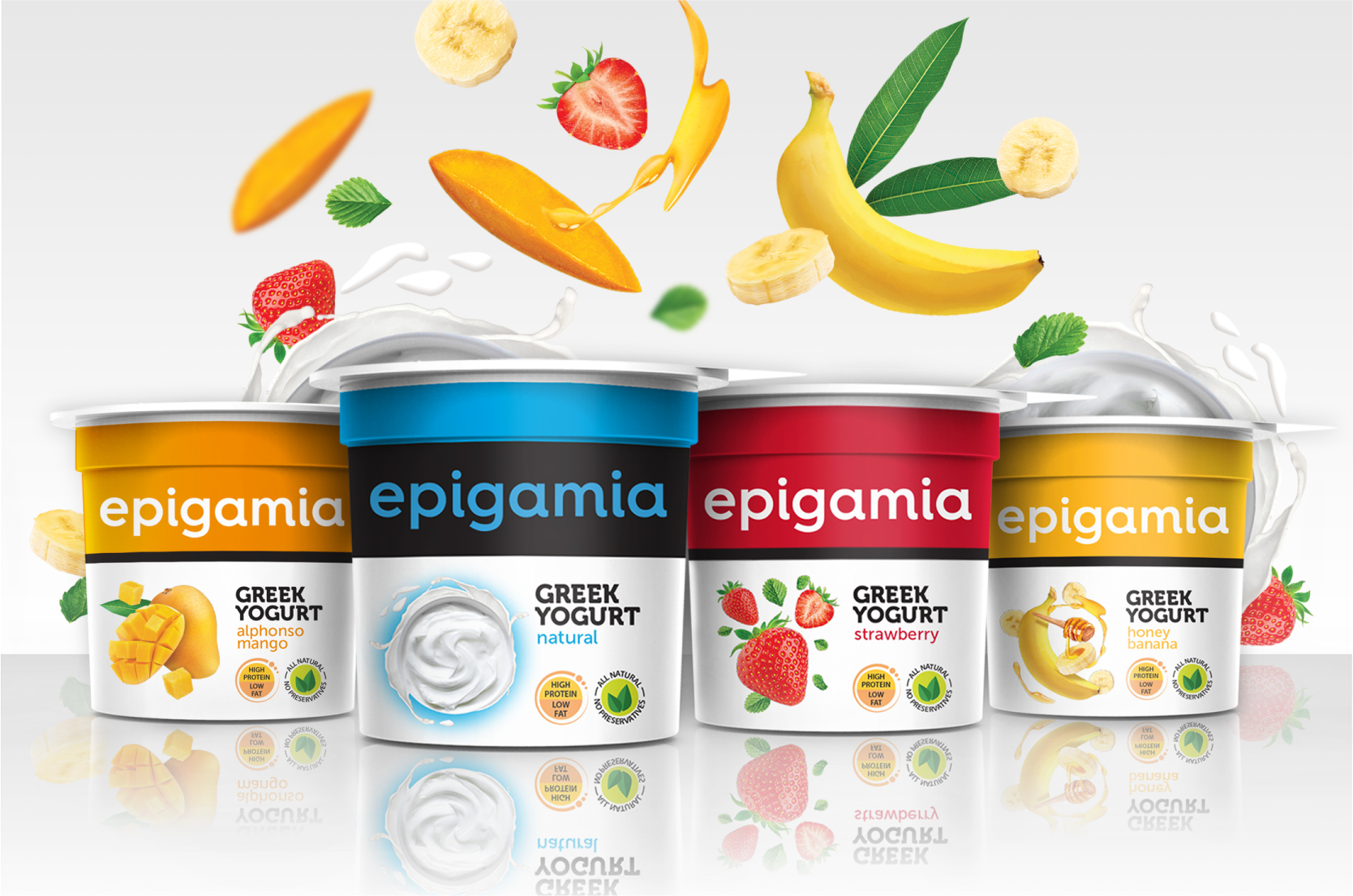
Epigamia was to be positioned as the Hero of Small Hunger, the ideal healthy 4 o’clock snack. The Visual Identity was made bold and confident, to be taken seriously as a player in the snack market. We added vibrant fruit colours to the packs, for easy to differentiate flavours and to enhance the taste appeal.
The healthy aspect is a big part of their philosophy so we highlighted it with boldly mentioning the features on the front of the pack. With a vibrant, friendlier look and easy to understand information, the packs stood out on the shelves. The visual identity allowed itself to adapt to various product formats.
Reworked as a healthy and confident brand, Epigamia’s Greek Yogurt packs have brought in the 3rd round of funding for the parent company. Their focus is now only on Epigamia, with a newly launched Snack Pack and more products on the way!