

The Focus
Creating a visual language and subsequently, packaging system for Licious’ Ready to Eat (RTE) segment of spreads
Product needed to establish a distinct new category as these would be the first meat based spreads on shelves packed with pickles, jams & other spreads
Solution also had to have a clear, powerful core story that could be adapted across flavors and packaging formats to create stronger recall
The Design
Elephant created a strong visual packaging system for Licious spreads, playing on the ‘gourmet/artisanal’ palette, reflected through text and other elements
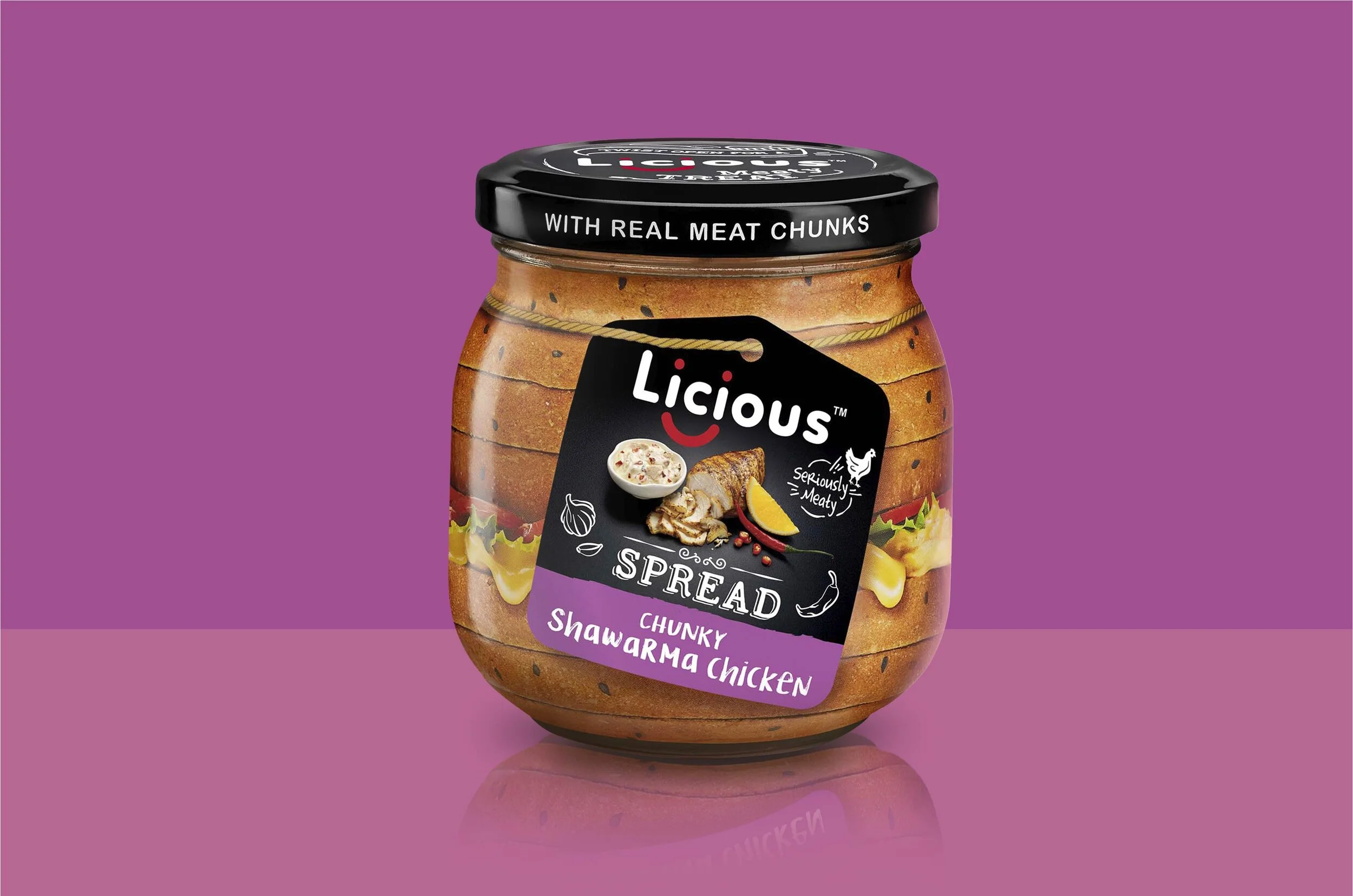
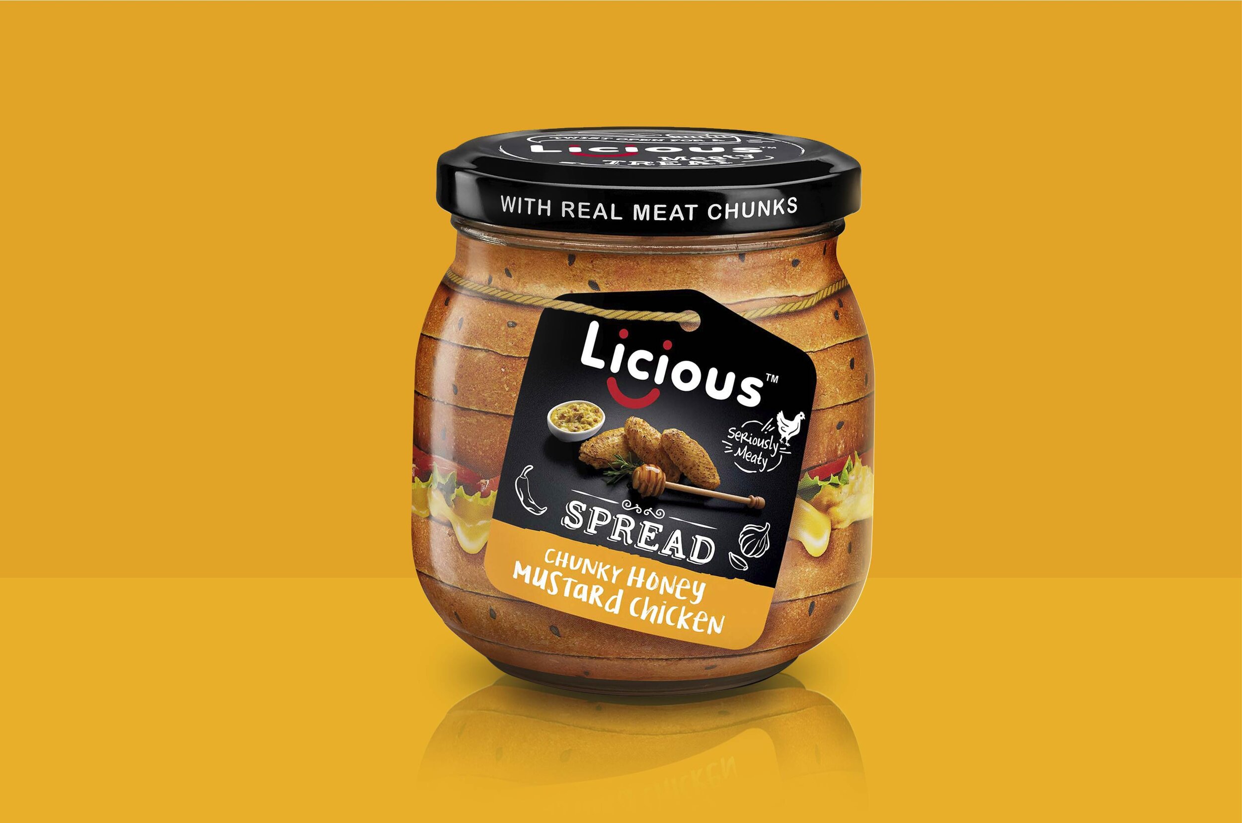
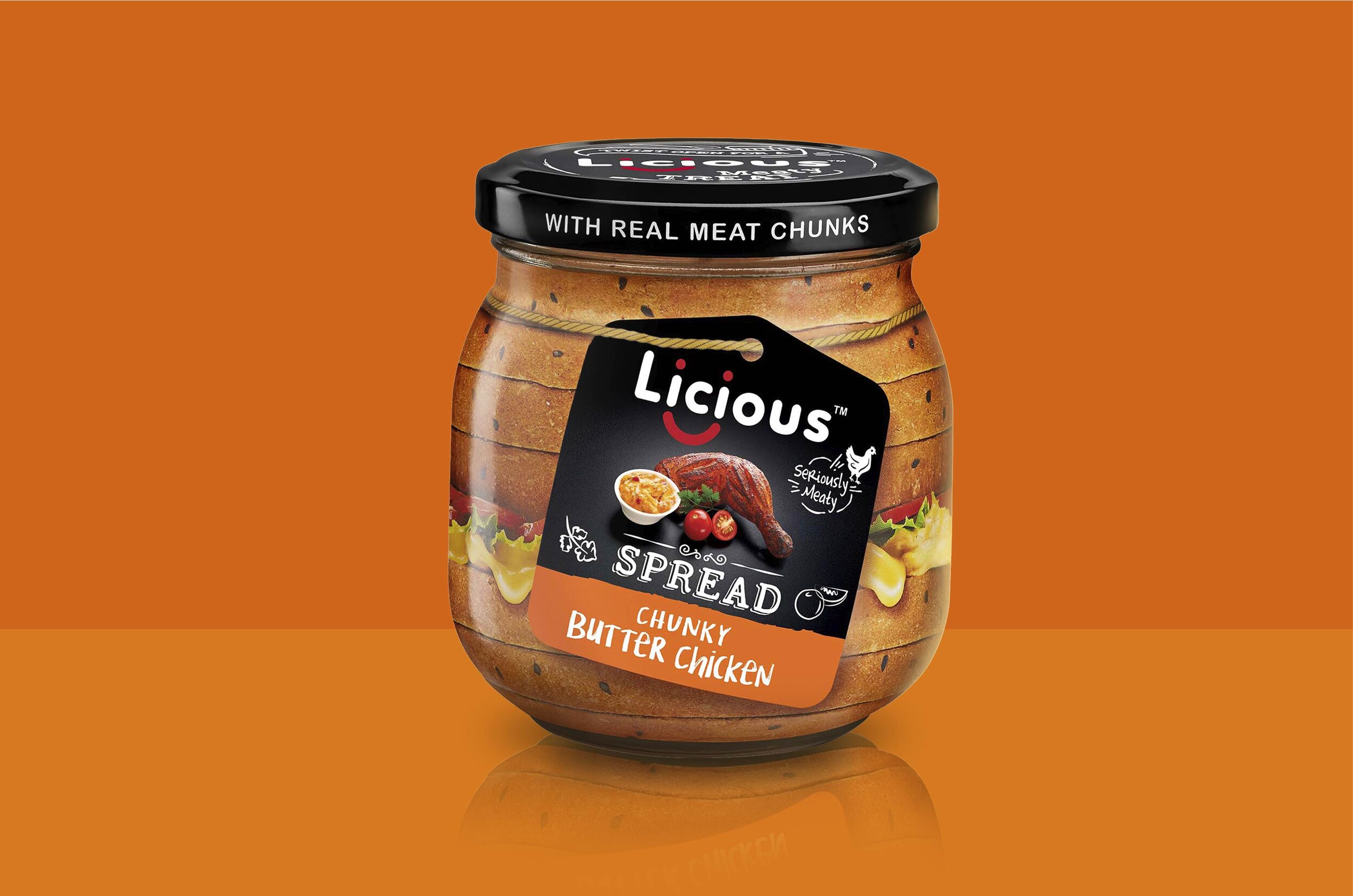
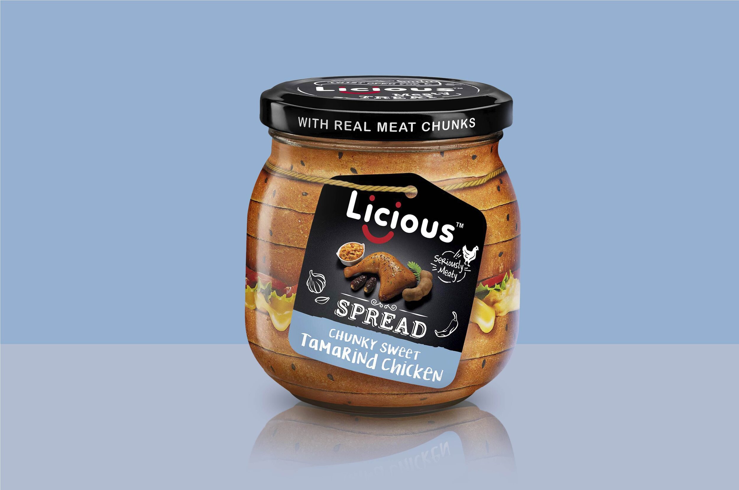
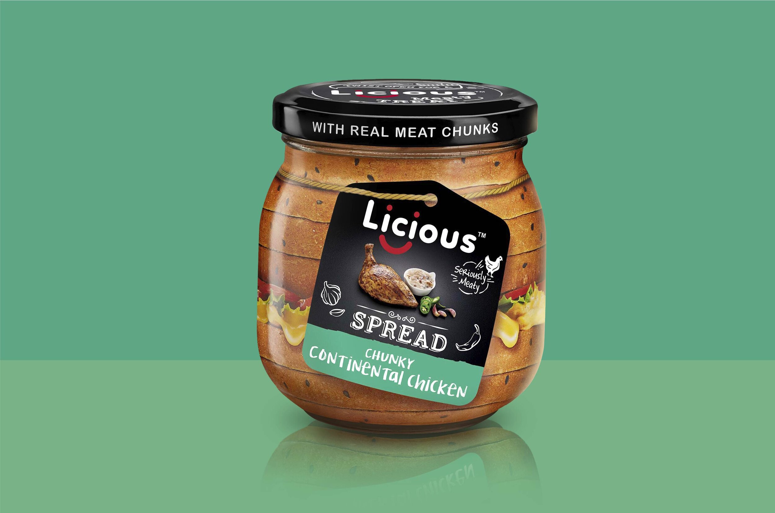
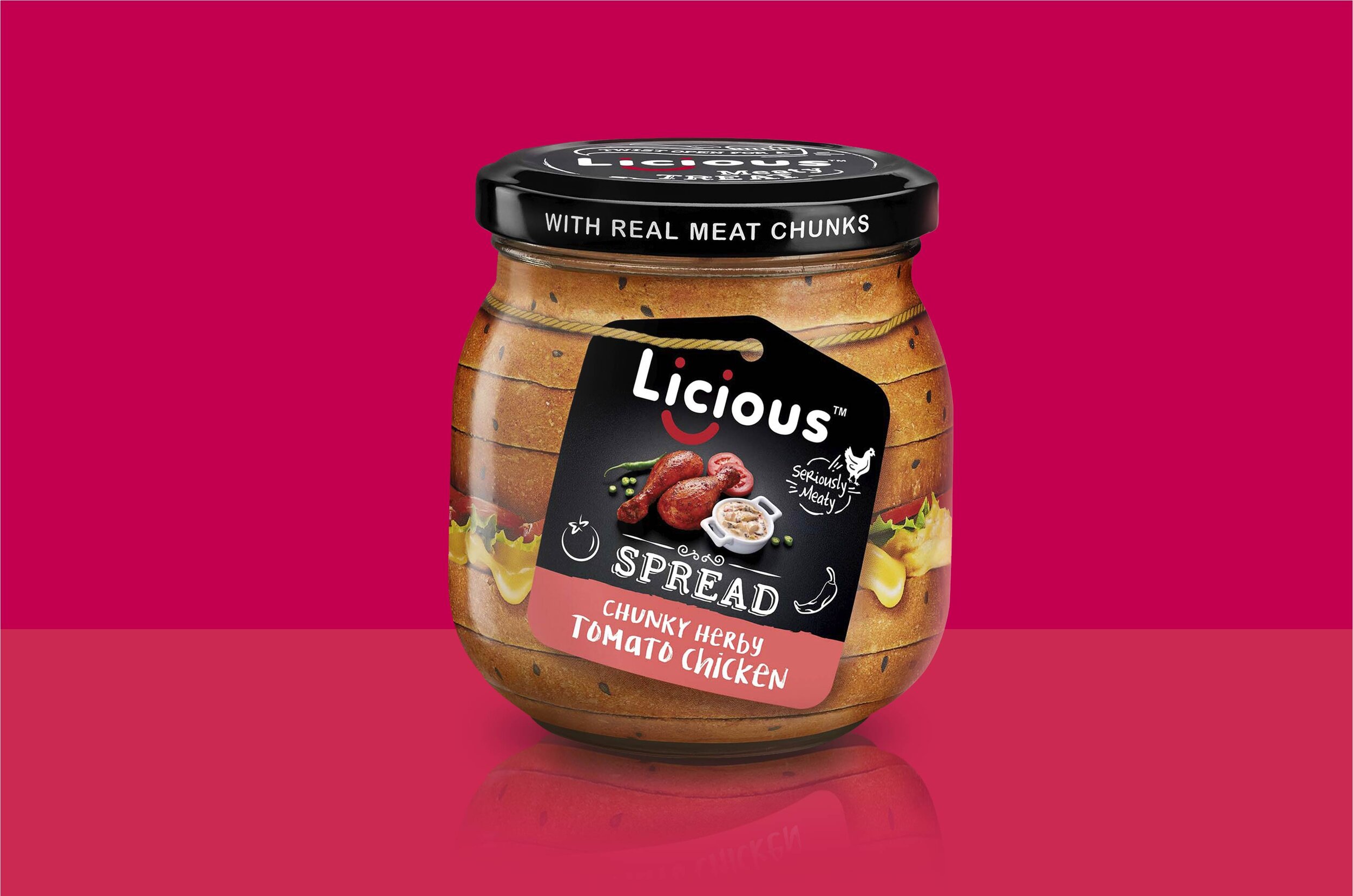
A rustic loaf of bread is chosen to be the core that immediately connects to the usage of the product on sandwiches. Different color codes and graphics connoting the flavor and type of product gave the range a unique & ownable identity.
An interplay of print textures, personalized text and graphics generated conversational tone and increased consumer-brand engagement
The Story

The market for meat products is a tricky one to navigate. In India, especially, there are multiple lenses through which meat is viewed. The decidedly modern adoption of vegetarianism/veganism and any variants thereof may be looked at as the ramification of globalization. But India has had a mixed relationship with the procurement, processing and consumption patterns when it comes to meat.
Enter Licious, who seek to break the market with their unique, personalized outlook towards meat. With a wide range of products – from raw, selected cuts to ready-to-eat chunky spreads – Licious seeks to remove the notions of taboo and uncleanliness associated with the industry. With the advent of their brand, meat has become a safe, verified, quality-controlled product that is dispatched to the comforts of your home.
Licious approached the team at Elephant to create a fresh packaging solution, comprising of both: A strong visual language and a uniform packaging system that could also adapt according to product flavor and type. All this while demystifying and creating a category that is not entrenched in usual consideration set of Indian grocery list.
Since Licious planned to pioneer meat based spreads segment within the heavily cluttered Ready-To-Eat spreads category, brand differentiation and recall needed to be extremely powerful and unique. They would also necessarily compete with products in other segments like pickles, jams, mayonnaise and more, which added to the task at hand
“Licious approached the team at Elephant to create a fresh packaging solution, comprising of both: A strong visual language and a uniform packaging system that could also adapt according to product flavor and type”
Artisanal Finesse
Most RTE products utilize hyper-realist depictions of their product on the packaging, which also adds to the cluttering on the shelf. Elephant team devised a novel system for Licious’ range of spreads, playing upon hand-crafted overtones. The core graphic is a gourmet sandwich, labeled with flavor tag tied around the jar, just as artisanal chefs would do for freshly made delicacies.
The tag is the central display that depicts the flavor and the product in question. The team decided to utilize café-style font in order to add to the sophisticated, yet approachable nature of the brand. It is a clear signal to a youthful, energetic environment where each item is tailor-made.
The design system works such that the background can be changed in accordance with the category in question. The artisanal nature is highlighted by adding a string around neck of the jar, giving a bespoke, personalized touch. All these elements serve to distinguish itself as a gourmet product.
The content and style of the text was given special attention to bring Licious’ dynamic, friendly and vibrant nature to the fore. Licious is not about selling a product – it is about delivering an authentic, delicious meat experience that engages with meat-lovers in a far more intimate manner.
The flexibility shines through when used for alternative packaging, like the single-serve variant, where the same design is as impactful and the brand identity resonates clearly.
“Licious is not about selling a product – it is about delivering an authentic, delicious meat experience that engages with meat-lovers in a far more intimate manner”
The Text and the Texture
The key text revolves around creating authenticity and identity. This can be seen through text on the cap – ‘with real meat chunks’, highlighting the product’s freshness, with the promise of farm-to-fork experience. The same goes for a ‘window’ on the side in the shape of a butter knife, providing cues for usage – but also giving a glimpse into the real product within, setting all doubts at rest.

Elephant team also decided to add a second level of discoverable elements for creating complete sensorial experience. A series of textures were brought to life through print – for instance, the texture of bread was perceptible around the sandwich graphics. The entire package was then rounded off with components that aimed to connect to the consumer, like a spice meter and vibrant color coding for differentiation between flavours.
Overall, the packaging system achieves all that it sets out to do, providing a strong foundation for a quirky and vibrant brand. It clearly aligns with the sentiments of meat-lovers and resonates on a personal experiences where consumers are reassured that they will receive an authentic and delicious product – while also engaging with them in a way that carries a story