
The Focus
Nestle released a range of cereals under the ‘NesPlus’ brand in India - an already competitive,
inundated marketWanted packaging that would highlight the “crunch” of the cereal as a key feature, in addition to cues of taste and health
Range needed to differentiate itself from other dominant brands while also appealing to the whole family with its vibrant visual language
The Design
The team at Elephant designed a spirited, visually stimulating package that highlighted “crunch” through several texture-based, graphically versatile cues
Ensured that an adaptive system was in place to incorporate all future variants with differentiating elements for each variant
The entire treatment was product focused, with the central bowl element and other brand identifiers that amplified differentiation on the shelf

The Story
What is the ideal Indian breakfast? Answering that is trickier than you think. When Nestle came to us and told us that they were planning to hit the Indian breakfast segment, we were excited to see what they had come up with. After all, they created Maggi and in India, Maggi is an integral part of every citizen’s vocabulary. Kids actually learn to associate Maggi with instant noodles; not the other way around!
Our excitement proved to be justified. Nestle asked us to design the packaging
for their new, crunchy multi-grain cereal product – NesPlus.
The Crunch Factor
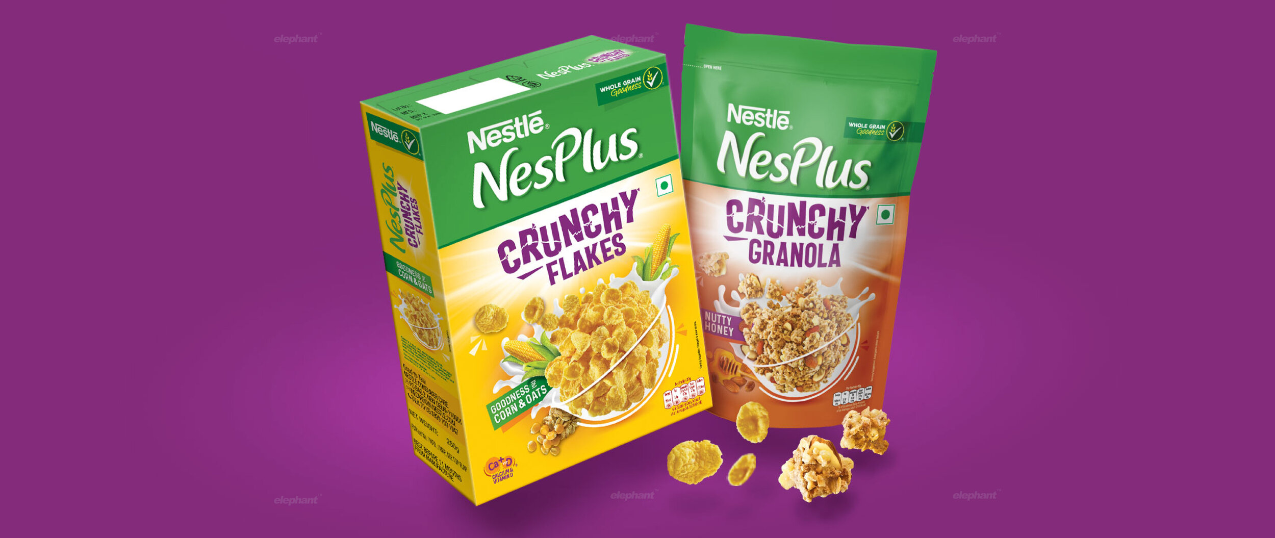
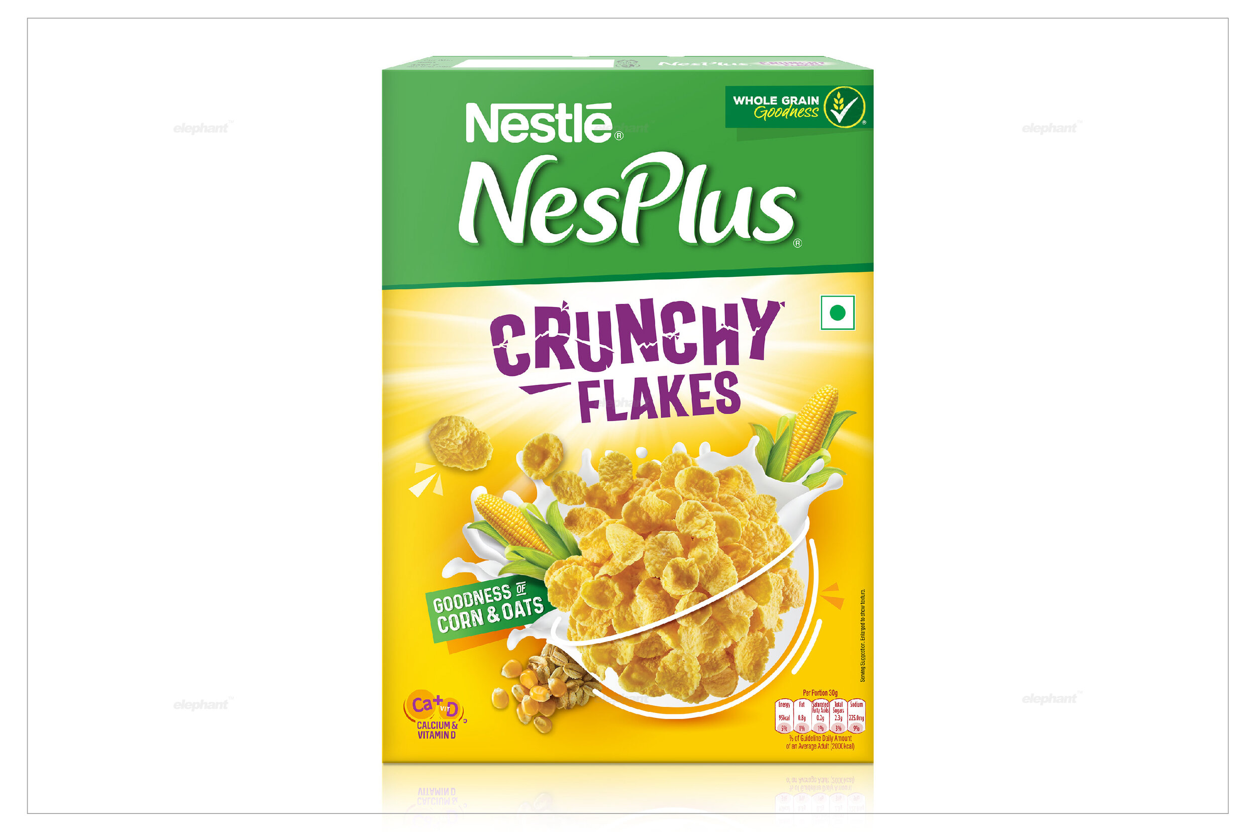
Our team managed to integrate an array of cues to bring out the core proposition of the NesPlus range – the crunch factor. For instance, the letter play on the product name showcases letters breaking apart while closeup shots of the product in hyperrealistic focus only serve to amplify it. The product also breaks apart from the core bowl element in the centre, depicting a burst of crunchiness – all of these keep reinforcing the sensory idea in the consumer’s mind.
Ownable Colours
Since the market has been inundated with several competitors, some of whom have dominated it for decades, differentiation was extremely necessary – if not downright essential. With a consistent, extremely visible strip of green dominating the top of the pack, the brand name was clearly showcased. Bright colors like blue and white are amply utilized since they represent a vibrant, fresh morning – indicating the fresh injection of energy that is inherent within the product, while yellow ties it all together, representing the bright morning sun which is a perfect start to any day.

The World in a Bowl
Bowls are iconic in breakfast culture – a bowl of instant noodles, a bowl of porridge, a bowl of wholesome cereals – the list can go on. Why? Perhaps it’s because bowls represent a sense of wholesomeness, and let’s face it, most of us would be typically using a bowl for our breakfast too. Thus, the bowl formed the core design element on the packaging.
Here, the crunch comes through via a variable range of product shots and the bowl mixes different styles of ingredient depiction where photos and illustrations were merged with a note that illustrates why the product is crunchy, given that it’s made of four different types of multigrain.
But what about other aspects of a cereal? Gone are the days where only taste sells. Since our focus was also to appeal to modern moms who were shopping for their kids, or their families, we knew that the emphasis on nutrition would be equally important. This is also why vibrancy is important, where the ‘buddy mom’ also was reassured that this choice would nutritionally benefit her vibrant, healthy family who only deserved the best.
We decided to include the more informative aspects of the product on the back of the pack while retaining the original theme. Hence, the whole 4-grain product, comprising predominantly of corn and oats which is a key part of the ingredient story is contained here.
All in all, the team managed to create a fun, engaging, and compelling package for NesPlus, with ample focus on the crunch – the key proposition, enabling the product to stand distinctly amidst shelves brimming with competitors, promising a healthy, fun, and wholesome breakfast like none other.
