
On the Run
Natural Energy Bars for A Fast-paced Lifestyle
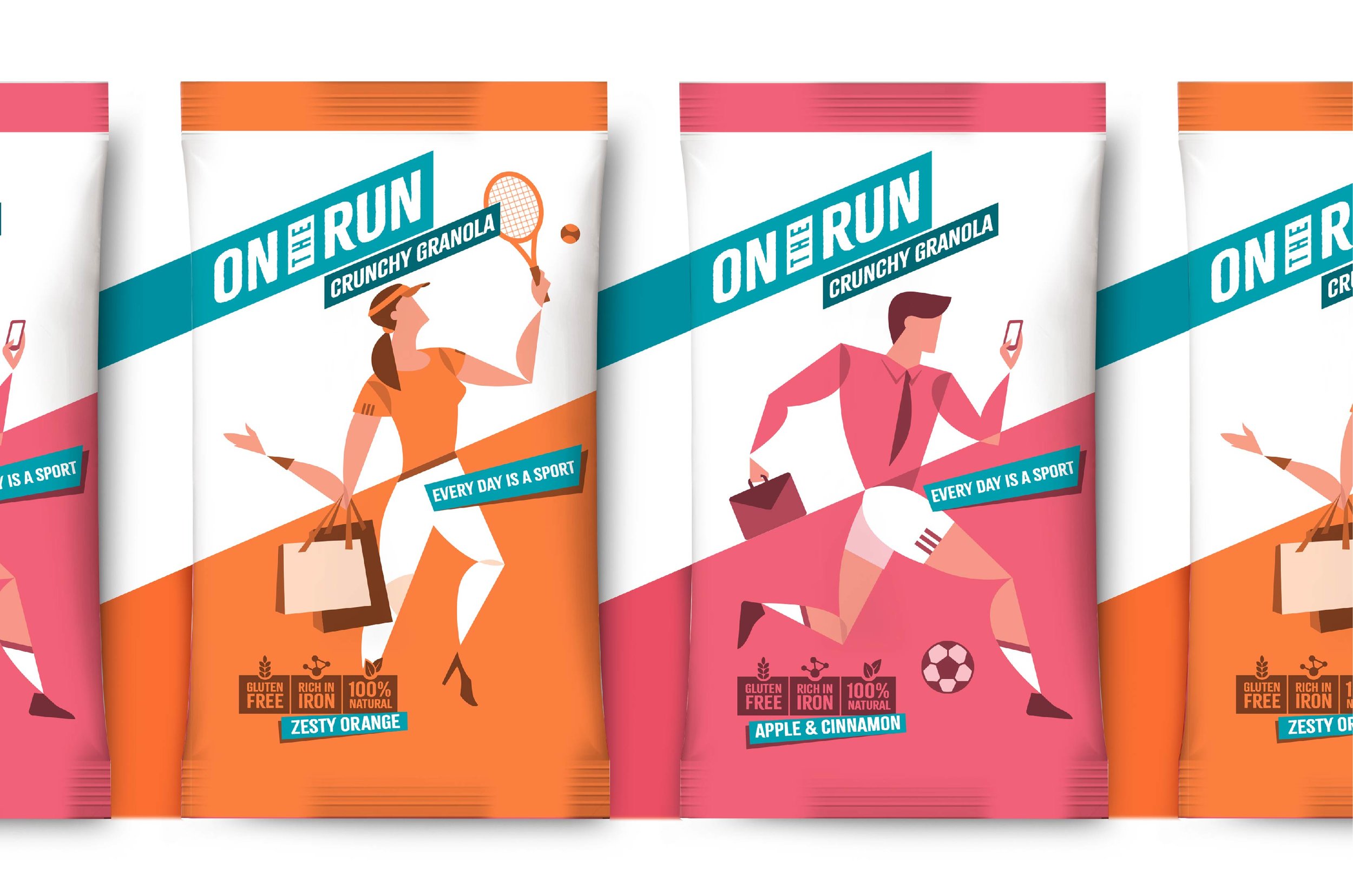
To keep up with our fast-paced lives, we need something equally quick to provide that essential boost of energy. Enter On The Run. All natural energy bars, which are easy to carry and easy to digest; the perfect food to grab on the go! On The Run approached us to refresh the identity and packaging design for their range of energy bars and crunchy granola snacks.
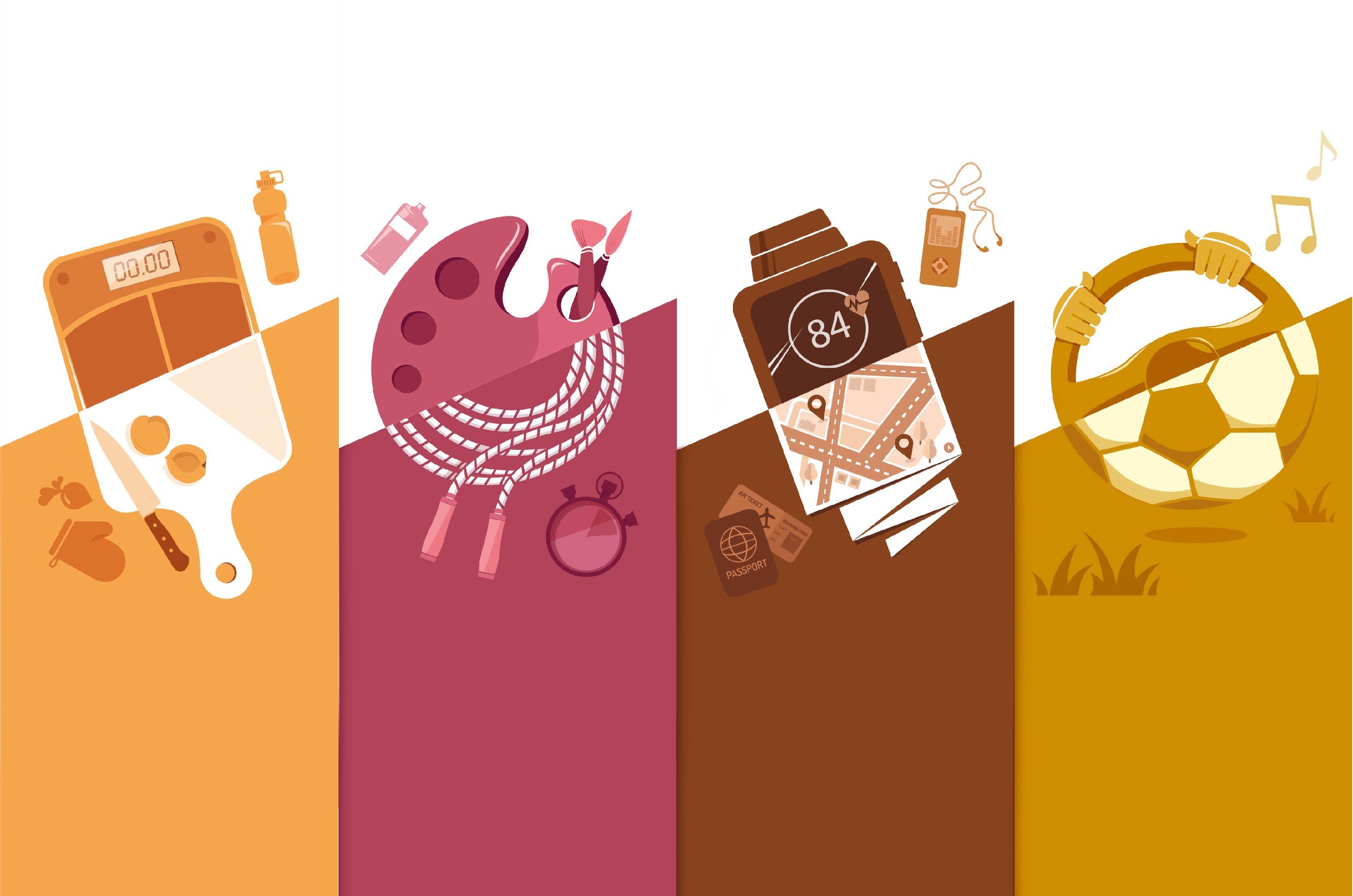
Whether its balancing a career and a passion, or juggling between a being a mother and a working woman, we all have multiple things going on at the same time. In the midst of this, we don’t always get the nutrition we need, especially when we’re short on time. This was the core concept behind the new On The Run packaging design.
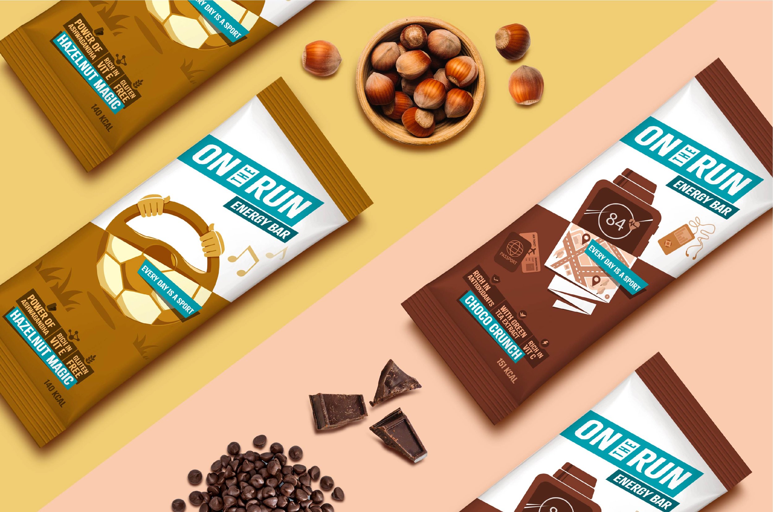
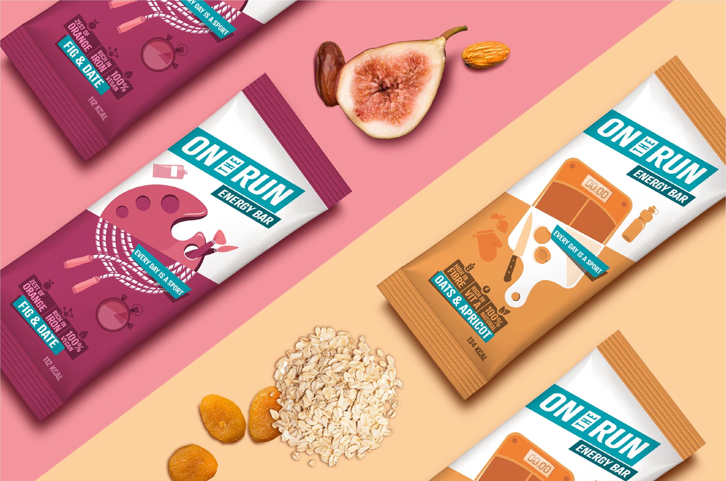
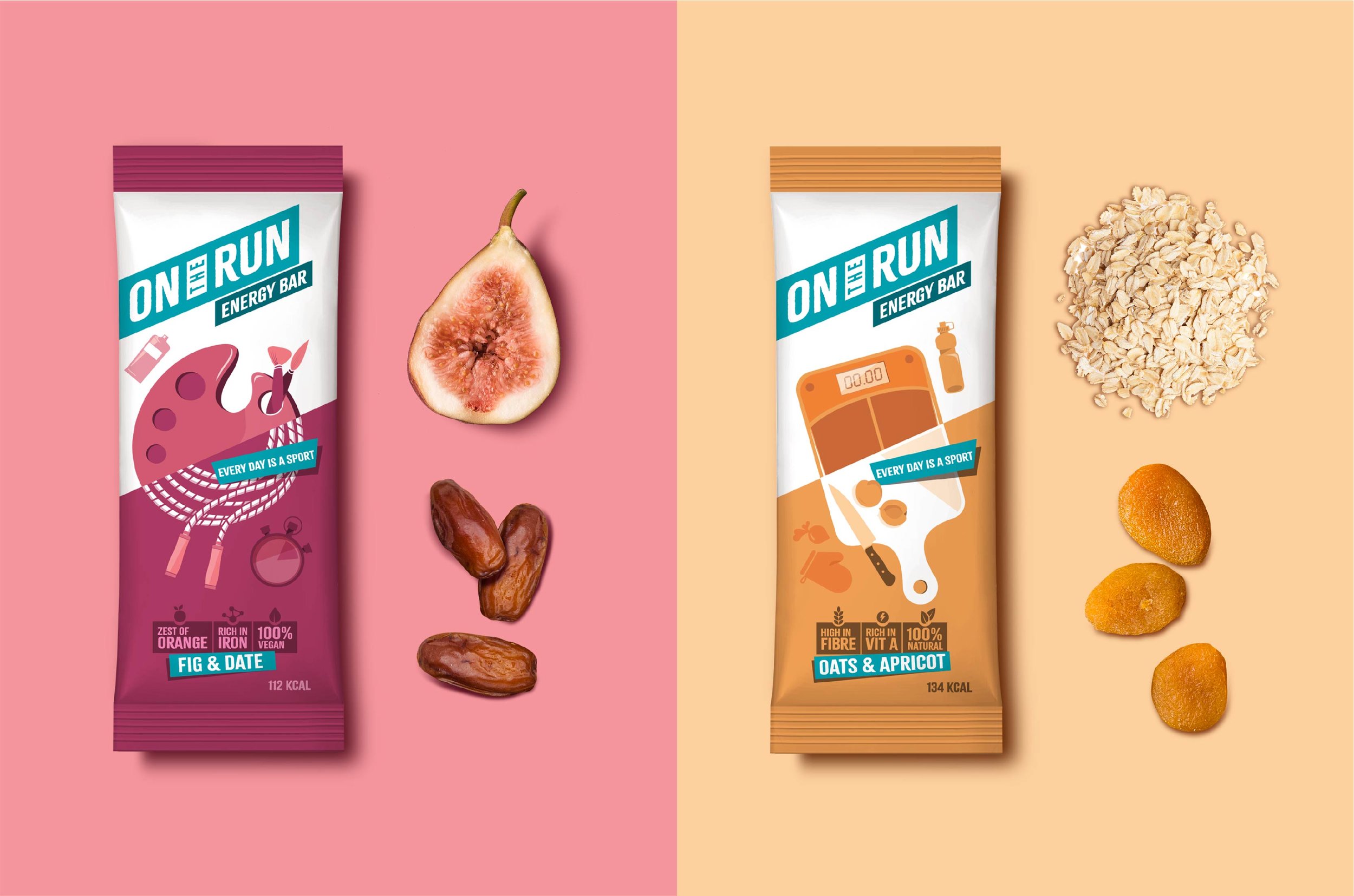
We wanted to acknowledge the duality of life, capturing snippets of it through the design approach. The packs were split into two, depicting two separate activities which seamlessly merged at the centre. The illustration style was targeted towards contemporary audiences, with the usage of stylised renditions and pastel colours. We kept the illustrations ambiguous to interpretation, neutral to geography, age, and gender. The side of the carton packs included realistic images of ingredients, to build a quicker connect with consumers.
The new identity connoted a fast-moving food, one which could keep up with a speedy lifestyle. This system was constructed to be easily adaptable to future products, with varied forms of packaging. On The Run has since become a preferred source of fast and healthy energy for the busy individual.