The Focus
Organic Harvest, founded in 2013, was acquired by the Good Glamm group in 2022, necessitating a brand & packaging revamp to make it ready for larger online reach.
The design had to target users that sought natural skin care with a caveat: it had to be potent and effective.
Ultimately, the packaging would drive customers towards Organic Harvest’s ever-expanding product portfolio and become their go-to option when shopping for natural skin care in a highly competitive market.
The Design
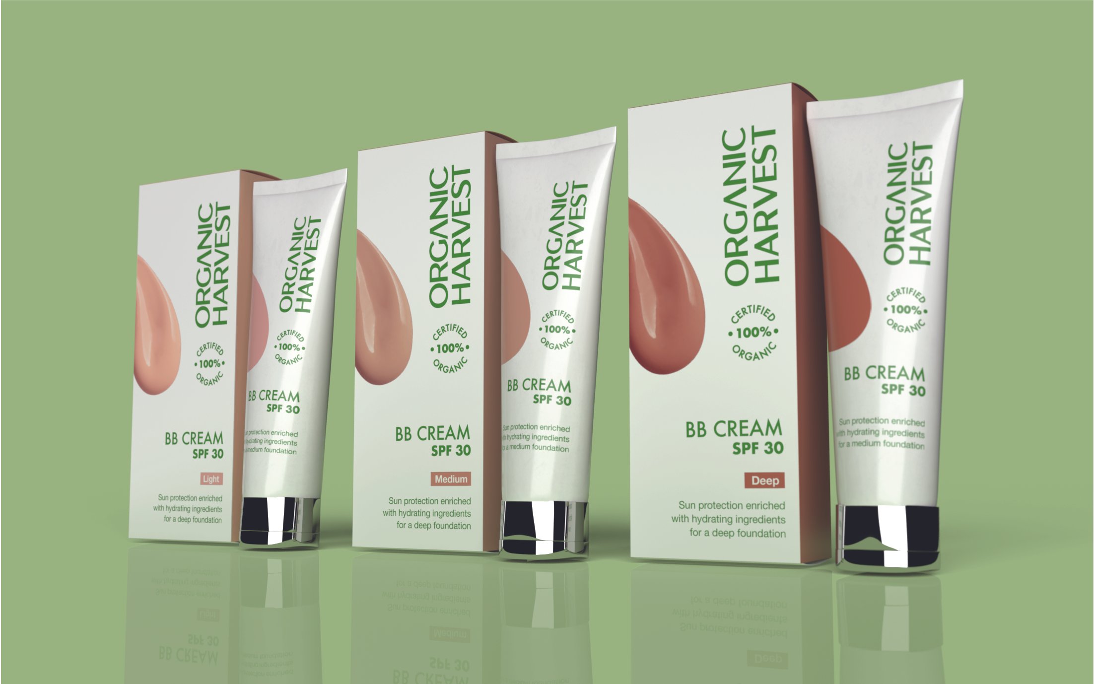
The team at Elephant revamped the packaging by opting for a clean, minimalist look that focuses on highlighting the brand’s key propositions like its ECOcert certification.
The packaging system works seamlessly on both online and offline shelves, where efficacy and expertise are primary impressions, along with a bold ingredient treatment and a benefit-focused approach.
Organic Harvest now emerges as a brand that is as natural as is possible in today’s saturated market, with no compromise on potency.
The Story
Elephant was approached by Organic Harvest, a skincare brand known for its use of organic and natural ingredients to revamp its packaging to enhance elegance, establish system and improve appeal for e-commerce as well as retail shelves. Organic Harvest was acquired by the Good Glamm group in 2022. Known primarily as an offline brand, the Group plans to leverage Organic Harvest range for their rather sizable digital audience.
Organic Harvest aimed to appeal to women in the 25-40 age group who seek efficacy from natural skincare products, prefer sustainable lifestyles, and have low loyalty to other brands unless they are well-established.
To that effect, Organic Harvest teamed up with Elephant for a complete revamp and refresh of their visual identity and packaging system which would pivot the brand and make it appealing for their intended audiences.
“Organic Harvest’s USP is its use of raw materials that are organically grown, which makes their products fertilizer-free, clean, and eco-friendly. This already distinguishes them from ‘herbal’ products with their focus on ingredients that are not chemically toxic or ‘natural’ products that involve the use of naturally derived ingredients. ”
Organically Potent
The beauty market is crowded with brands that promise a ‘natural, gentle’ treatment that reiterate a popular belief that commonly used chemical ingredients harm and damage your skin with long-term use, and natural beauty is compromised. However, consumers remain unaware and have a perpetual question of whether natural necessarily translates to efficacious. If there aren’t any chemicals, how potent can the product be? What sort of results would it have? All of these are relevant questions, and Organic Harvest has good answers.
Organic Harvest's USP is its use of raw materials that are organically grown, which makes their products fertilizer-free, clean, and eco-friendly. This already distinguishes them from ‘herbal’ products with their focus on ingredients that are not chemically toxic or ‘natural’ products that involve the use of naturally derived ingredients.
“These deviations from a category that goes all-out on the packaging to provide a woody, natural, utopian feel to highlight the gentleness or the pristine quality of the product result in a welcome break for the customer on the shelf, where their eye is drawn to Organic Harvest’s clutter-free approach. ”

Additionally, the brand is ECOcert-certified. Acquiring this is a rigorous, stringent process and serves as another unique selling point.
With these facts in mind, the team at Elephant made the certification take centre-stage in the revamped packaging design. This assured customers that they were indeed accessing the gold-standard of Organic Beauty products, where an uncompromising attitude towards sourcing and cultivation guarantees purity and in turn, efficacy.
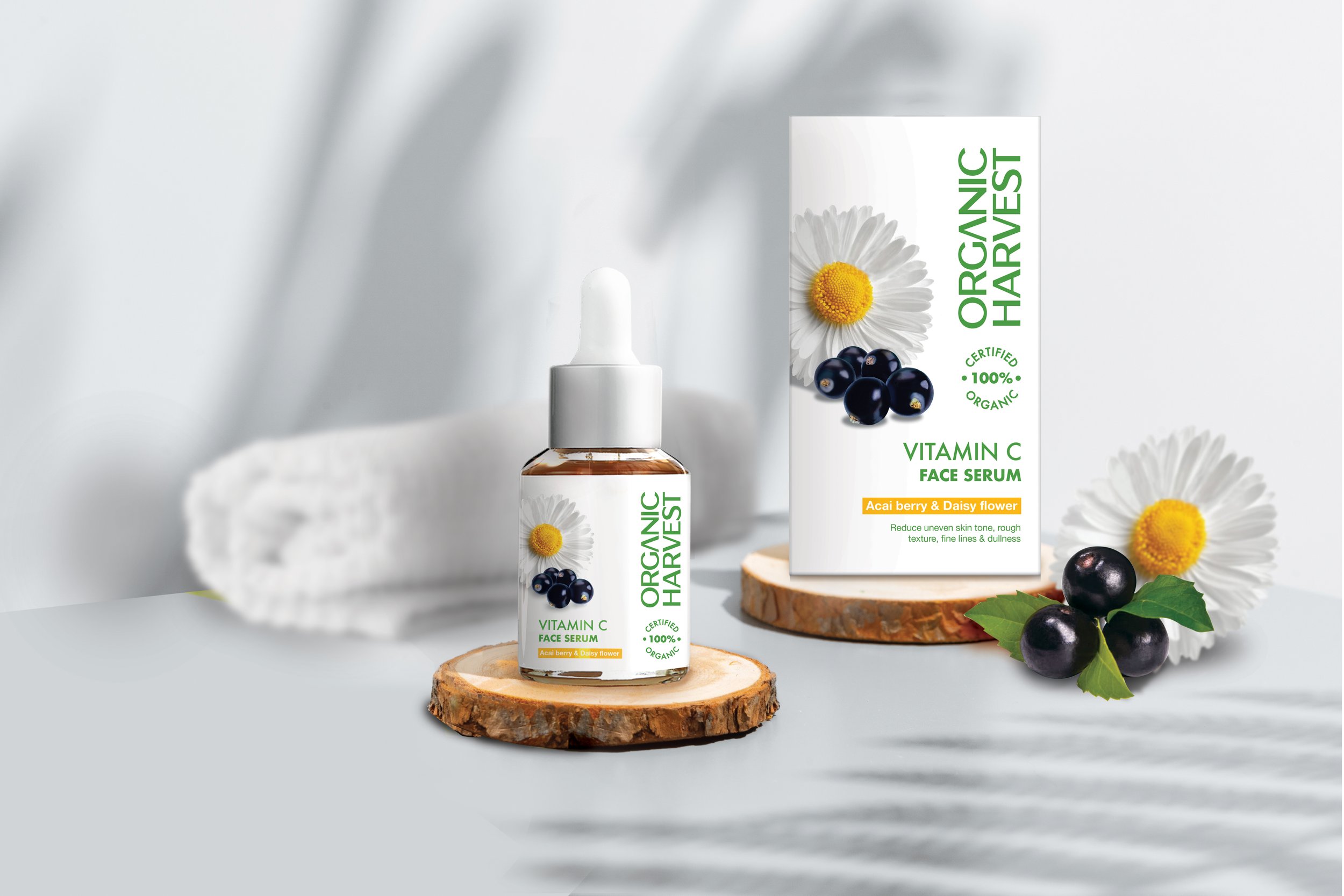
The team opted for a sans-serif font and a green-and-white colour palette that is backed up with an array of bold secondary colours that add dramatic contrast and appeal. The new design with its focus on efficacy and a scientific-minimal treatment makes Organic Harvest an expert companion for all things natural cosmetics. The clean, minimalist layout provides crucial information in a succinct, easy-to-understand format.
These deviations from a category that goes all-out on the packaging to provide a woody, natural, utopian feel to highlight the gentleness or the pristine quality of the product result in a welcome break for the customer on the shelf, where their eye is drawn to Organic Harvest’s clutter-free approach.
““There is only one type of designer – the type that cares about type.”
”
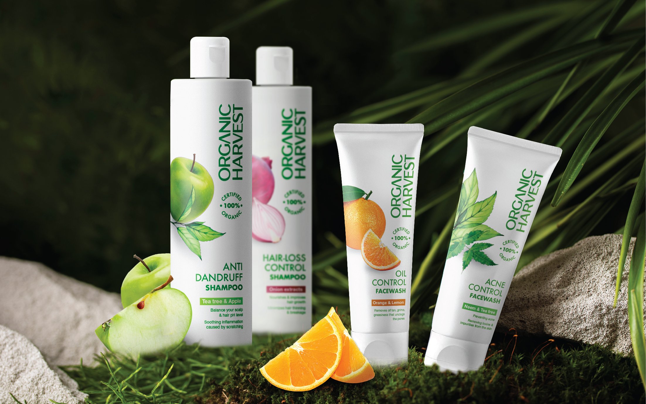
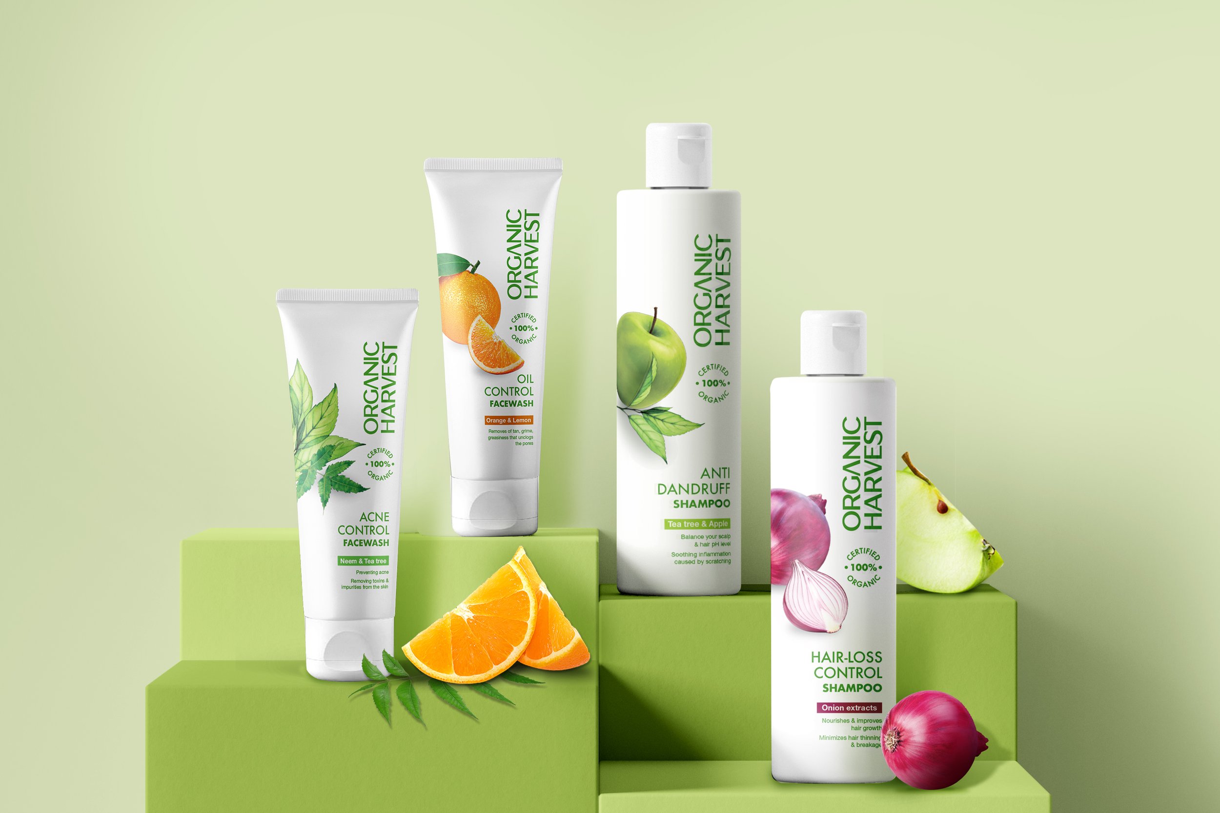
The Dance between Benefit and Ingredient
Opting for either an ingredient-focused or a benefit-focused treatment when it comes to skincare/wellness products and their packaging is a safe choice. It does not try juggling too many things at once at the risk of overwhelming the consumer.
Organic Harvest posed a challenge as their product had both: ingredient and benefit-focused aspects. While ingredient sourcing and cultivation are important, we needed to simplify the product for consumers to make quick purchase decisions. Thus, we had to strike a balance between these two aspects.
The team opted for a benefit-focused approach, where the benefit (acne control, oil control etc.) accompanies the product name. The ingredients are given their due with a bold presence on the other side, amplifying the purity and potency of the product. Lastly, a transparent window on the packaging enables a glimpse into what lies within, giving customers all, they need to make a quick purchase decision.
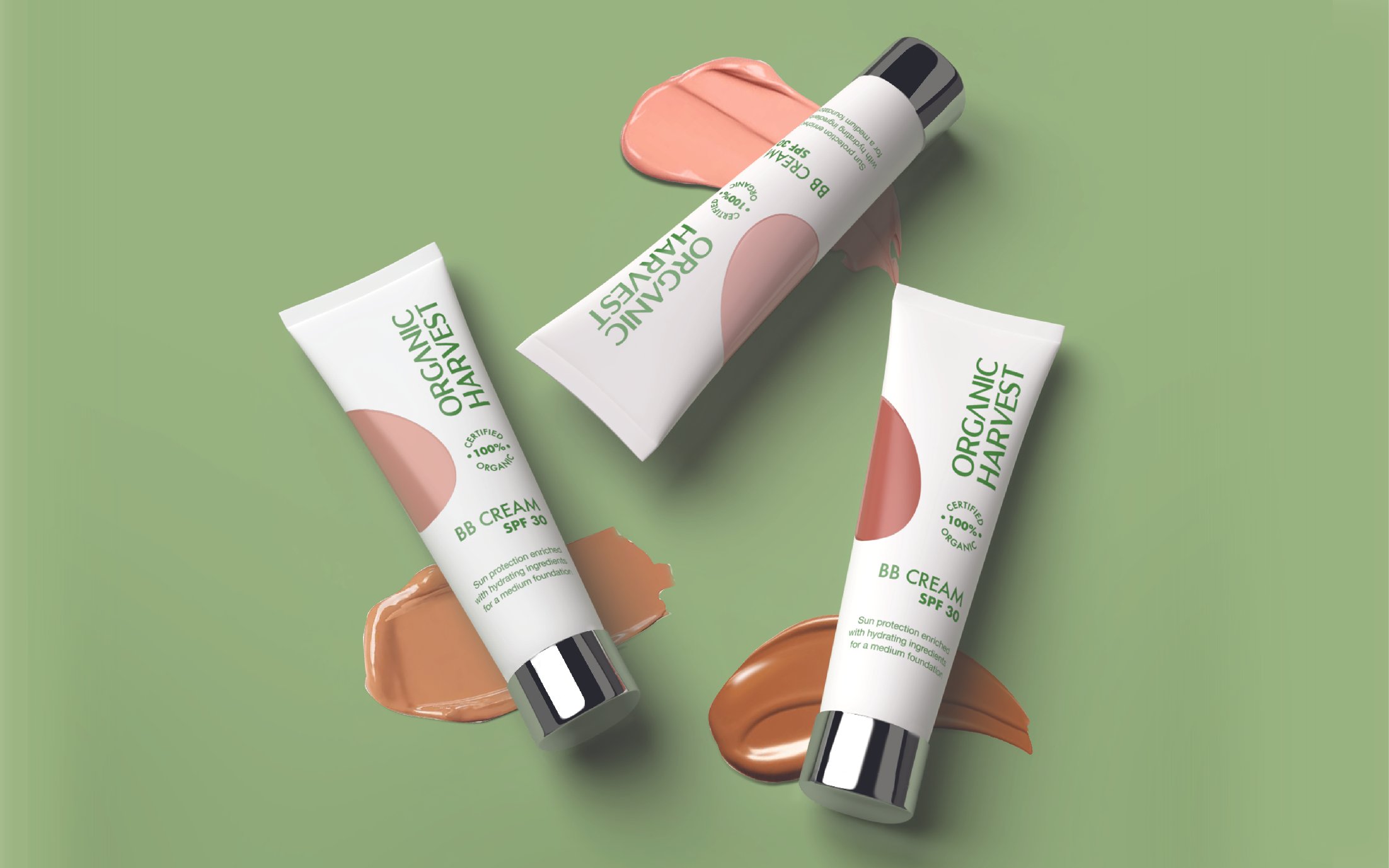
The Trifecta of Clean, Organic and Premium
After successfully launching the core range, Organic Harvest returned to the Elephant Team with an additional project: designing the packaging graphics and system for their new makeup range.
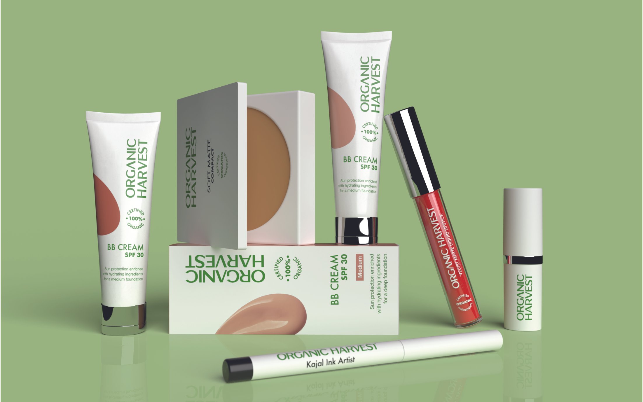
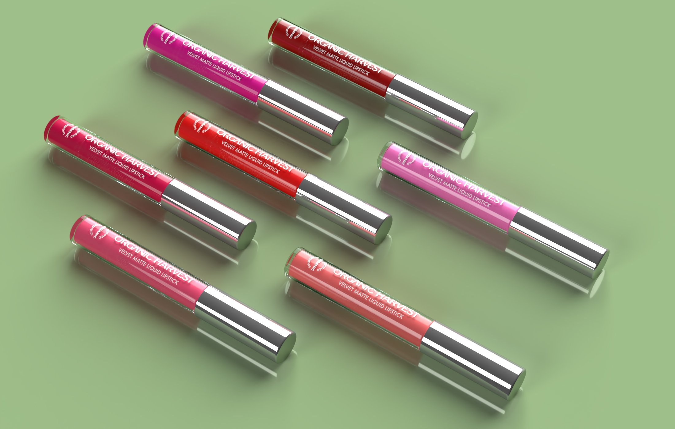
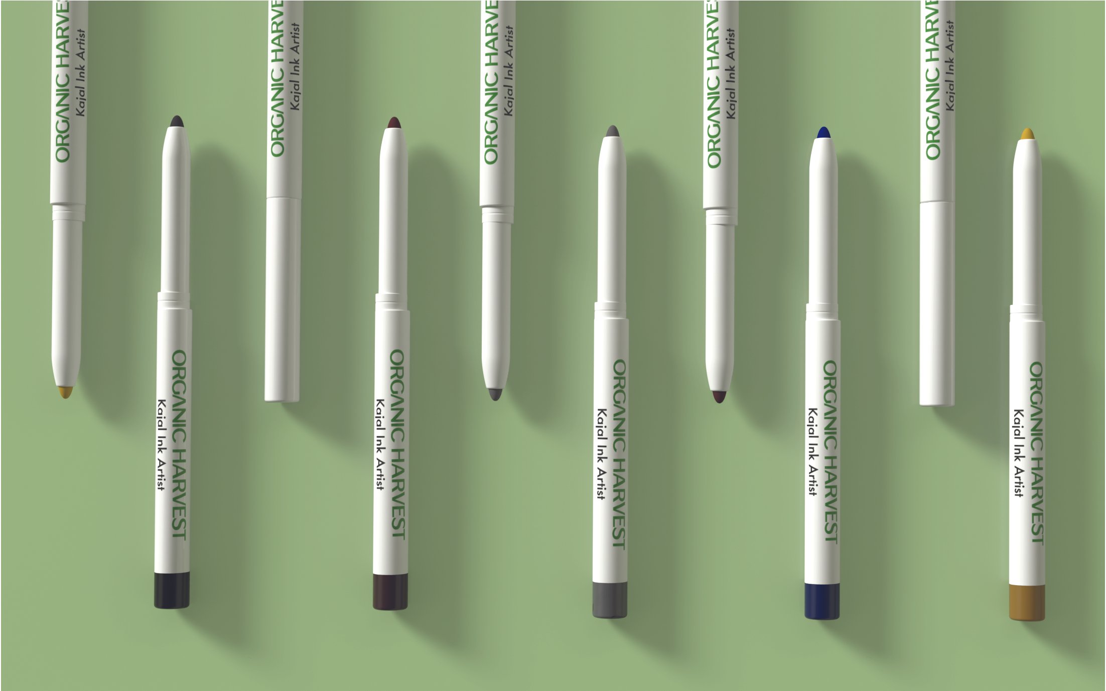
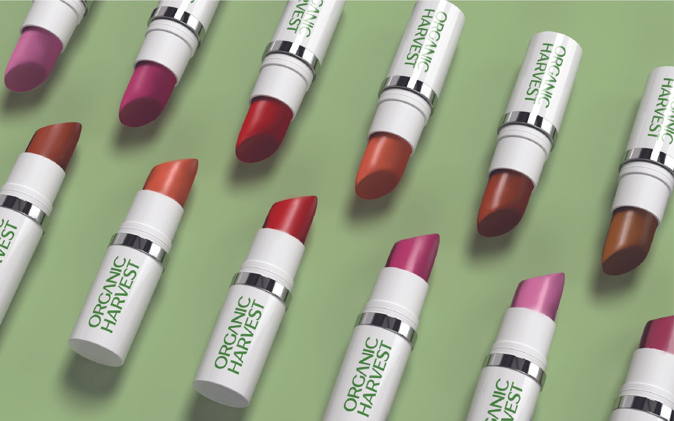
Our design was focused on evoking the clean beauty theme, which is characterized by its rejection of harmful, potentially damaging ingredients like parabens and sulphates. This rejection is echoed via a clean, white background with a crisp type while retaining organic codes that are characteristic for the brand. The team also used a clear, transparent approach for products like lipstick, where the internal components and colours are important for consumer purchase decisions. The interplay of smooth matte and glossy finishes adds a premium touch.
Organic Harvest’s new packaging and visual identity presents clear communication for the consumer to make an informed choice. The design lays down a strong, renewed foundation for a range of skincare, hair care, makeup, and beauty products. This new avatar draws in an existing base of loyal customers while easily introducing newer customers to the line with its new, modern, minimalistic approach to skincare that is both potent and natural at the same time.