
ASAP
Helping youngsters onto the healthy eating bandwagon
To say that there has been an influx in healthy eating trends would be putting it lightly. Even youngsters are becoming conscious of what they consume and opting for healthy alternatives to fast food.
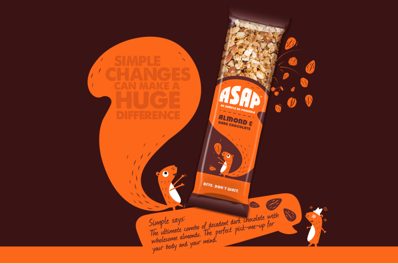
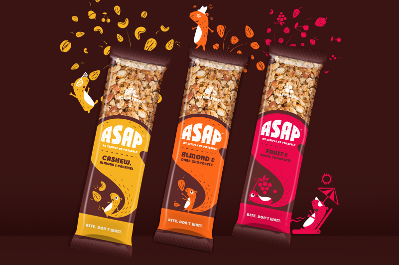
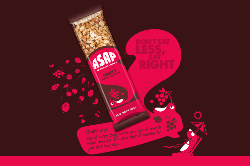
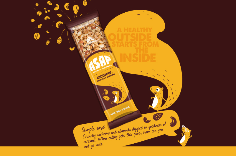
ASAP stands for As Simple As Possible, granola bars designed for youngsters always on the move. For the packaging of these bars, we needed to create a strong connect with young adults and up the quirk factor without sounding too serious.
Drawing inspiration from nature to highlight the goodness of the bars, we opted for a squirrel as their mascot. Since the squirrel knows and picks the best nuts from the trees, she was the best fit for this brand. Bright and bold colours were picked for the background of each pack, changing from flavour to flavour. The typeface complemented the theme of nature and quirkiness which went with the packs.
ASAP bars were put out in stores online and have been well received since! They’re also available on airline menus and being loved by travelers on the go.