
Tata Q
Making Quick Quisine Rewarding
When you’ve had a long day at work, going home and cooking dinner becomes a tiresome chore. For those days, there’s always Tata Q. A ready-to-eat range of products from the Tata group, Quick Cuisine was targeted towards youngsters living alone who craved for convenient and quick food, without compromising on taste and freshness.
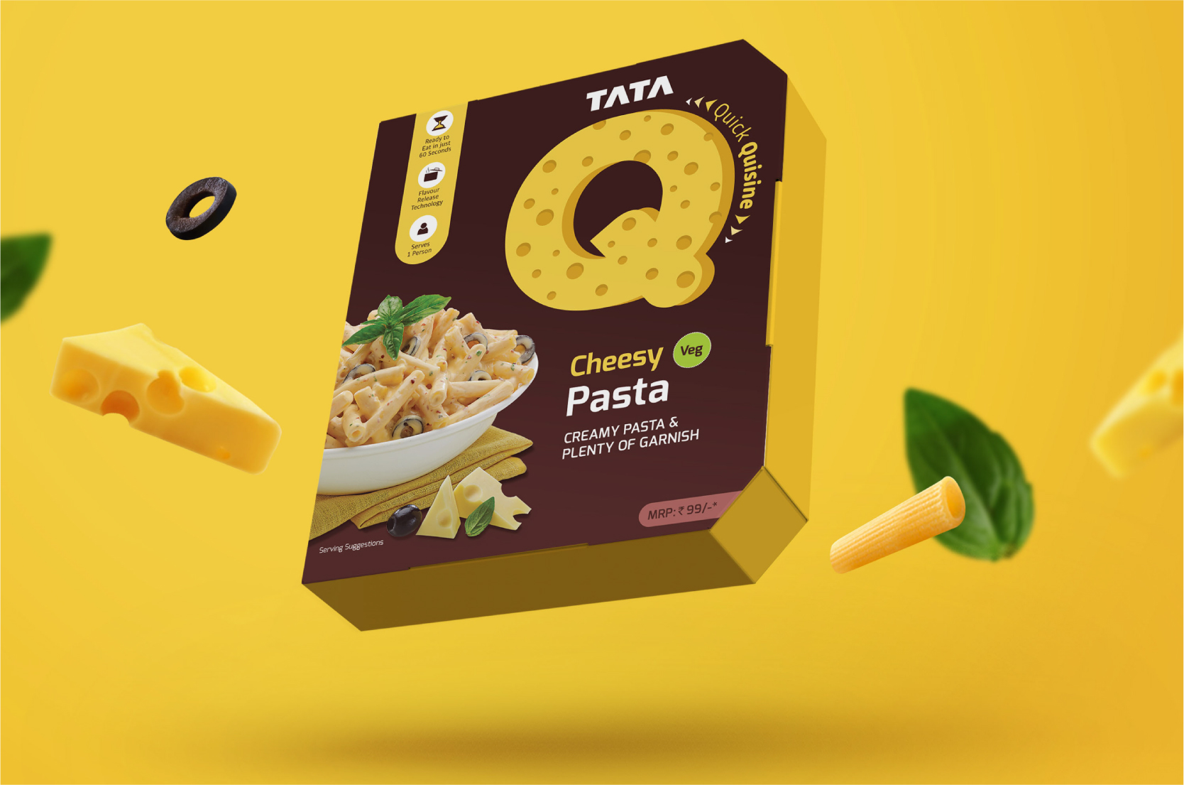
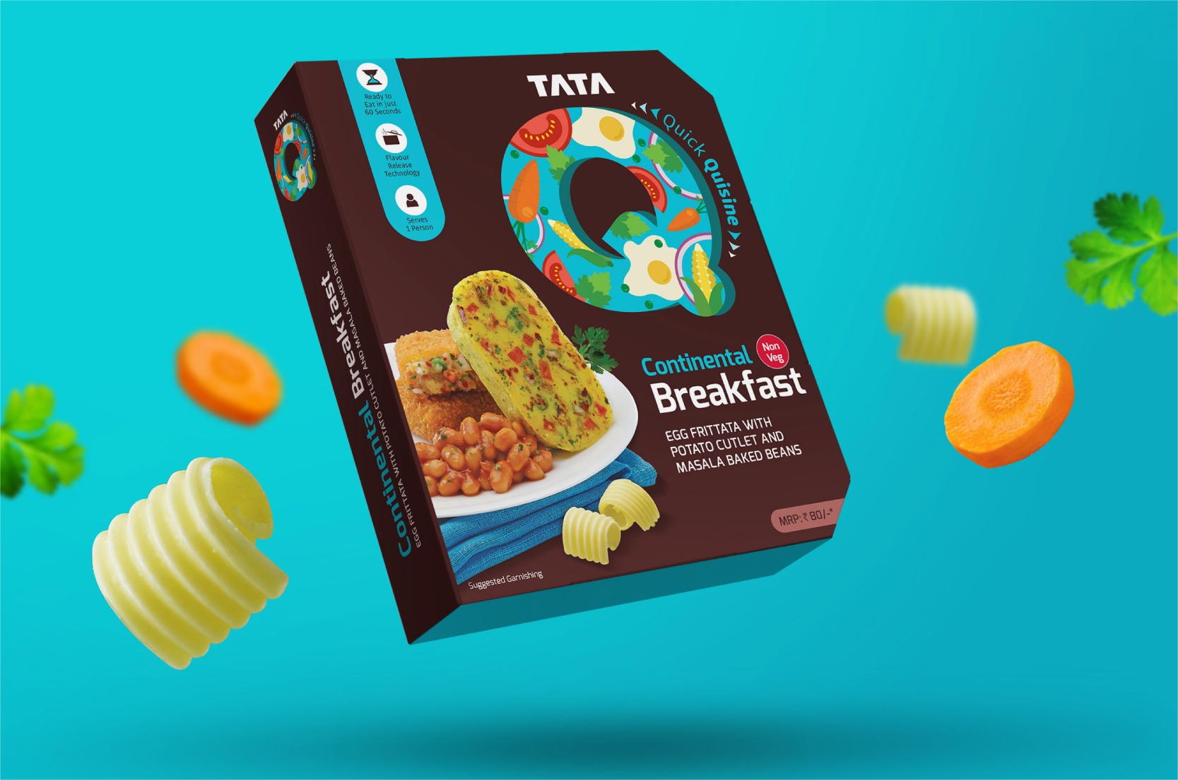
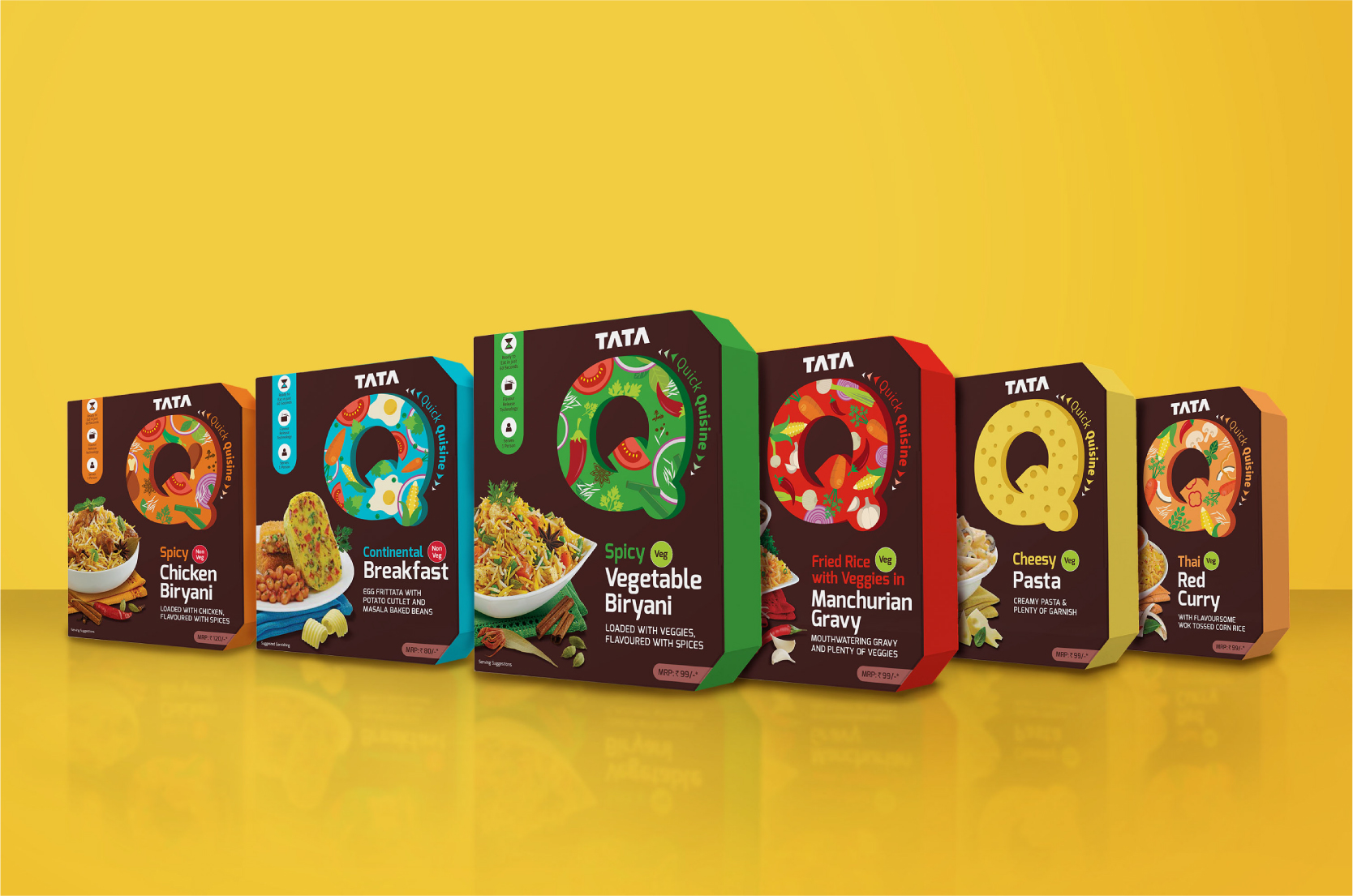
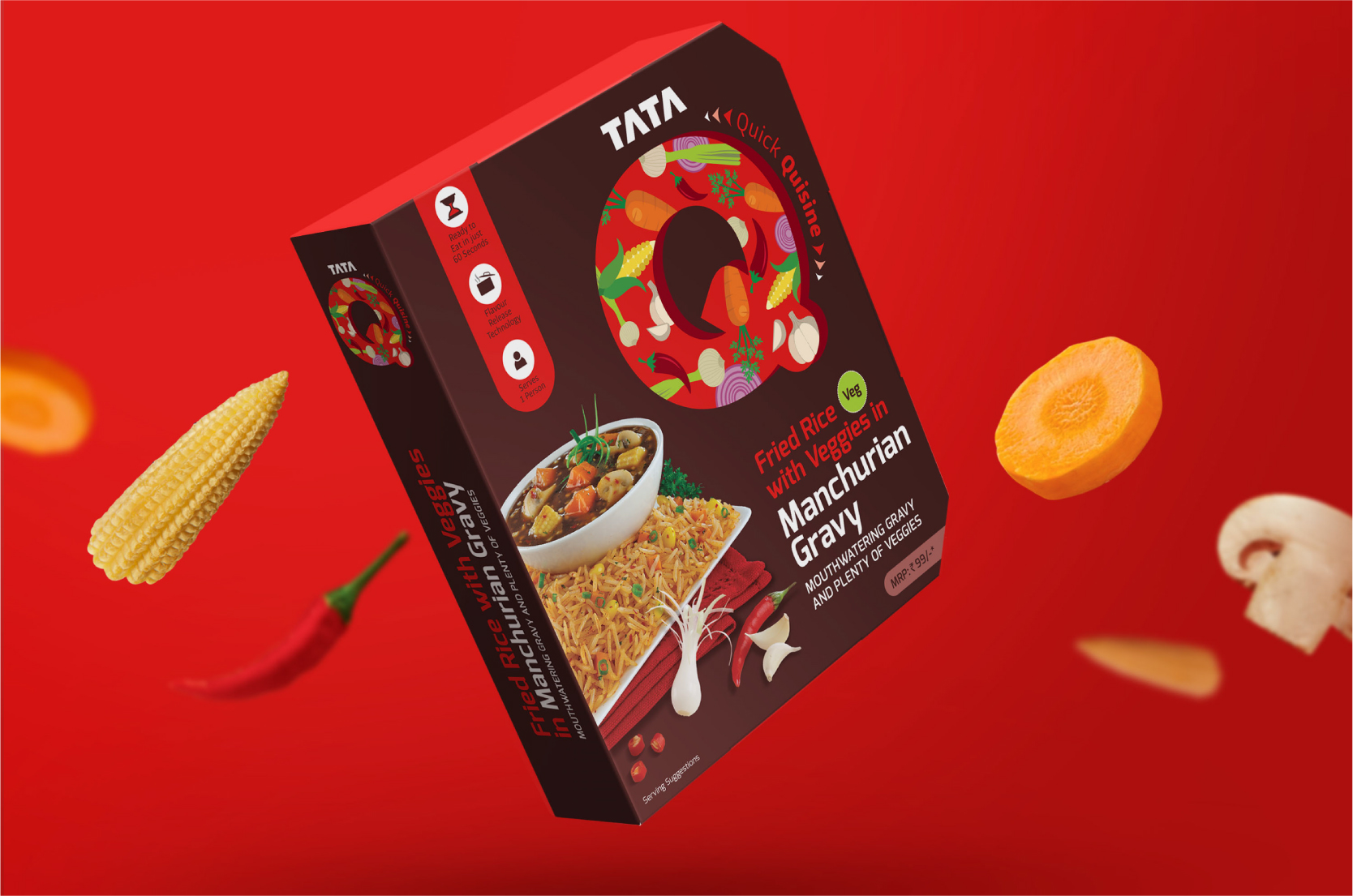
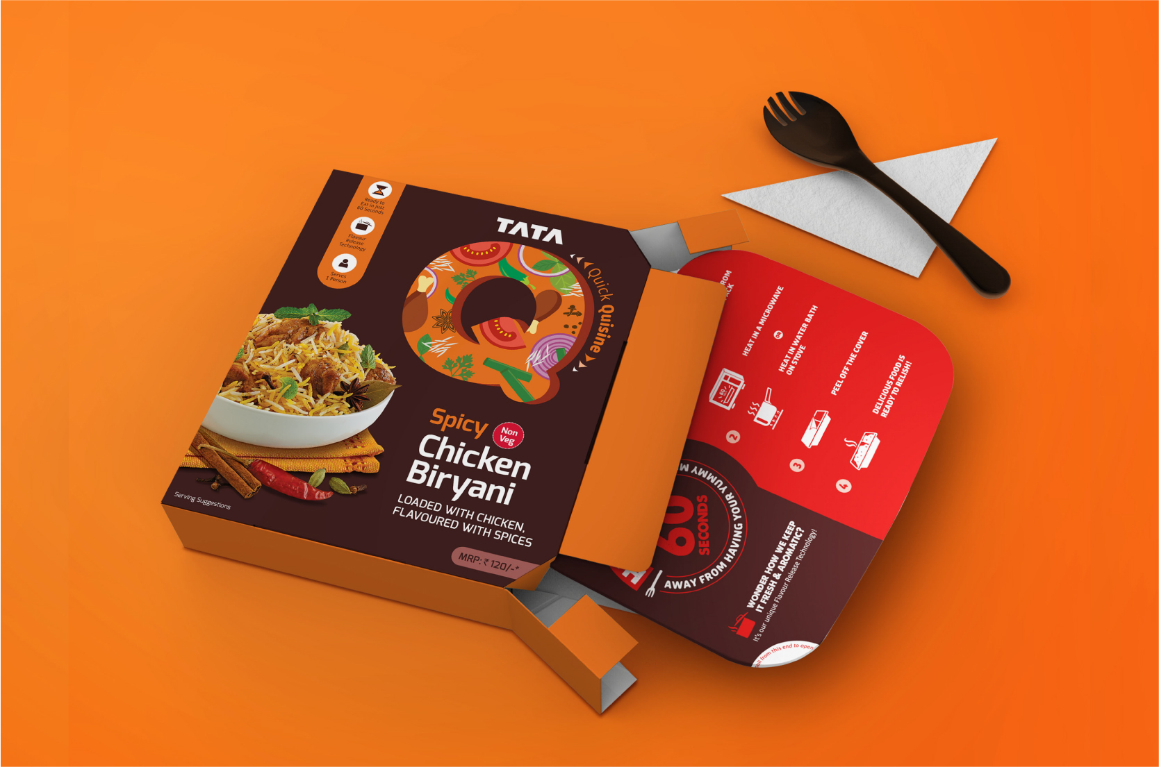
We were approached to collaborate with the core team on the positioning of the new brand and eventually to design the new packs. These had to be communicated as complete meals that can be ready to relish in 60 seconds. To appeal to the independent millennial, they had to look delicious, vibrant and stand out from the clutter on supermarket shelves.
The most striking features of the packs became the bold Q, a central unit, and a unique colour palette which distinguished it from other ready-to-eat offerings. The patterns within the Q enclosure changed with each flavour, adapting itself to the ingredients in the dish.
A vertical tab was devised to ensure the key offerings wouldn’t be missed. The drool-worthy bowl of food was made to look instantly attractive to display the wide variety of flavours.
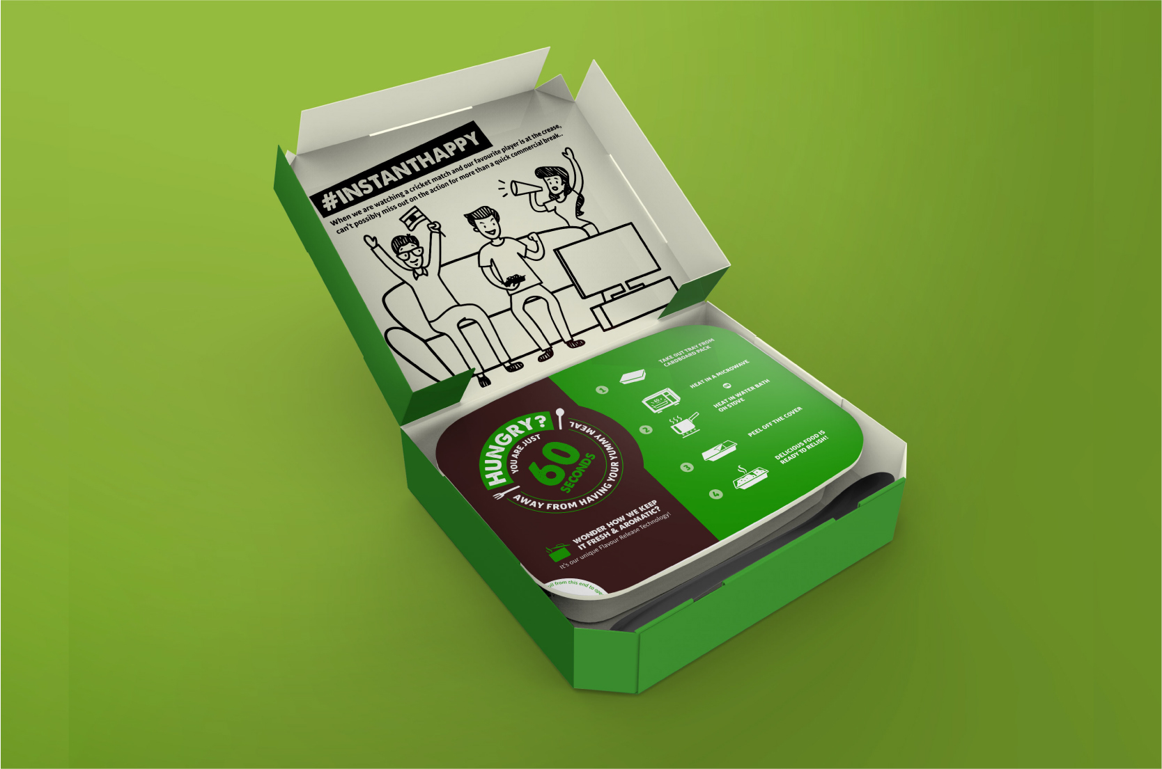
To make it an engaging experience for consumers, we also added fun illustrations on the inside, visible once the pack was opened. The lid of the tray had prominent colour codes to identify vegetarian and non-vegetarian dishes. This was particularly handy when multiple dishes were being heated together.
Currently launched only in Pune, Tata Q is doing well on the shelves and is scheduled for a nationwide release soon.