

The Focus
Tata Consumer Products’ foray into the domestic food essentials space, Tata Sampann, approached Elephant for the creation of brand identity and subsequent packaging
Centered on the concept of a ‘sampoorna aahar’ (all-encompassing nourishment) where inclusion, as opposed to exclusion, formed the ideal diet
Needed a system that could accommodate for their current products, but also rise up to adapt to a highly ambitious expansion plan, signaling evolution
The Design
The team at Elephant designed an apt logo, centered on the ‘handi’, the earthiest form of cooking and storing Indian food
The visual language and use of colors situated the brand as being in the ‘center-of-plate’ business, while playing on the cues of abundance, wholesomeness and inclusion
Created a highly malleable packaging system with visual identity codes for each product, with the ‘goodness of ingredients’ being a core focus, while other elements remain adaptive

The Story
The process of adjusting, tailoring and manipulating our food intake in a conscious manner so that we experience a sense of wellbeing is extremely universal. “Dieting” can’t even be called a fad anymore. However, one thing is definitely certain: we have been influenced by Western trends and fads when it comes to diet choices.
“As the name suggests, “Sampann”, meaning ‘all-encompassing’ encapsulates all that is Indian when it comes to a nourishing, wholesome diet. From unpolished dals to blended spices and readymade food mixes, at the heart of Sampann lies the goodness of its core ingredients that will always nourish you in their myriad forms.”
When they approached the team at Elephant, they only had their staples in circulation and wanted to expand the brand into several categories and products. Thus, building a brand, from the logo to the visual identity to the packaging system, had to consider the fact that it had to work across segments in different formats, products and ranges.
In addition, the Design solution had to echo their core tenets of wholesomeness in the realm of nutrition and craft a consistent brand identity that would encourage their consumers to wholeheartedly accept what was inherently theirs, be it in the cultural or the social domains.
Goodness: The Container and the Contained
One of the very first steps we took was creating an appropriate logo to embody everything the brand stood for. Here, you can observe a highly familiar shape – the Indian cooking pot, or the Handi, which is the most earthy and authentic form of containing, as well as cooking Indian food, within which the logotype is contained.The leaves also connote freshness of ingredients
“Green is adequately used to indicate freshness and purity while also echoing minimal interference in the form of processing. This is accompanied by illustrations of the idyllic, windswept farmland. All organic products have a transparent window through which the contents can be viewed by the consumer for their satisfaction in this vein.”
Authenticity can be shown through many ways when it comes to food and one of the key factors when it comes to determining authenticity is through the processes of sourcing. All of Sampann’s products are pure and sourced through responsible farming practices.
This is echoed in the packaging where green is adequately used to indicate freshness and purity while also echoing minimal interference in the form of processing. This is accompanied by illustrations of the idyllic, windswept farmland. All organic products have a transparent window through which the contents can be viewed by the consumer for their satisfaction in this vein.
Wholesomeness at the Centre
To bring the idea of the quintessential Indian diet to the fore, we developed the entire visual system with a circular, central element with other interchangeable elements around it. In effect, the statement is that this brand will add to the core, center-of-plate offerings. It will contribute to the idea of the all-encompassing, nourishing diet that the subcontinent prides itself on.
The packaging system is also highly adaptive. Since this brand has a variety of products in different segments that also target different groups of customers, versatility is a necessity. The circular mnemonics change to reflect the category, which makes it easy for consumers to navigate between product offerings. The benefits of each category are also highlighted.
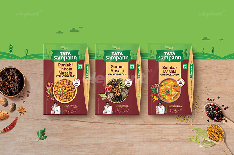
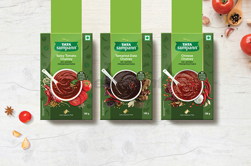
Each range also has its own category codes. For instance, masalas have their core ingredients displayed in full glory, chutneys have playful illustrative ingredients in the background (since they are for playful, instant consumption) while the more modern ready-to-eat food packaging depicts the finished products in their hyperreal glory.


“The story of the creation of this brand identity and packaging system is that of evolution. Here, our capability to design an adaptive system for a parent brand that has an entire range of SKU’s under different brands, showcasing the capability for differentiation but also a method to tie it all together. ”
Color codes and schemes also vary while retaining certain elements, where the mixes have their unique color, the pure masala range depicts the masala contained within and the dals, much like other organic products, depict what lies inside the package.
The core range, which comprises of products that are directly sourced (staples, dals) and so on can be distinguished from the innovative range which are derived (compound masalas, ready-to-cook offerings).
Other cues and contextual icons are also added, like a masala daani on the spices, the containers used for depicting various dishes in the ready-to-cook brackets and so on which are more modern, but the treatment doesn’t integrally change. The ‘goodness of ingredients’ never goes away but with each category, the cues shift and change.
““Creativity is a highfalutin word for the work I have to do between now and Tuesday.””
The story of the creation of this brand identity and packaging system is that of evolution. Here, our capability to design an adaptive system for a parent brand that has an entire range of SKU’s under different brands, showcasing the capability for differentiation but also a method to tie it all together.