
Too Yumm
Healthy Snacking Alternatives

We love it when we can relate to the brands we create! It makes the job more fun. This is what happened when RPSG Guilt Free Industries approached us to develop the brand & packaging for their new range of healthy snacking products, Too Yumm!
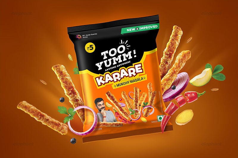
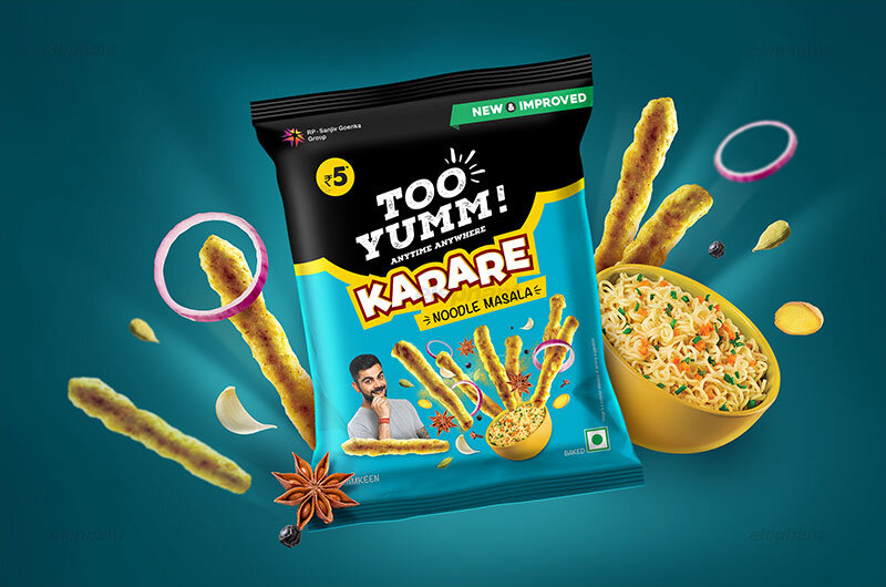
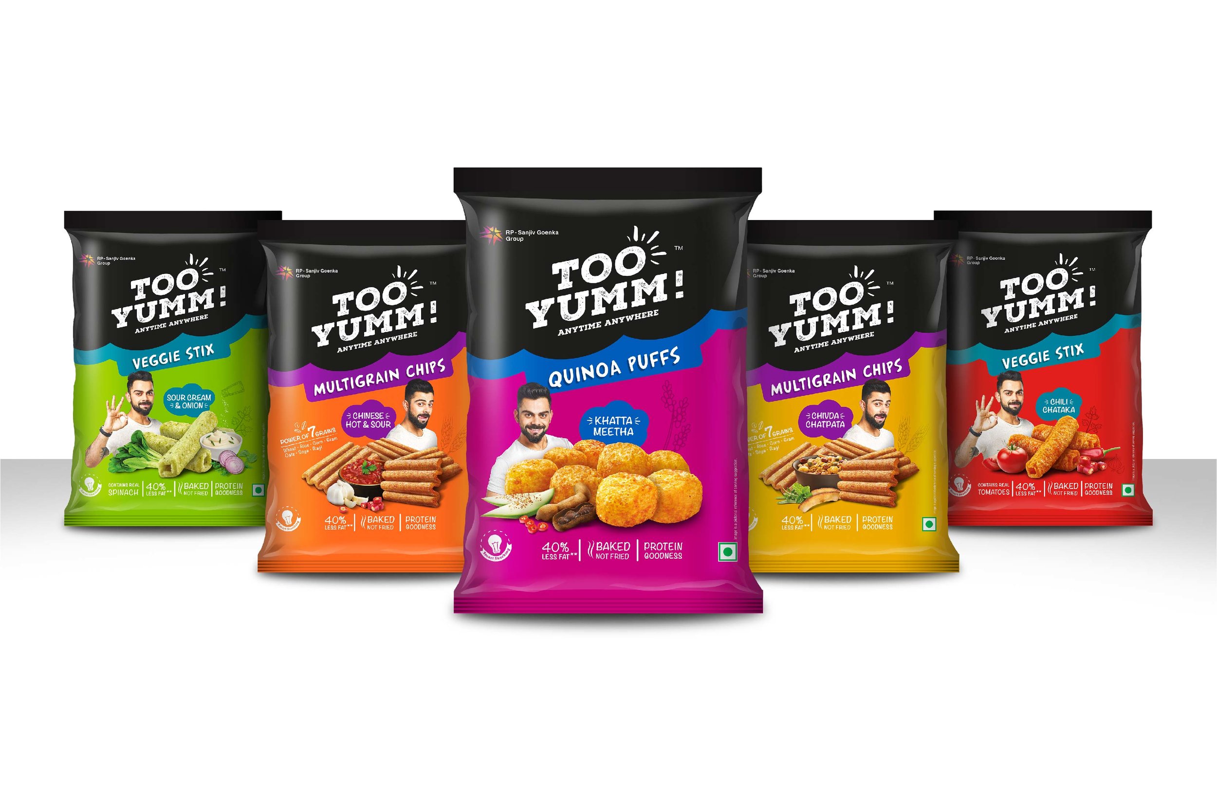
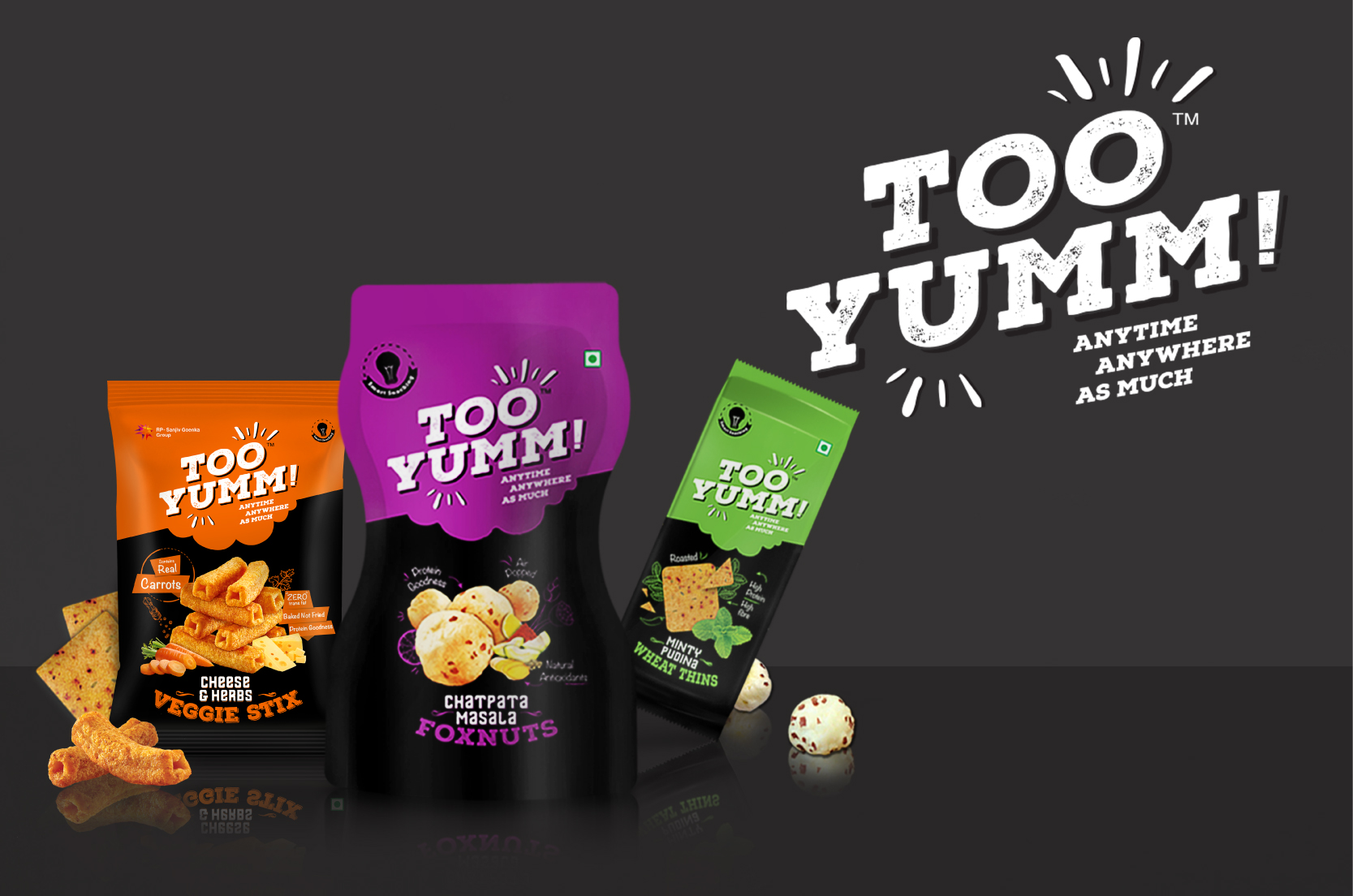
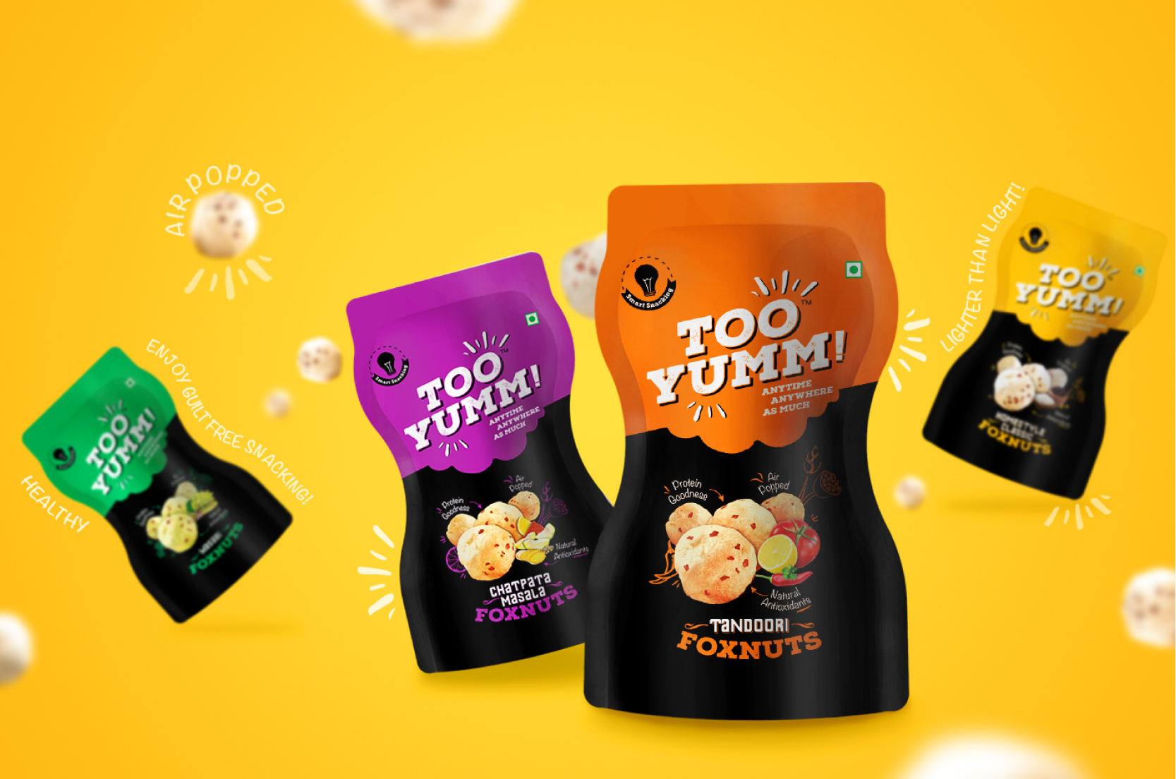
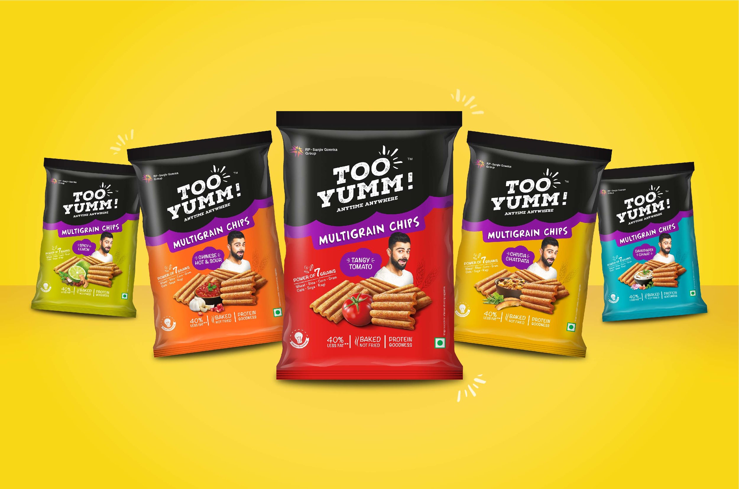
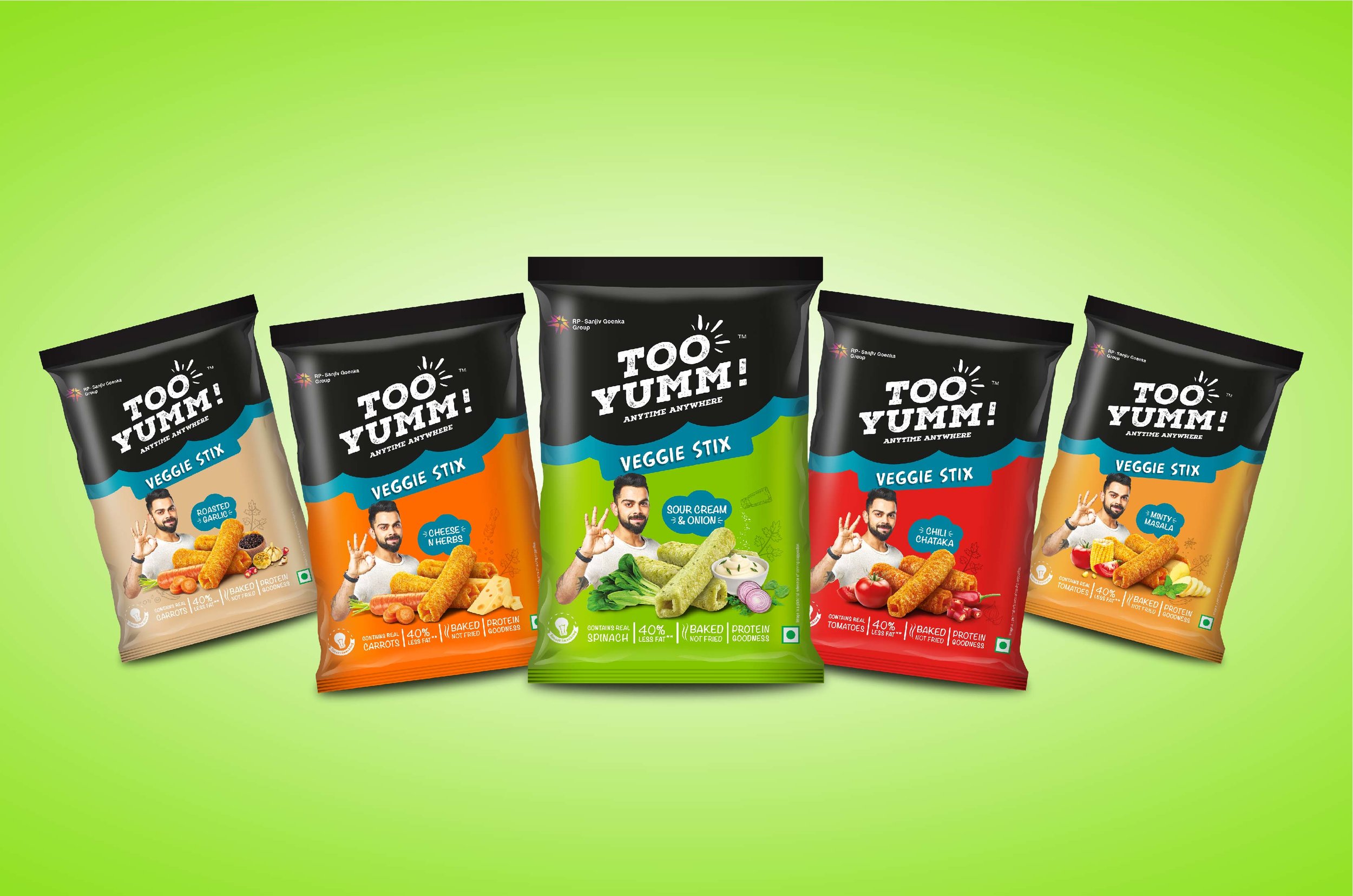
To start with, the Too Yumm team was ready with two products that were meant to be positioned as healthy solutions to beat the snack-y cravings. The Foxnuts and Wheat Thins were twists on traditional indian snacks and had multiple contemporary flavour offerings.
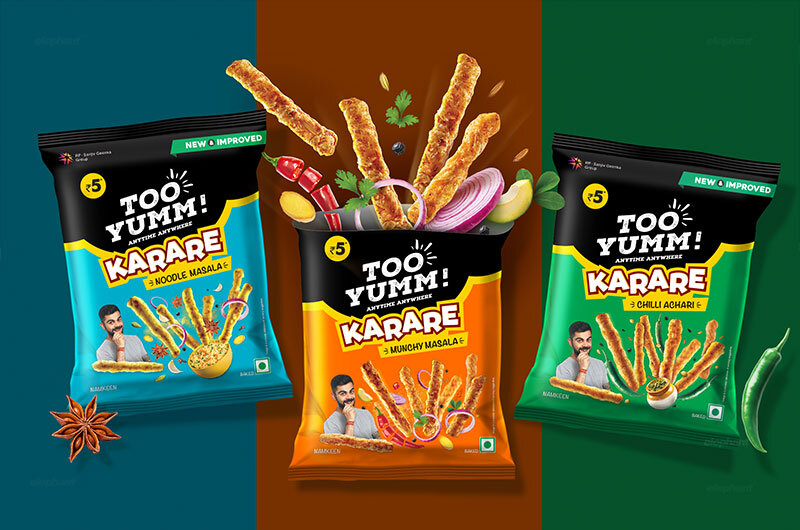
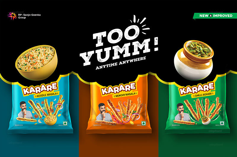
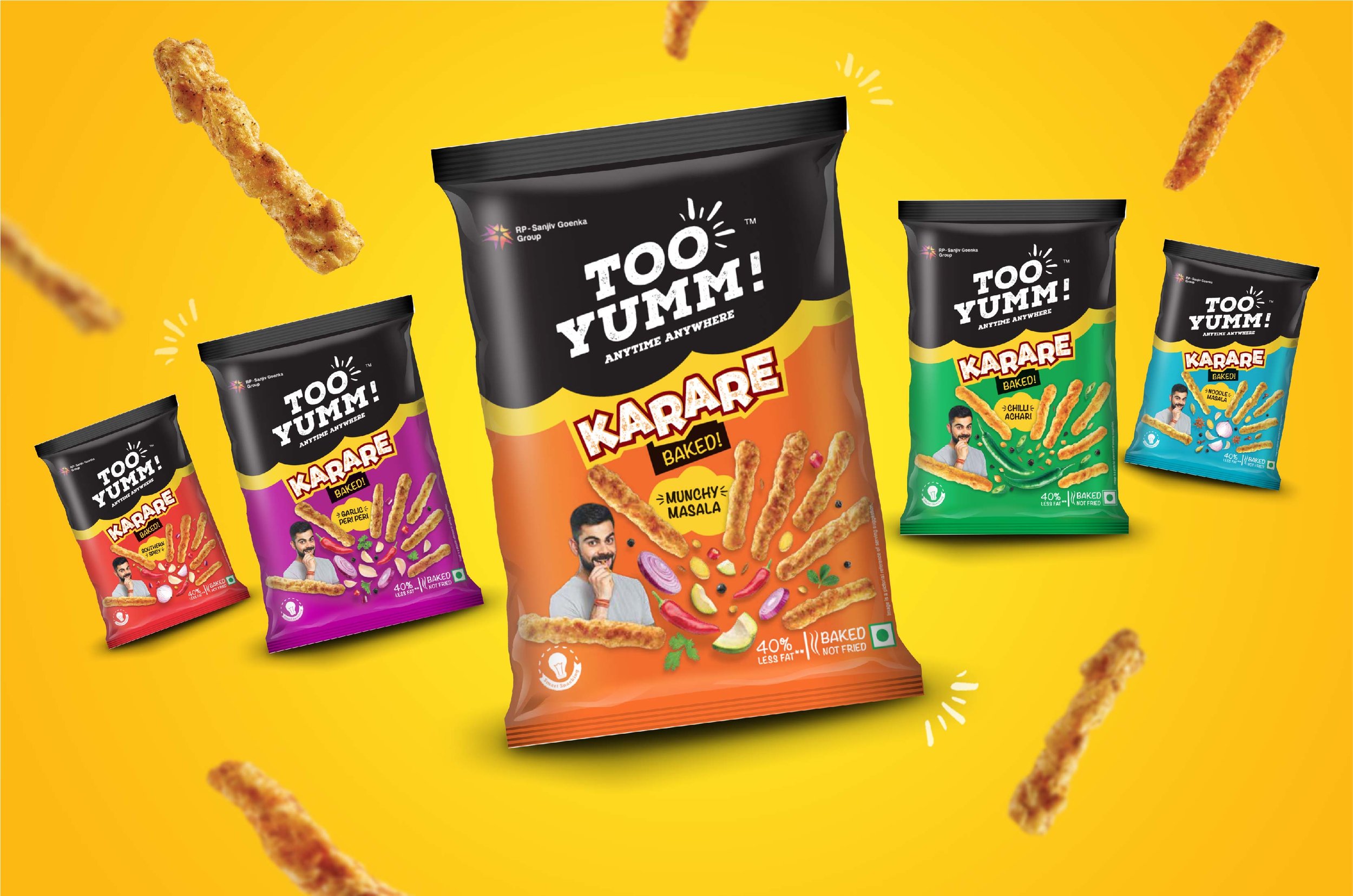
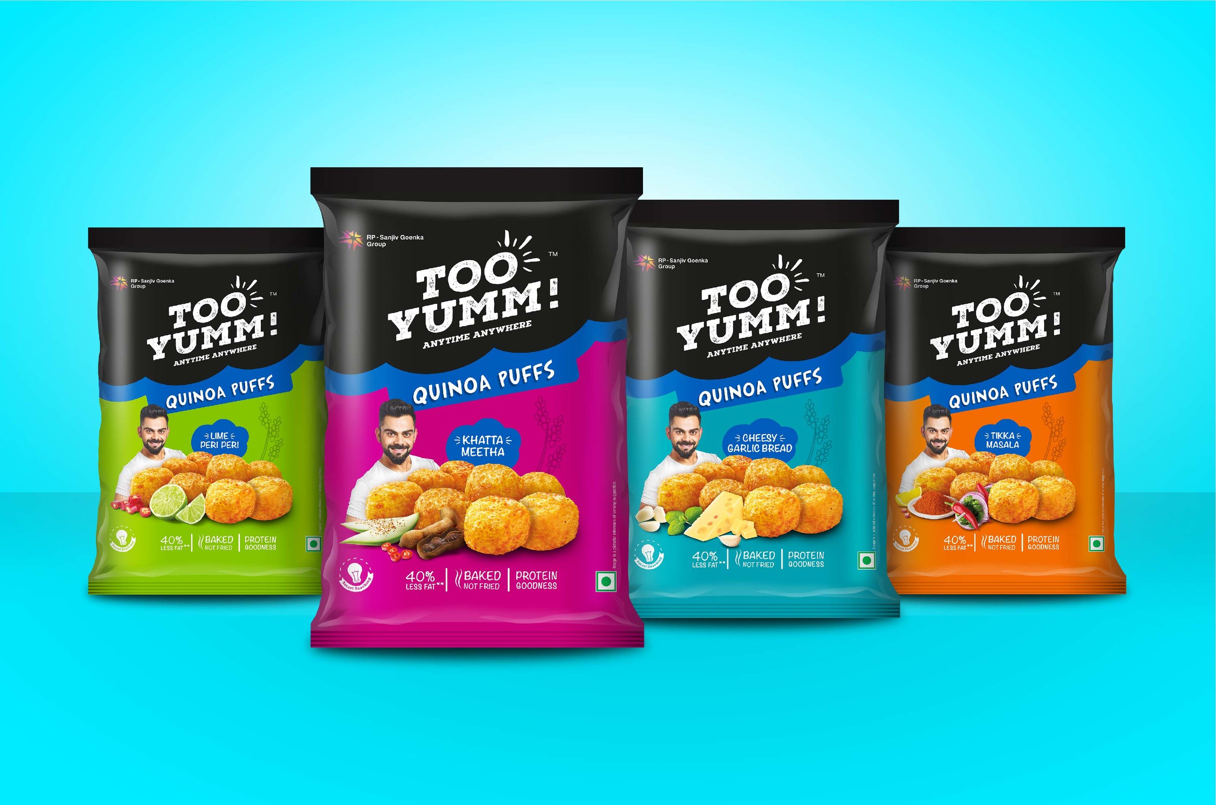
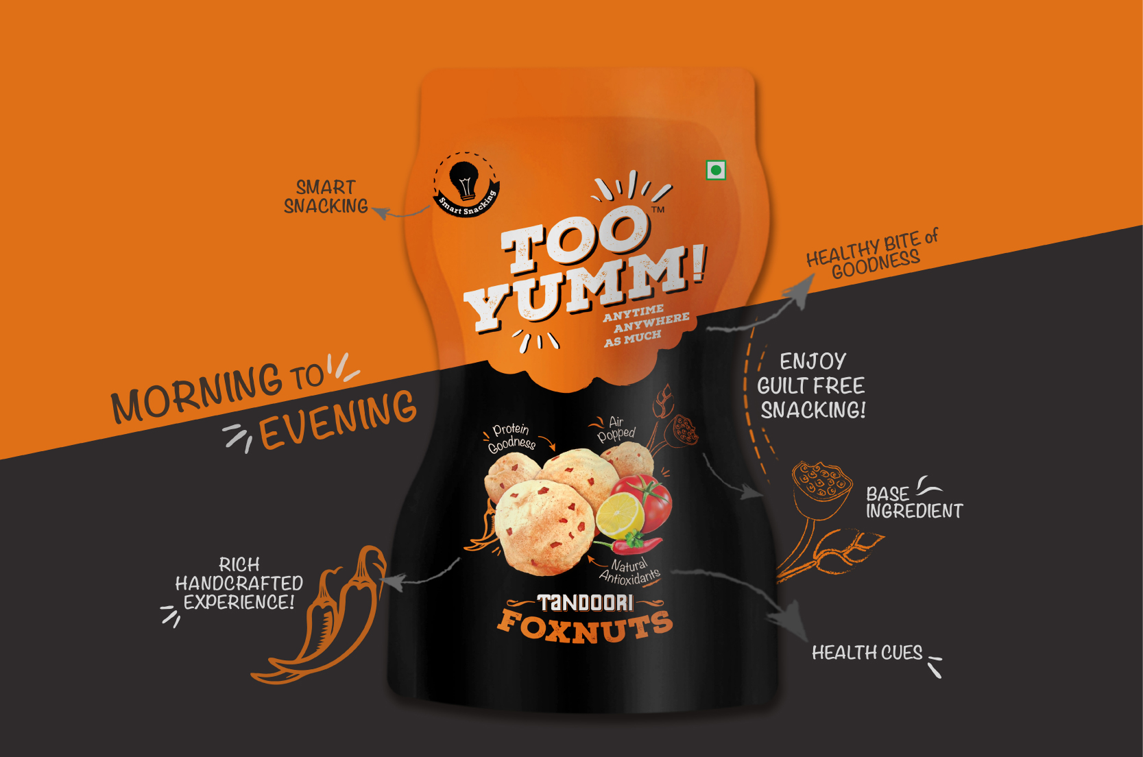
As snacking is a very crowded space, we needed to cue the well deserved premiumness and pronounce differentiation against other brands. After deliberating on the snacking cues and visual equities of existing brands, we decided to introduce matte black as the base colour for all the packs. Apart from cuing a premium position, it gave us the opportunity to use pop colours without getting lost in sea of other snack packs. Pop colours also gave a great shelf stand-out. Keeping the product shot to a minimum with mouth-watering depiction of tasty ingredients and conversational hand written messages about how or why healthy, we added to the drool appeal.
A bite mark was added between the division of colours to increase the impulse pick-up.
Too Yumm was launched during Indian Premier League 2017 and the Pune team proudly wore the logo on their attire.
The packaging has already won the prestigious India Star Packaging Excellence award and is winning many hearts across the country.
