
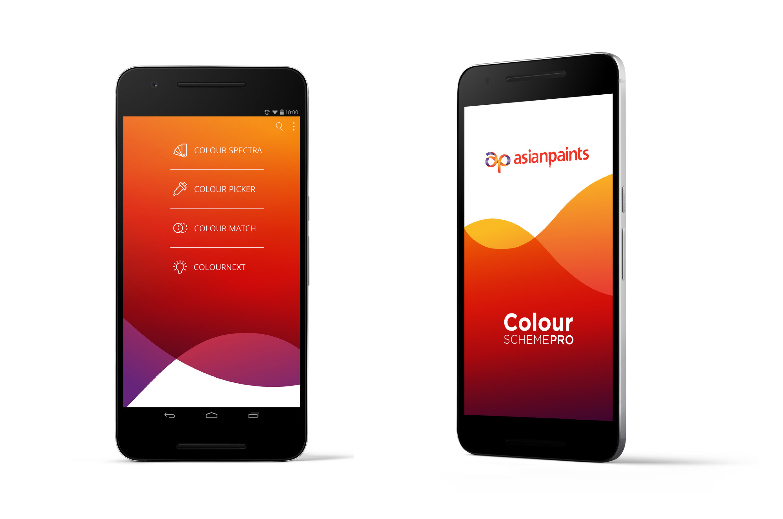
Asian Paints
Simplifying Digital ‘Colour Selection’ Process for Interiors
The beauty of home lies in its decor, whether a palace or a small apartment. A house becomes a home only when it looks and feels beautiful. Asian Paints, one of India’s leading decor companies was looking to redesign their mobile application for making it user friendly for interior design professionals.
The users were facing basic functionality issues in the existing mobile app like confusing colour shade categorisation & linear colour selection process, which was the primary brief for redesigning. Along with this, the app needed to be intuitive to help users with colour selections. The task was to make the app user-centric, intuitive & delightful to use.
We started the project by conducting user research with design professionals and consumers to understand usage pattern while selecting a colour virtually as well as physically. Heuristic analysis and usability studies underwent multiple rounds of brainstorming and ideation, which was followed by paper-wireframes as well as low-fidelity wireframes.
Onboarding illustrations were introduced in the app to make users aware about the functionalities and to reduce complexities while completing a task. Moving away from traditional linear flow, we designed a floating button which allowed easy accessibility of all the in-app features from anywhere in the application.
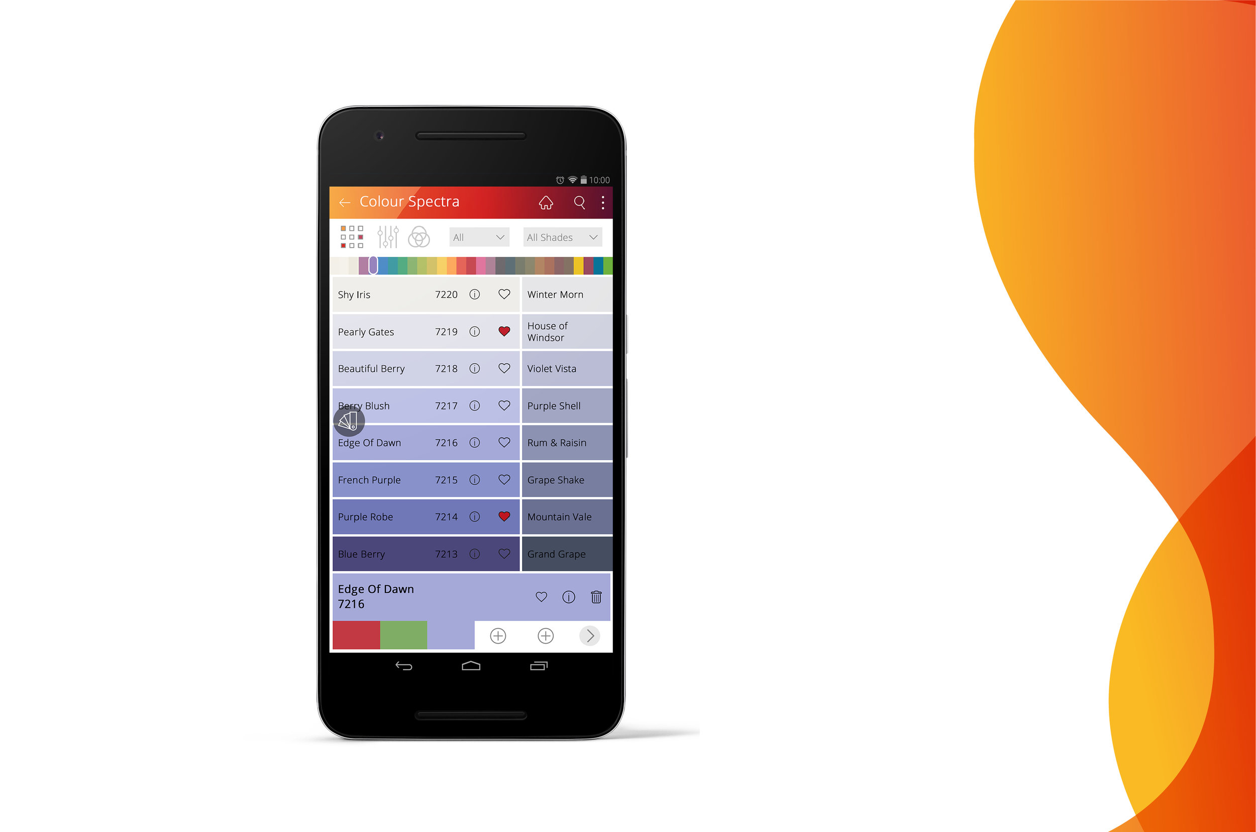
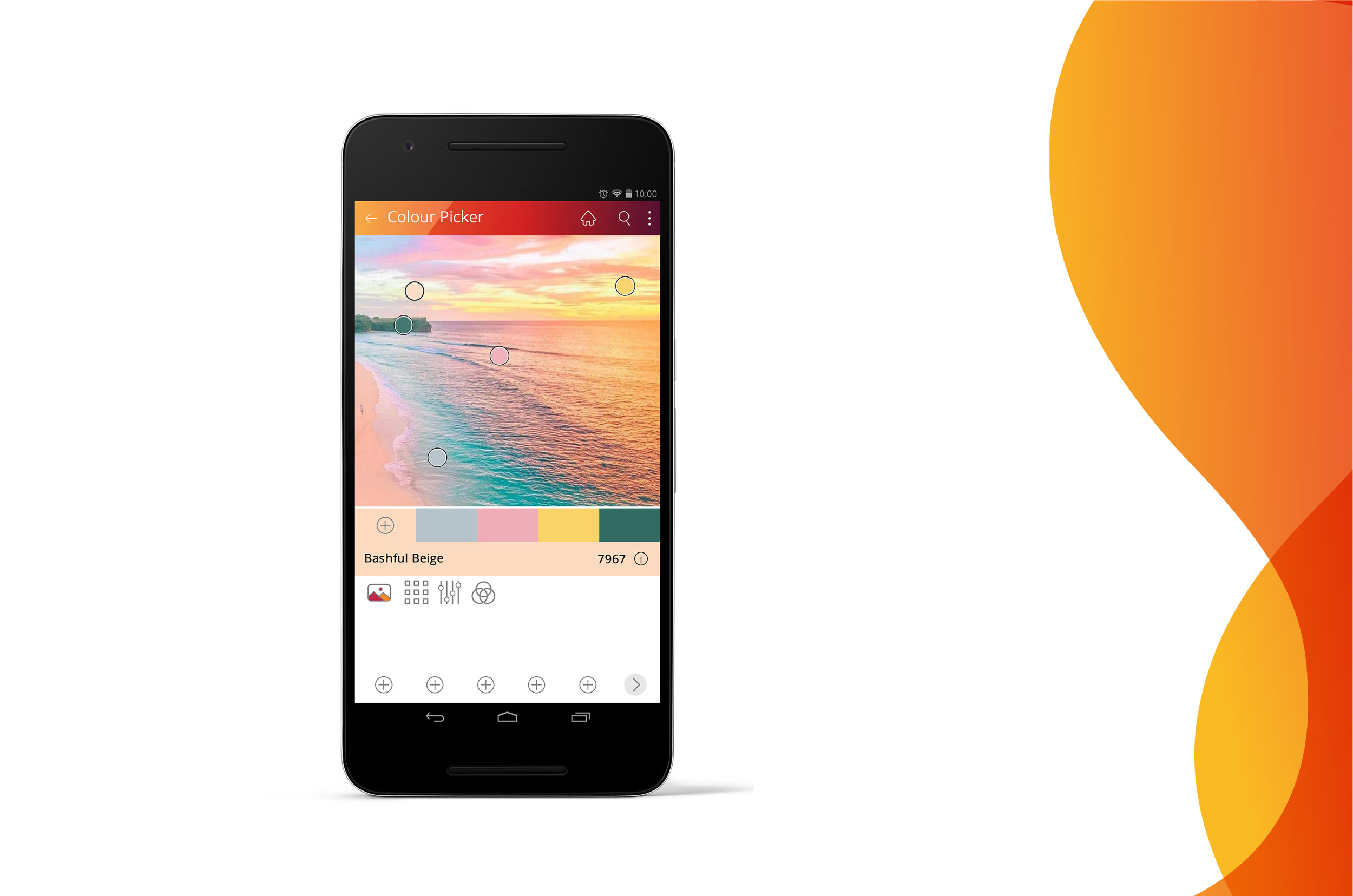
To make the colour selection process simpler, upfront colour shade filters were added. Along with this, we integrated colour spectra, which resembles the Asian Paint’s physical colour palette, to match between the system and the real world. The colour picker feature was redesigned to auto-pick colour with efficiency, allowing users to select colours from an uploaded image.
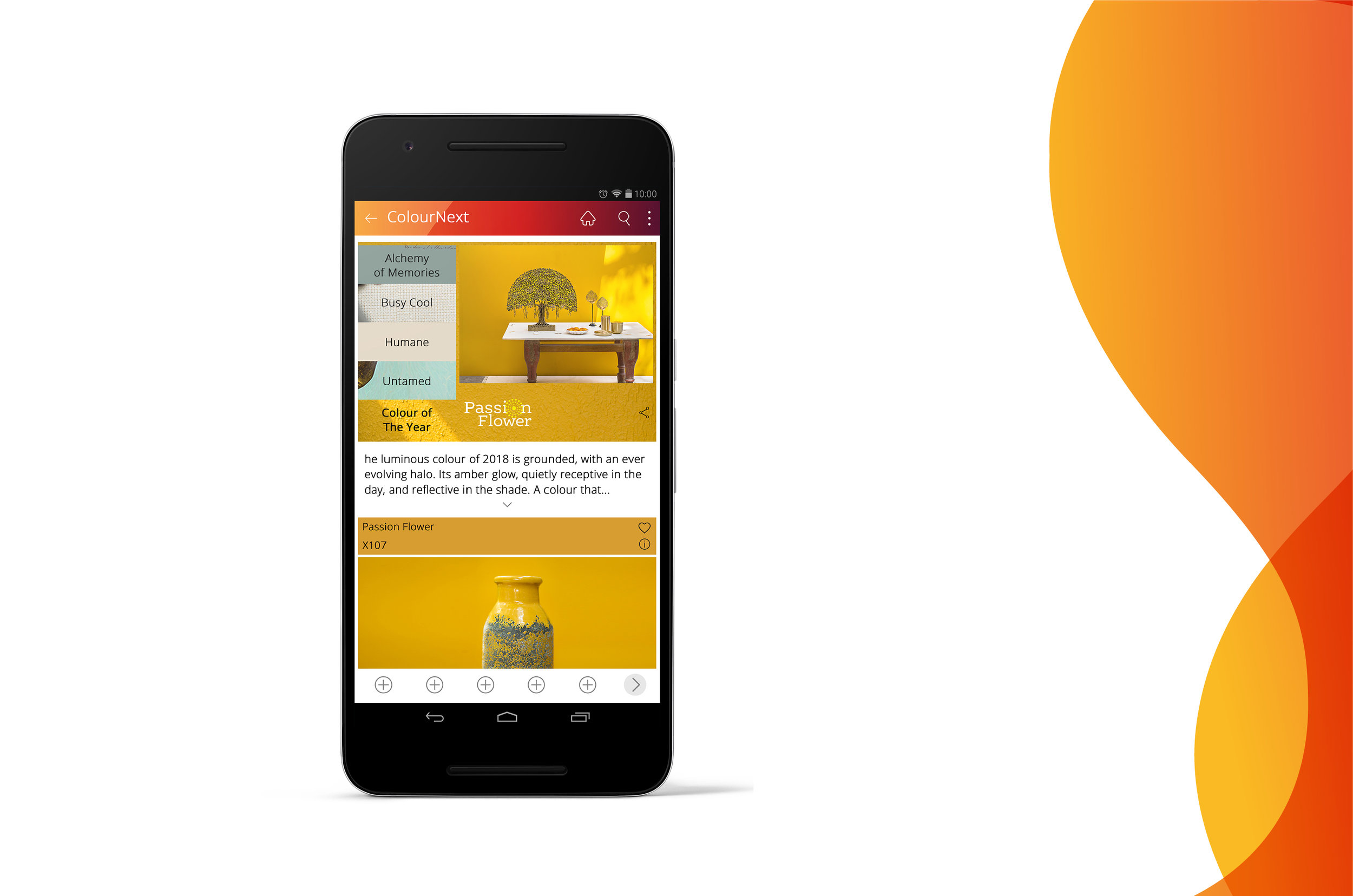
System-assisted colour selection was a unique feature of this application, which aided users to choose appropriate colours based on their existing colour scheme. Expert Assistance was built into the application, which enabled users to directly contact nearby colour consultants. Asian Paints’ ColourNext, which announces colour trends for the year, was integrated into the application, instead of cumbersome redirection to the website.
For the visual design of the application, we drew inspiration from the brand’s core values of innovation and agility. An add-on feature of setting brightness at the optimum level in order to see true colours was integrated in the app. Line iconography style was designed to reduce distraction, while making the app interactive and effective. We used more of whites and greys in the UI, to minimise the impact on colour selection process.
The application has become a complete solution to meet users’ paint and decor related needs. Since its soft launch, the app has been well received by the industry.