&me
Identity and Packaging for a range of Women Centric-Beverages
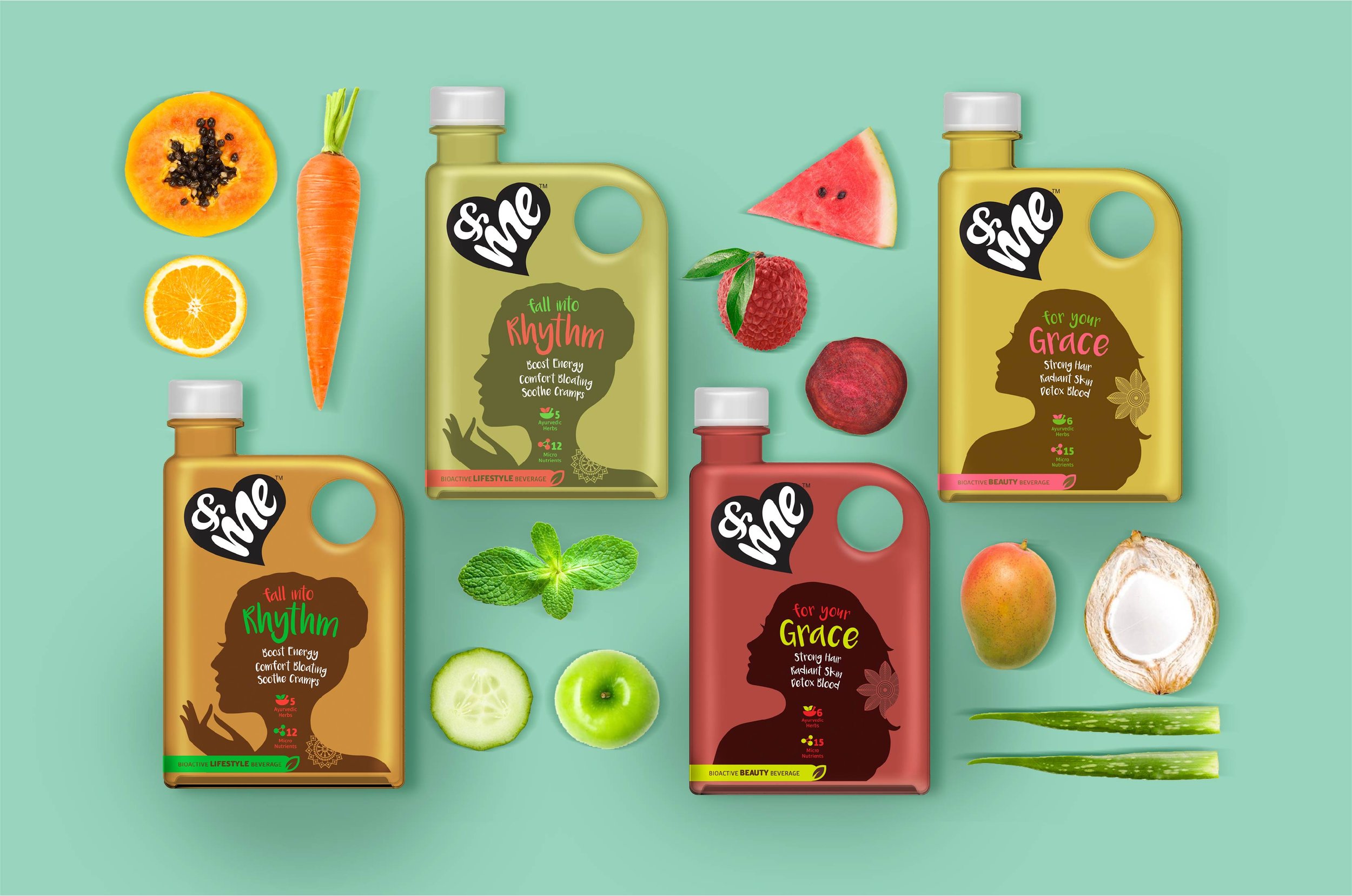
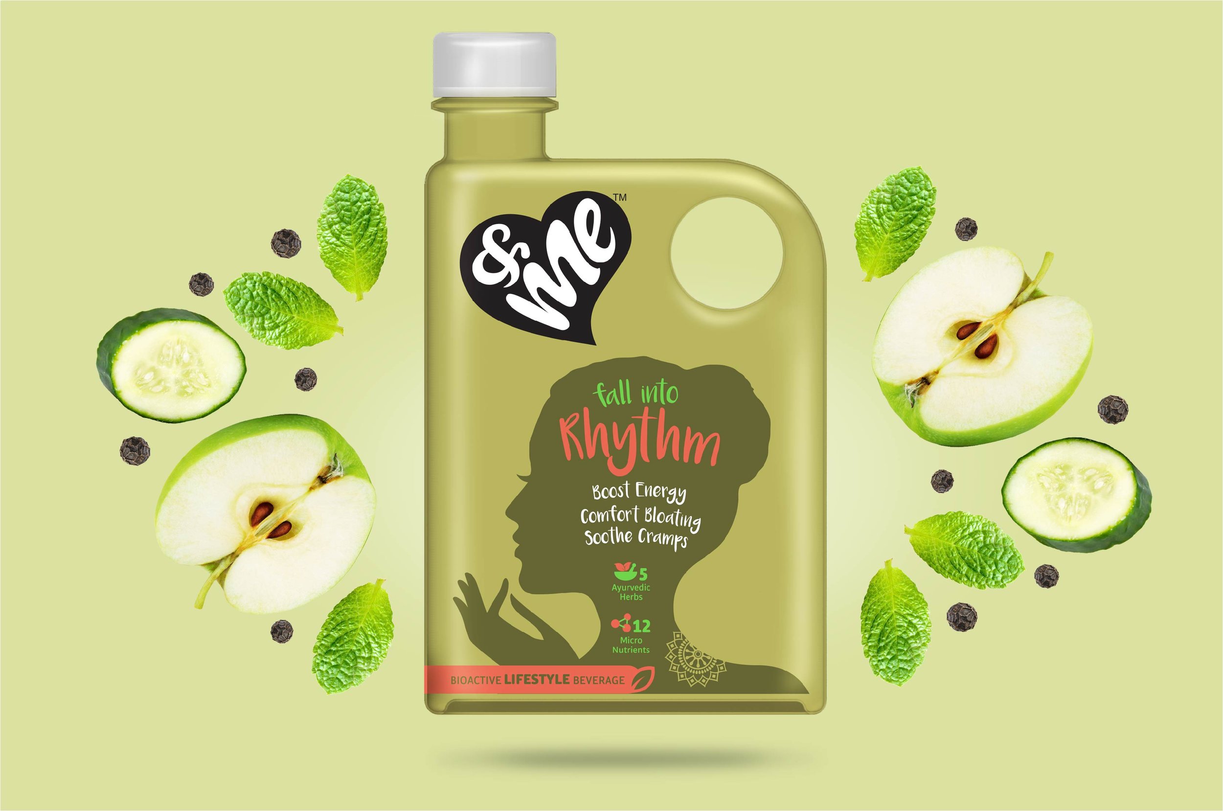
Women have always been encouraged to put their family’s needs before their own. Once they start a family, they often end up neglecting their own health while looking after others. With women’s nutrition needs differing from men’s, there was a gap in the market for products targeting them, particularly in beverages.
Merhaki Foods and Nutrition had come up with a range of beverages, designed specifically for the Indian woman. Encouraging them to prioritise their health, these would inculcate self-care into their routine with a simple solution. These drinks were developed to target the specific nutrition needs of women while changing the perception of health drinks in India, making them appealing and exciting. We were approached to create the visual identity and packaging for the brand.
In order to focus on the self-care offering of the beverages, we worked with the client team to name the brand. “&me” was chosen to highlight the importance of women looking after their own health. The logo was designed to resemble a heart, symbolising the self-love that the brand advocates.
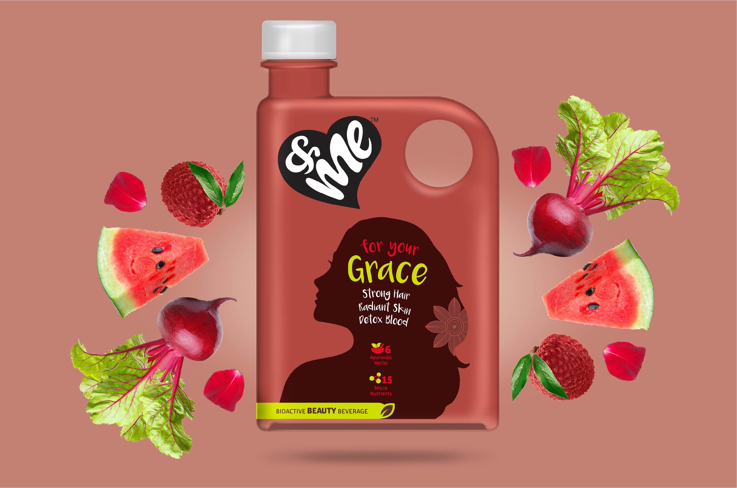
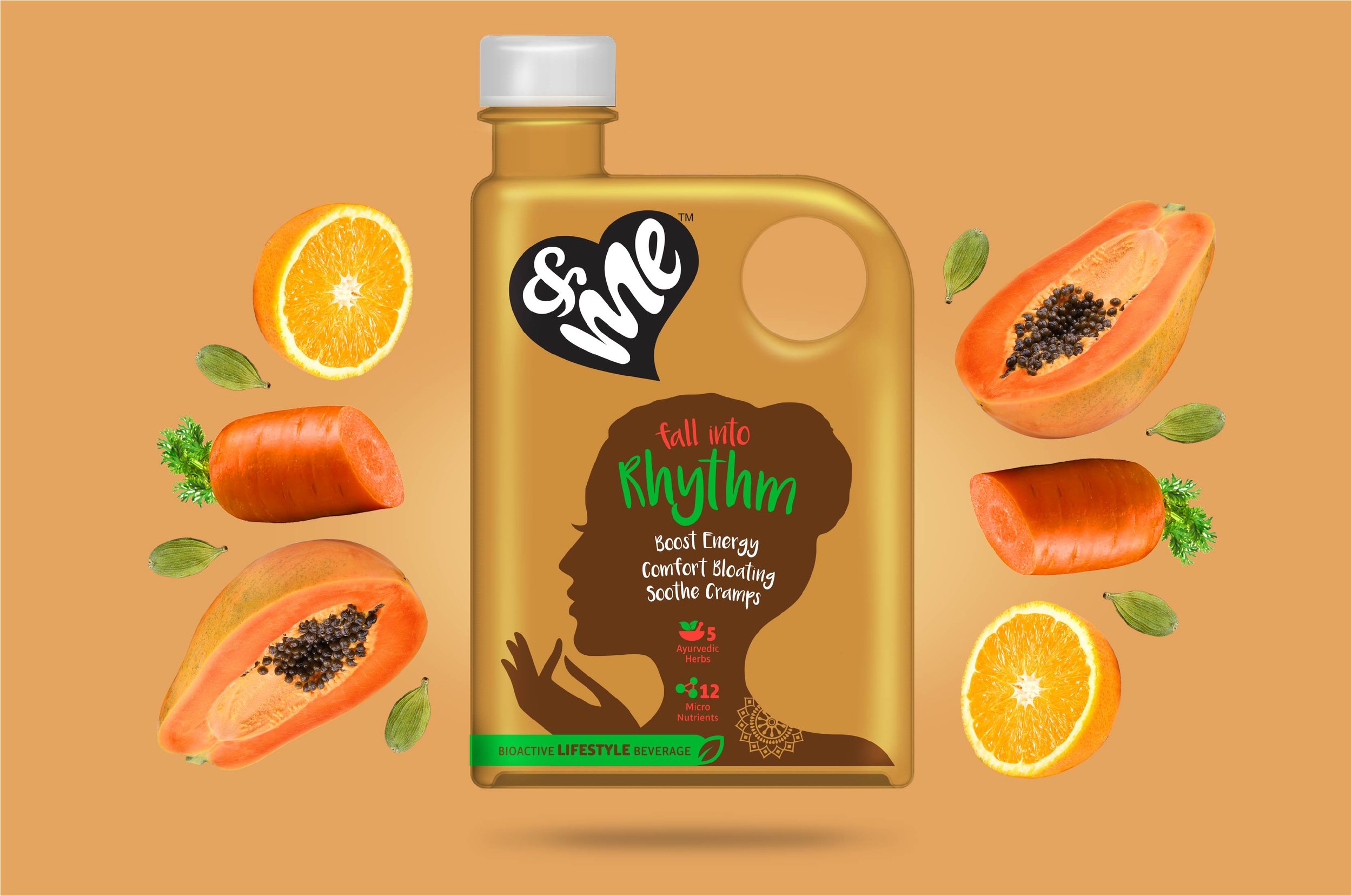
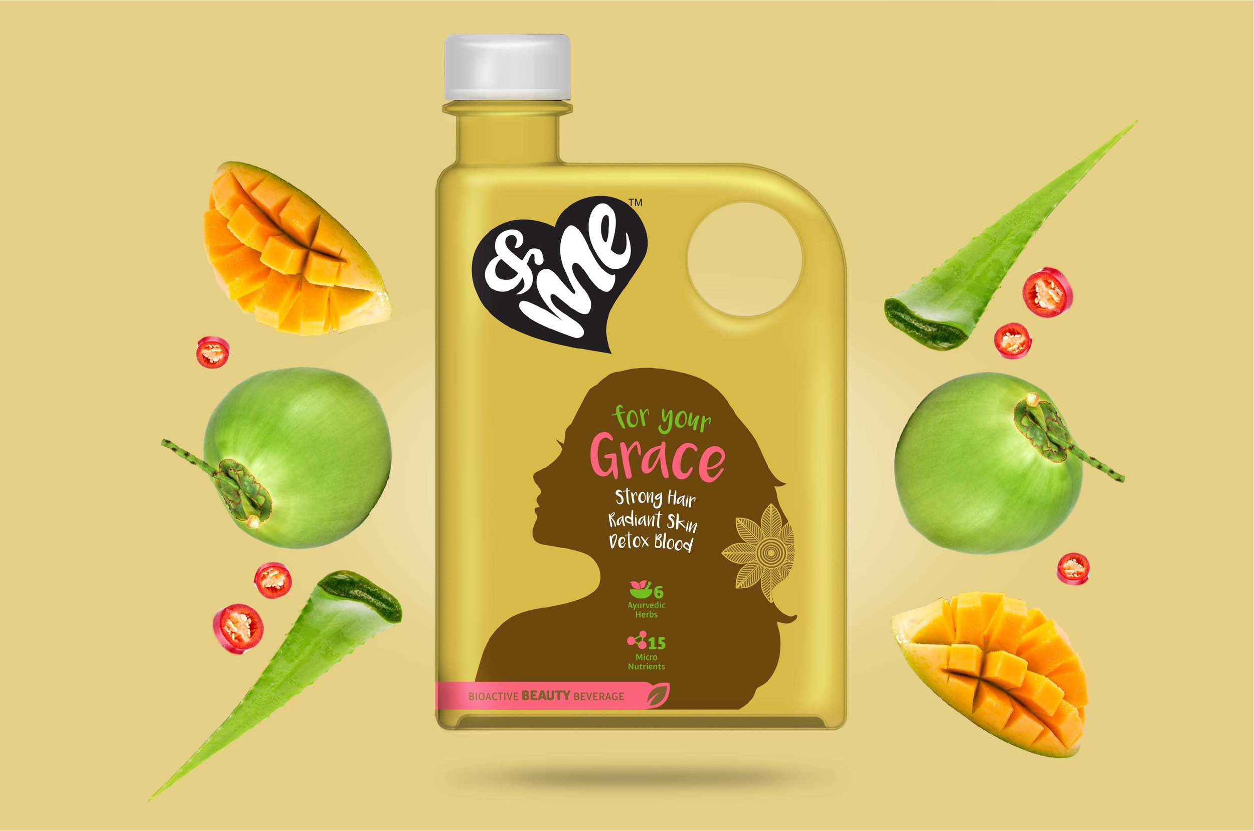
&me was bottled in an unconventionally shaped bottle, which was created to help it stand out on shelves. The main element of the packaging was a silhouette of a woman, designed to symbolise confidence, beauty and elegance. We created different silhouettes to harmonise with the variants, which were also used as differentiating factors. The offerings of the beverages were incorporated within the silhouette. Our team worked on creating illustrations to depict ingredients used.
For the back of pack, we integrated the brand story of Maya, who was depicted with different silhouettes as per the variant. The colours used on the pack changed to correspond with the flavours.
The opaque packaging and the unique bottle ensured &me stands out from the competition. This drink is on its way to ensure women take out the time to care for themselves too!
