The Focus
Reliance F&L aimed to launch a staunchly Indian, mid-premium fashion brand that anticipated fast-fashion trends and capitalized on them
Would provide superior omnichannel retail experience replete with personalization and technological innovations embedded at different touchpoints
Wanted the team at Elephant to design a fitting name, logo & visual identity for the brand that highlighted its futurism, fashion-consciousness and new tech interventions.
The Design
The team proposed an evocative name – ‘Azorte’ – which stood for the limitless assortment of fashion that consumers would experience within their online and offline environs
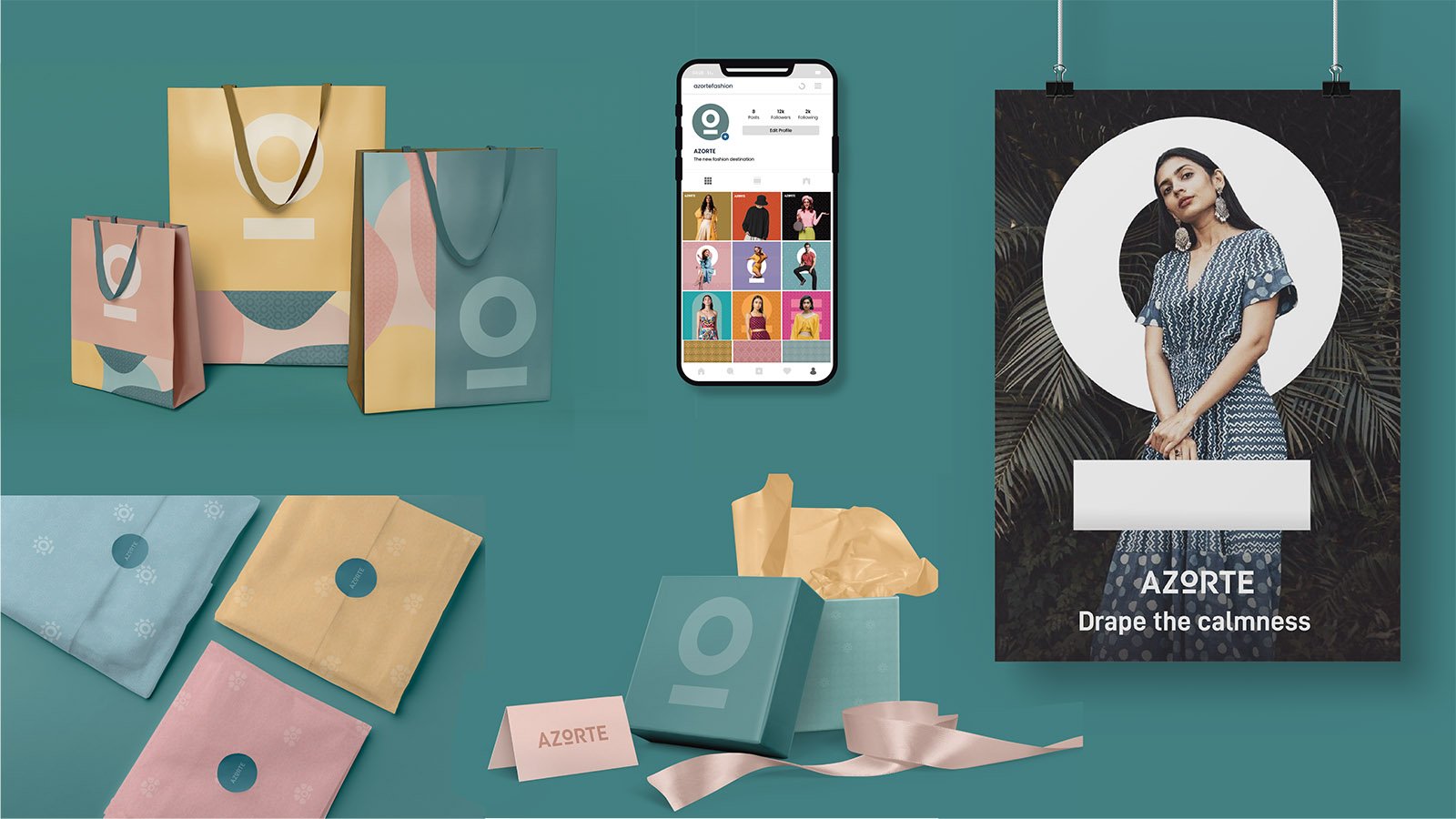
We also developed an extremely ownable and flexible logo-motif: the ‘O-dash’, which can be used across any and all possible media, from stationery to billboards across a malleable range of packaging and marketing formats
Beyond its offerings, Azorte stands out because of the team’s insistence on using Deep Teal as the ownable brand colour, given its neutrality and unisex appeal.
The Story

The fashion industry is exploding and will continue to explode in India, given its rapidly growing middle class and manufacturing capabilities. McKinsey estimated India’s apparel market at $59.3 billion in 2022; making it the sixth-largest in the world. More than 300 international fashion brands have unleashed their wares in this ever-expanding market. Domestic players are levelling the playing field by matching up with competitive rates, increased quality and yet other factors that leverage India’s robust textile industry and its practices.
Fast fashion is no exception. India’s median age stands at 28 years in 2022, marking a population that is mostly young and full of potential as far as the workforce is concerned. They also consume differently: gone are the days of conservative spending and non-indulgent lifestyles, which leads them to indulge in fast fashion, replete with trends, styles and personalization for an infinity of aesthetic flavours.
Reliance F&L noted that consumers weren’t opting for international brands. There was an increasing acceptance and pride when consuming high quality goods of Indian origin – so why not create an Indian mass-premium fast-fashion brand that competed with international brands while providing a superior retail experience?
Capitalizing on this opportunity, they approached the team at Elephant to design a name, logo and visual identity that would be apt for the brand. Other aspects to consider were: differentiation from other brands because of a superior, more tech-integrated omnichannel experience combined with an element of personalization that would accompany their fast-fashion offerings.

Infinite Assortment
Fast fashion has many connotations. Beyond standard associations with rapidly changing trends, styles and flexibility, we landed on the concept of ‘assortment’. This resonates with the brand’s desire to provide India’s young, contemporary consumer with an array of apparel and related experiences – leading us to the unique, slick ‘Azorte’.
Azorte signifies the beginning, the end and everything in between when it comes to fashion. It represents the brand’s promise to provide a 360-degree bouquet across footwear, apparel, accessories, cosmetics and more for women, men and children. It also signals the notion of infinity, since Azorte is constantly on the search for ever-evolving trends which are implemented across various sub-brands within their ambit.

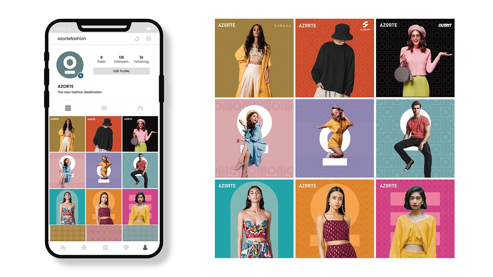
The O-dash
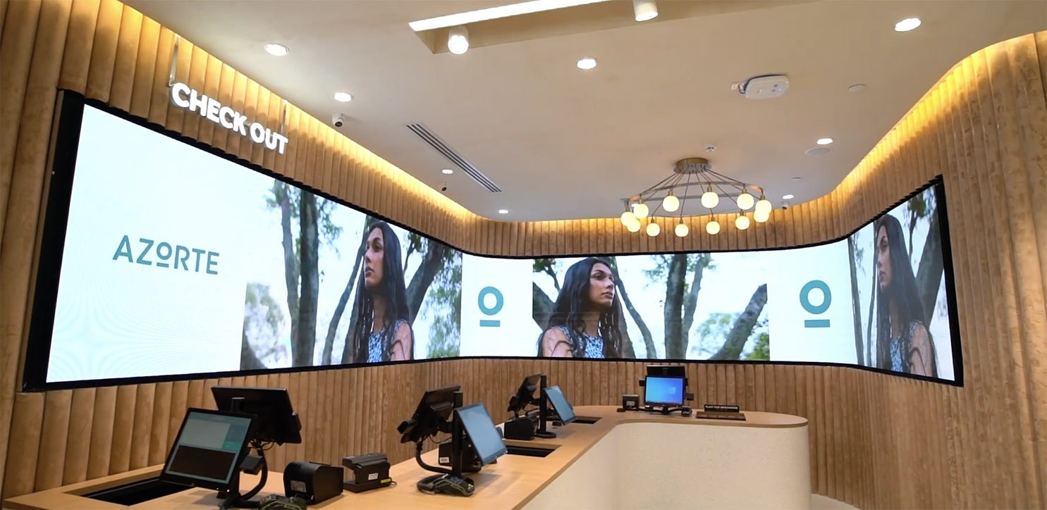
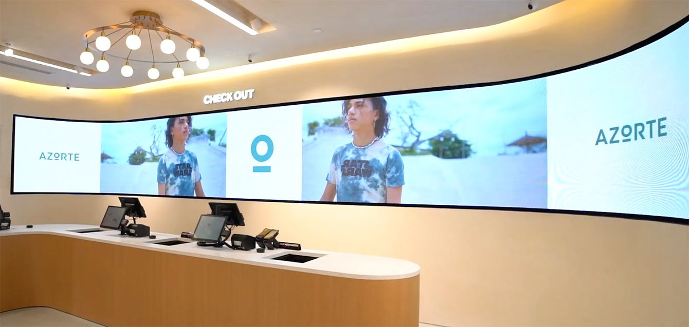
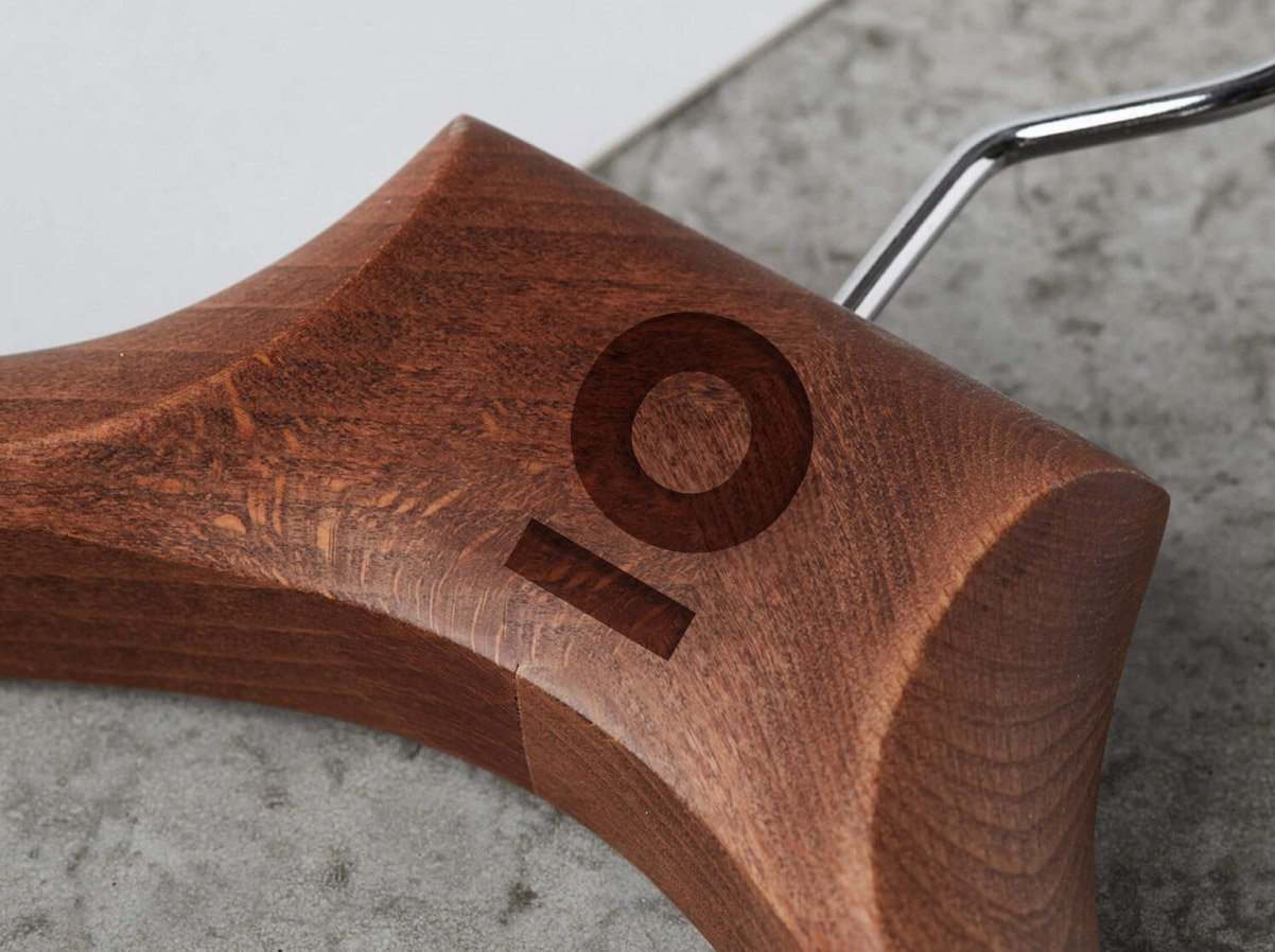
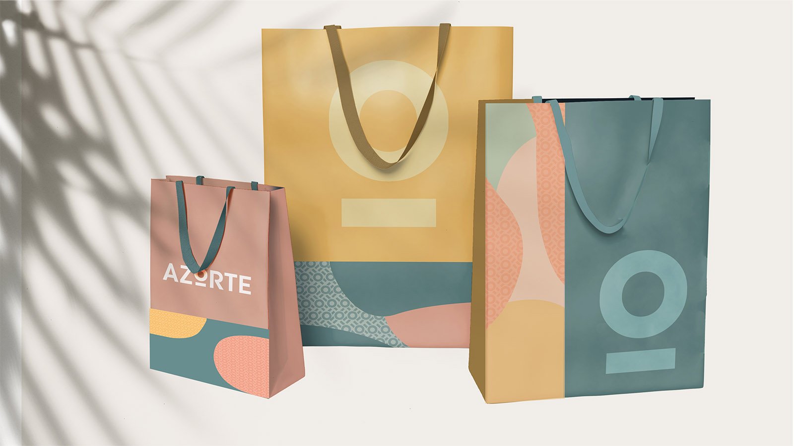
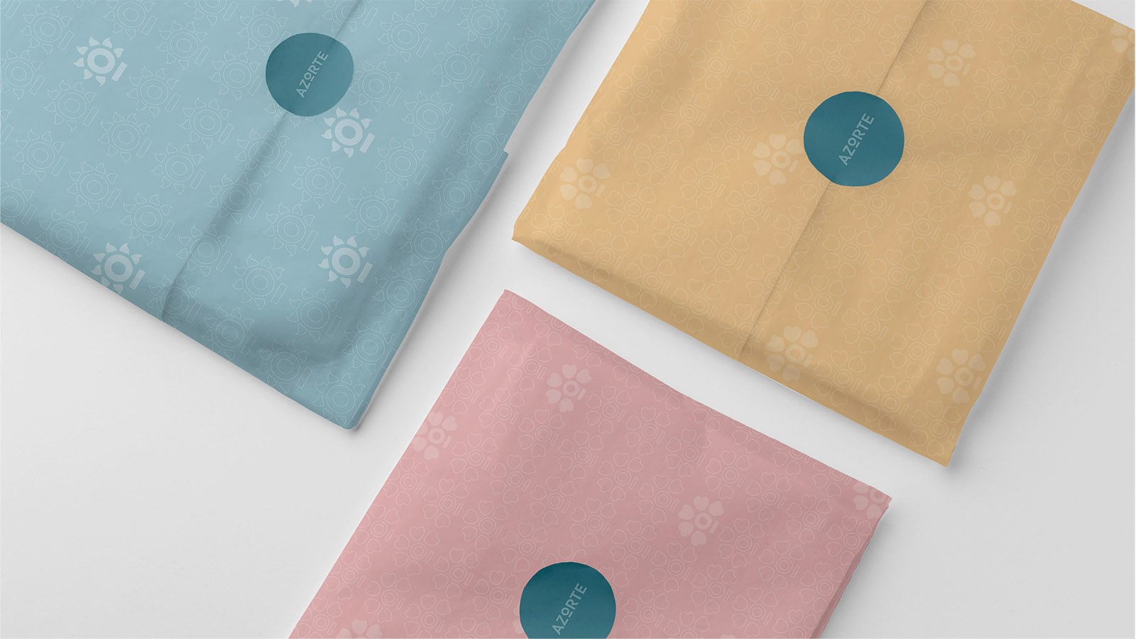
The team created an ownable, flexible logo and key motif – what can only be called, the ‘O-dash’. This circular element is extremely flexible. This is evident with the examples we provide for its potential uses across a range of media, applications, brand campaigns and more.
Here, it can represent the new and the fresh at the heart of a flower, morph into a hoop-and-ball to attract the sporty audiences or even take its rightful place behind the ubiquitous smartphone camera, often used to showcase one’s aspirational, trendsetting lifestyle. O-dash patterns can be used as monochromatic elements, or be seamlessly paired with organic elements.
The element also comes into its own within Azorte’s personalization-focused, technologically motivated in-store retail experience. From paper bags to wooden hangers, gift boxes to section fixtures – there’s a space for the Azorte motif everywhere. It blends, yet stands out whenever required.
Lastly, the motif’s use for digital content – from campaigns to snugly sitting within our largely circular UIs – is unparalleled. Here, we witness its use for seasonal campaigns across a range of screens, be they tablets or smartphones. The logo-motif’s flexibility, combined with the brand name, echo this sentiment of assortment and tie into the overarching theme.


Beyond Hues and Conventions
Lastly, the team wished to utilise an ownable colour in a market that was extremely inundated. Our process culminated with us choosing the sublime-yet-stunning deep Teal, a colour the distinctly stood out amidst more category-friendly reds, blacks, golds and whites – or the more newly stressed on pinks and yellows. The awareness that this was a new-age brand that needed to transcend conventions also led to us using a truly gender-neutral colour, going back to our concept of ‘assortment’, which promises variety for all under this techno-savvy roof.
Our work for Azorte will be rolled out at scale with a marked presence in retail environments throughout the subcontinent, making this an extremely impact-driven project for us. With favourable client feedback and a green light for implementation, we hope to work with yet other proudly Indian brands aiming to provide best-in-class products and experience to the Indian populace.