
Candid Powder
A New Avatar for a Trusted Remedy
Candid is a leading brand of dusting powder that is used for relief from fungal infections, rashes and other skin related problems. As Candid was moving from being a prescription product to an Over the Counter (OTC) one, Glenmark invited us for a relevant makeover of packaging.
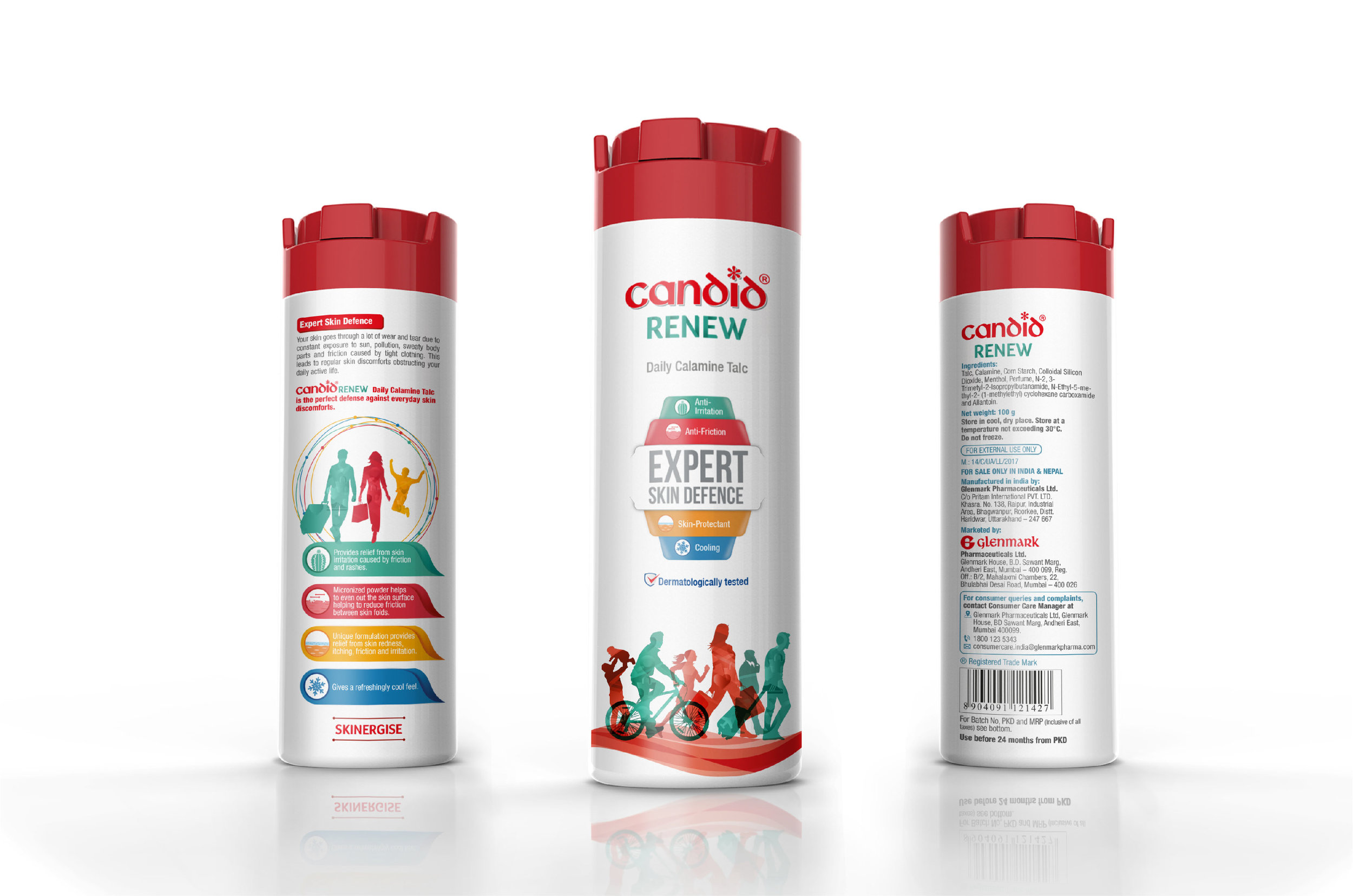
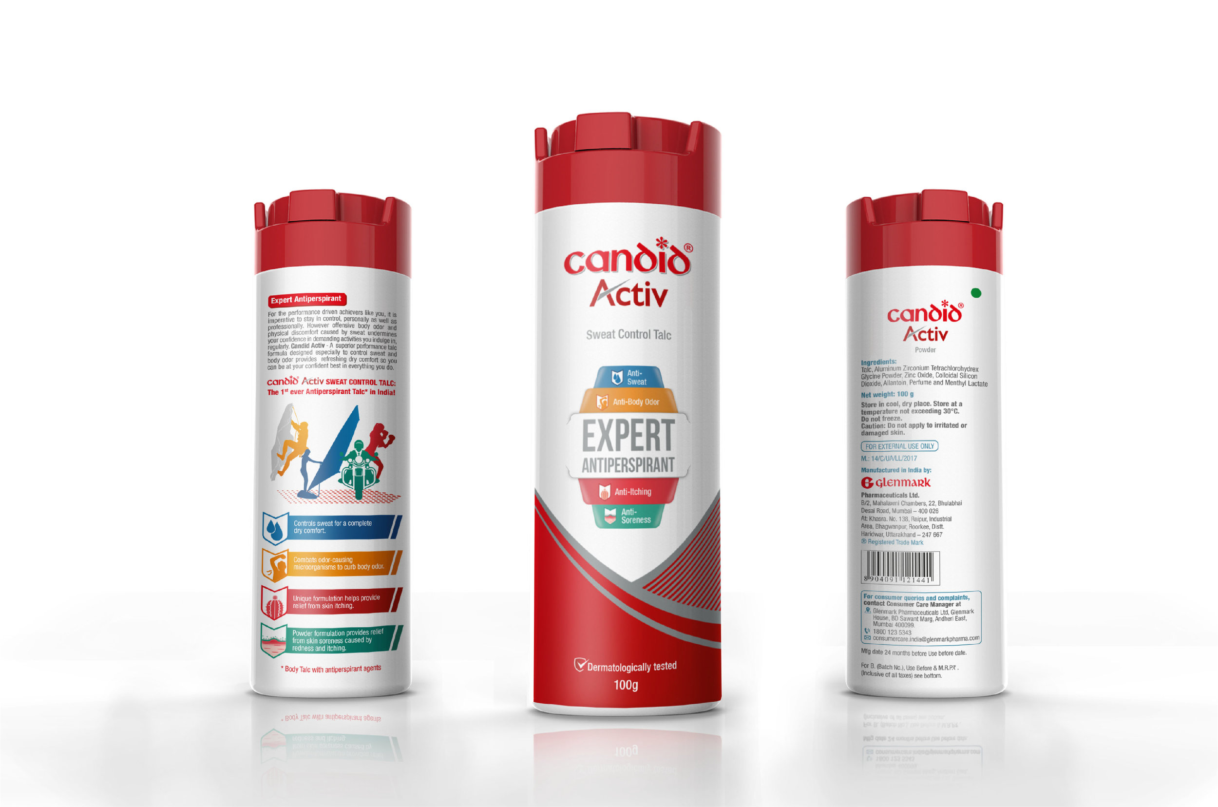
Revamping the packaging for a leading brand is always challenging because of the long standing familiarity & legacy around the brand and packaging. The dated packaging lacked cues about efficacy & expertise that were essential, especially considering that it no longer relied on medical prescriptions for sale. Since the design team found merit in retaining some of the visual assets such as white & red colours and hugely familiar logo, we decided to keep those while making the overall look contemporary, approachable and credible.
Though we decided to retain the original logo, a few subtle changes were in order for a clean & contemporary feel. We created a central mnemonic for the front of the pack, which highlighted the expertise and usage case. This system was built for easy extensions to other variants of Candid for building a uniform visual equity.
The pack communication was clearly defined to create awareness about the benefits and usage, along with visual icons. Colour codes from front of pack were carried to the back of pack to explain the efficacy in detail.
Since its launch, the OTC sales have doubled for the brand within one year and a new variant, Candid Cool, has already hit the market. More brand extensions are in the pipeline and the response has been splendid!