The Focus
Redesigning the package for Colgate Active Salt (CAS) to shift consumer perceptions toward the toothpaste.
Showcasing CAS as a regular use toothpaste as opposed to a paste used only for specific occasions.
Situating ‘salt’ as a natural, texture-based ingredient to increase lucrativeness and relevance.
The Design
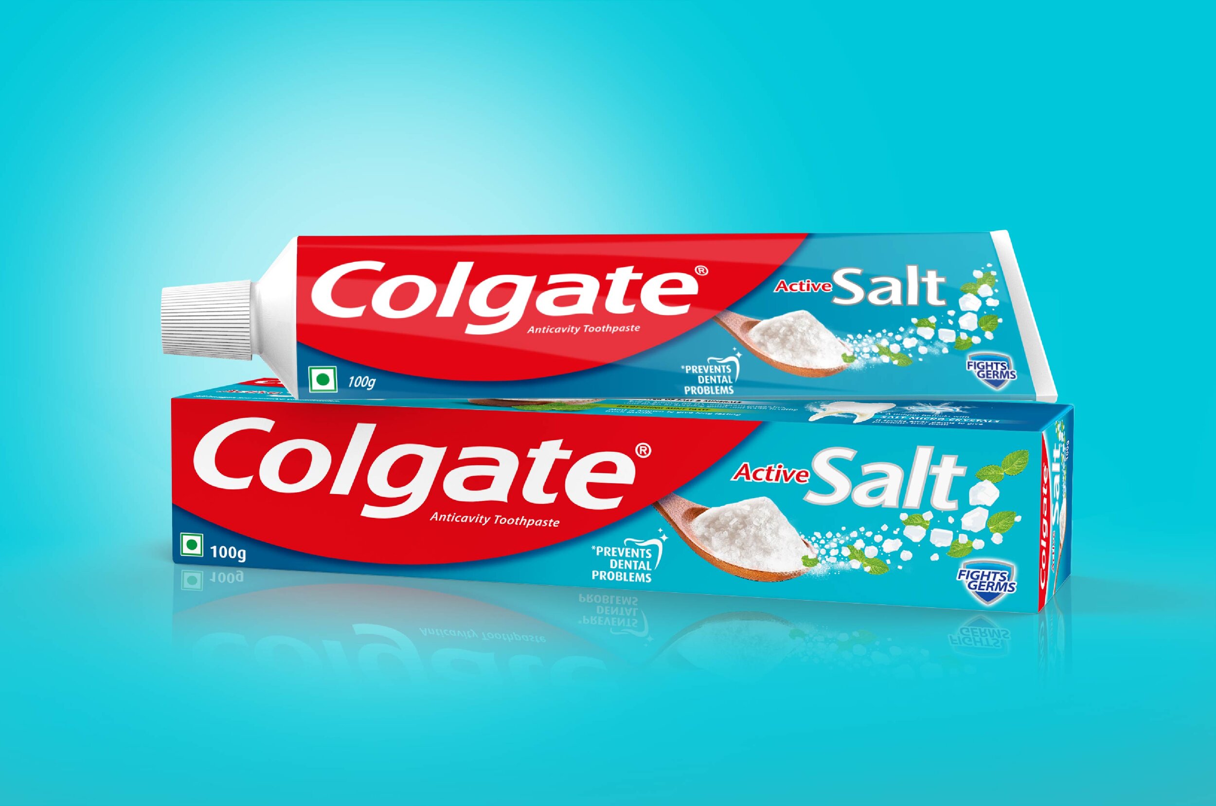
Successfully redesigned the packaging for CAS relaunch while strategically utilising the global template.
The ‘naturalness’ of salt now compares to other Ayurvedic ingredients with ample cues for the paste’s benefits as a long term, daily use product on the pack.
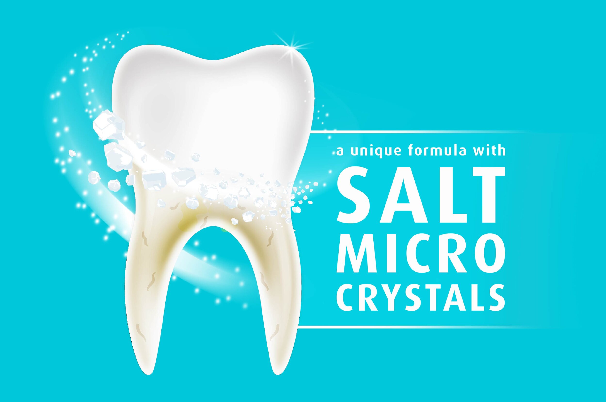
Enhanced the lucrativeness of ‘micro-crystals’ through design changes, incorporating more tactile and texture-centric cues.
The Story
Colgate’s global presence is staggering. Market research company Kantar Worldpanel indicated that this was the only brand in the world to be purchased by more than half of ALL households! In India, Colgate has been around since 1937 when it distributed its pastes via handcarts. Now, it holds over half of the customer market share in India.
Elephant was approached by them to redesign the packaging for one of their signature products – Colgate Active Salt (CAS). CAS was launched as early as 2005 since families across India traditionally touted the benefits of salt to be integral to good oral care. However, there were two key issues plaguing the product.
First, many competitors had flooded the market with their own natural-ingredient filled toothpastes. Vivid visuals promising a blend of ayurvedic ingredients stood out more than the decidedly more sober, mineral-driven salt – despite the fact that it was just as natural.
The second issue was that consumers were ‘resorting’ to CAS, using it as a pain-relief toothpaste instead of using it on a daily basis.
Salty is Natural
Salt and charcoal have been used by Indians since time immemorial in conjunction with herbal twigs for dental care. CAS, hence, is actually a blend of the traditional and the modern.
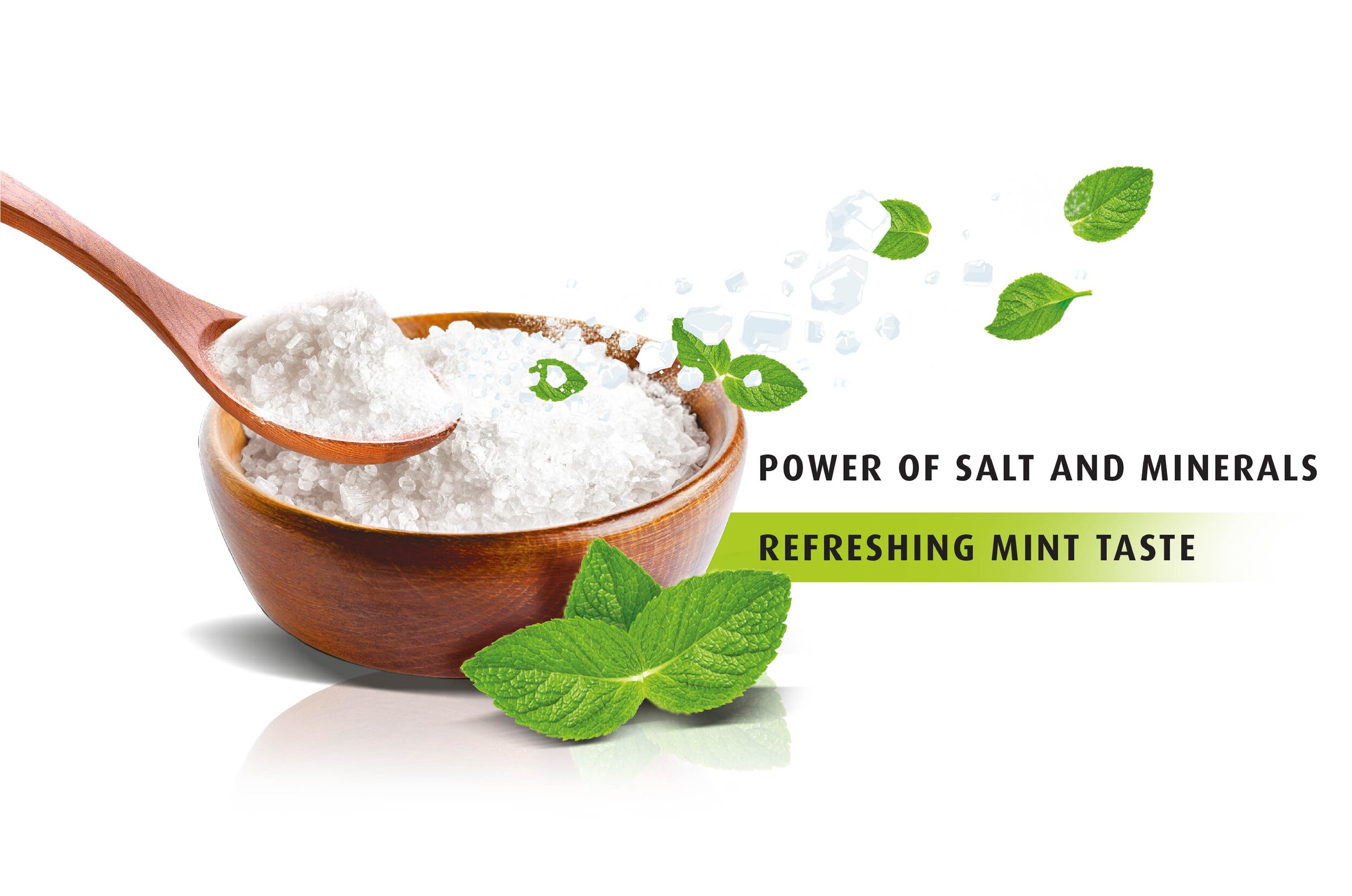
Elephant needed to keep the global template in mind before making any changes to reflect this ‘Naturalness’. This presented its own set of challenges. How could salt correlate to naturalness? We added a wooden spoon to contain the salt to give it that feel, in addition to interspersing green leaves within their standard blue palette.
“How could salt correlate to naturalness? We added a wooden spoon to contain the salt to give it that feel, in addition to interspersing mint leaves within their existing blue palette.”
From Reactive to Proactive
CAS was being picked up by consumers to simply relieve toothache – as and when it would occur. That needed to change. The new CAS was a preventive, proactive, daily use toothpaste which needed to be showcased as such.
The goodness of the ingredient was highlighted through the depiction of micro-crystals that flowed from the spoon, showcasing the salt’s capability to scrub away germs. Strong textures were used to highlight this capability of the salt.
The ingredient in our new package now did not look like a mineral derivative, or something that was synthetic and remedial. The fact that it ‘Prevents Dental Problems’ was also clearly highlighted, and supplemented with the benefits of salt on the back of pack illustrations.
All in all, CAS’ USP, natural origins and general purpose were altered with the right application of design thinking – without drastically deviating from all that was familiar, or all that was Colgate.
“The ingredient in our new package now did not look like a mineral derivative, or something that was synthetic and remedial.”


