The Focus
With the niche sensitive oral care toothbrush market in India being dominated by a leading brand, Colgate’s forays into the Sensitivity category certainly required a fresh approach,
Packaging needed to establish Colgate’s expertise and showcase the product efficacy to encourage more purchases and better distinction from the regular category
Packaging system had to incorporate a large range of specialized toothbrushes under one sub-segment that could establish the Sensitivity category for Colgate
The Design
Elephant team decided to integrate clinical, scientific cues with a distinct take on ‘sensitive’ promise over & above Colgate’s familiar branding system
Designed a comprehensive system that communicated the unification of all “sensitive care” brushes under one bracket – with homogenizing and differentiating elements both being integrated
The launch of this range was received so positively in lead markets that Colgate decided to utilize the design system across its global portfolio; a major indicator design’s success
The Story
The Colgate brand has been synonymous with oral care in India since 1937, where its products were distributed via handcarts. Today, apart from dominating the Indian market in the general category, it is also the only brand in the world to be purchased by more than half of ALL households (Kantar Worldpanel Report).
“Colgate approached the team at Elephant in order to implement a packaging relaunch for their Sensitive range; one that could enable them to compete in this niche market. The relaunch needed to incorporate an entire range with a strong design system to help differentiating between each product.
”
However, when it comes to the alternative spaces of the oral care industry, Colgate has more than its fair share of competitors. Colgate approached the team at Elephant in order to implement a packaging relaunch for their Sensitive range; one that could enable them to compete in this niche market. The relaunch needed to incorporate an entire range with a strong design system to help differentiating between each product.
Sensitivity with a Clinical Edge
After meticulous research, the team garnered a few crucial insights. While Colgate’s existing focus had entirely been on ‘gentleness’ in their packaging, their competitors were relying on imagery that conveyed “premium, modern, clinical and scientifically innovative” cues.
Secondly, most of Colgate’s Sensitive range seemed isolated in nature with different products echoing different benefits according to their price points. The system still lacked homogeneity.
“Elephant’s two-step action plan incorporated cues that would unify all standalone products under one comprehensive bracket and secondly, infuse ‘premium’ cues leading to better believability in product truth. Science and gentleness would have to both go hand in hand for maximum efficacy.”
It was also interesting to note that the typical consumer for sensitive oral care products didn’t really have a genuine sensitivity issue. They sought extra benefits through product attributes and were even willing to pay a premium if they thought the efficacy of the brand was greatly heightened. In fact, instead of looking at sensitive toothbrushes as a product aiming to solve specific problems, consumer usage patterns demonstrated that they had begun to treat it as a daily use and maintenance-oriented product.
After deliberating on these insights, the team created a two-step action plan for the design: One, to incorporate cues that would unify all standalone products under one comprehensive bracket and two, infuse ‘premium’ cues as we ascended from the value segment to premium ones for better believability in the product truth. Science and gentleness would have to both go hand in hand for maximum efficacy.
Unify and Conquer
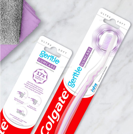
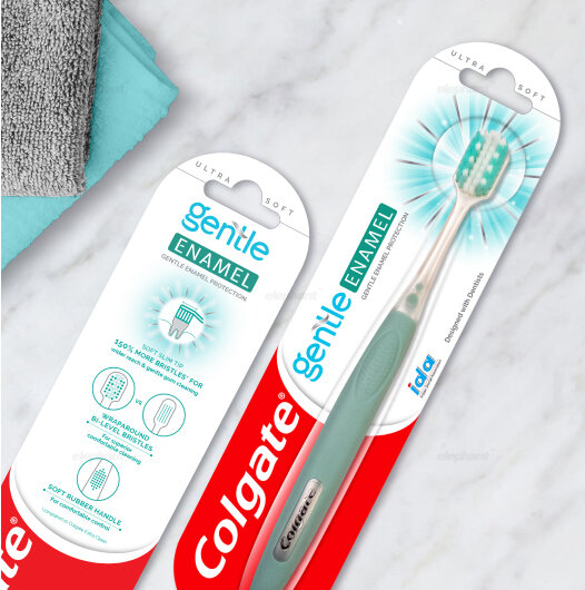
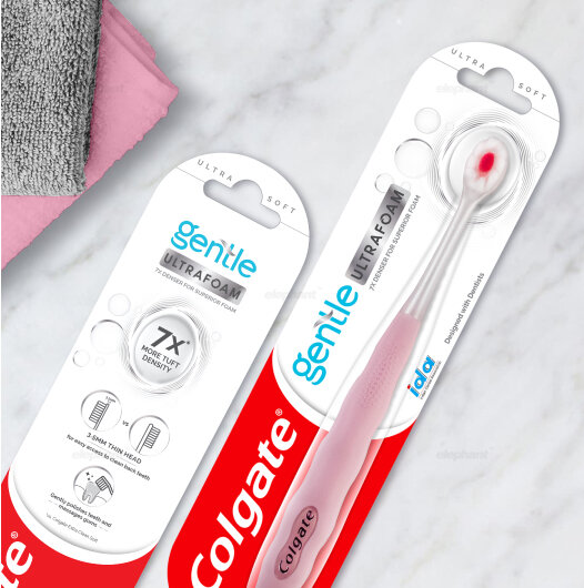
The new packaging system, as a result, utilizes a common template for the entire range of toothbrushes. The ubiquitous Colgate smile occupies the bottom half of the blister packs, with meaningful variations being incorporated in the top half for differentiation.
The typical cue for “Gentleness” has now been incorporated in small case, blue font – where ‘gentle’ becomes the sub-brand. The use of blue adds to the emotion of ‘expertise’ being conveyed.
“The new packaging system, as a result, utilizes a common template for the entire range of toothbrushes. The ubiquitous Colgate smile occupies the bottom half of the blister packs, with meaningful variations being incorporated in the top half for differentiation.”
Differentiation is showcased through several elements. The blister packs for premium toothbrushes are shaped like a capsule, while the regular variants have a standard, rectangular pack. The key proposition becomes the brand name for each brush within the segment, which is given its own enclosure & identity.
The color and the treatment of this enclosure, along with the graphics around the head of the brush all clearly indicate the hierarchy of products.
For instance, the most premium toothbrush, the “Ultrafoam” has a silver enclosure for the product name, giving it the required feel. The enclosure also embodies the motion of brushing action to eliminate germs. Similarly, the “Sensitive”, which is the value offering, added petals to enhance gentleness. All the brushes within the category, hence, convey their individual benefits clearly.
““Good design is like a refrigerator—when it works, no one notices, but when it doesn’t, it sure stinks” ”
After having proposed these designs to Colgate, the reception was overwhelmingly positive. This was further reinforced when they took the decision to implement this system across their global portfolio for sensitive-care products. Currently, all products have seen a successful launch and the response has been favorable across the board.


