The Focus
Devising ideal brand nomenclature for Fonterra Future’s foray in India with its range of dairy products.
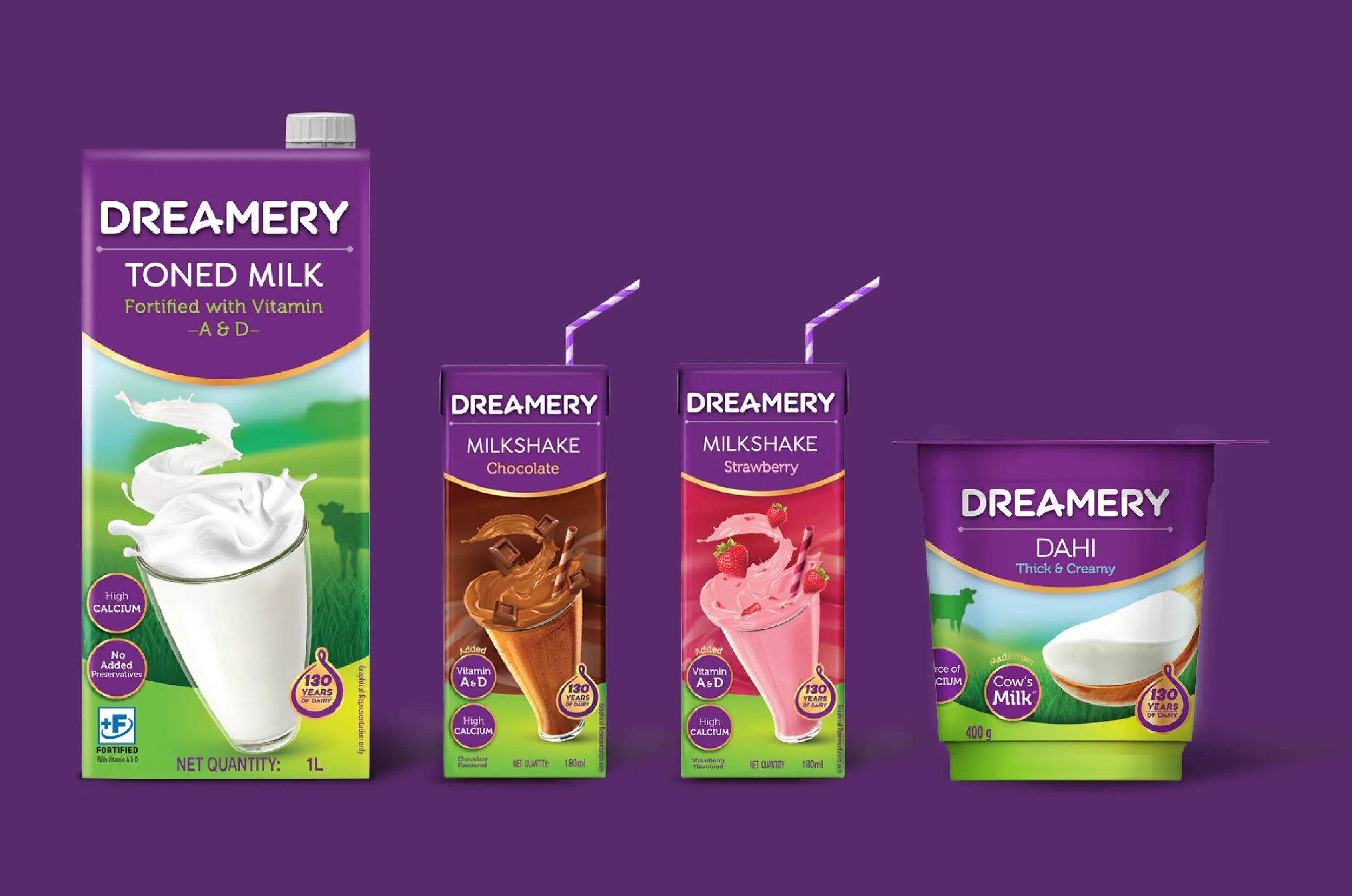
Designing a packaging system that captures the essence of ‘potential’, contained within the new generation of those who will shape the ‘New India’.
The design also needed to showcase the premium, superior nature of Fonterra Future’s products as compared to the other brands on the market
The Design
Working closely with teams at Fonterra & Future Group, Elephant team incorporated cues of hope, positivity, potential and a bright future to create “Dreamery”, the nomenclature for their dairy range of products.
Deviating from standard category colours, Elephant designed a new packaging system using purple, the colour of imagination.
Created an ideal launchpad for Fonterra’s brand image in India, with the promise of a solid foundation & superior products in the competitive dairy market
The Story
Fonterra is one of the largest dairy manufacturers in the world with a phenomenal output of 30% of the world’s dairy exports. The largest company in New Zealand, Fonterra runs under the collective ownership of over 10,000 farmers.
Fonterra harboured a desire to enter the challenging, hypercompetitive dairy market in India. To that end, they have partnered with the Future Group of Companies, which is already an established FMCG giant in the Indian business landscape.
This formidable combination was now poised to make a splash – which was when they approached Elephant to primarily design, develop and name a modern dairy brand for the modern Indian consumer. More importantly, the overtones of this brand needed to be positive, infused with hope and geared toward the generation of India’s youth who would shape the nation for years to come.
The Stuff that Dreams are Made Of
Elephant undertook the creative exercises of arriving at brand nomenclature as this was to be a fresh new brand with codes of positioning rooted in the optimistic ethos of current India.
The key inspiration came from John Lennon’s iconic song – ‘Imagine’, which advocated for building a better world, a better tomorrow – collectively. Infused with positivity and hope, this was truly the stuff that dreams were made of.
Going into that overarchingly wholesome feeling, Elephant team came up with a very differentiated name for a milk brand for new generation that believes in ‘glass half-full’ side of the world, and that was: Dreamery.
Simply put: This company was not simply going to be another milk brand. The Dreamery was about an entirely different experience altogether.
“Elephant team came up with a very differentiated name for a milk brand for a new generation that believes in ‘glass half-full’ side of the world, and that was: Dreamery.”
The Superior Milk Experience
Fonterra Future intended to occupy a space within the premium dairy brands, promising a superior consumption experience. With a ‘new-age’ approach to dairy, the focus would also be on sensorial experiences and the promise of locally sourced, highly premium quality of milk itself – along with other innovative formats.
Keeping that in mind, Elephant decided to create a visual identity that would be ideal and yet be flexible enough for a variety of formats like tubs, cartons etc.
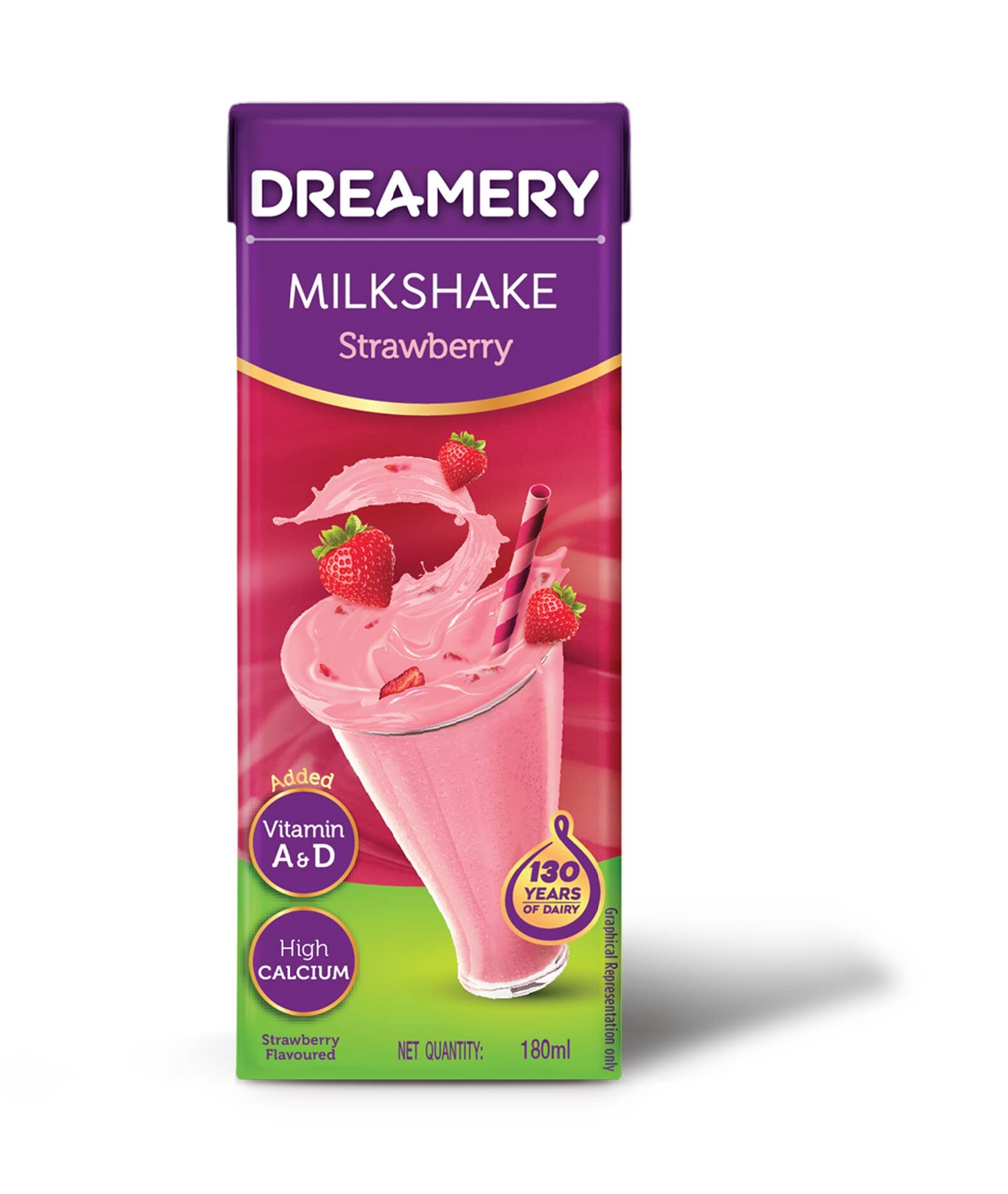
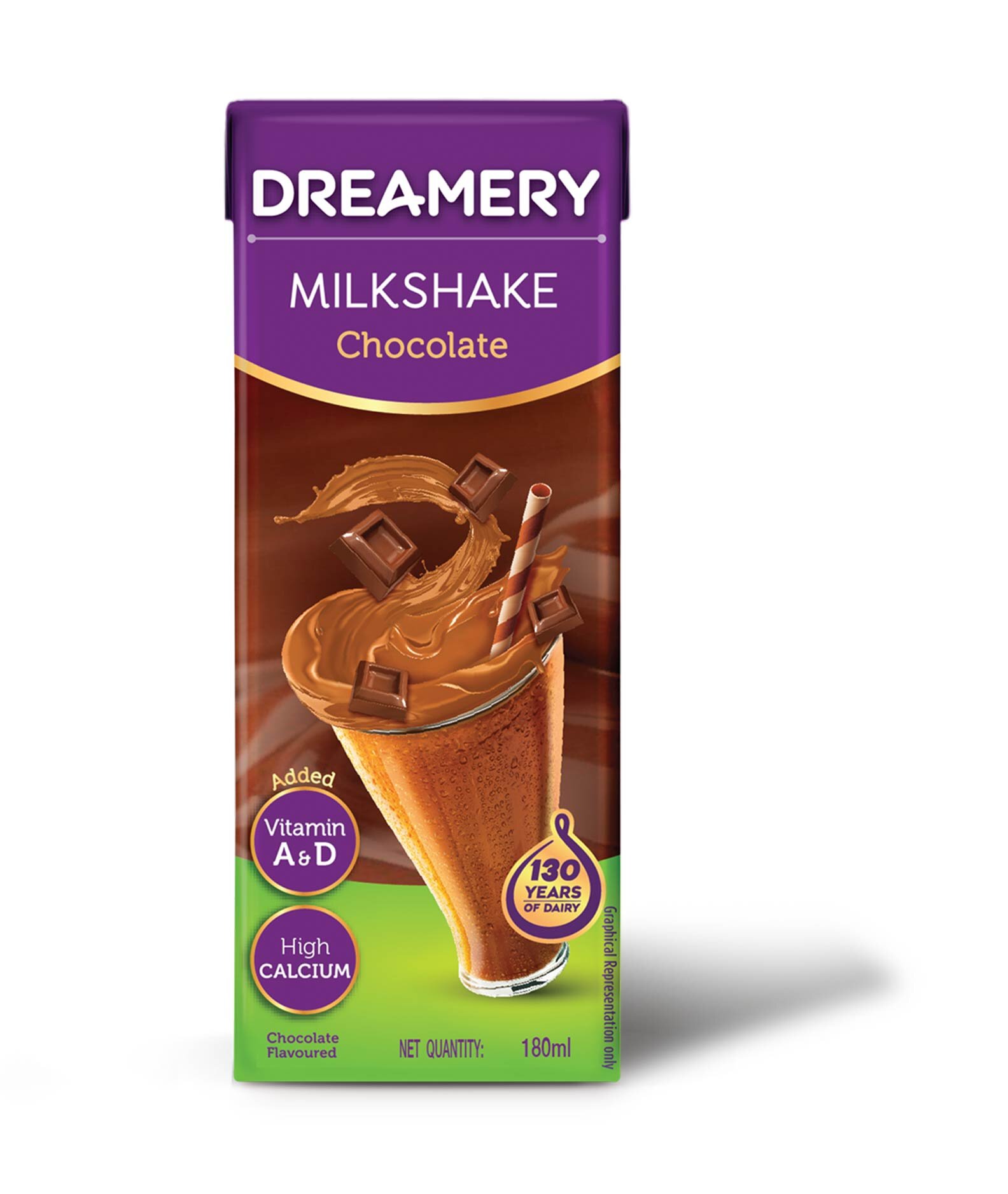
To give the product a truly unique feel, Elephant deviated from using standard category colors, opting to use rich hues of purple instead. Purple is also the color that represents imagination – along with opulence and indulgence.
The visual identity has been designed with a smile bracket to contain the brand and product nomenclature, highlighting the optimism of this brand. Key information is displayed without any clutter, with lush, farm-centric visual cues in the background.
Lastly, the Elephant team also ensured that this template would be highly adaptive. The intent of laying the foundation for many more products to be included within their fantastic roster came through the design system.
With this packaging system and nomenclature, we are confident that Fonterra’s foray in India will be highly fruitful, with ample scope for growth and success in the years to come.


