The Focus
Making consumers feel more connected with Global Desi’s ecommerce website
Adding vibrancy to the boho-chic brand and its virtual presence, simultaneously differentiating it from competitors
Addressing the need to engage consumers & driving sales more efficiently on the platform
The Design
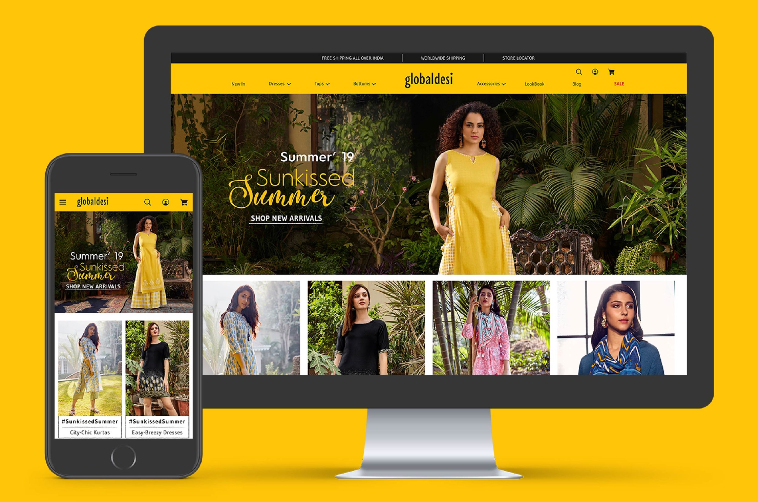
Elephant decided to make the website an embodiment of Global Desi’s essence – focusing on patterns, contemporariness and differently ethnic style
Undertook extensive brainstorming before implementation, to ensure all user journey and interaction scenarios
Created a highly versatile layout to decrease clutter, catalyze buying decisions and improve engagement on the whole
The Story
Founded in 1995, House of Anita Dongre Limited is one of India’s leading fashion houses today. Global Desi being one of the brands owned and operated by the company – is full of vibrant and free-spirited clothing, replete with boho-chic ensembles. It’s fun, lively and funky – which embraces the versatility that is in India, and adds a bohemian aspect to their clothing style, toeing the line between the traditional and the modern culture. So why didn’t their website fully reflect that? That was the first problem outlined by them to us.
The second issue was, that the customers were facing a lot of experience-based issues with the current website. It began from being unable to find the desired clothing with correct sizes and went on to include technical issues being glitchy. A small cluster of problems were banding together to create larger issues, which needed rectification – which resulted into low user engagement.
Finally, consumers needed to feel approachable for navigating the website, along with easy fundability of the desired clothing and making quick buying decisions in order to boost user-experience.
“Global desi is fun, lively and funky – which embraces the versatility that is in India, and adds a bohemian aspect to their clothing style, toeing the line between the traditional and the modern culture.”
The Bohemian Makeover
The word Bohemian meaning - chaotic harmony, the brand essence, was not reflecting on the ecommerce website, as observed by our team.
The earlier website had a very homogenous color palette, which was making it difficult to distinguish different clothing categories. The home page had a static banner, and not much attention was given to the content hierarchy focused to the users.
Thus, the first order of affairs was tearing all that down, and beginning with a literally clean slate. White became a good, subdued background for all the color that Global desi’s products already had. We retained the yellow and black brand colors, with highly rich visuals in the foreground.
The font and typography was changed, and more energetic fonts chosen in accordance with the entire vibrant yet subtle theme of the brand. The entire layout was stitched together, keeping the images in focus.
“All of these changes tied together cohesively, and the user can now observe that they resonate with each other to create a much more unified brand image.”
Browse like A Boss
The main header was restructured to make the navigation more accessible. Large amount of time was dedicated into determining the information hierarchy of the website that yielded great results.
Another noteworthy addition was the infinite scroll, where customers could keep browsing without any interruptions; while also giving a sense of limitlessness to the options available.
Along with focused buyers, Global desi, also has a lot of customers that are geared towards sales & offers. Elephant implemented dedicated ‘Sale’ section as opposed to simply tagging items that were on sale. As per the offers, we added flyouts for sales, discount & new on the image thumbnail, also adding strikethrough prices so that the shoppers could calibrate their purchases more accurately.
To increase overall user engagement on the website, the ‘Look Book’ feature worked wonders. Utilising the potential of the stunning imagery, users could now see how different styles could be sported for different occasions, and seasons.
“Utilising the potential of the stunning imagery, users could now see how different styles could be sported for different occasions, and seasons. This made the products altogether more desirable, while also adding value to the fashion-conscious consumer.”
Sense and Sale-ability
The final task was driving sales, and enhancing that in terms of pure figures can be a dicey proposition for any company. However, given Global desi’s appealing product range, it was just a matter of tweaking things in the right direction. Elephant tackled the challenge by adding certain options to make the browse-to-purchase ratio higher.
We added the quick-buy option under every product for focused shoppers – those who knew exactly what they were looking for and also those who were more impulsive with their buying decisions.
All product images were available up-front, and there was no scrolling needed anymore for the customer to see the full detailing of the product. We also added a ‘Style With’ section, for better product combinations and enabling additional purchases facilitated by easier decision-making.
Along with design solution, we cleverly integrated SEO friendly content to boost the site ranking, with tell-tale icons (Style+, Corporate+ and Shopping Policies+) that only the curious consumer would utilise.
Our changes succeeded in creating an immensely easy-to-navigate website that truly resonated with the brand image. In addition, Global Desi’s vibrancy had a smooth practicality when it came to driving sales, and keeping the consumer engaged with its content and ever-expanding range of products.


