Hero Sprint
Trailblazing for a Distinctive Retail Experience | Hero Sprint
Hero Cycles, a legend in Indian bicycle manufacturing, aspired to:
Create a distinctive and relevant retail experience for cycling enthusiasts through its subsidiary 'Hero Sprint.'
Build a one-stop destination for value-conscious customers.
Leverage the brand's legacy and trust quotient more efficiently.
Our team identified 4 principles to create the ideal retail experience:
- Enhancing Effectiveness
- Efficiency
- Engagement
- Memorability
The visual language successfully tied together differing cycling connotations from health to adventure, consistently, across all elements and communication touch-points
The final result was a welcoming, approachable store that facilitated empowered purchase decisions while echoing the experience’s customer-centric theme: Inspired By You.

Hero Cycles has been synonymous with Indian cycling for decades. 'Hero Sprint' was introduced as a go-to place for people wanting to cycle. The brand offers good quality, stylish, yet economical bike options inspired by lifestyles and need for a good cycling experience.
Though Hero became the largest Branded Bicycle Retail Network in the Country with 375 Stores (2020-21), the general feeling was that Hero Sprint stores:
Lacked a holistic approach to providing a fantastic cycling experience and needed a revamp in terms of overall store design & customer journey.
Needed to come across as a complete solution provider for all biking needs (Sale, Service/Repair & accessories), while offering a better touch-feel experience and awareness of the wide range, variety and premium technology offered.
Hero Sprint approached Elephant to reinvent their customer journey, displays and visual communication & messaging while improving the overall retail experience.
Elephant began by identifying the main target customer profiles and conducting interviews to understand their cycling needs, pain points, lifestyle, use-case scenarios, aspirations, expectations and brand perception. This also involved visits to Hero Sprint and competitor stores in a few metro cities to understand customer behavior, gaps in the selection and buying processes, and pain-points for browsing, displays, communication, and post-sale activities.

The team assimilated the data from these interviews and store visits and distilled four fundamental principles from the insights gathered. We formulated these as 4 critical principles concerning the store design and communication:
Improve effectiveness - Highlight brand & product relevance to consumers.
Increase efficiency - Simplify and ease processes across key touchpoints to increase decision-making confidence.
Enhance engagement – Create meaningful brand & product interaction points to aid choice & selection and awareness.
Kindle memorability - Establish the store as a one-stop cycling destination, for all, from pre to post purchase
This led to a shift in the Customer Journey, Perception & Communication and finally, a bold new message: "Inspired By You", that resonated across all key touchpoints within the store.
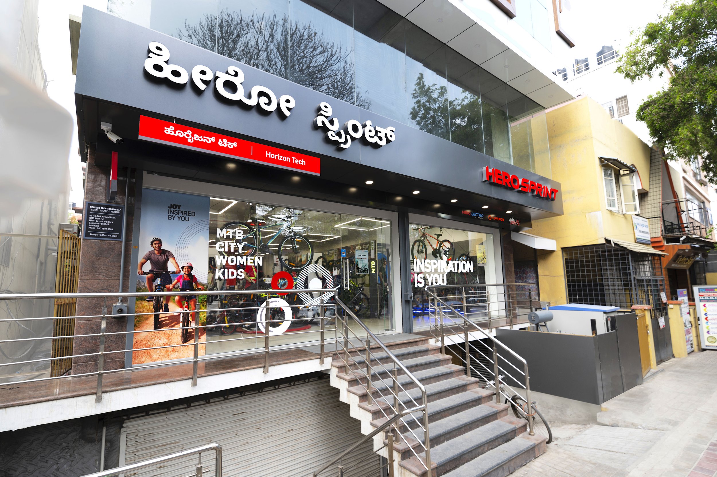
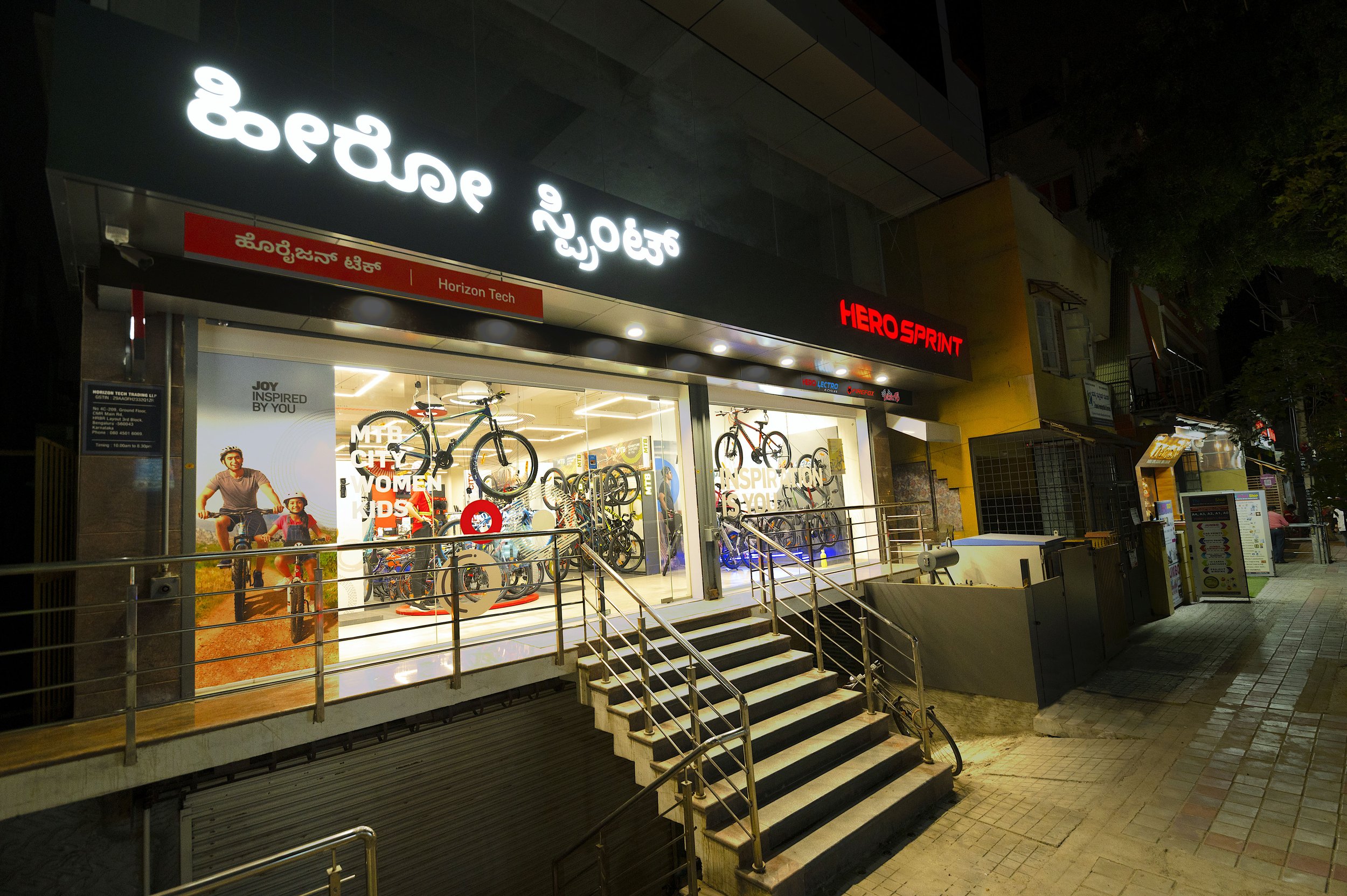
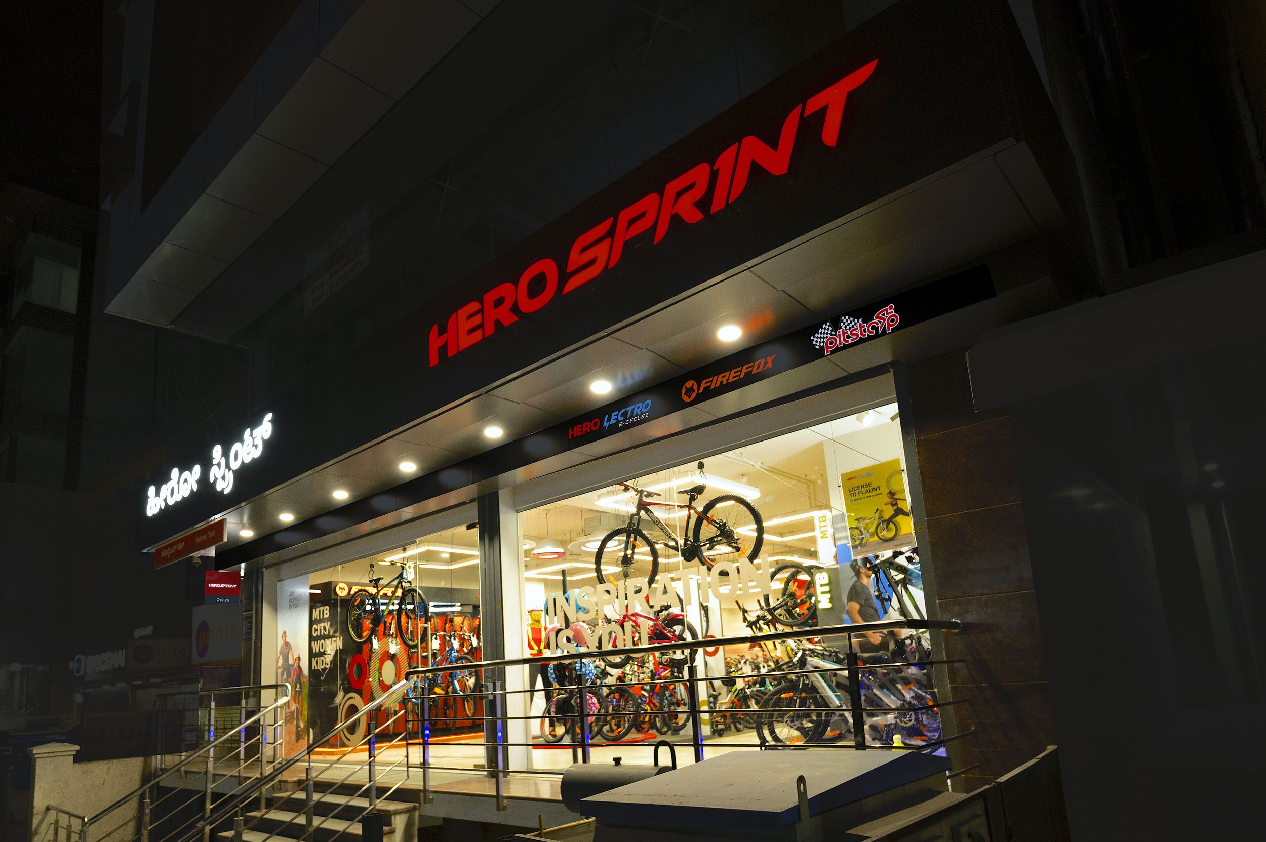
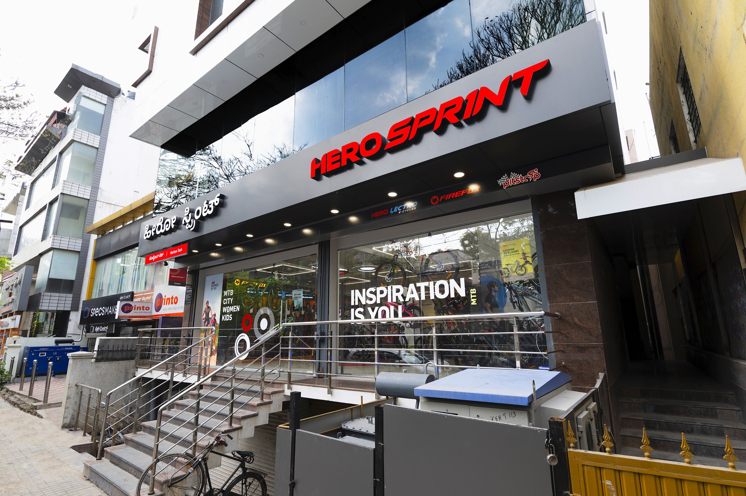
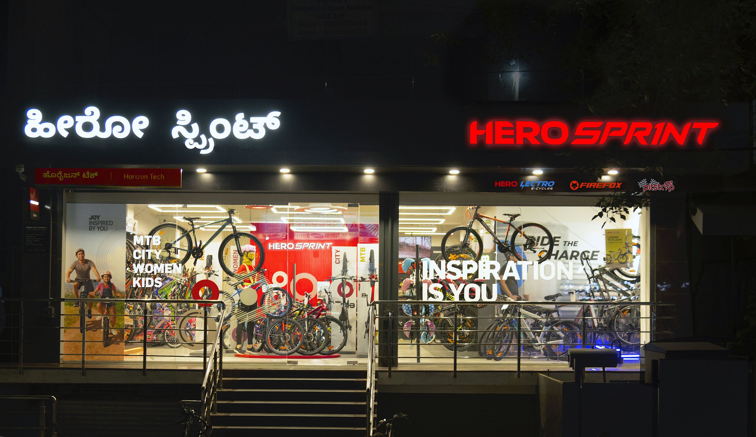
The Hero Sprint identity has substantial recall value and is presented prominently on the fascia in the local context on a contrasting dark grey backdrop. Sub-brands, categories, messaging, dealer name & promotions are strategically organized at the frontage. Dynamic window displays provide the 'wow' factor and help create the desired pull. Full window glazing allows end to end visibility from the outside. Overall, the storefront imparts an approachable and welcoming facade.
Bold, conversational messaging - 'Inspiration Is You' connects with customers on an emotional level while the vertical lifestyle poster supports the brand's message with appealing, relevant visuals.

Cycling as a lifestyle has various connotations. For some, it's about health. For others, it's about the thrill of adventure sports or an idyllic leisure activity. With this in mind, Elephant created a unique visual language as a kit of parts, that conveys an abstraction of circles in varied patterns, expressing cycles in motion, defining emotions of happiness, health, speed, movement and inspiration. This visual language weaves across all elements & communication, knitting them together.
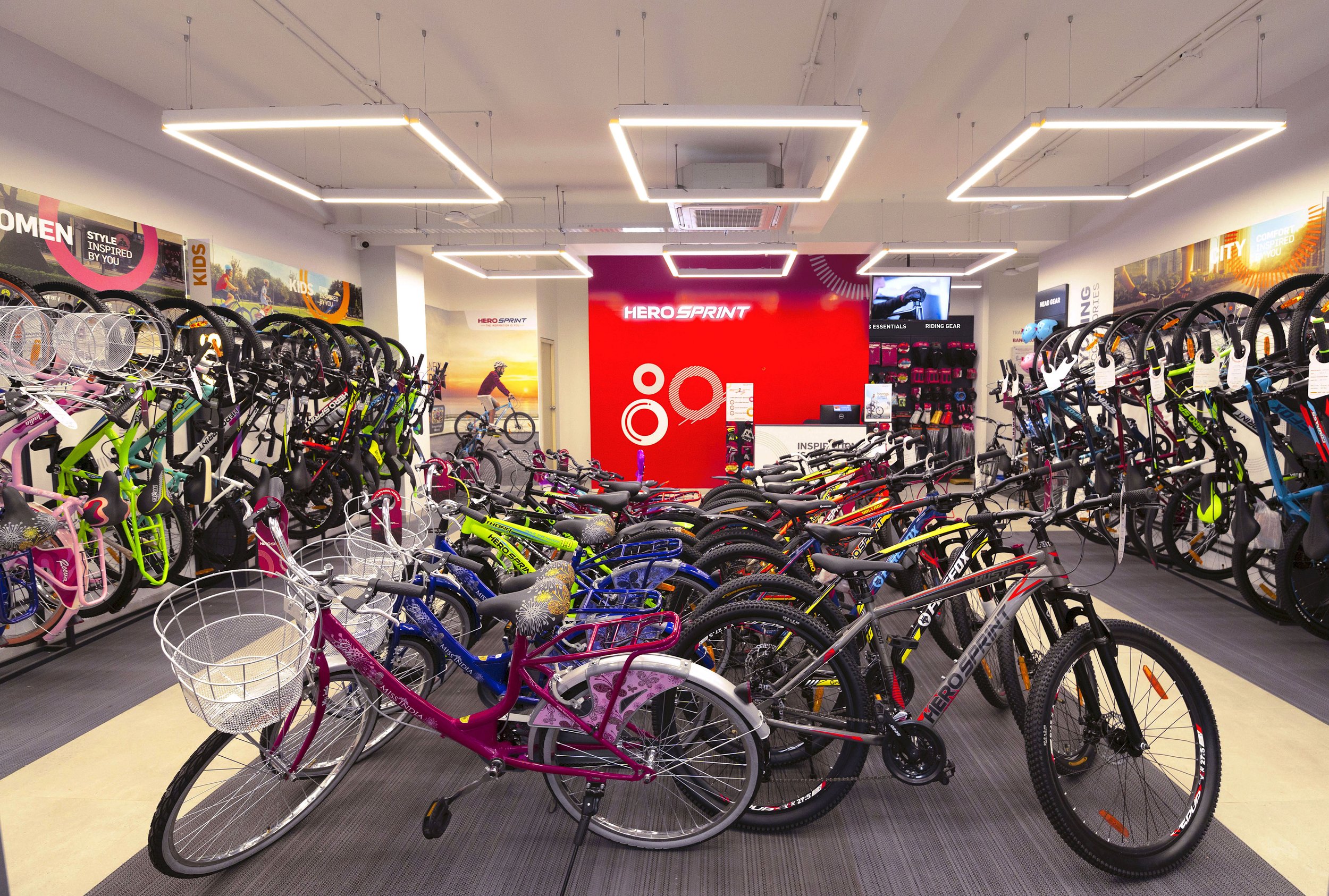
The bright red in-store brand wall is easily noticed even from outside, marking the store as a Hero Sprint cycling destination. Walls and ceilings are purposefully treated in light grey and white shades to offset the colorful products, imagery, and communication elements.
Upfront, the vertical cluster displays not only showcase the 4 bike categories – Women, Kids, MTB & City but also the latest arrivals, to make customers aware of what's available and enable a quick selection process as soon as they enter the store. A fully attired mannequin on the circular podium helps customers visualize themselves in cycling gear, while demonstrating cycling gear, wearables, and high-end bikes on display. Compact helmet stand is visible from outside as an impulse purchase option.
Fully loaded, segregated category displays have been placed along peripheral walls. Cycles are mounted vertically for easy touch-feel & access and to relieve circulation space while self-browsing. Each category display unit is interestingly angled and defined by horizontal format graphics - conversational lifestyle-terrain imagery seen above, along with bold category signage, making it easier to choose based on the pre-defined ride purpose/ customer type (For Women, Kids, MTB & City cycling).
The store also promotes Hero's Firefox & Lectro brands featured prominently as a shop-in-shop format, complete with products, visuals, branding & signage to build awareness about Hero’s premium offerings.
Apart from the vertically mounted category display, the store has a central selection bay area with rows of neatly organized customer-facing bikes parked on a low maintenance rubber floor.
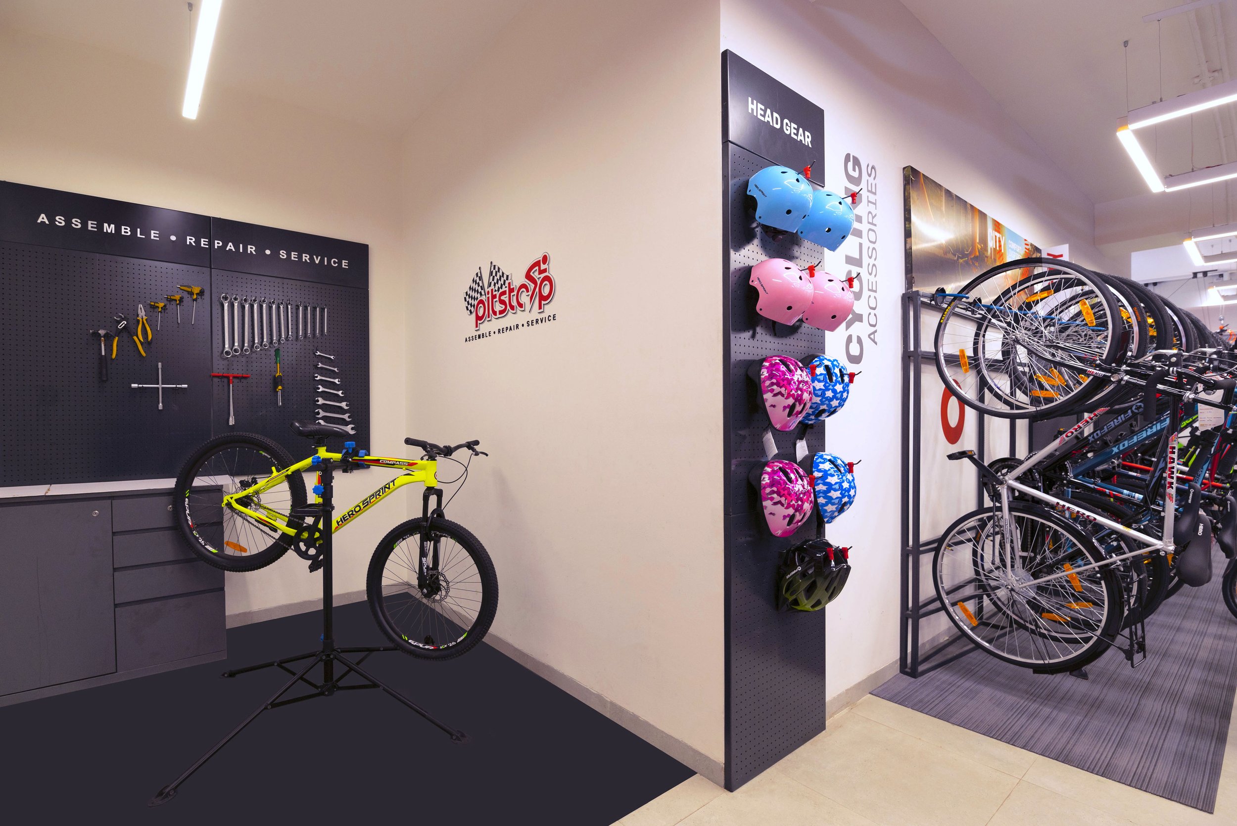
The open service 'Pitstop' area is designed to be approachable so customers can engage with the technician. ‘Ride Route’ Communication panels help newbies plan their first ride with local route suggestions. 'Pitstop' area projects a pro attitude towards service and helps build confidence in the brand and service facilities.
Digital tools are placed at two different locations and act as pause-points to aid self-browsing and provide in-depth information on products, services, deals and offers in both online & offline formats. A Digital Tab kiosk at the entrance allows the customer to have a glimpse of products and features on a picture slide show for an efficient browsing experience. The TV screen near the service area showcases various campaigns, DIYs, information, branding, product detail, and customer testimonials to keep customers gainfully occupied especially during a longer dwell time.
The accessories section is fully equipped with Hero riding gear against a contrasting backdrop of perforated sheet metal. Fixtures allow for easy placement and retrieval for customers to explore and identify their cycling essentials, for a better ride experience. SKUs are displayed near the transaction desk to facilitate an impulse purchase during the billing process.
Keeping brand legacy, offerings, consumer profile and proposition in mind, the new Hero Sprint retail store differentiates in multiple ways. Apart from being approachable and welcoming, it empowers customers with communication, tools & elements that simplify choice, selection & decision making while dispensing vital information exactly where it is needed. Displays offer an unhindered, hands-on experience of all aspects of the bike. From the storefront to the post-purchase & service, the new customer-centered journey seamlessly guides the customer across the store, while keeping them gainfully engaged. Design elements are elegant & functional, allowing the bikes to take centre-stage.
In essence, all elements, experiences & communication link with the overall theme ‘Inspired By You’, leaving our customers with the memory that they are the inspiration.