The Focus
Healthcare and wellness giant Himalaya developed a skincare product tailored for overseas markets, i.e., the Face Mask
The product and its category needed a nuanced treatment as Himalaya’s core brand language was more reserved and ingredient focused as opposed to being exuberant or spontaneous
They approached the team at Elephant to create a suitable visual system for this new range, where a newer kind of treatment and visual language would make the product approachable to their young target audience
The Design
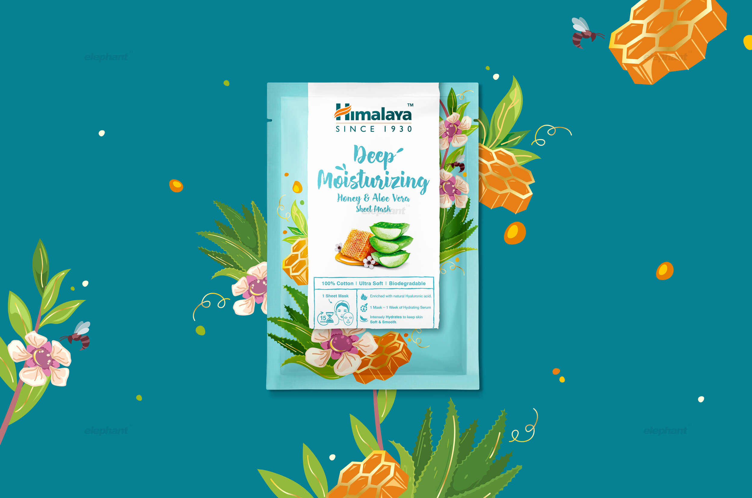
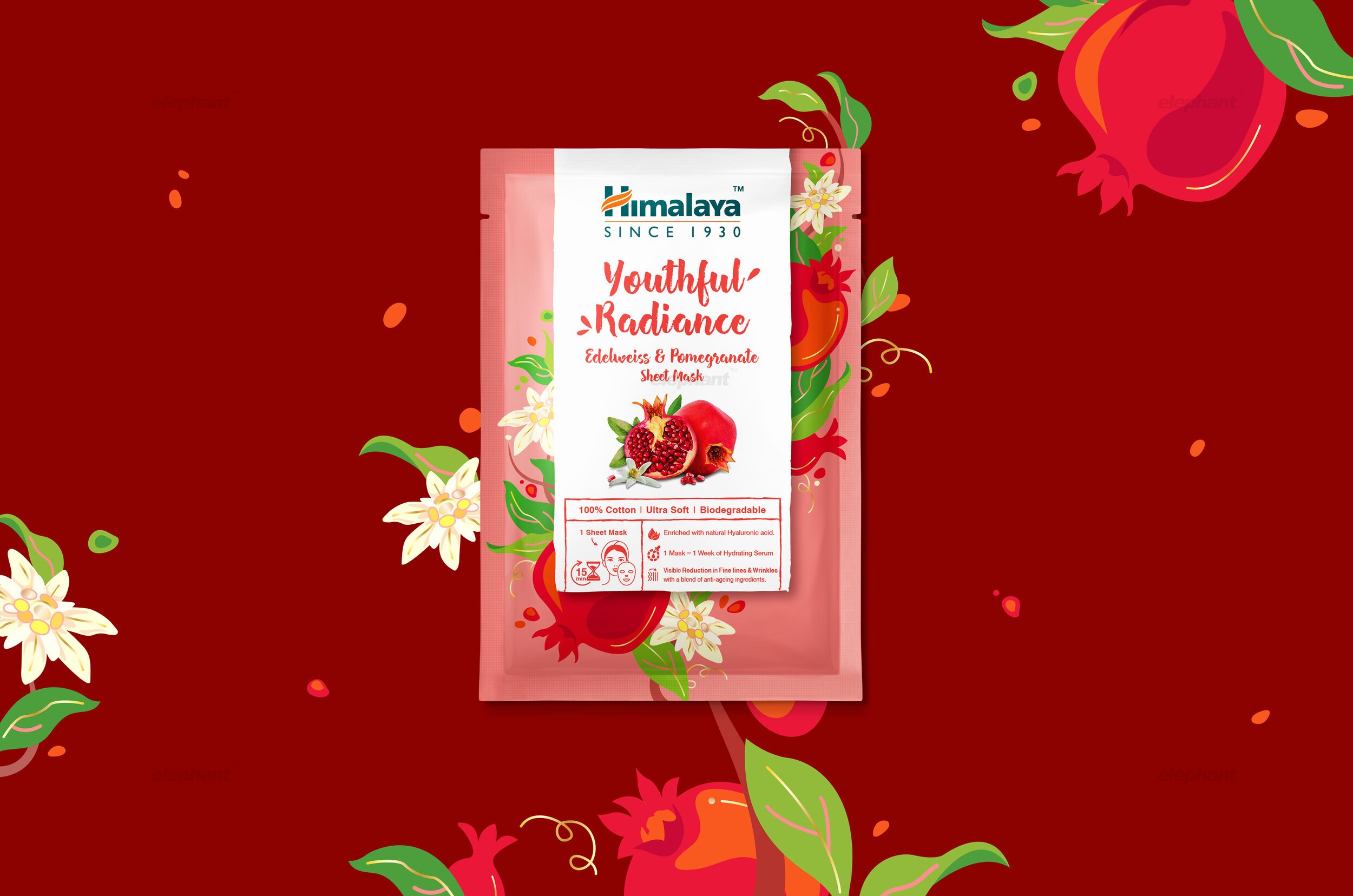
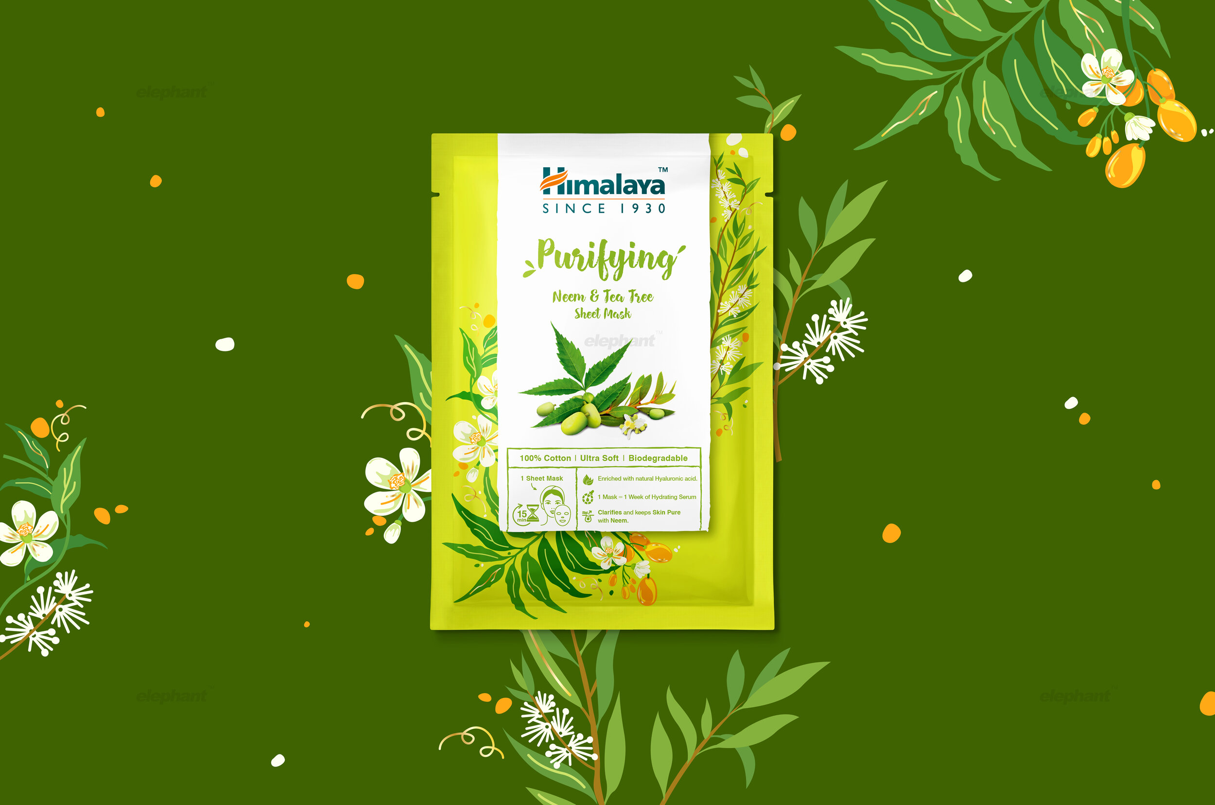
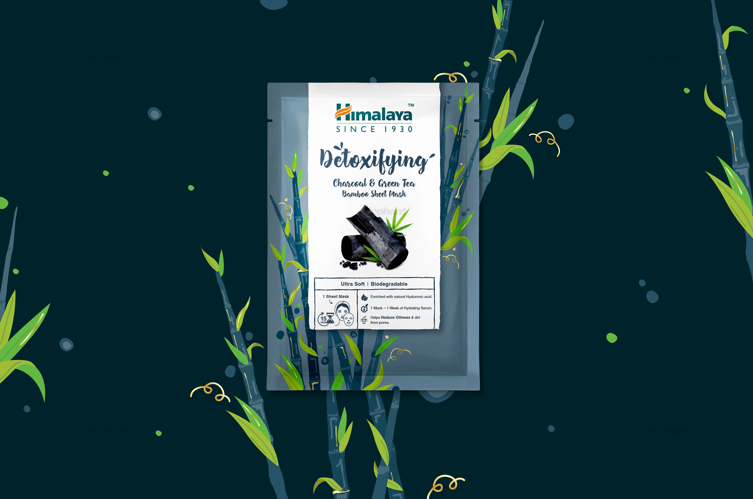
Elephant designed a visual language and system based on the idea of a ‘Zen Time’, which focused on creating an entire skincare experience that evoked fulfilment, tranquillity and ritualistic pampering
The team also integrated Himalaya’s focus on natural ingredients, adding cues to illustrate freshness and their sourcing from pristine environments
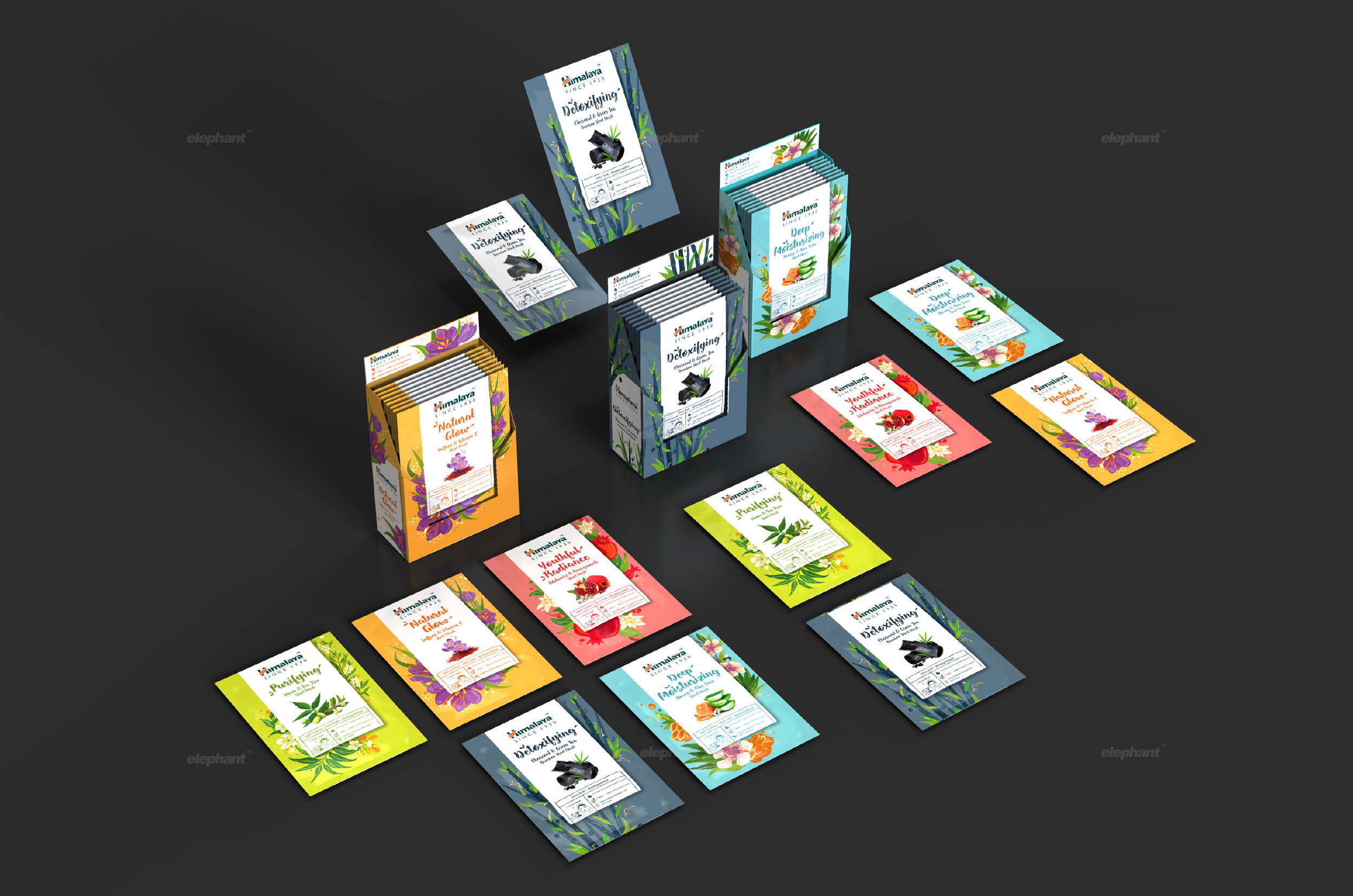
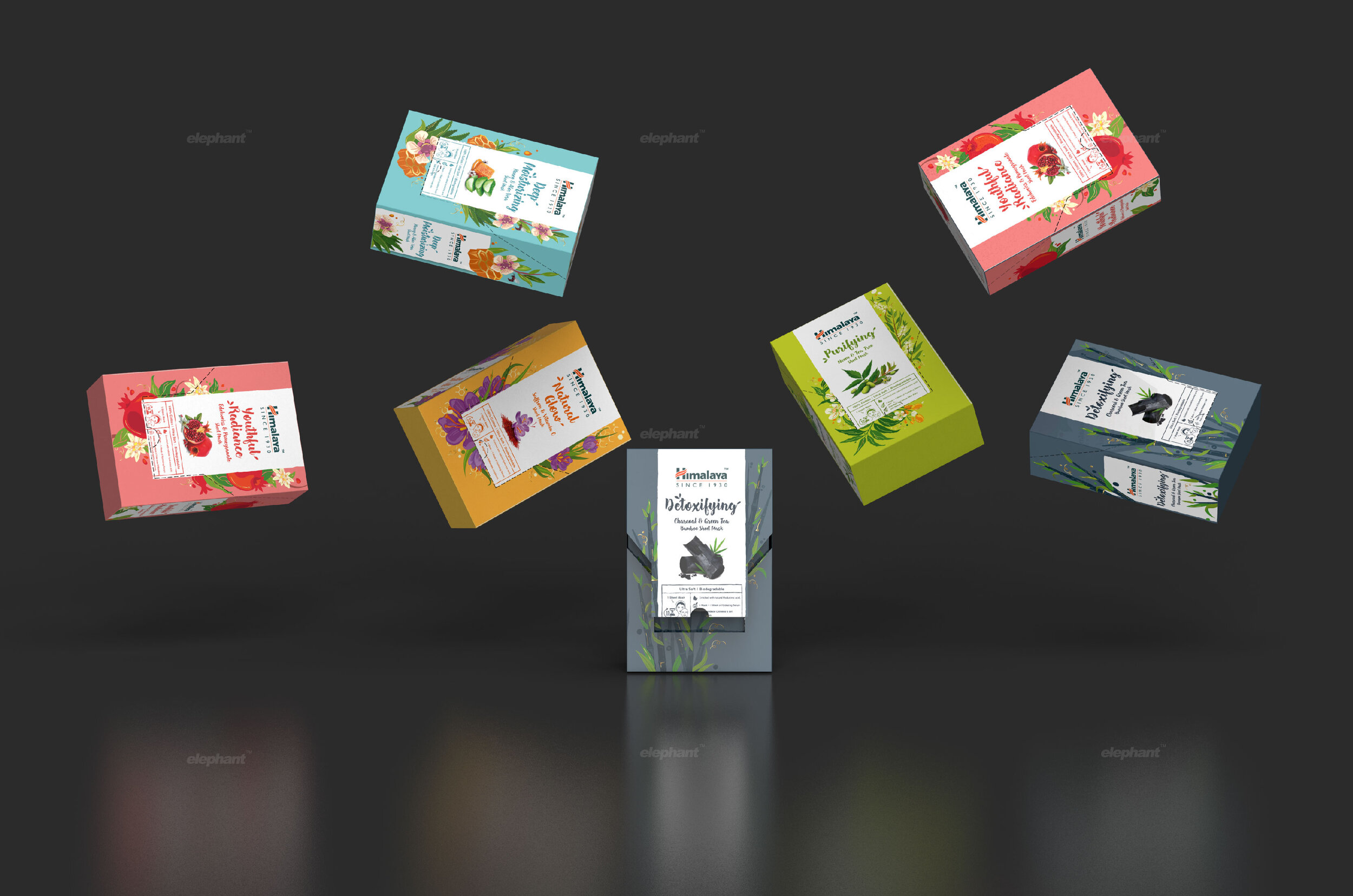
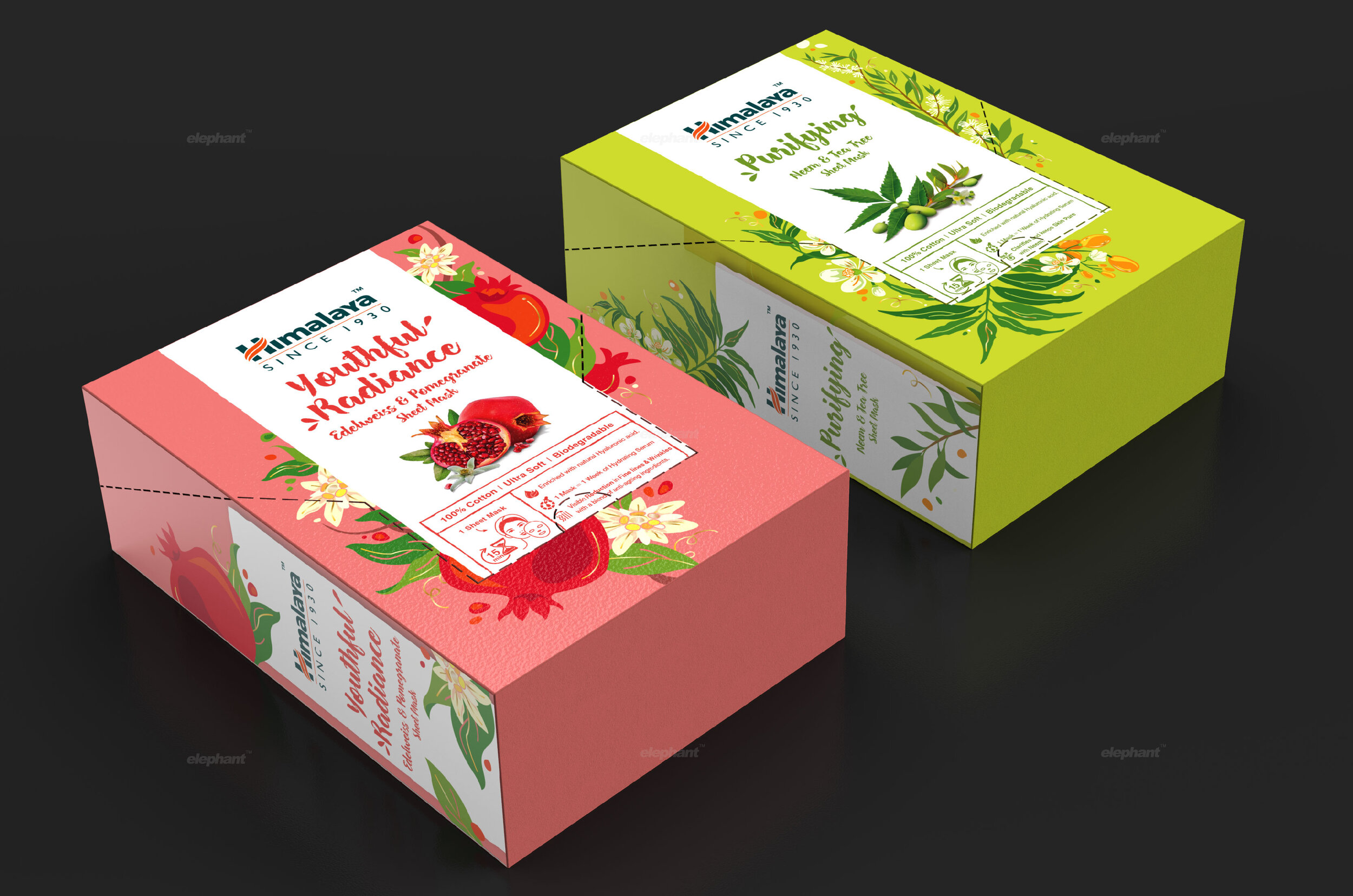
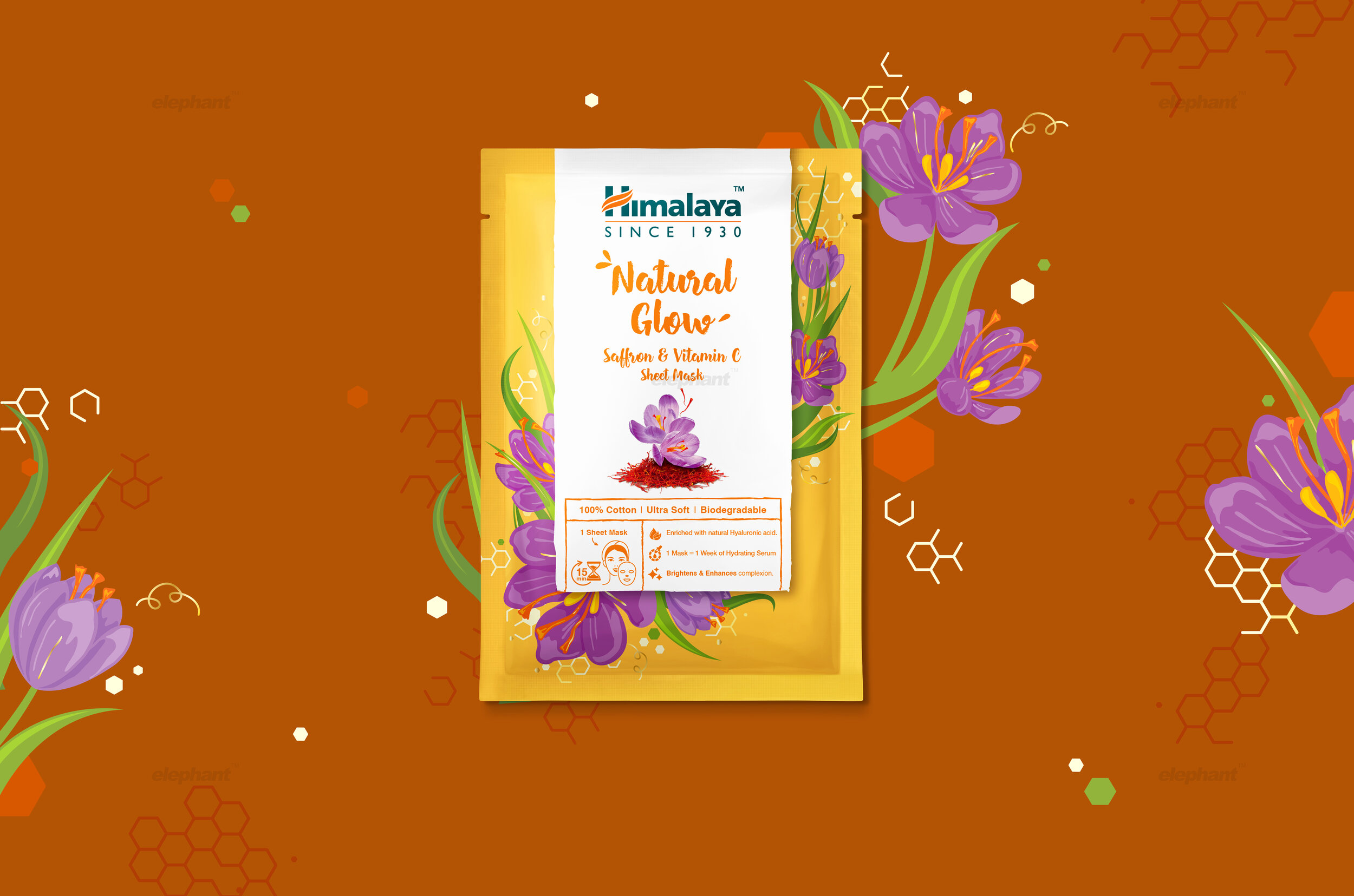
Scripty typography, an evolved colour palette and custom-made illustrations for each variant dominated the system that synergized with a wholesome packaging solution, which allowed it to become a versatile display unit on the shelf
The Story
Himalaya is a household name in the Indian healthcare and wellness sector with a long history that coincides with India’s own. Founded in 1930, their focus on natural ingredients, remedies, and solutions aligned with India’s cultural inclinations, which persist even today with a strong focus on alternative, homegrown medicine.
Today, the company spans several business segments and has a concrete global presence, with a constantly evolving portfolio in the mix. Their latest foray into the world of skincare illustrates their focus on innovation, with their Singapore team creating a sheet-style face mask for overseas markets.
“Most brands opted for an exuberant, ritual-driven and emotion-filled treatment as far as their skin masks were concerned. Conversely, Himalaya’s visual language and treatment was oriented towards a more serious approach that focused on natural ingredients and their sourcing from pristine, unadulterated environments”
This resulted in several new challenges and Himalaya approached the team at Elephant in order to develop a comprehensive visual system for their range of face masks. Naturally, it was to be infused with a visual language that appealed to the
youth – demanding an exuberant, engaging, and conversational approach. Conventionally speaking, Himalaya’s focus has always been on their products being derived from natural ingredients with benefits in tow, with a balanced brand voice and tone. Switching from that towards what the sheet mask category demanded was the real challenge for the team at Elephant.
Against all Odds
Since the team was devising a solution for climes that were largely unfamiliar, the focus on research was paramount. We garnered valuable insights from our visit to stores in Singapore where we also had a chance to interact with consumers. Global markets were extremely receptive to the sheet mask format, with several brands already vying for consumer attention. Consumer analysis also revealed that people were ready to spend a premium for these products.
However, the biggest challenge came in the form of category codes that dominated the packaging of this specific product. The reason was simple: while there were many other alternative products with the same benefits (skin-care, revitalization and so on), the skin mask was consistently being chosen by younger audiences due to the ritualistic, social-media friendly nature of the product. This led to brands opting for an exuberant, ritual-driven and emotion-filled treatment as far as their skin masks
were concerned.
“After the initial phases, our team managed to create a visual language that encapsulated three different spheres, which merged to create the concept of a ‘Zen Time’: a time where you indulge and pamper yourself with a product that revitalizes, energises and is effective. The idyllic dreamscape created by these cues also incorporate the ritualistic aspects of mask application, which engage the audience in an activity that is also trendy, fun-filled and lastly, viable for sharing on social media”
Conversely, Himalaya’s visual language and treatment was oriented towards a more serious approach that focused on natural ingredients and their sourcing from pristine, unadulterated environments. Their language also focused more on scientifically-derived benefits as opposed to playing on applications and processes that were the norm for face masks. Application, in fact, is a huge domain where the skin mask is a non-messy, engaging and fun alternative to other skincare products.
This contrast demanded an approach that managed to bring forth youthful category codes, while also retaining the Himalaya touch – not a simplistic balancing act by any means!
Skincare and Zen
After our research phase, the team redefined the goal and finalised a visual language that encapsulated three distinct spheres. Firstly, the efficacy of the mask was highlighted for the slightly older audience within this age gap, who preferred a more medically attuned, scientific approach. This was done via focusing on key ingredients like Hyaluronic acid while laying out product benefits in an engaging fashion.
“The last touch in our comprehensive offering was more to do with the packaging structure. Since the sheet mask was supposed to be shipped in sets of 10, the team needed to devise solutions in tandem. This led to us utilising a carton that also could function as a versatile display unit that showcased the contents within in a very attractive, holistic package”
Secondly, the team infused the packaging with codes that were attractive to the younger, more dominant target audience. Scripty typography, a brighter colour palette and the core element of a ‘note to self’ comprised of the main framework around which other elements were placed. This note was appealed to the more personal, emotional aspects governing a skincare routine - a letter to oneself that signified a commitment to revitalisation and pampering the self.
Lastly, the team merged Himalaya’s core brand language by depicting natural ingredients, playing on the cues of freshness and the sanctity of pristine, idyllic environments.
All of these merged to create the concept of a ‘Zen Time’: a time where you indulge and pamper yourself with a product that revitalizes, energises and is effective, courtesy of its essential ingredients while also being effusive, conversational and approachable for the youth. The idyllic dreamscape created by these cues also incorporate the ritualistic aspects of mask application, which engaged global audiences in an experience that was trendy, fun-filled and lastly, viable for sharing on
social media.
Out of the Lab and on to the Shelf
The last touch in our comprehensive offering was more to do with the packaging structure. Since the sheet mask was supposed to be shipped in sets of 10, the team needed to devise solutions that accommodated for this while also serving to provide utility when it came to logistics and other practical concerns.
“Every great design begins with an even better story”
This led us to create a carton style package that combined the forces of both, product and graphic design, to preserve the overall brand story. This carton also could function as a versatile display unit that showcased the contents within in a very attractive, holistic package.
Elephant’s work for Himalaya’s range of face masks has been met with positive reception in global markets which we believe to be a result of potent research-driven design. This delicate amalgam of distinct themes, coupled with a versatile display function that the packaging provides has been viewed favourably, with the product poised to launch in Dubai, Indonesia, Singapore, Australia and yet other climes across the world.


