MIBL Retail and Branding
Mahindra Paybima | A Humanized Approach to Insurance


The Focus
MIBL, the broking arm of Mahindra, sought Elephant Design's expertise to transform their brand Paybima, a Tier-2 and 3 focused insurance provider into a modern, customer-centric entity. The brief revolved around two key objectives:
Business: Position Paybima as a "Smart Digital Hub" for life and health insurance, offering end-to-end services from policy issuance to claim support.
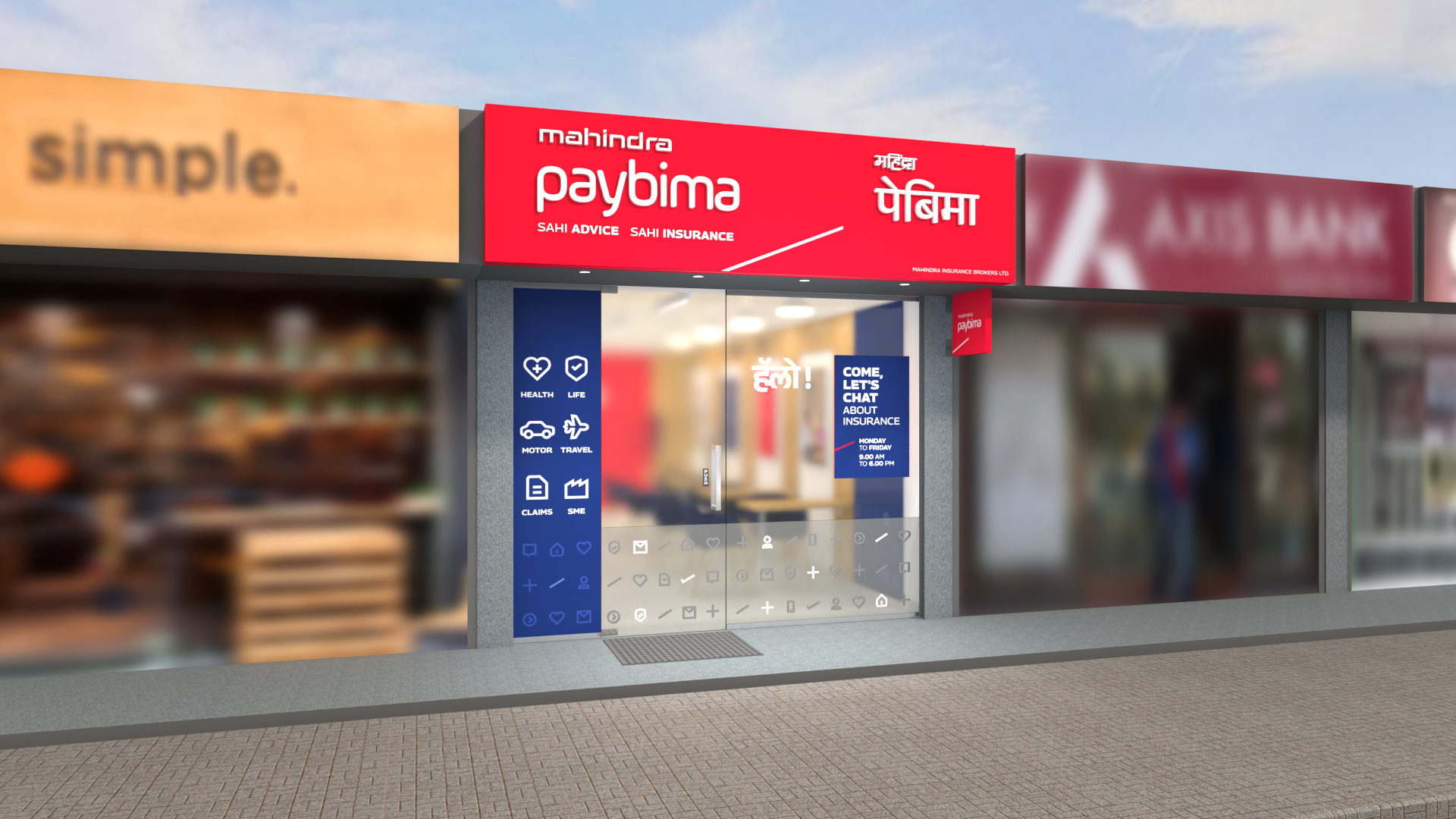
Retail: Create a robust, technology-led retail environment that simplifies the insurance journey, making it approachable and comfortable for customers.
Elephant Design was tasked with designing the physical retail space, branding elements, and crafting a seamless omnichannel experience.
The Design
Our solution addressed MIBL's needs through three key pillars:
Digitizing and humanizing insurance: We aimed to bridge the gap between technology and personal touch, creating a space that felt both innovative and approachable.
Simplified and effective advisory: The design facilitated informative consultations with advisors, empowering customers to make informed choices.
Omnichannel integration: We ensured a seamless transition between online and offline touchpoints, offering consistent support and information across channels.
The Story
Imagine entering a space dedicated to insurance, not with sterile walls and intimidating jargon, but with warmth, clarity, and a touch of digital magic. This was the vision Elephant Design brought to life for MIBL's Paybima, transforming a virtual insurance broker into a customer-centric haven in Tier-2 and 3 cities.
Our journey began with understanding Paybima's dual objectives: establishing themselves as a Smart Digital Hub for life and health insurance while crafting a robust, technology-led retail environment. This meant bridging the gap between cold, digital transactions and the human touch, creating a space that felt both innovative and approachable.
Insights
Research unveiled a diverse tapestry of Paybima's clientele:
The Tech-Savvy Millennial (25-35 years): Driven by ambition, they craved expert advice and seamless online-offline journeys.
The Assurance Seeker (36-46 years): Transparency and product simplification were key for this segment.
The Stability Builder (47-60+ years): They yearned for handholding and clarity amidst complex procedures.
Understanding these distinct needs became the bedrock of our design.
Four Zones, One Journey:
The physical store transcended the typical transactional space. We envisioned it as a journey through four distinct zones, each catering to a specific need:
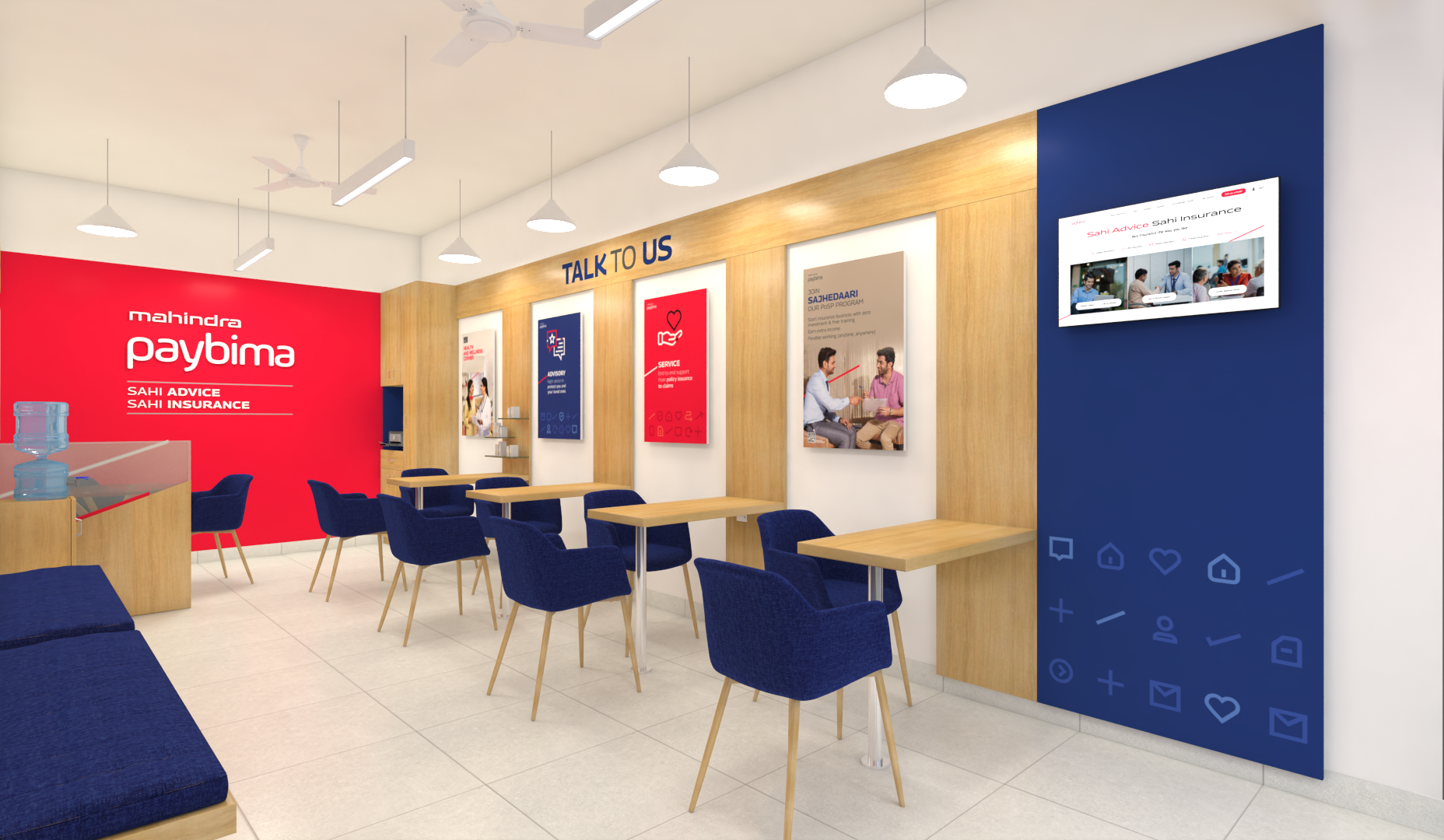
1. Consideration: Warmly lit and inviting, this zone offered self-browsing options on a dedicated ledge. Friendly advisors were readily available for initial conversations, dispelling anxieties and sparking curiosity.
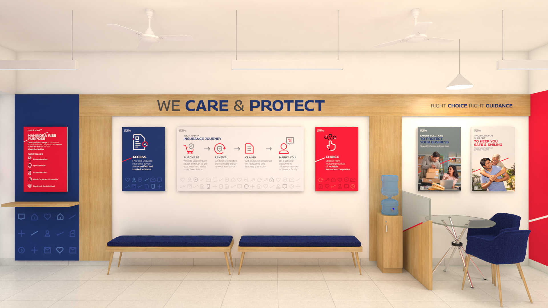
2. Enquiry and Self-Browsing: Informative panels and digital screens, displaying a curated selection of policies, empowered customers to independently explore and compare options. The space felt akin to a well-lit library, fostering informed decision-making.
3. Advisory & Purchase: Dedicated consultation areas, reminiscent of cozy living rooms, facilitated personalized guidance from expert advisors. Customers could customize policies based on their needs, feeling confident and informed throughout the process.
4. Support: For sensitive financial discussions, private meeting rooms provided a safe space. Here, customers could receive in-depth support and expert assistance, ensuring a holistic and secure experience.
Humanizing the Digital:
Technology wasn't cold or distant in this space; it was an invisible hand, enhancing the human touch. Digital screens displayed informative content, advisors leveraged tablets for efficient consultations, and seamless online integration allowed customers to effortlessly switch between channels.
The Paybima logo received a subtle yet significant makeover. We infused it with confidence and dynamism, reflecting the brand's evolution. The colour palette of red, grey, and blue conveyed stability, trust, and approachability, resonating with customers across demographics. A clear iconography system, featuring friendly illustrations, complemented the conversational tone, further humanizing the brand.
The transformed Paybima retail space and branding resonated deeply with customers and industry experts alike. The design successfully:
Bridged the digital-human divide: The space felt both innovative and trustworthy, fostering a sense of ease and empowerment.
Simplified the insurance journey: Customers felt informed and confident, thanks to readily available information, expert guidance, and seamless omnichannel support.
Built trust and loyalty: The humanized approach and commitment to customer needs strengthened Paybima's brand image and fostered lasting relationships.
The Paybima story is a testament to the power of design in humanizing complex experiences. By understanding customer needs and leveraging design thinking principles, Elephant Design helped create a space that not only met business objectives but also touched hearts and minds. In the ever-evolving world of insurance, the Paybima retail store becomes a beacon of clarity, trust, and human connection, paving the way for a brighter future for all.


