Park Avenue Soap
Soap bar with an attitude

Soap bar with an attitude

JK Helene Curtis, the company behind the Park Avenue brand felt that a timely relaunch of their men’s soap was in order
While slotted as a premium soap with over four different variants all at a competitive price, its success was being hampered by a market unundated with established players
Desired a masculine yet dynamic, differentiated structure for the soap since brand recall for soaps goes beyond relying on packaging graphics
The team at Elephant incorporated all the details for the brief while generating multiple, distinctive iterations that echoed dynamism, masculinity and a larger soap structure
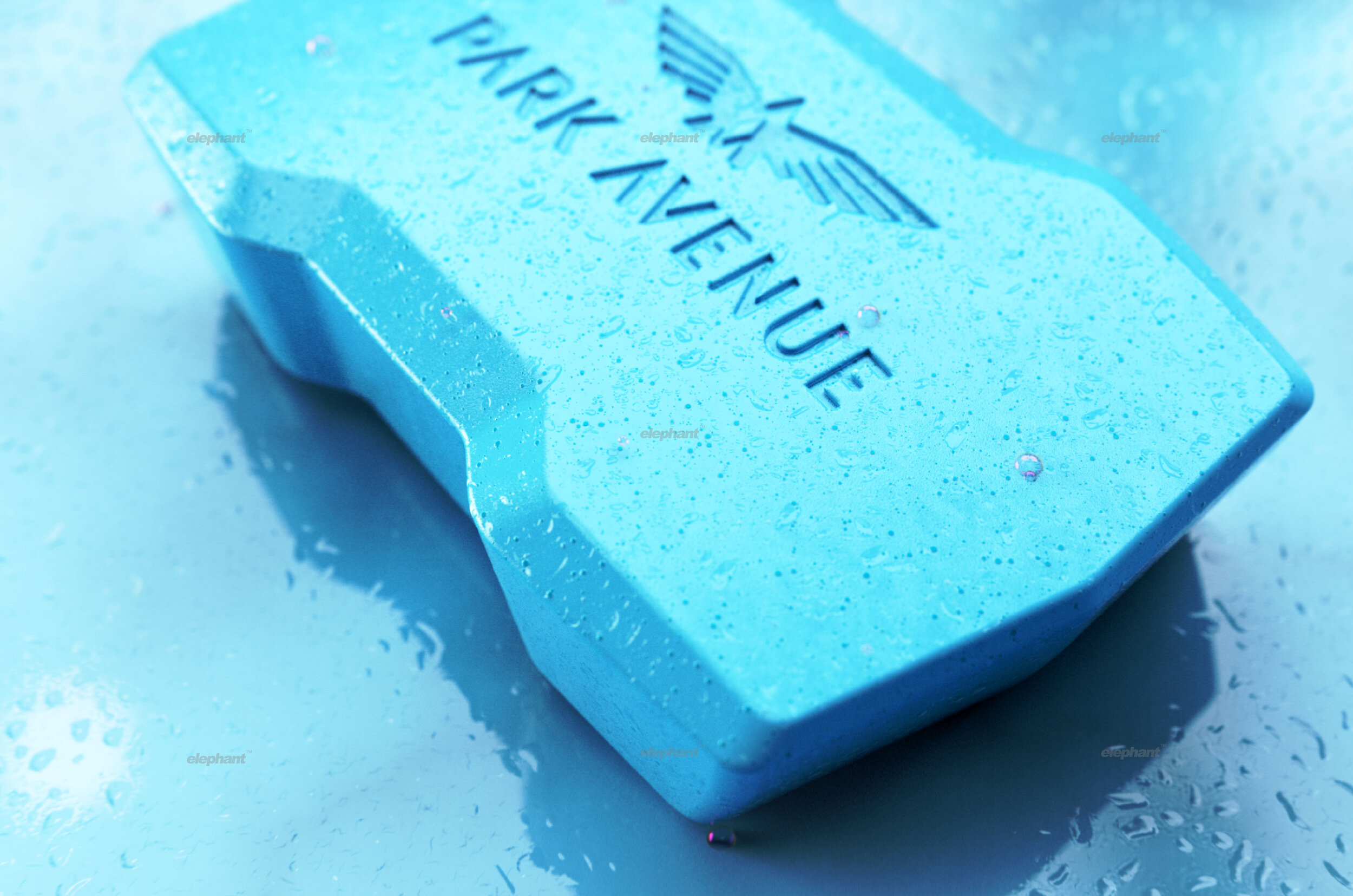
Worked within the limitations of the soap manufacturing process that does not allow for great variance in design, while also bestowing functional benefits in the form of a more ergonomic shape
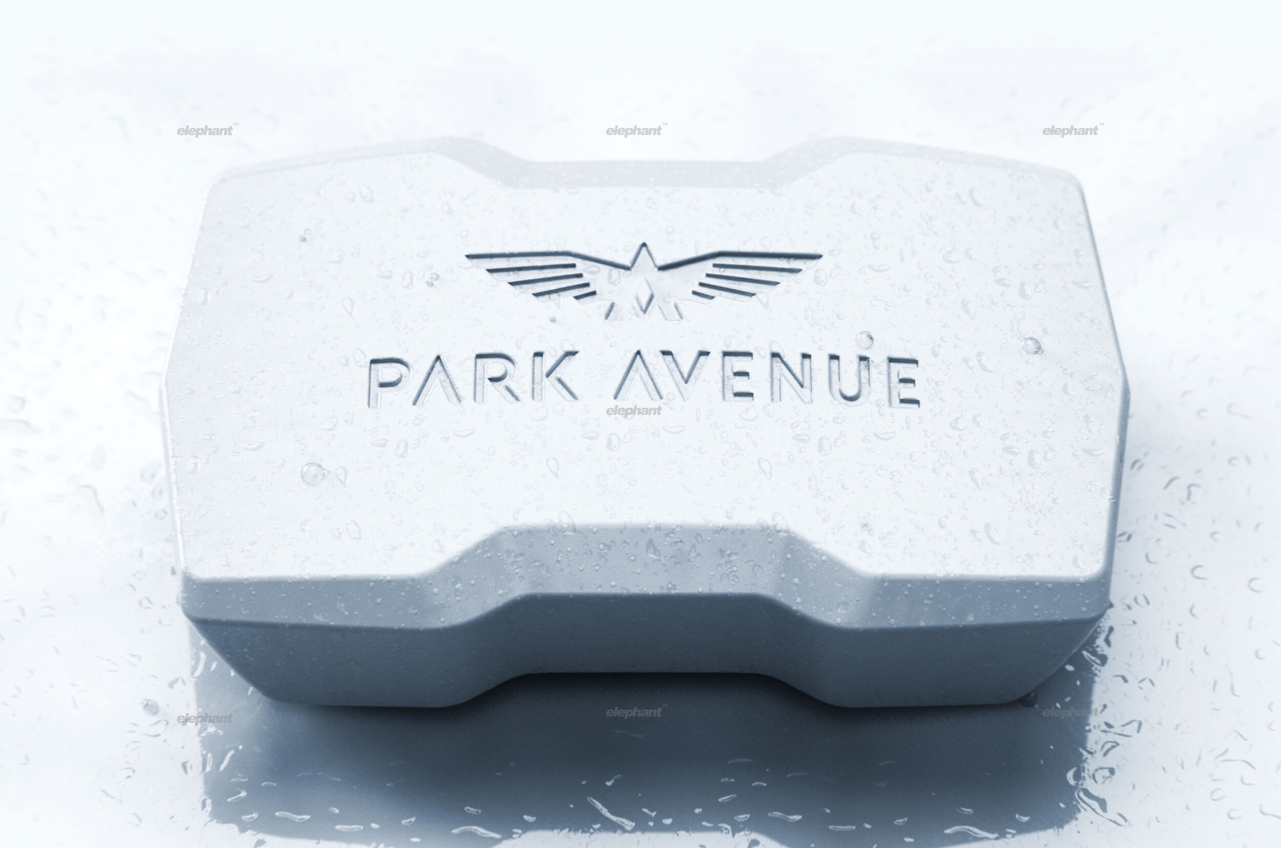
Finalized the “Edge” concept with its bold, symmetrical and larger structure with a distinct, dipped silhouette and ample branding space for maximum recall
Park Avenue is a brand that has managed to carve a niche for itself in the premium wardrobe solutions market, with forays in the men’s accessories and toiletries subcategories too. A part of the distinguished Raymond Group, it primarily targets young, ambitious, outgoing corporates with a flair for fashion – but older men are also driven to utilize the brand’s products due to its strong legacy quotient that comes with Raymond’s own reputation.
“Park Avenue approached the team at Elephant with a proposition where our team would help them develop an ideal form factor for their men’s soap, which was undergoing an all-encompassing relaunch.
”
With their target audience being what it is, the brand’s values are similarly inclined, adopting smart, masculine, premium, exciting and entrepreneurial overtones for their product range. The Park Avenue soap is no exception and has had a market presence since the early 2000s.
Park Avenue approached the team at Elephant with a proposition where our team would help them develop an ideal form factor for their men’s soap, which was undergoing an all-encompassing relaunch. Since the market was dominated by other established players, this relaunch was geared towards re-instilling the brand’s values & image into their target audience’s mind, and to carve a greater share of the market.

Soaps are a curious commodity when it comes to brand recall. We often might not remember the packaging of the soap once it is removed but we do remember its shape as it lies in our soap holders. This makes the form factor an extremely critical aspect of design when it comes to sheer differentiation – but of course, that has its own set of hurdles
“A futuristic, premium design palette was utilized, resulting in the sharp edges and a clean, decluttered surface without any frills. Ample space was provided for added branding opportunities on the surface. The team also took silhouette appearance into account, rounding off the structural revamp. ”
The soap making process isn’t as sophisticated – which means that structure-wise, we could hardly deviate from certain established norms in our bid to make the soap have a completely radical structure. Beyond that, uneven shapes often tend to give the illusion that the soap is disappearing fast during use because of its inherent property to dissolve in accordance with the structure: an even, symmetrical form is a must.

After several iterations and consumer feedback loops, we finalized the ideal structure for the soap – aptly titled “the Edge”. This shape was larger in size compared to the competition, giving off a confident, established air from the first look.
“Beyond the aesthetic component, the soap takes ergonomics into consideration, where it does not slip easily due to its chamfered face and angular side edges. Its curved bottom profile also ensures that water contact is kept to a minimum to prevent excess runoff. ”
A futuristic, premium design palette was utilized, resulting in the sharp edges and a clean, decluttered surface without any frills. Ample space was provided for added branding opportunities on the surface. The team also took silhouette appearance into account, where it gives off a distinct, stepped appearance that truly makes it stand apart from other conventional shapes and designs.
The Edge structure, in essence, combines the key aesthetic qualities of the bold, the fluid and the angular in one elegant
design solution.
Beyond the aesthetic component, the soap takes ergonomics into consideration, where it does not slip easily due to its chamfered face and angular side edges. Its curved bottom profile also ensures that water contact is kept to a minimum to prevent excess runoff.
Ultimately, the team successfully devised a structure that not only provided a refreshing reboot in both: the aesthetic and the functional sense, but also adhered to the tonality of a brand that exuded strength, innovation and the go-getter spirit.
““Recognizing the need is the primary condition for design.”
”