

The Focus
Global colour cosmetics giant Revlon wanted to improve their product-market fit in the Indian hair-colour space
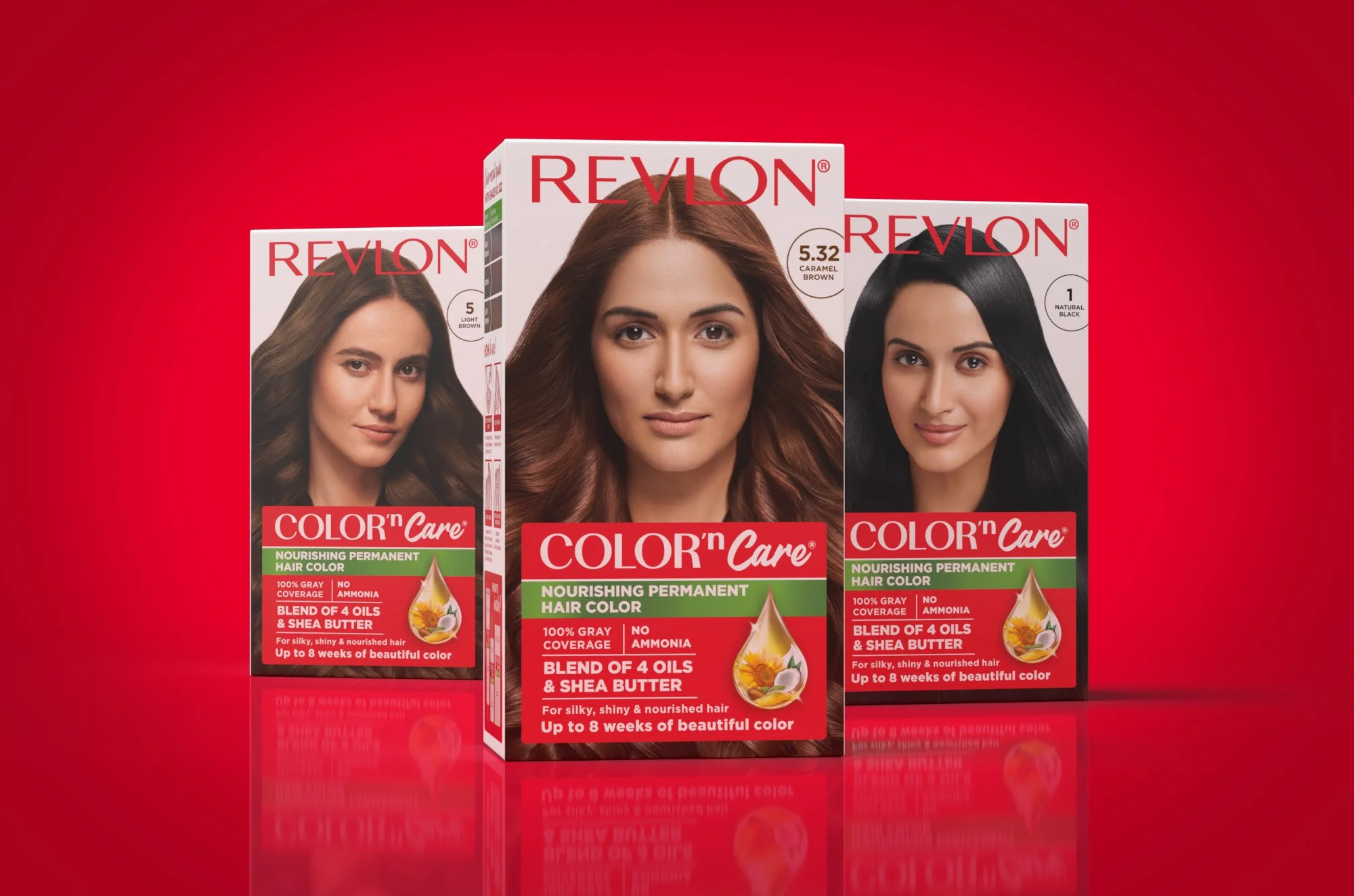
Wanted to develop user-centred design for their natural hair colour range packaging
Needed to highlight the natural ingredients alleviating concerns around harsh chemicals and hair-health, with a focus on ‘nourishment’
The Design
Elephant team started the exercise by decoding hair colour usage habits, cultural beliefs in efficacious natural ingredients and functional needs of information system in the category of hair colour.
The team then re-crafted the 'COLOR n Care' range identity to convey expertise as well as nourishing care for hair while maintaining the global template of Revlon.
Added easy-to-grasp information about usage, duration of application and accurate colour representation that would help users make informed decisions.
Prominent ownable elements like the nourishing ingredients drop mnemonic, accent of green to connote natural, talent shot with the Revlon confidence and a well-defined information system made the packaging appealing as well as user-friendly.
The Story
Revlon is a globally recognized cosmetics giant with a strong presence in the beauty industry. Established in 1932, the brand has a rich history and has successfully expanded its product offerings beyond lipsticks and shampoos. Revlon is celebrated for its wide range of beauty products, including foundations, mascaras, eyeshadows, nail polishes, and hair care items. The company has earned a reputation for its high-quality formulations, innovative technology, and trend-setting colours.
Revlon's reputation in India was primarily associated with lipsticks and shampoos, rather than hair colour, making it essential to shift the perception and increase their presence in the hair-colour market. Specifically, Revlon needed to position Colour N Care as the superior choice for women aged 30-40 that relied on other brands. The existing packaging appeared dated and failed to stand out among competitors, necessitating a comprehensive design revamp.
Global brands that seek to tap emerging markets like India are realizing the need to adapt and localise their offerings for a better market fit. This project proves the potency of localisation that suits their revamped formats and adds nuance, leading people to be more comfortable with international offerings that seem alien.
With that in mind, they approached the team at Elephant with a brief to create a modernized packaging design that would not only differentiate Revlon from its competitors but also alleviate customer concerns about chemicals and hair health, while capturing the attention of target customers and enabling quick purchase decisions off the shelves.

The Green Mile
To address the growing consumer preference for organically derived, nourishing products, we decided to infuse naturalness into the packaging design. The PD team embarked on a journey to revitalize Revlon's brand image in the hair-colour market. We started by revamping the Color’n Care logo, giving it a modernized look and incorporating a prominent green-metal strip. This green element aimed to signify naturalness and premiumness in one impactful swoop. The design also retained Revlon's signature red colour scheme for added brand recall.
The new packaging design followed a comprehensive approach to cater to customer needs and preferences. We focused on the sachet format, which is extremely popular in the Indian market. The sachet design was developed from scratch, integrating the revamped sub-brand logo and introducing a green band to highlight the product's naturalness and ingredient focus. To facilitate informed decisions, we added easy-to-grasp titbits on the sachets, providing information such as colour duration and a colour swatch. The colour variants were made easily distinguishable by incorporating differentiating features on the top and bottom strips of the sachet.

Hair Colour Primers: From Sachets to Cartons

The carton design was aligned with the sachet design to maintain a cohesive brand identity. It featured the revamped sub-brand logo and green band, while incorporating a brochure inside. The brochure, printed in 12 languages to cater to the diverse Indian landscape, used iconography to provide clear instructions and better understanding of how to use the product. It demystified the product for Indian audiences in the "under 200 Rs" price segment, which was a key target market for Revlon. The carton housed the cream, developer, and conditioner, with clear labelling for each component. The back of the packaging (BOP) provided detailed information about the product, highlighting the ingredients and their benefits. We also included a small guide to help consumers choose the right hair colour and added a realistic colour swatch result that accurately depicted the shade on the hair, easing the consumer choice.

The revamped packaging design for Revlon's Colour N Care hair colour range yielded positive results. The inclusion of natural and ingredient-focused elements successfully addressed customer concerns about chemicals and hair health, instilling confidence in the brand. The comprehensive brochure, with its multilingual instructions and clear information, contributed to demystifying the product for Indian customers.
Our collaboration with Revlon to revamp their Hair Colour packaging design proved to be a successful endeavour. By infusing a sense of naturalness and addressing customer concerns, we were able to position Revlon as a leading player in the Indian hair-colour market.