Sparx


The Focus
Design a distinctive retail experience for Sparx , an activewear brand that departs from the traditional "try-before-you-buy" model and embraces a unique "Try-Experience-Order" approach.
Attract young customers, encourage exploration and personalization, and foster a sense of community around the brand.
The Design
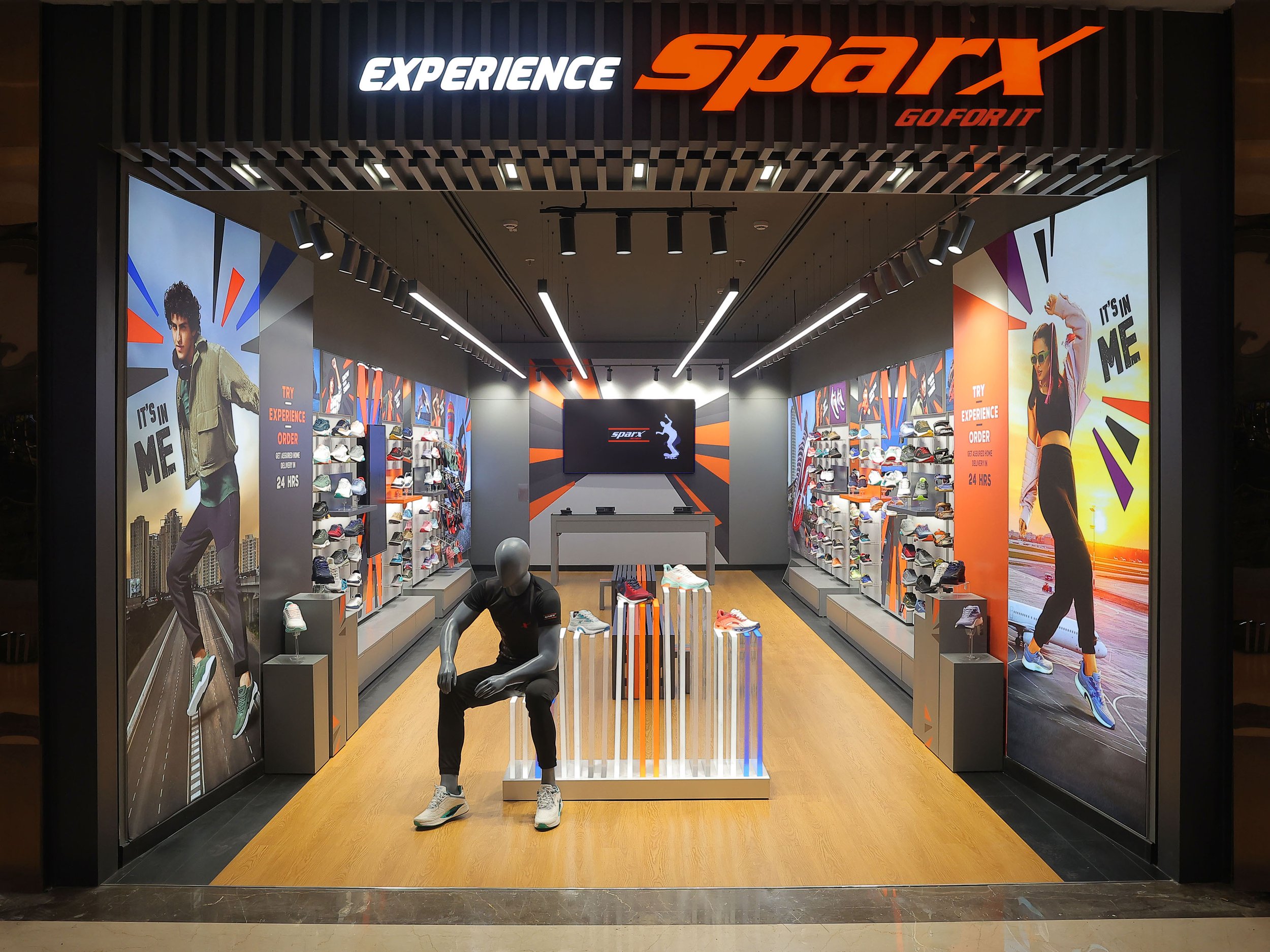
First, the ED team developed the store’s retail environment with the idea of designing a "Creation Hub" for Gen Z, very much inspired by the brand’s tagline, ‘It’s in me’: Open layout, funky colours, and a photo corner foster content creation, self-expression, and community.
The team also enabled a limitless shopping experience with easy navigation, digital product info, and tablets for browsing the full range beyond what was in the store to empower customers.
The store gave ample opportunities for consumers to create shareable moments while distinctly conveying the brand identity with elements like mirrors, a dynamic ceiling, and energy-infused theme create Instagrammable experiences that align with the brand's visual language.
The Story
Relaxo Footwears Limited, a household name in India, has dominated the footwear industry since its inception in 1984. Their diverse brand portfolio, including Sparx, Flite, and Bahamas, caters to a wide range of customer preferences, ensuring there's a perfect pair for everyone. With a robust network of distributors, retailers, and over 70000 exclusive brand outlets exceeding Relaxo ensures their footwear reaches every corner of India.
The footwear giant approached Team Elephant seeking a revolutionary retail experience for their youth-focused activewear brand, Sparx. The existing "try-before-you-buy" model needed an upgrade to resonate with the younger generation. Our mission was to design a store that fostered exploration, self-expression, and a sense of belonging.
Our team was commissioned to design a footwear retail space focusing on customer experience above all else. Purchases would be delivered to the intended customer at their chosen address, putting the onus on the in-store environment to truly engage and inspire. This freed us to explore innovative ways to heighten customer interaction with the brand.
The "Creation Hub"
We led with the concept of a “Creation Hub,” where the space is transformed into a launchpad for digital personas. This was very much inspired by the brand’s evocative tagline: “It’s in me”, which puts the users at the centre of their experience and challenges their perceptions of themselves, enabling them to put their best foot forward. We envisioned a haven where influencers, creators, and primarily Gen Z audiences ignite their creativity, crafting content that resonates and captivates. It's a space that inspires, empowers, and fuels the next big content wave. Here, our audiences are whoever they want to be without any judgements, or restrictions. More than just aspirational, it ignites a desire to belong.
Influencer Inspiration & Shareable Moments: The visual language captures the essence of influencer style and attitude, interwoven with playful elements like a dedicated photo corner (with tripod) and strategic mirrors – all designed to spark envy-worthy Instagram moments. Customers become the catalysts for the brand. They’re encouraged to explore the clean, minimal layout that’s studded with funky colours and vibrant imagery. The store makes them step away from the ‘marketplace of goods’, pure-retail mindset and revel in the brand’s experience more than anything else.
Minimally Grunge
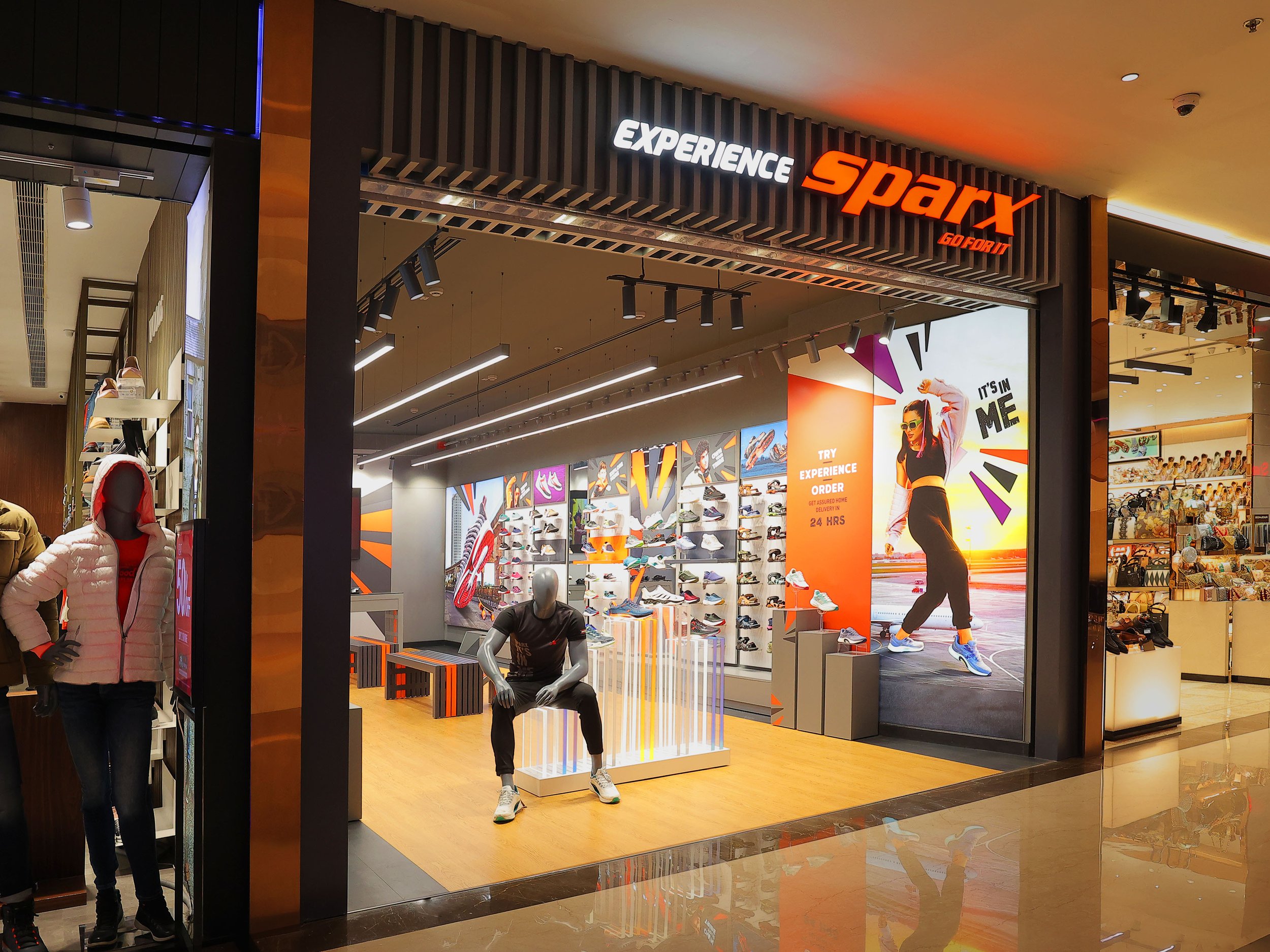
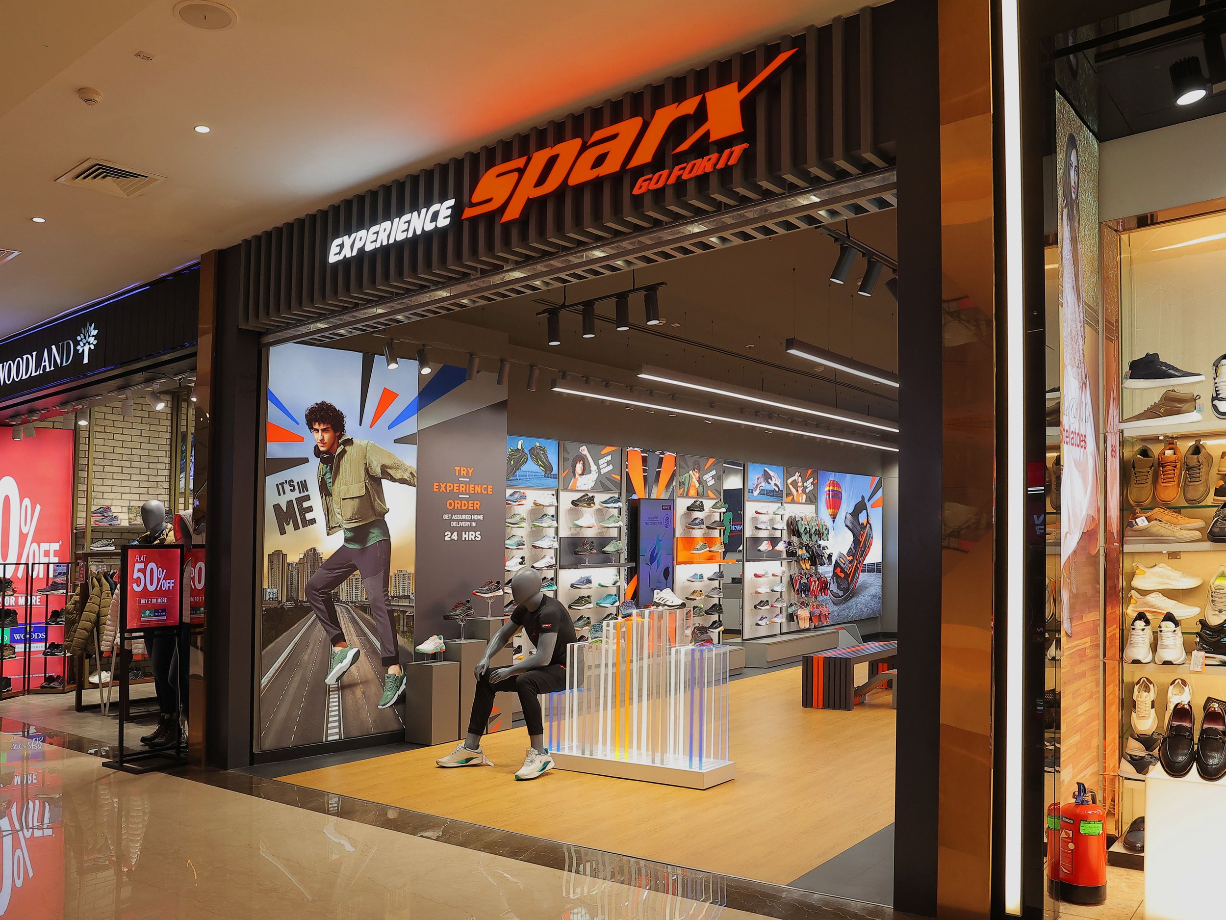
The layout is minimal and open. Multiple entrances allow the free-flow of consumer traffic. This fosters a welcoming atmosphere and encourages exploration.
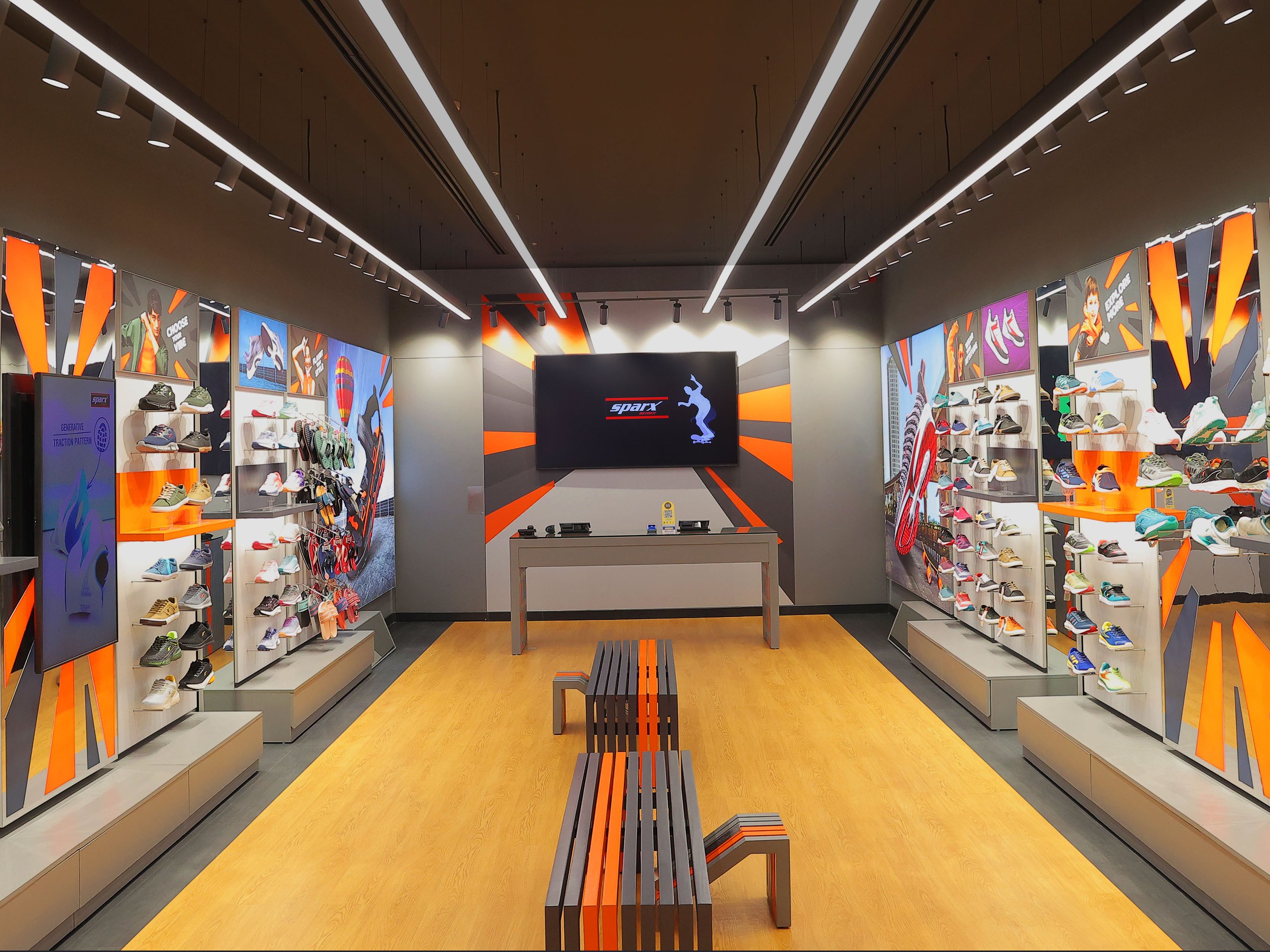
Numerous “sit-try-select” benches, fashioned in a grunge, bare-bones style and decorated in the signature brand colours line the central axis. These comfortable seating areas with footstools allow customers to relax and try on footwear at their leisure.
Curated merchandise is arranged neatly along the walls, opening up the space and giving customers a centralized view of what’s available. Each section is demarcated for easy browsing, interspersed with digital screens and full-length mirrors to break the monotony and provide additional product information.
The Cash Counter at the back is armed with tablets where customers can browse through the full assortment of brand products. This empowers them to explore additional options and complete purchases seamlessly. A brand wall, combined with a large digital screen affixed behind the counter displays promotional material and other interesting content, keeping customers engaged even at checkout.
A mirrored storeroom door doubles up as an instagrammable opportunity; and the storeroom occupies the very back for easy retrieval, inventory taking and stocking – unintrusive, and private. This maintains the clean aesthetic of the store while ensuring operational efficiency.
Positioned between the entrances, a mannequin and an acrylic lit Display Podium serve to draw attention to the store and its choicest offerings. This creates a visually impactful first impression and entices customers to enter.
Energy Infusion
Premium Base with Energy Infused: Our finalized visual language aligns with the brand’s steady stream of social media and other campaigns. Amidst a dynamic visual-graphical treatment, we use dark grey for that premium look-and-feel.
The central theme was “Energy,” where radiant, illuminated, zest-infused imagery is used to maximum effect. This energetic vibe resonates with the target audience and injects excitement into the shopping experience.
Conversational messaging accompanies every footwear category and subtly alludes to its use cases and experience. Aspirational, positive and inclusive are key tones associated with our chosen visual language and text graphics. This messaging not only informs customers but also creates a personal connection with the brand.
By focusing on customer experience above all else, Team Elephant successfully transformed the Sparx retail space into a dynamic "Creation Hub." This innovative approach empowers young customers to explore, express themselves, and connect with the brand on a deeper level, paving the way for a future filled with "Sparky" moments.


