The Focus
Redesigning Symphony’s flagship product in the residential segment – the Diet after ten years of top grossing sales
Introducing novelty and contemporariness in the product
Making changes by keeping many variables such as size or tank capabilities etc. because it would change product segment altogether
The Design
Completely revamped the old design while introducing greater capacity and other features, despite keeping the size intact
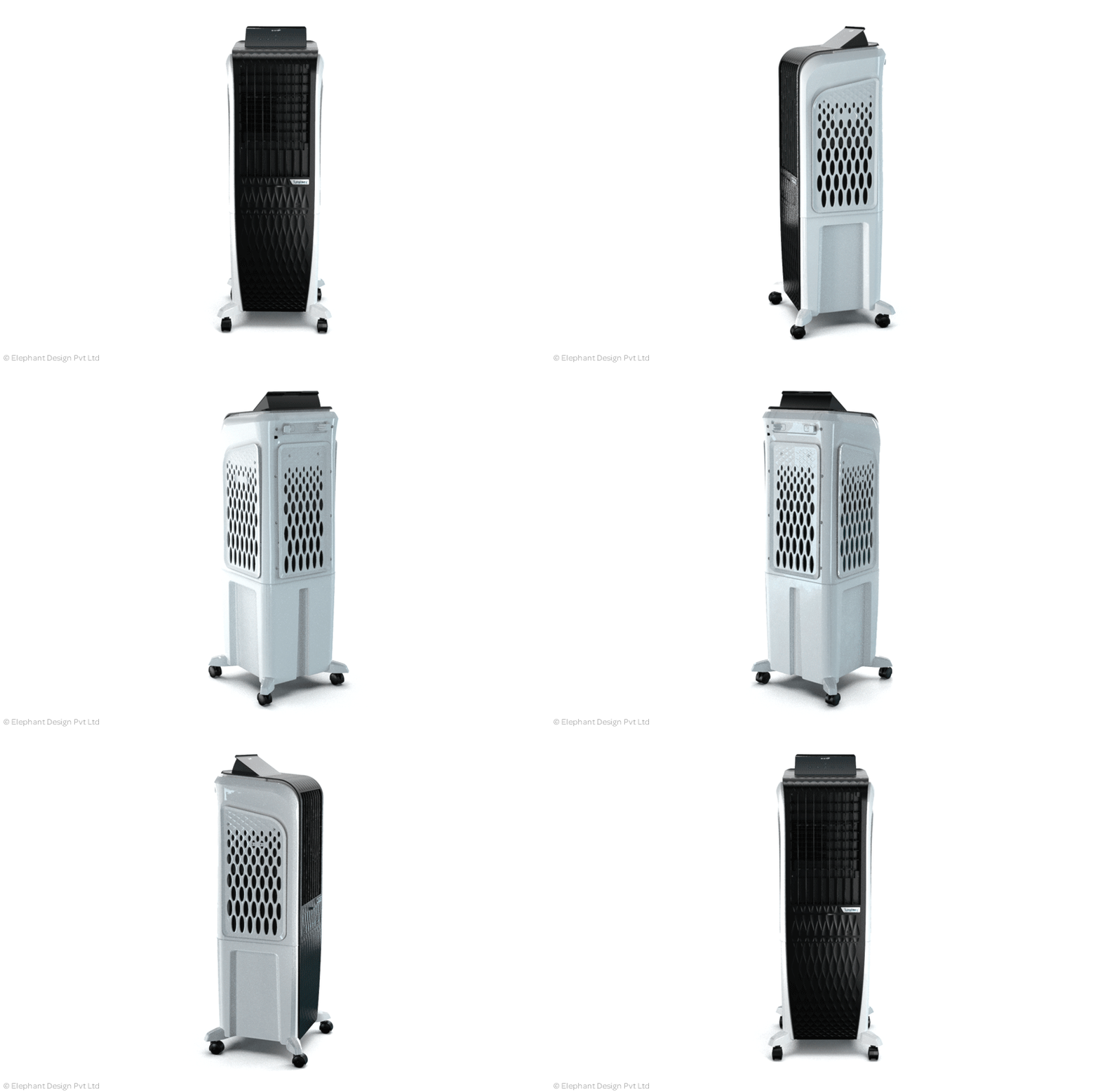
Aesthetic changes introduced the element of modernity and futurism, playing on textures and surfaces
Ensured that an entire range could be launched, keeping product varieties and changes in mind
The Story
The Symphony story ties in with Elephant’s growth as a company because we’ve enjoyed a continuous, long-standing association that goes back twenty-five years. We’ve had the honor, and the opportunity of designing all their products so far.
Ten years ago, we designed a cooler called the “Diet” – a 1x1 feet device that could snugly fit into the Indian middle-class household. Its ‘Cloud’ variant could even be wall-mounted. Both of these served as pioneers in their segment, because no other company had a cooler in this format at that point!
The rest, as they say, is history. While Symphony has grown enormously as a company, with several acquisitions to its name in different countries, the Diet remains its highest selling model – across segments, for the entire brand.
So, when Symphony approached Elephant to redesign this landmark product – we realized that this was going to be a welcome challenge for us to build upon pre-existing excellence. After all, why change something if it works? Why reinvent the wheel?
The answers to such seemingly complex questions are, of course, not that complex. In this case, it was simple: The product needed to be redefined because it simply lacked novelty after all these years!
However, it wasn’t that straightforward. We had to walk a tightrope because for one, the compactness could not be compromised. Nor could we take liberties with the air throw volume, or its superior cooling features that had succeeded in grabbing the attention of loyal and first-time customers. So, how did we go about doing it?
“So, when Symphony approached Elephant to redesign this landmark product – we realized that this was going to be a welcome challenge for us to build upon pre-existing excellence. After all, why change something if it works? Why reinvent the wheel?”
Breaking Constraints…with constraints
Making improvements to a top-selling product cannot be limited to making aesthetic changes – there need to be functional ones too. These were going to be the most difficult, given that we couldn’t change the product’s dimensions.
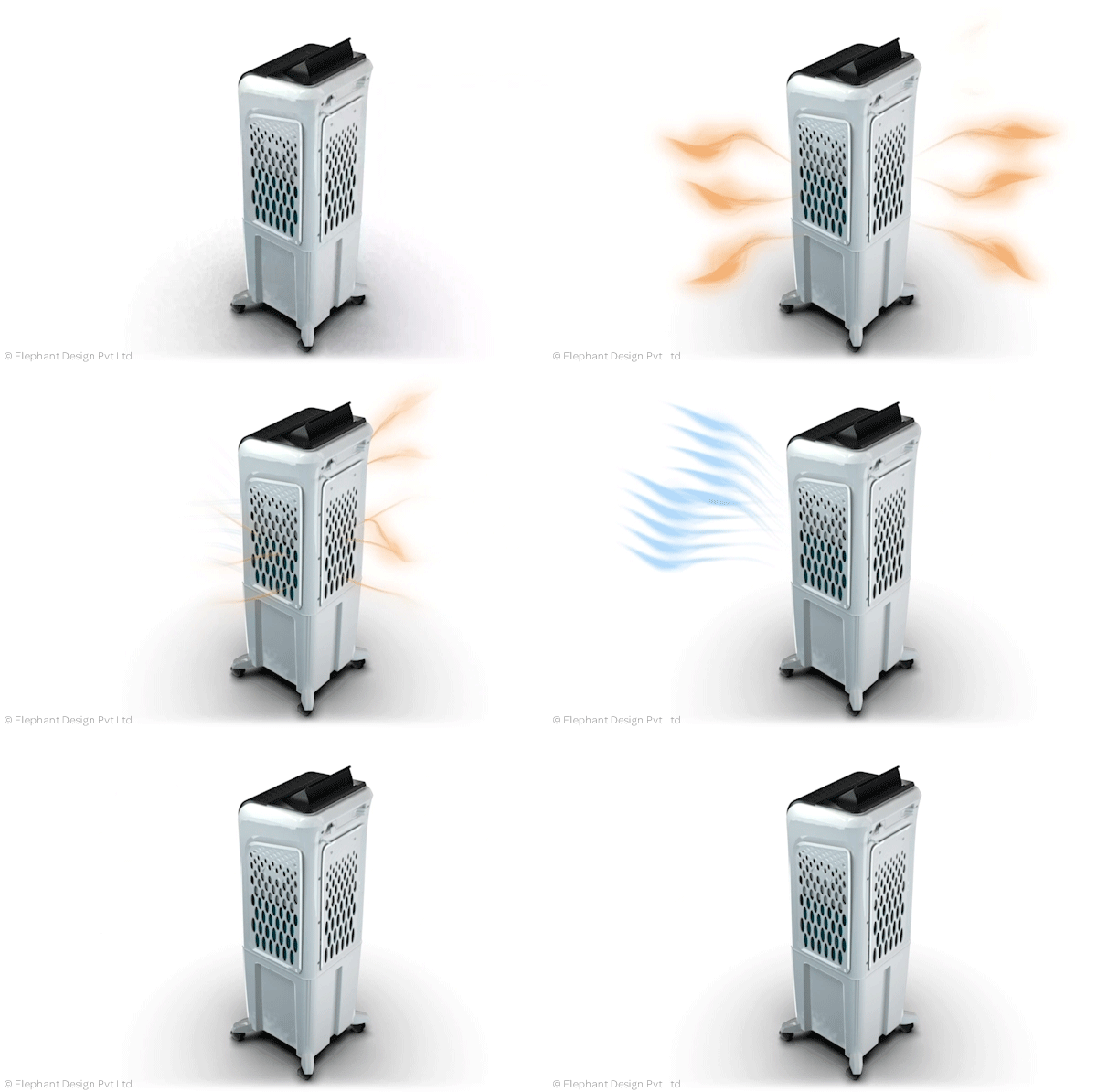
The first thing we did was increased the tank capacity within the same size. This boosted the product’s single-use longevity, as it would give more cooling in one refill.
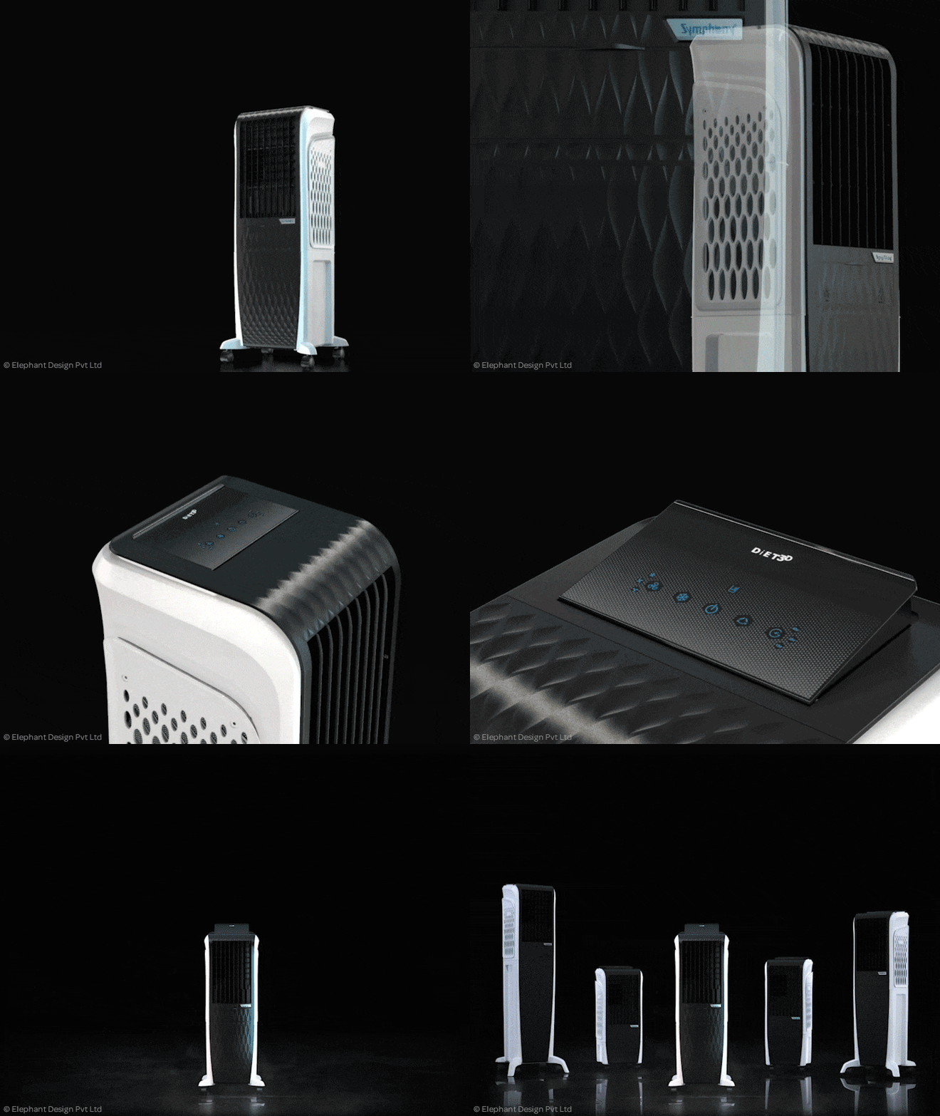
“The front has been cleaned up - an intricate pattern of petals that rest on yet other shapes in order to give it a futuristic look and feel. This is only more enhanced with glow highlights, floating panels and a pop-up control panel that contains an LCD screen.”
We also added more cooling pads in order to increase the cooling efficiency, again, adding to the single-use longevity of the product.
The diet is merely one product, but our experience with Symphony has stressed upon the fact that launching an entire range of products provides a much more significant advantage over potential competitors. Keeping this in mind, we accommodated for a full range of capacities to increase variants: the new Diet range extends from a minor 8 liters to 55 liters of capacity.
A Futuristic Flower in Bloom
Since a cooler is definitely eco-friendlier, and performs a naturalistic function of blowing cool breeze, we decided to extend the plant metaphor to the aesthetic design for the new Diet variant.
The centre was treated a flower bud, surrounded by petals rising up from the surrounding area – as indicated by the curved sides and panels in the new design. We also played on textures and surfaces in order to give enhance the futurism enabled by other design components.
The front has been cleaned up and the entire arrangement is involute – an intricate pattern of panels that rest on yet other shapes in order to give it a futuristic look and feel. This is only more enhanced with glow highlights, floating panels and a pop-up control panel that contains an LCD screen. The controls are, of course, customizable.
Last – but not the least, we incorporated new technology to replace the standard ice bricks/cubes that are normally used to make the airflow cooler – i.e. a gel pack.
“Perfection is achieved, not when there is nothing more to add, but when there is nothing left to take away.”
In Conclusion
The key takeaway for us, given our relationship to both the old and new products, was that we were definitely geared up for ingenuity. This was showcased by the team’s ability to provide a significant increase in functionality, given the constraints in size – while also being able to take bold experimental decisions when it came to aesthetic qualities in order to heighten the product’s ‘futuristic’ appeal.


