The Focus
Helping passengers seamlessly access Uber’s ride acquisition system outside Bangalore Airport
Streamlining passenger experience from the airport exit to the Uber Zone and in turn, making the Uber Zone more user-friendly
Enabling passenger flow, seamless pickups, though pin pointed solutions for both cab drivers as well as passengers
The Design
Elephant worked closely with Uber and the airport authorities to arrive at a comprehensive system to inform, educate and smoothly acquaint passengers with Uber’s app and its functions
The team identified key locations, tracing the journey of a passenger from the moment they alight, right up to the cab ride departure in order to place relevant signages, personnel and other interactive tools
Lastly, took care of several customer focused issues that were affecting the smooth experience of the Uber Zone so that riders are treated with care up to the last mile
The Story
If you are fortunate enough to own a smartphone in India, then having a cab at your beck and call has already become a reality. “Ubering” is very much a phenomenon in 2020, but people are quick to forget that it’s been only been 7 years since we had this indispensable luxury and Uber has now manifested into a mega digital tech platform that has a formidable global presence. The black logo has become ubiquitous.
“Uber and the Elephant team worked together in order to enhance consumer experience through a detailed service design offering while aiming to remedy existing problems. ”
The first Uber ride in India was in the tech-savvy environs of Bangalore. Thus, it should be no surprise that Uber also first tested the PIN system to cut wait times at airports. ‘Ride Zones’ for Uber and other ride-sharing companies already existed.
Uber and the Elephant team worked together to enhance rider experience through a detailed user research & service design offering while aiming to remedy existing problems.
A Hive of Micro-Issues
Uber operates as the alternative ride service in India. Indian consumers are also different from their tech-savvy peers of Silicon Valley. While the youth are well-versed with the app and its mechanics, middle-aged and older sections of the population still face considerable difficulty. India’s internet environment and social interactions also contain a higher level of unpredictability.
“While the youth are well-versed with the app and its mechanics, middle-aged and older sections of the population still face considerable difficulty. India’s internet environment and social interactions also contain a higher level of unpredictability.”
Keeping all these things in mind, the Uber Zone at Bangalore airport was swarmed with a hive of micro-issues that kept it from functioning optimally. One of the key pain points was that many passengers could not locate the Uber Zone from their point of arrival. Senior citizens faced a lot of issues since an airport can be daunting, with a lot of navigation points.
The second problem was acquainting people with the app, its features and the newly introduced PIN system. People also had problems when it came to choosing the type of cab that they wanted.
“Keeping all these things in mind, the Uber Zone at Bangalore airport was swarmed with a hive of customer comfort and clarity-centric issues that kept it from functioning optimally.”
The third problem related to the anxiety that comes with extended wait times due to shortage of cabs during peak hours. Customers were often confused about their cab arrival time and the Zone wasn’t equipped with amenities for a relaxed wait time.
Lastly, Uber’s on-ground presence was a concern since Uber personnel didn’t stand out as Uber representatives, and often wore civilian attire that made them undistinguishable from customers. This created both, a service-oriented issue and also limited the trust in brand Uber as it did not sport a standardized, visible front.
“The team at Elephant started off by conducting meticulous user research, focusing on the rider’s journey through the airport once they landed. The team identified several touchpoints where they could intervene with user focused solutions that could make the whole process smoother. ”
A Holistic Bouquet of Remedies
Guidance System
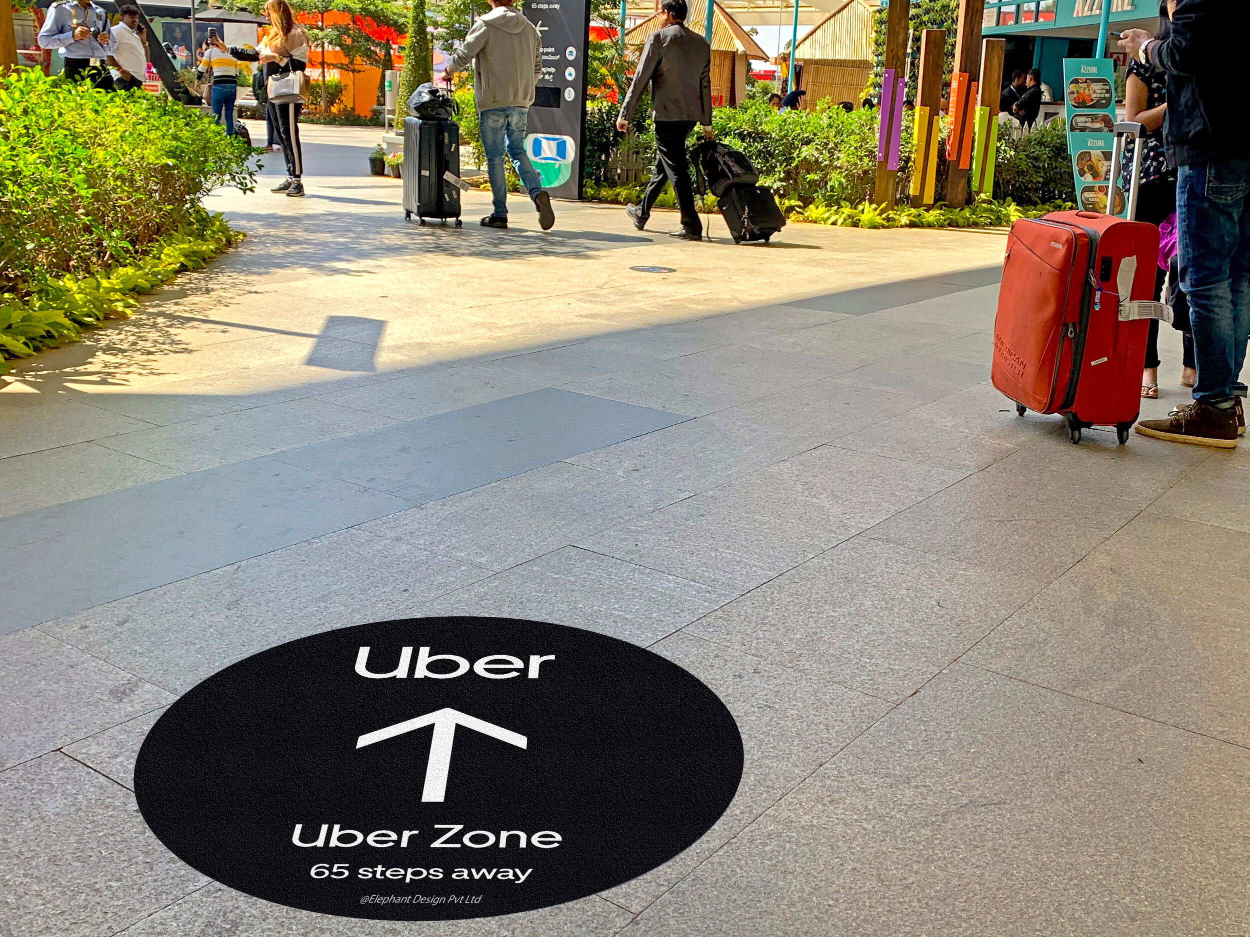
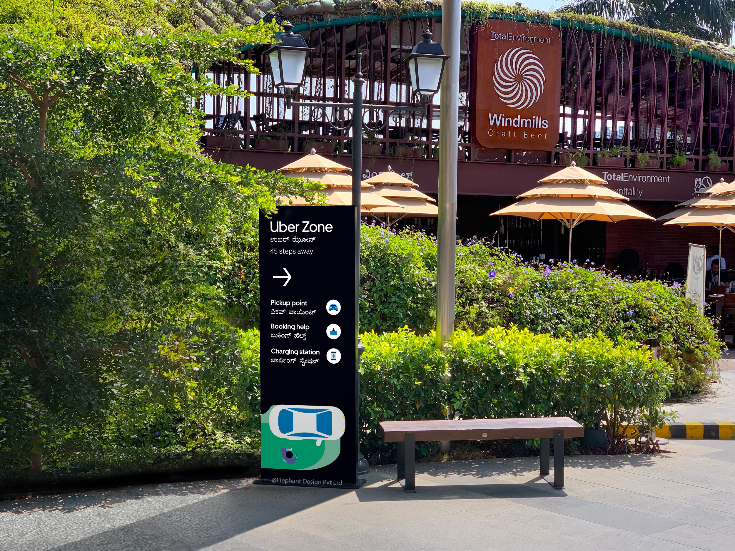
First, we designed a powerful system of communication devices and signages that guided passengers towards the Uber Zone. Floor-based communication was the primary tool used here with simple, targeted messaging that addressed basic questions for commuters, like: Where is the Uber Zone? How far is it? How do I book a ride? Is there a helpdesk? Where can I charge my phone?
We also included targeted communication to highlight other things like the availability of charging points, drinking water, booking help etc. in order to equip them with the essentials needed.
A large black archway with strong Uber branding and backlighting was added at the entrance of the zone to make it visible and easy to locate from a distance – whether it be day or night.
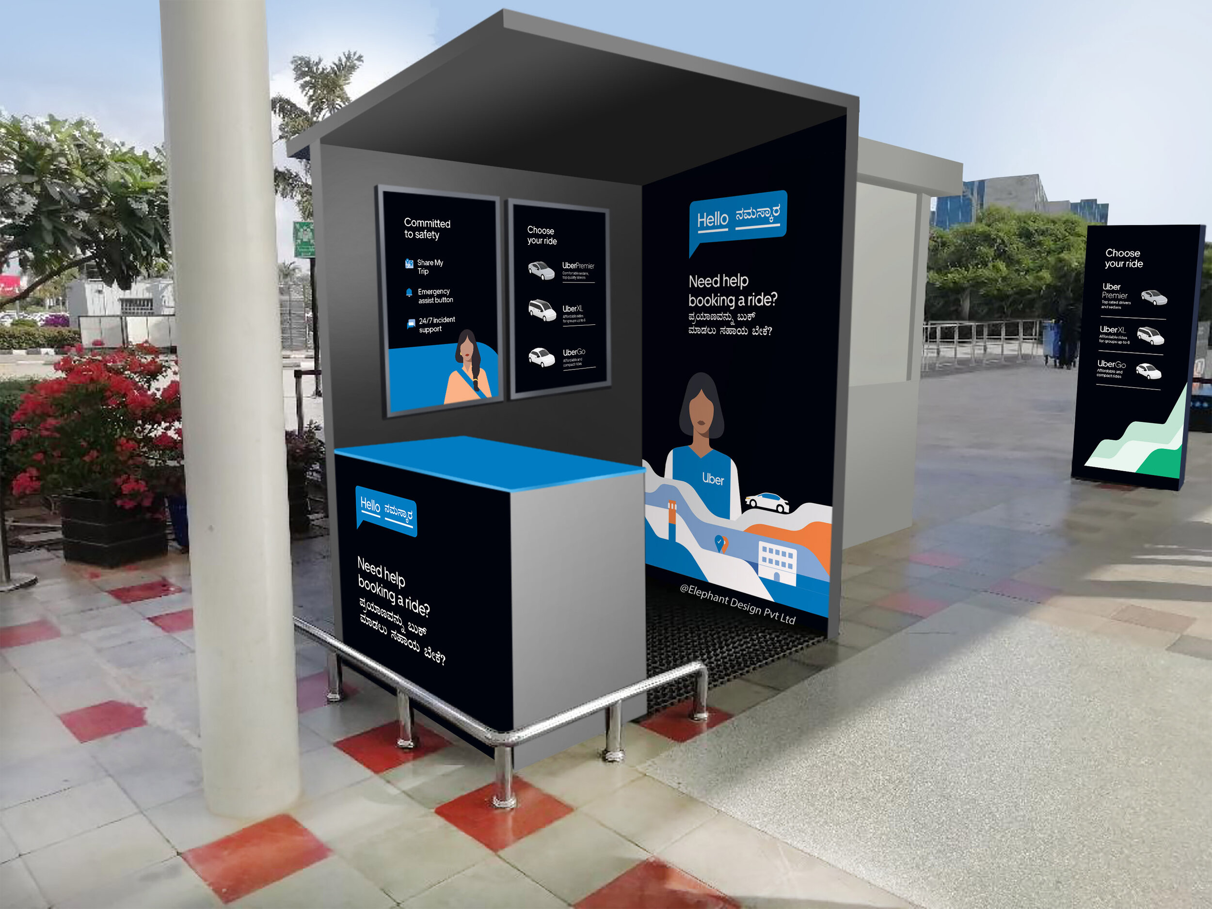
This system was augmented further by ensuring that Uber Personnel were also present at certain strategic touchpoints, in case the signages were missed. Alternatively, this also offered much-needed human interaction for help and guidance. To top it off, we provided branded Uber umbrellas in the event that it is sunny or it is raining as an added service feature.
Approachability
While an increase in the number of Uber Personnel was indeed welcome, finding ways to make them approachable was the next step. Elephant designed a uniform system that made the Uber personnel appear friendly, approachable and extremely easy to spot. Uber also ensured that the cab drivers underwent specialized training so that riders were put at ease.
“First, we designed a powerful system of communication devices and signages that guided passengers towards the Uber Zone. Floor-based communication was the primary tool used here with simple, targeted messaging that addressed basic questions for commuters, like: Where is the Uber Zone? How far is it? How do I book a ride? Is there a helpdesk? Where can I charge my phone?”
Sprucing up the Uber Zone
Information about the new PIN system was clearly displayed on signages at the entry itself. Personnel at the zone assisted clients if required. A designated booking kiosk was placed at the Zone entrance, functioning as the go-to spot for any kind of help.
Within the Uber Zone, we used systematic color codes to differentiate ride types: Yellow for UberGo, denoting agility and zippiness for the economical and quick option. Green, denoting community and spaciousness for UberXL, aimed at larger families with extra luggage. Purple, denoting luxury and choice, was chosen for Uber Premier, which would be ridden by those who desired an ultra-comfortable ride at an added cost.
A simplified visual language was created to harmonize with the Uber Black, with a distinct, recognizable style, encompassing an urban travel narrative.
Spaces within were also allotted according to the zone; the category that would see the most traffic would naturally have larger sitting areas, or queue management aisles and so on.
““To design is much more than simply to assemble, to order, or even to edit: it is to add value and meaning, to illuminate, to simplify, to clarify, to modify, to dignify, to dramatize, to persuade, and perhaps even to amuse. To design is to transform prose into poetry.””
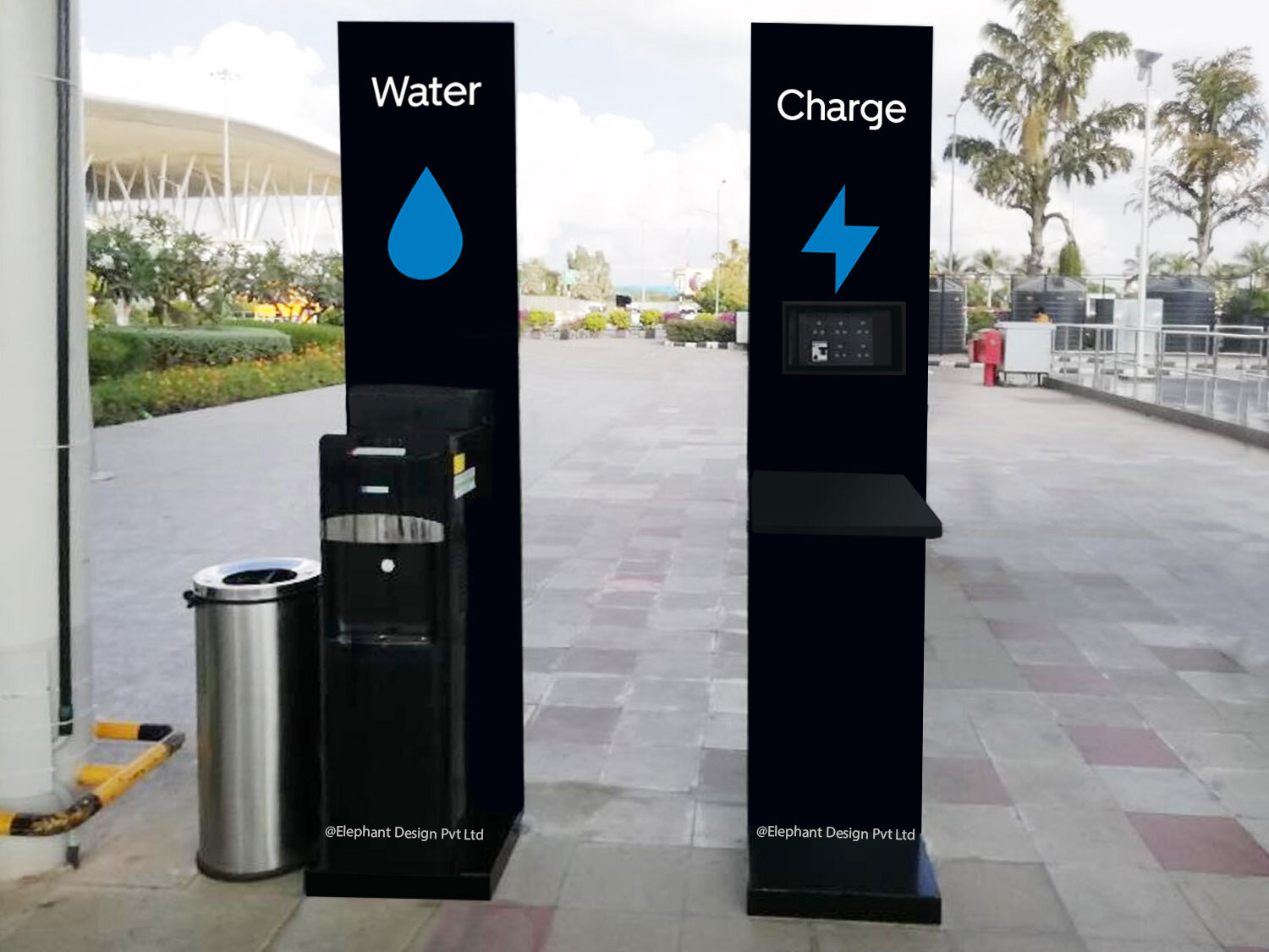
To remedy the issue of anxiety due to unnecessary waiting when cabs are in short supply – a Digital TV screen was added to clearly communicate wait times. Certain conveniences like the addition of a water dispenser, charging points, cushioned waiting seats etc. were added to ensure a relaxed & comfortable wait time.
For cab drivers, we decided to have another system of signages that could improve their speed and timeliness. These signages mounted on columns facing the driveway indicate exactly where the driver should stop, preventing confusion for the riders while also serving to declutter the area. Safety strip floor graphics at the boarding edge warn riders to stand behind the line as a safety measure.
Tertiary Troubleshooting
Lastly, to round off certain tertiary concerns faced by riders, Elephant added a host of other features to the mix. A special parking point for stray luggage trollies, was created to ensure better, uncluttered access for riders, to boarding areas. A key communication message was added to make women riders aware about emergency procedures and to provide them with a sense of safety & security during their last mile journey.
Independently branded Queue manager strips were provided for each product to ensure clear segregation and access. Premier Clients, we recommended using a portable charger, water and branded wet wipes as a premium service offering.
Lastly, we recommended that all CNG cabs must have an overhead carrier so that riders are not inconvenienced at the last minute due to insufficient boot space.
Elephant’s service design at the Uber Zone in Bangalore airport was met with a lot of positive feedback with steady, phasal development taking place. The same service is now being rolled out at other airports at New Delhi, Hyderabad and Calcutta. Our insistence on customer focused service indeed paid off, since the essence of on-demand experience is the prioritization of the customer’s need – and the Uber Zone is merely an extension of that very feeling!


