

The Focus
Asian Paints, the leading innovator in the Indian Paints industry decided to venture into the health and hygiene sector by launching a handwash brand
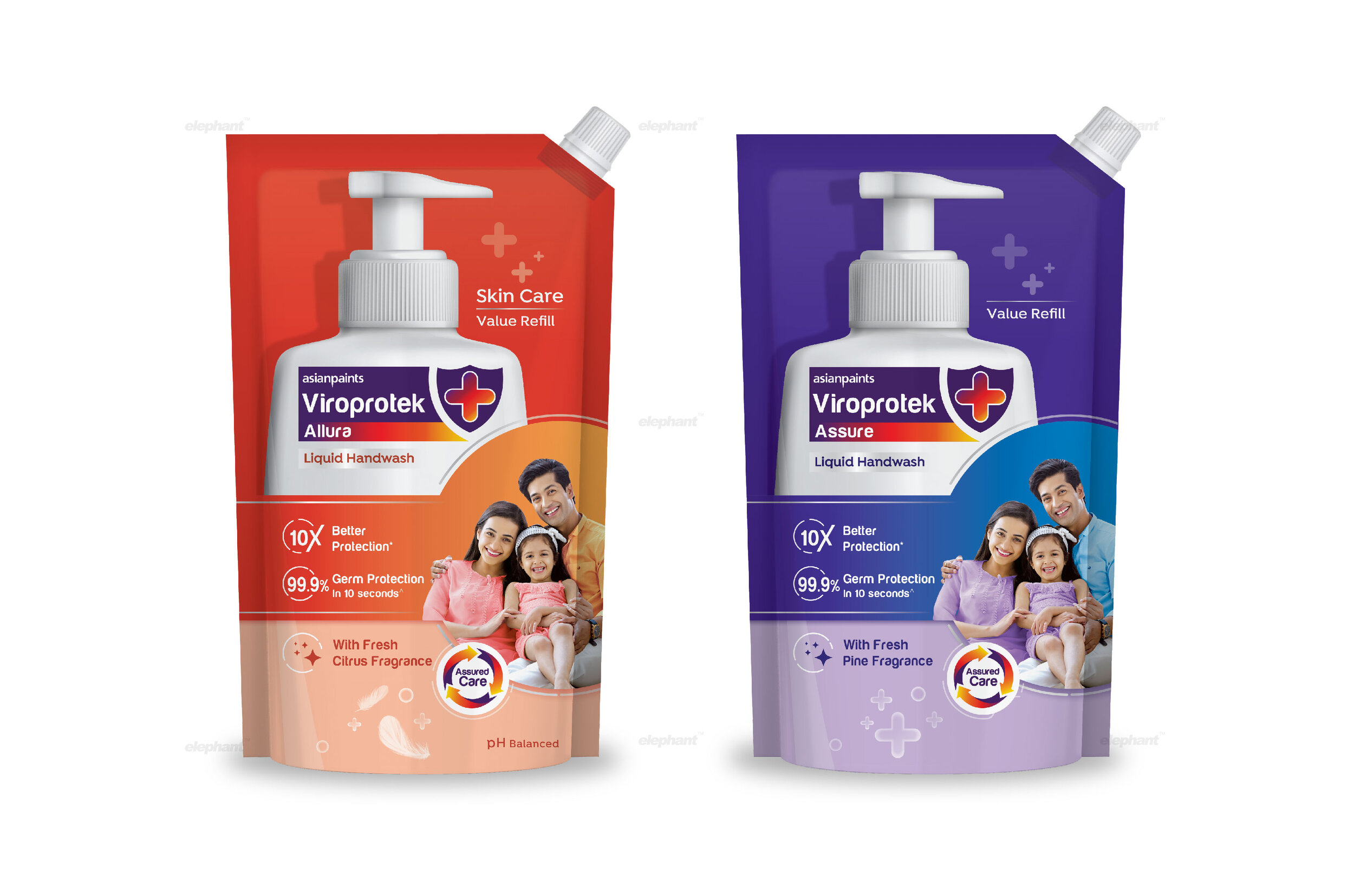
Focus on creating an unique packaging design system that would communicate key benefits while having a pragmatic, clean approach
Pack also needed to compete with several products within the entire Hygiene space, from soap to yet other germ-eliminating product
The Design
The team at Elephant designed a packaging system that strongly resonated with modern homemakers who combined traditional caregiving with the latest and most effective products
Innovation – a signature virtue for both Asian Paints and ourselves, was specifically focused on through the design language, in tandem with brand trust
The Germ-kill feature was given special attention, with advanced, expert protection being the defining theme conveyed via design elements

The Story
Asian Paints needs little to no introduction in India, given its iconic status as THE go-to provider for all commodities to do with paint. This long and continuous rise all the way since 1942 is not simply a testament to some kind of resilience. It is the spirit to constantly innovate and stay well ahead of the competition, both homegrown and abroad, that has now created an immense gap between them and any other paint company in India, bar none.
This innovation stems from a willingness to analyze changing market scenarios and subsequently, adapt the latest tools and technology without hesitation. The same goes for diversifying product portfolios and anticipating current trends and needs. Venturing into alternative areas has been their modus operandi as was witnessed with their forays into home décor and adhesives. This is where their Viroprotek range comes in.
The pandemic has made it clear that it is here to stay in some form or another. Even if it were to be eradicated in a flash tomorrow, the emphasis on general hygiene and wellness is never going to take a back seat again. With the intent of entering the ‘health and hygiene’ space, Asian Paints launched a range of products under the ‘Viroprotek’ label and the latest extension to this range has been a handwash.
They approached the team at Elephant so that we could craft a unique packaging design system for the handwash that enabled differentiation on the shelf while succinctly conveying key propositions without too much ornamentation. Lastly, the Asian Paints DNA also had to be integrated in this range, connecting it to a larger legacy of innovation while enabling instant consumer connect and trust.
“They approached the team at Elephant so that we could craft a unique packaging design system for the handwash that enabled differentiation on the shelf while succinctly conveying key propositions, while highlighting their DNA of innovation ”
Custodians of Safety
The coronavirus has vastly underscored the value of our home environments and turned them into sanctuaries. While some people have undergone a mindset shift in the way in which they perceive routine and purpose, securing one’s home with every possible resource is now the need of the hour. Homemakers, in particular, have turned into custodians who now take charge of safety, wellness and hygiene on a whole other level, ensuring that the family – from the old to the young – remains hale
and hearty.
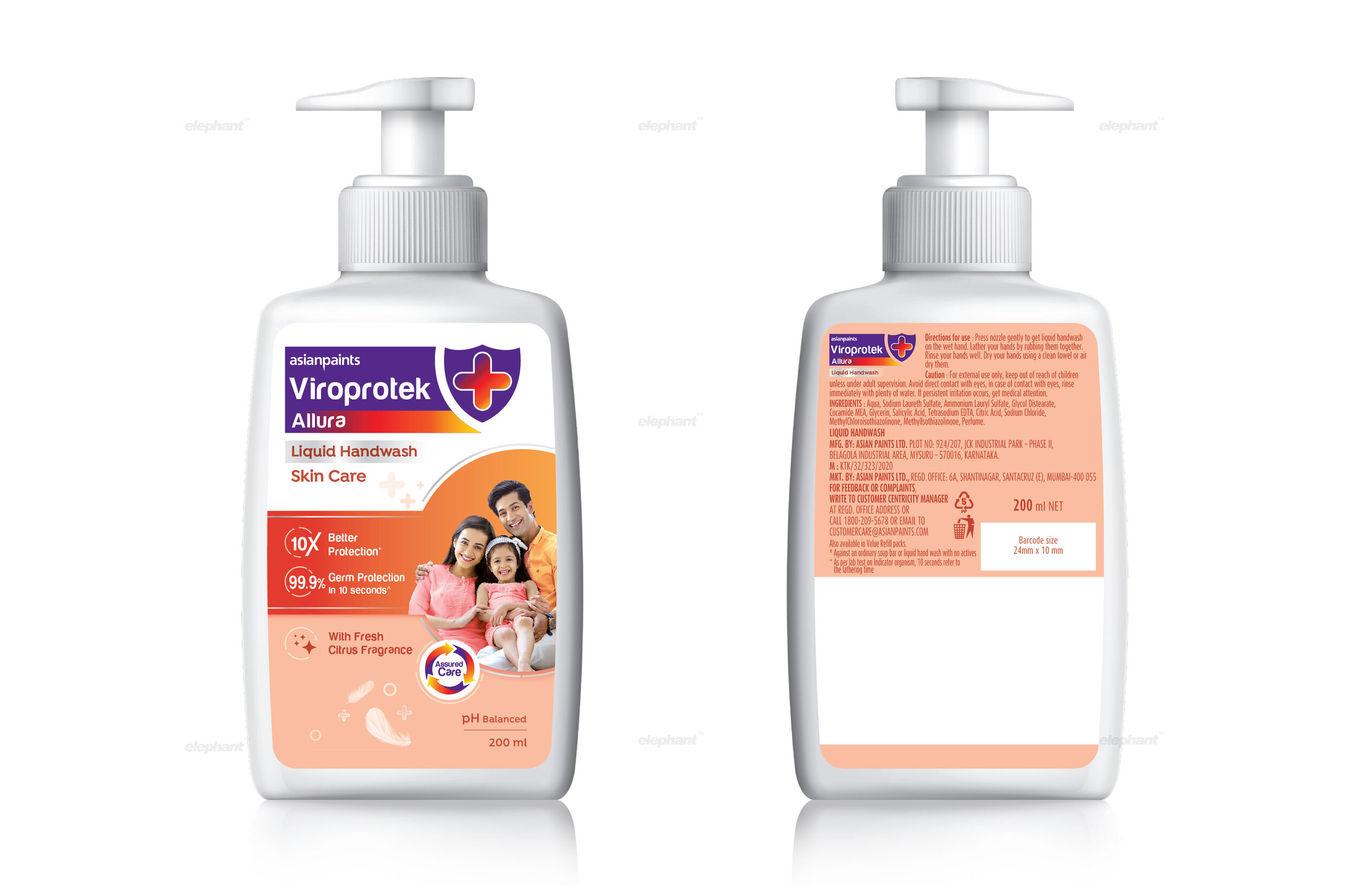
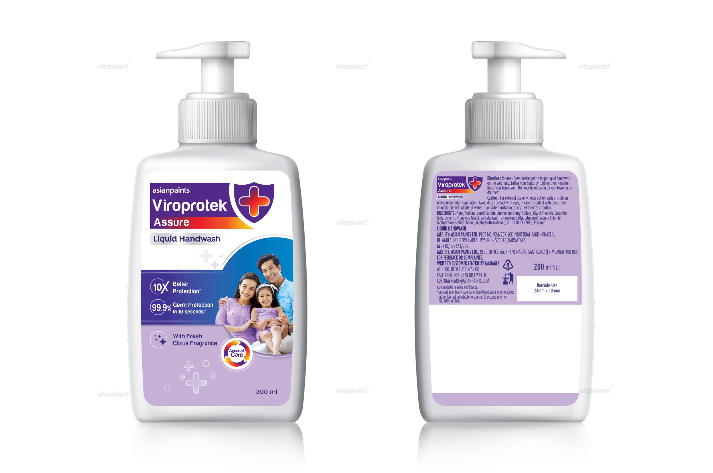
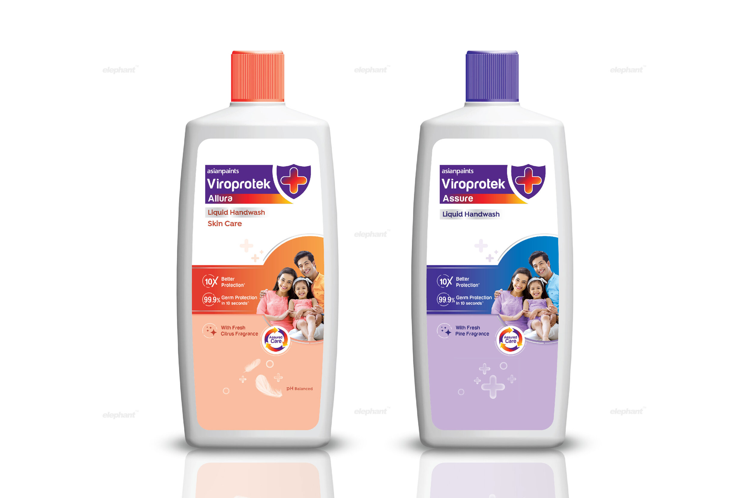
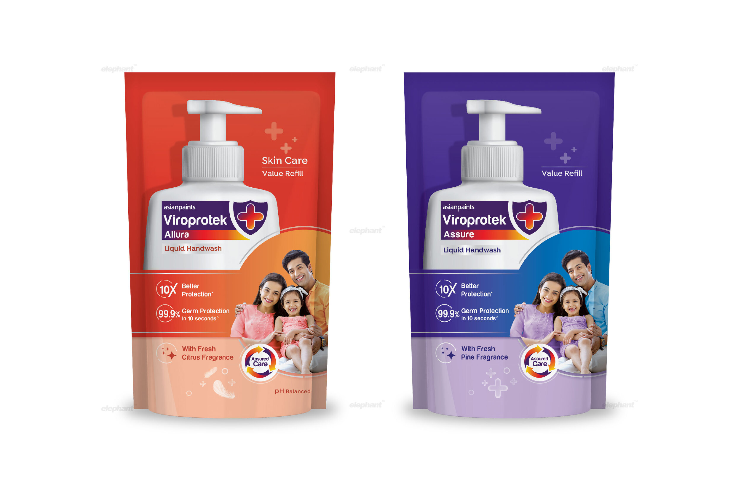
“Wellness, here, is shown through targeted imagery that provokes instant connection – the shield, which is also part of the logo itself, in addition to showing key propositions where it emerges as an effective protector. Its germ-killing capabilities are highlighted by adding a time factor.”
This family unit, hence, takes a center stage in our team’s packaging design where the depictions of them being completely enveloped by Viroprotek’s safeguarding effect is clearly visible. Beyond that, they exude comfort and confidence, signaling the transformative impact of adopting Viroprotek.

Expertise-Driven Protection
How do brands bring about this feeling of safety and security when it comes to hygiene? The number of approaches is pretty vast. There are brands that focus on the ‘wellness’ element with a holistic approach that brings about a feeling of long-term
self-care. Then there are those that position themselves as distant yet cutting-edge solution providers to all kinds of
health-care concerns.
“The colors for the logo and the surrounding collateral have been inspired by the brand, especially the ‘spectrum’ style multicolored element that contains the specific product name. Key messaging, like “Assured Care” and the colors surrounding it are also a strong allusion to the Asian Paints visual language. ”
Elephant chose a nuanced approach amidst all of these, opting to showcase Viroprotek’s efficacy by establishing expertise. Wellness, here, is shown through targeted imagery that provokes instant connection – the shield, which is also part of the logo itself, in addition to showing key propositions where it emerges as an effective protector. Its germ-killing capabilities are highlighted by adding a time factor (10 seconds). The pump bottle, which is the image embedded in the popular imagination especially after corona, is also a core part of the packaging layout.
The use of white heightens the expert cues, while interspersing them with silver enhances its premium feel. There is ample scope for additional variants apart from the current two, making it adaptive. All in all, the product deviates from fanciful imagery and brings in more functional cues instead.
The Asian Paints Touch
With a penchant for innovation and a long legacy that echoes stability and growth in tandem with the growth of the Indian nation-state, the fact that Viroprotek does come from the house of Asian Paints needed to be seen.
““Make it simple, but significant.”
The colors for the logo and the surrounding collateral have been inspired by the brand, especially the ‘spectrum’ style multicolored element that contains the specific product name. Key messaging, like “Assured Care” and the colors surrounding it are also a strong allusion to the Asian Paints visual language. All in all, the overall range now encapsulates Asian Paints’ penchant for innovative, future-forward products while enhancing its functional nature, backed by a scientific temperament that reassures its target audience in an effective manner while being clearly distinguishable on the shelf.