The Focus
Future Group wanted to create a brand identity for Voom, which encapsulated a new range of fabric care products
Needed to deviate from the general category codes of detergents being utilized for potent stain removal and basic usage
Packaging and brand perception had to be linked to a new, additional value being derived from fabric care
The Design
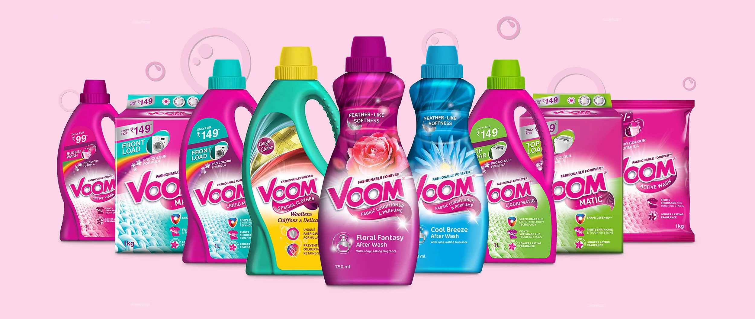
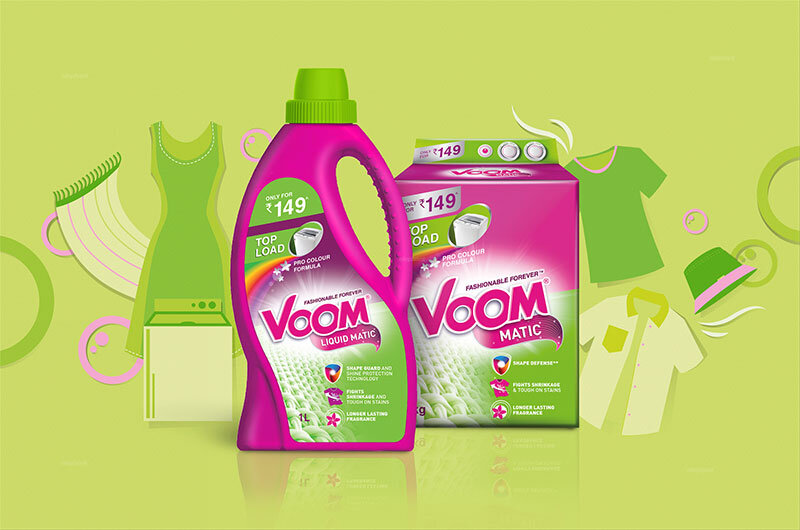
The team at Elephant developed a brand identity that reexamined the connection between clothes and lifestyle at various key moments
Vibrancy, optimistic energy and cues of being fashion-forward were given precedence while the world of stain removal and utility took a backseat
Overall, the identity for the entire range was consistent and playful, while also retaining enough cues to indicate its belonging to the fabric care category
The Story
The fabric care market is one of the most lucrative segments in the Indian economy, with immense potential and a CAGR of more than 13%. While it is dominated by big players, there are certain niche loopholes that can still be utilized by newer players – which is what the FMCG giant, Future Consumer Limited, thought it could do.
“Future Group approached the team at Elephant to design a comprehensive brand identity for their new brand in the fabric care market. An entirely fresh approach towards fabric care was to be at the heart of the new brand identity and subsequent collateral, like the packaging system”
In 2019, they declared that they would be entering the market with a whole new brand that would encapsulate products across multiple formats – liquids, powdered detergents and bars too, under the brand name “Voom.” This would be a highly specialized brand which offers more premium options to the everyday consumer.
With that, Future Group approached the team at Elephant to design a comprehensive brand identity for Voom. They had understood that the category was usually rife with what other established players had established as a norm. As a result, they wanted an entirely fresh approach towards fabric care to be at the heart of the new brand identity and subsequent collateral, like the packaging system.
Conventional Cues
The history of communication when it comes to brands in the fabric care industry is an interesting one. The team took a deep dive and came across trends in style, messaging and core propositions. Most of the big players had earlier focused on the ‘sparkling white/clean’ effect that their products would deliver, given the association of clean, sparkling clothes with class and aspiration. In tandem, since the buyers were mostly housewives on a typically limited budget, ‘value for money’ needed to also be incorporated where the detergent gives a bang for their buck when it comes to sheer efficacy.
“Most of the big players had earlier focused on the ‘sparkling white/clean’ effect that their products would deliver, given the association of clean, sparkling clothes with class and aspiration. We needed to majorly deviate from these cues”
The trend from purely functional cues to other intersections of life where fabric care may matter was exhibited by some players like Surf, with its “Daag Acche Hain” (Stains are Good) campaign that played on the nostalgia of childhood; or “Mann ka Mail” (The dirt of the mind) campaign by Ghadi, which plays on social stigma and ills also being washed away.
With these additional associations giving brands brownie points when it came to brand recall and sentiment, our team decided to go one step further and examine what clothing itself means to consumers today.
Clothes maketh the Man
While an archaic phrase, the significance of ‘clothes maketh the man’ is not entirely lost today. While earlier, there was a way in which clothes indicated hierarchies that seemed black and white, today, they are more about emotional exploration, one’s mood and largely, play on the fact that a certain ‘fashion-consciousness' has developed in the minds of the general populace.
Since we also live in a world where we have broadcasting abilities at our fingertips with the arrival of smartphones, clothes have become important catalysts of emotions. You are seen and perceived by many people every day, unfettered by geographic constraints.
“We examine the core element of fashion-forwardness, where the days of clothes being utility items are long gone. Fashion and its numerous seasons, trends and movements – all ensure that clothing is much, much more and this is where we decided to situate Voom’s appeal and brand identity”
Since we curate a version of ourselves on social media too, clothes become essential to that curation. More importantly, this brings forth the core element of fashion-forwardness, where the days of clothes being utility items are long gone. Fashion and its numerous seasons, trends and movements – all ensure that clothing is much, much more and this is where we decided to situate Voom’s appeal and brand identity.
With Voom, gone are the days of beating clothes into submission, or fighting a grand war against evil stains. Now, clothes are more vibrant, require special care and whiteness is not the marker of performance – gentleness is! Voom encapsulates that feeling of ‘taking care’ of one’s clothes, who in turn take care of our joyous, vibrant personas when we need them to.
Vibrancy Galore
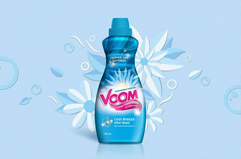
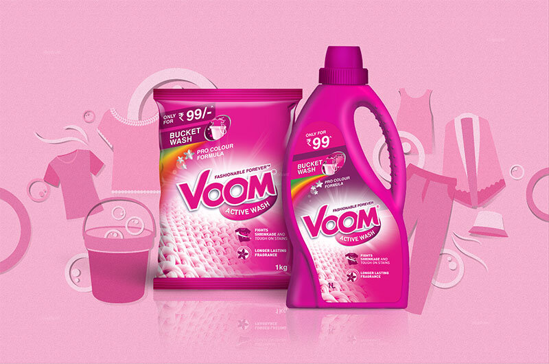
As a result, the design language and cues can be seen following this grand theme. Voom’s branding does not possess your typical blues and whites, but rather, utilizes richer shades of pink and green. The packaging system clearly illustrates the detergent’s propositions: here, benefits don’t focus on stain removal, but on advanced technology and special formulae that preserve the vibrancy of colors, the breathability of the fabric – all to keep it as new as it was the day you purchased it, because your personal brand of fashion should remain forever fresh.
““The alternative to good design is always bad design. There is no such thing as no design” ”
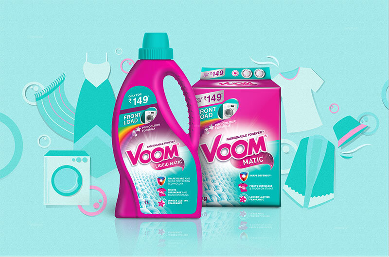
Our team retained certain other codes for immediate recall and association of Voom with the larger world of fabric care – for instance, the detergent powder carton is in the shape of a washing machine, or greenish-blue being used for super-specialized products within the category. The careful use of colors within the original palette, as well as in the packaging, makes it into a comprehensive system.
Overall, the identity is constant, vibrant, playful, while showcasing a certain amount of glow that makes it belong to the category to begin with while the changing colors on the caps indicate different variants, which makes the variety of products easy to navigate for consumers.

