The Focus
WellBe Foods by Sowparnika Retail, a brand of foods with no nasties was received well in a short span by the health & wellness enthusiasts.
Desired to expand its presence in the market, with a well thought out architecture, relevant messaging and good design. This necessitated a revamp.
Approached the Team Elephant for revamping the entire portfolio: architecture, visual identity and packaging system that would help differentiate their offerings on the shelf and appeal to health-conscious millennials.
The Design
The team at Elephant enhanced WellBe’s visual identity with a cleaner & refined look, associating with light, airy natural elements that resonated with the promise
Avoided the use of cliched colours and opted for a diverse palette with subdued beige at the core and vibrant colours as a top layer, unifying and yet differentiating diverse product categories across a wide portfolio
Most importantly, the team fleshed out WellBe’s “Zero Story”, where the focus is on the ‘absence’ of nasties that are typically found in snacks, resulting in a successful revamp that would help WellBe carve out its own appeal in a competitive landscape
The Story
Established in 2014, Sowparnika Retail has become a major player in the organic foods. WellBe Foods comes under their umbrella brand ‘Organic World’ and is their entry into the healthy snacking category. While there are many brands under their umbrella, WellBe Foods found higher appeal with the core audience. Their offerings range from staples to snacks and honey, all without harmful preservatives or additives that are otherwise the norm – without compromising on the tempting taste.
The WellBe team approached Elephant with a proposal to refresh their brand. WellBe had its own private labels for various food products, including jams, honey, breakfast cereals, and more. With the growing trend of health-conscious consumers, the brand saw an opportunity to expand its presence in the market and wanted to revamp its brand architecture, visual identity and packaging system to appeal to a wider audience.
While the existing identity worked at the base level, there was an opportunity to enhance the brand promise through modern, minimal treatment to the logo. The existing identity’s interlocking elements could not be easily discerned on the shelf, and the colour palette was too varied for cohesiveness. Given that the brand had an extremely varied array of products, the system needed to showcase the strengths of each product category while also being homogenous. For example, savoury Indian snacks had entirely different category codes as compared to cereals, or energy bars. Uniting all of them under one identity was a primary challenge.
Elephant team recognized the need for a brand refresh that would address all these concerns and make WellBe more visually appealing and distinctive.
Minimally Down-To-Earth
The scope of work included visual identity design, portfolio architecture and a comprehensive packaging system. The team removed the logo enclosure and focused on creating smooth, rounded interlocking elements inspired by leaves. These new elements were clean, light, and natural in their appearance. Simultaneously, they gave equal weightage to the font, ensuring a great visibility & recall to the logo.
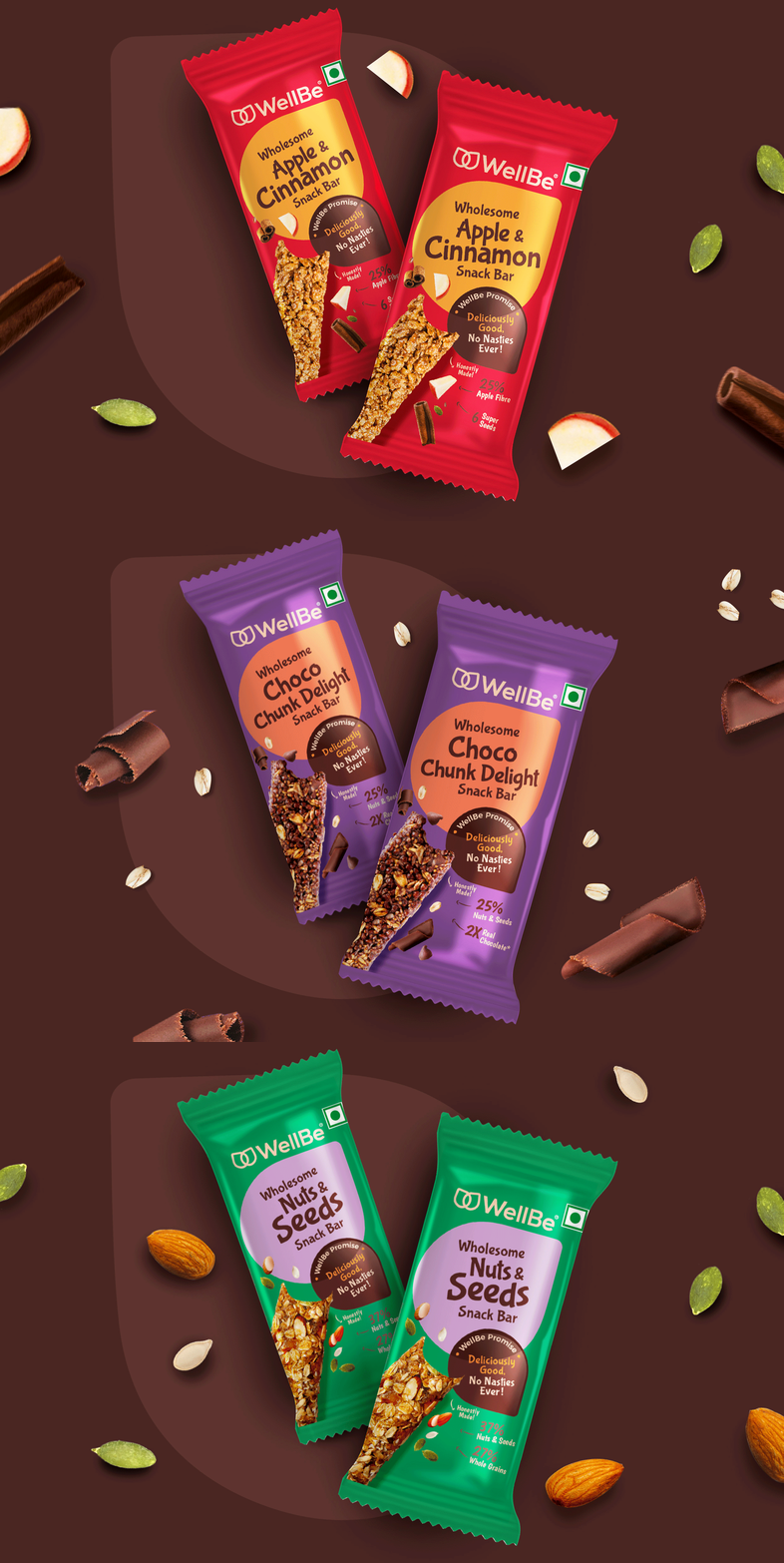
In developing the packaging system, Elephant Design carefully considered the unique characteristics of each product category. For the breakfast cereals, they opted for a beige colour palette that evoked a daylight, morning feel. They deliberately avoided the conventional "earthy brown" associated with organic brands, creating a distinct visual identity. The energy bars, on the other hand, adopted colours derived from the flavour variants, such as red and gold for Apple Cinnamon.
Zero-Tolerance Policy
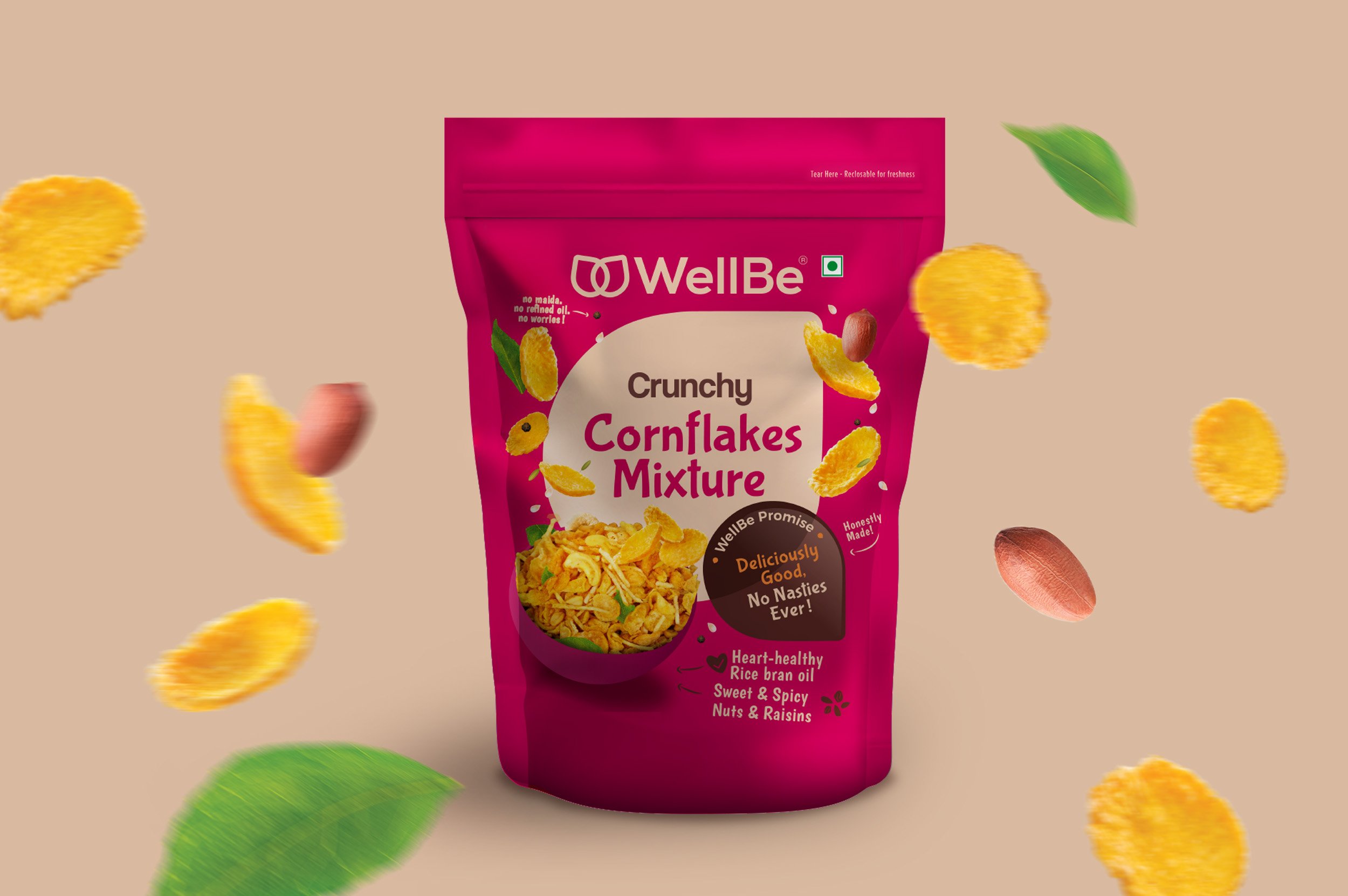
To capture the essence of snacks, Elephant Design selected a vibrant colour palette, with the inner leaf element becoming the brand colour. This consistent design element tied the packaging system together, ensuring a cohesive and recognizable brand identity across all product categories. One common feature on all packaging was the "Zero story" concept, highlighting the absence of harmful ingredients. The product-specific details, such as the "goodness check," were displayed on the back of the pack, reinforcing the brand's promises to consumers.
The team opted for dynamic product shots that appealed to younger audiences, while maintaining an ingredient-focused treatment. By enlarging the product images, consumers could observe the texture and colour in greater detail, making the products even more enticing. Authentic drool-worthy images were used throughout the portfolio to create a consistent taste appeal.
Turn over a new Leaf
One of the key challenges was to establish a cohesive system across different product categories. The team recognized that each category had its own unique nature, requiring a tailored approach. By using a “twin-leaf” treatment, combining a brown leaf element with a category-specific leaf element, the team unified the brand elements while accommodating product variants. This flexible and free-flowing approach allowed for a holistic representation of the complete WellBe product portfolio, as opposed to a restrictive system that would limit flexibility and differentiation.
The packaging system was carefully adapted to cater to both e-commerce and physical shelves. Dynamic colours were chosen to ensure the products stood out on screens, addressing the lack of contrast in the previous packaging. Elephant Design successfully achieved a balance between visual appeal and practicality, making the packaging visually striking and shelf friendly.
Elephant Design's work for WellBe demonstrates their expertise in revamping a brand's visual identity and developing an extensive packaging system. The refreshed visual identity successfully modernized the brand, resolving issues related to clutter, colour, and recognition. The packaging system not only harmonized the brand elements but also embraced the unique characteristics of each product category. WellBe is now well-positioned to make a strong impact in their space and expand its market presence, captivating health-conscious consumers with its appealing and distinctive new look.


