

The Design
The team at Elephant developed a paradoxical name for the brand: Wicked Gud, which worked on strong connotations of taste (wicked, junky food) and playful nourishment (It’s good for you!)
The packaging design system echoed this transformative, playful nature of the brand – replete with neons and unconventional elements that deviated from category norms
The visual identity was received extremely well given its interactivity and offbeat attitude while being confirmed for other product ranges
The Focus
A group of serial entrepreneurs decided to venture into the food staples category with a new offering that would focus on nourishment amidst a world of carb-filled indulgences
Desired a brand name, visual identity and packaging system for a range of staples (pasta, noodles) that provided both nutrition and taste without compromising on either front
The goals for the brand were to distinguish their products on the shelf and in the consumer’s mind, needing something unique in a market dominated by established players
The Story

With their initial success at a premium beverage venture, a group of serial entrepreneurs set their sights on developing a new range of products in the nutritious food staples category. Primarily driven by taste and pricing for consumers, health/nourishment is an emerging concern. The founders sensed this opportunity, where they began building a range of indigenous staples that would alter the way they were commonly consumed by using super-grains (chickpeas, oats, brown rice and so on) as core ingredients in their noodles, pastas and more.The results emerge in a brand that delivers twice the nutritional value in the semi-premium/premium segments and provides a strong alternative to brands that are dominating the category.
They approached the team at Elephant with a holistic proposition, which included developing a brand name, a visual identity and a comprehensive packaging system starting with their pasta and noodles offerings.
“Wicked Gud” was chosen as a fitting title, where wicked playfully connotes the otherwise harmful nature of junk food, combining it with sheer nourishing “gud”ness. Given that consumers often prioritize taste over health, this sends a clear message: why compromise on either? Have the best of both worlds! ”
The Pleasant Paradox
With the mandate to develop a fitting brand name for this range, the team decided to play on the paradoxical idea of “it’s so bad, it’s good”. Of course, this is something that’s predominantly expressed amidst the current generation in various iterations – from films to social media, the mix of good and bad is pretty lucrative.
This led the team towards choosing “Wicked Gud”, where wicked playfully connotes the otherwise harmful nature of junk food, combining it with sheer nourishing “gud”ness. Given that consumers often prioritize taste over health, this sends a clear message: why compromise on either? Have the best of both worlds!
A Mother’s Touch
In the Indian subcontinent, a mother’s touch is sheer magic. Today’s mother combines age-old, traditional wisdom with global modernity in the domestic sphere. Often desiring the best possible choices for her children, the modern mother has also realized that the old norms of discipline and obedience cannot work.
Instead, she finds innovative workarounds to nurture and sustain a healthy, mutually beneficial relationship with her children. Their nourishment is no exception – the children of today are spoiled for choice when it comes to food-based indulgences.
“There is no typical back-of-pack but rather, two front-of-pack panels that tackle two important facets: one conveys pure emotion and has an interactive conversation with the consumer... Given that the back of pack represents the fine print, Wicked Gud comes out swinging and declaring complete transparency with this approach.”
Our team positioned Wicked Gud in line with the mother’s choices to bring “junk at home”, where she has more control over the ingredients and nourishment quotient as opposed to getting it from outside. This is reflected through the creation of the brand proposition and within the packaging system, which is littered with ‘secrets’, enabling the mother to win at creating food that is lip-smacking and healthy at the same time.

Two Faces, One Purpose
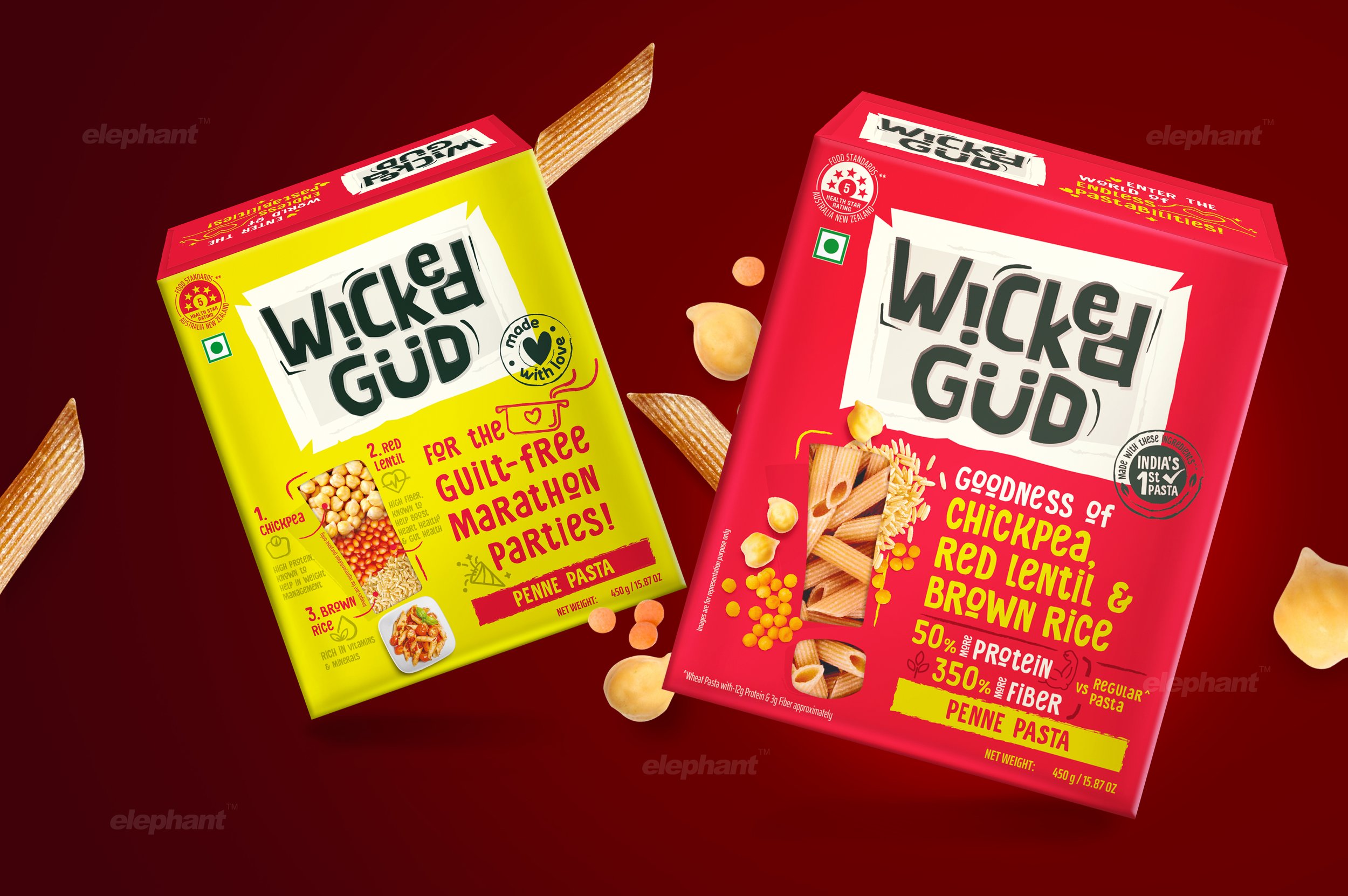
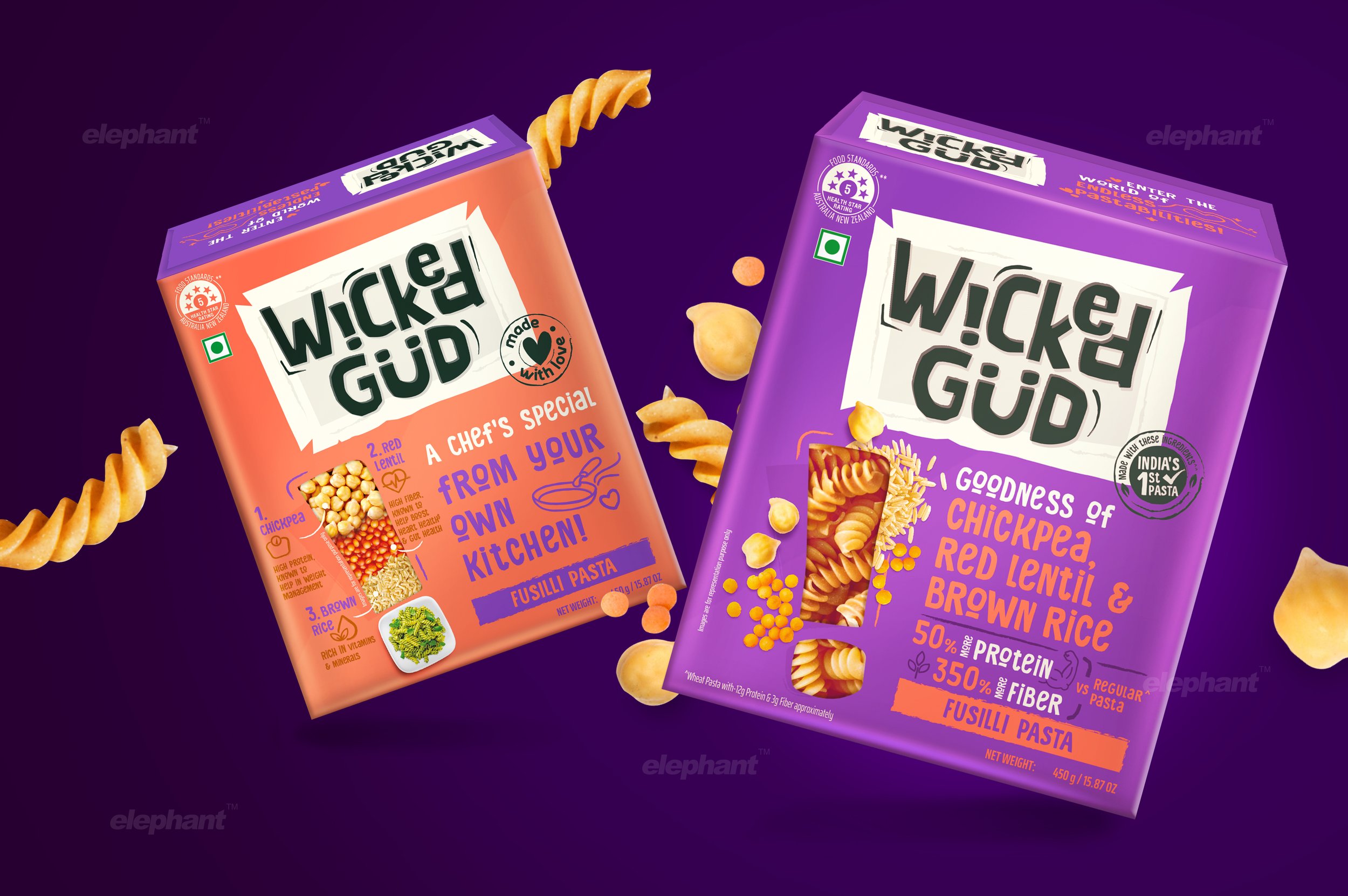
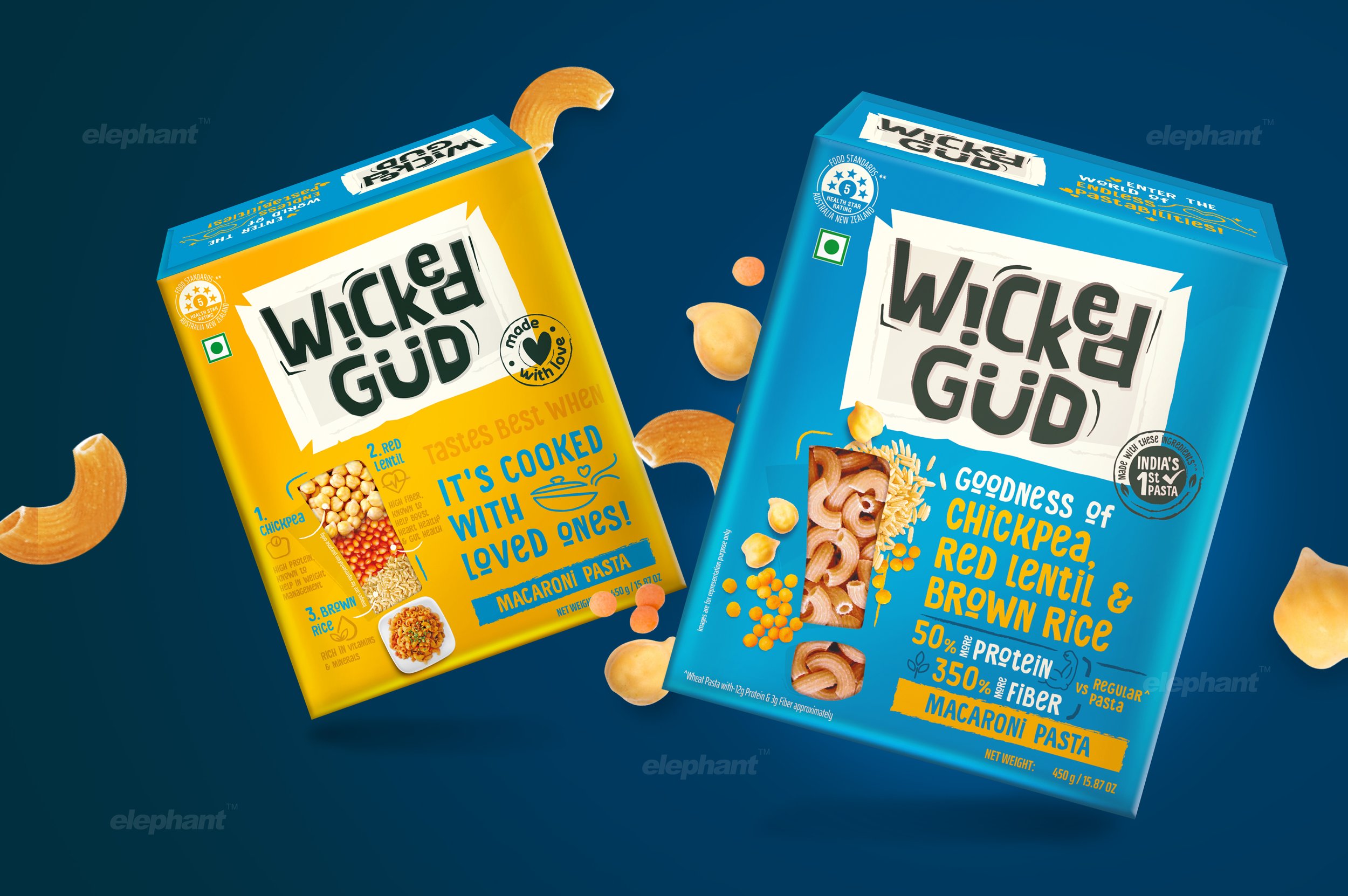
All good secrets are contained in boxes that stimulate curiosity and Wicked Gud products are no exception! We took a profoundly unconventional approach for the packaging system that suited the brand’s bold propositions and character.
“Extending the theme of secrets being concealed in exciting boxes, the packaging is amply littered with funky content and playful illustrations to match. Each box is tailored to feel personalized, where the brand speaks directly to the consumer as opposed to being subliminal and suggestive.”
There is no typical back-of-pack but rather, two front-of-pack panels that tackle two important facets: one conveys pure emotion and has an interactive conversation with the consumer, while the other is more functional and serves to convey nutritional information. Given that the back of pack represents the fine print, Wicked Gud comes out swinging and declaring complete transparency with this approach.
The exclamation mark element on the primary face indicates that the brand is the new, fresh face on the block that’s ready to take you by surprise and infuse your meals with excitement, while also providing a glimpse of the product within in all its untarnished glory. It also serves to reveal the surprising nature of the ingredients – where the surprise stems from the fact that what is commonly perceived as junk can be infused with nutritional goodness.
This excitement is also visible in the color palette the team developed – stark neon colors dominate the packaging system, with ample contrast and an offbeat look that immediately catches the eye.

Magical Treasure Chests
Extending the theme of secrets being concealed in exciting boxes, the packaging is amply littered with funky content and playful illustrations to match. Each box is tailored to feel personalized, where the brand speaks directly to the consumer as opposed to being subliminal and suggestive.
“How wonderful that we have met with a paradox. Now we have some hope of making progress.”
As can be witnessed, the brand name pops out at the consumer, hinting at a ‘jack-in-the-box’ feel, where surprise and delight are immediate associations upon opening the package. Additional elements compare it to other staples and highlight Wicked Gud’s nutritional superiority. The message is clear – junk can and will be domesticated, and we shall show you exactly how!
All in all, our work for Wicked Gud has garnered extremely positive response with more things in store as additional products are added to their roster. Elephant’s role, as iterated by the founders at Wicked Gud, has not simply been of a design firm but that of a business transformation partner – something that is integral to our functioning. All we’d now like to say is, keep your eyes peeled for this bundle of quirky, nutritious goodness on your neighborhood shelf!
