Witlinger
Creating Contemporary Packaging for A Bottled Craft Beer Brand
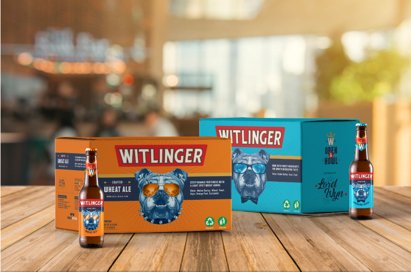
Do you long to spend sunny days with a cold beer instead of being stuck at work? We hear you. So when a beer brand approaches us to work on their new packaging, we make the most of it!
Witlinger was a bottled craft beer brand, which was looking to revamp its packaging to make it relatable to younger consumers. As a relatively new brand with a limited reach, its main focus was on attracting a new customer base, most of whom were millennials.
We needed to contemporise the packaging while maintaining certain elements for familiarity. We decided to play with a combination of story and elements to bring out youthfulness, while emphasising its inherently British background, which forms an important part of the brand’s identity.
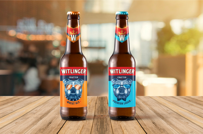
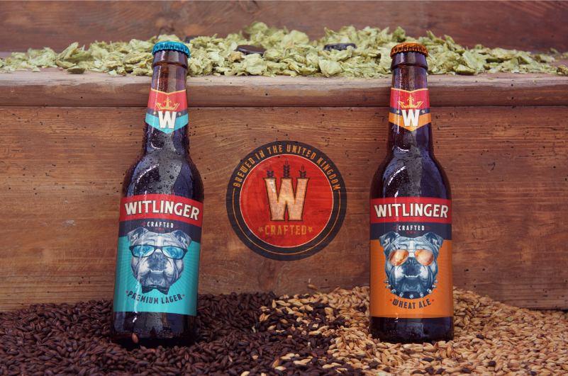
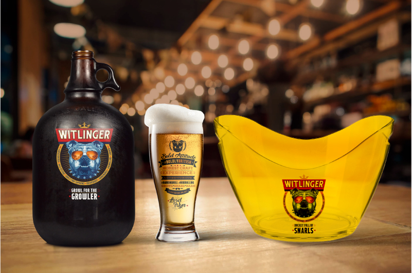
Along with the client, we zeroed in on an illustrative approach which would be story driven. A British Bulldog was the perfect mascot. A vibrant background made the bottles stand out among other brands and the dog was illustrated with different elements for each variant. We played around with tactile elements, using raised rays on the label.
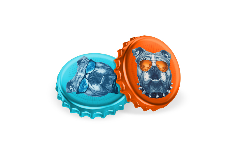
The Wheat Ale featured an orange background with a bold persona for the dog, depicting someone who was keen to explore and look for newer experiences. The Lager variant sported a blue background with a sophisticated looking bulldog, shown to be a social drinker. These mascots were manifested on the bottle caps as well.
The neck label replicated the colours on each variant, featuring the W from Witlinger’s logo with a crown on it. This element was chosen for its strong association with British Royalty. We opted to use a simple hashtag to accompany the packaging, affirming that the brand was #BoldlyBritish. The existing logo was a familiar aspect for existing customers and was kept largely the same, while adding a contemporary look.
The new packaging has been recently launched, but has garnered a positive response already. The brand is currently in the process of expanding to more cities.
