Mahindra Car & Bike Superstore Design
Creating an improved, omnichannel retail experience for a multi-brand Used Car dealership
The Focus
Mahindra First Choice Wheels Ltd. (MFCWL) invested in NDTV’s Car & Bike (C&B) to create an ecosystem within India’s rapidly growing multi-brand used car market, merging content with sales and distribution.
Wanted consumers to have a hassle-free, streamlined retail experience that also immersed them in the brand’s omnichannel environment.
The design needed to strengthen the new brand, heightening recall and improving walk-ins by establishing its one-stop-shop destination status.
The Design
Elephant’s retail experience team created a modular plug & play retail experience template with five zones, which could be interchanged depending on the available area and location type.
Fully utilized the potential of the newly crafted visual identity, implementing it at various touchpoints with phygital interactions and an omnichannel experience.
Lastly, the retail experience alleviated a wide range of consumer concerns like comfort, choice, informed decision-making needs and more while reinforcing trust with Mahindra’s legacy in tow.
The Story
Mahindra’s presence in the market predates the beginning of independent India. Beyond the Asia-Pacific region, Mahindra operates in Europe, Africa, the Middle East and the Americas, making it a truly global enterprise. Mahindra is also known to integrate and acquire businesses with potential and assimilate them into their ever-expanding family of brands. MFCWL had made several leaps within the used car market and created an ecosystem that bridged the gap between wholesale and retail channels. As a result, NDTV was delighted with the acquisition of its online CarandBike business by Mahindra First Choice. CarandBike is the most credible brand in auto content, built through tireless dedication by NDTV over the past 16 years and with a substantial online presence. MFCWL’s acquisition of Car & Bike, in effect, would create an omnichannel ecosystem. Customers could not only sell and buy cars but also get end-to-end, engaging, curated content that guided their purchases and sales. However, there were particular challenges with this assimilation, and this is where they approached the team at Elephant. MFCWL had two distinct projects for us. One to design and develop a brand and visual identity system for Car & Bike – you can read all about it in our dedicated case study here.
The second project entailed designing a new retail experience, drawing synergy from the C&B brand based on a larger following of focused automotive content, improved benefits to buyers & sellers towards trust & efficiency, product choice and a one stop buying & selling experience, seamlessly weaving online & offline presence.
Success factor considerations:
Strengthening the new brand
Easing decision making by revealing choice and enabling comparison
Bringing about clarity of benefits
Making digital & online expectations seamless
Improving walk-ins by establishing destination status
This also involved redesigning the customer journey and spatial retail elements, fit-outs etc. for the new Car & Bike Superstore model while introducing the new branding and visual language across key touch-points, along with the ‘Endless Aisle’ concept to customers, for a holistic in-store experience. The experience also needed to address existing pain-points and make the new C&B identity emerge as a game-changer in the field, backed by Mahindra’s legacy and promise.
Modular Magic
The new Mahindra C&B showrooms needed a solution to ensure quick roll-out across the country. Given that the Indian retail ecosystem is extremely vast and full of location-specific challenges, a one-size-fits-all solution was hardly appropriate. The solution, hence, took on the form of a modular, five-zone layout, comprising of:
Awareness Zone
Welcome Zone
Delight Zone
Browsing & Inspection Zone
Customer Interaction Zone
The layout is predominantly for square-shaped properties, but can easily adapt to rectangular formats as well. These zones can be swapped and some zones may also merge into others if there are area limitations or other location-specific concerns. However, the experience and retail journey are never compromised. The other principles for our design were that of accessibility, where the layout facilitates easy customer access to various zones, and browsability, where products are organized in segregated displays and phygital options to ensure self-browsing/selection.
Pain-points & Targeted Solutions
Elephant’s research-based process ensures that we benchmark, while also looking at a wealth of information: from buying patterns to customer concerns and employee testimonials to cultural trends. These led us to recognize some critical pain-points, which were resolved through design.
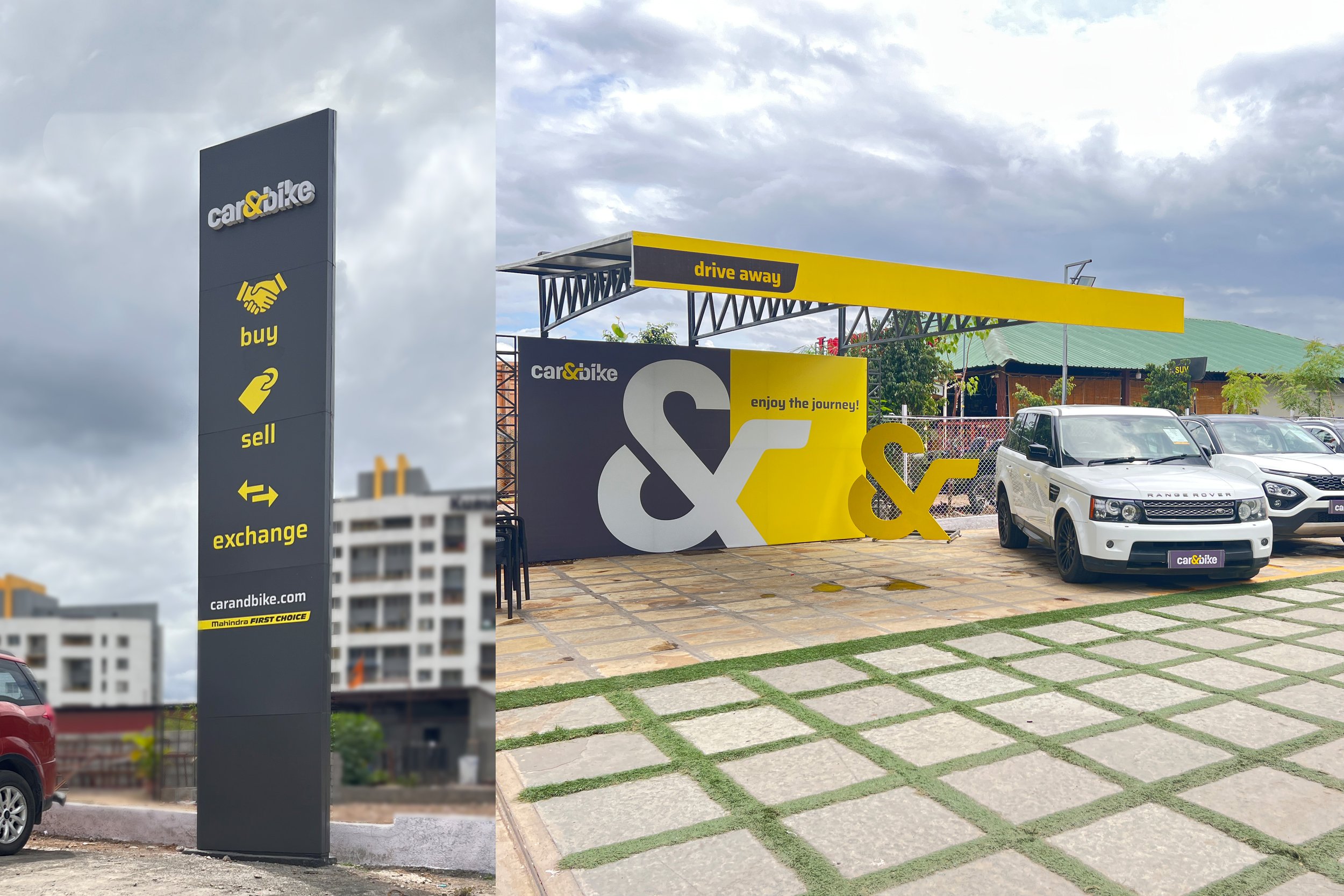
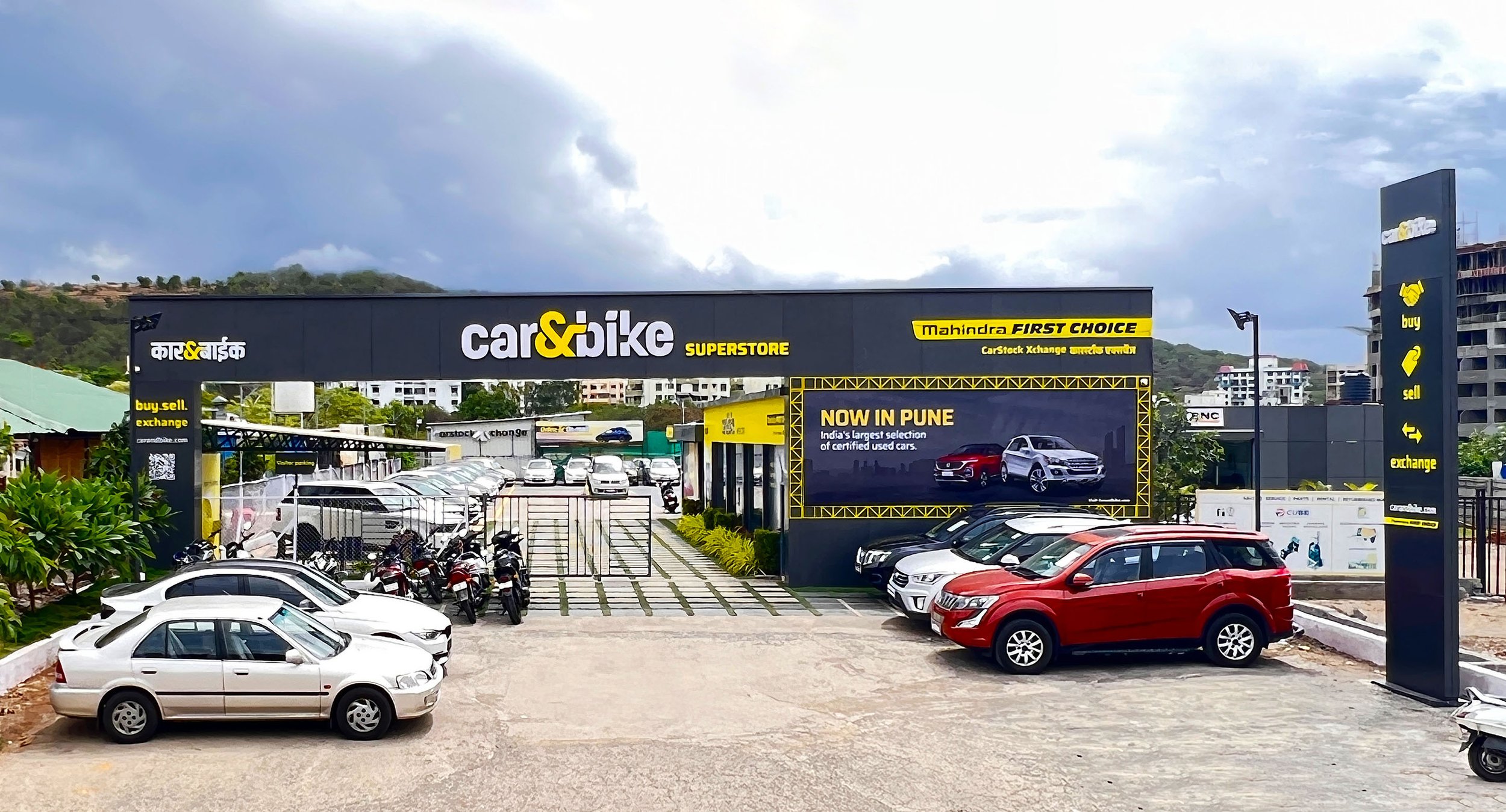
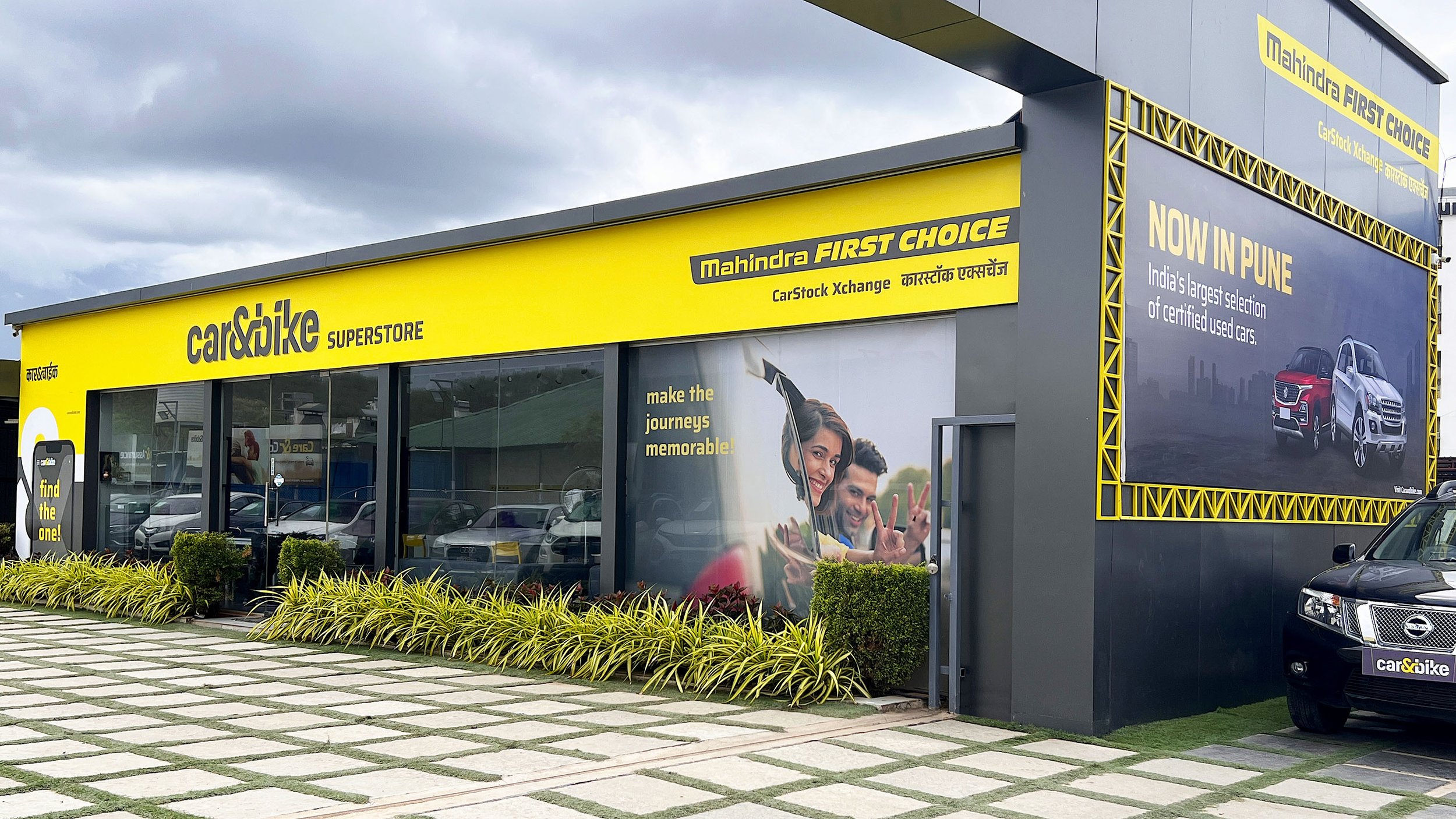
The Awareness Zone functions as the entrance, where we did away with concerns of wayfinding, brand visibility and obfuscation regarding brand offerings. A prominent fascia, with the backlit logo, dealer’s name, a QR code that links to the website, for authenticity, and current campaign information all serve to draw attention, invite potential customers to take their first step into the store and familiarize existing customers with C&B’s brand promise. The signage and communication have a friendly, conversational tonality in dual language for clarity and inclusivity.
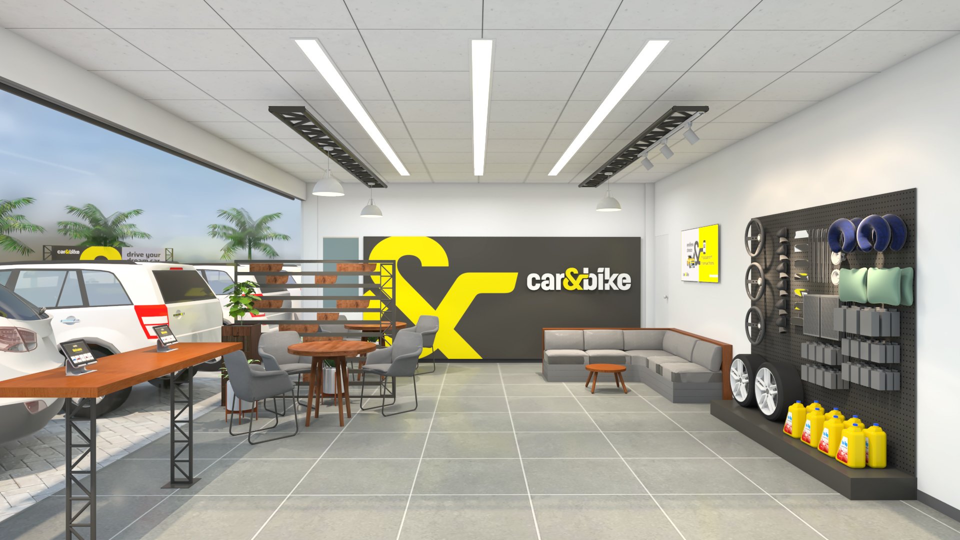
The Welcome Zone functions as a key introduction point to familiarize customers with the brand and assure them that their car buying, selling, accessorizing and fixing needs will be addressed in a professional manner. Earlier, there was no dedicated meet and greet protocol, with information being hard to obtain and no clear wayfinding systems. Our design recommended the addition of a welcome desk, equipped for data collection, a comfortable outdoor seating area and ample signage to amplify brand communication and available services. A convenient Store Orientation Map helps orient customers with the various zones around the showroom, and guide them to their preferred destination. There is also an elevated Hero Product display that leads into the browsing bays, which draws them in and increases affinity with aspirational messaging.
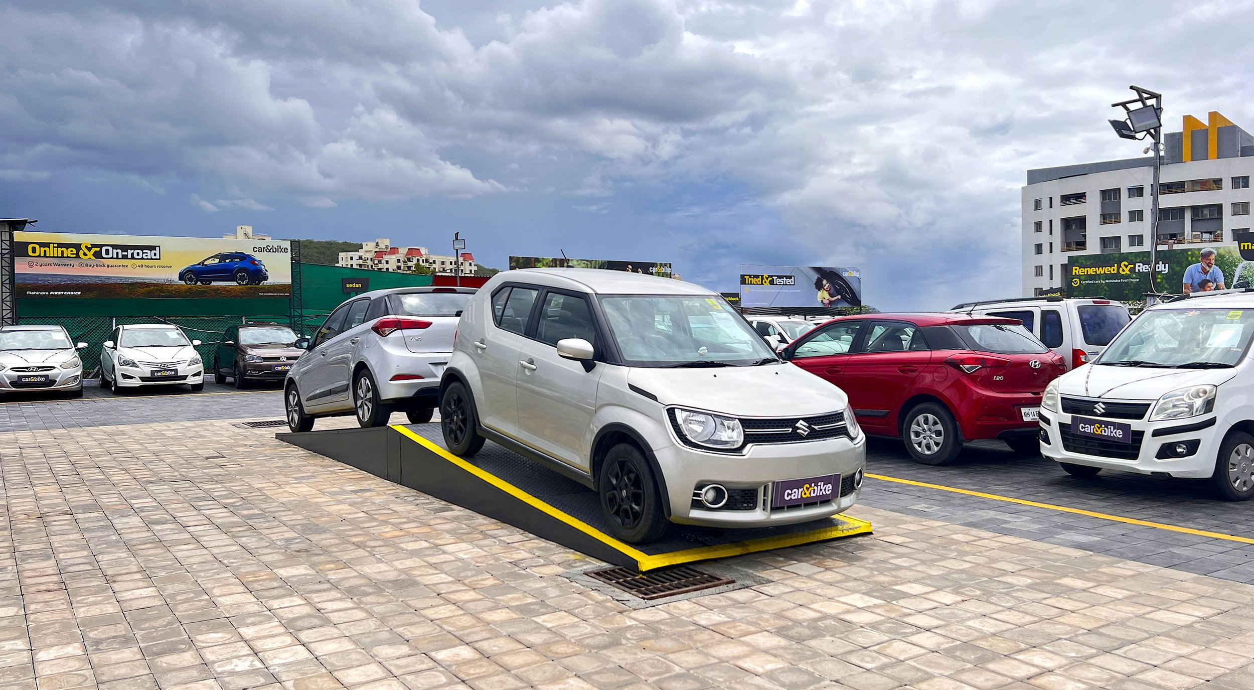
The Delight Zone is another addition to the layout. This zone is all about going the extra mile to wow customers with the help of hero product displays, raising their aspirations and familiarizing them with the brand. Customers shake off the perception that this is purely a Mahindra-exclusive showroom and realize that cars of all varieties are retailed here – from the luxury, high end to the more practical, economical options. There are aisles for exclusive Mahindra showcases for brand loyalists, too.
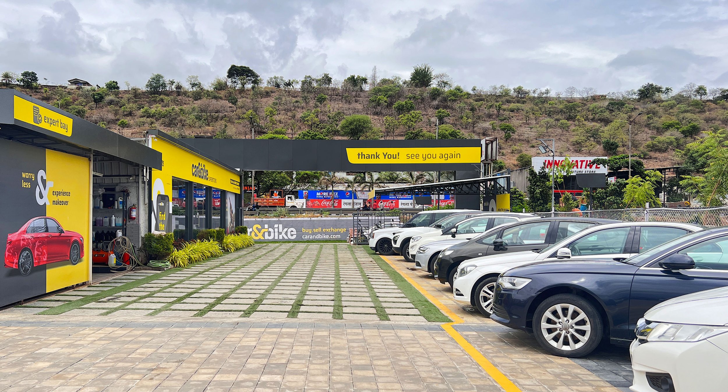
The Browsing & Inspection Zone remedies prior concerns of not having dedicated customer parking and ample space for the cars being sold. In our design, category signage and differentiated flooring helps organize, manage and clearly demarcate as per car types (SUV, Sedan and more), with ample parking space that allows people to freely move in and out, self-browse and make quick choices.
Ideally, customers can view sections of the browsing and inspection zones from the comfort of a bench seating placed in an area known as the Expert Bay. This is where a vehicle undergoes a comprehensive inspection by a certified engineer or by the customer, to enable trust and transparency in the process, displaying the brand’s dedication to professionalism.
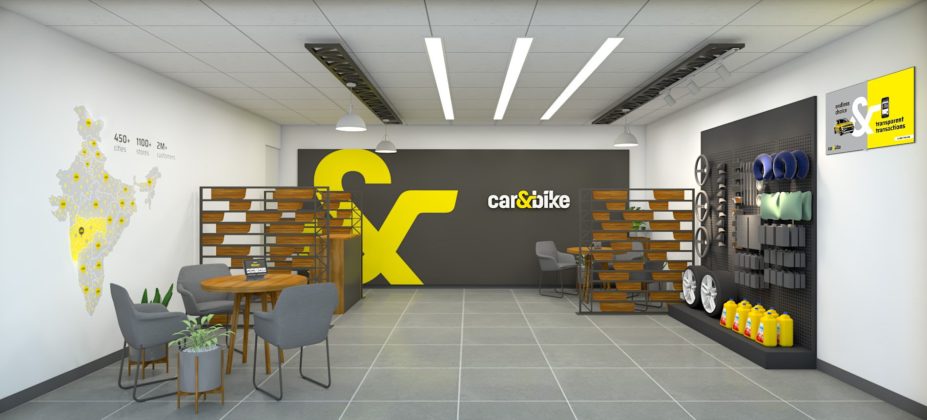
The Customer Interaction Zone aims to make customers as comfortable as possible while they spend time making important decisions revolving around buying and selling cars. Since concerns included a lack of privacy for confidential discussions, after sales service, accessorization, lack of proper information and more, we added a customer lounge, back office, and a washroom.
This zone features many phygital touchpoints like a large digital screen for current offers, catalogues and more, a self-browsing desk with tablets to introduce them to an omnichannel experience, an accessories panel and ample, comfortable discussion areas with partitions that for notional privacy when it comes to transactional conversations and purchase decisions. The prominent ‘Command Area map’ establishes the brand’s colossal presence in 450+ cities, pan India. Customers are also assisted by trained, informed personnel if they seek additional help due to the technical nature of the enterprise.
The Drive-away area is the designated point of delivery. This is where a spanking new refurbished vehicle awaits its new owner. Keys to the new possession are ceremoniously handed over, the momentous occasion is captured against a vibrant branded backdrop and the owners drive-away, happy.
Our retail solution is designed to be flexible, adaptive, informative and consistent – satisfying the conditions in the brief and going beyond, to provide an integrated experience like none other, especially within the used car retail industry.
The first Superstore rolled-out successfully at Baner Highway, Pune and since then we are delighted to note the presence of other superstores populating highways across the country.


