ㅤ
ㅤ
ㅤ
The Design
The team at Elephant designed a cohesive, adaptive identity system and logo concept that utilized the ampersand element at its core, along with color palettes derived from the automobile, technological and ecommerce categories
The identity merged Mahindra’s legacy with C&B’s expertise. The ampersand ensured a merger of legacy and trust, of customers getting the perfect ‘matchmaking’ experience when approaching the new C&B
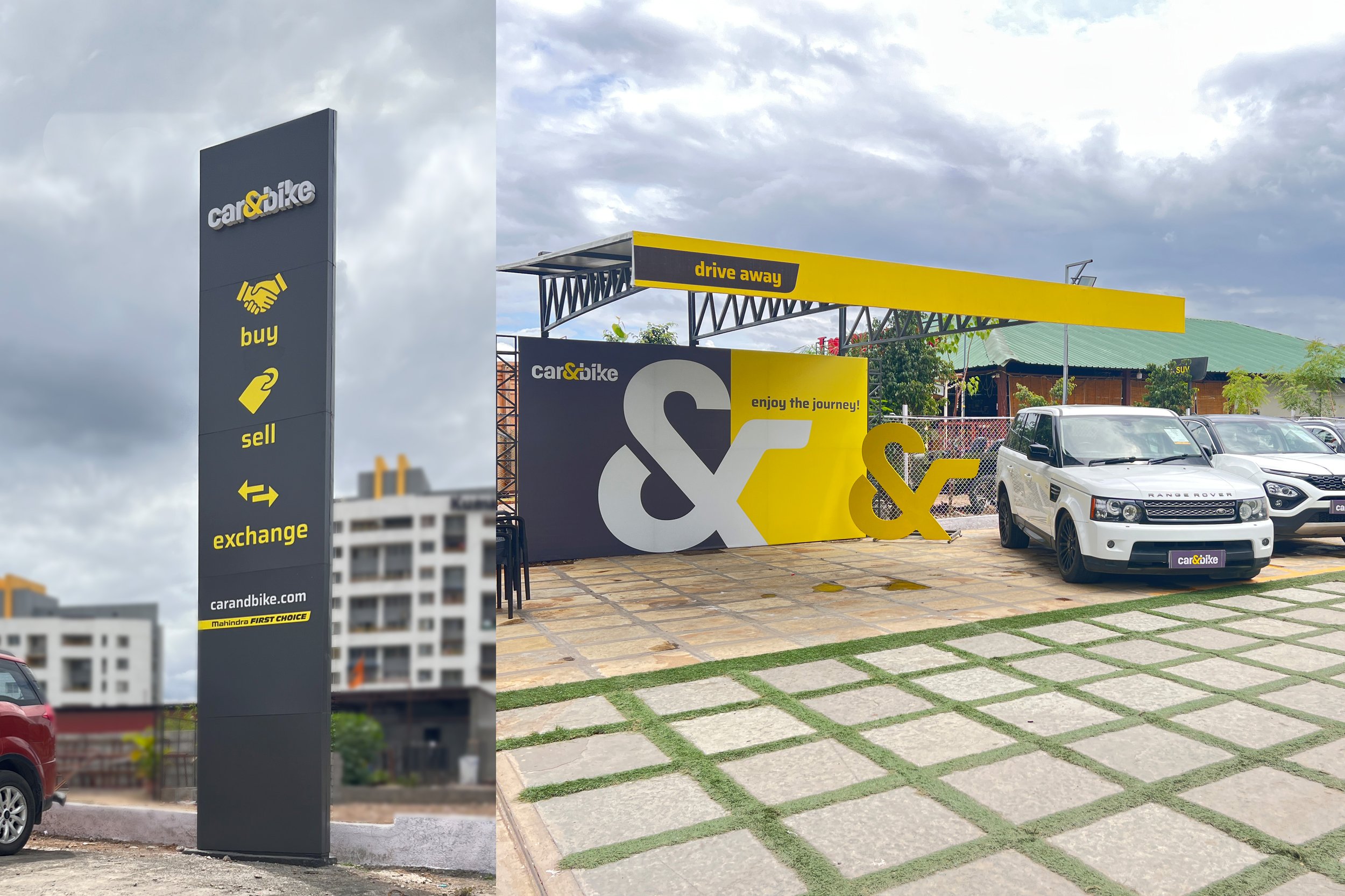
The concept played a pivotal role when developing key messaging for the brand and was translated into many key customer journey points by our Retail Design team for their in-store experience
The Focus
Mahindra First Choice Wheels Ltd. (MFCWL) purchased NDTV’s Car & Bike (C&B) to create an ecosystem within India’s rapidly growing pre-owned car market, merging content with sales and distribution
Wanted consumers to engage and connect with this new, merged entity that would provide them with an omni-channel experience, combining expertise, accessibility and service
Also wanted positioning that targeted the mass-premium, tech-savvy consumer and do away with impressions of this being a Mahindra-exclusive business
The Story
Mahindra’s presence in the market predates the beginning of independent India. While automobile production has always been at the heart of their business, their diversification due to the License Raj saw them enter a diverse array of markets like tech, infrastructural development, IT and financial services. Beyond the Asia-Pacific region, Mahindra operates in Europe, Africa, the Middle East and the Americas, making theirs a truly global enterprise.
Mahindra is also known to integrate and acquire businesses with potential and assimilate them into their ever-expanding family of brands. This keen sense led Mahindra First Choice Wheels Ltd. (MFCWL) to study NDTV-owned Car & Bike and eventually, acquire it.
MFCWL itself had made several leaps within the used car market and contributed to the creation of an ecosystem that bridged the gap between wholesale and retail channels. Car & Bike, meanwhile, was an established auto-portal with a substantial online presence, potently utilizing the digital ecosystem before it became a mainstream practice.
MFCWL’s acquisition of Car & Bike, in effect, would create an omni-channel ecosystem. Customers could not only sell and buy cars, but also get end-to-end, engaging, curated content that guided their purchases and sales. However, there were certain challenges with this assimilation and this is where they approached the team at Elephant.
MFCWL had two distinct projects for us. One, to design and develop a brand and visual identity system for Car & Bike. Customers had a misconception about First Choice’s offerings because of the Mahindra name attached to it – they believed that this was a marketplace for exclusively buying and selling Mahindra vehicles only.
An additional hurdle was the positioning of the C&B brand, which was previously a content platform that was now integrating with eCommerce. It needed to hit the ideal spot and appeal to the tech-savvy yet mass-premium segment. This would give them the edge as most of the competition was service-led.
All in all, Elephant needed to create and position an identity that heralded a new yet trustworthy omnichannel experience in the pre-owned car market.
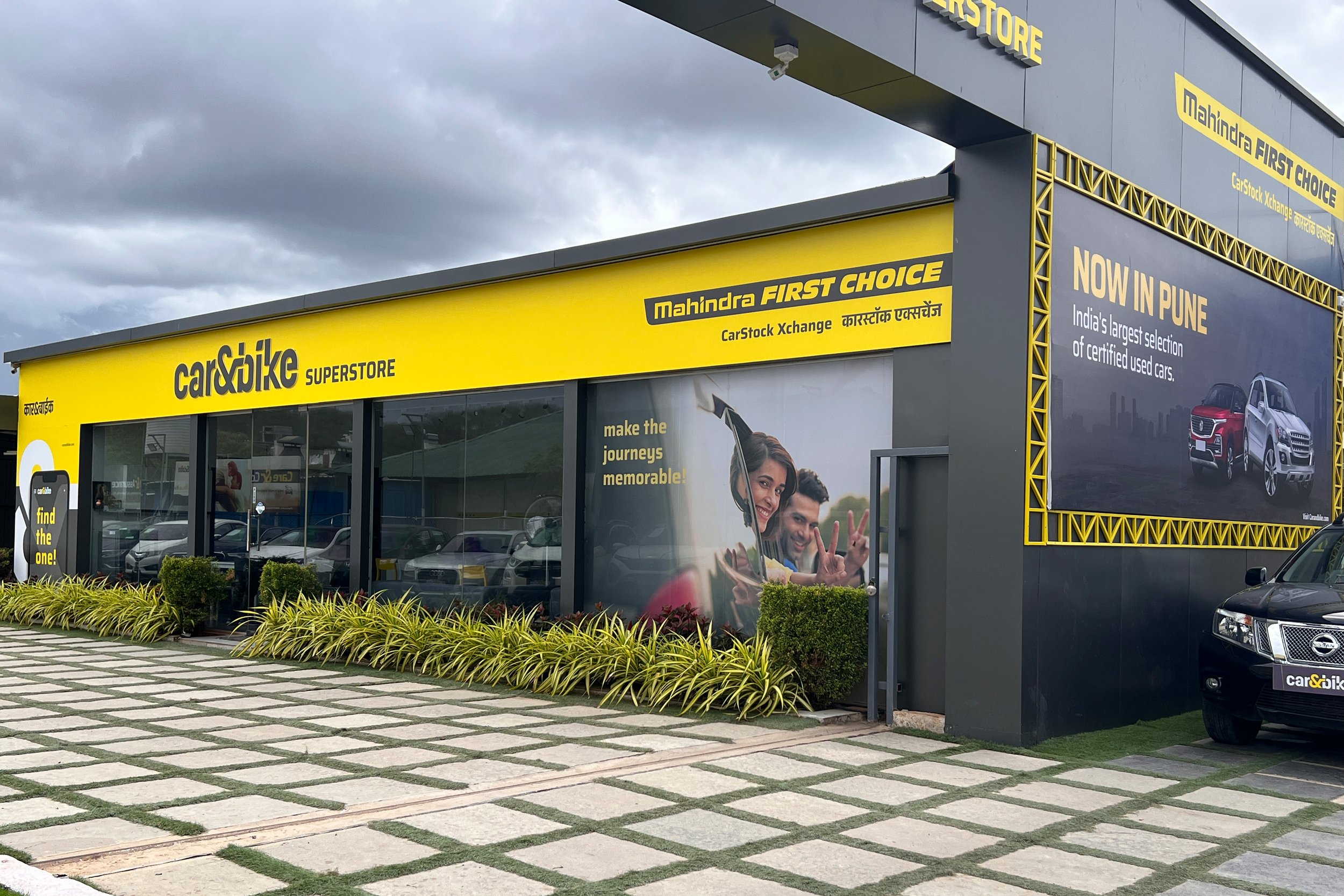
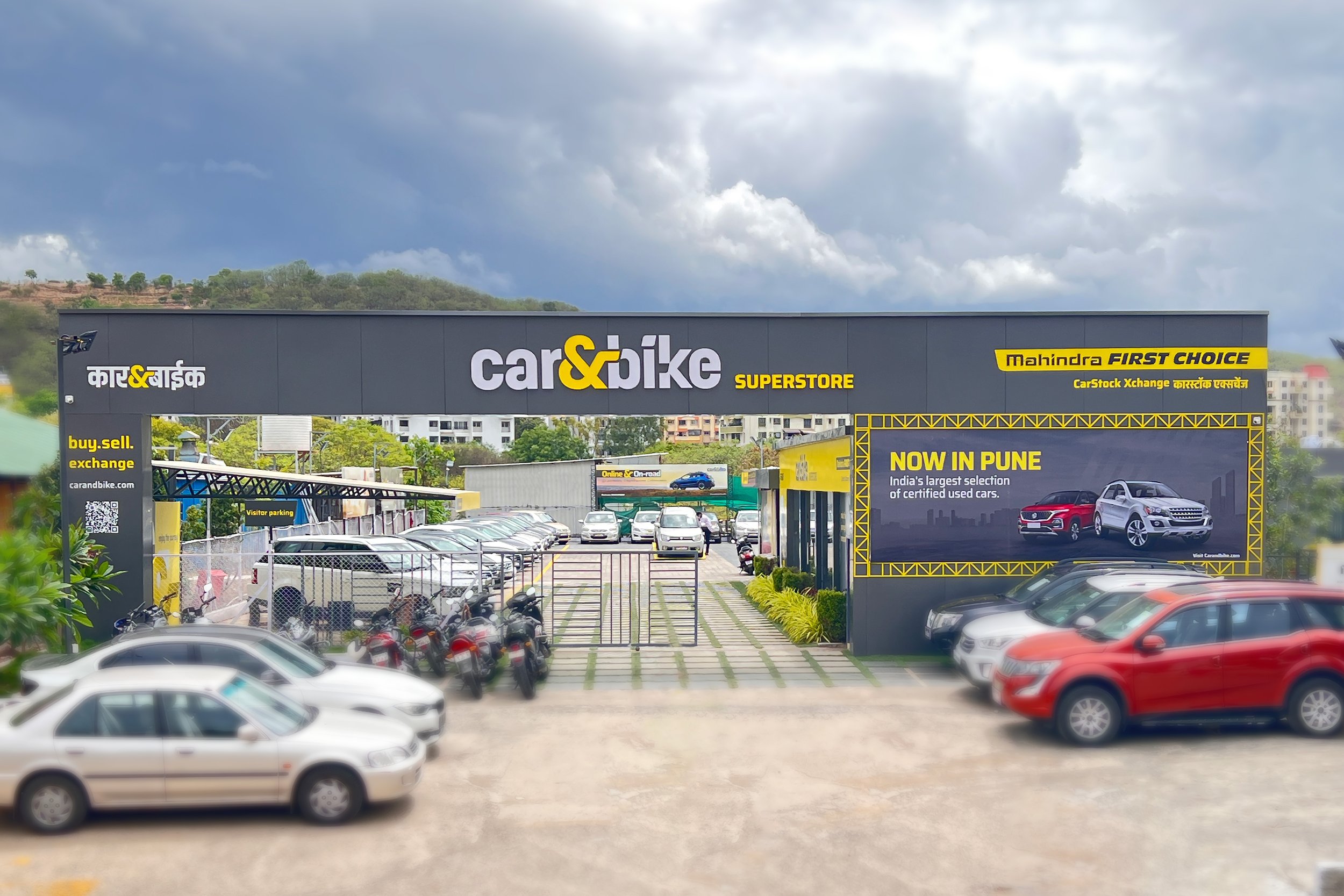
The second project was to implement the brand, creating a complete in-store experience for Car & Bike, introducing the ‘Endless Aisle’ concept to their customers. Readers can see how this was executed in a dedicated case study here.
The Ampersand
The world of used cars is dauntingly vast. Cars are complex machines with customers needing all the guidance they can get when it comes to engaging with the used car market. And they need it from a trusted, verified source since cars aren’t exactly small investments. Customers are always on the lookout for a good, justified deal and the world of buyers and sellers is full of people looking for this perfect fit of interests: commercial or otherwise.
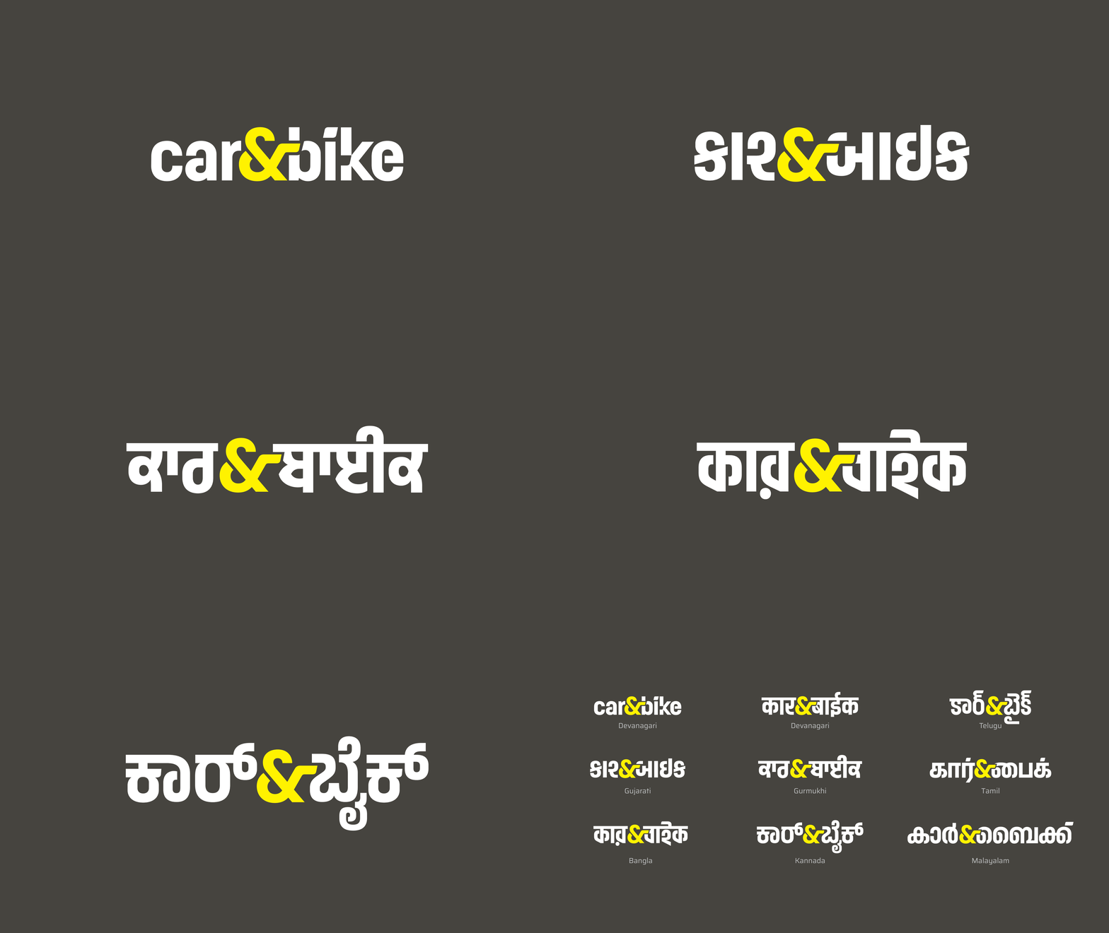
Extending this sentiment, the team at Elephant focused on the concept of ‘matchmaking’ to develop the new C&B logo. The simplicity and directness within the name – Car & Bike – had an element that became the core of our new logo concept, and that was the connecting Ampersand.
The premise was simple: we match you with those things that are specifically made for you – in this case, a car that meets all your needs, or a price that meets all your expectations. Additional color palettes were derived from the intersections of ecommerce, automobile production and road-based technologies, appealing to the modern, affluent, tech-savvy consumer.
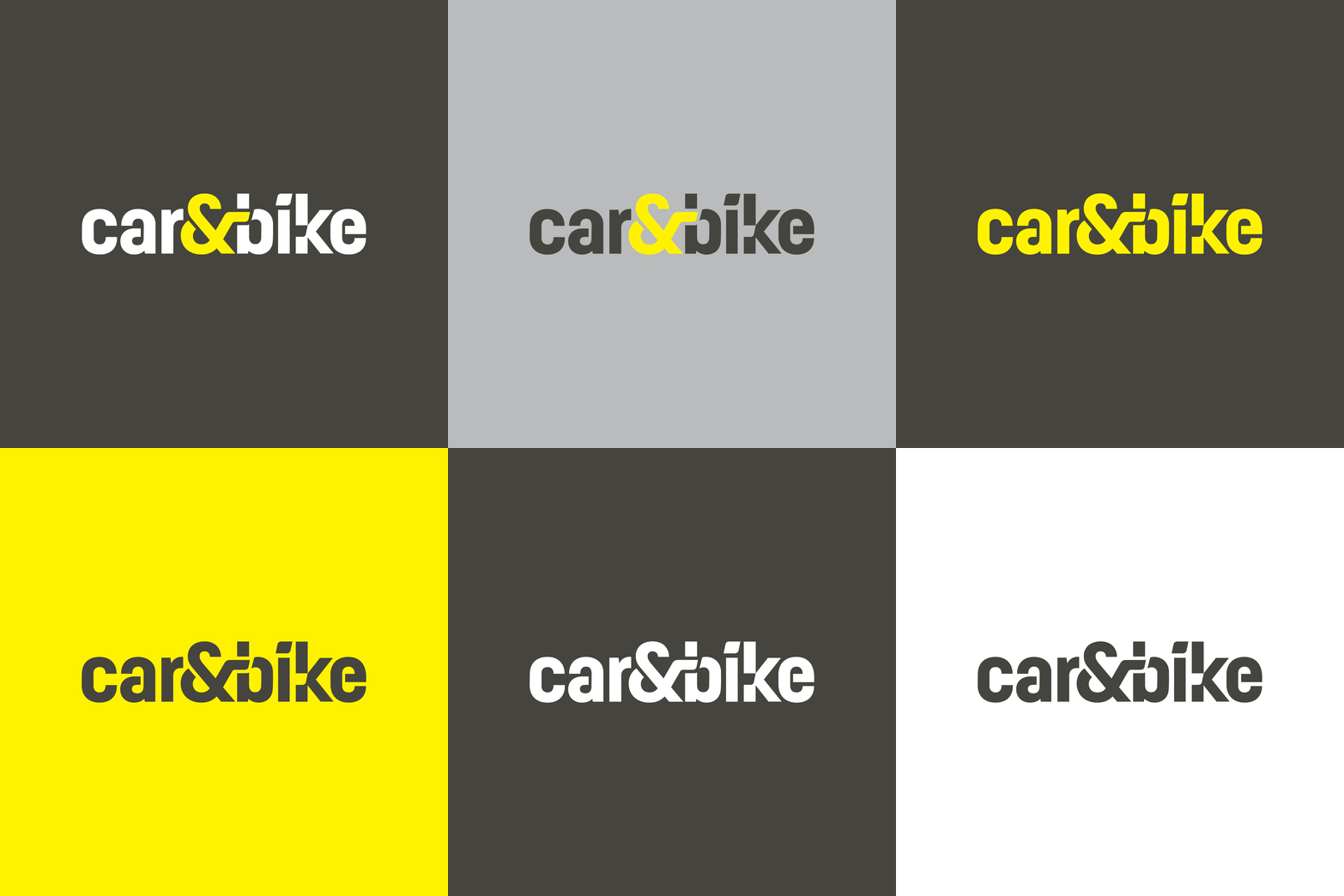
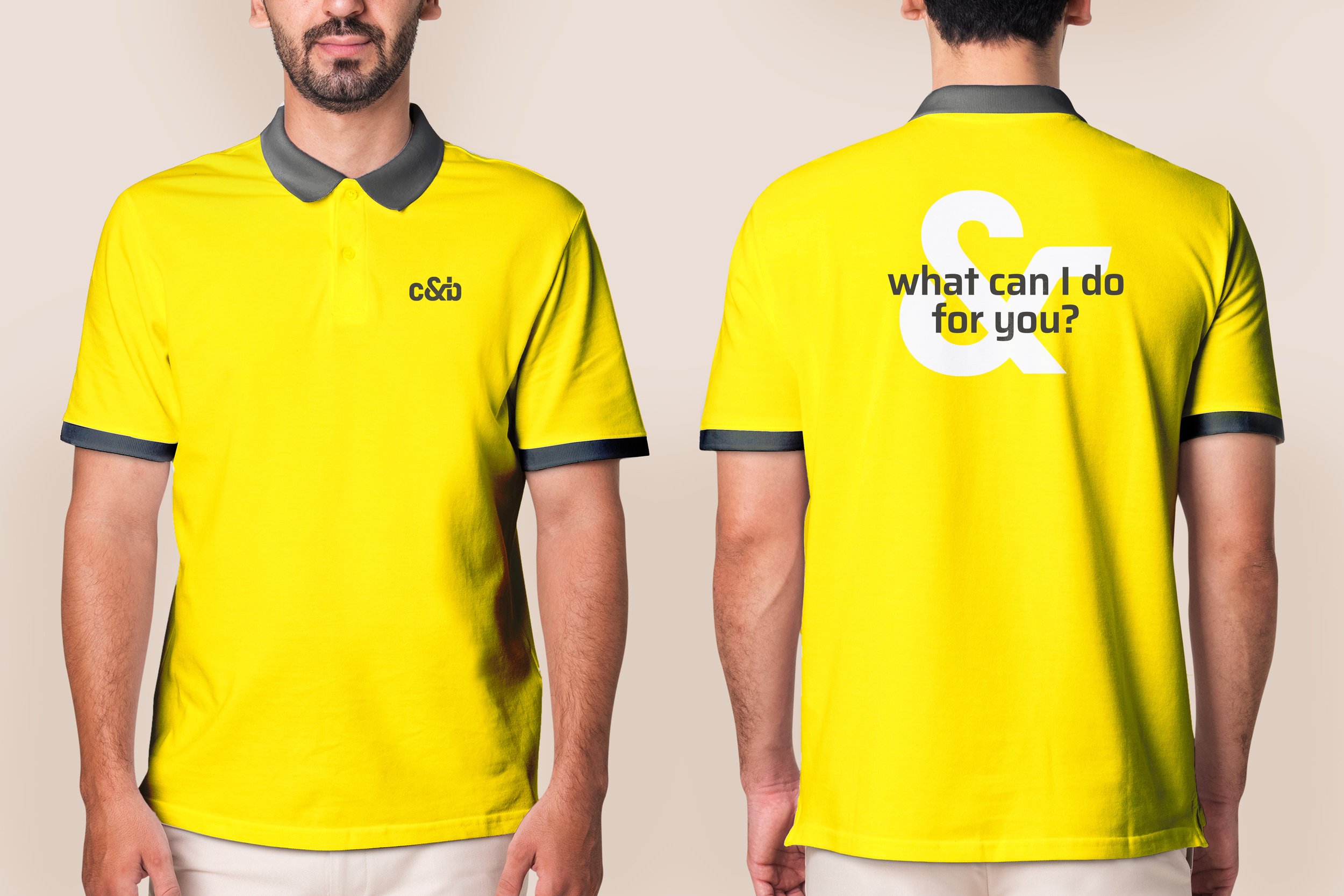
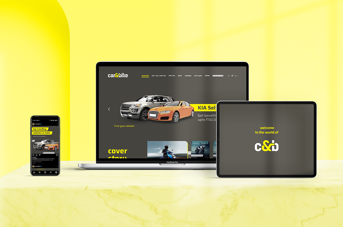
The team used First Choice colors inspired by the modern urban road environment, replete with tarmac greys and the neon-yellow ampersand. This served as the connecting, bridging element between several brand aspects, promises and between the two entities themselves, like.
Mahindra’s expertise and market presence were backed by C&B’s digital savvy, curated knowledge and trust. The logo shift also assured customers that while it was Mahindra’s impeccable legacy powering the brand, it wasn’t simply Mahindra cars that were being exchanged, but rather, corresponded to C&B’s expertise that involves ALL cars.
Something for everybody - & much, much more
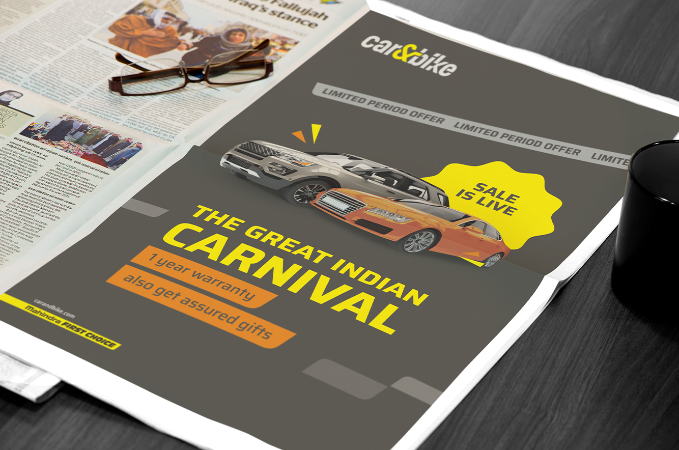
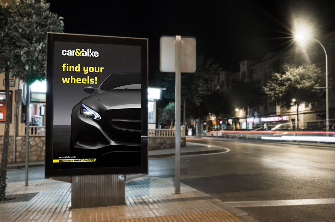
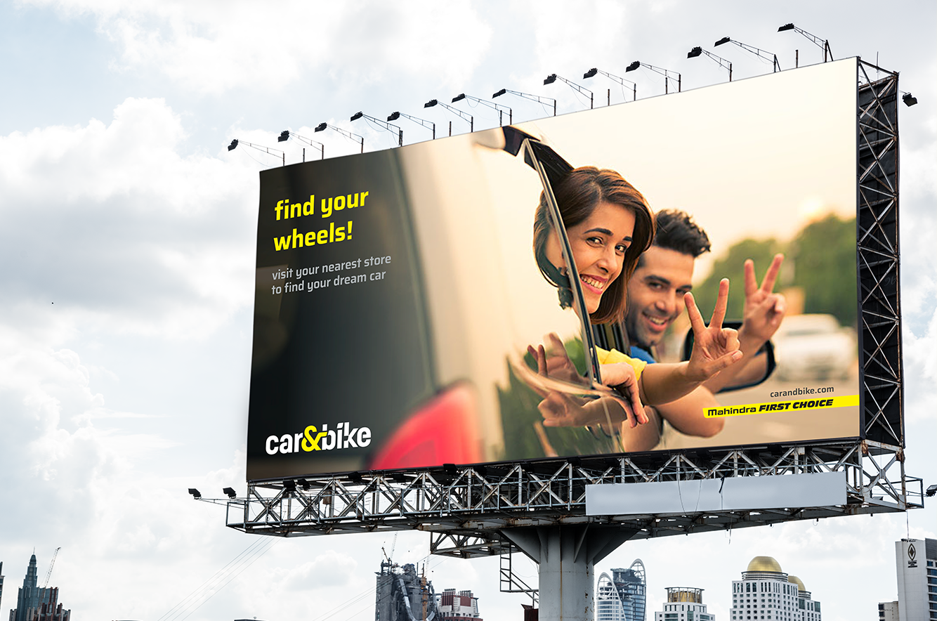
Communication was designed around the ampersand to reinforce C&B’s matchmaking prowess. Different variants of the phrase ‘Your Car & You” signified the weighing in of personal preferences and needs to deliver the right car, just the way you want it. Graphically, the ‘&’ becomes the point of contrast as well as connection and can scale with the format and type of communication desired.
The ‘&’ also contributes to elevating the omni-channel experience, since it literally symbolizes the potential for addition, for this and that, for more. Customers experience the ‘endless aisle’, a feature essential for an omni-channel experience, where their desires are matched with possibilities. A person visiting the store or the portal can effectively access sellers across the country and doesn’t need to limit themselves to local entities or the showroom.
All logo concepts were utilized in later crafting an engaging, multisensory retail experience at C&B showrooms. The malleability of the design made it easy to implement and translate into several languages, with communication that could directly speak to customers across different states and cultures. Lastly, the identity is digital-ready with no gendered language, creating a truly unified, non-discriminatory brand that is ready to take the pre-owned car ecosystem to the next frontier.
