
Grind Master
Syncing brand perception with reality

In 1984, when Grindmaster began its operations, the company would build precision machines in a garage to supply to manufacturing businesses. As the years passed, they expanded the scope & offerings and even found increasing global acceptance to their machines. Thirty years hence, Grindmaster is well known as a pioneer leader in Special Purpose Machines for Metal Finishing, Deburring, Microfinishing and Robotic Automation.
The challenge was that Grindmaster, the brand, hadn’t evolved in proportion to the company’s growth. We were asked to help articulate brand values, positioning and visual identity to align with the reality of this progressive entrepreneurial entity.
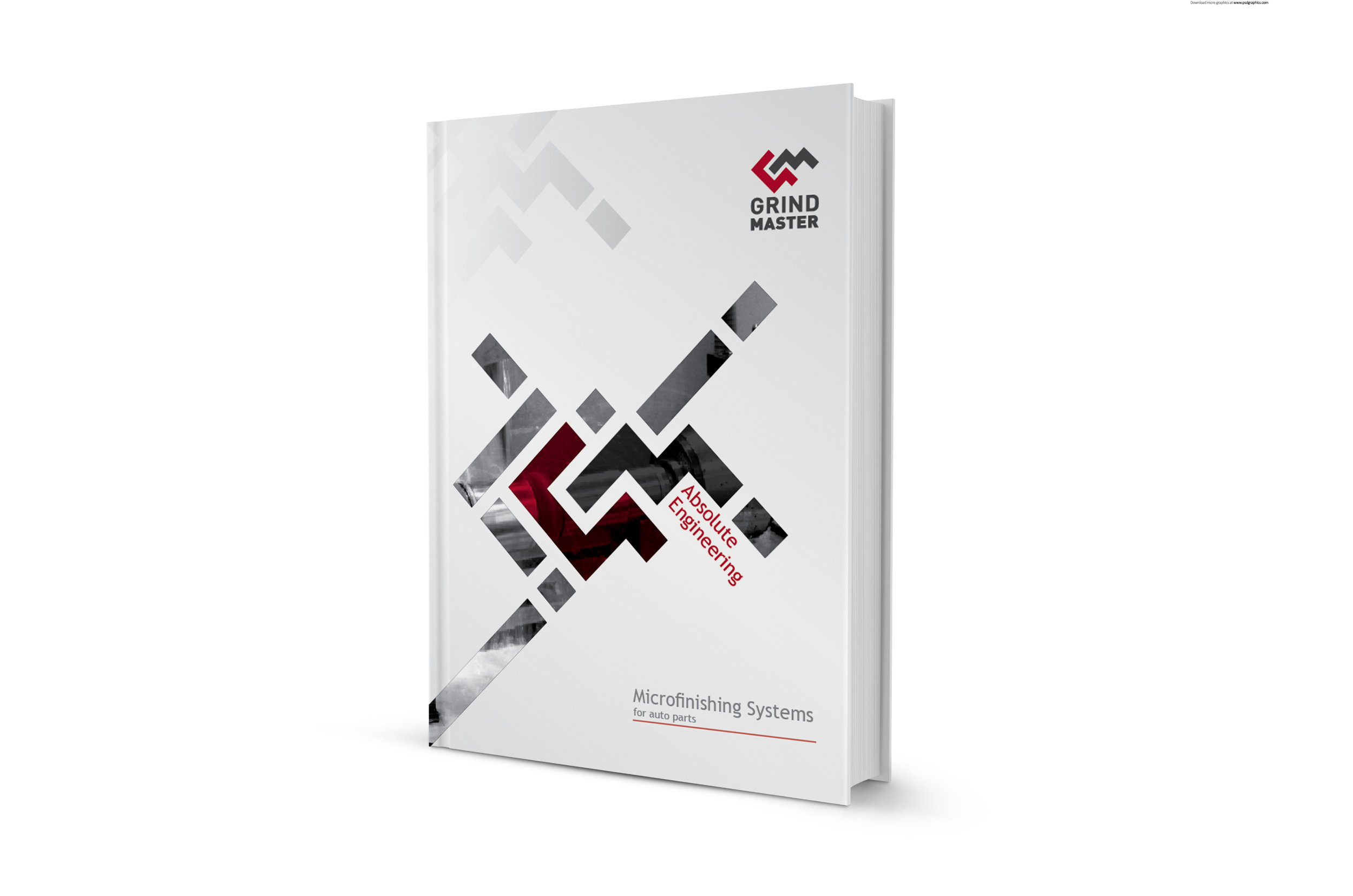
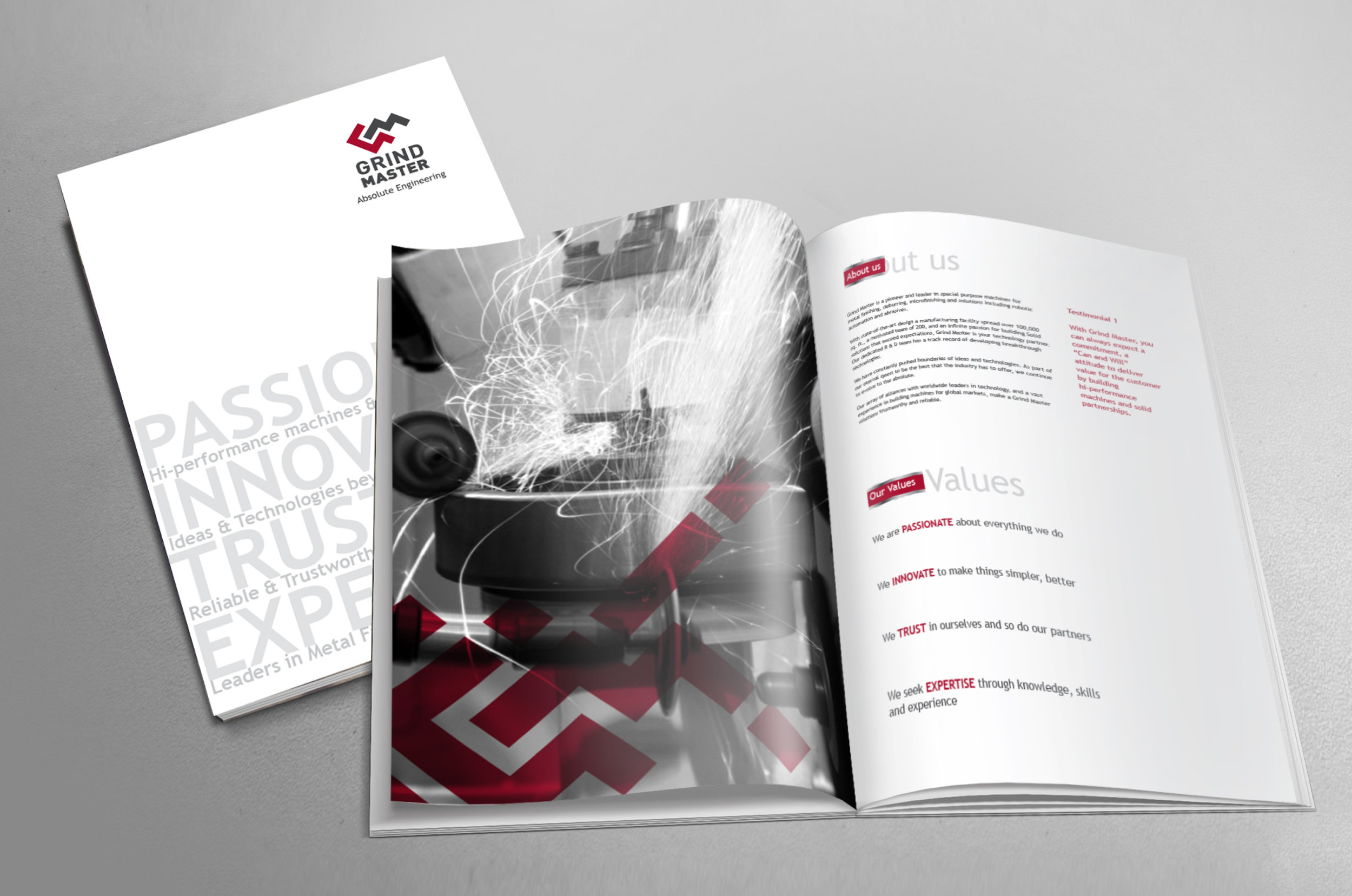
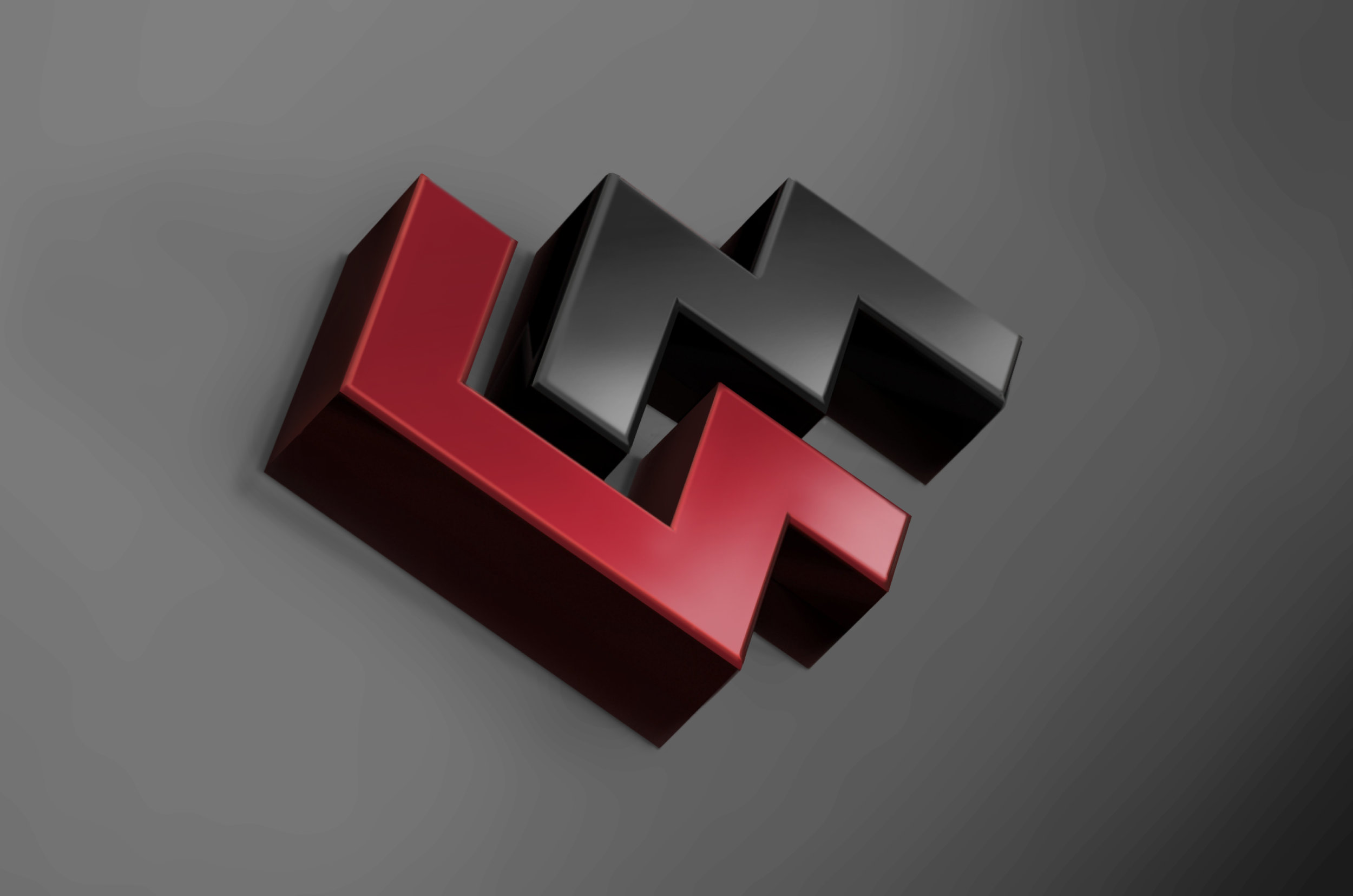
The visual identity for Grindmaster was developed keeping in mind their quest for precision work and increasing global reach. Perfectly interlocking, the 'G' and the 'M' letters have sharp edges, depicting the precision and passion for engineering technologies. We chose grey for the logo to portray the sophistication, while the wine red was chosen for warmth and passion, in tune with their company values.
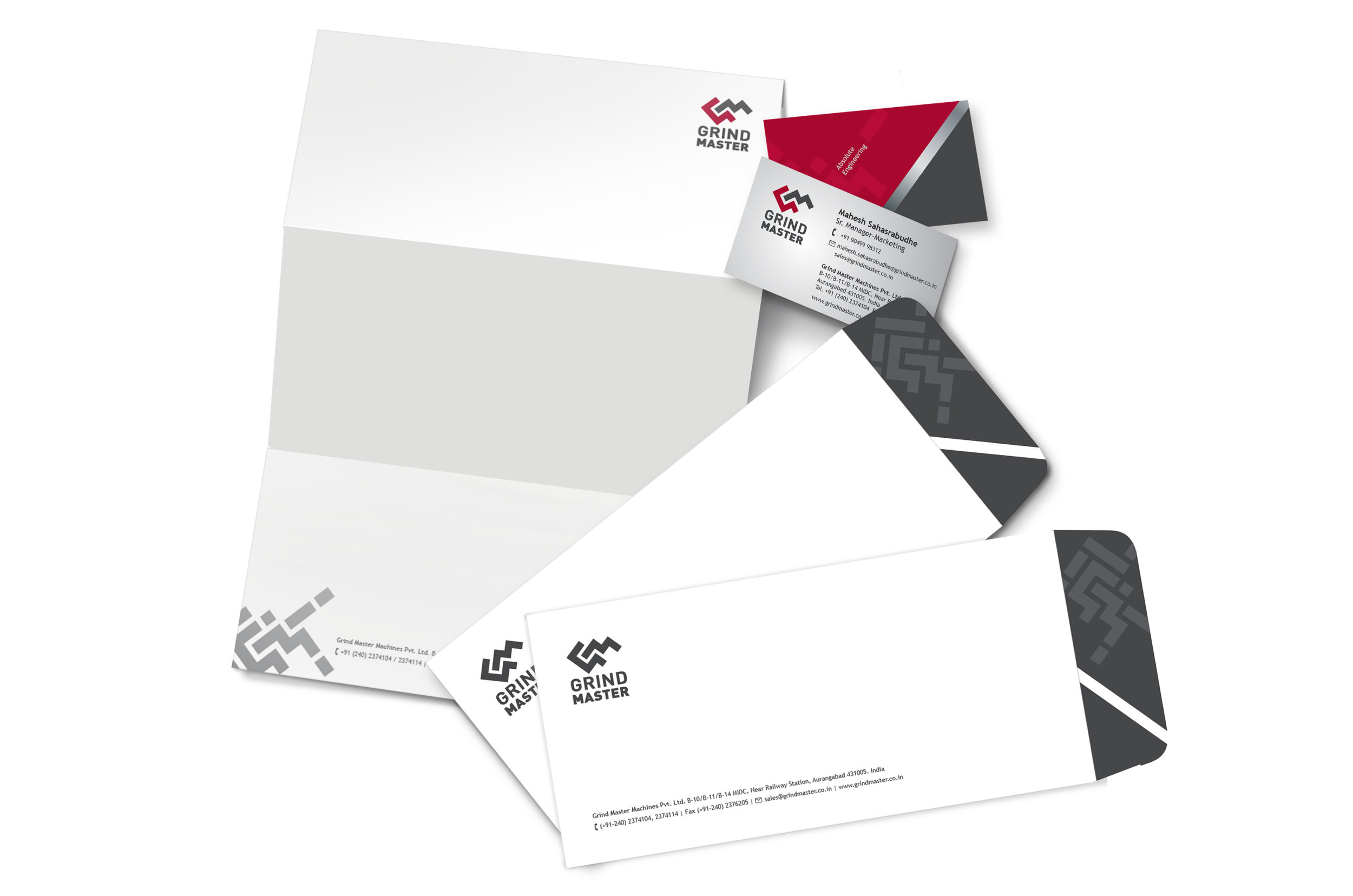
The rebranding exercise, has been followed up with every single touch point showcasing brand values and visual identity. This has had a positive impact on the image globally. The company has won many awards for their growth and achievements since the branding exercise.