IBO
Designing a One-Stop Shop Retail Experience for every Home-Building Need | IBO
The Design
The team at Elephant designed a rich, omnichannel experience for the model IBO store that catered to both, offline and online customers while merging those experiences.
A distinct system of signages and communication was implemented inside and outside the store, helping consumers quickly get to the materials they wanted and catalyzing purchase decisions.
The store is approachable, full of localized messaging for utility while also focusing on the brand’s consumer-facing value system, familiarizing those who walk in with the IBO advantage.
The Focus
A new entrant in the home-building space, IBO envisaged an in-store experience that adhered to the brand’s principles.
Built upon the distinct visual identity crafted for them by Elephant, the retail setting needed to leave consumers with a lasting experience, cultivating trust and mutual respect amidst its target audience.
The customer journey needed to be immersive with the goal of getting customers to their desired commodities in an optimized, speedy way.
The Story
The Indian construction agency is perhaps one of the largest industries of its kind, employing over 49 million people in various capacities. It is also one of the most unorganized, unreliable industries, plagued by poor employer-employee relationships, a lack of concrete job differentiation and fleeting employment opportunities.
The home building space, falling within this larger category, is not exempted from these issues. Individuals working in this space are mostly contractors, technicians and a host of other middlemen – apart from architects and homeowners themselves.
This audience faces a lot of challenges, especially when they’re new entrants trying to decide upon and purchase building materials. Here are some of their most pressing ones:
Disproportionate time investment to build and sustain relationships with vendors
Unfair pricing
Forced bulk purchases
Brand preferences based on pre-decided deals and not quality
Lack of respect arising from often feudal hierarchical systems
Elephant has already designed a distinct brand and visual identity that reassures users about its purpose and its role in remedying these challenges. The retail experience needed to implement this identity thoroughly, while making the customer’s in-store journey a hassle-free experience that familiarized users with the brand while cultivating trust and loyalty.
One-Stop Shops and Inclusive Journeys
The Retail Design team used the solid foundation that the brand identity provided, amply using the brand’s signature brick red, grey and white color palette.
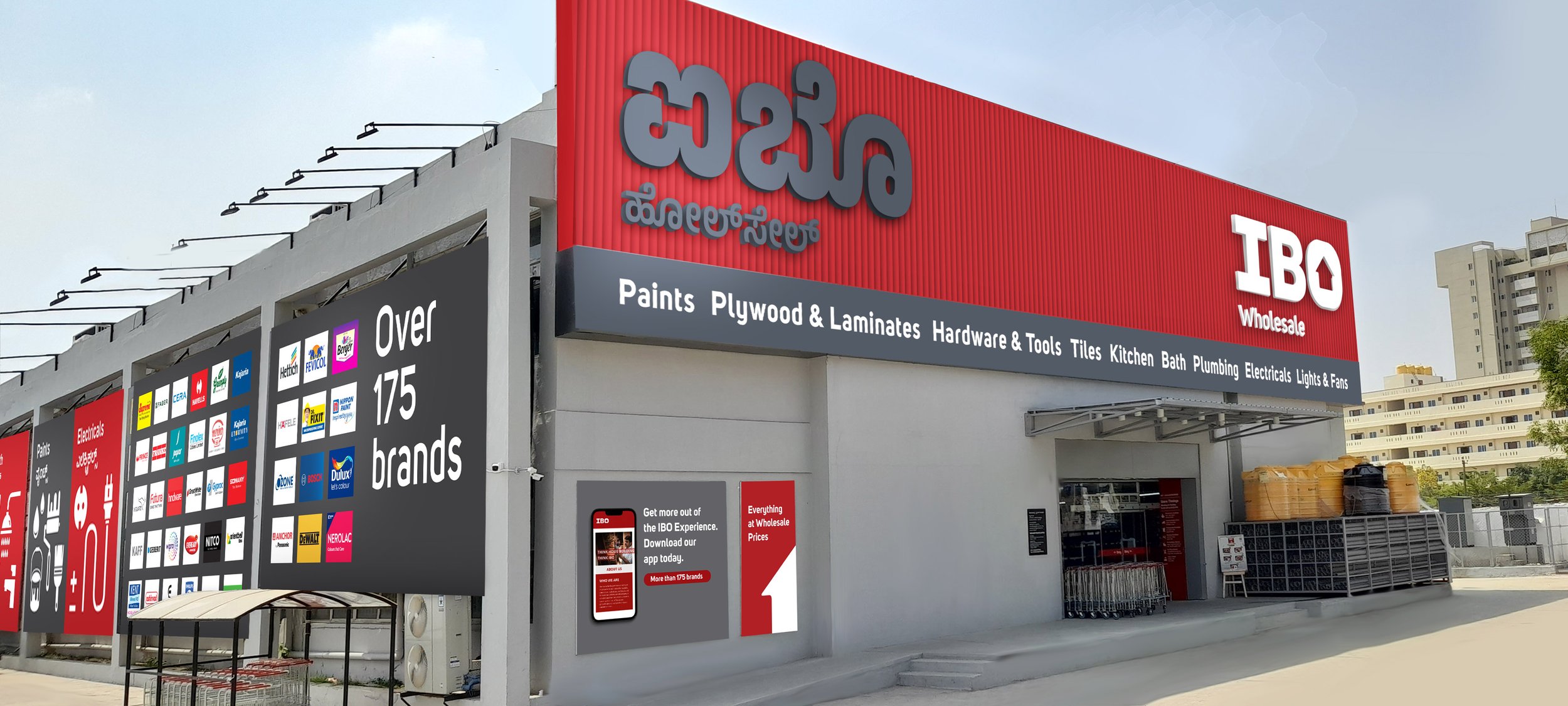
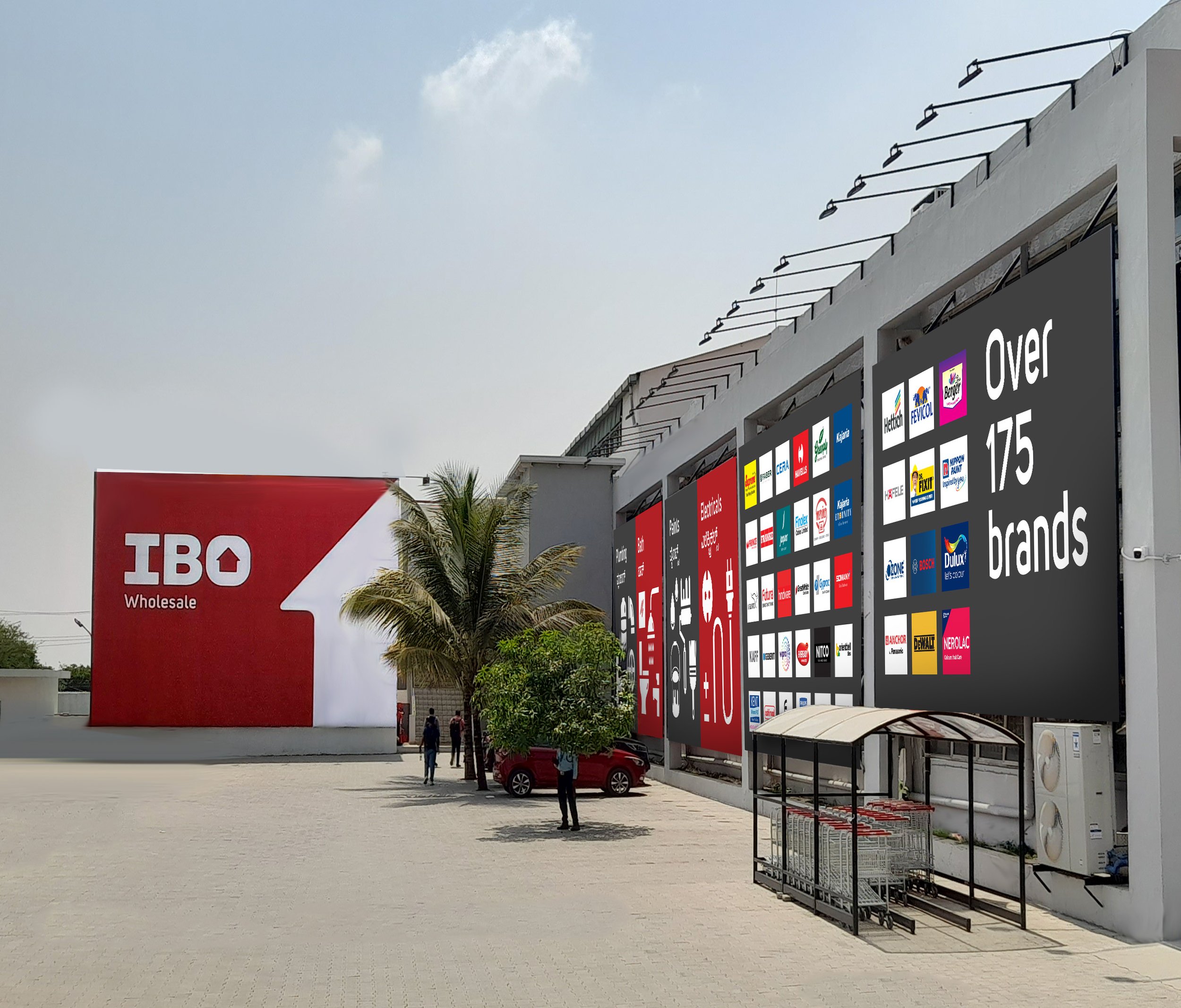
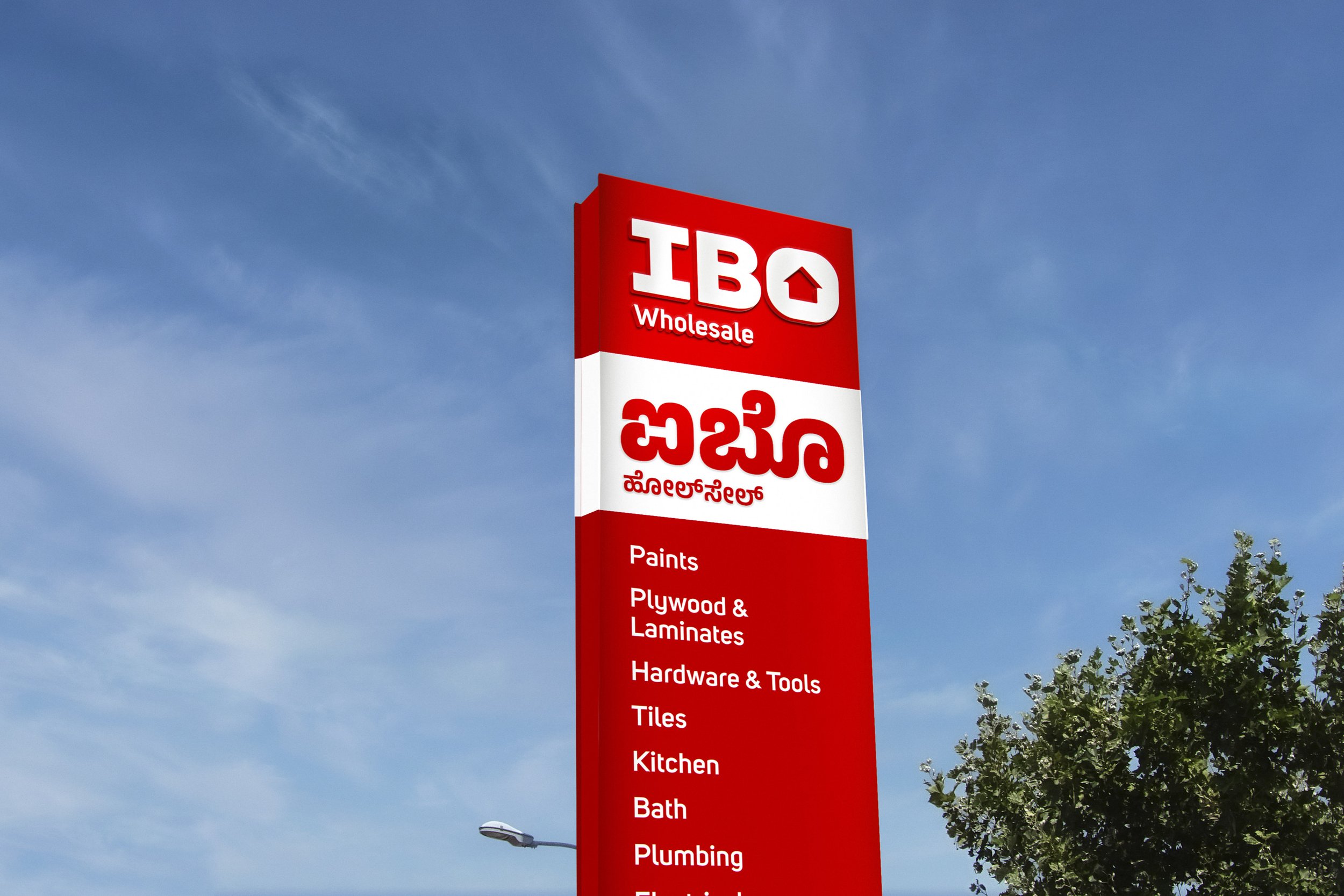
The start of the customer’s journey begins outside, with a pylon that clearly details the brand name and various product categories, letting them know exactly what to expect. The team made use of the building’s exterior, with a blank wall communicating the brand’s identity as well as the numerous partner brands that home builders would find. The large assortment assures customers about IBO’s commitment to quality and capability.
As they get closer to the store, the fascia takes center stage with succinct branding and a detailed version of the category list. Users can park on the left or right of this entrance that has ramps for easy locomotion, while also ensuring the comfort of differently abled visitors. The ramp also has communication that directs them to the IBO app, encouraging them to download it for added convenience, becoming the first milestone in the omnichannel experience.
The entry point has a list of useful information displayed via clear signages, from mask policy to store timings and more in English as well as the relevant regional language – in this case, Kannada. Customers can choose to pick up a trolley at the entrance. Multi-floor layouts will endeavour to place the staircase here itself, with signage indicating what customers will find on the upper floors/levels.
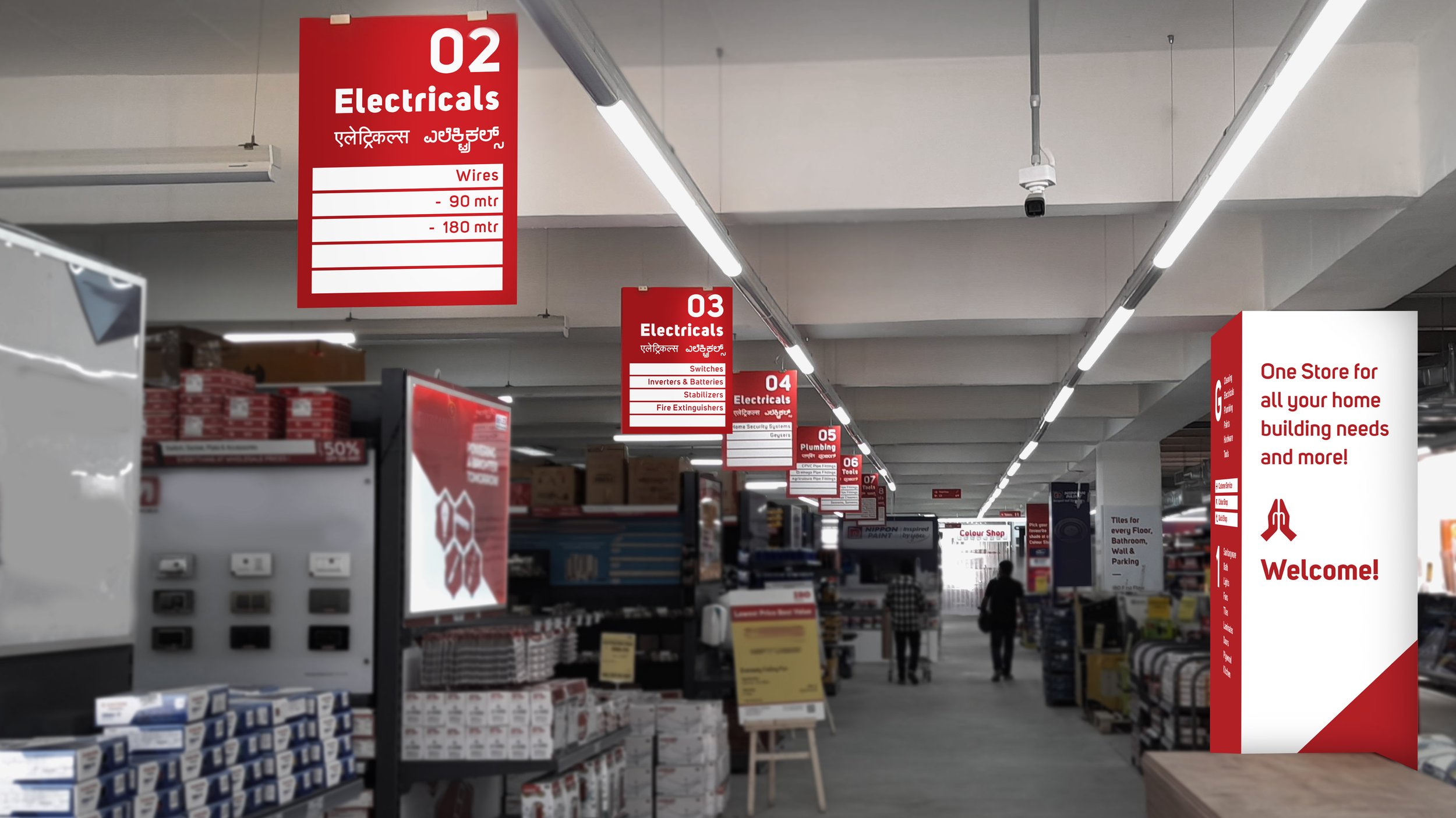
The presence of a welcome panel with a Namaste symbol at the entrance conveying IBO’s local-first approach and inviting customers with a traditional greeting. This is combined with app callouts, drawing attention to IBO’s digital offerings.
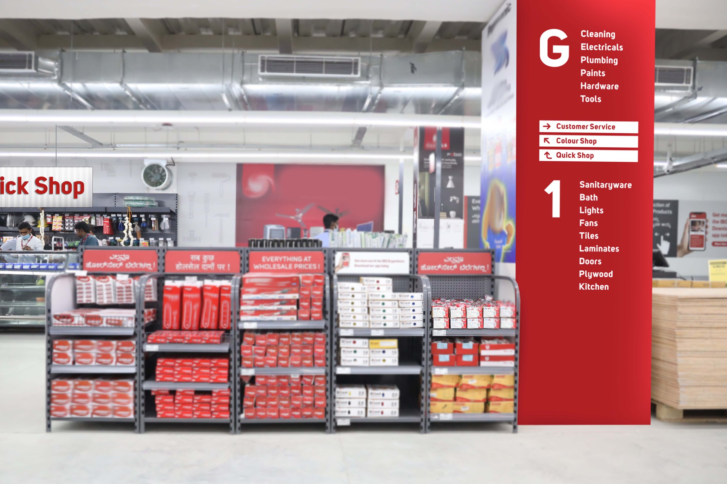
The entire central store space was divided into numbered isles. Simple cardboard-printed graphics show what each aisle has, making navigation more efficient since customers don’t have to hunt aimlessly.
One key feature of the retail journey is the team’s use of columns that were already part of the built environment. All columns have been optimized to communicate brand values and key propositions, familiarizing customers with the brand.
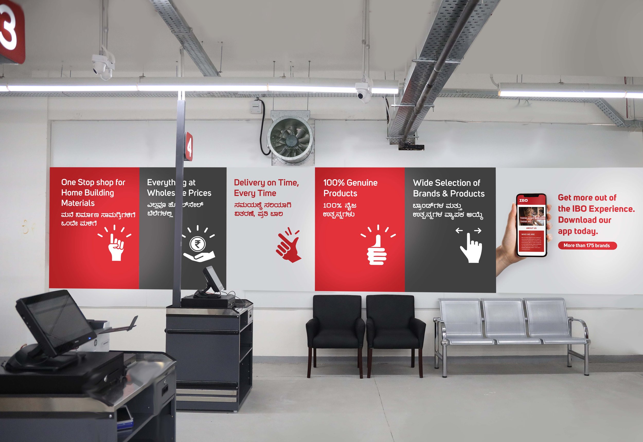
After customers are done picking up what they need, they can visit the easy to identify checkout counters. The team decided to situate a ‘Quick Shop’ area that displays smaller pieces of hardware for quick pickups. This is especially convenient for those not wanting to trawl through the entire store for things like screws and magnets. Since smaller items are prone to theft, placing them in a high-traffic region with full view serves as a deterrent.
Cash counters reinforce key business propositions (the genuine nature of the products, or the wide selection and so on) along with useful information about the refund policy. Lastly, a branded Thank You banner at the exit completes the consumer’s journey, adding to the store’s approachability and rounding off the consumer experience with warmth.
The retail design experience was fully implemented at IBO’s first outlet in Sharjah, and was met with a lot of positive impressions. The team seamlessly translated IBO’s visual identity and made it a crucial aspect of the in-store experience, giving consumers a sense of the brand’s ecosystem. Consumers also found the experience to be hassle-free, convenient and tech savvy – which was exactly the mission the team had set out to accomplish!


