ㅤ
ㅤ
ㅤ
The Design
The team at Elephant designed a brand identity that was simple and accessible, with guidelines promoting direct, honest communication.
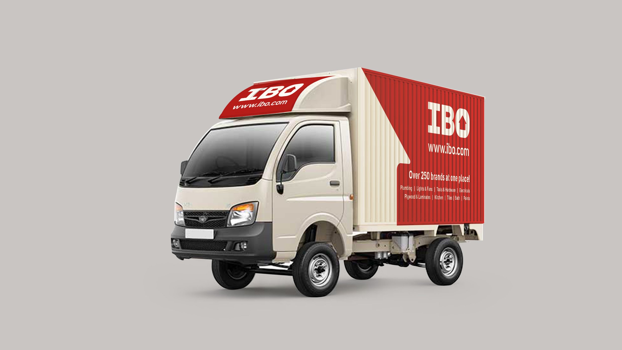
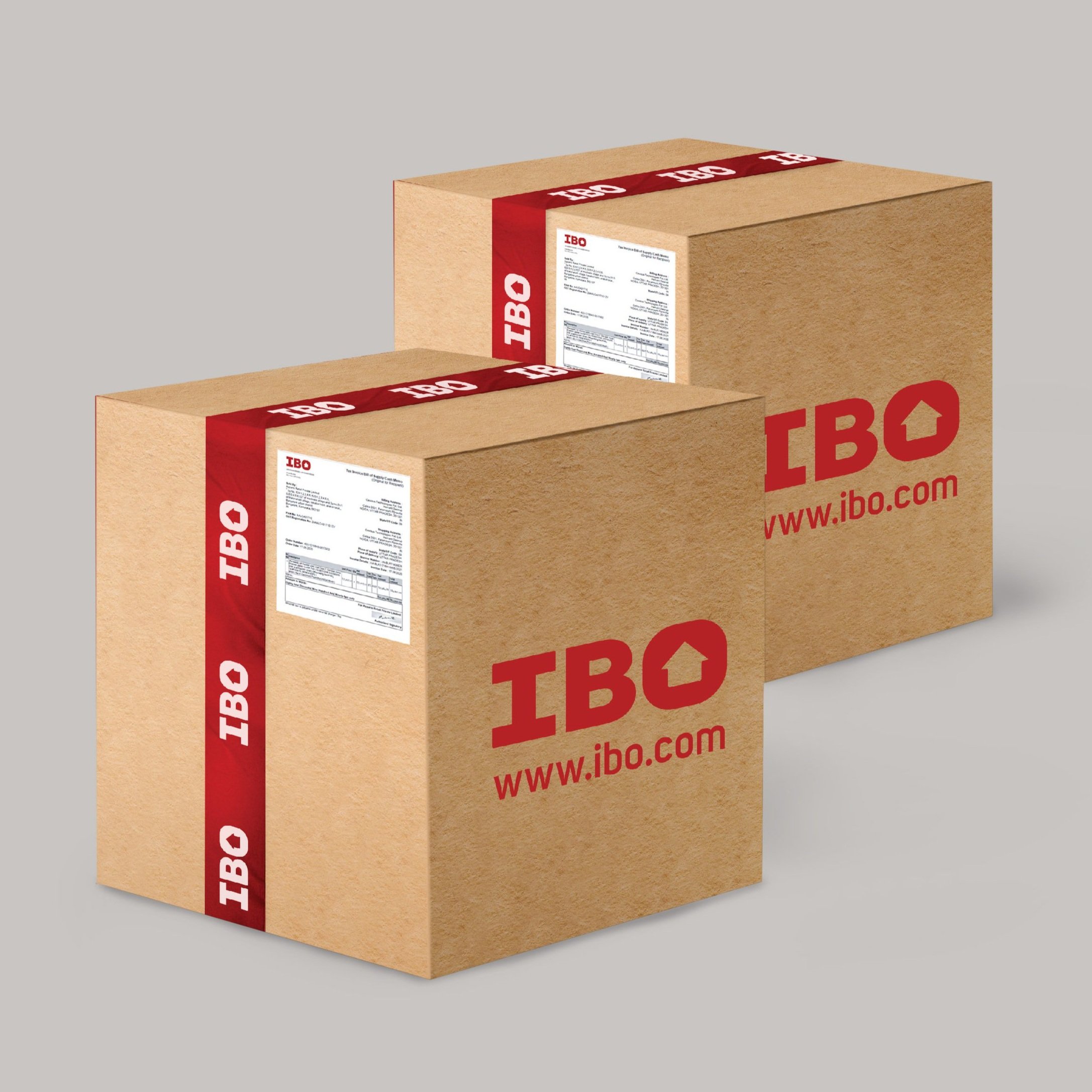
Used approachable colors like Brick Red and Iron Grey, which came with a corrugated texture palette to highlight category and other messaging, with the IBO logo containing a house element, alluding to its services.
The team also flexibly applied this identity across different collateral, from the website to in-store communication, while ensuring easy regional language adaptation.
The Focus
IBO, a new entrant in the construction space, wanted to create a brand that aimed to meet the needs of home builders: from contractors to technicians and homeowners.
Wanted a brand identity reflecting their ethos, revolving around the key values of respect, frugality and convenience.
The identity needed to be flexibly applied, as it would form the foundation for designing an omni-channel experience, from the in-store retail journey to an eCommerce portal.
The Story
The Indian construction agency is perhaps one of the largest industries of its kind, employing over 49 million people in various capacities. It is also one of the most unorganized, unreliable industries, plagued by poor employer-employee relationships, a lack of concrete job differentiation and fleeting employment opportunities.
The home building space, falling within this larger category, is not exempted from these issues. Individuals working in this space are mostly contractors, technicians and a host of other middlemen – apart from architects and homeowners themselves.
This audience faces a lot of challenges, especially when they’re new entrants trying to decide upon and purchase building materials. Here are some of their most pressing ones:
Disproportionate time investment to build and sustain relationships with vendors
Unfair pricing
Forced bulk purchases
Brand preferences based on pre-decided deals and not quality
Lack of respect arising from often feudal hierarchical systems
IBO was founded with the aim of remedying these problems for middlemen. They had created a space that would serve as a one-stop shop, selling all kinds of building products at wholesale prices. They approached the team at Elephant, desiring a well-defined brand identity that would reflect their watchwords of: convenience, frugality and respect. This identity would serve as the foundation upon which their retail experience would be built, which required that it be flexible enough for multiple use cases: from in-store communication to the website template.
The House on the Red Brick Road
The team decided to take a more direct, simple approach given that the audience did not need extravaganza, or unnecessary sophistication. This was a brand that needed to cultivate trust, while making every middleman feel comfortable enough to break their typical material buying patterns and pay them a visit.
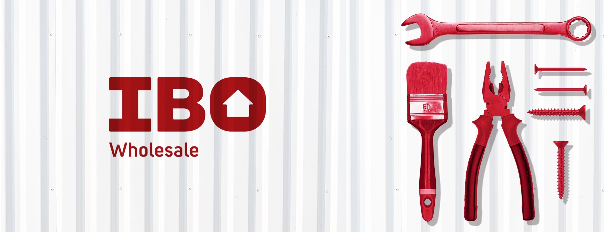
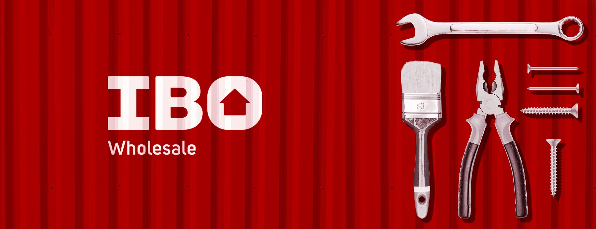
We chose a brick red to serve as the primary brand color for quick impact, with a subtle iron-gray as the secondary color – both extremely apt for the category. The red also bears the textured patterns often found on corrugated roofs, helping it stand out even more in the customer’s mind.
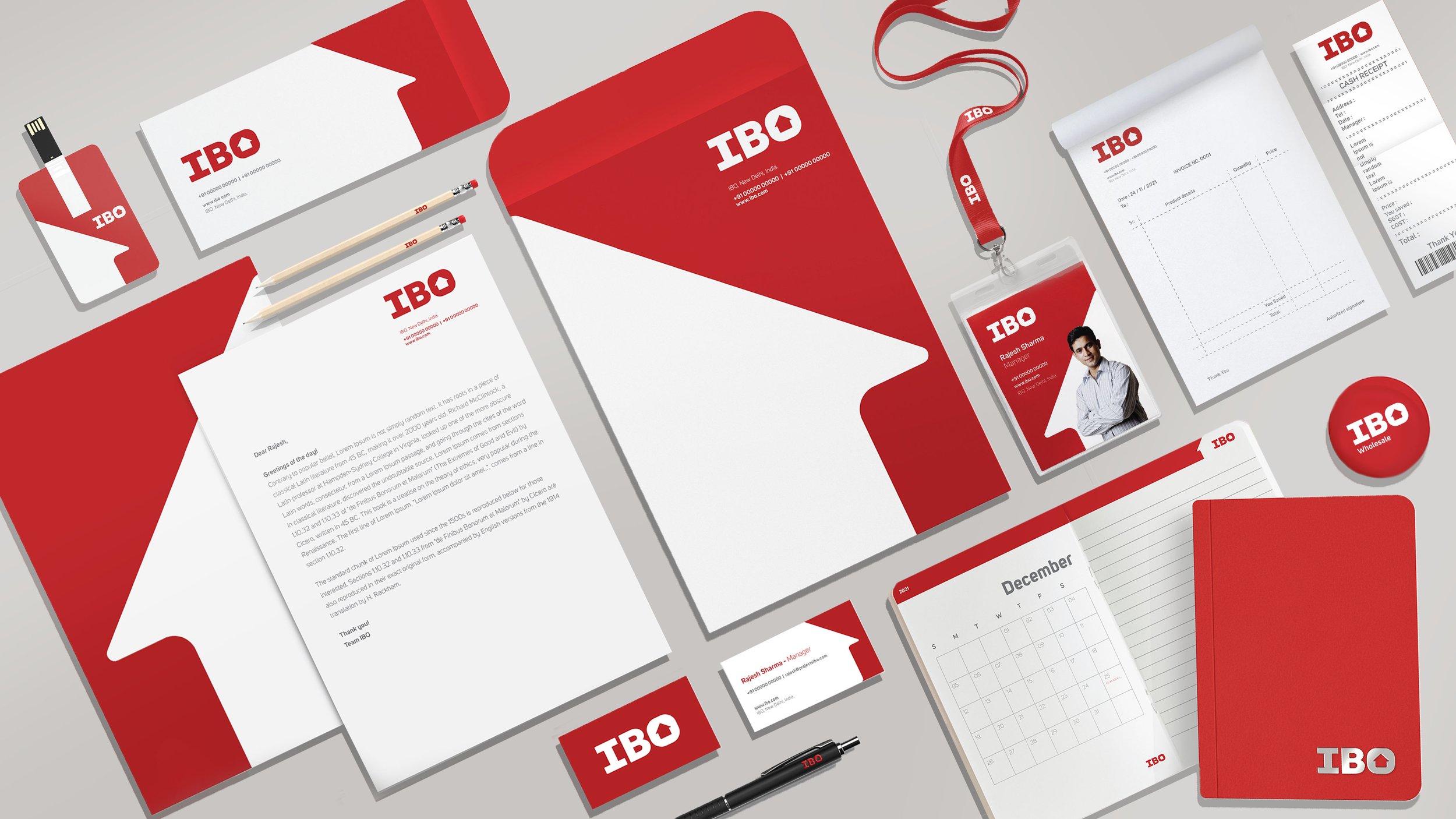
The ‘O’ in the IBO logo encapsulates a house element, making the brand’s association with all things home building crystal clear. The logo’s white distinctly stands out against the red, making signages and other communication easily legible. The identity system allows for localization in all regional languages, underscoring the brand’s need to be rooted and accessible to industry middlemen.
The team also developed a visual system, replete with symbols that helped demystify the brand’s exhaustive list of offerings, especially on all communications and in-store signage. All in all, Elephant’s work for IBO resulted in a brand backed by a strong identity, ready to make a splash in the home building space, and was met with positive feedback across the board. The identity’s flexibility could easily be demonstrated through its numerous applications when designing the retail, in-store experience – which readers can always explore by following this link.
