Shubham
Brand positioning and identity for an affordable housing finance company

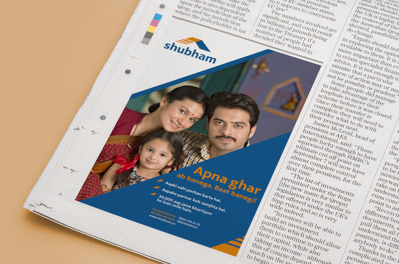

Clothing, shelter, and food are the basic necessities of life, right? But for a huge portion of the Indian population, buying a home is a difficult process. Given their informal incomes, finding a bank to loan them money is often impossible. Which where affordable housing finance companies enter the picture.
Shubham, an established affordable housing finance company wanted to rework its brand identity and we were brought in to help. Traditionally, companies of this sort are looked at with a high dose of scepticism and thought of as being akin to moneylenders. Shubham wanted to break out of this mould and move towards becoming a more trustworthy brand.
Our category interrogation on understanding the consumer, competition & category led us to believe that the Shubham brand needs to be positioned as a ‘Trustworthy partner that provides financial solutions to help life progress’. The new brand concept & its positioning intends to evoke optimism, positivity and create a sense of security and reassurance in the minds of customers. Shubham would also focus on its clientele’s life stories, instead of just the monetary aspect of the loan in order to deepen its positioning which is based in the ‘Progress’ Space.
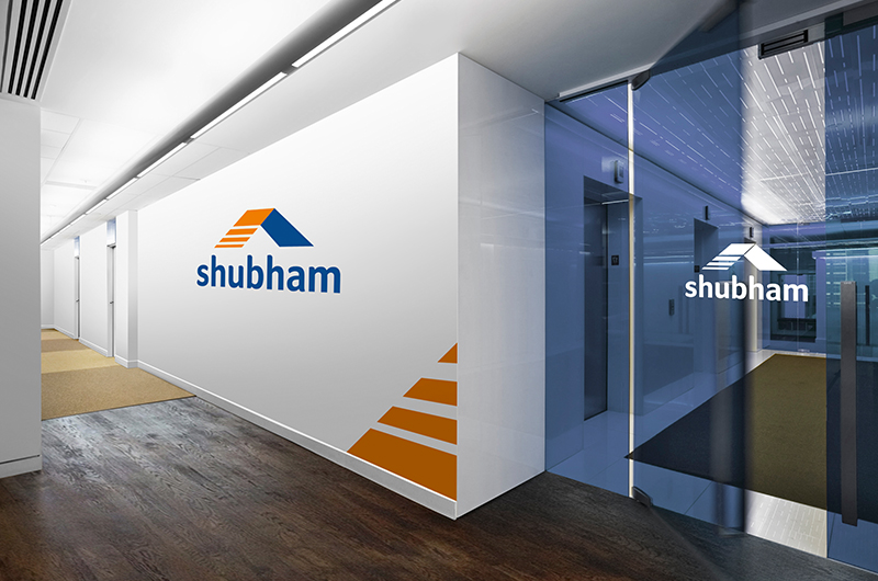
Our design team then worked on the brand’s new identity through adding passion, warmth, optimism and vibrancy, which the old identity lacked. We decided to build on the old logo and contemporaries. The blue colour was maintained, but made more vibrant; orange added to the colour palette to create warmth and add vibrancy while the earlier typeface which looked weak and lacked solidity was reworked to make it seem stronger and more approachable by maintaining lowercase letters in the font. The basic format of the roof was also kept intact, since it symbolised security and was a relatable unit.
While exploring both revolutionary & evolutionary identity options, it became clear that an evolutionary approach was right for this case and we then decided to bring in the theme of “stepping towards success”. The new logo resembles a staircase, signifying the vital growth and progress, denoting a better future for customers.
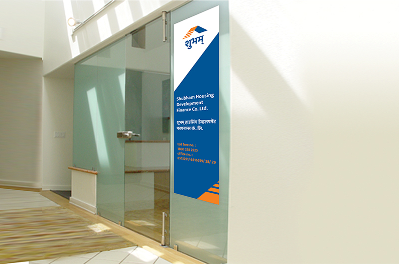
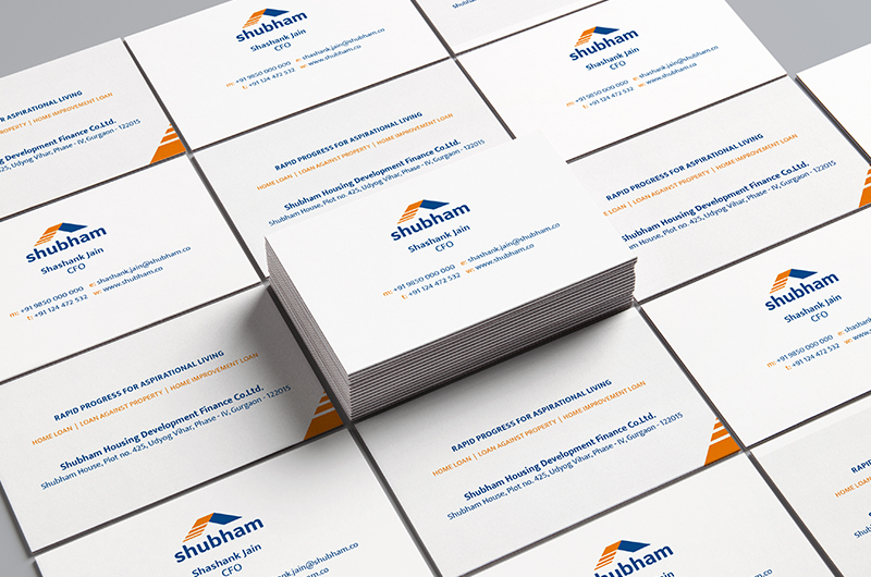
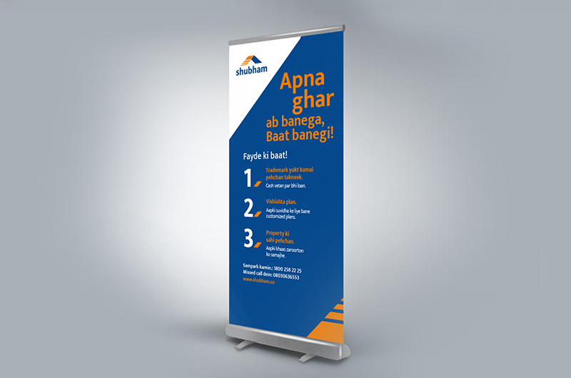
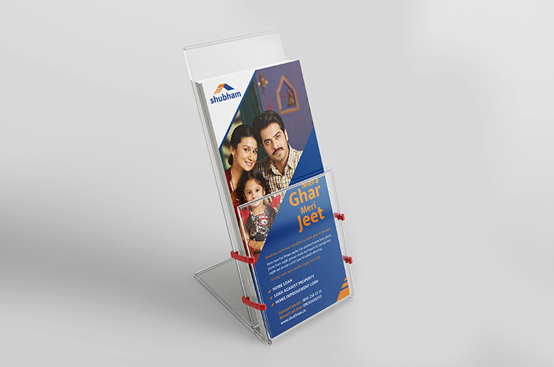
The new visual identity for Shubham conveys the contemporary and modern codes, staying relevant to the times. It has also been made adaptable to different formats at various consumer touch points.
