From Boring to Soaring: How Design is Revolutionizing Financial Services

When Banks Ignore the Power of Design 

Picture this: A long-standing financial institution, proud of its century-old legacy, finds itself struggling to connect with the digital-native generation. Its outdated branding and clunky user interfaces are driving potential customers away faster than you can say "mobile banking." This scenario, unfortunately, isn't just hypothetical – it's a reality faced by many traditional banks and financial services providers today. 

In an era where fintech startups are reshaping the financial landscape with sleek designs and user-centric approaches, established institutions can no longer afford to overlook the critical role of design in their operations. It's not just about looking good; it's about creating trust, facilitating understanding, and ultimately, driving business growth. 

The cost of neglecting design in the financial sector goes far beyond aesthetic considerations. It can lead to decreased customer engagement, lower adoption rates of digital services, and a perception of being outdated or out of touch. In an industry where trust is paramount, these factors can significantly impact an institution's bottom line and market position. 

How We are Reshaping India's Banking Landscape 

At Elephant Design, we've had the privilege of working with some of India's most influential banking institutions, including ICICI Bank and Standard Chartered Bank at the turn of the century when India was just getting introduced to Retail Banking. Those partnerships have not only helped shape service design in brick n mortar space but have also deepened our understanding of the unique challenges and opportunities in this sector. 

Our partnership with Axis Bank further strengthened our expertise in reimagining banking experiences across all touchpoints. Working closely with them over an extended period, we developed a comprehensive understanding of their needs and created a clear architecture for branches with varied functionality. From exclusive HNI lounges to specialized NRI branches and innovative Banks on Wheels for rural coverage, we detailed each concept and supported their implementation, ensuring a cohesive banking experience across all customer segments. 

Our experience has taught us that effective design in financial services is about creating a bridge between complex financial products and the everyday consumer, fostering trust, and simplifying processes that can often be intimidating or confusing. 

Turning Institutions into Inspirations 

From Scepticism to Optimism in Housing Finance 

In more recent years, we got an opportunity to position Shubham, an established affordable housing finance brand that had embarked on a journey to break the traditional money lending practice within communities with informal income. Our goal was to position Shubham as a "Trustworthy partner that respectfully provides financial solutions to those looking to progress in life." 

We infused the brand with optimism, warmth, and vibrancy, moving away from the scepticism often associated with affordable housing finance companies. The new visual identity symbolizes growth and progress, reinforcing Shubham's role in their customers' journey towards a better future.  

Chola MS: The Express Lane to Insurance 

Our work with Chola MS focused on creating a differentiated experience for insurance agents and customers alike. The "Insurance Express" concept was born out of the need to make insurance transactions quick, experiential, and friendly. 

We designed compact, ROI-focused outlets that don't compromise on experience or trust. The vibrant, energetic design language and user-friendly interfaces transformed the typically staid atmosphere of insurance offices into efficient self-service environments.  

MIBL Paybima: Where Digital Meets Personal in the Insurance World 

For MIBL's Paybima, we focused on creating a "Smart Digital Hub" that simplifies the insurance journey for customers in Tier-2 and Tier-3 cities. This project presented a unique challenge: how to leverage technology to simplify insurance processes while still providing the human touch that many customers in these markets prefer. 

Our strategy centred on three key pillars: digitizing and humanizing insurance, providing simplified advisory services, and ensuring seamless omnichannel integration. We recognized that while digital solutions could greatly improve efficiency, the human element remained crucial in building trust and providing personalized advice. 

Indel Money: Traditions Meet Digital Innovations 

Indel Money approached us with a strategic objective: to reposition themselves as a comprehensive financial services company, moving beyond their established identity as a gold loan provider. This transformation required a careful balance between leveraging their existing trust while signalling their expanded capabilities to serve broader financial needs. 

Our strategic approach focused on developing a brand narrative that would effectively communicate this evolution while maintaining their foundation of trust and expertise. We crafted a modern, forward-looking identity that reflected their expanded financial services portfolio while preserving the core values that had earned them customer loyalty over the years. 

The Secret Sauce: Insights from the Finance-Design Fusion 

Our extensive work in the financial sector has yielded valuable insights into what works and what doesn't in retail banking design. Here are some key learnings: 

  1. Simplicity is Key: Financial products are inherently complex, but good design can make them feel simple and accessible. It's about rethinking entire processes and customer journeys to remove unnecessary complexity.  

  2. Trust-Building Through Design: In an industry where trust is paramount, every design decision should contribute to building and maintaining that trust. This can be achieved through consistent branding, transparent information design, and creating physical and digital environments that feel secure and professional.  

  3. Balancing the Digital and Human Touch: While digital solutions are essential for efficiency and scalability, the human element remains crucial in financial services. Good design should facilitate both digital efficiency and meaningful human interactions.  

  4. Consistency Across Touchpoints: An omnichannel approach ensures a seamless experience whether the customer is online, on mobile, or in a physical branch. This consistency not only improves the user experience but also reinforces brand identity and builds trust.  

  5. Cultural Sensitivity: Especially in diverse markets like India, design must be culturally relevant and inclusive. This goes beyond just using the right imagery or colors. It's about understanding cultural nuances in how people interact with financial services and designing accordingly.  

  6. Empowering Financial Literacy: Good design in financial services should not just facilitate transactions; it should also educate and empower users to make better financial decisions. This can be achieved through thoughtful information design, interactive educational tools, and creating spaces (both physical and digital) that encourage learning about financial products. 

  7. Flexibility and Scalability: The financial sector is rapidly evolving, and design solutions need to be flexible enough to adapt to changing regulations, technologies, and customer expectations. 

  8. Emotional Connection: While banking and finance are often seen as purely rational domains, successful brands in this space create emotional connections with their customers. Design plays a crucial role in this, from crafting brand narratives that resonate with people's aspirations to creating experiences that make customers feel valued and understood. 

The Bottom Line: Why Design is the Best Investment for Financial Brands 

As we've seen through our work with Shubham, Chola MS, MIBL Paybima, and Indel Money, strategic design is not just a nice-to-have in the financial sector -- it's a necessity. In an industry often perceived as cold and impersonal, thoughtful design can inject warmth, build trust, and create meaningful connections with customers. 

The financial institutions that will thrive in the future are those that embrace true user-centricity through design thinking principles. Whether developing technological solutions or creating physical spaces, these principles are essential for arriving at insights-led solutions that genuinely serve customer needs. 

The ever-evolving landscape of financial services necessitates the role of strategic design and user-centric thinking will only grow in importance. At Elephant Design, we're committed to pushing the boundaries of what's possible, helping our clients create meaningful, impactful experiences for their customers. In doing so, we're not just shaping brands — we're shaping the future of finance itself. 

Legatrix Nxt: Revolutionizing Task Management in the Digital Age

When Legasis, a provider of legal systems and integrated solutions, approached us to revamp their compliance management web tool, it presented a valuable opportunity to study, understand, and enhance a digital tool that significantly impacts the daily workflows of a large professional user base. 

In today's fast-paced digital world, task management tools are a dime a dozen. But how many of them truly understand and address the pain points of their end-users? Enter Legatrix Nxt, a next-generation web tool that's redefining task management as we know it. 

The Challenge: Beyond Speed and Aesthetics 

When redesigning high-frequency digital tools, the goal isn't just to make them faster, easier, or more attractive. The real challenge lies in creating a system that empowers users to optimize their workflow and perform better. After all, a tool is only as effective as its user. 

Imagine spending precious time documenting tasks you've already completed, sifting through pages of information before finishing a task, or doing this hundreds of times. Now, picture yourself as a team leader, trying to get a quick overview of your team's performance from an Excel sheet crammed with text and numbers. Daunting, isn't it? 

The Legatrix Nxt Approach: Redefining User Journeys 

To tackle these challenges, we went back to the drawing board, armed with insights from end-users of this critical yet daunting digital tool. We peeled away layers of biases, expectations, aspirations, and redundancies to create a proactive and intelligent system that fosters a conducive environment for user engagement and interaction. 

Here's how we did it: 

  1. Mimicking Familiar Interfaces: We designed interfaces that users are comfortable with, reducing the learning curve. 

  2. Creating Meaningful Engagements: Throughout the user journey, we incorporated affirmations in communication and segregated what users see from what they do, easing the cognitive load. 

  3. Intuitive Features: We added quick-access features like compliance calendars, role-specific dashboards, faster information consumption, and error-free task submission. 

  4. Mobile Optimization: Recognizing the need for on-the-go access, we tackled the challenge of presenting dense information on mobile screens using card systems, fluid navigation, gestures for layered information, and differential CTAs.  

The Result: A Tool That Works For You 

Legatrix Nxt isn't just another task management tool. It's a system that adapts to your needs, encourages productivity, and evolves with you. Whether you're documenting tasks, reviewing team performance, or accessing information on the go, Legatrix Nxt has you covered. 

The Human Touch in Digital Solutions 

While Legatrix Nxt is packed with cutting-edge technology, we never lost sight of the human element. The tool is designed to reduce stress, not add to it. Here's how we kept the user experience human-centric: 

Empathetic Notifications: Instead of cold, robotic reminders, Legatrix Nxt uses language that acknowledges the challenges of work and offers encouragement. 

  • Wellness Integration: The system includes gentle reminders for breaks, stretching, and hydration, promoting a healthier work environment. 

  • Customizable Interfaces: Users can personalize their dashboards, adding personal touches like color schemes or motivational quotes. 

  • Adaptive Reporting: Gone are the days of one-size-fits-all reports. Legatrix Nxt's adaptive reporting feature customizes information presentation based on the user's role and preferences. A CEO might see high-level performance metrics, while a project manager gets detailed task completion data. 

Breaking Down the Future in this Engagement 

Let's dive deeper into some of the groundbreaking features that can set Legatrix Nxt apart in near future: 

1. AI-Powered Task Suggestions 

Legatrix Nxt can use machine learning algorithms to analyze your work patterns and suggest optimizations. For example, if you consistently complete certain tasks quicker in the morning, the system might suggest rearranging your schedule to capitalize on your peak productivity hours. 

2. Visual Task Mapping 

Instead of traditional list-based views, Legatrix Nxt would be able to offer a visual task mapping feature. This mind map-style interface allows users to see how different tasks interconnect, helping to identify dependencies and streamline workflows. 

3. Collaborative Workspaces 

Recognizing that modern work is rarely solitary, Legatrix Nxt can introduce collaborative workspaces. These virtual environments allow team members to work together in real-time, share resources, and communicate without leaving the task management interface. 


Integration of emerging technologies 

As we continue to refine and expand Legatrix Nxt, we're exploring exciting new frontiers: 

  • VR/AR Integration: Imagine stepping into a virtual workspace where you can manipulate tasks and data with your hands. 

  • Voice-Activated Commands: For hands-free task management on the go. 

  • Cross-Platform Ecosystem: Seamless integration with other productivity tools to create a unified work experience. 

The Key to Success: Alignment of Vision 

The success of Legatrix Nxt wasn't just about conceptualization and execution. It was about the alignment of vision between all stakeholders - a progressive, experimental, and enthusiastic client working hand-in-hand with a dedicated development team. 

In the end, Legatrix Nxt stands as a testament to what's possible when we dare to reimagine digital tools not just as faster or prettier versions of their predecessors, but as intelligent systems that truly empower their users. Welcome to the future of task management. 

The Fine Intersections of Snacking and Design

In the vibrant, fiercely competitive world of snacking, packaging transcends mere wrapping; it's a silent salesperson, a brand ambassador, and a crucial influencer in the split-second decisions hungry consumers make. With aisles overflowing with enticing options, snacking brands must master the art of visual storytelling to grab attention, communicate their values, and ultimately, land in eager hands. This article delves into the intricate tapestry of crafting packaging graphics, systems, and visual identities for modern snacking brands, weaving in considerations like typography, colour psychology, category codes, consumer behaviour, the diverse landscapes of retail and online spaces, cultural contexts, and the growing weight of sustainability. 

Typography: Speaking Volumes in a Crowded Pantry 

The typeface chosen isn't just about aesthetics; it sets the tone, conveys personality, and aids readability. Take Frito-Lay's Ruffles, where the bold, playful font reflects the "crunch factor" of the chips, inviting an impulsive grab. Conversely, the elegant serif typeface adorning Kind bars speaks to their natural and sophisticated image, attracting health-conscious consumers. Remember, legibility is paramount, especially online where smaller screens reign supreme. Look at RXBAR's clean, sans-serif font that ensures clear communication of ingredients even on thumbnail images. A study by 99designs highlights the impact of typography, revealing that 63% of consumers consider it influential in their purchasing decisions, emphasizing the importance of choosing a font that aligns with your brand's personality and target audience. 

Colour Psychology: Evoking Emotions Through Palettes 

Colours carry powerful emotional associations, influencing our perception and behaviour. Red exudes excitement, driving cravings like M&M's vibrant hues. Green signifies naturalness, resonating with the health-conscious, as seen in Naked Juice's packaging. Understanding these connections is key. Blue, associated with calmness and trust, dominates yogurt packaging (Yoplait) to reflect health and well-being. Interestingly, research by the Institute of Grocery Distribution found that yellow packaging increases impulse purchases by 8%, making it a popular choice for grab-and-go snacks like Pop-Tarts. In India, Haldiram's leverages a similar strategy with its yellow and red packaging, instantly communicating its association with vibrant spices and traditional flavours. 

Category Codes: Conveying Familiarity & Innovation 

Consumers rely on visual cues to navigate crowded shelves. Familiar colour schemes and design elements within a category provide a sense of comfort and recognition. For example, blue and white dominate chip packaging, signalling salty goodness. However, brands can stand out within these codes by injecting novelty. Popchips uses a vibrant colour palette to differentiate itself in the American beige potato chip landscape. Similarly, India's Bingo! snacks utilize playful characters and bold primary colours to stand out in the crowded savoury snack category. 

Consumer Behaviour: Understanding Bite-Sized Decision Makers 

Millennials, the "snacking generation," value transparency, experience, and sustainability. Think clear ingredient lists on Nature Valley bars or playful illustrations on Hippeas chickpea puffs. Conversely, families with young children might be drawn to colourful characters and fun shapes like those on Annie's Bunny Grahams. In India, brands like parle-G and Britannia cater to families with their nostalgic packaging designs and familiar flavours, while newer entrants like Yoga Bars and Epigamia tap into the health-conscious and experience-driven preferences of millennial consumers. Understanding who your target audience is and what resonates with them is crucial for creating packaging that connects. 

Retail vs. Online Spaces: Tailoring the Visual Narrative 

The physical shelf presents unique challenges; packaging needs to be eye-catching and informative from afar. Bold colours, clear product visuals, and concise messaging are key. Think about Pringles' iconic can or OREO's instantly recognizable black and white packaging. Online, where consumers rely on product images and descriptions, detailed nutritional information and high-quality photos are essential. Think Bare Snacks, which emphasizes the natural ingredients and textures of their dried fruits through close-up photography on their website. A study by the Food Marketing Institute highlights the importance of online presence, reporting that 72% of consumers research groceries online before making a purchase, emphasizing the need for packaging that translates effectively to the digital realm. 

Cultural Contexts: Navigating Diversity & Sensitivity 

Global brands must be mindful of cultural nuances. Colours carry different meanings across cultures; for example, red might symbolize good luck in China but danger in some European countries. Consider Mondelez's Cadbury Dairy Milk, which uses purple packaging in the UK but adopts a blue and white design in China to resonate with local preferences. Similarly, in India, brands like Haldiram's and Bikano adapt their packaging designs and flavour profiles to cater to regional preferences and cultural sensitivities. 

Sustainability: Snacking with a Conscience 

Consumers are increasingly eco-conscious, making sustainable packaging a priority. Think about Terra Chips' compostable bags or Lärabar's use of recycled materials. These choices not only align with consumer values but also future-proof brands in a shifting landscape. In India, brands like Ekta Chips and Earth Origin utilize biodegradable and recycled packaging, demonstrating a growing commitment to sustainability within the domestic market. 

Statistics & Numbers: Quantifying the Impact of Design 

The numbers speak for themselves. A study by Sonoco Packaging found that 73% of consumers base purchasing decisions on packaging design, highlighting the significant influence visual elements have on consumer choices. Nielsen reports that eye-catching packaging can increase sales by up to 30%, demonstrating the tangible impact of effective design. Additionally, a study by McKinsey & Company revealed that 70% of consumers are willing to pay a premium for sustainable packaging, emphasizing the growing importance of eco-conscious design choices. 

Designing for snacking brands is a complex dance between aesthetics, function, and emotional connection. Understanding the interplay of typography, colour, category cues, consumer behaviour, retail landscapes, cultural contexts, and sustainability is crucial for creating packaging that not only stands out on the shelf but also resonates with consumers on a deeper level. By weaving these elements into a cohesive narrative, snacking brands can create a powerful first impression, build brand loyalty, and ultimately, secure a delicious bite of the market share.  

Calling all snack enthusiasts! Today, we chat with Gouri, our graphic designer with a passion for both branding and delicious treats. We'll explore her snacking habits and creatively tasty titbits! 

3 Types of Snacks I Consume 

  • MOM Makhane/Too Yum 

  • Kurkure Solid Masti 

  • Pringles  

3 Things You are Mindful of While Snacking  

  • Zero Transfats 

  • Sodium content 

  • Smaller grammages to avoid overeating 

3 Snack Brands I Cherished Working on 

  • Dominos 

  • Hungritos 

  • Kurkure 

3 Snack Brands From the Elephant Pantry I’d Like to Work on 

  • Bauli Moonfills 

  • Wai Wai Noodles 

  • Haldirams 

Putting the Desi in Global: Navigating India's Lucrative but Demanding Market

India, with its burgeoning middle class and insatiable appetite for new experiences, has become a treasure trove for global brands. The sheer size and projected growth of its consumer base make it a market no company can afford to ignore. For those already here, amplifying their presence is the name of the game, while the others desperately seek a winning entry point.

But conquering the Indian market is no cakewalk. Brands that dip their toes into "localization" by adding a few Hindi phrases or swapping their mascot for a sari-clad one often flounder. The Indian consumer, while increasingly global in outlook, is deeply rooted in their diverse cultures and evolving aspirations. A surface-level understanding simply won't cut it.

This is where the three levels of localization come into play. Level one, the basic translation and adaptation, is just the tip of the iceberg. Level two delves deeper, understanding and adapting communication based on the nuances of local humour, social norms, and cultural sensitivities. But even this isn't enough. Imagine India as a vibrant tapestry, woven with countless languages, traditions, and aspirations. A single "Indian" identity doesn't exist. This is where level three shines.

Level three localization involves brand transformation. Companies create sub-brands or even entirely new brands tailored specifically for the Indian market. These brands resonate with local desires and aspirations, speaking their language, understanding their humour, and reflecting their values. Think Liril, a soap brand born in India, or Horlicks, reinvented with Bollywood stars and cricket endorsements. These brands aren't mere adaptations; they're desi at their core.

And what better guide to navigate this intricate landscape than Elephant Design? Our journey mirrors India's own rise to prominence. We've grown alongside the nation, our roots firmly planted in Indian soil, our branches reaching towards global horizons. This unique perspective allows us to understand the market not just intellectually, but also intuitively. We see the subtle shifts in demographics, the evolving aspirations, and the hidden desires that drive consumer behaviour in India.

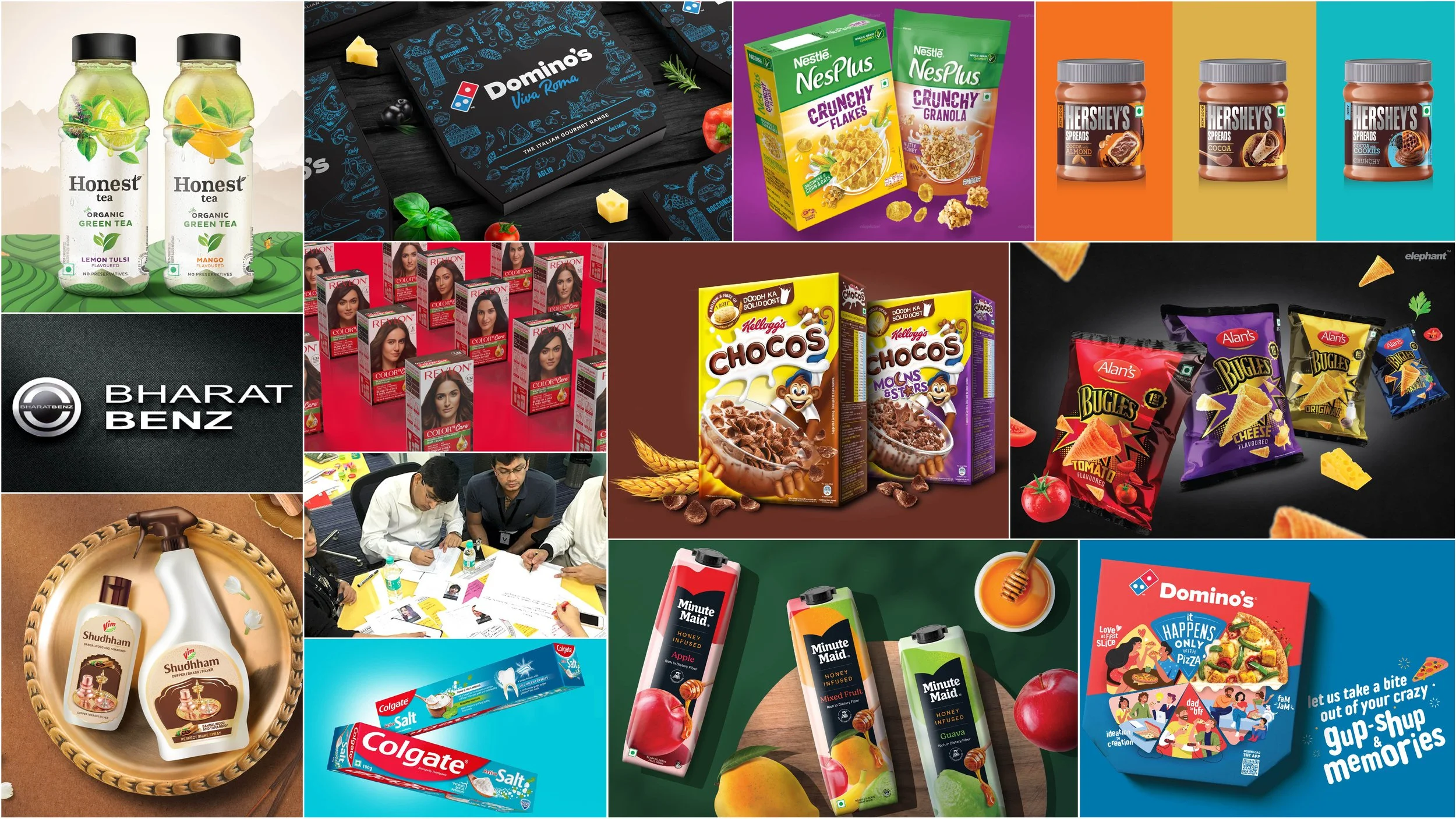
We’ve helped many prominent brands and streamlined their entry into Indian markets, while also re-positioning others so that their offerings, and image resonate with their intended audiences. From globally renowned haircare brands to automobile giants and infant-care to snacks, our portfolio is diverse. This has given us a few insights that we think are crucial when thinking about localization.

So, how can you "put the Desi in Global"? Here are some golden nuggets from Elephant Design's treasure chest:

  1. Tap into the power of nostalgia: India cherishes its past. Leverage nostalgic design elements, vintage references, or even reimagining iconic Indian brands to evoke a sense of familiarity and comfort. Think reviving classic patterns with a modern twist or partnering with legendary local brands for limited edition collaborations.

  2. Celebrate festivals and occasions: India's calendar is bursting with vibrant festivals and special occasions. Tailor your design and communication strategies to these moments, creating limited edition packaging, festive campaigns, or special offers that resonate with the celebratory spirit.

  3. Embrace vernacular languages: While English has its place, don't underestimate the power of regional languages. Use local scripts, puns, and humour in your design and communication to connect with specific communities on a deeper level. Imagine vibrant packaging adorned with Tamil poetry or witty Hindi slogans.

  4. Think beyond metros, target Tier 2 and 3 cities: The burgeoning consumer base in smaller towns and cities craves brands that understand their aspirations. Adapt your design aesthetics and communication style to their preferences, focusing on affordability, practicality, and relatable local references.

Design-Specific Tips:

  • Visual storytelling over text: India is a land of rich visual traditions. Use vibrant colours, intricate patterns, and evocative imagery to tell your brand story, minimizing text dependence. Think rangoli-inspired packaging or murals depicting local heroes.

  • Mobile-first design: Indians are glued to their smartphones. Ensure your website, app, and social media presence are optimized for mobile screens, with quick loading times and user-friendly interfaces.

  • Localize fonts and typography: Ditch the generic fonts! Embrace regional scripts, traditional calligraphy, or playful hand-drawn typography to add a touch of authenticity and connect with local audiences.

  • Symbolize with care: India has a rich tapestry of symbols with specific meanings. Research and understand the cultural connotations before using symbols in your designs. Avoid appropriation and ensure your symbology resonates with the intended audience.

  • Design for accessibility: Remember, India has a diverse population with varying abilities. Incorporate inclusive design principles to ensure your packaging, communication, and digital platforms are accessible to everyone.

By incorporating these additional nuggets and design-specific tips, you can craft a brand experience that truly resonates with the Indian consumer. Remember, it's not just about adapting, it's about embracing the vibrant essence of India and weaving it into the very fabric of your brand.

By following these insights and partnering with a trusted guide like Elephant Design, you can unlock the true potential of the Indian market. Don't just translate, transform. Don't just adapt, evolve. Embrace the "Desi" spirit and watch your brand flourish in this land of a billion dreams.

Remember, "Putting the Desi in Global" isn't a slogan, it's a strategy. It's about understanding, respecting, and celebrating the unique essence of India, weaving it seamlessly into your brand narrative. It's about creating experiences that resonate so deeply, they bridge the gap between local and global, leaving an indelible mark on the hearts and minds of Indian consumers. This is the key to unlocking the golden gates of this vibrant market and writing your own success story in the land of endless possibilities.

Designing Desire: The Allure of Beauty Packaging

The concept of beauty in the cosmetics and wellness industries has undergone a remarkable evolution throughout human history. The trajectory of its accompanying packaging design reflects these changes. Earlier, notions of beauty included elements of symmetry and proportion. There was undue focus on the harmonious balance between form and function. Today, beauty has become increasingly diverse and inclusive. Beauty encompasses a broad spectrum and attempts to transcend physical appearance. As we navigate the complexities of the digital age, beauty is visualized in the way one expresses themselves, reflecting a more holistic understanding of what it means to be beautiful. 

The beauty and cosmetics industry, too, is naturally shaped by consumer preferences, technological advancements, and societal shifts. Packaging design has always been a critical element in brand identity and consumer engagement. As we move further into the 21st century, several notable trends are reshaping how beauty and cosmetics products are presented to consumers. In this article, we will explore seven key packaging design trends that are making waves in the industry.  

1. Focusing on Personalized, Pro-Active Care 

One of the most significant trends in the beauty and cosmetics industry is the move towards personalized, pro-active care. Consumers are no longer satisfied with one-size-fits-all products; they crave solutions tailored to their unique needs. Packaging design plays a pivotal role in conveying this personalization. 

Brands are increasingly utilizing customizable packaging, allowing consumers to mix and match product variations, choose their preferred scents, or select skincare regimens tailored to their skin type. Sleek, modular packaging with interchangeable components has become a hallmark of this trend, giving consumers the power to curate their beauty routines.  

2. Inclusivity 

Inclusivity has become a buzzword in the beauty industry, and it extends to packaging design. Brands are embracing diversity in their packaging imagery, showcasing a wider range of skin tones, hair textures, and gender identities. This shift towards inclusivity is not just a nod to societal progress; it's a reflection of the diverse customer base that beauty brands need to cater to. 

Inclusive packaging design communicates a brand's commitment to serving all consumers, regardless of their background or appearance. It sends a powerful message that beauty is for everyone, promoting a sense of belonging and acceptance within the beauty community. 

3. Minimalism and Simplicity 

Less is more in the world of beauty and cosmetics packaging design. We see this characterized by clean lines, uncluttered layouts, and a focus on essential information. This design philosophy is a response to consumer fatigue from overwhelming and overly ornate packaging that previously dominated the industry. 

Minimalist packaging not only exudes elegance and sophistication but also aligns with sustainability goals by reducing material waste. Brands are using eco-friendly packaging materials and opting for compact, refillable containers that reduce the environmental footprint of their products.  

4. Sustainability Motifs/Messaging Up-front 

Sustainability is no longer an afterthought but a prominent feature in beauty and cosmetics packaging design. Brands are proudly showcasing their commitment to environmental responsibility through packaging motifs and upfront messaging. Earthy gradients, nature-inspired graphics, and eco-friendly symbols communicate a brand's dedication to sustainability. 

Moreover, brands are incorporating information about their sustainability efforts directly on the packaging, such as details about recyclability, cruelty-free status, and ethical sourcing. This transparency resonates with eco-conscious consumers, fostering trust and loyalty. 

5. Flat Design with Distinct, Ownable Themes 

Visual aesthetics play a crucial role in attracting consumers, and the use of flat design with pastels, earthy gradients, and retro themes is gaining traction. Flat design, characterized by simple, two-dimensional visuals, creates a clean and visually appealing look. 

Pastel and earthy gradient colour schemes evoke a sense of serenity and natural beauty. Newer brands also focus on differentiating themselves via ownable shades and themes that deviate from what typically dominates.   

For instance, retro themes appeal to consumers' nostalgia and add a touch of vintage charm to packaging. These designs can range from Art Deco elegance to '80s and '90s pop culture references, creating a unique brand identity that stands out in a crowded market. 

6. Focus on Educating Consumers About Ingredients and Their Scientific Efficacy 

Today's consumers are more informed than ever about the ingredients in their beauty and cosmetics products. Packaging design here becomes a tool for education. Brands are incorporating infographics, icons, and QR codes that link to detailed ingredient information and scientific studies supporting product claims. 

Clear, concise explanations of key ingredients and their benefits empower consumers to make informed choices. This trend not only promotes transparency but also positions brands as authorities in skincare and beauty science. 

7. Smart Packaging to Integrate Added Communication 

The integration of smart packaging is a revolutionary trend that brings the digital and physical worlds together. Smart packaging incorporates technologies like near-field communication (NFC) and augmented reality (AR) to offer consumers enhanced experiences and communication. 

With a simple tap of their smartphones, consumers can access product tutorials, virtual try-on experiences, and real-time skincare analysis. Smart packaging extends the consumer journey beyond the point of purchase, fostering engagement and loyalty. 

In conclusion, the beauty and cosmetics industry is evolving, and packaging design is at the forefront of this transformation. Brands are embracing personalization, inclusivity, minimalism, sustainability, aesthetics, education, and smart packaging to connect with consumers on a deeper level. As the industry continues to innovate and adapt, we can expect even more exciting developments in packaging design that cater to the ever-evolving preferences of beauty enthusiasts worldwide. 

Designing Environments for Mental Health and Well-being

In our fast-paced and urbanized world, the impact of the built environment on our mental health and well-being cannot be underestimated. As we spend the majority of our time indoors, the design of interior spaces plays a pivotal role in influencing our psychological state.  

Colour, lighting, spatial layout, and material choices are key factors that can significantly impact our emotional well-being. In this article, we will delve into the profound influence of design on mental wellness and explore how evidence-based principles can create spaces that reduce stress, enhance mood, and support mental health. 

Colour Me Healthy 

Colour, being the most perceptible element of design, holds the power to evoke emotions and set the tone for a space. Warm hues like soft yellows and earthy tones are known to create a sense of comfort and security. For instance, healthcare facilities have adopted this principle by using calming Colours in patient rooms and waiting areas to alleviate anxiety. In contrast, vibrant and bold Colours such as red or orange can stimulate energy and creativity. They find their place in spaces like gyms or collaborative work areas. 

One real-life example of a product that embraces the use of Colour to promote mental well-being is the "CalmSpace" by Steelcase. This innovative office pod is designed with serene blue and green tones, providing employees a private retreat to recharge and de-stress amidst a bustling workplace. 

When implemented, pods seem to be quite the hot favourite. The Relaxation Pods at ASMRtist Studios - ASMR (Autonomous Sensory Meridian Response) are known for its soothing and calming effects. These specialized studios offer relaxation pods with ASMR experiences, designed to reduce stress, anxiety, and improve overall mental relaxation. 

Uplifting Lumens 

Equally significant is lighting, which profoundly influences our circadian rhythms and emotional states. Natural light has been proven to enhance mood, productivity, and focus. In contrast, harsh artificial lighting can lead to eye strain and exacerbate stress. Therefore, incorporating large windows and skylights can significantly improve the well-being of occupants. 

A real-life application of this concept can be found in the "Breather" spaces, which are designed to offer natural light and a connection to the outside world. These private meeting spaces in urban areas provide a sanctuary for individuals seeking a moment of tranquillity amidst the chaos of the city. 

The Circadian Lighting System at Loma Linda University Medical Centre illustrates the concept better. This hospital integrates a dynamic circadian lighting system that mimics natural light patterns, positively influencing patients' sleep-wake cycles and improving overall well-being during their stay. 

Moreover, the spatial layout should prioritize openness and accessibility. Cluttered and cramped spaces can induce feelings of anxiety, whereas open and flowing interiors promote a sense of freedom and peace of mind. There’s a reason wellness retreats and spaces of learning – like university campuses – feature such spaces. 

Spiritual-Material Bridges 

Material choices also carry immense significance in influencing mental well-being. Natural materials like wood, stone, and bamboo have a grounding effect, promoting a sense of stability and connection to the earth. On the other hand, synthetic materials like plastics and artificial fabrics may contribute to a feeling of disconnect and unease. 

Muji, a Japanese retail company, has been a pioneer in promoting mental well-being through material choices. Their minimalist and nature-inspired stores use natural materials to create a serene shopping environment, offering visitors a respite from the sensory overload of modern consumerism. 

Applying evidence-based design principles can transform interior spaces into sanctuaries that nourish mental health and well-being. The principles of biophilia, Colour psychology, and optimal lighting are just a few examples of how design can be harnessed to promote psychological wellness.  

However, it is essential to remember that designing for mental health goes beyond mere aesthetics. The philosophy of "empathetic design" emphasizes understanding the needs and emotions of the occupants and tailoring spaces accordingly. 

The role of design in promoting mental health and well-being within interior spaces cannot be understated. Colour, lighting, spatial layout, and material choices all contribute to the psychological well-being of occupants. By applying evidence-based design principles and embracing empathetic design, architects and designers have the power to create environments that reduce stress, enhance mood, and support mental wellness.  

Biophilic Design and Sustainable Building Systems: Enhancing Well-being and Sustainability

In an increasingly urbanized world, the human connection to nature has undeniably diminished. However, a harmonious approach to design and construction, known as biophilic design, has emerged to bridge this gap and reconnect people with the natural world. By integrating elements of nature into building systems, this design philosophy enhances well-being and productivity and contributes to a more sustainable and environmentally-viable future. 

Understanding Biophilic Design 

Biophilic design stems from the idea that humans have an innate affinity for nature. This connection has been embedded in our evolutionary history, where our ancestors thrived in natural environments for thousands of years. But as urbanization took on a more aggressive, unplanned form, its structures prioritized functionality over natural elements, leading to a disconnect between humans and nature. 

Biophilic design aims to rectify this by incorporating nature-inspired features, such as natural materials, water elements, green walls, and indoor gardens, into the built environment. These elements mimic the patterns, shapes, and colours found in nature, providing a sense of harmony and tranquillity within the bustling urban landscape. 

The Role of Natural Materials 

One of the key aspects of biophilic design is the use of natural materials in construction. Wood, stone, bamboo, and cork are prime examples of eco-conscious materials that not only add a touch of elegance to the design but also reduce the carbon footprint of buildings. For instance, innovative companies like EcoLumber have been revolutionizing the construction industry by producing sustainable, high-quality lumber from responsibly managed forests. Bangalore-based Phantom Hands is another homegrown example, where they specialize in creating long-lasting furniture made from reclaimed, supply-chain verified teakwood.   

By choosing these alternatives to traditional materials, architects and developers can significantly reduce the impact on the environment while creating visually appealing structures. 

Green Walls: Vertical Gardens for Cleaner Air and Mind 

Green walls, also known as living walls or vertical gardens, are installations of plants that cover building exteriors or interiors. These green wonders not only serve as stunning visual features but also improve air quality by filtering pollutants and releasing oxygen. A famous exemplar of biophilic design and green wall integration is Singapore’s Gardenia Tower. This awe-inspiring skyscraper boasts lush greenery covering its entire facade, providing a sanctuary of calmness in the midst of a bustling city. The presence of such living elements within the building system fosters a sense of connection with nature, which can reduce stress levels and enhance cognitive function. 

Indoor Sanctuaries 

The inclusion of indoor gardens within building spaces can transform sterile environments into vibrant oases. Companies like Verdure Sanctuaries specialize in designing and installing indoor gardens, fostering a symbiotic relationship between humans and nature within the built environment. Such sanctuaries have been found to reduce tension, anxiety, and fatigue, promoting emotional well-being among building occupants. An excellent example is the Bosco Verticale, or the "Vertical Forest." This residential complex in Milan designed by Stefano Boeri Architetti features two towers covered with more than 20,000 trees, shrubs, and plants, creating a living, breathing ecosystem that combats air pollution and enhances biodiversity.  

Well-being and Productivity 

Biophilic design's profound impact on well-being and productivity has been well-documented. Employers have also noticed an increase in productivity among employees working in office spaces with biophilic design features. BioCo Workspace, a company specializing in biophilic office designs, reports a notable boost in employee satisfaction and creative output for businesses that adopt their nature-centric approach.  

Another stellar example is Microsoft's campus in Redmond, Washington that features unique treehouse meeting spaces tucked amidst the forest. These rooms offer employees a chance to connect with nature while at work. The treehouses blend seamlessly with the surrounding trees, providing a serene and inspiring atmosphere. 

Sustainability: The Environmental Benefits of Biophilic Design 

Beyond human well-being, biophilic design plays a crucial role in promoting sustainability. The use of natural materials and green walls helps lower the demand for energy-intensive construction materials, thereby reducing greenhouse gas emissions. Moreover, green walls contribute to the cooling of buildings, mitigating the urban heat island effect and saving energy on air conditioning. Additionally, indoor gardens help improve indoor air quality, reducing the need for mechanical ventilation systems and enhancing energy efficiency. 

In conclusion, biophilic design represents a paradigm shift in architecture and construction, emphasizing the importance of nature in our lives and its integration with building systems. 

As we embark on a journey toward a greener and more sustainable future, biophilic philosophy may become the norm. Through this symbiotic relationship, we can create healthier, more inspiring spaces that benefit humans while nurturing the precious ecosystem we are a part of.  

From Disposable to Eternal: Embracing Emotional Durability

It’s no secret that consumerism encourages disposable, short-lived products. But a shift towards emotional durability and longevity in product design emerges as a beacon of sustainability. Instead of churning out products with planned obsolescence, forward-thinking companies are now embracing the philosophy of creating enduring items that forge lasting emotional connections with their users. This approach reduces waste while fostering a more mindful consumer culture, where attachment and value take precedence over mindless consumption. 

The Essence of Emotional Durability 

Simply put, emotional durability is the capacity of a product to resonate with users on a deeper level. Such products become more than mere possessions. They’re infused with sentimental value, memories, and experiences that weave themselves into the fabric of the users' lives. This emotional bond often outlives the product's functional lifespan, leading to an extended use, reuse, or even preservation for generations. 

This isn’t a new concept. Jonathan Chapman, a British academic laid down the foundations for it in his book “Emotionally Durable Design: Objects, Experiences and Empathy” back in 2005. Today, when designers, scientists, students and educators use ‘emotional durability’, they indirectly refer to the complex relationship between people and objects. The attempt to create these meaningful things comes with a more profound question: how do objects acquire value and meaning? A few examples help us with the answer.  

Everlasting Travel Companions 

Leica is a prestigious camera brand celebrated for its iconic rangefinder cameras. These meticulously crafted cameras are prized by photographers for their timeless design, exceptional optics, and unparalleled image quality, making them not just tools but cherished artistic companions. There’s a reason they predominantly sell pre-owned products as enthusiasts gobble them up – it also helps that aftercare is an integral part of owning a Leica, whose mechanisms are notoriously durable. 

Similarly, outdoor clothing company Patagonia embodies sustainability by creating rugged, durable, and multifunctional products that withstand years of wear and tear. Their indestructible tote bags serve as shining examples of emotional durability. With each adventure, each trail conquered, the bag becomes a companion, a silent witness. This emotional bond fosters a sense of loyalty and respect, prompting users to extend the bag's life instead of discarding it at the first sign of wear. 

Kitchen Heirlooms 

Le Creuset's enamelled cast iron cookware are emblems of longevity. These pots and pans are built to outlast generations of culinary experiences and become cherished family heirlooms. The emotional bond between cook and cookware goes beyond the appreciation of cooking capability. They become vessels that carry the stories of family gatherings, special occasions, and comforting meals shared with loved ones. Their emotional resilience encourages users to cherish and maintain them, reducing the need for frequent replacements and fostering a culture of sustainability in the kitchen. 

Another famous tool that’s gathering fame is the Japanese kitchen knife. Earlier, these were relegated to the kitchens of professional chefs but today, many home cooks swear by this prized possession. And why not? Swordsmiths turned to knife-smithing in the Edo period, which then became their full-time occupation after the Sword Abolishment Edict in 1868. The application of generational metalworking techniques turned the humble knife into an elegant, deadly heirloom whose blade rarely dulls with time – and users cannot help but attach themselves to these tools. Even the rarely-needed sharpening process becomes a ritual they look forward to.  

While going through these examples, the astute reader might remark: Well, aren’t you simply listing niche luxury goods whose appeal is enhanced by elegant storytelling? A branding exercise, even? This is partly true. In a consumption-driven reality, the line between a wholesome story and well-crafted sales gimmick gets blurry.  

But isn’t it also the responsibility of other, everyday brands to emphasize longevity, despite how common they might be? Does cheap necessarily mean fleeting, short-lived, disposable? For the ordinary consumer, isn’t longevity a greater need? 

At its core, the concept of emotional durability and longevity aligns with various philosophical principles that emphasize mindfulness and responsibility. By shifting the focus from a materialistic mindset to one centred on lasting connections and value, we cultivate a more profound understanding of our relationship with the material world. This philosophy encourages us to reflect on the true essence of our needs and desires, prompting us to make conscious choices that align with our values and the well-being of the planet. 

Context of Industrial Design in India: Present & Future

-by Ashish Deshpande

Today, world over and in India we celebrate Industrial Design Day (initiated by World Design Organisation). What does it mean in the context of India? Here, is a brief thought compilation on this 29th of June 2023, World Industrial Design Day.

Just the other day, someone remarked, “Industrial Designers are a dying breed.” Probably, an over-the-top reaction to general movement of a larger chunk of Product Design workforce towards the digital world of UX / UI design. Nothing wrong for young designers to look for opportunities, one, where they lie at present and two, what is dictated by present technology & business conditions in India.

Even at Elephant Design, having started Industrial Design activity 34 years ago, we have had to constantly reinvent ourselves in newer domains of design work. Traditionally, Industrial Design & Communication design were our forte. In the later part of 90s, with the advent of modern retail and a boom in consumerism, we quickly added Retail Design, Packaging Design and Service Design to our services. This led us to focus on understanding people and the eco system that surrounds them, and we created a special operations domain dedicated to Design Research & Strategy. This helped address growing business concerns about product differentiation, platforms, and innovation. We were late boomers in the digital world and soon we understood that the hard physical world of operation, control, interaction, and management of processes would need digital applications. The world around us was changing thanks to superlative progress in digital telecommunications, internet and internet of things, data & cloud functions, and lately artificial intelligence.

“When the music changes, so does the dance.”, is an old African proverb, that succinctly sums up the present. In India, we have had a long and rich history of highly functional and aesthetically design objects, stemming largely from local hand craft, lifestyle, and ritualistic functions. This is how we functioned a few centuries and beyond, rich in design, cultural expressions and objects reflected the local social fabric & the economy. Advent of Industrialisation heralded a world full of comfort goods driven by prevalent technology of mass production and global scale. Modern design education is a love child of this equation of the 1950’s -60’s and we in India followed, driven by the rise of industrialised consumerism from the western world. This held ground and was responsible to contribute extensively to Industrial Design making its impact on commerce and society. These were the days, where from a largely agrarian economy, we moved to a manufacturing driven economy. However, the millennium year, saw India take a commanding position in the IT and Digital technology world, slowly taking up position as a service sector powerhouse.

Today, In India, the Manufacturing Sector is contributing about 17% to the GDP, whereas the Service sector contributes about 55%. Internet based technology adoption has been swift, and we see many functions getting digitised. We see this in finance, healthcare, clean energy, communication, education, e-commerce and e-governance. This digital and connected world is going to grow in the coming years, impacting our otherwise inaccessible millions. This shift driven by technology and efficiency in business needs has rightfully created a exodus of design professionals into the digital & IT world. Even traditional Industrial Design domains like Appliances, Machine Tools, Automotive and such have seen a stronger application of digital interfaces & communication, wireless connectivity, and other upcoming technology stacks.

At present, traditional Industrial Design where form, function, material and feel rode hand in hand, may look a bit lost. Though in actual, this is not the case. It is simply a new world order of the ‘software’ and the ‘hardware’ that has polarized a composite design approach of the last century. Shift in career preference towards the digital side has only suppressed the impact Industrial Design continues to bring to the economy.

I will reinforce this with three strong pointers that at present are silver lining for the future of Industrial Design.

  1. Opportunity Gaps

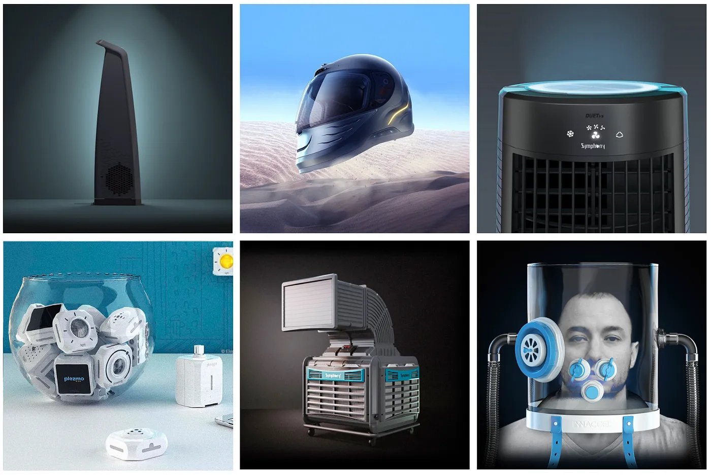
    India as a region presents a huge opportunity with large need gaps in the renewable energy, climate care, healthcare, nutrition, education, water & sanitation, and mobility sectors. It is imperative that Industrial Designers focus on these critical areas of development and growth. This is where Industrial Design will work based on our local context & conditions. Symphony Coolers, Learn & Play IoT products from Plezmo or smart, low cost & accessible healthcare devices like Healthcube are good examples of work already starting to impact these sectors.

  2. Offshore Service

    Design in India has been through 60+ years of incubation. Profession of Industrial Design has matured, and it is high time designers take services beyond Indian shores. Our cost & quality structure makes us ideal for providing offshore services to several EU & American economies where work on Industrial Design products along with strong technology teams for emerging markets far outweighs local consumption. Design of wearable Stroke Rehab device for SynPhNE, a company based out of Singapore is one demonstration of this possibility. Any push in this direction is a scalable proposition and says much about the future of Industrial Design from India.

  3. Building Brands

    Biggest fillip to Industrial Design will come from creating a Creative Economy where entrepreneurship & creative design & manufacture will run hand in hand. Many design education institutions like IDC, IIT Powai, MITID, Pune and NID, Ahmedabad and more are nurturing design incubation programs. Industrial Designers are no longer being stamped out to meet industry job requirements. Fresh Industrial Designers are seeing design education an opportunity to kick start design led entrepreneurship programs. This attitude if nurtured is the real game changer for India.

    Good policy thinking from the state & central government, a nurturing attitude from the industry and a design education system that will work towards providing training and higher research for building a strong foundation will go a long way to inject a stimulus for Industrial Design. Quality of manufacturing and design & technology based research platforms are some areas that need more work. Industrial Design from India and followed by Made in India is totality that is possible. Wishful thinking from an Industrial Designer, this World Industrial design Day.

Author:

Ashish Deshpande is a M Des eq., Industrial Designer, trained at the National Institute of Design, Ahmedabad. He has been a practicing designer for over 34 years as co-founder of the multi-disciplinary Design Consultancy firm, Elephant. www.elephantdesign.com

Summertime Madness

Designing for the Heat 

The sweltering summer heat is finally here! The spectre of climate change still looms large over it – given all those random spells of rain and whatnot – but let’s face it, the heat is here to stay. And perhaps, for longer than before.  

All ominous chitchat aside, there is something to be said about designing for summer. For designers, summer presents an opportunity to create design solutions that capture the essence of the season and help people make the most of their time in the sun.  

We are looking to explore some of the key elements of designing for summer, with some of our work that follows our advice. That’s how you know we are putting our money where our mouth is.  

Colour me Cool (Or Warm?) 

When it comes to summer, colour is king! Bright, bold, and vibrant colours are the way to go. Think beach balls, popsicles, and tropical drinks. Incorporate these summer-inspired colours into your designs and watch them come to life! From sunny yellows to ocean blues,

the options are endless. Forget about colour combinations at your own peril here: pairing colours like coral and turquoise or pink and green can create a fun and playful summer vibe. 

Our packaging design for La Shield sunscreen illustrates this. We opted for deeper shades of yellow and orange, choosing to contrast it with blues and whites. The image of a sandy beach with azure skies just compels the customer to allude to a time where sunscreen isn’t an option – it’s a necessity, and a pleasant one at that.  

Love is in the Air

Health conscious or not, there’s no summer without ice-cream (and we hear there’s all kinds of healthy options for those now too!). And ice-creams have always been all about making the best of your summer vacation – creating special moments with your friends, or significant others. 

Our team took this ‘bonding time’ theme and implemented it with our packaging design for Vadilal Flingo – Vadilal's cone ice cream range, designed to beat the heat! Deviating from the usual norms of using realistic imagery to add to the drool factor, we created fruit-personas with playful imagery that showcase the bond between any two people: not just lovers. That ‘enjoying an ice-cream together’ moment is more priceless than we give it credit for!  

The Summer Type-Cast

It’s a no-brainer for designers to amplify their work via the potent use of typography. The right font captures the essence of the season. Consider the context in which it will be used, and it can work out splendidly! A bold, sans-serif font might be appropriate for a beach party flyer, while a more elegant serif font might be better suited for a wedding invitation – context, of course, is everything. 

It's also important to consider the readability of your font. Summer designs can often incorporate a lot of text, so choosing a font that is easy to read is crucial – it must also contrast with your colours.  

For some, there is no better duet than beer and summer, so let’s look at Witlinger as an example! Our work for this craft beer brand uses summer colours – yellows and oranges – to profound effect, where the story of its sociable, cool British Bulldog Mascot looking to chill out is underscored by “Boldly British”, an allusion to its legacy. This font used for its flavour variants and this legacy call-back is playful yet makes the desired impact and lifts it out of its traditionalist bracket into a fresh, modern outlook. Shades, dark glasses, goggles, whatever you may call them, it is the coolest summer accessory. 

Zero-Sum-Imagery-Game

Imagery is another key component of summer design. Whether you are designing for print or digital, incorporating images that capture the essence of the season can help create a strong emotional connection with your audience. While typical thematic imagery includes beaches and sunsets, adding in a healthy variety of other elements like citrus fruit, pool toys or outdoor games can help.  

Another strong, yet underutilized summer theme is that of well-being. For most of the world, summer is a call for a vacation, with an increased focus on consuming chilled beverages to stay hydrated. But most of them happen to have a high sugar content. And that can be unhealthy in the long term.  

So, to help understand how powerful imagery can be, we can look at our work for Paper Boat Zero – which infuses your summer with nostalgia and the promise of fresh, new starts! The packaging for Paper Boat’s Zero Sugar Sparkling Water range is all about conveying crisp, fruity goodness with an emphasis on Zero: everything that needs to be absent for you to feel your healthy best. The design appeals to fitness enthusiasts and summer-beverage-hounds alike, while portraying goodness that is firmly a part of Paper Boat’s brand identity.   

The Symphony of Beating the Heat

Design is often a delicate balance between aesthetics and functionality – and more so when it comes to product design. At Elephant, no person in the chain is as important as the end user, and we are constantly looking at ways in which we can add functionality above and beyond the product’s basic premise.  

For instance, in the spirit of summer, think about what a water bottle does. When designing one, you can always incorporate ‘nice-to-haves’ like a built in, self-cleaning straw mechanism or a sturdy attachment clip for backpacks and other surfaces. 

Our design for the Symphony DüET Mini cooler aims to do exactly that. Deviating from the standard clunky, space-occupying cooler unit that’s also very movement resistant was the need of the hour. Our answer comes in the form of a cooler that is sleek, ultramodern, ultra-portable and fits into your array of desktop devices like speakers or other tech. Its obelisk structure allows for standard cooling capacities with strong air-throw for its size, while also making it modular enough to be moved around and kept in the smallest spaces for individual cooling.  

Our summer advice bottom line? It’s straightforward but a little tricky when it comes to practice. It requires careful consideration of colour, typography, imagery, and functionality. By incorporating elements that capture the essence of the season, you can create solutions that resonate with the audience and create a strong emotional connection.

UI/UX and Remote Work Models: How do we enhance them?

As remote and hybrid work models become increasingly common, the design of tools that facilitate collaboration is more important than ever. One key aspect of these tools is their user interface and user experience (UI/UX). A well-designed UI/UX can improve productivity, reduce errors, foster collaboration and communication, improve accessibility, and improve user satisfaction and adoption. However, there are several prevailing challenges when it comes to how productivity/remote work tools are designed that can hinder the success of remote collaboration. 

Complexity: Many productivity tools have a steep learning curve with complex and unintuitive interfaces that can be overwhelming for users. This can lead to frustration and reduced productivity, as team members spend valuable time trying to figure out how to use the tools instead of actually collaborating. 

Personalization (Or lack thereof): Remote workers have different preferences and work styles, but many productivity tools lack the right customization options. This can make it difficult for workers to tailor the interface and features to their individual needs, which can lead to reduced efficiency and effectiveness. 

Inconsistency: With so many different productivity tools available, it can be difficult to maintain consistency across different tools and platforms. This can lead to confusion and inefficiency, as users have to constantly adapt to different interfaces and workflows. 

Communication Barriers: Productivity tools that are meant to facilitate communication can actually hinder it if the UI/UX design is not optimized for effective communication. For example, if it's difficult to find and access messaging or video conferencing features, it can lead to delays and misunderstandings. 

Accessibility Issues: Remote work can involve team members working in different time zones or with different schedules. Productivity tools that are not accessible 24/7 can create barriers for remote workers, who may struggle to access the tools and information they need, which can limit their participation in the collaborative process. 

Security: There is an increased risk of data breaches and other security threats. Productivity tools that are not designed with security in mind can put sensitive information at risk. 

Integration Woes: These can create inefficiencies and make it difficult for remote workers to collaborate effectively. With so many different productivity tools available, it can be challenging to integrate them seamlessly. 

In conclusion, while designing tools for collaborative, remote work, it is important to address the challenges posed by UI/UX. The challenges of complexity, lack of personalization, inconsistent user experience, communication barriers, lack of accessibility, security concerns, and integration issues can all hinder the success of remote collaboration. By considering the needs and preferences of the users and investing in a UI/UX that is intuitive, easy to use, and aesthetically pleasing, remote collaboration can become more effective, productive, and successful.


Surveys Used 

Buffer 2021: Included over 3,500 remote workers from around the world, 20% of respondents reported that the biggest challenge of remote work is communication and collaboration. 16% cited loneliness and isolation as a major challenge, highlighting the importance of effective communication and collaboration tools. 

Nielsen Norman Group Survey, 2020: Found that the usability of productivity software can have a significant impact on user productivity. Participants who used software with a high usability rating completed tasks an average of 40% faster and with 60% fewer errors than participants who used software with a low usability rating. 

Stanford University Survey, 2020: The study found that allowing remote workers to personalize their workspaces and choose their own tools and technologies can lead to improved performance and job satisfaction. 

G2 Survey, 2021: 63% of respondents reported that inconsistent user experiences across different tools and platforms was a major challenge when it comes to remote work. 

Center for Generational Kinetics Survey, 2020: 74% of respondents reported that technology issues were a major frustration with remote work. This includes difficulties with communication and collaboration tools. 

Owl Labs, 2021: 24% of respondents reported that lack of access to necessary tools and information was a major challenge of remote work.  

PwC, 2021: 50% of respondents reported that security concerns were a major challenge of remote work. This includes concerns about data breaches and unauthorized access to sensitive information. 

India House at the Tokyo Olympics: Vision of creating a home away from home

Envisaging an Oasis of Indian Culture on World Stage – A Vision, unrealized due to the tragedy of the pandemic, but one that left us with hope & pride.

MicrosoftTeams-image (83).png

Combining Resilience and Achievement  

For those involved with sport in any capacity, the importance of the Olympics is but a bygone conclusion. But this event, this celebration of cultural assimilation and human achievement transcends commonsensical notions of what it means to view and appreciate sports. With its theistic beginnings in ancient Greece that were limited to a handful of athletic and combat-based events, the world now witnesses an astounding 33 sports spanning 46 disciplines in omnichannel-style distribution. In a world that was otherwise united by the tragedy of the pandemic, the decision to host the Olympics this year could not have come at a better time. We wait with bated breath: to heal, to recover and to celebrate humanity, one impressive, Herculean feat at a time.

Enter Hospitality Pavilions 

The Olympics don’t simply allow different countries to showcase their repository of talent. They also provide the general public a glimpse into the sheer variety of cultures, mindsets and landscapes that span our world – something we often need to be reminded of for this diversity to be appreciated. It is this spirit of discovery that governs the creation of hospitality pavilions.        

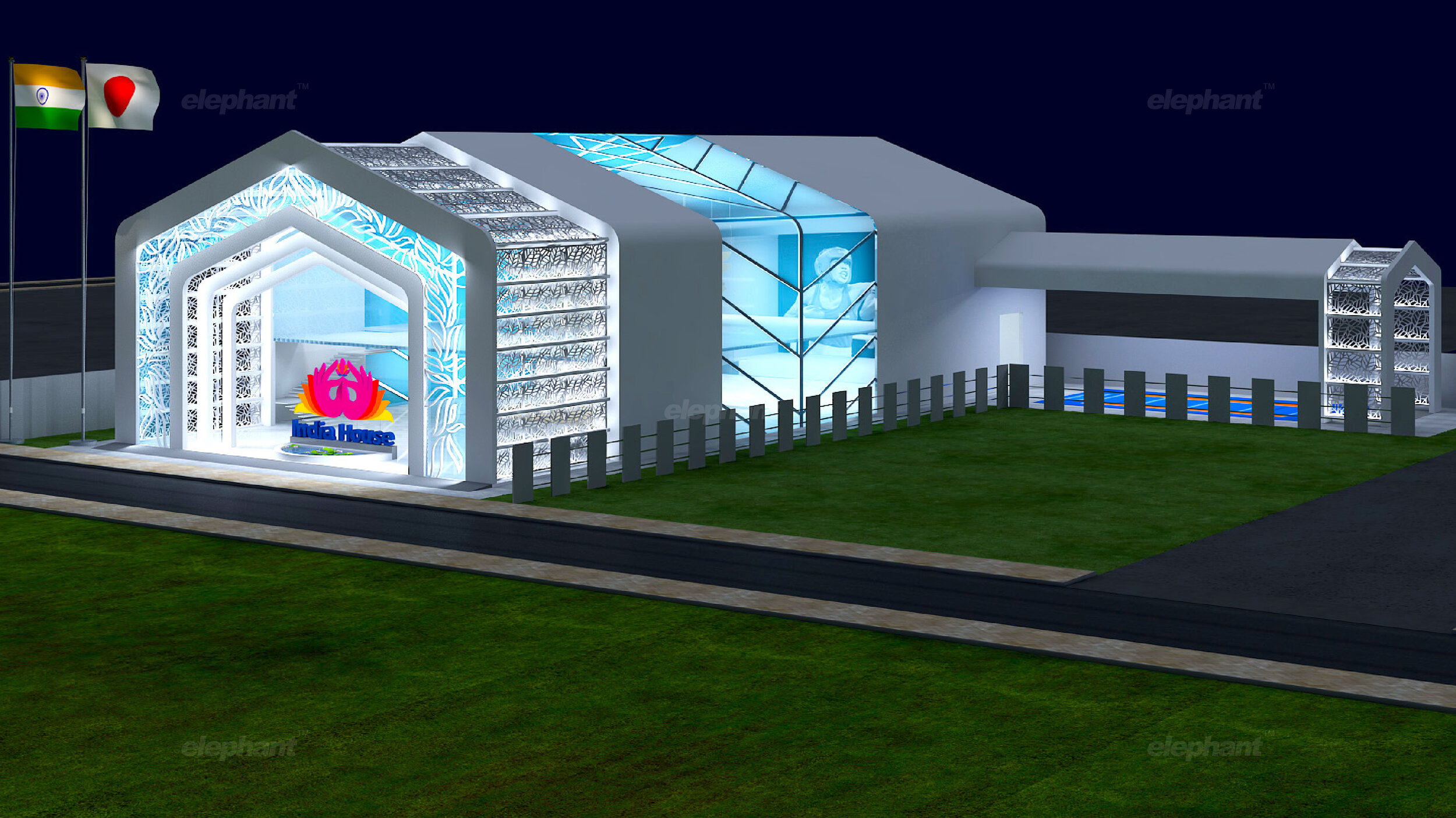
You can imagine the excitement that surged through our team when we were approached jointly by JSW and the Indian Olympics Committee to create India House: an extraordinary celebration of India’s presence at the Tokyo Olympics. While the pandemic sadly did not let us implement our concepts, we wished to provide certain insights that came with this momentous exercise in creativity.

Crucial Questions 

When one removes all instances of a built environment, what remains is simply an area – a plot of land where one’s imagination needs to envisage something that will innately embody the spirit of ‘India House’. But what does that truly mean? Beyond bare spatial requirements, the theme, structural design and visual identity determine everything.  

How could we design this pavilion so that it conveyed everything that was truly Indian? What motifs, symbols and stories could we weave together to create meaningful impact? And how could we align our cultural identity with that of the Olympic essence? Would this space be the most welcoming and convenient experience for our para-athletes? These were some of the questions with which we began our work and the process of answering these were found at the intersection of environment design and the development of a visual identity system for India House.

Cultural/Visual 

Our team ultimately decided that there wouldn’t be any better cultural virtue to focus on but the tenet of Indian hospitality itself. Atithi Devo Bhava, a common Sanskrit phrase likens the unexpected guest to God, where our hospitality should match the stature of this guest. In that vein, we articulated the values of this experience to revolve around Welcoming, Celebratory and Graceful overtones.  

Each one of these values was then matched with prolific Indian symbols like the magnificent arches from heritage architecture, a dancing peacock in its full glory and the beauty and the grace of the lotus flower. We also utilized colors from the Indian flag and Devanagari script to add to our visual inspirations and form a complete palette. 

Cultural/Structural 

Beyond visual identity, the structure and environment also needed to adhere to Indian virtues, for which we devised several options, of which two were met with great reception.

P 01-03.jpg
P 01-04.jpg

The first option focused on using traditional Kerala architecture, involving the indigenous science of carpentry that was often used to build ancient temples, palaces and dwellings. Here, the Sun motif – a central symbol in Indian rituals and traditions would be interspersed with the spatial architecture in different zones. Even the activities and zones would be similarly themed – like the surya namaskar which stands for an active form of meditation and relaxation.

P 01-02.jpg

However, the option that was ultimately selected revolved around using the Peepal Tree as a central motif.  

Signifying enlightenment, requiem and rebirth, the Peepal tree is not simply the tree under which the Buddha obtained enlightenment – something often conveyed in Indian mythos beyond India. It also serves as a gathering point for socio-cultural events in the Indian rural landscape, under which the panchayat often sits, or musical/dramatic performances are given.         

With the Peepal Leaf’s heart-shaped profile being interpreted in multiple ways, we saw its implementation in the form of backdrops, intricate filigrees, main framework, floor patterns and other tangible elements. While harmonizing seamlessly with the hospitality-driven visual identity, this structure beckons all attendees in an inviting, warm fashion and promises a unique, completely immersive experience like none other. 

Unity and Collaboration 

Both – the structure and its constituent materials, meanwhile, combine a blend of ancient and modern to lend credence to both aesthetic form and pure function. This additionally pays homage to the respective cultures of Japan and India, embracing the spirit of creative collaboration between civilizations that strikes at the heart of the Olympic spirit. 

Our work in this direction was a vision that remained a dream because of a reason that now afflicts us all – the pandemic. But this dream had three distinct objectives, which we hope were realized within our processes: One, to highlight the idea of a modern India: An India with technological prowess, an industrious economy and within this context, a sporting powerhouse. Two, celebrate our impressive roster of hardworking, dedicated Olympians whether they take the podium or not. Lastly, embody the notion of a home away from home – creating our very own oasis where people could just sit back and absorb the nuances of Indian culture – and thus, we go forth!

‘Designers have to take responsibility of making the store meet business objectives’

The following article by Ashish Deshpande appeared first in an interview in the Retail4growth magazine July edition, 2021.

https://www.retail4growth.com/viewpoints/designers-have-to-take-responsibility-of-making-the-store-meet-business-objectives-879

“How many of us as designers go back to our stores after a year of operation and ask franchisee / store manager about the ROI from the store? It’s time we did that, “ says Ashish Deshpande , Co-Founder & Director, Elephant Design, in this exclusive interaction with Retail4Growth on the future of store design, the need for retail design to adapt to post-Covid realities, and more...

Screenshot 2021-07-21 at 2.15.34 PM.png

To start with, could you share your views on how the whole retail design segment is looking post pandemic? Fact is retailers are going slow on their spends now, being more cautious about expansion and renovations or moving to the online space, due to the impact of the pandemic. How is this impacting store architects and designers?

John Lennon famously remarked, “Everything will be okay in the end. If it is not okay, it is not the end.” The founding member of The Beatles probably meant that it will never be okay and, it’s time for us to look ahead and get on with what we do. The pandemic is far from over as it continues to ebb and flow with uncertainty. However, do not despair: there is a silver lining. As per McKinsey & Company’s insightful report, on a global scale, the retail industry has outperformed and the consumers are as hungry as ever. The Retail sector has outrun many other sectors based on accelerated transformation during the last 18 months. As a McKinsey & Company report says, ”The past year suggests the recipe for success in retail is changing, and those that wait too long to adapt may never catch up.” So, the picture today for retailers and designers is not about complete mayhem but rather about adaptability. The earlier traditional retailers and store designers learn this lesson, the quicker they will move towards meeting the new normal.

So what exactly can store designers and architects do to navigate through this situation and move forward? What have been your own takeaways in the last one and a half years?

Traditionally, store designers and store architects have been too involved in the creative process. Be it form, space, colour or even materials: the new frontiers that the realm of store design has outlined have often been seen as too distant and otherworldly. Even in the immediate pre-pandemic period, it was rare to see designers and retailers listening to the expectations of customers. Those who did would have noticed a change in the mental model of how customers saw their store experience, given the rising adaptation of smartphones, streaming internet technology and telecommunication that was getting cheaper by the day.

The pandemic has now presented the design workforce with an opportunity to align store design with emerging user expectations, look at smarter ways to meet business objectives and seamlessly integrate the freedom of choice presented by the tech world into their brick & mortar solutions. This is not to say that technology will rule store design. It is about using enough technology to increase access, efficiency and integrate the online experience into the touch feel of the store.   

How exactly do you think store design can contribute to better ROI for the client at a time when every penny spent matters?

Businesses have always been concerned about ROI. As a designer, one could design a “wow “ store look & feel, yet the litmus test is faced one year down the line. How many of us as designers go back to our stores after a year of operation and ask franchisee / store manager about the ROI from the store? It’s time we did that.

Designers have to take responsibility of making the store meet business objectives and the pandemic has only driven this point home. We need to focus on store functions that add real value to the customers’ lives, align with their mental models and generate profit for business stakeholders. That’s our job.

As designers we need move effortlessly between our preoccupation with the subjective and into the world of quantifiable metrics. ROI from the store program can be met by the design team if the success metrices are established early on. Any design effort that leads to reducing steps, improving decision-making for the customer, enhancing transaction speed and eliminating elements that do not add value to the customer experience improves ROI.

At Elephant we follow this Five Step Model when it comes to increasing ROI:

Step 1, Efficiencies: Increase functional benefit

Step 2, Effectivity: Improve comprehension, conversion

Step 3, Effort: Reduce human load

Step 4, Errors: Eliminate waste

Step 5, Experience: Holistic value-add to shoppers

Speaking of adaptability and the inevitable shift towards contactless retail interfaces, how can a store design follow a more tech integrated, engaging and interactive approach?

Contactless transactions are here to stay. We were lucky during this pandemic period that several tech-focused 3rd party enterprises had introduced contactless transactions, including our own government though its UPI based Bhim application. So, integrating these applications has not really taxed the retailer or the store designer.

Today, designers need to look at the future of store design. We need to question our traditional layouts – as well as the need for checkout counters! Payment can be enabled at the exact point of sale, saving customers the time and effort often spent in queues, while sharpening decision making. This will lead to an increased focus on browsability and product experience will take centre stage. Customers can happily order from the comfort of their homes including choice of payment options & delivery.

Store design will focus towards making the product proposition more compelling. Here is where technology will come into play. Customers are looking to visit stores to discover new features, satisfactory trials, obtain niche’ advice, and grab those special offers. How does technology deliver these elements within the spatial ambience of a store? This is a question that the designer needs to answer. At the end of the day, technology has to be an underlying enabler for the shopper and also make money for the retailer. As designers, we have to tread this path cautiously, so that we don’t overindulge, which in turn might just overwhelm the customer or kill the business due to unachievable ROI.

As designers, we need to move effortlessly between our preoccupation with the subjective and into the world of quantifiable metrics. ROI from the store program can be met by the design team if the success matrices are established early on. Any design effort that leads to reducing steps, improving decision-making for the customer, enhancing transaction speed, and eliminating elements that do not add value to customer experience improves ROI

Any observations on how clients are approaching their store design projects now? Any interesting project you'd like to talk about?

Over the years and more so during this pandemic period, clients are looking at retail as an effective component of the sales & brand building process. The overall approach has become more scientific. Most clients are investing in on-ground research, customer insights and digital technology. Many have been quick to respond and have tweaked their store models. One good example is the sporting goods Decathlon Store. DecathlonTM opened post lockdown in the pandemic, seamlessly connecting their digital browsing, purchase and payment experience to usher in a queue-free, crowd-free, quick in- quick out shopping experience: all in accordance with what the customers wanted.

At ElephantTM, we have been helping a prominent global e-commerce player develop omnichannel shopping experience for tier 2 / tier 3 cities & towns in India. As store designers, we have to understand that retail doesn’t end in metropolis malls. India is a large country, and people have aspirations. Retail growth will come from tier 2 cities where touch & feel and the ability to buy online without a smart phone needs to be managed through smart stores.

How do you think the retail solutions industry, including the suppliers and manufacturers of retail lighting, fixtures, signage, mannequins, props, etc. move ahead from the pandemic impact and step up their game even as brick-and-mortar retail staggers back to normalcy?

The retail solutions industry has done a commendable job in the past decade to help India’s retail standards soar and reach a globally competitive level. This decade, especially under the pandemic, needs more from the industry. It is time for our retail solution providers to make an orbit shift from simply being followers to becoming innovators. We need efficient solutions in all sectors of store design. Fitouts need to get smarter, thinner, faster, flexible, save resources and energy, communicate seamlessly and most importantly, help integrate the online world with in-store hardware.

Stores are already opening and it’s only a matter of time before customers return with new expectations. The pandemic has provided us with an opportunity to look at new solutions that will make the customer feel empowered and satisfied

Little mercies go a long way

By Ashish Deshpande

Many times, innovative problem-solving focuses on larger, game-changing solutions. Of course, there’s no problem with that — it works wonders when we consider the business & technology context. However, it is the tiny affordances in design that bring about the little joys of comfort that help build everlasting trust and acceptance.

1_Archimedes-image.png

Each one of us needs support. Well, most of us definitely do.

We’ve all perhaps had one elevator moment or another. Many times, I end up like a rabbit caught in the headlights as I fumble, trying to find my floor button on the elevator panel. It is such a grateful comfort to have a fellow commuter enquire about the floor and help me locate the button. A small help, nevertheless, goes a long way to release my stress with elevator panel buttons.

These are nothing but small mercies that sometimes come our way. On other occasions, they simply end up contributing to a poor experience. As we run through a plethora of objects and events, how many times can we actually accept this discomfort and simply get on with life?

I am reminded of one of my first assignments as an Industrial Design professional at Elephant™, almost three decades ago. I was commissioned to design a cookware pan. And I was thinking to myself, what is there to design in a cooking pan? It is round, has a lid and a handle. This question took me to the kitchen and I began undertaking latent, behavioral observations during the cooking process. The lady I was shadowing stopped stirring her pot, wiped her spatula on the edge of the pot, and then interestingly, took out a bowl to park the soiled spatula. The domed surface of the pot lid prevented use as a parking space for spoons and ladles. Leaving the spoon in the pot was not an option for the fear of getting a smarting burn. Since most cooking needs the occasional stir, it was apparent that parking a spoon or a ladle was an underlying concern hitherto under-expressed. This led us to design the first Split handle lid that allowed any cook to park their spoon or spatula. This feature, however small, was much appreciated by cooks & chefs and this led to the introduction of a generic feature in each subsequent range designed for Nirlep™, all carry a feature to park spoons & spatulas. A feature that was emulated and copied by several other brands.

2_Packaging+Consumer+Innovation+Trends_Lata+Blog_Elephant-Design_India_Singapore.png

Paperboat memory drinks package is another story. Having watched a flyer on a flight struggle to open a beverage cap, a simple winged cap not only provided a distinct form but made the experience of beverage consumption a breeze. Getting rid of the little struggles, kinks, and streamlining the user’s experience goes a long way in building great brands that inspire trust and customer confidence.

3_Packaging+Consumer+Innovation+Trends_Lata+Blog_Elephant-Design_India_Singapore.png

Take a good look around and try and look at products that you like. It is worthwhile to ask — Why do we like those products? I’ve used a Lamy™ ink pen for over two decades. Apart from the many features that this pen possesses, there are two outstanding details that got me hooked. Just above the nib, the finger grip features twin symmetrical surface scoops that very elegantly park my fingers, making writing & sketching a comfortable experience. And then, on the cap of Lamy™ is a simple wire clip detail that subtly curves outwards to allow for easy insertion into a pocket or a sheaf of papers.

4_Packaging+Consumer+Innovation+Trends_Lata+Blog_Elephant-Design_India_Singapore.png

Ludwig Mies van der Rohe, the German Bauhaus architect, famously remarked, “God is in the details.” It is that little bump, that little trough, a groove, a bend that works to make a difference between pain and pleasure. It is that 1% attention to detail that makes a product work and be loved. It separates the chaff from the long-life winners, true tools of our age that really make our life simple.

The next time you find yourself designing a product or simply buying one, look out for those little hidden gems that provide relief and put a smile across your face. Your smile is a direct reflection of those small mercies, indicating good design at work.

“Many small people, who in many small places do many small things, can alter the face of the world.” African Proverb

Elephant Design is India’s Best Design Practice (ET-Brand Equity 2012–2020 ranking) with a multi-disciplinary experience of 32+ years having presence in India & Singapore and has been transforming brands, organizations & businesses using Design-led Innovation.

ASHISH DESHPANDE is an Industrial Designer, Co-founder & Director at Elephant™. An alumnus of the National Institute of Design, Ahmedabad, he is a keen Design Thinker, a member of the India Design Council & Jury for India Design Mark. He has worked on several design programs, notably, Titan Eye+, Ceat Tyres, Axis Bank, ICICI Bank, Asian Paints, Symphony, Paperboat, JAWA and works on medical & healthcare devices amongst others. Ashish is a certified Independent Director, Board of Directors, Symphony Limited, a public listed company.

* First picture is used for reference and the rights belong to its creator. All other pictures are by the author of this article.

Part III: Packaging Consumer Shifts and Trends

By Lata Sankaran

Sustainable Packaging

Packaging Consumer Shifts & Trends_Lata Blog_Elephant-Design_India_Singapore

Heightened consumer concerns about cleanliness and hygiene have resulted in brands attempting new ways to build trust. Consumers need healthy reassurance when it comes to protection and safety. This has enabled certain trends that are non-sustainable and wasteful, even.

‘Single Use’ and ‘Non-returnable’ packaging, for instance, has become the preferred choice for most manufacturers. With recycling codes being rewritten, upcycling and repurposing have become adaptive solutions to sustainability in these changing times. This brings us to the key question for this trend: How brands are altering material choices in the context of a pandemic while addressing environmental issues?

Packaging Consumer Shifts & Trends_Lata Blog_Elephant-Design_India_Singapore

Reusable packaging is faced with challenges when ‘single-use’ and ‘non-returnable’ packaging is emerging to be a viable, potent solution. For instance, Samsung’s new reusable boxes can be transformed into anything from cardboard kitten homes to bookshelves. While this is sustainable, it also provides a very concrete direction for alternative uses.

Packaging Consumer Shifts & Trends_Lata Blog_Elephant-Design_India_Singapore

Elephant Design’s foray into the realm of sustainable packaging can be seen through our work for India’s largest paint company: Asian Paints. With an extensive product portfolio of paints, home décor, and other related products, Asian paints wanted to highlight their adhesives, which were catering exclusively to professional and industrial needs. This meant taking a look at the ways in which adhesives were utilized in home and school environments.

The extensive user research informed the importance of ‘single-use’ and ‘quantity’ as two critical attributes for the pack design. The spherical orb-like design structure addressed both these attributes while enabling precise application control. The playful nature of the orb makes the process of using adhesive a far more delightful experience.

The only challenging aspect of a spherical structure is the inability to stand on its own. This problem was smartly tackled by introducing a secondary packaging and having multiples of these orb-like structures in different vibrant colors.

Packaging Consumer Shifts & Trends_Lata Blog_Elephant-Design_India_Singapore

This secondary packaging was created by keeping the upcycling in mind, where otherwise redundant products are repurposed — in this case, providing a smart functionality that also supports the core packaging.

As can be seen, the pandemic has shifted the conversation around sustainability as the availability of material that can meet the ever-increasing demand for quick packaging has been a concern for the packaging industry.

Re-use of familiar materials like glass, cardboard, metal, and plastic that can mitigate hygiene issues has regained importance. The pandemic has also heightened the unpredictability of situations and brands. Now, they are compelled to stay on their toes and be adaptive in their offerings. Customization to the changing consumer needs and rebuilding confidence in their choices have become the most important aspect of brand communication.

The examples of case studies included in this document offer a glimpse of the growing possibilities of innovation within the packaging design and how Elephant Design can help bridge the alignment of brand beliefs and values to the end consumer.

Part II: Packaging Consumer Shifts and Trends

By Lata Sankaran

Part II: Smart Packaging

Part II_Packaging Consumer Shifts & Trends_Lata Blog_Elephant-Design_India_Singapore

The pandemic has converted many compulsive shopaholics and reluctant online shoppers into accepting the digital mode of interacting with brands. We now witness interesting ways in which technology is integrated with packaging.

In fact, it has become a strong enabler for brands to communicate product information and engage with the customers beyond the pack. Which is where we come to our key question: How are brands leveraging smart technology in packaging to enable consumers to interact with products beyond the pack?

Blog imagePart II_Packaging Consumer Shifts & Trends_Lata Blog_Elephant-Design_India_Singapore_7.png

First, there is heightened consciousness regarding matters of hygiene and safety. ‘Intelligent packaging’ allows consumers to stay informed about key parameters that add to their well-being and care. Consumers also love personalization, which brands can now increasingly cater to with the application of smart tech that is integrated with packaging.

At Elephant Design, we’ve constantly believed that trends involving tech almost always don’t remain passing fads — they become essential in the long run. This is doubly so for businesses that change, innovate and disrupt industries. For instance, the education sector has changed drastically as a result of the pandemic. Teaching and learning scenarios are no longer the same.

Given the lack of contact and play with peers in the new confines of home, continuous engagement and motivation have been a point of concern for parents and teachers alike.

Part II_Packaging Consumer Shifts & Trends_Lata Blog_Elephant-Design_India_Singapore

Based on the principle of ‘Learn through Play’, Plezmo is an open-ended platform devised to enable children to learn new concepts in coding and mechanics through experiences relevant to their day to day lives.

Part II_Packaging Consumer Shifts & Trends_Lata Blog_Elephant-Design_India_Singapore

We made the pack elements transformative, where they evolve into DIY story kits, striking the right balance between entertainment and education. These kits allow children the opportunity to physically realize their ideas and topics of interest.

With digital integration, the kit empowers children to build and grow both: offline, within their own spaces, and online, within their learning communities. As a result, we’ve found that with Plezmo, children can experience one of the most rewarding and enjoyable formats of learning where their ideas can actually come to life.


Part I: Packaging Consumer Shifts and Trends

By Lata Sankaran

Introduction

The aftermath of a pandemic has been instrumental in shapeshifting consumer behavior patterns as well as creating adverse disruptions across sectors. The resurgence of previous trends, as well as an altered consumer perspective towards purchase and consumption in a post — COVID world, are redefining and reshaping new trends.

At Elephant Design, we present the Packaging | Consumer Shifts & Trends white paper identifying three key macro trends and the consumer shifts that are shaping the changes within the packaging industry and highlight a few examples of design manifestation of the same amidst this continuum of change. Brands continue to cater to the ever-changing landscape of customer expectations and define the ‘new normality’ of customer experience.

Viewing this on-going transformation and recalibration from a strategic lens, we present a few case studies from the repertoire of Elephant Design that has delivered solutions in the past adapting to these underlying patterns of consumer behavior.

One key behavioral transformation of the pandemic has been the acceleration in digital consumption in an already networked society. ‘Online anything’ phenomena has taken precedence creating the habit shift to virtual interactions with brands in the absence of a strong in-store engagement.

Additionally, daily life context in a post-pandemic world has transformed into prolonged ‘lock-downs’ and ‘work from home’/’study from home’ scenarios. ‘in-person’ brand experiences have thus become the most significant value add than ever before.

With heightened fear and anxiety around hygiene, health, and wellness, brands are constantly adapting their product packaging, designs, and material choices accounting for these value-shifts.

Positioning with these contextual scenarios, we identified three key packaging trends that form the focus of our blog series.

Part I: Thinking Inside the Box

Packaging Consumer Shifts & Trends_Lata Blog_Elephant-Design_India_Singapore

The last mile in the customer journey has become one of the most crucial touch-point in a post-pandemic world. Unboxing rituals are no longer restricted to special occasions and premium buying.

It has resurged and regained prominence at a time where consumers are interacting with brands in the confinement of their homes amidst restrictive retail shopping habits.

As the demand for online purchase increases, we ask the key question: How has un-boxing has become key in creating impactful experiences to drive long term product engagement?

Packaging Consumer Shifts & Trends_Lata Blog_Elephant-Design_India_Singapore

One particular trend is to infuse the feeling of ‘delight’ within the unboxing experience. Online shopping decisions are generally triggered by instincts and emotions. Brands are able to create an enriching customer experience when they play on consumer curiosity and heighten their excitement levels.

Customization and personalization in the package transform the unboxing experience from a mere product reveal to a moment to be cherished.

Packaging Consumer Shifts & Trends_Lata Blog_Elephant-Design_India_Singapore

Packaging also has immense potential when it comes to branding opportunities and disseminating value-based content to the consumer.

Given the lack of opportunity in seeing, feeling, or holding the product before buying, there is a heightened role of packaging in conveying the brand narrative. Visual stimuli aids are often utilized to expand the brand narrative from a mere product to an immersive retail experience.

To illustrate this, we examine the packaging design we created for Hershey’s Kisses, where the brand came up with the task of introducing a premium range of gift packaging. This would help them distinguish themselves on the retail shelf and more significantly drive customer engagement and drive purchase.

Packaging Consumer Shifts & Trends_Lata Blog_Elephant-Design_India_Singapore

The product itself is geared for the premium segment of chocolate lovers in India, so the experience was altogether more important. Elephant recognizing Unboxing to be the most important touchpoint between the brand and the customer. Keeping the changing context of gifting chocolates among urban Indian customers, our design expressions on the pack emphasized the celebration of shared moments as a metaphor for long-lasting engagement.

Fortune cookies are excellent examples of personalized content being delivered at the right touchpoints — which we drew upon. The pack now opens to a personalized message, delighting customers on two levels; that of discovery, replete with fond memories of the same, and of the pure indulgence that comes with high-quality chocolate.

Keep Calm and Make Art

Keep Calm and Make Art

We at Elephant decided to make the most of being away from each other yet feel connected and be part of a meaningful cause during these unprecedented times.

Every team member was reacting to the new change around them in their own way and had their own thoughts about coping with it. We just gave it a creative outlet by letting them bring their ponderings alive in a poster dedicated to this very unusual phenomenon we’re going through.

Our journey was through reflection, empathy and a touch of wit. We hope our thoughts & feelings align with yours. Because if not anything else, art is always a great healer. Stay safe everyone!

Disclaimer : These posters are created as an expression about the current situation. They have no commercial value. Some of them may be based on an inspiration from popular culture. Ideas expressed are those of their individual creators.

Design for Changing Consumer Behaviour

Kedar.jpg

Design for Changing Consumer Behaviour

Kedar Parundekar

General Manager, Strategy & Business Development

There is no denying that COVID – 19 has had a huge impact on the economy. It is going to be a long time before consumer confidence bounces back. 

In fact, some industries have changed for good at fundamental consumer behaviour & experience levels. Brands operating within those industries have to rapidly evolve at business model levels. Take the case of theatres within the entertainment industry. A business model that is based on aggregating people together may not be sustainable anymore. Consumers may not view entertainment as an essential activity and may not be willing to sit in confined spaces for long times because of the perception of risking infection. Another case in point, the events industry is surely looking at hiatus. Large events for sports, music, politics, religion etc. may not be allowed to aggregate a large number of people anymore.  

Elephant_Design_Blog_Kedar_.jpg

This is where design has a fundamental role to play as it enables businesses to question the conventional assumptions of consumer behaviour within their industry. In industries where consumer behaviour will change radically, design may have the answer through enabling businesses to reimagine the manner in which they deliver their consumer experience.

Movie goers may want to view movies but may look at experiences which inspire more confidence than current ones. Old age ideas like open air theatres where people can view movies from the confines of their cars may not be a bad idea! The whole movie delivery experience is up for reinvention in a manner that enables social distancing & immersive experiences at the same time. 

In the events industry, the consumer journey becomes more important than ever before and for control of crowds, technology may play a larger role than ever before. Imagine one-hour slots for parties being given to party goers in a music festival. But this would also mean that brands have to work that much harder as the audience is captive only for an hour.

In the restaurant industry, we are already seeing innovation in anticipation of a changed scenario. A few restaurants have begun delivering meal kits to consumer’s homes trying to tap into a new age trend for cooking at home. As such the brand experience for these restaurant brands now moves from the restaurant space to the meal kit that is delivered. Packaging structure & graphics is what will drive the stickiness of new age restaurant brands for now. 

Designing personalised experiences that are tech driven, immersive & build not only customer confidence but also government & societal confidence is the need of the hour.

To sum things up, businesses & brands that rapidly evolve their business models using design & design thinking will bring in new ways for affected industries and will not only survive the coming economic onslaught but might be able to take advantage of upcoming economic opportunities.

< Back to Blogs

Women of Gen Z - Your Next Big Consumer

Screen Shot 2020-03-06 at 3.44.47 PM.png

Women of Gen Z - Your Next Big Consumer

Rachita Gondhali 

Associate Graphic Designer 

If you know someone who gets their daily news off Instagram and calls you ‘BRO’ once in a while, you are probably interacting with a species of the Gen Z. They at times, might seem so alien to you, choosing between being perplexed and in awe isn’t a choice. 

To help decode them a little better, Gen Z, the next big consumers for our brands to obsess over are between 10 to 24 years of age as of this day. Yes, the ones that would text you from across the room instead of talking to you and consider Google as their best friend are the ones deciding a brand’s lifecycle.

If you know how to connect with this creative generation then you have a cat in the bag since it accounts for 40% of consumers in 2020 with India having the world’s largest young population. This highly analytical and pragmatic generation that shares an ever evolving intuitive relationship with social platforms is primarily an offspring of liberalisation. 

Blog website_header-01.jpg

Interestingly, one of the happiest Gen Z comes out of India among other countries. Indian individuals are defying linear ambitions to reach high with a mindset that doesn’t close off unconventional options. While wealth and travelling the world is a priority, marriage and religion tend to be less important in comparison to its predecessors. 

What can make the parental generations anxious is how this hyper-cognitive generation consumes information in real time by integrating virtual and offline experiences. Being digital natives, even when they shop in-store, they get real-time feedback via whatsapp. Amazon has turned this into an opportunity and added a “you might also like” section under the product title along with ratings and reviews. We wouldn’t expect any less, would we? 

It might be overstated but the Gen Zs live in a space of multiplicity, even with their identities.Their inclination towards unisex and unbiased products raises a question to many brands driven by gender about how long they can continue to make sense to the consumer. How should companies market clothes, cars or jewellery for that matter? 

Since this generation has blossomed during economic prosperity, it wouldn’t be wrong to call them optimistic and driven by passion. They made self actualisation look cool, translating in a need of a fulfilling work environment. This in turn, makes the generation a huge contributor to the ‘gig economy’. What about the women of this generation, though?

After years of downplaying a woman’s role in society, with the likes of Aranya Johar and Naina Jaiswal, we can proudly say that females have more power and a stronger voice in society today.

Understanding this vivacious group of Gen Z females as consumers and what their need of the hour is can be a key for the brands to come. 

Since the women of Gen Z are born with heavy social influence, social values play a big role in their decision making and purchase patterns. Reports suggest more than sixty percent of women expect brands to take a stance on social issues, inclusivity being one of the biggest concerns. Better late then never, maybe? American Eagle’s sub-brand, Aerie, has upped its game by adopting the no photoshop method and including models who are physically handicapped or have vitiligo, while Bumble has sneakily made room for itself in the lives of our Indian hearts by giving women a choice of quality. 

If you don’t see a Gen Z woman scream about authenticity, you probably haven’t met one. It cannot be emphasised any more. This generation sees through the celebrity marketing that has been around for ages. Celebrities are no longer the trusted word of mouth. What these women are looking for are authentic influencers that aren’t aspirational but more grounded and relatable. Youtubers are their most trusted source. One of the most famous ‘influenza’ women are going crazy about is the hilarious Bhuvan Bam from BB ki Vines or Prajakta Koli, popularly known as MostlySane who subtly breaks stereotypes with a hint of humour. 

No matter how much we label them as tech babies, Gen Z women are becoming skeptical about its benefits. This overwhelming constant connection has caused ‘technology fatigue’ and raised doubts about digital safety and security, though this fatigue hasn’t stopped the dependancy. Women are now worried about their personal details getting in the wrong hands, also a result of gender based harassment that women face online. The most common but rarely spoken about example is the usage of deepfakes to make non-consensual pornography.  

So how do you break through this generation? If you are a marketer, you now know how enormously important it is for brands to please this generation since over ninety percent of household purchases are influenced by Gen Z, especially when it is regarding travel, food, lifestyle and furniture. One way to look at it is to rethink the value creation models. This pragmatic generation analyses not only what they buy, but also the very act of consuming. Redefining consumption as having access rather than owning them is the key. Unlimited access to products and services creates value and connects to the Gen Z, a model Uber and many other subscription based services follow. As the offline and online becomes one, the need to consume products or services at any time any place has become a norm, developing a need for omnichannel marketing to get creative. 

All anchored in one element, essentially what Gen Z is saying is, ‘give me the truth and excite me at the same time’. If you still have any doubts, you can leave them at the door considering this is coming from a Gen Z herself.