Packaging Design

Part III: Packaging Consumer Shifts and Trends

By Lata Sankaran

Sustainable Packaging

Packaging Consumer Shifts & Trends_Lata Blog_Elephant-Design_India_Singapore

Heightened consumer concerns about cleanliness and hygiene have resulted in brands attempting new ways to build trust. Consumers need healthy reassurance when it comes to protection and safety. This has enabled certain trends that are non-sustainable and wasteful, even.

‘Single Use’ and ‘Non-returnable’ packaging, for instance, has become the preferred choice for most manufacturers. With recycling codes being rewritten, upcycling and repurposing have become adaptive solutions to sustainability in these changing times. This brings us to the key question for this trend: How brands are altering material choices in the context of a pandemic while addressing environmental issues?

Packaging Consumer Shifts & Trends_Lata Blog_Elephant-Design_India_Singapore

Reusable packaging is faced with challenges when ‘single-use’ and ‘non-returnable’ packaging is emerging to be a viable, potent solution. For instance, Samsung’s new reusable boxes can be transformed into anything from cardboard kitten homes to bookshelves. While this is sustainable, it also provides a very concrete direction for alternative uses.

Packaging Consumer Shifts & Trends_Lata Blog_Elephant-Design_India_Singapore

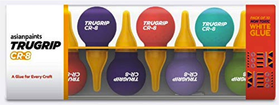
Elephant Design’s foray into the realm of sustainable packaging can be seen through our work for India’s largest paint company: Asian Paints. With an extensive product portfolio of paints, home décor, and other related products, Asian paints wanted to highlight their adhesives, which were catering exclusively to professional and industrial needs. This meant taking a look at the ways in which adhesives were utilized in home and school environments.

The extensive user research informed the importance of ‘single-use’ and ‘quantity’ as two critical attributes for the pack design. The spherical orb-like design structure addressed both these attributes while enabling precise application control. The playful nature of the orb makes the process of using adhesive a far more delightful experience.

The only challenging aspect of a spherical structure is the inability to stand on its own. This problem was smartly tackled by introducing a secondary packaging and having multiples of these orb-like structures in different vibrant colors.

Packaging Consumer Shifts & Trends_Lata Blog_Elephant-Design_India_Singapore

This secondary packaging was created by keeping the upcycling in mind, where otherwise redundant products are repurposed — in this case, providing a smart functionality that also supports the core packaging.

As can be seen, the pandemic has shifted the conversation around sustainability as the availability of material that can meet the ever-increasing demand for quick packaging has been a concern for the packaging industry.

Re-use of familiar materials like glass, cardboard, metal, and plastic that can mitigate hygiene issues has regained importance. The pandemic has also heightened the unpredictability of situations and brands. Now, they are compelled to stay on their toes and be adaptive in their offerings. Customization to the changing consumer needs and rebuilding confidence in their choices have become the most important aspect of brand communication.

The examples of case studies included in this document offer a glimpse of the growing possibilities of innovation within the packaging design and how Elephant Design can help bridge the alignment of brand beliefs and values to the end consumer.

Part I: Packaging Consumer Shifts and Trends

By Lata Sankaran

Introduction

The aftermath of a pandemic has been instrumental in shapeshifting consumer behavior patterns as well as creating adverse disruptions across sectors. The resurgence of previous trends, as well as an altered consumer perspective towards purchase and consumption in a post — COVID world, are redefining and reshaping new trends.

At Elephant Design, we present the Packaging | Consumer Shifts & Trends white paper identifying three key macro trends and the consumer shifts that are shaping the changes within the packaging industry and highlight a few examples of design manifestation of the same amidst this continuum of change. Brands continue to cater to the ever-changing landscape of customer expectations and define the ‘new normality’ of customer experience.

Viewing this on-going transformation and recalibration from a strategic lens, we present a few case studies from the repertoire of Elephant Design that has delivered solutions in the past adapting to these underlying patterns of consumer behavior.

One key behavioral transformation of the pandemic has been the acceleration in digital consumption in an already networked society. ‘Online anything’ phenomena has taken precedence creating the habit shift to virtual interactions with brands in the absence of a strong in-store engagement.

Additionally, daily life context in a post-pandemic world has transformed into prolonged ‘lock-downs’ and ‘work from home’/’study from home’ scenarios. ‘in-person’ brand experiences have thus become the most significant value add than ever before.

With heightened fear and anxiety around hygiene, health, and wellness, brands are constantly adapting their product packaging, designs, and material choices accounting for these value-shifts.

Positioning with these contextual scenarios, we identified three key packaging trends that form the focus of our blog series.

Part I: Thinking Inside the Box

Packaging Consumer Shifts & Trends_Lata Blog_Elephant-Design_India_Singapore

The last mile in the customer journey has become one of the most crucial touch-point in a post-pandemic world. Unboxing rituals are no longer restricted to special occasions and premium buying.

It has resurged and regained prominence at a time where consumers are interacting with brands in the confinement of their homes amidst restrictive retail shopping habits.

As the demand for online purchase increases, we ask the key question: How has un-boxing has become key in creating impactful experiences to drive long term product engagement?

Packaging Consumer Shifts & Trends_Lata Blog_Elephant-Design_India_Singapore

One particular trend is to infuse the feeling of ‘delight’ within the unboxing experience. Online shopping decisions are generally triggered by instincts and emotions. Brands are able to create an enriching customer experience when they play on consumer curiosity and heighten their excitement levels.

Customization and personalization in the package transform the unboxing experience from a mere product reveal to a moment to be cherished.

Packaging Consumer Shifts & Trends_Lata Blog_Elephant-Design_India_Singapore

Packaging also has immense potential when it comes to branding opportunities and disseminating value-based content to the consumer.

Given the lack of opportunity in seeing, feeling, or holding the product before buying, there is a heightened role of packaging in conveying the brand narrative. Visual stimuli aids are often utilized to expand the brand narrative from a mere product to an immersive retail experience.

To illustrate this, we examine the packaging design we created for Hershey’s Kisses, where the brand came up with the task of introducing a premium range of gift packaging. This would help them distinguish themselves on the retail shelf and more significantly drive customer engagement and drive purchase.

Packaging Consumer Shifts & Trends_Lata Blog_Elephant-Design_India_Singapore

The product itself is geared for the premium segment of chocolate lovers in India, so the experience was altogether more important. Elephant recognizing Unboxing to be the most important touchpoint between the brand and the customer. Keeping the changing context of gifting chocolates among urban Indian customers, our design expressions on the pack emphasized the celebration of shared moments as a metaphor for long-lasting engagement.

Fortune cookies are excellent examples of personalized content being delivered at the right touchpoints — which we drew upon. The pack now opens to a personalized message, delighting customers on two levels; that of discovery, replete with fond memories of the same, and of the pure indulgence that comes with high-quality chocolate.

Brand Makeover

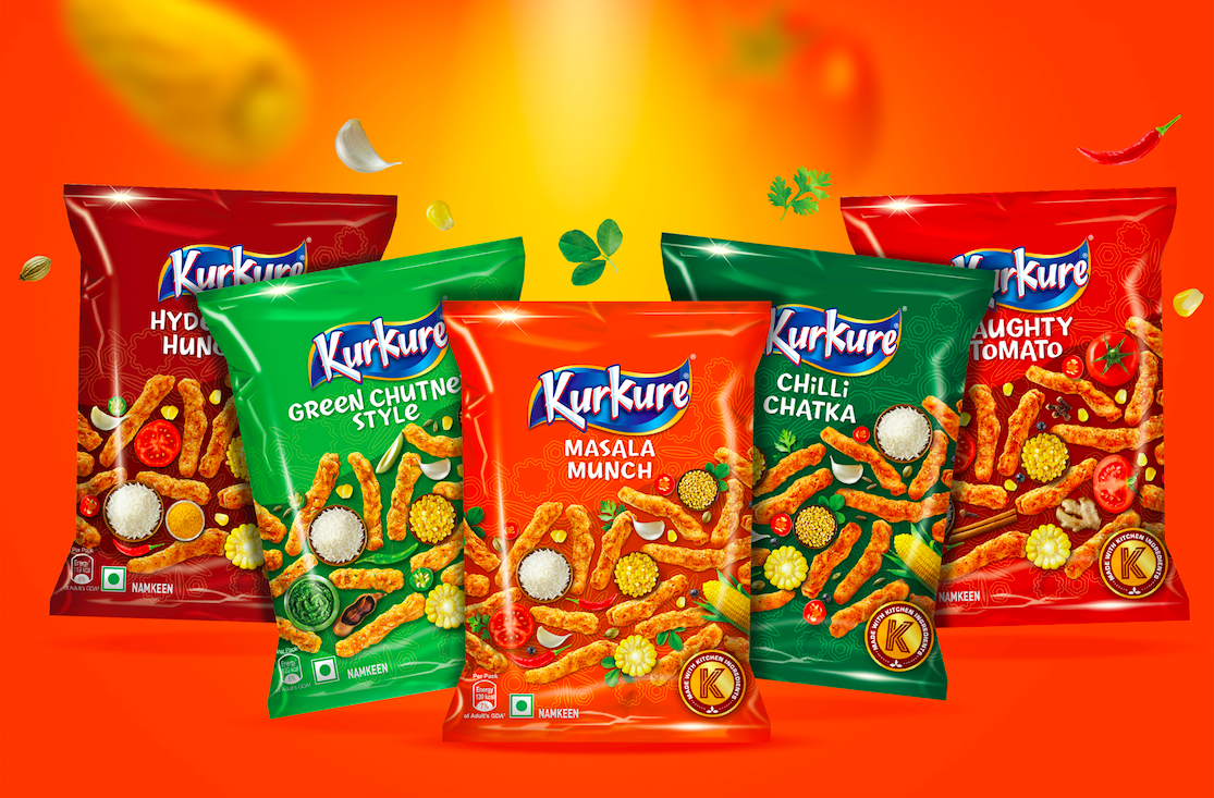
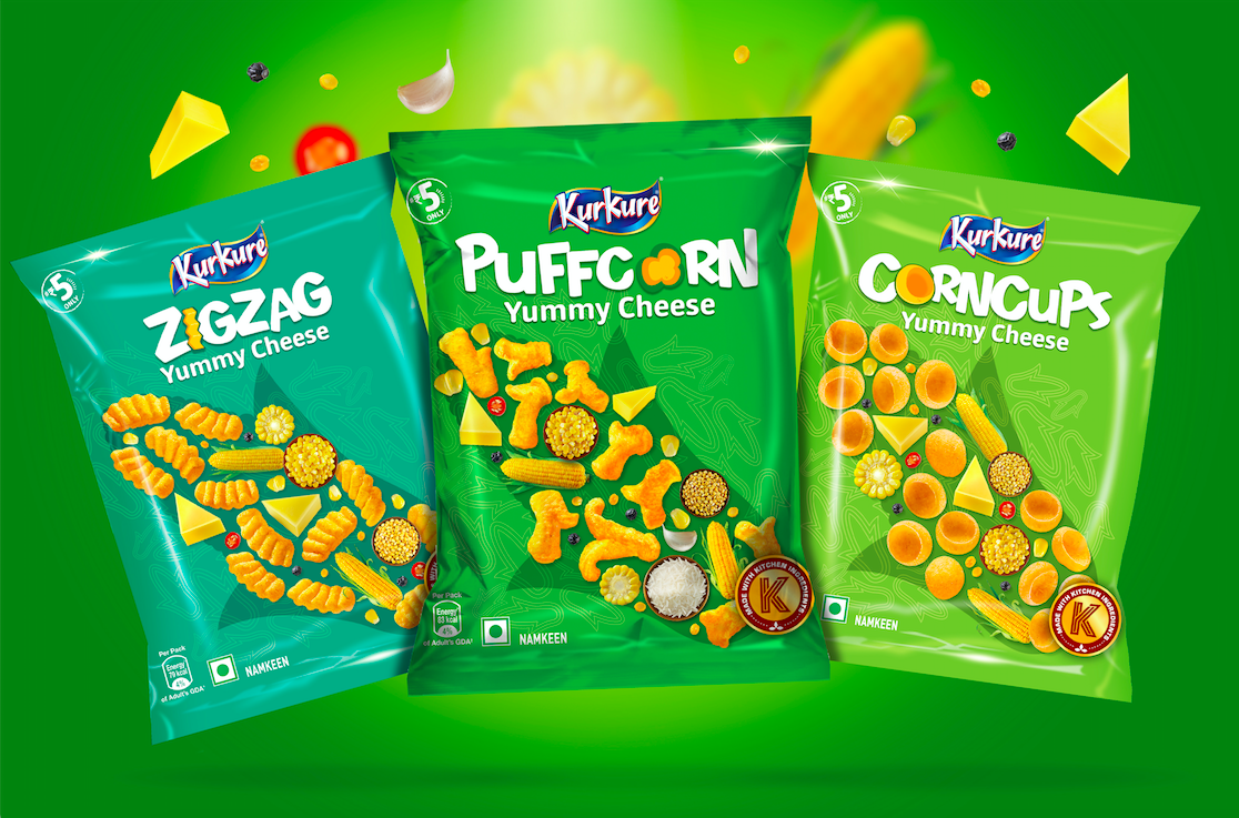
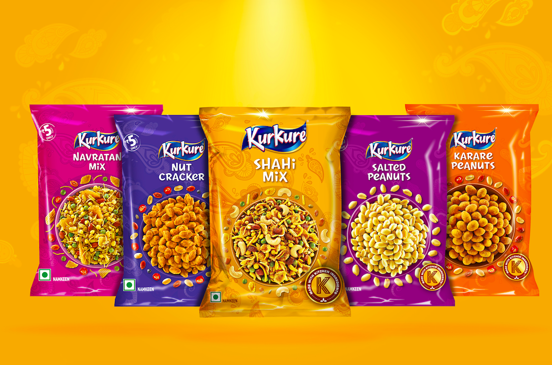
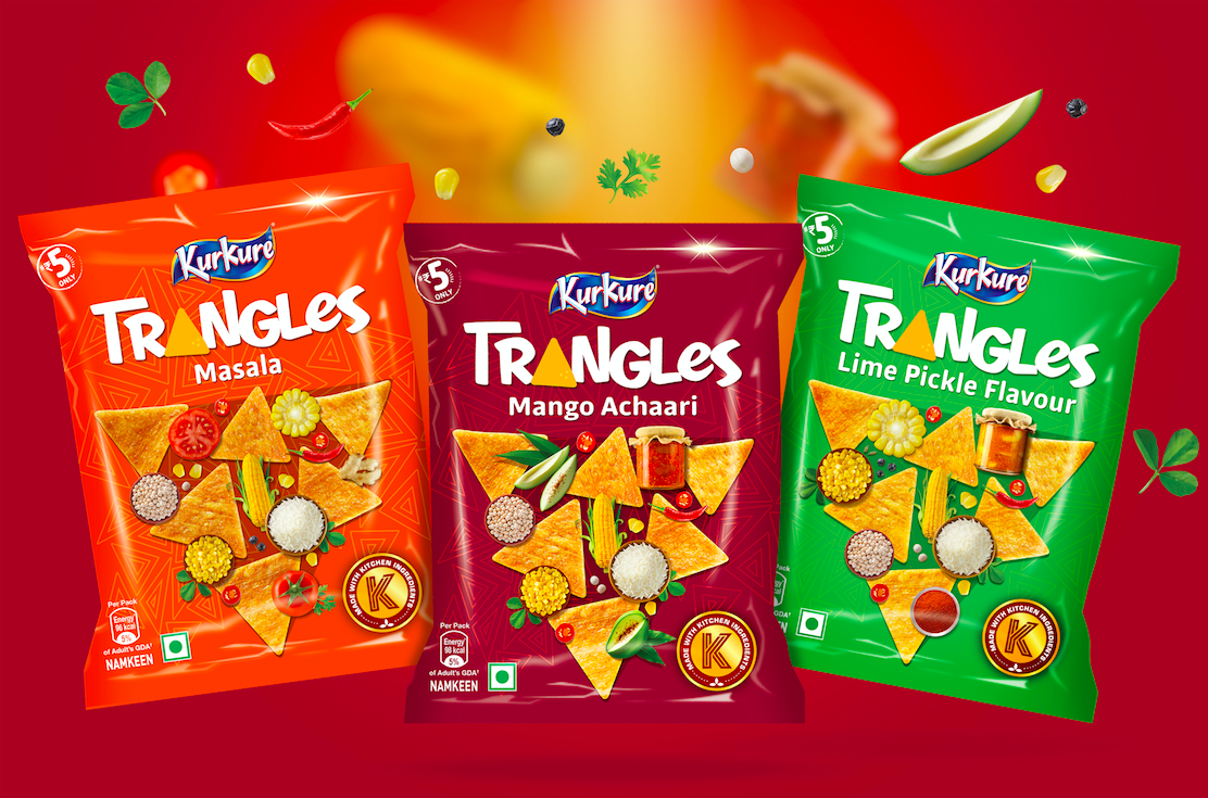
Kurkure has a vast portfolio of multiple categories, flavours & sizes with varying preferences of tastes & shapes across the country. 

As some of the innovations in shapes & flavours had happened organically, this hugely popular brand needed a cohesive brand architecture and visual language. Indian snacks had added to the complexity of portfolio even further.  

There were 3 significant tasks for this redesigning exercise: 

  • Enhance brand leadership, relevance & distinctiveness.
  • Build an architecture that is able to create strong differentiation for categories 
  • And most importantly, help consumers navigate the shelf & pick the right snack of their choice

As echoed by consumers everywhere, Kurkure being the brand of abundance, crunch & quirk, design team decided to highlight these three axes on the packs. 

The concept was built around getting the ingredients in focus to enhance taste appeal with a larger than life shape of the product providing backdrop for play between products & ingredients. Every variant is called out in custom designed typography that also makes it ownable. Back of packs are brought to life with custom drawn illustrations of turning mundane encounters into fun moments by sharing the tasty crunchy snack. 

While harmonising the entire portfolio in terms of messaging, tone of voice and visual language the team was successful in creating clear distinction within categories of collets, puffcorns, trangles and Indian savoury snacks; taking the shelf visibility & excitement to next level. 

Time to grab India’s favourite Masala Munch! 

Packaging Design: An Arranged Match*

Suraja Kotnis, Lead Designer, Communication Design, Elephant

Suraja Kotnis, Lead Designer, Communication Design, Elephant

Packaging design is very demanding yet interesting. It is like someone looking for an arranged marriage match. With just 3 seconds to impress, the design needs to speak the buyer’s language, or else, it gets thrown out of the consideration set.

Designing anything with such a small real estate and high expense requires a lot of thinking, understanding and planning.

* a marriage planned and arranged by the families of the couple

Here are some thoughts to consider before embarking on a packaging design exercise.

1.    Inside the closet or outside the closet:

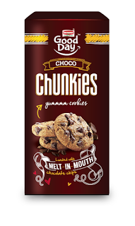
Does the product have a show-off value, will the brand enhance the buyer’s image or is it a regular habitual product. This helps understand the purpose and mindset of the person buying a brand. eg: a glucose biscuit vsChunkies cookies –

Graphic language and messaging attitude follows smoothly if the answer is clear.

2.    Target Audience:

Who, when, how and why is the brand being bought.

I believe there are 3 kinds of TG – the influencers, the decision makers and the end users. And we have to impress all :) at every stage

Sometimes the end user might not even get to see the packaging. But what if she/he does and doesn’t get impressed?

3.    Brand – Is it a Leader or a follower

As communication designers, we might think of a completely out of the box idea but if the brand has an established legacy it will just be a great idea without any connection to the brand or its loyal consumers. eg: MTR Foods: The idea in revisiting the packaging was not to alienate its existing consumers. The task was to simplify the information in the exact manner that as consumer seeks it while taking the design a level ahead as a leader & trend-setter.

4.    Building an exclusive brand experience at 3 levels – attracting, buying and end usage

At every touch-point, we need to think of creating small but impactful experiences. That is the only way to create a continuous cycle of loyalty for the brands.   

<  Back to Blog