Elephant Design

‘Designers have to take responsibility of making the store meet business objectives’

The following article by Ashish Deshpande appeared first in an interview in the Retail4growth magazine July edition, 2021.

https://www.retail4growth.com/viewpoints/designers-have-to-take-responsibility-of-making-the-store-meet-business-objectives-879

“How many of us as designers go back to our stores after a year of operation and ask franchisee / store manager about the ROI from the store? It’s time we did that, “ says Ashish Deshpande , Co-Founder & Director, Elephant Design, in this exclusive interaction with Retail4Growth on the future of store design, the need for retail design to adapt to post-Covid realities, and more...

Screenshot 2021-07-21 at 2.15.34 PM.png

To start with, could you share your views on how the whole retail design segment is looking post pandemic? Fact is retailers are going slow on their spends now, being more cautious about expansion and renovations or moving to the online space, due to the impact of the pandemic. How is this impacting store architects and designers?

John Lennon famously remarked, “Everything will be okay in the end. If it is not okay, it is not the end.” The founding member of The Beatles probably meant that it will never be okay and, it’s time for us to look ahead and get on with what we do. The pandemic is far from over as it continues to ebb and flow with uncertainty. However, do not despair: there is a silver lining. As per McKinsey & Company’s insightful report, on a global scale, the retail industry has outperformed and the consumers are as hungry as ever. The Retail sector has outrun many other sectors based on accelerated transformation during the last 18 months. As a McKinsey & Company report says, ”The past year suggests the recipe for success in retail is changing, and those that wait too long to adapt may never catch up.” So, the picture today for retailers and designers is not about complete mayhem but rather about adaptability. The earlier traditional retailers and store designers learn this lesson, the quicker they will move towards meeting the new normal.

So what exactly can store designers and architects do to navigate through this situation and move forward? What have been your own takeaways in the last one and a half years?

Traditionally, store designers and store architects have been too involved in the creative process. Be it form, space, colour or even materials: the new frontiers that the realm of store design has outlined have often been seen as too distant and otherworldly. Even in the immediate pre-pandemic period, it was rare to see designers and retailers listening to the expectations of customers. Those who did would have noticed a change in the mental model of how customers saw their store experience, given the rising adaptation of smartphones, streaming internet technology and telecommunication that was getting cheaper by the day.

The pandemic has now presented the design workforce with an opportunity to align store design with emerging user expectations, look at smarter ways to meet business objectives and seamlessly integrate the freedom of choice presented by the tech world into their brick & mortar solutions. This is not to say that technology will rule store design. It is about using enough technology to increase access, efficiency and integrate the online experience into the touch feel of the store.   

How exactly do you think store design can contribute to better ROI for the client at a time when every penny spent matters?

Businesses have always been concerned about ROI. As a designer, one could design a “wow “ store look & feel, yet the litmus test is faced one year down the line. How many of us as designers go back to our stores after a year of operation and ask franchisee / store manager about the ROI from the store? It’s time we did that.

Designers have to take responsibility of making the store meet business objectives and the pandemic has only driven this point home. We need to focus on store functions that add real value to the customers’ lives, align with their mental models and generate profit for business stakeholders. That’s our job.

As designers we need move effortlessly between our preoccupation with the subjective and into the world of quantifiable metrics. ROI from the store program can be met by the design team if the success metrices are established early on. Any design effort that leads to reducing steps, improving decision-making for the customer, enhancing transaction speed and eliminating elements that do not add value to the customer experience improves ROI.

At Elephant we follow this Five Step Model when it comes to increasing ROI:

Step 1, Efficiencies: Increase functional benefit

Step 2, Effectivity: Improve comprehension, conversion

Step 3, Effort: Reduce human load

Step 4, Errors: Eliminate waste

Step 5, Experience: Holistic value-add to shoppers

Speaking of adaptability and the inevitable shift towards contactless retail interfaces, how can a store design follow a more tech integrated, engaging and interactive approach?

Contactless transactions are here to stay. We were lucky during this pandemic period that several tech-focused 3rd party enterprises had introduced contactless transactions, including our own government though its UPI based Bhim application. So, integrating these applications has not really taxed the retailer or the store designer.

Today, designers need to look at the future of store design. We need to question our traditional layouts – as well as the need for checkout counters! Payment can be enabled at the exact point of sale, saving customers the time and effort often spent in queues, while sharpening decision making. This will lead to an increased focus on browsability and product experience will take centre stage. Customers can happily order from the comfort of their homes including choice of payment options & delivery.

Store design will focus towards making the product proposition more compelling. Here is where technology will come into play. Customers are looking to visit stores to discover new features, satisfactory trials, obtain niche’ advice, and grab those special offers. How does technology deliver these elements within the spatial ambience of a store? This is a question that the designer needs to answer. At the end of the day, technology has to be an underlying enabler for the shopper and also make money for the retailer. As designers, we have to tread this path cautiously, so that we don’t overindulge, which in turn might just overwhelm the customer or kill the business due to unachievable ROI.

As designers, we need to move effortlessly between our preoccupation with the subjective and into the world of quantifiable metrics. ROI from the store program can be met by the design team if the success matrices are established early on. Any design effort that leads to reducing steps, improving decision-making for the customer, enhancing transaction speed, and eliminating elements that do not add value to customer experience improves ROI

Any observations on how clients are approaching their store design projects now? Any interesting project you'd like to talk about?

Over the years and more so during this pandemic period, clients are looking at retail as an effective component of the sales & brand building process. The overall approach has become more scientific. Most clients are investing in on-ground research, customer insights and digital technology. Many have been quick to respond and have tweaked their store models. One good example is the sporting goods Decathlon Store. DecathlonTM opened post lockdown in the pandemic, seamlessly connecting their digital browsing, purchase and payment experience to usher in a queue-free, crowd-free, quick in- quick out shopping experience: all in accordance with what the customers wanted.

At ElephantTM, we have been helping a prominent global e-commerce player develop omnichannel shopping experience for tier 2 / tier 3 cities & towns in India. As store designers, we have to understand that retail doesn’t end in metropolis malls. India is a large country, and people have aspirations. Retail growth will come from tier 2 cities where touch & feel and the ability to buy online without a smart phone needs to be managed through smart stores.

How do you think the retail solutions industry, including the suppliers and manufacturers of retail lighting, fixtures, signage, mannequins, props, etc. move ahead from the pandemic impact and step up their game even as brick-and-mortar retail staggers back to normalcy?

The retail solutions industry has done a commendable job in the past decade to help India’s retail standards soar and reach a globally competitive level. This decade, especially under the pandemic, needs more from the industry. It is time for our retail solution providers to make an orbit shift from simply being followers to becoming innovators. We need efficient solutions in all sectors of store design. Fitouts need to get smarter, thinner, faster, flexible, save resources and energy, communicate seamlessly and most importantly, help integrate the online world with in-store hardware.

Stores are already opening and it’s only a matter of time before customers return with new expectations. The pandemic has provided us with an opportunity to look at new solutions that will make the customer feel empowered and satisfied

Part II: Packaging Consumer Shifts and Trends

By Lata Sankaran

Part II: Smart Packaging

Part II_Packaging Consumer Shifts & Trends_Lata Blog_Elephant-Design_India_Singapore

The pandemic has converted many compulsive shopaholics and reluctant online shoppers into accepting the digital mode of interacting with brands. We now witness interesting ways in which technology is integrated with packaging.

In fact, it has become a strong enabler for brands to communicate product information and engage with the customers beyond the pack. Which is where we come to our key question: How are brands leveraging smart technology in packaging to enable consumers to interact with products beyond the pack?

Blog imagePart II_Packaging Consumer Shifts & Trends_Lata Blog_Elephant-Design_India_Singapore_7.png

First, there is heightened consciousness regarding matters of hygiene and safety. ‘Intelligent packaging’ allows consumers to stay informed about key parameters that add to their well-being and care. Consumers also love personalization, which brands can now increasingly cater to with the application of smart tech that is integrated with packaging.

At Elephant Design, we’ve constantly believed that trends involving tech almost always don’t remain passing fads — they become essential in the long run. This is doubly so for businesses that change, innovate and disrupt industries. For instance, the education sector has changed drastically as a result of the pandemic. Teaching and learning scenarios are no longer the same.

Given the lack of contact and play with peers in the new confines of home, continuous engagement and motivation have been a point of concern for parents and teachers alike.

Part II_Packaging Consumer Shifts & Trends_Lata Blog_Elephant-Design_India_Singapore

Based on the principle of ‘Learn through Play’, Plezmo is an open-ended platform devised to enable children to learn new concepts in coding and mechanics through experiences relevant to their day to day lives.

Part II_Packaging Consumer Shifts & Trends_Lata Blog_Elephant-Design_India_Singapore

We made the pack elements transformative, where they evolve into DIY story kits, striking the right balance between entertainment and education. These kits allow children the opportunity to physically realize their ideas and topics of interest.

With digital integration, the kit empowers children to build and grow both: offline, within their own spaces, and online, within their learning communities. As a result, we’ve found that with Plezmo, children can experience one of the most rewarding and enjoyable formats of learning where their ideas can actually come to life.


Part I: Packaging Consumer Shifts and Trends

By Lata Sankaran

Introduction

The aftermath of a pandemic has been instrumental in shapeshifting consumer behavior patterns as well as creating adverse disruptions across sectors. The resurgence of previous trends, as well as an altered consumer perspective towards purchase and consumption in a post — COVID world, are redefining and reshaping new trends.

At Elephant Design, we present the Packaging | Consumer Shifts & Trends white paper identifying three key macro trends and the consumer shifts that are shaping the changes within the packaging industry and highlight a few examples of design manifestation of the same amidst this continuum of change. Brands continue to cater to the ever-changing landscape of customer expectations and define the ‘new normality’ of customer experience.

Viewing this on-going transformation and recalibration from a strategic lens, we present a few case studies from the repertoire of Elephant Design that has delivered solutions in the past adapting to these underlying patterns of consumer behavior.

One key behavioral transformation of the pandemic has been the acceleration in digital consumption in an already networked society. ‘Online anything’ phenomena has taken precedence creating the habit shift to virtual interactions with brands in the absence of a strong in-store engagement.

Additionally, daily life context in a post-pandemic world has transformed into prolonged ‘lock-downs’ and ‘work from home’/’study from home’ scenarios. ‘in-person’ brand experiences have thus become the most significant value add than ever before.

With heightened fear and anxiety around hygiene, health, and wellness, brands are constantly adapting their product packaging, designs, and material choices accounting for these value-shifts.

Positioning with these contextual scenarios, we identified three key packaging trends that form the focus of our blog series.

Part I: Thinking Inside the Box

Packaging Consumer Shifts & Trends_Lata Blog_Elephant-Design_India_Singapore

The last mile in the customer journey has become one of the most crucial touch-point in a post-pandemic world. Unboxing rituals are no longer restricted to special occasions and premium buying.

It has resurged and regained prominence at a time where consumers are interacting with brands in the confinement of their homes amidst restrictive retail shopping habits.

As the demand for online purchase increases, we ask the key question: How has un-boxing has become key in creating impactful experiences to drive long term product engagement?

Packaging Consumer Shifts & Trends_Lata Blog_Elephant-Design_India_Singapore

One particular trend is to infuse the feeling of ‘delight’ within the unboxing experience. Online shopping decisions are generally triggered by instincts and emotions. Brands are able to create an enriching customer experience when they play on consumer curiosity and heighten their excitement levels.

Customization and personalization in the package transform the unboxing experience from a mere product reveal to a moment to be cherished.

Packaging Consumer Shifts & Trends_Lata Blog_Elephant-Design_India_Singapore

Packaging also has immense potential when it comes to branding opportunities and disseminating value-based content to the consumer.

Given the lack of opportunity in seeing, feeling, or holding the product before buying, there is a heightened role of packaging in conveying the brand narrative. Visual stimuli aids are often utilized to expand the brand narrative from a mere product to an immersive retail experience.

To illustrate this, we examine the packaging design we created for Hershey’s Kisses, where the brand came up with the task of introducing a premium range of gift packaging. This would help them distinguish themselves on the retail shelf and more significantly drive customer engagement and drive purchase.

Packaging Consumer Shifts & Trends_Lata Blog_Elephant-Design_India_Singapore

The product itself is geared for the premium segment of chocolate lovers in India, so the experience was altogether more important. Elephant recognizing Unboxing to be the most important touchpoint between the brand and the customer. Keeping the changing context of gifting chocolates among urban Indian customers, our design expressions on the pack emphasized the celebration of shared moments as a metaphor for long-lasting engagement.

Fortune cookies are excellent examples of personalized content being delivered at the right touchpoints — which we drew upon. The pack now opens to a personalized message, delighting customers on two levels; that of discovery, replete with fond memories of the same, and of the pure indulgence that comes with high-quality chocolate.

Keep Calm and Make Art

Keep Calm and Make Art

We at Elephant decided to make the most of being away from each other yet feel connected and be part of a meaningful cause during these unprecedented times.

Every team member was reacting to the new change around them in their own way and had their own thoughts about coping with it. We just gave it a creative outlet by letting them bring their ponderings alive in a poster dedicated to this very unusual phenomenon we’re going through.

Our journey was through reflection, empathy and a touch of wit. We hope our thoughts & feelings align with yours. Because if not anything else, art is always a great healer. Stay safe everyone!

Disclaimer : These posters are created as an expression about the current situation. They have no commercial value. Some of them may be based on an inspiration from popular culture. Ideas expressed are those of their individual creators.

Design for Changing Consumer Behaviour

Kedar.jpg

Design for Changing Consumer Behaviour

Kedar Parundekar

General Manager, Strategy & Business Development

There is no denying that COVID – 19 has had a huge impact on the economy. It is going to be a long time before consumer confidence bounces back. 

In fact, some industries have changed for good at fundamental consumer behaviour & experience levels. Brands operating within those industries have to rapidly evolve at business model levels. Take the case of theatres within the entertainment industry. A business model that is based on aggregating people together may not be sustainable anymore. Consumers may not view entertainment as an essential activity and may not be willing to sit in confined spaces for long times because of the perception of risking infection. Another case in point, the events industry is surely looking at hiatus. Large events for sports, music, politics, religion etc. may not be allowed to aggregate a large number of people anymore.  

Elephant_Design_Blog_Kedar_.jpg

This is where design has a fundamental role to play as it enables businesses to question the conventional assumptions of consumer behaviour within their industry. In industries where consumer behaviour will change radically, design may have the answer through enabling businesses to reimagine the manner in which they deliver their consumer experience.

Movie goers may want to view movies but may look at experiences which inspire more confidence than current ones. Old age ideas like open air theatres where people can view movies from the confines of their cars may not be a bad idea! The whole movie delivery experience is up for reinvention in a manner that enables social distancing & immersive experiences at the same time. 

In the events industry, the consumer journey becomes more important than ever before and for control of crowds, technology may play a larger role than ever before. Imagine one-hour slots for parties being given to party goers in a music festival. But this would also mean that brands have to work that much harder as the audience is captive only for an hour.

In the restaurant industry, we are already seeing innovation in anticipation of a changed scenario. A few restaurants have begun delivering meal kits to consumer’s homes trying to tap into a new age trend for cooking at home. As such the brand experience for these restaurant brands now moves from the restaurant space to the meal kit that is delivered. Packaging structure & graphics is what will drive the stickiness of new age restaurant brands for now. 

Designing personalised experiences that are tech driven, immersive & build not only customer confidence but also government & societal confidence is the need of the hour.

To sum things up, businesses & brands that rapidly evolve their business models using design & design thinking will bring in new ways for affected industries and will not only survive the coming economic onslaught but might be able to take advantage of upcoming economic opportunities.

< Back to Blogs

Women of Gen Z - Your Next Big Consumer

Screen Shot 2020-03-06 at 3.44.47 PM.png

Women of Gen Z - Your Next Big Consumer

Rachita Gondhali 

Associate Graphic Designer 

If you know someone who gets their daily news off Instagram and calls you ‘BRO’ once in a while, you are probably interacting with a species of the Gen Z. They at times, might seem so alien to you, choosing between being perplexed and in awe isn’t a choice. 

To help decode them a little better, Gen Z, the next big consumers for our brands to obsess over are between 10 to 24 years of age as of this day. Yes, the ones that would text you from across the room instead of talking to you and consider Google as their best friend are the ones deciding a brand’s lifecycle.

If you know how to connect with this creative generation then you have a cat in the bag since it accounts for 40% of consumers in 2020 with India having the world’s largest young population. This highly analytical and pragmatic generation that shares an ever evolving intuitive relationship with social platforms is primarily an offspring of liberalisation. 

Blog website_header-01.jpg

Interestingly, one of the happiest Gen Z comes out of India among other countries. Indian individuals are defying linear ambitions to reach high with a mindset that doesn’t close off unconventional options. While wealth and travelling the world is a priority, marriage and religion tend to be less important in comparison to its predecessors. 

What can make the parental generations anxious is how this hyper-cognitive generation consumes information in real time by integrating virtual and offline experiences. Being digital natives, even when they shop in-store, they get real-time feedback via whatsapp. Amazon has turned this into an opportunity and added a “you might also like” section under the product title along with ratings and reviews. We wouldn’t expect any less, would we? 

It might be overstated but the Gen Zs live in a space of multiplicity, even with their identities.Their inclination towards unisex and unbiased products raises a question to many brands driven by gender about how long they can continue to make sense to the consumer. How should companies market clothes, cars or jewellery for that matter? 

Since this generation has blossomed during economic prosperity, it wouldn’t be wrong to call them optimistic and driven by passion. They made self actualisation look cool, translating in a need of a fulfilling work environment. This in turn, makes the generation a huge contributor to the ‘gig economy’. What about the women of this generation, though?

After years of downplaying a woman’s role in society, with the likes of Aranya Johar and Naina Jaiswal, we can proudly say that females have more power and a stronger voice in society today.

Understanding this vivacious group of Gen Z females as consumers and what their need of the hour is can be a key for the brands to come. 

Since the women of Gen Z are born with heavy social influence, social values play a big role in their decision making and purchase patterns. Reports suggest more than sixty percent of women expect brands to take a stance on social issues, inclusivity being one of the biggest concerns. Better late then never, maybe? American Eagle’s sub-brand, Aerie, has upped its game by adopting the no photoshop method and including models who are physically handicapped or have vitiligo, while Bumble has sneakily made room for itself in the lives of our Indian hearts by giving women a choice of quality. 

If you don’t see a Gen Z woman scream about authenticity, you probably haven’t met one. It cannot be emphasised any more. This generation sees through the celebrity marketing that has been around for ages. Celebrities are no longer the trusted word of mouth. What these women are looking for are authentic influencers that aren’t aspirational but more grounded and relatable. Youtubers are their most trusted source. One of the most famous ‘influenza’ women are going crazy about is the hilarious Bhuvan Bam from BB ki Vines or Prajakta Koli, popularly known as MostlySane who subtly breaks stereotypes with a hint of humour. 

No matter how much we label them as tech babies, Gen Z women are becoming skeptical about its benefits. This overwhelming constant connection has caused ‘technology fatigue’ and raised doubts about digital safety and security, though this fatigue hasn’t stopped the dependancy. Women are now worried about their personal details getting in the wrong hands, also a result of gender based harassment that women face online. The most common but rarely spoken about example is the usage of deepfakes to make non-consensual pornography.  

So how do you break through this generation? If you are a marketer, you now know how enormously important it is for brands to please this generation since over ninety percent of household purchases are influenced by Gen Z, especially when it is regarding travel, food, lifestyle and furniture. One way to look at it is to rethink the value creation models. This pragmatic generation analyses not only what they buy, but also the very act of consuming. Redefining consumption as having access rather than owning them is the key. Unlimited access to products and services creates value and connects to the Gen Z, a model Uber and many other subscription based services follow. As the offline and online becomes one, the need to consume products or services at any time any place has become a norm, developing a need for omnichannel marketing to get creative. 

All anchored in one element, essentially what Gen Z is saying is, ‘give me the truth and excite me at the same time’. If you still have any doubts, you can leave them at the door considering this is coming from a Gen Z herself.


2019: Year of Actions for Sustainable Development Goals

SDG image.jpg

We believe United Nation’s Sustainable Development Goals need to become a way of life. Elephant has always believed in Gender Equality (SDG 5). We are quite proud of our 50-50 ratio and equal pay policy that was in place since the company’s inception in 1989. 

Elephant has been a zero wet waste company since 2016. We replaced plastic plates & cutlery with sustainable alternatives since 2017. However, this year we took some more steps. We reduced the use of paper cups by 90% and also managed to completely do away with single use plastic water bottles. All these actions align with SDG 11 - Sustainable Cities & Communities and we hope more companies join us in making better choices. 

We are also EcoVadis certified for 2019, a global sustainability compliance framework which covers 21 criteria across four themes of environment, fair labour & human rights, ethics, and sustainable procurement. 

< Back to Blogs

2019: Year of Knowledge Sharing

grid-08.jpg

As President of National Executive Committee of Association of Designers of India (ADI), Ashish Deshpande led several design awareness initiatives and knowledge partnerships through the year besides leading the product innovation & retail experience design teams at Elephant. He presided over the Lexus Design Awards India 2019 jury and was also on the jury panels of VMRD Retail Design Awards & Kyoorius Design Awards. He was a speaker at TISDC event in Taiwan & at NASSCOM Design4India conference. 

Apart from an active role at Elephant, Ashwini Deshpande has had a busy year. Once again she made it to Campaign India’s A List, Impact 50 Most Influential Women in Media & Advertising list, served as Design Jury President at D&AD London besides being on jury panels of C2A - USA, Gerety Awards - France & TISDC - Taiwan. Audiogyan & Designed This Way recorded her interviews for their podcasts and her Josh Talks video has had more than 24K views in 2019. Some of the significant events where Ashwini was a guest speaker included Women in Data Science Conference, UN Global Compact Network Leadership Summit and Hello Taichung at Taiwan. 

In the third successive year, Partho Guha mentored student start-ups participating in the Smart India Hackathon organised by Ministry of HRD, Government of India. 

Anand Palsodkar delivered talks at Siemens Designathon and at a seminar by the SME Center in Singapore. He was also on the jury for Taiwan International Student Design Competition. 

Mayuri Nikumbh was on Printweek Awards jury. She was invited to inaugurate the Communication Design Graduate Show at National Institute of Fashion Technology (NIFT) Mumbai as a chief guest. Mayuri featured in the list of Impact 40 under 40 Achievers from media & advertising.

Gerard Rebello was invited to join the Afaqs Foxglove Awards jury. He also delivered a talk at Unitedworld Institute of Design Ahmedabad. 

Swapnil Joshi delivered a talk at National Institute of Technology (NIT) Rourkela. 

Kedar Parundekar & Reema Mehta conducted a brand workshop for start-ups at the Entrepreneurship & Incubation Centre of FLAME University. 

We had 45 Monday Morning Meetings where we discussed ideas, thoughts, concepts, vision and basically learnt about and from each other. Our teams attended ADI Pune Design Festival, Kyoorius Designyatra, NASSCOM design4india conference, Bangalore Design Week, TiECon Pune besides the learning sessions that took place at our own Learning Centre. We also initiated online learning this year and will be taking it ahead as part of the next year's learning plans. 

We are because we learn. 

< Back to Blogs

2019: Year of Winning

Year End Review2-08 copy.jpg

Bringing home ‘No 1 Design Agency’ title by The Economic Times Brand Equity again, followed by prestigious awards App Design for Asian Paints Colour Pro, Digital Product Design for Plezmo Play Blocks, Packaging Design for &me and Tasty Tales and Retail Experience Design for Jawa Motorcycles, Elephant has won big this year.

Every vertical at Elephant brought in an award proving our knowledge, experience & creative quotient leading to outstanding solutions for our clients. This was topped up by ‘Specialist Agency of the Year’ award at Indian Agency Awards and shortlist as ‘South Asia Consultancy of The Year’ by Campaign Asia. While awards don’t define us (impact of our work does), they definitely encourage us to do better with each year, one solution at a time.

< Back to Blogs

Sustainable Furniture

Furniture Design is a complex equation between Human Interactions, Material, Technology & Technique, Form and Function. There is a strong overlay of character and quality of build. Each piece is a product of time and at the same strives to be timeless. Each piece complements the space is sits within and yet holds a conversation on its own. The design of the table and stool is an interplay of all the above.

Sustainable Furniture_Elepahnt Design_Pune, Singapore_2.jpg
Sustainable Furniture_Elepahnt Design_Pune, Singapore_1.jpg

Treetem Pole - Honouring a Memory

Whoever has learned how to listen to trees no longer wants to be a tree. He wants to be nothing except what he is. That is home. That is happiness.
— Herman Hess
_DSC4231.jpg

We planted our happiness way back in the early 2000’s and started listening to trees. Both, the trees, and us were in our formative stages. We’d moved into this new space and wanted to make it our own and one of them was a 2 feet tall Silver Oak right near our entrance on the south east side of the lot. The silver oak grew more than 45 feet tall, and as it grew, it became the essence of our workspace. We’d sit underneath its shade for impromptu meetings and chats over coffee. All our photos featured this tree, just like it was a part of our family. It was tall, majestic and every now and then dropped a few leaves, lending an autumn character to our staircase. 
At some point last year, our silver oak became sick. It was taken over by a disease and had started showing signs of giving up. We tried a lot of remedies, but nothing seemed to work. Once it ran dry, we decided to pull the tree down ourselves, before it fell and accidentally hurt someone. We kept a portion of the trunk intact at the bottom, as a way of preserving its presence. 

It was never the same. Our space felt hollow without the Silver Oak’s charming aura. We were itching to pay homage to the tree that had given all of us so many memories. After much thought, our Design team came up with the concept of a Totem Pole installation. 

Traditionally, totem poles are a significant part of Native American culture. They’re carved out of large trees and serve many purposes beyond their beauty. Some of them represent stories or important event or pay respect to the departed. With these poles, each figure represents a part of the story. These are not worshipped, or even considered to be God. Instead, they represent traits or characteristics of the tribe or story. 

We decided to adapt this concept to honour our fallen tree, and thus was born the Tree-tem pole. This Tree-tem pole would celebrate the memories of our tree, and overlay with values shaping us for the future. 

At Elephant, we pride ourselves on a strong set of values which we abide by in our lives and work. Each figure engraved on our Tree-tem pole would embody a value that we stand by today. The face of a human being at the top depicts Empathy, something we strive to incorporate into all of our actions. The bee represents Expertise, as we endeavour to offer the same level of proficiency as she does while constructing honeycombs. An Eagle personifies its exploratory nature, and Honesty mirrors the kind face of a dog. We chose a cow to depict Value Addition, considering how selflessly she gives to our mankind. The Tree-tem pole is interfaced near the top by a large Elephant head, crafted with a sheet of aluminium, embodying the spirit of Design at Elephant. 

Treetempole_6.jpg

Life sprouts on to this inanimate structure through creepers planted at the base of the pole, which now have started winding their way upward. The old Silver Oak trunk stays visible through the mesh at the base allowing each one of us to get a glimpse of the original tree. 

Treetem Pole_Blog_Elephant Design_Pune, Singapore.jpg

Startups are the best!

Another year. Our 30th actually. 

We were a startup once. And in a sense we still are. Because almost every challenge that lands on our laps feels like a fresh start. Old constraints ready to be busted with new ideas. 

Honestly, ever since paper boat happened in 2013, startups and established brands alike reach out and ask us to work up the same magic for their brands. But being a notoriously stubborn team that we are, we start with a strong refusal. We refuse to repeat. We are against “same same”.  But we promise to match your passion & appetite for “new” if you have it. We believe brilliance of our work is directly proportionate to the faith you place in us. It always works that way. 

In 2018, we saw brands being far more inclined towards health & sustainability. What’s in it became a bigger concern for the consumer and food thus became more engaging even before it got consumed. 

Some of them are taking their first steps as you read this and some have spread their wings rather wide. 

So here is a list of five fresh brands we helped build in 2018.

Swing 

A fresh, fun & approachable fruit juice for the joy of its pure & unadulterated taste is how we would describe swing from paper boat! Packaged in signature doy packs, swing promises to bring alive the wind in your hair & spring in your step with its juicy fruity beat. 

Elephant_Swing.jpg

On the Run 

As they say, there is only one life! Our big insight? We need to maximize and shine through every role we play. Be it work or relationships, travel or entertainment, we need to be able to give our best. Because life is a sport and we can all be winners. On The Run packaging is a reflection of multiplicity of our lives and how to stay positive through it all by consuming food made with conventional wisdom & goodness.

Elephant_On_the_Run.jpg

Epigamia Smoothies

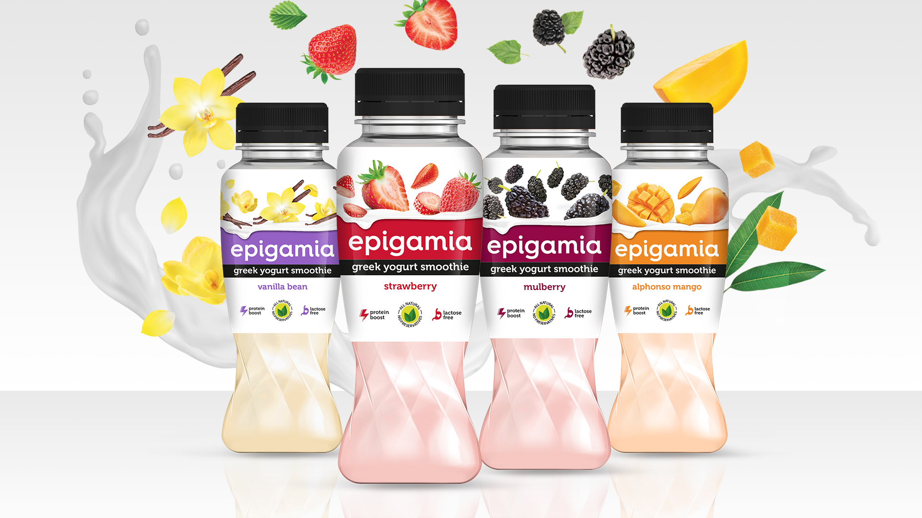
After the stupendous success of epigamia greek yogurts, it was time for smoothies on popular demand. What makes these greek yogurt smoothies remarkable? They are all natural, lactose free & above it all, very very tasty! The bottles are designed to practically twirl & emulate churning of smoothies. Globular shoulder & wider mouth makes it easy to grip & gulp from, whereas loaded fruit visual does justice to what’s inside the bottle. So if you are looking for a tasty protein boost, you know what to reach out for. 

Elephant_Epigamia_Smoothies .jpg

&me 

51% of Indian women are anemic and 70% risk getting osteoporosis due to various deficiencies! This happens because women always put others’ needs before their own & land up neglecting their health. Sad but true. 

&me as the name suggests, is a trigger to remind women that with everything else that is important in life, they need to give themselves equal priority. &me is a brand of Bio-active Beverages for Women. Developed with ancient Ayurveda and modern science to meet the fast-paced lifestyle of modern women, these beverages focus on specific needs. &me professes self-love & self-care. With strong imagery and stories, we intend to start a conversation and help break stereotype.

Elephant_&me.jpg

hydron 

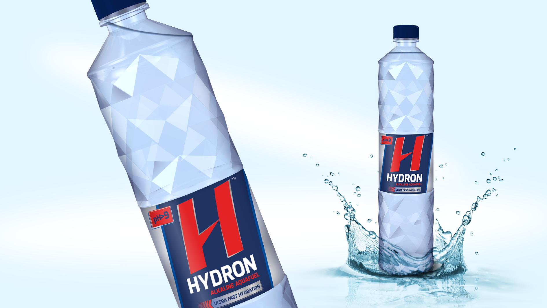
Its clear that functional nutrition needs of men & women are different. Here was our opportunity to turn that into a powerful hydration brand that helps men unleash their potential to the fullest in a healthy way. Hydron as we named it is not your regular thirst quenching water. It is hydrogen rich, anti-oxidant and and simply put, hydrates seven times faster. A highly functional beverage, Hydron alkaline water helps one recover from strenuous activity like workouts or sports very quickly. This is exactly what we brought to life on its packaging. Potency & science. 

Elephant_Hydron.jpg

Notes from Future: When Nobody Dies

(“P” and “N” are kind of long-distance friends residing in two time zones 30 years apart. “P” stays at year 2050 and “N” at 2018. These are few of the many notes '“P” wrote to ‘N”: )

Warning - PURE FICTION 

No_Disease.jpg

Inspired from the book "Homo Deus" by Yuval Noah Harari

IIn the past, war used to be a big killer but in last few decades there is no big war. The chance of a real war is only getting slimmer as time passes. In the past, hunger used to be a cause of death. Today we already have enough food for all and in future there will not be any death due to famine. In the past, disease was a big cause of death. Today we already have knowhow and mechanism to control any deadly outbreak. Disease is no more a cause of large-scale death.  

In future, we will live a very long life, may be we will have no compulsion to die.


Hey N,

You seem to be curious about how life seems at 2050. I will try and describe some of the things happening around here. Future is nothing like you see in Sci-Fi films but there is a rapid change happening. Let me try and describe few of the interesting things, which are noticeable. 

Today let me tell you few examples of things happening because human beings are almost not dying anymore.  At 2050 we can extend our old bodies to the maximum. Most people these days live beyond 100 years. There are no diseases or other external factors, which endanger health. Our body does become old and frail but there is no suffering due to sickness. 

Scientists are now doing research for keeping the body young at very old age. In few years, we will see our mind maturing with time, but the body remaining at 20 years only. 

Now let me quickly tell you some of the interesting things, which I see around myself. 

exxoskeleton.jpg

There are lots of Exoskeleton shops in the city these days.  There is even one at Bavdhan. This Exoskeleton centre make interesting attachable smart mechanisms which are attached to the hands and legs. They help frail bodies to increase strength of their limbs for heavy lifting and speed walking for long distance.  These are individually customizable depending upon the specific weakness. It is a very helpful service, which keeps elderly people active so that they are able to take care of themselves quite well.  Most of the elderly are now working and have very active life.  These Exoskeleton parts come with various colours and styles. They are now considered fashion accessories. Even young people are using them, so that they can enhance their physical abilities considerably. 

Next, let me tell you about Gene Therapy Clinics.  

Most of the older hospitals have transformed into these clinics. They ensure long-term wellness and provide whatever medical help we need.  Treatments these days are focused on gene issues.

Looking for Right companion for elderly has become a big business. Dating, live-in, changing partners is a need these days.  People experiment living in various kind of relationships, as time is not a constraint any more. Relationships like commune, robo-companion, contract relationship are norms these days. Marriage is a forgotten practice now. 

Now I need to go and change my body Exoskeleton. It needs more strength to keep up with my adventures world-tour journey I am planning. 

With love 

P

Elephant had three Interesting outings this October!

Elephant_Design_October'18.png

TiE Pune Healthcare Summit

Anand Palsodkar delivered a talk on Design with Empathy for Patients at the TiE Pune Healthcare Summit that took place on 27 October 2018. 

TiE is world’s largest network of entrepreneurs that works towards fostering growth. The purpose of this Summit is to bring together like minded experts to promote thought leadership and exchange of ideas and to position Pune as the Healthcare hot-spot.

Organised by Pune Chapter of TiE, this annual Healthcare Summit was well attended by healthcare eco-system including Industry bodies, Incubators, Government and Public Policy experts as well as Investors. 

Anand Palsodkar is Design Director at Elephant and heads Product Innovation vertical.


Ladies Wine & Design

Mayuri Nikumbh shared her experiences as a Woman in Creative Profession at the Ladies Wine & Design Pune kick-off event on 27 October 2018 organised by a group of young designers & design students. 

LW&D is an initiative started by designer Jessica Walsh to empower creative ladies around the world after she realised that only a small percent of creative directors are women, and she would like to help change this through mentorship circles, portfolio reviews & talks. 

Mayuri Nikumbh is Design Director at Elephant and heads Product Innovation vertical.


DesignUp

Ashish Deshpande participated in a panel discussion on Leading Design at the DesignUp conference that took place in Bangalore on 25-27 October 2018. This annual conference is focussed on Design-intech & Design-for-tech. 

The panel also included Jurgen Spangi (Atlassian), Anjali Desai (Intuit), Amy Huang (RedMart) and Daniel Burka (Google Ventures). Discussions revolved around Ux, Product Innovation, Emergent Tech & more.

DesignUp started in 2016 with the idea of raising the design agenda within tech companies and tech-led businesses. 

Ashish Deshpande is Co-founder, Director at Elephant and leads Product Design & Retail Experience verticals.


We are in an Interesting Era of Creating Multi-sensorial, Multi-media Experiences

Printweek India talks to the co-founder of Elephant, a design led innovation company that’s been around for three decades

Ashwini.JPG

2019 would mark the 30th birthday of Pune based Elephant which laid its foundation in 1989 with three NID (National Institute of Design) graduates as its co-founders– Ashwini Deshpande, Ashish Deshpande and Partho Guha. Elephant has had a truly phenomenal journey, marked by its work for some of the biggest brands in the country, various awards, and presence in some of the biggest forums about design across the world. 

For this month’s Design Dialogue, we have a conversation with Ashwini Deshpande about Elephant’s trajectory so far, some of their key projects including their recent branding and packaging work for Kurkure and Witlinger, their experience of working with start-ups, the benefits of having interns from different countries, and their Singapore operation. 

Edited excerpts:

Q :

Elephant has been in the Indian design landscape for three decades now. What are some of the most crucial changes you have seen over the years? 

It has been a long and exciting journey, every step of the way. We started Elephant with a dream to create the ‘big picture’ of design in India. 

When we started out in 1989, the Indian creative industry was limited to advertising agencies. The most challenging task was to demonstrate a genuine professional design practice that helps businesses grow. 

There was no organised, scalable, and professionally managed design consulting at that point. There were just two design schools (NID Ahmedabad and IIT-IDC Mumbai). The fact that ‘design’ and ‘design thinking’ could add value to a bottom-line was not experienced by any business house. 

I believe there are over 75 established design schools in India now and the number is growing as we speak. Every global media network has brought their design consulting arm to India; some of them have been around for over ten years now. Every communication agency has an in-house design team, all IT giants have large in-house design teams, and many conglomerates have design teams as part of their R&D set ups. There are hundreds of boutique design agencies mushrooming all around. However, even after 29 years since the start of Elephant, there are only a handful of design practices with any scale. So despite all our consistent efforts to demonstrate the value of design intervention for business growth, design is yet to become a mandatory, nation-wide phenomenon. 

I remember the fascinating lessons in blocks, typesetting and letterpress printing at NID in the 80s. A lot of the stationery used to be screen printed in the early days. Even short run brochures or exhibition panels used to be screen printed. Then came the large format digital printing in the mid-90s. From the time of cut and paste artworks to limited editions to personalised print-runs, one has seen a complete transformation of the print business. With digital distribution replacing a lot of print communication, we are in an interesting era of creating multi-sensorial, multi-media experiences. 

Paperboat

Q :

As the studio finishes its 30th year next year, what has been the biggest achievement of Elephant so far according to you? 

I think our consistent efforts to establish the business of design in India for a sustained period is an achievement in itself. The large economic changes, liberalisation, recessions, presence of global agencies, mushrooming of boutique agencies, and rapid changes in technology and media – we have made the most of all these and have managed to create a positive impact through design in almost every business domain we have worked in. 

Q :

How do you choose brands/projects to work for? Are there any particular criteria you follow? 

We have a very simple method. Earning, learning and excitement form the three most important principles for selection. When we get a project or an engagement query, there must be a resounding nod against at least two of the three principles. Because we are a ‘learning’ organisation and we believe feeling excited about solving a certain problem directly reflects on the creative quotient of the solution. 

Q :

Packaging design has always been a very strong part of Elephant's portfolio. This year too, you did some interesting packaging design revamp for Witlinger beer and Kurkure. Tell us a bit about both these projects. 

To rebrand a craft beer was like a dream project for the creative team. While many craft beers try to keep their origins ambiguous, Witlinger wanted to convey its British origin unabashedly. We decided to leave the clichéd British iconography of the Tower Bridge or Big Ben and found a true hero in the British bulldog. To highlight the distinct personality of each crafted brew, we decided to bring various facets of the Bulldog's persona to life. The new design with British bulldog as a mascot characterises Witlinger's true British origin and conveys a message of being bold - with a lot of attitude and honest fun. 

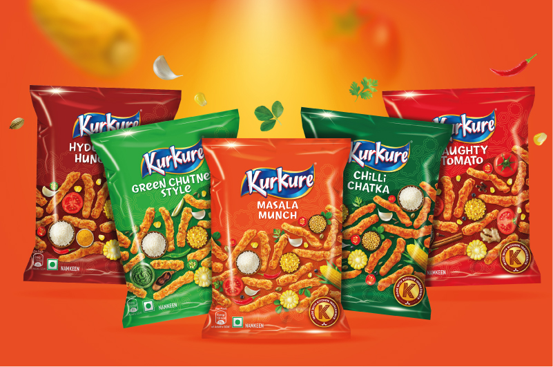
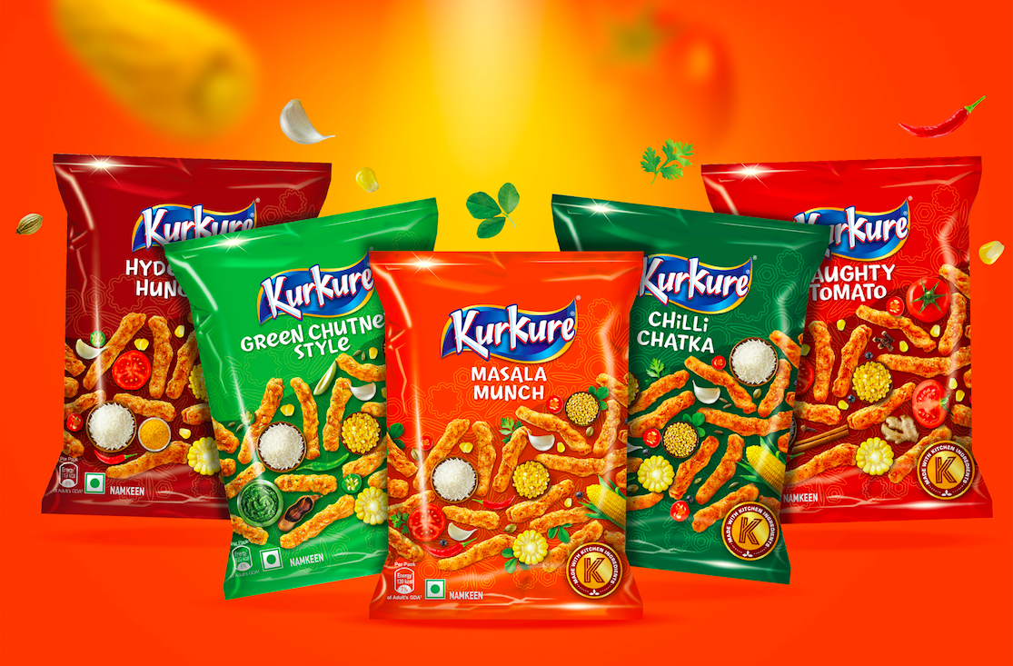
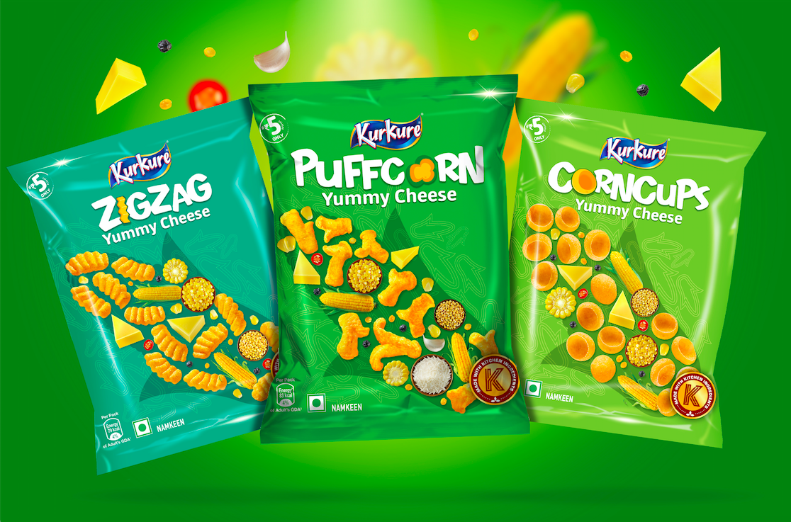
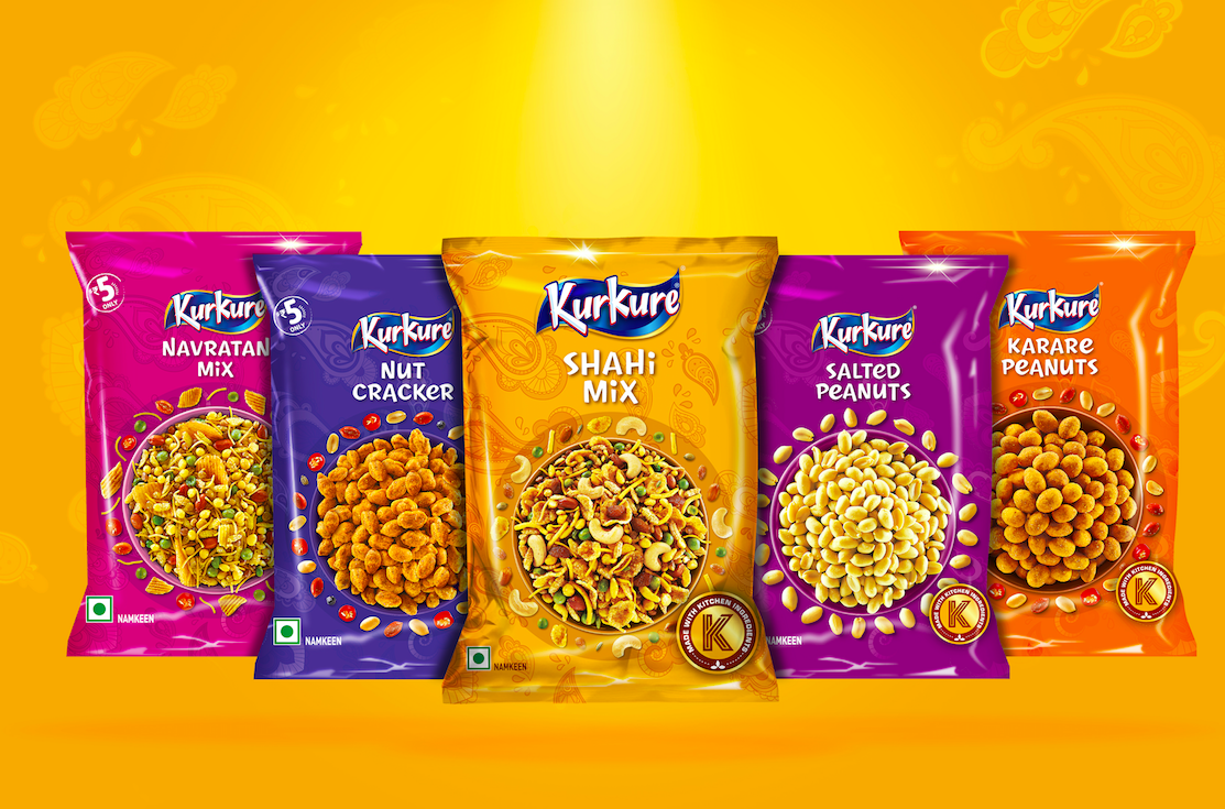
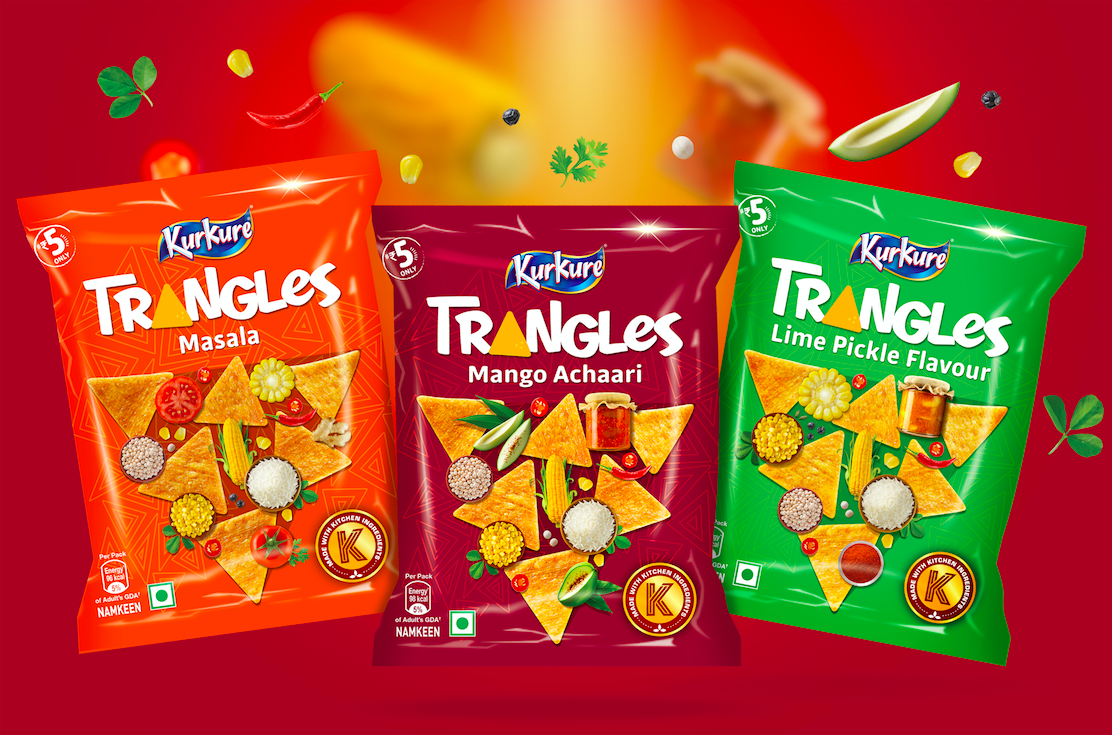
Kurkure team handed us three significant tasks through the packaging revamp exercise. The first one was to enhance brand leadership, relevance and distinctiveness. The second was to build an architecture that can create a strong differentiation for categories. The last one was to help consumers navigate the shelf and pick the right snack of their choice. When you are working on one of India’s most loved brands, you have to listen to the fan base and understand the degree of shift possible. You also have to understand the nuances involved in designing for a very large print run at multiple locations with varying infrastructures. 

The concept was built around focusing on the ingredients to enhance the taste appeal with a larger than life shape of the product, providing the backdrop for a play between products and ingredients. Every variant is called out in custom designed typography that also makes it own-able. The back of the packs are brought to life with custom drawn illustrations about turning mundane encounters into fun moments by sharing the snack. Such large impact exercises become more interesting as we get to interact and learn from global brand custodians. 

1-01_.jpg
1-01 copy.jpg

Q :

Could you tell us a bit about your Singapore operations? What kind of brands do you work with there? 

Our business model in Singapore is very different. In India, we have a mix of design research, brand and design consulting, product design and innovation consulting. In Singapore, however, we mostly take up consulting projects around insights farming leading to innovation strategy. Many of them don’t require pure design input. And the ones that do culminate into design projects are handled at our Pune studios.

(L-R) Partho Guha, Ashwini Deshpande &amp; Ashish Deshpande

(L-R) Partho Guha, Ashwini Deshpande & Ashish Deshpande

Q :

You were recently announced as a jury member of the Young Guns 16 competition. What are you most looking forward to while judging? Also, in general, what are some of the key qualities you look for in the work of young designers/interns who approach Elephant for mentorship? 

I am always curious to know what young designers are thinking or doing. While judging any work, I am more focused on the idea. Is it outstanding, aligned to brief, original, and feasible? Once I am satisfied with these, I look for the degree of detailing and the quality of execution. 

While looking at portfolios of young designers, I like to find passion bordering on obsession to convey the idea in its most powerful form. If I find someone with extraordinary skills, I may get impressed, but I rarely hire anyone for just their skill. 

Britannia Breads_Packaging Design_Elephant Design, Pune, Singapore.jpg

Q :

Elephant has interns from different countries. In what specific ways, is that beneficial?

Yes. We have had interns from France, The Netherlands, USA, Singapore, Mexico, Turkey, and of course every Indian state. The interns bring immense positive energy and manage to enliven the entire team. They also bring a taste of their culture, their educational ethos, and a sense of exploration. 

In turn, we believe that Elephant is like an institution that changes the way they think about the profession and creativity. Going forward, we offer full-time positions to some of our brightest interns once they complete their education as there is a familiarity that reduces their adjustment time.

Q :

Elephant also works with a lot of startups. How is the experience different from working with established brands? Personally, which one do you enjoy more? 

The Indian start-up landscape is very vibrant at the moment. And the founders who understand ‘design’ as a crucial differentiating factor tend to approach design consultants at an early stage. We have worked with quite a few start-ups in the past four to five years, including Paper boat beverages, Fingerlix ready-to-eat foods, Too Yumm snacks, Epigamia Greek Yogurt, ASAP Bars, Witlinger Beer, Plezmo intelligent play-blocks, SynPhNe stroke recovery system, and Healthcube Diagnostics. 

Start-ups are nimble, so they take quick decisions and are not worried about failing and starting again. On the other hand, established businesses tend to think in a linear but robust way; they take fewer risks and have long launch cycles. Both are rewarding learning experiences in their own way and we tend to transfer our knowledge to both sides as well.

Britannia Breads_Packaging Design_Elephant Design, Pune, Singapore.jpg

Rebranding a business with hundred years of legacy!

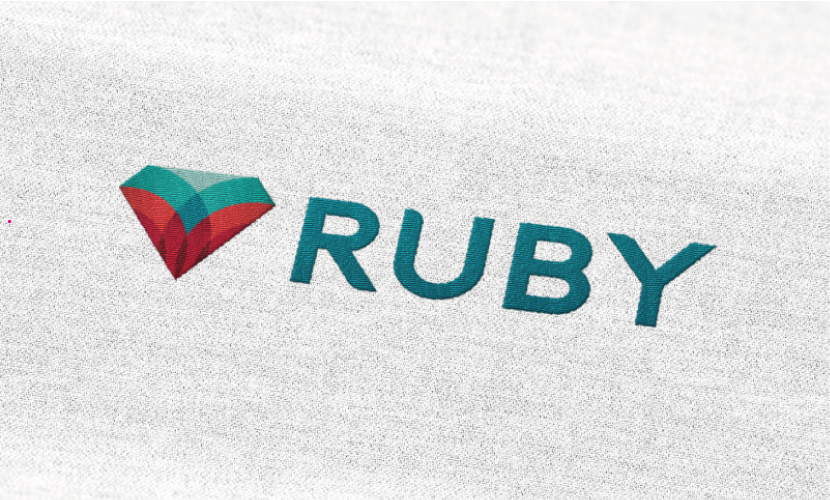
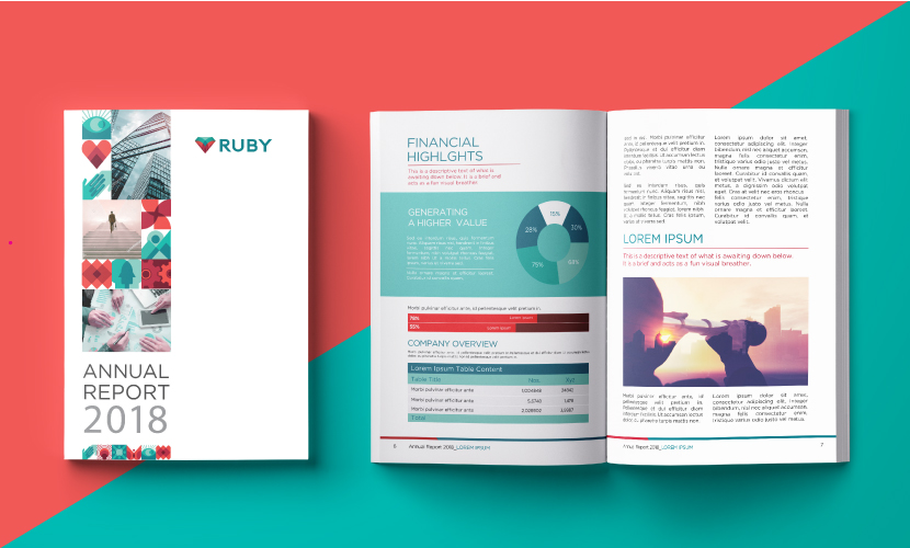
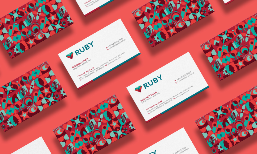
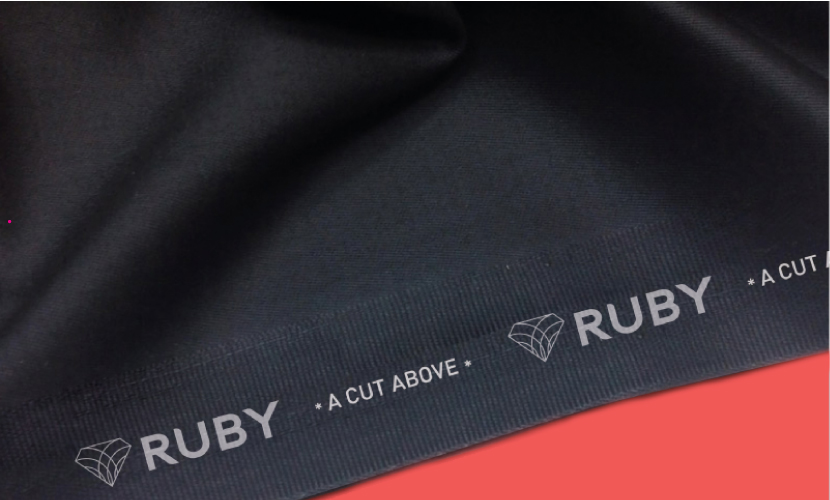
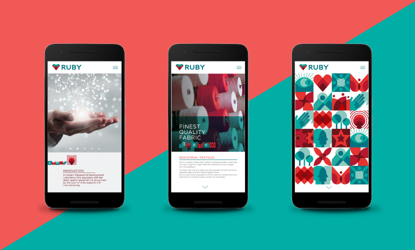
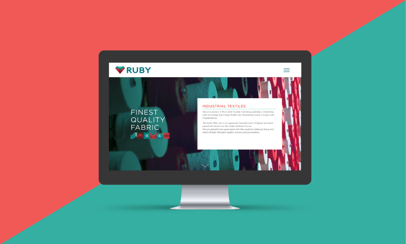
Incorporated in the year 1917 as a composite textile mill, Ruby Mills wanted to enter the next century with clear brand positioning, well defined values and a refreshed visual identity.

Ruby Mills teamed with Elephant to showcase its transformation with a new brand identity system.

Rebranding a legacy that has been a significant part of India’s journey from fighting for #Swadeshi to proudly #MakeInIndia for over a century was a huge responsibility. We were tasked with realigning the brand for today’s progressive aspirations while keeping the heritage & dignity intact. We drew inspiration from the brand’s core values of innovation, sustainability, ethical and responsible manufacturing and excellence in quality to build an ownable palette of visual expressions for various online & offline communication needs.

We designed a dynamic and vibrant brand-mark that was rooted in heritage yet had a very ownable & contemporary flair. The red heart in the logo stands for passion, one of the brand’s core principles. As per our advice, the brandmark retains only the name ‘Ruby’ while doing away with the full form “The Ruby Mills Ltd” that was present in the earlier visual identity.

New brand-mark and visual language were recently launched at a trade event. Ruby team is in the process of implementing the newly designed language throughout their portfolio and intends to complete the transformation in 2018.

Brand Makeover

Kurkure has a vast portfolio of multiple categories, flavours & sizes with varying preferences of tastes & shapes across the country. 

As some of the innovations in shapes & flavours had happened organically, this hugely popular brand needed a cohesive brand architecture and visual language. Indian snacks had added to the complexity of portfolio even further.  

There were 3 significant tasks for this redesigning exercise: 

  • Enhance brand leadership, relevance & distinctiveness.
  • Build an architecture that is able to create strong differentiation for categories 
  • And most importantly, help consumers navigate the shelf & pick the right snack of their choice

As echoed by consumers everywhere, Kurkure being the brand of abundance, crunch & quirk, design team decided to highlight these three axes on the packs. 

The concept was built around getting the ingredients in focus to enhance taste appeal with a larger than life shape of the product providing backdrop for play between products & ingredients. Every variant is called out in custom designed typography that also makes it ownable. Back of packs are brought to life with custom drawn illustrations of turning mundane encounters into fun moments by sharing the tasty crunchy snack. 

While harmonising the entire portfolio in terms of messaging, tone of voice and visual language the team was successful in creating clear distinction within categories of collets, puffcorns, trangles and Indian savoury snacks; taking the shelf visibility & excitement to next level. 

Time to grab India’s favourite Masala Munch! 

Is ‘Empathy’ really that difficult?

Empathy_Blog_Elephant Design, Pune, Singapore_1.jpg

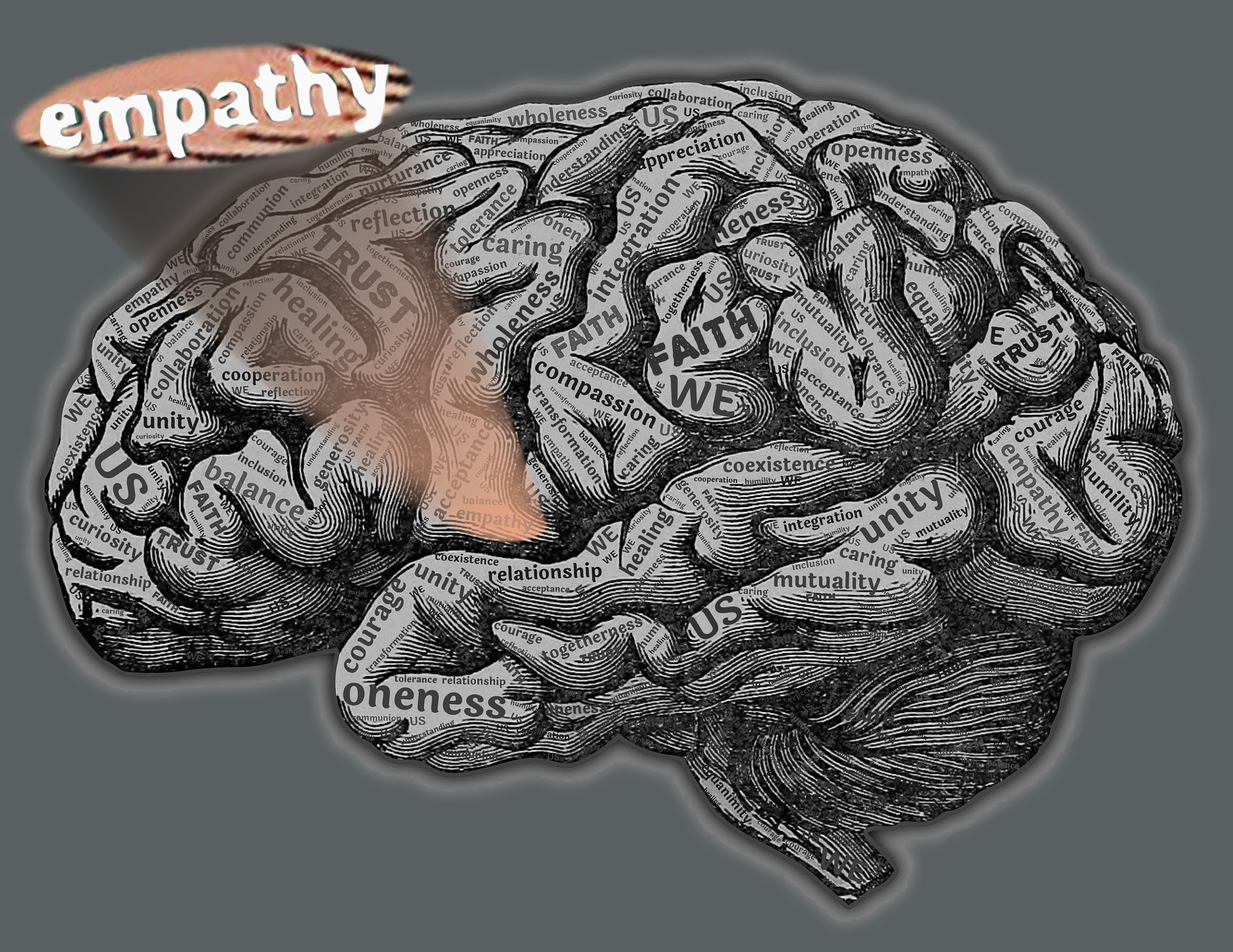
While Design Thinking (DT) creating a buzz across industries or domains, there is a lot of overwhelming content on popular business magazines like Forbes, HBR, FastCo. etc. reinforcing its importance in businesses. However, there is one common element which everyone wants to stress in Design Thinking is ‘Human Centricity’ or ‘User Centricity’ or a more conclusivily ‘User EMPATHY’. This excites me to write on this topic that whether ‘Empathy’ as an emotion or as an act, really that difficult to inherent Design Led Innovation? 

To begin with I tried to build up a scale on Human Emotions + Attitude (Emotitude*) with a scenario around a person who is trying to interact or approach another person. 

By ‘interaction’ I mean ‘Talking - setting up a conversation’ or ‘Observing - looking at other’s activities’ or ‘Immersing – participating in his/her activities’. 

Emotitude* scale

Empathy_Blog_Elephant Design, Pune, Singapore_4.jpg

Please note* - This scale is fixed up on a broader emotions along with commonly known acts/attitude which one use in daily lives. 

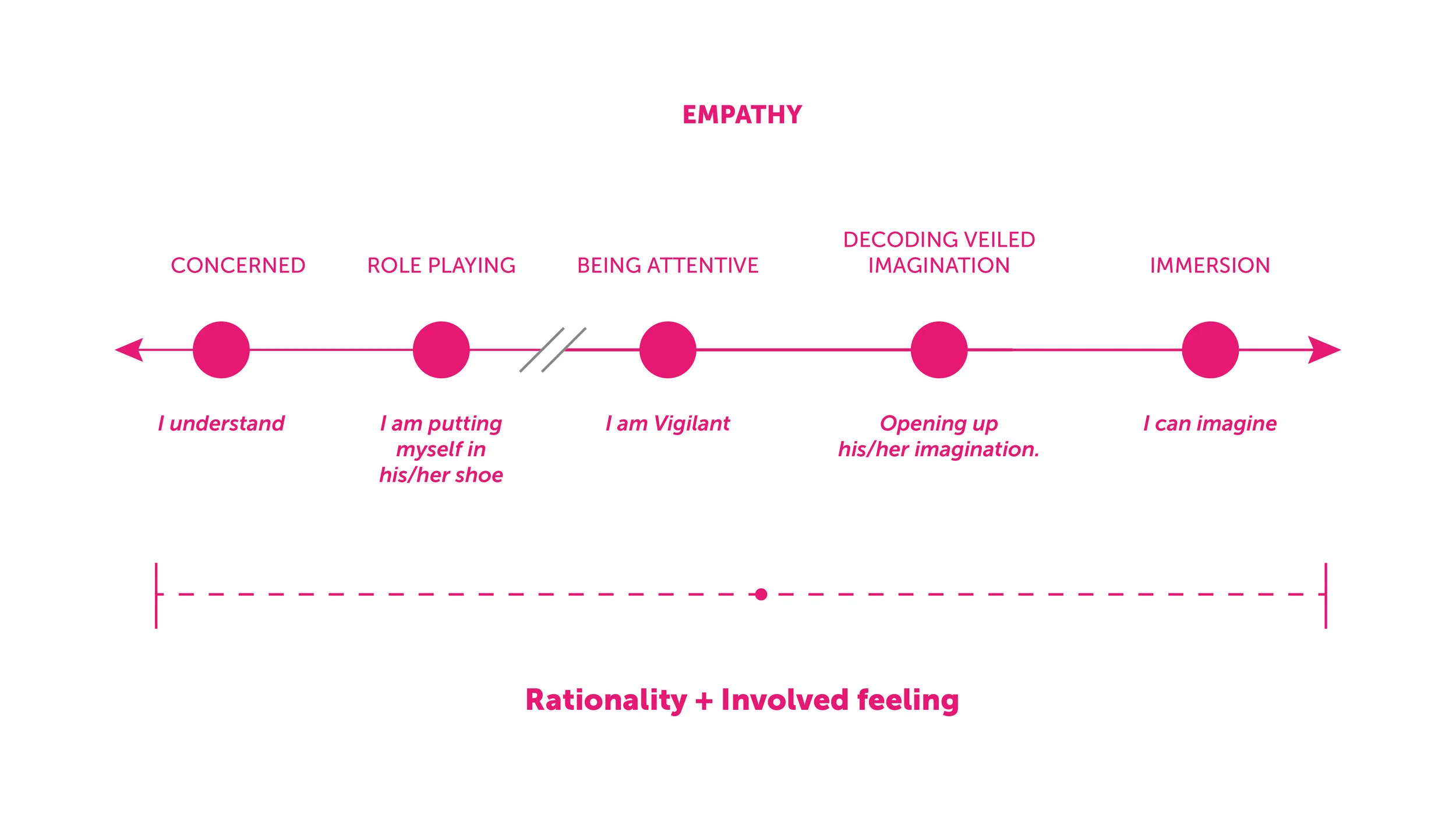
    Emotitude scale ranges from a “Don’t bother me” attitude i.e. ‘Ignorant’ emotion to almost feeling helpless for someone (like crying) which could be showing up extreme ‘Sympathy’. As one progresses from being ‘Ignorant’ towards ‘Sympathy’ there is some transition that takes place from being ‘Rational’ to getting ‘Involved in deeper care’.  This transition might be extensive with further varied layers, however, I feel this is where ‘Empathy’ lies or takes place broadly. 

    ‘Empathy’ might roughly start from “I understand you” and spread across to a more involved or an immersive emotion of “I can completely imagine your situation”. During this transition one person is trying to rationalise the other person’s situation and at the same time trying to get involved in his/her emotions to ‘Imagine’ or ‘Immerse’.  To elaborate this thought, I will further share some regular stories of User research on how ‘Empathy’ played a role from understanding a person to initiate imagination in his / her situation.

Story 1  - Role Play

Background – While carrying out a home visit, I was interacting with a lady who was obstinate in answering my questions. She remained inconspicuous throughout the conversation. Though it was a paid recruitment, she was unable to talk and she only had objective answers. Eventually, I was loosing my patience and had no hopes to get any fruitful insights from this visit.  One thing I realised, that she was unwilling to allow me to enter her kitchen for my study purpose. 

I somehow got inside and looked around to dig into the scene of her cluttered and messed up kitchen, to know why she was suspiciously reluctant. Here, I tried to put myself in her situation and started imagining why one would have such behaviour. I realised, any woman would have the tendency to hide a messy space in her home! And why? Because the tendency is to avoid getting judged on portraying bad picture of a sacrosanct space like kitchen even if the woman is getting paid for it. 

I guess ‘I was right!’. When I started the conversation around her kitchen, she expressed her concern about the muddle and slightly opened up talking about her experiences. 

Well, a long story, but few deep dive learning was about user behaviour and how ‘Empathy’ helped to break the barricade of hesitancy. 

  • Here, I tried to question ‘Why’ to a obvious behaviour, instead of assuming loosely. 
  • The only way to find the answer was to be like the other person (atleast do a short role play in your mind) and then self analyse.
  • Later part was to validate that analysis by probing those questions to the user. 
Empathy_Blog_Elephant Design, Pune, Singapore_2.jpg

Story 2 - Attentive

Background – Meeting a Quadraplegic Cerebral palacy (Specially abled) girl who was diabetic. To learn how she uses her blood glucose monitoring device on her own. 

We tried observing her interaction with the product. We also discussed with her Mother about her experince as a care taker.  For a long amount of time we were failing to understand that if at all there was any issue with the device. It is tough to do a role play in such case. We eventually, video recorded this meeting for our later analysis. While repeatedly looking at the video we realised that affordance of her thumb to operate few buttons on the screen was problematic to her, which she was unable to communicate. 

We learnt that not always a ‘role play’ or ‘putting yourself in other person’s shoe’ is going to be helpful. Here, ‘being attentive’ or ‘keen’ towards even minor observations can help ‘Empathise’ with the user. 

Story 3 – Decode Imagination

Background – In most of communication design projects, we want to learn from user their perception about colors or symbols associated with the brand and it’s attributes. 

Such exercises are usually tough to crack. ‘Color’ itself has a lot of individualistic perspective. One person might be in favor of something and the other may have differing opinion. 

However, colors or visuals are natural catalyst to grow fruitful conversation with the User.  As humans we are visually literate species. Human eye reads a word as picture and sound. Our saccadic vision help in scanning words, recognise them as pictures and immediately trigger its meaning to our brain. And all this happens in fraction of a second. Therefore, the challenge here is to learn what is triggering recognition in the User’s mind. 

A set of colors or cards or symbols can help in decoding User’s imagination as User’s tend to talk more what they recognize

Trick here is to study the pattern of comments made against choices and not the  pattern of preferences. 

The spectrum of ‘Empathy’ scale itself, has many shades of emotions and attitude one can use towards the User to understand him/her better. Yet, it is a natural asset to everyone of us to simply empathise and learn from the obvious.

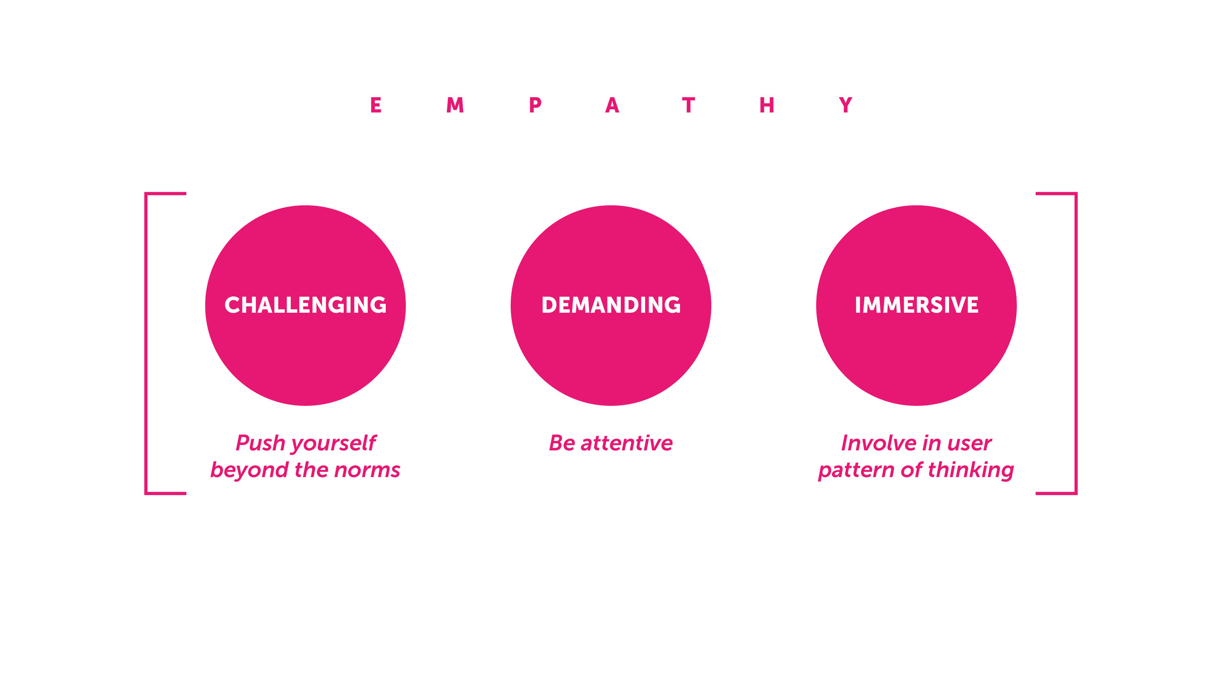
Going back to my question “Is Empathy really difficult?” Well, my answer will be it is NOT! But it is Challenging, Demanding and Immersive! Almost like scanning one hundred thousand nuerons sitting inside human neuro system. One has to be extensively passionate to deep dive in the User’s world to really empathise and learn his/her latent needs or wants. 

People or organizations who are eager to weave in Design Thinking must learn ‘To Empathise” with their User or collaborate with people who are already fanatical about this subject.

Emotitude* term is coined, for this blog purpose

Please note* - Emotitude scale is completely based on author’s personal hypothesis and may not have a scientific / psychological relevance.

KRANTI VANJARI is a Manager & Subject Expert of Strategy & Design Research at Elephant. She has a graduate diploma in Mechanical Engineering, WCE and a Post Graduate Diploma in Strategic Design for Business, MIT Institute of Design, Pune, India.

Bibliography:

https://think360studio.com/what-is-design-thinking-and-design-thinking-process/

https://www.creativityatwork.com/design-thinking-strategy-for-innovation/

https://www.ideou.com/pages/design-thinking

https://hbr.org/2008/06/design-thinking

https://www.forbes.com/sites/reuvencohen/2014/03/31/design-thinking-a-unified-framework-for-innovation/#7b5e8ba38c11

https://www.seeker.com/our-brains-see-words-as-pictures-1769641068.html

https://www.scientificamerican.com/article/when-we-read-we-recognize-words-as-pictures-and-hear-them-spoken-aloud/

https://www.childbirthinjuries.com/cerebral-palsy/types/quadriplegic-cerebral-palsy/

Settling in a new ‘fun’ place

Screen Shot 2017-09-21 at 5.10.36 pm.png

Its my first month at Elephant and I’m still finding my way around. As a new face in the crowd, you tend to get swept away. In the midst of trying to find a rooting, I have been amusing myself with the little things at Elephant. The little things are quirky, fun and add an element of happiness to my dullness of solitude while I attempt to make new alliances. 

IMG_5725.JPG

On my first day, within the first hour, I am showered with goodies. A well illustrated coffee mug, a t-shirt, and a diary (there are a set of cool stamps which can be used to personalise your diary!). I am also given a little pink diary (yes, pink) which gives me contacts and guidelines that I may need while settling in. It also allows me to set goals to be achieved in the first few months. All this using unique comic-book type illustrations.

As I wander around the premises, I notice these little signages which add to my amusement. The conference rooms have names such as ‘Idea Bar’, ‘Think Tank’, and ‘Chat Box’: (REALLY cute displays). While going down the stairs in one of the buildings, the ceiling is a bit low towards the landing and here comes a little sign saying ‘Oops!’. That truly does put a smile on my face. There are coffee and lunch breaks at the ‘Palm Beach Cafe’ and it rightly holds true to its name. It is an open wide space giving you plenty of opportunities to mingle with the rest of the crowd. Even the disposable cups have been personalised by Elephant and have cute illustrations.

It is still my first month and as time passes, I am sure to discover more little things at this institute that believes in the power of magic!

Reema Mehta

Change is the only Constant !

Elephant No1-01.jpg

We have seen business of design change over years. Initial years ( late 1980's to 1995 ), we struggled hard to educate businesses about design. Subsequent years ( 1996 to  2010 ) we focussed our communication around strong thought and strategic importance of Design that Elephant brought to the forefront. Post 2010, the message was geared towards reinforcing our thought leadership in the field as well as revealing the bandwidth of tackling complex design challenges.

Last five years, we have seen change taking place at a tremendous pace. Be is technology at one end or people at the other end. Our clients are younger, smarter and global in vision. As every now & then, we regrouped as a team and rejigged our business processes, skills & resources to meet the challenges as we head towards 2025.

"This is a kind of rebranding & alignment with our key partners. It is the most relevant way to be in touch and was long due. This effort has made us much more accessible and approachable than before. Our communication through the refreshed website reflects the informality of our internal culture and our approach to inside & outside is on the same plane." - Ashwini Deshpande, co-founder, Elephant.

In 2015, team at Elephant identified a series of touch points & processes that needed change. This is of such effort at its launch phase. We will keep publishing each change. Keep a watch and meanwhile, do check out, www.elephantdesign.co