Design Led Innovation

Notes from Future: When Nobody Dies

(“P” and “N” are kind of long-distance friends residing in two time zones 30 years apart. “P” stays at year 2050 and “N” at 2018. These are few of the many notes '“P” wrote to ‘N”: )

Warning - PURE FICTION 

No_Disease.jpg

Inspired from the book "Homo Deus" by Yuval Noah Harari

IIn the past, war used to be a big killer but in last few decades there is no big war. The chance of a real war is only getting slimmer as time passes. In the past, hunger used to be a cause of death. Today we already have enough food for all and in future there will not be any death due to famine. In the past, disease was a big cause of death. Today we already have knowhow and mechanism to control any deadly outbreak. Disease is no more a cause of large-scale death.  

In future, we will live a very long life, may be we will have no compulsion to die.


Hey N,

You seem to be curious about how life seems at 2050. I will try and describe some of the things happening around here. Future is nothing like you see in Sci-Fi films but there is a rapid change happening. Let me try and describe few of the interesting things, which are noticeable. 

Today let me tell you few examples of things happening because human beings are almost not dying anymore.  At 2050 we can extend our old bodies to the maximum. Most people these days live beyond 100 years. There are no diseases or other external factors, which endanger health. Our body does become old and frail but there is no suffering due to sickness. 

Scientists are now doing research for keeping the body young at very old age. In few years, we will see our mind maturing with time, but the body remaining at 20 years only. 

Now let me quickly tell you some of the interesting things, which I see around myself. 

exxoskeleton.jpg

There are lots of Exoskeleton shops in the city these days.  There is even one at Bavdhan. This Exoskeleton centre make interesting attachable smart mechanisms which are attached to the hands and legs. They help frail bodies to increase strength of their limbs for heavy lifting and speed walking for long distance.  These are individually customizable depending upon the specific weakness. It is a very helpful service, which keeps elderly people active so that they are able to take care of themselves quite well.  Most of the elderly are now working and have very active life.  These Exoskeleton parts come with various colours and styles. They are now considered fashion accessories. Even young people are using them, so that they can enhance their physical abilities considerably. 

Next, let me tell you about Gene Therapy Clinics.  

Most of the older hospitals have transformed into these clinics. They ensure long-term wellness and provide whatever medical help we need.  Treatments these days are focused on gene issues.

Looking for Right companion for elderly has become a big business. Dating, live-in, changing partners is a need these days.  People experiment living in various kind of relationships, as time is not a constraint any more. Relationships like commune, robo-companion, contract relationship are norms these days. Marriage is a forgotten practice now. 

Now I need to go and change my body Exoskeleton. It needs more strength to keep up with my adventures world-tour journey I am planning. 

With love 

P

Client is ...

There are more things that happen between a client and a design team than what meets the eye. A great design outcome is only possible when some magic happens, some happiness blooms.

By Partho Guha    Co Founder  Director     elephantdesign.com

Client is a person

A client represents a business and wants to leverage design for its growth & success. That is just the starting point. A client is also a person gearing to do something awesome, to leave a mark, to sleep in satisfaction, at the end of a hard day.

Relationship

Like any relationship, it is a two way exchange and to make it work we need to accept the other as they are. Often we want to change the other and that destroys the trust.

In a relationship, some times we forget that the only one whom we can change is oneself. When we focus and change self to accommodate the other, the seed of a great project is sown. It is not easy to give away the pride of earlier success, the creative ego, the superiority of intelligence and be humble to make space for others. Different attitude, skill-sets, experience is a must for a project, but conflict never makes a great project. 

Invent the future

Clients and design team are the collaborators ready to take that tandem jump for the unknown scary future. To gain the confidence of sticking one's neck out and feel that the other will cover your back is a gradual process. The confidence grows based on small evidences happening at the early stages of the relationship. Most likely, these are soft and emotional responses. Dating time has serious impact on the project outcome. 

Success

Design projects mostly do not have a sharp target. The success of a project gets revealed with passing of time. The initial response from market, analysis of statistic & data, the pat from the boss, admiring glances from the peers, all contribute to the success of a project. When the client feels the personal success, the project is on a good path. It mostly takes some time before design team feels the glory of the project success. In a way, the success of the client as person is the first leaf of a healthy blooming plant.

Spread the word

When a client speaks about the project he/she is proud of, the design team is always glorified. Those good words are the real indicators of how the project has fared. It takes patience and humility, to wait seemingly infinite time for client to talk. 


Then at the right time, all the good words come. It not only energises the design team but also brings in new clients. 


Well... what is a success, if it does not bring new clients!

<  Back to Blog

1% inspiration 99% perspiration

1% Inspiration 99% Prespiration_Blog_Elephant Design.jpg

By Partho Guha Co founder Elephant Design, elephantdesign.com

1% inspiration 99% perspiration

In any project where the outcome is something new, we think it is driven by inspiration. The ideas which leads to big shift in our life, which really takes us to the future are the domain of few gifted individuals who can think up these great ideas. 

In today's time, this is a mistaken presumption.

Inspiration

Most people can join some few dots and come up with next best idea. The ‘eureka’ moments are way too common than we believe. If we ask around, it will be really hard to find a person who has no great idea. Idea is always in abundance and overflows at our will. This is way too over rated.

Perspiration

Getting an idea from ‘thought to thing’, is completely a different capability. Very few people have the gift to commit for an idea and spend half a life to realise. This is the true magic of creation.

1% inspiration is actually enough to get an idea to start with, but one does need 99% perspiration to keep at the idea and make it come alive.

Most of our education system is focused around this 1%. We learn to become good in thinking and communicating ideas. Our hero is a person who can speak beautifully about a life changing big idea. We are not really bothered about those people who will actually work on the idea and implement it. They mostly stay in the fringe and are forgotten as ordinary.

To inculcate the culture of innovation and doing never before things, it is time to we start celebrating the perspiration. 

Perspiration demands meticulous planning, ingenuity to do with less of everything, patience to endure ridicule and maybe failure every-day for next ten years. That is the kind of time it takes, to make a new idea work for users successfully. 

Perspiration may seem ridiculously painful, but it is the true joy for many invisible, adventure loving, excellence seeking working folks around us. 

What is a journey if it is not really scary!


Scientist at NASA experienced 20 failures in its 28 attempts to send rockets to space. 

<  Back to Blog

Seeking the ‘Little Girl’

Seeking the ‘Little Girl’

Little Girl, is that bubbly person with her unique sense of life and constantly looking for joy. She is the future, unaffected by the past. That is the person we always want to design for. Through our design we are always trying to add little joy in her life. But thats not always really simple. The serious conversation of design on competition, manufacturability, the appropriate time to launch, the scale it needs to achieve dominates the conversation. Little girl mostly slips away from these conversations. 

By Partho Guha, Co founder & Director, Elephant   www.elephantdesign.com

There is no ‘Little Girl’ in the user data

In our conversations about the users, we are now quite sophisticated. We have borrowed framework, principle & methods from sociology, statistics, anthropology, psychology & such expertise to understand large number of users. Understanding the desirability factors of a user’s mind specially for a mass distributed offerings is a huge challenge. We are trying hard to make it a fact based conclusive logic, because that is easy to explain when large investments are in questions. But the Little Girl, always absent from such data sets and analytics

There is no ‘Little Girl’ in the analysis

Though are we fully aware that hard data never represent emotions of the users. Emotions are possibly the strongest driver for desirability. In our high level conversations we are avoiding these soft issues because we do not know how to discuss feelings, memories, happiness as data.  May be the analytical approach itself is completely inadequate to tackle these soft issues. 

We may find the ‘Little Girl’ in early ideas

We need to move over to the synthesis processes to have any conversation on feeling. An analysis process starts with breaking down the context and than work towards ideas and a synthesis process starts with ideas and than concludes through validation. When we start the design process with messy data & deep empathy and trust the artist in us, there is a chance we may get the Little Girl in conversation. 

May be a chance worth trying.

<  Back to Blog

Growing with the Problem

Problems, which keeps the world leaders awake at night, have already changed. Technology is becoming the dominant force and as human we are grappling with the speed & meaning it brings to our daily life. World today is looking at design to solve these complex & unprecedented problems. We as designers are eager to rise to the occasion and welcome the change. We need to relook at our methods, mindset and measurements to be effective with these problems.

At Elephant, we are constantly experimenting with our self to understand and gain capability to address these problems. Creating a next level of work culture is one such focus. 

Partho Guha, Co founder and director Elephant design.

EMPATHY. People matter to us. More than anything people defines what we do. People from all walks of life use our design. Clients represent a business but at the end they are people too. They come with their own needs and wishes, their personal expectations, dislikes and world views. Then comes our own team, the most important set of people we have at Elephant.

To work with people we need to understand them deeply & seriously. Considering we do not even understand our self-well, this is a daunting task. Empathy is possibly the most human way to understand another human. After going about the practiced way of logical profiling, demography, segmentation, motive & barriers and such logical methods, one needs to trust empathy. That is how we go beyond words & statistics and people become alive and connectable.

Thankfully we are born with empathy and use it extensively in our personal life. When at work we seem to switch off this important capability. At Elephant, we wish to switch on the empathy and use it as our primary tool to understand people.

EXPLORE. A design problem comes with certain obvious solutions. The practical, proven, easily acceptable solutions, little tweaked for the context, easily becomes the winning idea. Possibly in any design project this is the greatest challenge to solve. How not to give in to the obvious and push the boundary fitting to the opportunity. It demands a great effort and energy from the team (client, design & vendors) to take the project beyond the obvious.

Adapting to the mindset of an Explorer, possibly the best way to go beyond in a collaborative way. The explorer’s restlessness of finding the edge, the faith that there is always a better way drives this effort. At Elephant we greatly respect and encourage the explorer in us to grow and take charge of projects.

MAGICAL CHANGE. Subtle changes are everyday occurrence in our life but only sometime there are changes, which are momentous and defining. They demarcate the past from the future. At Elephant we work towards making such magical change happen to the business and people we work with. Most importantly, we try to create such changes for people in our team. We try to contribute and bring about magical changes in each other’s life.

At Elephant we believe magical changes only happen when we work with empathy and like an explorer. 

Surely many from the global design community have felt this urgency for change and already doing something in their context. We all need to learn from each othersexperiences.

We are all ears to learn from your comments and thoughts.Thank You.

<  Back to Blog

Behind every successful startup, there is Good Design!

ASAP, CIIE-IIM-A incubated Bangaluru startup that created this “on the go” snack, Elephant design helped strategise and communicate a differentiating visual story.

ASAP, CIIE-IIM-A incubated Bangaluru startup that created this “on the go” snack, Elephant design helped strategise and communicate a differentiating visual story.

Last few years, India has seen a steady rise in design consulting needs from new mushrooming businesses, commonly referred as ‘Startups’. These are not necessarily the love child of newbies but also some industry veterans or serial entrepreneurs taking on new business challenges, who understands the importance of design. Here, Ashish Deshpande explains the pros & cons of designing for startups.
(As appeared in Creative Gaga)

A motivating enterprise environment in India, propelled by several industry & government initiatives has helped create a breed of entrepreneurs high on enthusiasm, technology savvy and willing to take the risk on new product service formats. Design is playing a crucial role in their journey as well as successes and there is increasing acceptance to the use of design in building a resounding brand & quality of product or service application. Paperboat is great example of a recent startup success story where one can observe design playing a key role. However, working with startups has its own unique hiccups and thrills.

Paperboat. A memory drinks based startup where design added emotive value to the brand, identity, language, pack form function

Paperboat. A memory drinks based startup where design added emotive value to the brand, identity, language, pack form function

CHALLENGES with Startups

1. MULTI-ROLE INVOLVEMENT

Let’s face it! Startups are ultra lean. Aligning business & technology solutions to a consumer-focused approach needs to be done at multiple levels. Since most startups, unlike the well-established corporate world, cannot afford multiple experts & agencies, a designer is seen as a ‘fix all’ for several needs. Involvement of a designer or design firm goes beyond a specific design assignment. Designer ends up playing a strategic role, trying to balance business strategy with design, brand image, product, pack, quality, vendor development, applications and point of sale, with key design language & marketing messages.

2. DISTINCT SOLUTION

Most startups are either technology or business focused. Design is a weakness and so is the ability to profile and understand end consumer. Startups tend to get committed too early to a particular tech or proposition without ascertaining appropriateness, uniqueness and distinction of their offering. Despite a new idea, most times, the end offering is neither distinct enough, nor is perceived value appreciable. This grave omission places the fledging business at risk from the word go.

3. INCREMENTAL APPROACH

Paucity of key in-house expertise & resources, especially funds, forces design to be undertaken in an incremental manner, stretching across months at times. Design implementation also takes place at a slow pace so it is difficult to see the full picture or measure the impact of design. A healthcare start up, setting up new format of hospitals launched the service care product with just the new brand identity, However, the hospital experience that would resonate with the brand was placed on hold due to lack of funds. The result was apparent. Customers never experienced the distinction in the hospital value proposition and never understood as to why they should adopt this new hospital chain.

SynPhNe. Singapore based technology startup where design helped cutting edge tech become human through Industrial Design of Wearable stroke rehabilitation device focused on needs of patients.

SynPhNe. Singapore based technology startup where design helped cutting edge tech become human through Industrial Design of Wearable stroke rehabilitation device focused on needs of patients.

ADVANTAGES with Startups

1. CONTAGIOUS ENERGY

Startups are a happy lot. Usual work culture is hands-on and people come across eager to learn, share and help. It is great to work with synergies of such teams and be part of an exciting journey. The results reflect on the design output. Client meetings are less of drudgery, are participative and consequently more productive.

2. WILLING EXPLORERS

This is one place where Startups score. They are willing to play along as you explore, experiment & test. There is negligible blame game, no departmental silos or ‘mother of all’ presentation to the King of the corporate. Results are quick and decisions are usually part of a co-creative play. Funds are the only constraint but then frugal approach and ‘jugaad’ prototypes are more than welcome. This approach works wonders for the confidence of the design team.

3. CREATIVE SATISFACTION

Many startups are working in the healthcare, social impact, agri-tech and energy space. Just the sense of what your work will potentially achieve can layer the designer in you with goose bumps. Each startup is a new challenge, whether it is B2B or B2C, it gives a sense of new purpose and when design helps enable such opportunities, the result is very satisfying. Design as core to startups is understood by the fact that many new enterprises have designers as co founders. Designers in India will have to quickly adapt to this new scenario and draw out a process to work with the Startup eco system. This culture is here to stay.

Plezmo. IOT based education platform that helps you learn program logic while you have smart fun. Pic by Plezmo

Plezmo. IOT based education platform that helps you learn program logic while you have smart fun. Pic by Plezmo

Plezmo. IOT based education platform that helps you learn program logic while kids have smart fun. Pic by Plezmo

Plezmo. IOT based education platform that helps you learn program logic while kids have smart fun. Pic by Plezmo

Is the future of design industry collaborative?

The emerging trend of multidisciplinary collaborations provides opportunities to innovate through unconventional means - Extract from an article by Aparna Raje published at Mint

"Over the last nearly three decades, the Pune-based multidisciplinary consultancy Elephant Design and Ahmedabad-based air cooler firm Symphony have evolved a symbiotic relationship. It has resulted in consistent product innovation, marketplace dominance and tremendous financial success, even scooping Symphony out of bankruptcy at one point, in 2009.

“We began working with Symphony in the early 1990s, when we had just started Elephant. They had four-five products in their cooler range, and sales of approximately Rs20-25 crore a year, when we first met them, and they were not listed on the stock exchange. Today they’re in more than 60 countries. Our relationship has grown from being a design service provider, to playing an advisory and strategic role. We have either worked completely on, or been instrumental in designing, nearly every product they’ve launched, especially in the last 10-15 years, creating new categories such as tall, slim, space-saving coolers with better aesthetics,” says Ashish Deshpande, co-founder of Elephant Design.

Achal Bakeri, managing director of Symphony, concurs. “Design is deeply integrated into our business model and always has been. Through design we have differentiated ourselves from what’s available in the market. We don’t have any in-house industrial designers, we had them for some time but found it was unnecessary. Our design team would only know air coolers, Elephant designs all kinds of products and has a much wider design understanding than us. Their teams work very well alongside our sales, marketing, engineering and manufacturing teams,” he says."

"Bakeri of Symphony endorses the role of informality in promoting design-led collaboration. “Over the years, Elephant and Symphony have understood each other very well, we don’t need to talk much.... The organizations have a good chemistry,” he says."

"Collaboration and design are naturally harmonious, but can sometimes fall out with each other. Design-led collaboration warrants patience and resilience, believes Ashish Deshpande (Elephant Design co-founder). “Design needs patronage. If it is nurtured over a period of time, it starts delivering. If it is confined to only a one-time period, it doesn’t always work. In many companies, people keep changing and it is harder to maintain consistency in the relationship.”

Red to Blue: Mark of differentiation

Red to Blue-Mark of differentiation_Blog_Elephant Design.jpg.jpg


Red to Blue: Mark of differentiation

Biggest challenge facing businesses fighting in red ocean zone is ability to effectively differentiate. How does design help deliver business advantage?

By ASHISH DESHPANDE

“Differentiation is the essence of strategy, the prime source of competitive advantage. You earn money not just by performing a valuable task, but by being different from your competitors in a manner that lets you serve your core customers better and more profitably. The sharper your differentiation, the greater your advantage.” - Chris Zook & James Allen, The Great Repeatable Business Model in hbr.org

The air cooler market in India is estimated above Rs.3000 Cr and 70% of this is the unorganized sector. Soaring summer temperatures, longer summer months, rising aspirations of the Indian middle class & accessibility to global markets have made every appliance manufacturer turnout products, to take a share out of the air cooler pie.

Evaporative cooler technology, over years, has improved incrementally and relaxed Intellectual Property compliances makes it hard to place Air Cooler products that are differentiated from the me too & rip offs flooding the consumer space. In this context, how does an appliance manufacturer stay above the waterline? What role does design play in helping companies take a hard look at their product line up? An interesting case of design at work asElephant teams with Symphony Limited, world’s no.1 cooling company.  

Customer focus ≠ Host of Features

Many cooler manufacturers believe that providing a host of incremental benefits is a way to the customer’s heart. Little more pad area, a few cubic feet of more air throw, a liter more of tank capacity is no better than running a race at the discount store.

Differentiation begins with empathy-based observations of what people do when they buy your products. Design team at Elephant spend hours observing people in their homes, looking at their habits and noticing their real time concerns. During one such visit, the design team observed that coolers were always being shunted to balconies, lofts or were pushed under wall units. People need space, and when they don’t need a product, they try and get it out of their way. Coolers not only consume precious floor space but also block airy windows in case of window mounted versions. Air Coolers inherently carry volume and are bulky. Instead of focusing on increasing air throw or the next best remote control, the design team focused on “reclaiming space” for customers. 

Pictures taken by Elephant Team during actual home visits showing Air Coolers stowed away.&nbsp;

Pictures taken by Elephant Team during actual home visits showing Air Coolers stowed away. 

Setting a Big Hairy Audacious Goal (BHAG)

Once a challenge is identified, it ends up providing the design team with a sense of direction. However, challenges are not easy mountains. The design team at Elephant & Symphony set themselves a couple of goals.

First was to design a full size cooler that fits on a footprint of 1’ x 1’ tile. This was not as easy as it probably reads, since the entire air throw mechanism was to be reconfigured and reengineered to fit into a compact, yet, tall space. This itself was not enough since the product was to deliver a better cooling performance and air throw than conventional models.

Second was to free the window. Windows are a relief in urban apartment environments and the design team set itself the second challenge to create a product that doesn’t need window mounting. The product could be mounted high on the wall like a split AC. Again, this was easier said than done. The design team had to solve the problem of water tank, water filling and cooling.    

Making it happen

When design team under takes new direction or challenge, they come across unknown obstacles. Some of them are known spoilers like weight of the product, cost of parts, number of parts, assembly, quality of manufacture and size for shipping. All these obstacles need to be sorted out from the regular functional issues before a cooler can be realized. As a new format of product that is deviant from the traditional, it is imperative that the product carries no bugs.

The development work resulted in two product formats.

First, was the creation of the ultra compact and tall range of next generation cooler range “DiET”. This product connected with people due to its floor saving footprint, low power & water consumption and was an instant hit. DiET today retails across 40 countries with over 1.2 million units sold. This product for its design & innovation quality was awarded the “India Design Mark 2013”.

DiEt cooler with ultra compact foot print, tall delivery and “intelligent” controls.

DiEt cooler with ultra compact foot print, tall delivery and “intelligent” controls.

Second, resulted in the creation of world’s first wall mounted air cooler, “Cloud”. A cooler that has completely freed window and floor space for people for whom space is luxury. This product for its design differentiation and innovativeness has been recently awarded the India Design Mark, 2016.

Cloud Cooler, mounted on wall. This freed floor space and windows.

Cloud Cooler, mounted on wall. This freed floor space and windows.

When development effort focuses on people, appreciates and acts on unsaid needs, product innovation can take place. The two efforts for Symphony are good examples of moving from a crowded orbit to an elevated plane. This orbit shift is what creates powerful brands, those that rise above the red ocean and make business sense.

Design led Innovation is a powerful tool however needs the courage from corporations and a resolute design team to undertake lofty challenges. Challenges that are not a figment of someone’s imagination or sales target but rather drawn from the latent needs of people.  

All successful product categories get crowded, what matters in time is agile & continuous people based design & innovation effort.   

ASHISH DESHPANDE is an Industrial Designer, Co-founder & Director at Elephant. An alumnus of National Institute of Design, Ahmedabad, he is a keen Design Thinker, a past member of India Design Council & President of Association of Designers of India. He has mentored several start ups, conducts Design led Innovation workshops and has worked on several design programs, notably, Titan Eye+, Ceat Tyres, Axis Bank, ICICI Bank, Symphony, Paperboat and works on medical & healthcare devices amongst others.

<  Back to Blog

MTR foods - new identity, packaging & story

About the refreshed MTR visual identity: 

MTR, the brand with the outstanding legacy, global outlook and millions of happy consumers was looking at realigning its visual identity to the core purpose of rooted transformation. 

We decided to retain the basic visual equity of red roundel with white fence and worked on improving the typography for ease & clarity in reproduction across variety of substrates & sizes. We created a bold sans serif brand-mark for cleaner & contemporary presence. We also reduced the picket fence elements around the logotype to de-clutter the identity. Natural ingredients being the core of all MTR products,  a fresh green was added to the roundel to announce meaning & mission of the brand.

About the packaging strategy & design: 

With changing roles within new family structures and new working patterns, women are not burdened by the need to prove their expertise in kitchens. They see their role as a family manager & look for ways to keep the family happy & healthy. Buying ready to cook, ready to eat & even ordering-in food is seen as a great way to ensure quality time with family. They are open to experimentation & introduce their family to new cuisines with ease. But they want to do this with knowledge. They want to be aware. They want to know the source, the ingredients, quantities, accompaniments, consumption occasions? basically everything. 

So when we were given the responsibility of designing packaging for the entire range of MTR products, we decided to dive deep into finding out what the changing consumer will be delighted with. 

With a portfolio as large as 140+ products, first thing to do was to discover what works as an equity for MTR and preserve or even enhance that. Next step was to question & evaluate existing information architecture & remove redundancies to make way for cleaner, user-focused bytes. Though it sounds like the most obvious thing to do, we brought in a strong product nomenclature that would catch the eye and remove any ambiguity. We decided to retain the strong red associated with the brand and build upon that by devising a colour code for each category for ease of purchase. We created three strong visual pillars for the product portfolio ? pure authentic, confident contemporary and everyday celebrations. These moods were created within the master visual template to further accentuate the brand expertise and its involvement at every need and stage of the modern consumers' life. Since products like Sambar are available in multiple formats like masala powders, ready-to-cook mixes & ready-to-eat meals, we brought the category descriptor right up followed by the consumption occasion & announcements like time for cooking, whether anything needs to be added etc. A product shot is one of the most important factors for an impulse purchase in foods and our team planned each shot meticulously, keeping in mind time of the day, occasion and accompaniments. Authenticity was built through right serving sizes, ingredient depiction and serving bowls. 

Since there is lot of curiosity about food from other regions, we have added a very interesting background of region of origin for every dish. It is a subtle addition, but one we hope will be discovered to the delight of consumers and strengthen the brand's expertise pan India. 

http://www.campaignindia.in/Article/401709,mtr-foods-adopts-a-new-identity.aspx

Sanjay Sharma – CEO, MTR Foods, said, “Today’s consumers have evolved quite a bit – both in terms of their food preferences as well their consumption patterns. They prefer Indian food but perceive it to be cumbersome and time-consuming. Our brand is the flag bearer of innovative, easy-to-make, nutritious and authentic-tasting products that take away the time dimension from cooking and make Indian food more accessible to consumers."

He added, “However, as a brand we needed to change to reflect who our key consumers are today. While the new brand identity better represents where the company is today, our detailed growth strategy will make MTR ready for the future. This is the new beginning for MTR Foods and we are confident that the changes we have undertaken and our new brand identity will make us a part of our consumers’ everyday lives.”

Ashwini Deshpande, co-founder and director, Elephant Design, noted that the re-branding exercise involved defining renewed purpose, creating visual identity and packaging communication, evolving portfolio strategy and packaging design for over 120 products, sold as 350 SKUs. 

<  Back to Blog

The Missing Esslinger

The Missing Esslinger

As they say, the search continues, yet the journey stemming from an inspiration has yielded results.

By ASHISH DESHPANDE

Hartmut Esslinger1 caught my imagination during NID2  days, way back in mid 1980's. As students, we would spend hours at NID's Resource Center (library), reading rare periodicals like DESIGN, ID and FORM. These magazines were our windows to Design in the western world (remember, there was no Google, those days). Esslinger & his firm, FROG, represented the epitome of design flow. He was enigmatic and the work being done by frog was an inspiration. Young FROG, a student initiative by FROG was to be ogled & drooled over, and the little haiku3 quotes were the seeds for our day to day philosophy & debates. 

As students, we would wait for the next periodical to arrive with the latest FROG creation. We dreamt of designing Skate Boots, Computer Work Station’s, Walkman's, all fired up by the 6 month old news provided by the “customs approved , imported & late arrival edition” of ID, Design or FORM magazine.

Stepping out of NID, armed with a graduate diploma in Industrial Design, I quickly discovered that there were no Skate Boots to design. There were no Macintoshes or Walkman's in India. India presented a different opportunity to look at design, playing to an unexplored field of functional needs of a developing nation. We had basic concerns about water, energy, health , hygiene, productivity that needed attention. Design business had to survive in a fledging economy by proving itself. The “Esslinger dream”quickly became an enigmatic inspiration of what an ugly Elephant4 could transform into one day.


27 years later, I was recently invited to speak at International Design Congress, 2015, at Gwangju, Korea. I scanned the list of key speakers and found Dr. Hartmut Esslinger, founder, FROG5 was speaking on day 2. This got me super excited. Listening to Esslinger was the closest, I would come to my Esslinger dream as a student. I grabbed my 2kg copy of Esslinger's latest book Design Forwardand lugged it all the way to Gwangju. The thought of listening to Esslinger live, getting my copy of his book autographed sentKimchi6 textured goose bumps all over me. I even included a quote by Esslinger in my talk at the conference.

Dr. Esslinger never arrived. No one explained. I re-read a few lines from his book after two days of carrying his book in my back pack and set it down into my luggage for its journey back to India.

May be, I thought, the journey is still incomplete. It began 30 years ago as an inspiring dream, morphed into co-founding anElephant4. Till today, the search continues for the missing Esslinger.

Maybe, one day,

                    "The old pond,

a frog jumps:

                    Plop!” – Bashô 7

the sound waves & ripples might lead our Elephant to find the Frog.

1.     Dr Hartmut Esslinger, Industrial Designer, founder FROG
2.     NID, National Institute of Design, Ahmedabad, India
3.     "Haiku" is a traditional form of Japanese poetry
4.     Elephant, is India’s premier design consulting firm
5.     Frog, is a global design and innovation firm founded in 1969 by industrial designer Hartmut Esslinger
6.     Kimchi, a vegetable side dish in Korea
7.     Haiku Poem by Bashô quoted by FROG

ASHISH DESHPANDE is an Industrial Designer, Co-founder & Director at Elephant. An alumnus of National Institute of Design, Ahmedabad, he is a keen Design Thinker, a member of India Design Council & Jury for India Design Mark. He has worked on several design programs, notably, Titan Eye+, Ceat Tyres, Axis Bank, ICICI Bank, Symphony, Paperboat and works on medical & healthcare devices amongst others.

Recently, Ashish spoke on Design with Context : Design for Real Needs, at the

<  Back to Blog

Service Design : Looking at Clues

What does the mini bar tell you about service design? A peep at how the hospitality industry could focus on customer experience.

By ASHWINI DESHPANDE

At some point, in some city, most of us have landed up checking into a hotel at an hour when one is too tired to order & wait for the room service, but could do with a tiny sip & snack. 

All hotels know this. And so they have the mini bars! Yes. Those tiny refrigerators that hold juice boxes & soda cans and also the cookies & chips in the vicinity outside. And then there would the most un-miss able list of all the items with prices that look like you could have bought five of those in that money. 

It seems Siegas, a German company, first invented a mini-refrigerator in the 1960’s. Some luxury hotels in US used the mini fridge in some of their suites. However, it was Hong Kong Hilton Hotel, which first institutionalised this idea in the mid seventies. It was based on a unique user & business insight. It made such sense to the guests that the hotel is supposed to have recorded 500% increase in their in-room beverage sales in just a few months. Every hotel followed suit and it soon became a standard fixture in all hotel rooms across the world. 

Now, this solution has its own problems. Recording, tallying & collecting money against the sales has been a source of concern for most hotels. There have been various ideas to counter thefts or record consumption accurately. This includes weight sensors & infrared sensors. However, sensors can only record removal of an item from the fridge. They are not a proof of consumption by the guest. It is a fact that at the time of checkout, guests are always in a hurry. It becomes impossible for hotels to get the mini-bar checked before a guest departure. 

During a recent stay at Icon Hotel in Hong Kong, to my surprise, everything from the mini bar was free and was replenished every day. It was a sheer delight, which the hotel possibly managed in less than 20 HK$ a day out of the 2000 HK$ they were collecting per room night. Just last week, my travel bag & me, we found ourselves at a luxury 5 Star in Mumbai. And the surprise? Yes! Not a pleasant one. The mini bar was empty! 

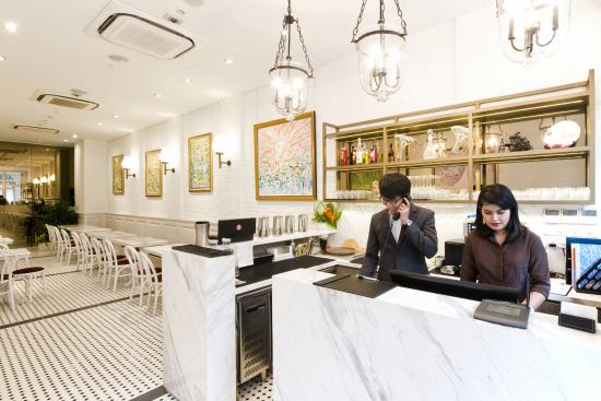
Adonis Hotel, is a boutique hotel experience designed by Elephant, that focuses on the needs of travellers centered around business, journey & stay

Adonis Hotel pictures from www.hoteladonis.com

Well, this note is not just about mini bar. But about solving a wicked problem such as this one by using service design principles. 

First & foremost, service design needs to be centered about usersAlways. 

Besides the core experience, service design must take cognizance of before & after scenarios. For example, if a spa experience is being designed, the team needs to look into how the service would be reached & booked, how the user would get there, how he or she would park & identify the outlet and what will be the residual memory after the user has left the spa. This may start with an app and end with a branded product range to carry home or a loyalty program that offers discounts or an exclusive blog; depending upon where the competencies lie and what seems most valued by the users.

This brings me to the other important factor of team competencies. Empathy towards the user is very important, but a service must be built with empathy to service giver as well. There is no point in designing an experience if the team cannot be trained & motivated to deliver it. Impromptu dance by Hard Rock Café staff resonates only because they are motivated to deliver it well, day after day. So the experience is best co-created with all stakeholders. 

No matter where, people are bound to look for a tissue only after they wash hands. So sequencing of events & imagining every possible scenario from the users’ perspective is an essential component of building a great service. 

And finally, it is important to have an open & experimental mindset while designing a service especially, if it has to be pleasantly differentiated. Indigo airline’s I O U notes are a great solution to take care of awkward anxiety of passengers towards balance amount from the food orders. 

So, what does the mini bar tell you about service design?

Elephant is India’s Best Design Practice (ET-Brand Equity 2012-2014 ranking) with a multi-disciplinary experience of 25+ years having presence in India & Singapore and has been transforming brands, organizations & businesses using Design led Innovation.

ASHWINI DESHPANDE is a Visual Communication Designer, Co-founder & Director at Elephant. An alumnus of National Institute of Design, Ahmedabad, she is a prolific speaker at several international conferences & workshops on design. Ashwini has been a jury Cannes Lions, Design for Asia & Spikes Asia Awards. She is a subject expert on Brand Identity Programs, Package Design & Colour Trends and known for her highly effective work for Britannia, Paper Boat, Nirlep, Gillette and Daimler Auto.

<  Back to Blog

Smart City: Exploring the Myth

What is Smart City: Exploring the Myth

India PM, Narendra Modi, announced his vision of Smart Cities across India recently. There is also an announcement of 98 cities that will benefit under this initiative. Smart city concept explained through a series of info graphics 

By ASHWINI DESHPANDE

Indian Government’s definition of Smart City focuses on improving the conditions of Indian cities to make them more livable and friendly. This also includes improving infrastructure facilities and creating better environment for investors. While there will be large budgets allocated for the development, public participation and citizen voice will form the backbone of this initiative.

Policies & government initiatives always mean well, however, it is very difficult to communicate the extent of an initiative to ordinary people. Government programs are mostly verbose with a healthy sprinkling of legally safe lexicon. People need to understand these programs, their benefits and extents to be able to participate. Communication needs to be broken down and abstract concepts iconised to put across simple & quicker understanding.

How does technology simplify our lives? Demystifying technology and applying to examples from our daily lives communicates the usefulness of its application.

Others have done it ! Why can’t we do it? Info graphics helps create a picture of key benefits of smarter living in other parts of the world.

And finally, how does all this smart thinking, smarter living in smart cities, change my life as a citizen. It is important to talk to people and put across their thoughts on how smart cities will affect various facets of their day to day living.

 Elephant team worked with Sakal Media Group to create simple communication & infographics that explain the concept of Smart Cities along with a case study & voices of prominent personalities on their vision of Smart Pune City.

Elephant is India’s Best Design Practice (ET-Brand Equity 2012-2014 ranking) with a multi-disciplinary experience of 25+ years having presence in India & Singapore and has been transforming brands, organizations & businesses using Design led Innovation.

ASHWINI DESHPANDE is a Visual Communication Designer, Co-founder & Director at Elephant. An alumnus of National Institute of Design, Ahmedabad, she is a prolific speaker at several international conferences & workshops on design. Ashwini has been a jury on Spikes Asia, Design Lion Cannes and Design for Asia Awards. She is a subject expert on Brand Identity Programs & Package Design and known for her highly effective work for Britannia, Paperboat, Nirlep, Grandmaster, P&G and Piramal Industries.

<  Back to Blog