Best Design Studio

Client is ...

There are more things that happen between a client and a design team than what meets the eye. A great design outcome is only possible when some magic happens, some happiness blooms.

By Partho Guha    Co Founder  Director     elephantdesign.com

Client is a person

A client represents a business and wants to leverage design for its growth & success. That is just the starting point. A client is also a person gearing to do something awesome, to leave a mark, to sleep in satisfaction, at the end of a hard day.

Relationship

Like any relationship, it is a two way exchange and to make it work we need to accept the other as they are. Often we want to change the other and that destroys the trust.

In a relationship, some times we forget that the only one whom we can change is oneself. When we focus and change self to accommodate the other, the seed of a great project is sown. It is not easy to give away the pride of earlier success, the creative ego, the superiority of intelligence and be humble to make space for others. Different attitude, skill-sets, experience is a must for a project, but conflict never makes a great project. 

Invent the future

Clients and design team are the collaborators ready to take that tandem jump for the unknown scary future. To gain the confidence of sticking one's neck out and feel that the other will cover your back is a gradual process. The confidence grows based on small evidences happening at the early stages of the relationship. Most likely, these are soft and emotional responses. Dating time has serious impact on the project outcome. 

Success

Design projects mostly do not have a sharp target. The success of a project gets revealed with passing of time. The initial response from market, analysis of statistic & data, the pat from the boss, admiring glances from the peers, all contribute to the success of a project. When the client feels the personal success, the project is on a good path. It mostly takes some time before design team feels the glory of the project success. In a way, the success of the client as person is the first leaf of a healthy blooming plant.

Spread the word

When a client speaks about the project he/she is proud of, the design team is always glorified. Those good words are the real indicators of how the project has fared. It takes patience and humility, to wait seemingly infinite time for client to talk. 


Then at the right time, all the good words come. It not only energises the design team but also brings in new clients. 


Well... what is a success, if it does not bring new clients!

<  Back to Blog

Typefacets: My life measured in fonts

Typefacets: My life measured in fonts

Typeface_Blog_Elephant Design.jpg

Nayantara Pande, Graphic Designer, www.elephantdesign.com

People associate certain things from the past with a particular fragrance, or a place, sometimes food. You taste something and it reminds you of your mother and your childhood, get a whiff of some perfume that reminds you of your long lost love. My love for typography makes me associate my past with fonts.

I have always had a keen interest for Type. Even as a kid, unknowingly, I used to sit on MS Word browsing through fonts, exploring. Typing out some of my story books on Word using these fonts thinking I was doing some extremely important work.

Confession: Comic Sans was my preferred choice for a greeting card or something fancy. Papyrus and Chiller were my go-to fonts for something “exotic”. Precisely the fonts that I cringe at if I see them used somewhere in a poster now, thinking to myself ‘Oh God! What were these people thinking?’ 

So what changed that made me realise the good from bad, the beautiful from ugly, the wrong from right? Going to Design School being the most obvious answer, the gruelling assignments, research, books and sharing knowledge played a big roll.

Which brings me to my first love,

1. Helvetica : The Clichéd Choice

How unoriginal of me to like something that every designer is “supposed to like”. But my first ever type assignment was working with Helvetica - The back breaking job of tracing the font in a sentence to understand mechanical and optical kerning, that too from a Typolog. Which means tracing each and every alphabet separately to form a word and then a sentence. That is tedious!

But I loved it. It is then when I realised typography is what I want to be associated with in future, in one way or the other. When you’re working on something so intensely, you do predominantly tend to notice things related to that in your surrounding. So I started noticing Helvetica used in posters, hoardings, ads, logos. I learnt how to recognise a typeface! One achievement unlocked! That thrill of being able to recognise a typeface is kind of addictive. Gives you an ego boost. So I started digging deeper and reading more, observing more using the typeface more and at the same time exploring new typefaces.

This is when I met my muse,

2. Baskerville : The Classic Beauty

This memory is synonymous with my mentor and teacher Manasi Keni, who realised my love for typography right from the beginning of my first year. Very strict but equally rewarding, I was very lucky to have such a dedicated teacher who went out of her way to help and strive for our betterment. Out of the many fun assignments she gave us, one of them was to present our favourite font. 

I had moved on from Helvetica by then and fallen in love with Baskerville. It’s beautiful curves, contrast and it’s elegance. A serif font with gentle transitions. The serifs gliding into the stems was a treat for the eye. Two of my favourite letters were the uppercase ‘Q’ because of the unapologetically bold yet elegant backward slash and the lowercase ‘G’ for it’s ear and loop. 

This was the first presentation I ever gave in college. I have a very bad stage fright. I was absolutely dreading the day even though I had to present in front my own classmates and friends. I was thinking, why did my teacher put me through this task?! I’d rather go through the agony of tracing the entire Typolog than do a presentation! It is when my knees were shaking and heart pounding that I remembered, while researching for the presentation I found out that John Baskerville, the creator of this font was illiterate. His knack for calligraphy and penmanship and a strong urge to learn about type made him quit his job and start his own press which ultimately gave birth to the first transitional typeface which later was an inspiration for Bodoni and Didot. 

I thought to myself, if an illiterate could achieve such a feat and design his own font, I can most certainly give a presentation. It gave me courage and I got through it. I still get scared to present in front of people, but now I know that, I can do it anyway. This font taught me that where there is passion and dedication, nothing seems impossible. All the qualities that got me through design school and to where I am now. Constantly evolving, constantly searching.

3. Museo and Brandon Grotesque: My 3AM Friends

Your first job is like finally diving into the ocean after swimming in the pool for four years. It is when you find out that most of the things you learnt in college do not apply in “real life”. The basic design sense is there, aesthetics and principles apply, but the rest? In that moment you realise you have SO much to learn still. 

All that ego about being one of the brightest students in class is shattered by the slap of reality that life gives you. Everything is unclear again. But that’s okay! Remember what Baskerville taught you? Perseverance and dedication! Also, some good friends are just what you need! It is here where I came across Museo and Brandon Grostesque. I was aware of Museo back in college but never really got to explore it. These two fonts have proved to be my pillars in tricky situations like a creative block a day before a deadline. 

The have made my logos look sleek and my packaging clean and contemporary. Museo is like a flexible companion providing solutions to all your problems with its Serif, Sans, Cyrillic and Slab Family. Brandon Grotesque is a total hunk with it’s strong yet friendly appearance sitting next to you saying encouraging words while you burn the midnight lamp.

On this quest of life I look forward to many more adventures with my Type friends. I thank those which have taught me important life lessons, some which have disappointed me and some which have supported me.   :)

<  Back to Blog

Experience Design: Dr. Kallam Anji Reddy Memorial

Experience Design: Dr. Kallam Anji Reddy Memorial

How does one pay tribute to a man who is an institution? A space experience designed to inspire people with thoughts & legacy of a life devoted to leadership, development & giving.

By ASHISH DESHPANDE

“Everyone has a purpose in life and an unique talent to give to others. And when we blend this unique talent with service to others, we experience the ecstasy and exultation of our own spirit, which is the ultimate spirit of all goals.” – Late Dr. Kallam Anji Reddy

Dr. K Anji Reddy had a dream, to make bulk drugs available & affordable to common people. With zeal and an inspiring life journey, he made the impossible a reality. A shade of his dream, enterprise and dedication is presented at the 1.2 acre site located in Miyapur, Hyderabad, Telangana, India.

The site is a subtle weave between the location, the architecture, landscape and the story of Dr. K Anji Reddy. Conceived to celebrate his life, the memorial architecture is the work of Mindspace, Ar. Sanjay Moghe and the experience layer has been created by Elephant Design.  Architecture is a non-building, nestled within the natural surrounds, preserving the serene atmosphere. At Elephant, the design team had a challenge to build a layer of tangible experience in the memorial over the architect’s cognitive approach toward the design of the space.

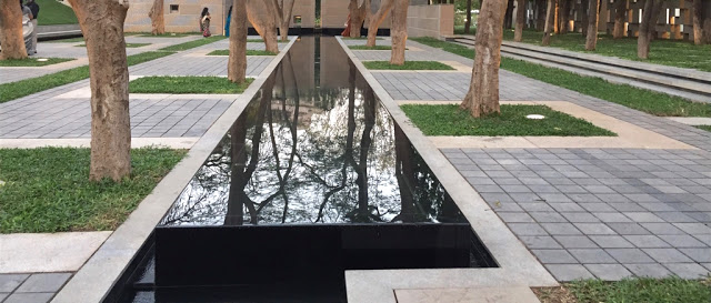
The story of Dr. K Anji Reddy unfolds through distinct vistas and journey paths within the space. It begins at an inspirational level as the story unfolds in layers over the chiseled Mont Blanc stone used at the memorial, leads down a path of enlightenment & discovery, unfolds as an entrepreneurial journey inside a series of pavilions and settles reflecting over a linear water body ending as a meditative Samadhi.

Touch points were woven through the space keeping visitor journey in mind. There is always a take away whether it was a 1st time or a regular visitor.

Inspiration layer

This layer brings about the strength of character and the calm through inspiring quotes and text chiseled into stone-clad spatial dividers. These inscriptions tell the story and bring forth very subtly those words of wisdom that drive the spirit of human achievement through Dr. K Anji Reddy’s mind.

The font chosen for the inscriptions is Gotham, which is a rare san-serif font that is new & assertive and yet feels familiar & non-imposing. It is geometric, but also friendly. It has just the right quality of timelessness we were looking for in weaving the memorial story. 

Constantia is a transitional serif font with less contrast between thick & thin, making it ideal for readability in various light conditions as the installations; panels & wall engravings were open to direct natural light in the day. 

Together, these two fonts made for a classic combination.

Entrepreneurial layer

Unfolding inside a series of 6 pavilions, this layer tells the story from the beginning of Dr. K Anji Reddy’s life and travels through space over several key milestones. The story is told as a series of flowing panels, maintaining a serene tone. A motorcycle display marking the humble beginning of Dr. K Anji Reddy’s struggle, his favorite car and his workspace towards the end of the path reflects his quest for achieving the higher.

Reflection Layer

This layer forms the key experience and allows the visitor to reflect upon a series of inspirations and the philanthropic vision of Dr. Anji Reddy. The flow encourages visitors to walk down this path through a colonnade of trees, sit on a bench and reflect. The benches are designed using hardwood and casted architectural concrete and that would age well & blend with the natural surroundings.

Dr. Kallam Anji Reddy memorial has seen a steady stream of visitors since it’s opening in 2016 and continues to inspire young minds in the spirit of giving, every day and design continues to highlight the relevance & meaning of his work.

ASHISH DESHPANDE is an Industrial Designer, Co-founder & Director at Elephant. An alumnus of National Institute of Design, Ahmedabad, he is a keen Design Thinker, a member of India Design Council & Jury for India Design Mark. He has worked on several design programs, notably, Titan Eye+, Ceat Tyres, Axis Bank, ICICI Bank, Symphony, Paperboat and works on medical & healthcare devices amongst others.

<  Back to Blog

Red to Blue: Mark of differentiation

Red to Blue-Mark of differentiation_Blog_Elephant Design.jpg.jpg


Red to Blue: Mark of differentiation

Biggest challenge facing businesses fighting in red ocean zone is ability to effectively differentiate. How does design help deliver business advantage?

By ASHISH DESHPANDE

“Differentiation is the essence of strategy, the prime source of competitive advantage. You earn money not just by performing a valuable task, but by being different from your competitors in a manner that lets you serve your core customers better and more profitably. The sharper your differentiation, the greater your advantage.” - Chris Zook & James Allen, The Great Repeatable Business Model in hbr.org

The air cooler market in India is estimated above Rs.3000 Cr and 70% of this is the unorganized sector. Soaring summer temperatures, longer summer months, rising aspirations of the Indian middle class & accessibility to global markets have made every appliance manufacturer turnout products, to take a share out of the air cooler pie.

Evaporative cooler technology, over years, has improved incrementally and relaxed Intellectual Property compliances makes it hard to place Air Cooler products that are differentiated from the me too & rip offs flooding the consumer space. In this context, how does an appliance manufacturer stay above the waterline? What role does design play in helping companies take a hard look at their product line up? An interesting case of design at work asElephant teams with Symphony Limited, world’s no.1 cooling company.  

Customer focus ≠ Host of Features

Many cooler manufacturers believe that providing a host of incremental benefits is a way to the customer’s heart. Little more pad area, a few cubic feet of more air throw, a liter more of tank capacity is no better than running a race at the discount store.

Differentiation begins with empathy-based observations of what people do when they buy your products. Design team at Elephant spend hours observing people in their homes, looking at their habits and noticing their real time concerns. During one such visit, the design team observed that coolers were always being shunted to balconies, lofts or were pushed under wall units. People need space, and when they don’t need a product, they try and get it out of their way. Coolers not only consume precious floor space but also block airy windows in case of window mounted versions. Air Coolers inherently carry volume and are bulky. Instead of focusing on increasing air throw or the next best remote control, the design team focused on “reclaiming space” for customers. 

Pictures taken by Elephant Team during actual home visits showing Air Coolers stowed away.&nbsp;

Pictures taken by Elephant Team during actual home visits showing Air Coolers stowed away. 

Setting a Big Hairy Audacious Goal (BHAG)

Once a challenge is identified, it ends up providing the design team with a sense of direction. However, challenges are not easy mountains. The design team at Elephant & Symphony set themselves a couple of goals.

First was to design a full size cooler that fits on a footprint of 1’ x 1’ tile. This was not as easy as it probably reads, since the entire air throw mechanism was to be reconfigured and reengineered to fit into a compact, yet, tall space. This itself was not enough since the product was to deliver a better cooling performance and air throw than conventional models.

Second was to free the window. Windows are a relief in urban apartment environments and the design team set itself the second challenge to create a product that doesn’t need window mounting. The product could be mounted high on the wall like a split AC. Again, this was easier said than done. The design team had to solve the problem of water tank, water filling and cooling.    

Making it happen

When design team under takes new direction or challenge, they come across unknown obstacles. Some of them are known spoilers like weight of the product, cost of parts, number of parts, assembly, quality of manufacture and size for shipping. All these obstacles need to be sorted out from the regular functional issues before a cooler can be realized. As a new format of product that is deviant from the traditional, it is imperative that the product carries no bugs.

The development work resulted in two product formats.

First, was the creation of the ultra compact and tall range of next generation cooler range “DiET”. This product connected with people due to its floor saving footprint, low power & water consumption and was an instant hit. DiET today retails across 40 countries with over 1.2 million units sold. This product for its design & innovation quality was awarded the “India Design Mark 2013”.

DiEt cooler with ultra compact foot print, tall delivery and “intelligent” controls.

DiEt cooler with ultra compact foot print, tall delivery and “intelligent” controls.

Second, resulted in the creation of world’s first wall mounted air cooler, “Cloud”. A cooler that has completely freed window and floor space for people for whom space is luxury. This product for its design differentiation and innovativeness has been recently awarded the India Design Mark, 2016.

Cloud Cooler, mounted on wall. This freed floor space and windows.

Cloud Cooler, mounted on wall. This freed floor space and windows.

When development effort focuses on people, appreciates and acts on unsaid needs, product innovation can take place. The two efforts for Symphony are good examples of moving from a crowded orbit to an elevated plane. This orbit shift is what creates powerful brands, those that rise above the red ocean and make business sense.

Design led Innovation is a powerful tool however needs the courage from corporations and a resolute design team to undertake lofty challenges. Challenges that are not a figment of someone’s imagination or sales target but rather drawn from the latent needs of people.  

All successful product categories get crowded, what matters in time is agile & continuous people based design & innovation effort.   

ASHISH DESHPANDE is an Industrial Designer, Co-founder & Director at Elephant. An alumnus of National Institute of Design, Ahmedabad, he is a keen Design Thinker, a past member of India Design Council & President of Association of Designers of India. He has mentored several start ups, conducts Design led Innovation workshops and has worked on several design programs, notably, Titan Eye+, Ceat Tyres, Axis Bank, ICICI Bank, Symphony, Paperboat and works on medical & healthcare devices amongst others.

<  Back to Blog

Relaxo Rebranding

Relaxo brings alive the wave of transformation

In the highly dynamic world, Relaxo is one brand that has made steady inroads into the world of emerging India. Whether it is through basic flip-flops that they pioneered in India or the active & young brands like Sparx & Bahamas, Relaxo has led the way for about 40 years. 

To align with the evolving consumer & state-of-the-art offerings, Relaxo has unveiled its rebranding.  

Explaining the reasons behind the rebranding exercise, Gaurav Dua, Executive Director, Relaxo Footwear Ltd said, “ With a strong legacy of success & leadership, it was our responsibility to build a future-ready brand Relaxo. We are an ever-evolving brand that has stayed true to the core values of being reliable & approachable across India. With the rebranding exercise, we have also infused youthful & transformational spirit that is important for the growth of internal & external stake holders of the brand. Elephant, our brand building partners have played an immensely significant role in bringing our core values to life. I can proudly say that we collaborated with the right partners who understood our ethos and our brand's value proposition. They will continue to help us deliver seamless brand experience to our customers in times to come.” 

Ashwini Deshpande, co-founder & director of Elephant, the rebranding agency says “Relaxo rebranding exercise involved validation of current values of being reliable & approachable while seeking newer dimensions to reiterate the brand’s leadership. In keeping with the evolving consumers & new-age products, we have built the new Relaxo visual identity with a wave of positive transformation. 

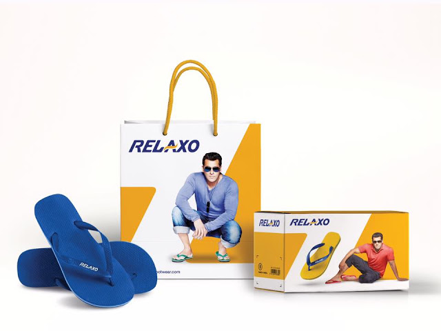
Brand’s dynamism is embodied by forward slanting letters in Berry Blue with Sunny Yellow swoosh flowing across. The swoosh stands for wave of transformation, optimism and positive growth. 

All brand applications are being created with an ownable visual language and will be evident in the coming weeks across products, print, retail & online presence"

"The new Relaxo visual identity signifies effortless movement towards progress. ” added Mr Dua. 

<  Back to Blog

Start Up & Design Thinking

Startup & Design Thinking_Blog_Elephant Design.jpg.jpg

Select START UP teams of The Intel & DST – Innovate for Digital India Challenge 2.0 underwent #designthinking workshop Elephant Design Learning Centre yesterday. 

As a mentor adviser Ashish Deshpande spoke to top teams at #T_Hub earlier this month. 

<  Back to Blog

Design with Responsibility

Design for Responsibility_Blog_Elephant Design.jpg.jpg

Responding to local Needs

There are numerous challenges that emerging economies like India face today. Where do we find answers to these complex problems? What do we learn from our past, our present?

What is the role of a practicing designer? Are designers, architects waging a lone battle when it comes to Green Products & Practices? With Paris agreement looming large, it is a good time to do a reality check on how businesses should approach the problem. 

How do we apply our learning to the future of 1.3 billion people in India and how do we align it to the challenges facing our “One Earth”.

By ASHISH DESHPANDE, Co Founder Elephant, Member of India Design Council, Jury for India Design Mark & 

VP - Association of Designers of India

Man has always been a creator.

Be it for anthropological reasons or certain survival instincts, creation is not new to us. We have been creating objects for a few millennia's. From creating for survival and local day to day needs, we have moved towards a rampant phase of object creation, stocking, consumption and refuse generation. The question that creeps up is how much should man create. What led us go get into an overdrive mode of converting every possible resource that we could mine into not an object of survival but that of desire? It is question every environmentalist is up in arms with the powers that be in our world.

According to the author, economist & environmentalist, Ramchandra Guha, “there was no environmentalism before industrialisation”. The term did not exist and came into existence only in the post industrialization period. Industrialisation itself came to India 30 years after it engulfed Europe in a bid to produce more, consume more post the discovery of oil & especially after the proliferation of mass production factories and later the plastics1. Designers and their self-serving employers in their greed & enthusiasm to scale up slowly drew into the web of global consumerism, forgetting our immediate environment concerns & local needs.  

Design as sensible

Design as a profession in its modern definition came into existence almost in parallel to the Industrial and the post-material phase contributing significantly towards creating innumerable objects of desire. Design has been ever present in our society.

The question is and always has been if designers are focusing on needs that are most relevant to us? Not always. If we focus on local context and we can see how examples from our past and cultural heritage have been contributing in creating objects of daily use.

Lets us take a deeper look at a traditional container that is used as an everyday object of use. In India we call it LOTA. It is a simple container found commonly in Indian homes as a traditional object, many a times handed down for generations.

Amazingly, it took the great American Design couple, Charles & Ray Eames to look at this ubiquitous object, to so very eloquently describe it in their now famous India Design Report which laid the foundation of present design in India.

Lota is a product that is very simple in shape and can hold water, milk, grain. It can act as a measure of volume and weight. It is very comfortable to hold, ergonomic, can be carried in hand, affords being carried at waist, or on the head. It can be stored one on top of other. When poured it makes a nice sound. The shape counters fluid dynamics during motion and at the same time is simple & beautiful. It is truly multi purpose. It is locally produced and when made in clean copper, even purifies water. It has taken our society years to perfect this object into a very sensible product.

Lota, however traditional, establishes principles of good design. Good design is the one that addresses needs of our immediate surroundings, is multipurpose, made from local resources, lasts long and is adaptable over the period. As an object, Lota has not lost its relevance after centuries, nor has it contributed to our over growing refuse and land fill problems. It teaches us an ancient lesson of beingsensible in our approach to adding objects into our present day daily existence.

Design as emotionally durable

However, sensibility cannot be restricted to functions alone in the personal lives of people. Like in Korea, in India too, people love their food and cooking traditional recipes is a national passion. Traditional cooking is on a slow flame so as to retain flavors, ingredients and so on. However, the traditional pots presented a problem of reuse and cleaning. Additionally, such pots get soiled during cooking and are not useful for serving as tableware. This practice is getting lost over time.

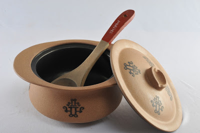
The Slow Cooking pot range was completely redesigned and recreated using organised process of Earthenware manufacture. This way the dimensions and stability of the product can be controlled. The new pot was design with a system of lid and pot. The unique feature of the new pot was that the exterior as well as the interior of the pot is coated with food grade teflon. This is interesting as it makes the pot reusable and very easy to clean. The pot draws from the traditional form of the pots but adds convenience of an integrated carry and serve handgrip. The shallow dome shaped lid traps the steam and the detail allows it to snugly sit over the pot improving efficiency of cooking over heat. The lid handle is actually a small container for water to help condense the steam. The knob handle becomes a convenient resting place for the spatula. The product is called Bhoomi , which means Earth. The motif, which is glazed on to the surface, is derived from the Devanagri2 script letter “Bhaa” of Bhoomi and is simply a calligraphic expression reinforcing the products connect with earth.

 Designer as a creator

As Designers, we usually tend to distance ourselves from taking responsibility for the negative impact of our creations to our society, economy and ecology. It is important that we introduce metrics that would guide us measure such an impact. It is also important to create an environment & team that is amiable and sensitive to being responsible.  

“Design, if it is to be ecologically responsible and socially responsive, must be revolutionary and radical – says Victor Papanek.3

Victor Papanek, an Austrian designer was rebel with a cause. He relentlessly campaigned for designers and product manufacturers to make their articles relevant, meaningful & sustainable. This father of responsible design was even critical of the design fraternity, beginning his seminal book, Design for the Real World with, "There are professions more harmful than industrial design, but only a few… following up with ... by creating whole species of permanent garbage to clutter up the landscape, and by choosing materials and processes that pollute the air we breath, designers have become a dangerous breed."


Though designers are crucial to the creation of products & environments, they do not constitute the sizeable decision making machinery in corporate juggernauts. Whipped into being morally responsible many designers have fallen into line, however do they have control?

The Paris Agreement on climate change saw 195 nations give it a nod. However, notably 5000 businesses from 90 countries have agreed to align and support the global agenda towards a properly sustainable & low carbon world. This is a recognizable outcome of COP21 and will call for a fair bit of transparency framework and practices to be adopted. Against this backdrop where do producers of products and services stand today? What is the degree of practice shown by business concerns today that is environment friendly and sustainable? As designers, it is important to take a hard look at the playing field.  

Who is thinking Green? 

One rarely comes across corporates & producers with genuine concern for sustainability. Corporate structure necessitates several point of views getting channelized into the decision making process. Designer’s concerns have a tendency to lose itself in a deluge of constrains from all stakeholders. Green concerns have always been secondary. Most producers are motivated by long term monetary savings, or operational benefits that green products bring to their business.

The “green & good for environment” part is a by-product of fiscal decisions. So, the priorities today can be stated as;

·       Operational expense savings

·       Company law regulations, environment policy mandates

·       Competitive advantage

First is the prime mover for “green decisions” in corporates. The second is a legal necessity and the third is the story. However, all require a Design Thinking approach to make the impact stick with people, deliver monetary & habit change and be good enough to bear the “green edge”. Design is one such asset capable of enabling a “green edge” within a production setup, provided design teams start dropping their blinkers and business leaders open their minds.

Stepping beyond singularity, design teams tend to stick around creative ideation as their strength. A large part of this creative energy goes towards focusing on the Product or Service, form, function & experience. Products or services are interaction cores of a larger engine that makes solutions happen. Design needs to enlarge focus beyond the fuzzy elements of product solutions. Rarely do Designers concern themselves with manufacturing processes, materials with reference to its impact on our environment. Most follow the producers set up as an overriding constraint to design. It is interesting to bear in mind that a product or service is not alone. It comes heavily loaded at one end with manufacturing systems and on the other end with logistics of market access, retail & consumption. A sum total of this value chain is the impact of a “Design” on environment. This value change can no longer afford to be linear in thought process and remain in isolated silos of excellence, rather play like a football team with a unified objective.

Creators & producers need to proactively look beyond ideas into product optimization, cleaner production, life cycle assessment, cradle to cradle, extended responsibility and environmental impact assessment as part of their design process & tools, both in development & route to markets. Green Innovation will happen, provided the thought is holistic and across the value chain. Newer practices will add up to the expenses, however, eliminating waste, sharing resources may be light weight methods of lowering costs and offsetting any new“green” expenses without business disruption.

It is sad to see that most “green energy” transport solutions today, are the most “expensive” transport solutions.  Herein lies an opportunity for “creative” approach towards ensuring both “green” (environ & monetary) returns on investment made. Many a times policies can be binding, like take the case of restrictions on use of thin plastic grocery bags. Prior to the bags coming in market through grocery chains and standalone shops, cloth & paper bags were prevalent. Years after restrictions were executed, the industry has not been able to promote alternatives. Paper bags are laborious to manufacture, not sturdy & have their own issues, cloth bags have not regained popularity. The industry has invested huge into plant, materials, machinery & markets that prevent it to see a linear solution in sight. Solutions at present are incremental or too expensive and need a creative thought from a different viewpoint. This calls for a mind & process shift by creating a new development process based on Design Thinking.

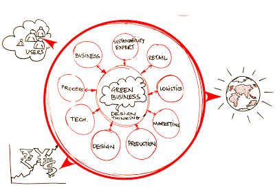
So, Industry focus must shift and businesses can start investing in co-creative development teams to make the future greener. New areas of focus for redevelopment can be one or all of the ones stated;

·       Power & Energy (Reduce consumption, Green source, increase efficiency)

·       Resource consumption and waste (localize, Reduce, Share, Reuse)

·       Production materials (low carbon rating, low pollutants)

·       Finishing substrates (Reduce, Remove, low carbon rating, low pollutants)

·       Logistics (Reduce distance, time, space)

·       Functions (merge, eliminate least desired)

·       Retail (Reduce touch points, strengthen story, share)


New development process based on Design Thinking leading to Radical impact within Resource limits. Illustration by the author.

Mahindra Reva’s e2o is a good example5. The design team went beyond the traditional indulgence of vehicle design into adapting efficient green production process, unconventional materials, solar charging and regenerative braking technologies and even new ownership programs to make buying affordable. The effort resonates of all round contribution at various levels & verticals. However, the car still leans on government policies & subsidies and has not yet managed to make the end price attractive for making box office hits. E2O and its predecessor REVA since inception has been a green focused business and so it is not surprising. That will be a remarkable example of “green impact” at an affordable price tag of US$6,000 compared to say a TESLA3 at US$35,000.

The way to do this is to work with cross-functional teams as a start point with Design Thinking as a primary enabling tool & framework for development. This presents a new challenge for designers as well as an opportunity to create more relevant, holistic & eco-friendly solutions. Moving focus away from traditional playgrounds for design development teams to new areas for innovation is a route with guaranteed success in the “Battle for the Greens”. Though, Design Thinking may “no longer be a competitive advantage” for companies, as questioned by Tim Brown, CEO, IDEO ( HBR Post )6, design & design thinking are still good enough to ensure a “greener” tomorrow.

Design for Larger impact

Let us look at another product from recent times. Like Republic of Korea, India is a large democracy and people voice is important. People express their voice & choice through voting. We are a country of 1.3 billion people and the numbers in India are staggering. We have 815 million registered voters. In our general elections we have 8000+ candidates in fray from 1600 political parties. People cast their votes from urban to remote corners of India through over 93 thousand polling stations. General elections used to consume more than 8000 tonnes of paper, accounting for over 200 thousand trees. This use to take days and days of laborious counting and bogus voting practices.

The design and introduction of the Electronic Voting Machines heralded a revolution in the voting process for the common people. Designed by Industrial Designers A G Rao & Ravi Pooviah from Industrial Design Center, IIT Mumbai7, along with Electronic Corporation of India8, they were first Tested first in 1989, the EVM’s have been used in total since 2004. The system is easily portable, takes less space to store, easy to use, makes the voting process quicker and results are available within a few hours. The communication and interface is highly simple and algorithms used are fool proof against erroneous voting and even frustrate bogus voting attempts.

This is another effective example of how sensible design can have a great impact on common people.

So, design must lead to a larger impact.  By sensibly addressing the needs of our people and by being relevant to the immediate social environment, it can bring about true improvement in life of a large number of population.

Design for community opportunities over luxury

India is changing. For people in an emerging economy to survive, local job creation is extremely important. About 800+ startups are set up every year. By 2020 there will be 12000 startups employing over 250,000 people. These start ups are looking at local business opportunities based on local needs. This is where design needs to focus.

Lets discuss the work of two enterprises working within local context. First example is work of Designer Laxmi Murthy and her organisation UGER9. UGER is a social enterprise. Lakshmi Murthy was very concerned with poor menstrual hygiene among socio-economically backward populations, women as they were not able to afford synthetic pads manufactured by Multi National Companies.

The existing pads were not friendly to the skin due to use of bleach and once thrown, due to synthetic materials, disposal was big issue contributing to land fill problems.

Eco friendly Pads being sold online, picture by Author of Uger online promotion

Uger has designed sanitary pads for women that are made entirely in cotton. They can be washed at home and hence can be reused. This makes use of sanitary pads affordable to low income group women. And improves hygiene amongst these women. The pads come in pleasant colours and patterns. The inner stuffing is cotton that does not add to disposal and landfill issues. Pad making has given employment and work to women from the region. Laxmi Murthy has created value for women who are socio economically backward while mitigating environmental risks.

The second project is by Promethean Power Systems10, a start up. This project was done for the benefit of milk farmers in rural India. It demonstrates as to how technology led solutions can be created for people with lower resources and means.

Operation flood that was launched in India by the government has ensured that milk production has substantially increased at rural levels. Over 100 million gallons of milk is produced each year in India. However, milk requires immediate chilling otherwise in hot, humid conditions in regions like India, the milk quality diminishes in less than 4 hours. In India 10 million US$ worth of agricultural produce is lost due to inadequate cooling. In rural areas there is power only for 10 – 12 hours.

This affects milk chilling and the quality of milk, which in-turn reduces the earning by the farmer.

The new solution by Promethean Power Systems uses a Thermal storage battery that uses a phase change material to store and transfer chill energy. The battery charges up whenever the power supply is present and is ready to chill even when there is no power. This system ensures that there is chilling charge available in the system 24 hours, even when there is no electrical supply. Costly diesel set and stocking of fuel is avoided. The components are Modular and hence they can be easily transported in a small commercial vehicle. The bodywork is Stainless Steel, is hygienic. The loader platform ensures ease in pouring milk. What has this product achieved? It has made Making milk chilling affordable at community level. The farmers do not loose milk produce. The dairies get better quality of milk and the consumer gets healthy milk product.

Empowering communities to add value to their produce helps local communities grow and prosper. When we provide more value using fewer resources for more people our design efforts can be said to be truly working.

Design that helps sustain

There is an emergent need to shift the focus of design from the top 1% of the world population to the needs of rest of the world. This majority portion of the world faces complex problems in healthcare, energy needs, education, basic food & sanitation. Design has the potential to connect people with technology, people with people and businesses with people to reach out appropriate solutions that not only make lives better but help our planet to breathe.

Remote health care has started gaining importance in emerging economies. In countries like India, which fall short on resources, modes of travel, presence of primary health care, design and technology can come together to reach solutions and care to people who till today do not have access to good healthcare and diagnostics services. SynPhNe11 and Healthcubed are two such examples of new companies that are employing cutting edge technology and design to provide low cost, portable healthcare and diagnostics solutions to common people. Their design & technology may be based on local context but the solutions can help bring access to cutting edge healthcare and diagnostics to any person on our planet.

Talking of our planet, it is important to highlight the work of Daily Dump12, a Bengaluru, India based design led enterprise that has been using design to create eco friendly compositing solutions for organic waste. Daily Dumps work has helped change mind set of urban citizens towards waste segregation through effective use of design, local solutions and in the end it is a big step towards helping sustain our planet.

There is enough to be done for our planet and its habitants. As designers, we need to keep asking where we stand. I believe, It is our responsibility as a designer to sensibly keep giving more, by look for opportunities and understand that we can help make a large impact with design to the lives of common people, while sustaining our precious eco system.

Notes:

1.      How much should a person consume? By Ramchandra Guha, 2010, Hachette India. Ramachandra Guha is an Indian historian and writer whose research interests include environmental, social, political and cricket history. For the year 2011–2012, he held a visiting position at the London School of Economics and Political Science (LSE), the Philippe Roman Chair in History and International Affairs. https://en.wikipedia.org/wiki/Ramachandra_Guha.

2.      Devanagari, a script based on ancient Bramhi script family that has forty seven primary characters and is used for over 120 languages, https://en.wikipedia.org/wiki/Devanagari

3.      Victor Papanek, Victor Joseph Papanek (22 November 1923 – 10 January 1998) was a designer, author and educator who became a strong advocate of the socially and ecologically responsible design of products, tools, and community infrastructures. http://papanek.org/about/victor-j-papanek/

4.      Design for the real world, Victor Papanek, Academy Chicago Publishers (Preface to the first edition)

5.      Mahindra & Mahindra is an automotive manufacturer, India, Reva & E2O, are all electric vehicles with zero tailpipe emission claims, http://mahindrareva.com

6.      Tim Brown, CEO & President, IDEO, https://www.ideo.com/people/tim-brown,  HBR Post, https://hbr.org/2015/08/when-everyone-is-doing-design-thinking-is-it-still-a-competitive-advantage

7.      IIIT, Mumbai, Industrial Design Center, is a premier design school established in 1969, http://www.idc.iitb.ac.in

8.      Electronics Corporation of India Limited (ECIL) is a Government of India Enterprise under the Department of Atomic Energy (India), established on April 11, 1967 by Dr A S Rao at Hyderabad, to create a strong indigenous base in electronics, http://www.ecil.co.in

9.      UGER, means “new beginning”, UGER is a movement about women's empowerment and menstrual issues, http://ugerpads.jimdo.com, a brain child of designer, Laxmi Murthy

10.    Promethean Power Systems, designs and manufactures refrigeration systems for cold-storage applications in off-grid and partially electrified areas of developing countries. http://www.coolectrica.com/#productsCoolectrica

11.    SynPhNe is a Singapore based bio medical initiative, http://www.synphne.org

12.    Daily Dump helps manage waste and garbage for home, http://www.dailydump.org

<  Back to Blog

Packaging Design: An Arranged Match*

Suraja Kotnis,&nbsp;Lead Designer, Communication Design, Elephant

Suraja Kotnis, Lead Designer, Communication Design, Elephant

Packaging design is very demanding yet interesting. It is like someone looking for an arranged marriage match. With just 3 seconds to impress, the design needs to speak the buyer’s language, or else, it gets thrown out of the consideration set.

Designing anything with such a small real estate and high expense requires a lot of thinking, understanding and planning.

* a marriage planned and arranged by the families of the couple

Here are some thoughts to consider before embarking on a packaging design exercise.

1.    Inside the closet or outside the closet:

Does the product have a show-off value, will the brand enhance the buyer’s image or is it a regular habitual product. This helps understand the purpose and mindset of the person buying a brand. eg: a glucose biscuit vsChunkies cookies –

Graphic language and messaging attitude follows smoothly if the answer is clear.

2.    Target Audience:

Who, when, how and why is the brand being bought.

I believe there are 3 kinds of TG – the influencers, the decision makers and the end users. And we have to impress all :) at every stage

Sometimes the end user might not even get to see the packaging. But what if she/he does and doesn’t get impressed?

3.    Brand – Is it a Leader or a follower

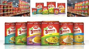
As communication designers, we might think of a completely out of the box idea but if the brand has an established legacy it will just be a great idea without any connection to the brand or its loyal consumers. eg: MTR Foods: The idea in revisiting the packaging was not to alienate its existing consumers. The task was to simplify the information in the exact manner that as consumer seeks it while taking the design a level ahead as a leader & trend-setter.

4.    Building an exclusive brand experience at 3 levels – attracting, buying and end usage

At every touch-point, we need to think of creating small but impactful experiences. That is the only way to create a continuous cycle of loyalty for the brands.   

<  Back to Blog

Monday Morning & Taximeter

Monday Morning Meeting & Taximeter_Blog_Elephant Design.jpg.jpg

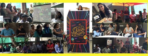
First #MondayMorningMeeting at the reclaimed #PalmBeach opened with the very inspiring presentation by our super designer #PriyankaKaryekar who walked away with the cool #taximeter trophy at #taxifabric#TFWorkshop with her Disco Driver theme. 

<  Back to Blog

Fruits & Elephant

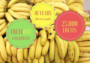
It was a day in 2007 when we were discussing nutrition and realised how most of us had too little time, knowledge or focus on what we eat. so we decided to improve at least one day of the month by making it a "Fruit Day". 

Now in its tenth year, this day is celebrated on 10th of every month! This takes planning, passion & execution. 

Thanks to our support team of Dhanashree Joshi Jayashree Babar #Amit #Yogesh #Sunil we enjoy a different fruit every month.

<  Back to Blog