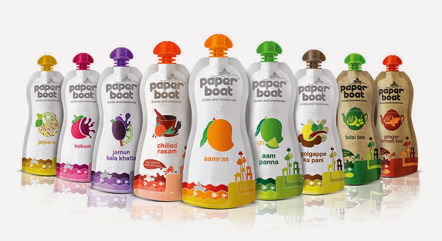
Paper Boat designed by Elephant Design was presented The India Story Design Award 2016 to applaud the emotional power and timeless nature of its design.
Elephant has been instrumental in shaping this hugely loved brand of drinks & memories right from the inception, contributing to its name, story, shape & visual identity.
Packaging Design: An Arranged Match*
Packaging design is very demanding yet interesting. It is like someone looking for an arranged marriage match. With just 3 seconds to impress, the design needs to speak the buyer’s language, or else, it gets thrown out of the consideration set.
Designing anything with such a small real estate and high expense requires a lot of thinking, understanding and planning.
* a marriage planned and arranged by the families of the couple
Here are some thoughts to consider before embarking on a packaging design exercise.
1. Inside the closet or outside the closet:
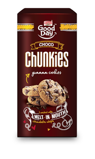
Does the product have a show-off value, will the brand enhance the buyer’s image or is it a regular habitual product. This helps understand the purpose and mindset of the person buying a brand. eg: a glucose biscuit vsChunkies cookies –
Graphic language and messaging attitude follows smoothly if the answer is clear.
2. Target Audience:
Who, when, how and why is the brand being bought.
I believe there are 3 kinds of TG – the influencers, the decision makers and the end users. And we have to impress all :) at every stage
Sometimes the end user might not even get to see the packaging. But what if she/he does and doesn’t get impressed?
3. Brand – Is it a Leader or a follower
As communication designers, we might think of a completely out of the box idea but if the brand has an established legacy it will just be a great idea without any connection to the brand or its loyal consumers. eg: MTR Foods: The idea in revisiting the packaging was not to alienate its existing consumers. The task was to simplify the information in the exact manner that as consumer seeks it while taking the design a level ahead as a leader & trend-setter.
4. Building an exclusive brand experience at 3 levels – attracting, buying and end usage
At every touch-point, we need to think of creating small but impactful experiences. That is the only way to create a continuous cycle of loyalty for the brands.
Tata Salt, Olympics & Elephant
Tata Salt partnered with Elephant to reach out to over seven crore households across the nation with a limited edition packaging. This specially designed pack not only displays the athletes proudly on the tricolour background, but also has a call-to-action where consumers can give a missed call to register their wishes to support the Indian Olympics
How does Design affect business ?
How does Design affect business ?
"Design is as much craft as it is insightful thought."
Like we say at elephant, doing a cool design for "limited edition" is alright, but what can we do it for a mainstream product that sells in excess of a million every single day!
Britannia breads packaging needed to reflect the positive & healthy change in recipes. With misconceptions around brown, wheat, whole wheat & so on, we wanted to give each variant a distinct identity so that consumer is fully aware of what she/ he is picking up. With a conversational tone and cheerful illustrations, this sure is a welcome change for these loaves… about 1.5 million of them are selling like hot breads now...
Bready affair...
Centre of Excellence, Elephant, Team, Pune.
What’s happening in Visual Design: Before & Beyond
Visual Design and Graphic communication is evolving. What are the trends that will sway the graphic world, how does new technology play a role in this new evolution and how does one connect with the new age end user.
By MAYURI NIKUMBH
With the lines between different media of visual communication blurring by the minute, it is inevitable that the design trends are being heavily cross-pollinated as well. While skeuomorphism has taken a big beating in the latest versions of all digital platforms, it is a trend that is not going away for a long time to come but rather is being adopted by print as well. Simple, flat graphics with solid, contrasting colours is the flavour of our present and fast becoming the preferred style of visual communication for designers & viewers alike.
What’s also emerging as a visual delight and emotional connect is ‘handcraftedness’. Whether it is the use of freehand fonts or unfinished textures or rough sketch lines – imperfection is the new perfection. It is probably the coming of a full circle after the visual fatigue of too much slick & shiny in the preceding seasons. People as consumers are now looking for rootedness and familiarity of the days gone by! Since products & services are also speaking of the same language – their means of communication cannot remain unaffected.
An offshoot of the above is also another visual trend which sees the mixing of the old and the new – the classic contemporary or the retro new age! Both compliment each other beautifully in terms of image & typeface or colour & form or even tone of voice & visual expression.
Packaging Design for Britannia Good Day Chunkies, truly emphasizes the imperfect, handcrafted feel of the product within.
Today technology is enabling in more ways, to express the desired design outcome. If all the above design trends can be brought to life, say in a packaging design exercise, it is due to the advances in printing technology. Whether it is about making a plastic pouch appear like paper or whether is it about creating illusionary glass bubbles on a flat surface, it is all being made possible to attract the consumers’ attention sitting on a shelf and communicate the right brand story.
Another area technology has impacted communication is the new way of purchase – online! The way packs look and engage a consumer is rapidly requiring newer strategies and design expressions. Here the competition or concern is not so much about the shelf shout. The challenge is to appear distinct and engaging in a few pixels and help make purchase decision without holding and feeling the pack in hand!
Substrate treatment simulating actual paper does complete justice to Paperboat Drinks in bringing alive its brand story of being pure and unadulterated nostalgia
In an age where there is prolific usage of internet & new-media not just by the youth but every set of hands who has a cell phone, easily spanning an age divide from 12 to 80, the end user is changing with every new download or upload. The only way to strike a chord with these people is to understand their world – become them. As a designer, one has to constantly be shifting identities and changing shoes based on for who is he or she is designing. One could be reading ‘The Diary of a Wimpy Kid’ on a day to understand what does today’s ‘tween’ think like or could be speaking to a pediatrician on another to understand what a mother is truly anxious about. A designer of our near future has to be a heady mix of psychologist + ethnographer + crystal gazer! J
MAYURI NIKUMBH is a Principal Designer, Visual Communication at Elephant. An alumnus of Industrial Design Center, IIT-Powai, Mumbai, she leads a cool team of designers with work straddling across brands, packaging and branded environments.


