FMCG

Intimate Hygiene: Story of a package brand & dispensing solution

Intimate Hygiene_Blog_Elephant Design.jpg.jpg

Intimate Hygiene: Story of a package brand & dispensing solution
What makes an intimate hygiene product connect to women? Evolving touch points for the product system, where perception, communication & feel are critical.

By ASHISH DESHPANDE

With mass urbanization, longer commutes and longer hours away from home, personal hygiene issues are no longer a rarity nor taboo in urban India. There is a growing acceptance of new age grooming needs and solutions are being sought to take care of all eventualities.

However, there has been very low awareness on intimate hygiene and the fact that regular cleaning products are not suitable for the purpose is not known. Also, most women reached out to curative solutions when they faced issues and they were not even aware that there were preventive products. With years of strategy & action by FMCG majors, sanitary pads have managed some visibility at the shops. But intimate hygiene products are nascent in India and retailers were not willing to allocate any display space to these products.

How does one get modern urban woman’s attention and communicate that intimate hygiene is an essential part of her everyday grooming? What does design do to contribute to her intuitive yet informed decision-making mind? 

We interacted with potential users, women who were able to make their own grooming choices based on their needs. The central idea of these interactions was to understand their sense of comfort, apprehension and engagement. They were open to new ideas, however, there was complete lack of awareness about de-merits of using regular soap & water, changes in PH balance during cleansing for maintaining hygiene of vaginal & uterine parts of the body.

A medicinal bottle structure was considered an embarrassment, as she would not want to wrongly communicate any medical condition. 

Design research team keenly looked at her bathroom to understand the kind of products she was using. They deducted that women would be comfortable if the product matched aesthetics & usability standards of their other products like conditioners, body lotion, hand-wash etc.

Outer packaging also needed to play triple role of;

1. Attract

2. Engage

3. Educate the right set of values.

The design team created ideas that explored colour, form, communication & materials. Ideas were repeatedly tested with user groups to understand comprehension, apprehensions & acceptance.

The form of new bottle dispenser design is asymmetrical yet smooth. It is intuitive the way it is held and aligned for use. The form is focused towards a woman of elegance standing tall and with poise. The bottle cap is like a crown quickly moving the product from a curative to a personal grooming category.

It was pertinent to make the brand come alive for the smart & confident woman who makes informed choices. Brand logo is clean, contemporary & no-nonsense.

Cuing reliability & efficacy along with personal-care codes was an important decision that the design team took. While staying within feminine pinks, pastels were avoided to get away from any undue cues since this product has no unnecessary additives like colour or fragrance. Brand palette was dialed up with a dense magenta. Metallic substrate and silver added to the expertise & efficacy. 

In terms of communication, the team decided to focus on PH balance of V-Wash, the single most point of distinction to educate the user with a simple & easy to understand infographic.

ASHISH DESHPANDE is an Industrial Designer, Co-founder & Director at Elephant. An alumnus of National Institute of Design, Ahmedabad, he is a practicing designer, a keen Design Thinker, member of India Design Council & has been a Jury for India Design Mark. He has worked on several design programs, notably in consumer appliances, medical & healthcare products, packing & display structures, furniture amongst others.

<  Back to Blog

What’s happening in Visual Design: Before & Beyond

Mayuri Nikumbh

Mayuri Nikumbh

Visual Design and Graphic communication is evolving. What are the trends that will sway the graphic world, how does new technology play a role in this new evolution and how does one connect with the new age end user.

By MAYURI NIKUMBH

With the lines between different media of visual communication blurring by the minute, it is inevitable that the design trends are being heavily cross-pollinated as well. While skeuomorphism has taken a big beating in the latest versions of all digital platforms, it is a trend that is not going away for a long time to come but rather is being adopted by print as well. Simple, flat graphics with solid, contrasting colours is the flavour of our present and fast becoming the preferred style of visual communication for designers & viewers alike.

What’s also emerging as a visual delight and emotional connect is ‘handcraftedness’. Whether it is the use of freehand fonts or unfinished textures or rough sketch lines – imperfection is the new perfection. It is probably the coming of a full circle after the visual fatigue of too much slick & shiny in the preceding seasons. People as consumers are now looking for rootedness and familiarity of the days gone by!  Since products & services are also speaking of the same language – their means of communication cannot remain unaffected.

An offshoot of the above is also another visual trend which sees the mixing of the old and the new – the classic contemporary or the retro new age! Both compliment each other beautifully in terms of image & typeface or colour & form or even tone of voice & visual expression.       

ElephantDesign_BritanniaChunkies.jpg

Packaging Design for Britannia Good Day Chunkies, truly emphasizes the imperfect, handcrafted feel of the product within.

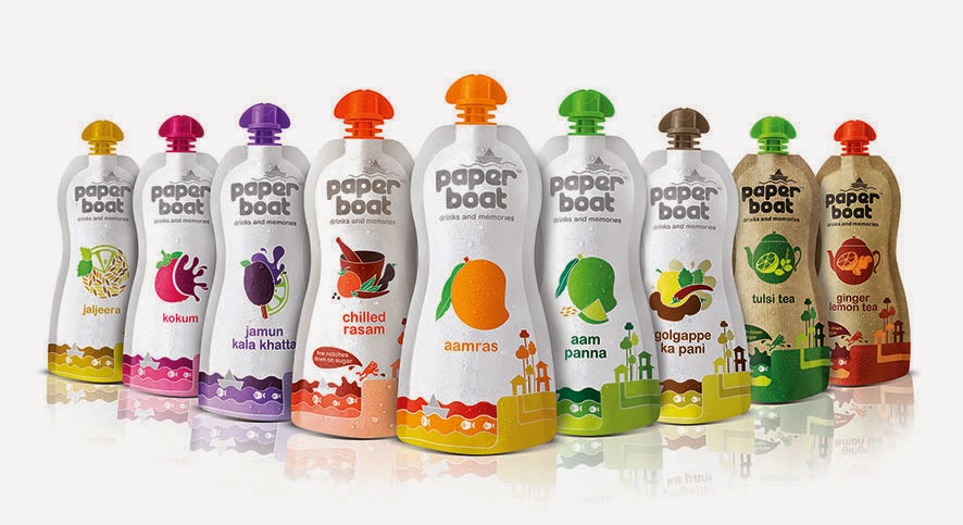
Today technology is enabling in more ways, to express the desired design outcome. If all the above design trends can be brought to life, say in a packaging design exercise, it is due to the advances in printing technology. Whether it is about making a plastic pouch appear like paper or whether is it about creating illusionary glass bubbles on a flat surface, it is all being made possible to attract the consumers’ attention sitting on a shelf and communicate the right brand story.

Another area technology has impacted communication is the new way of purchase – online! The way packs look and engage a consumer is rapidly requiring newer strategies and design expressions. Here the competition or concern is not so much about the shelf shout. The challenge is to appear distinct and engaging in a few pixels and help make purchase decision without holding and feeling the pack in hand!

Substrate treatment simulating actual paper does complete justice to Paperboat Drinks in bringing alive its brand story of being pure and unadulterated nostalgia

In an age where there is prolific usage of internet & new-media not just by the youth but every set of hands who has a cell phone, easily spanning an age divide from 12 to 80, the end user is changing with every new download or upload. The only way to strike a chord with these people is to understand their world – become them. As a designer, one has to constantly be shifting identities and changing shoes based on for who is he or she is designing. One could be reading ‘The Diary of a Wimpy Kid’ on a day to understand what does today’s ‘tween’ think like or could be speaking to a pediatrician on another to understand what a mother is truly anxious about. A designer of our near future has to be a heady mix of psychologist + ethnographer + crystal gazer! J

MAYURI NIKUMBH is a Principal Designer, Visual Communication at Elephant. An alumnus of Industrial Design Center, IIT-Powai, Mumbai, she leads a cool team of designers with work straddling across brands, packaging and branded environments.

<  Back to Blog