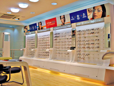
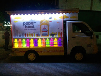
Point of Purchase

MTR foods - new identity, packaging & story

About the refreshed MTR visual identity: 

MTR, the brand with the outstanding legacy, global outlook and millions of happy consumers was looking at realigning its visual identity to the core purpose of rooted transformation. 

We decided to retain the basic visual equity of red roundel with white fence and worked on improving the typography for ease & clarity in reproduction across variety of substrates & sizes. We created a bold sans serif brand-mark for cleaner & contemporary presence. We also reduced the picket fence elements around the logotype to de-clutter the identity. Natural ingredients being the core of all MTR products,  a fresh green was added to the roundel to announce meaning & mission of the brand.

About the packaging strategy & design: 

With changing roles within new family structures and new working patterns, women are not burdened by the need to prove their expertise in kitchens. They see their role as a family manager & look for ways to keep the family happy & healthy. Buying ready to cook, ready to eat & even ordering-in food is seen as a great way to ensure quality time with family. They are open to experimentation & introduce their family to new cuisines with ease. But they want to do this with knowledge. They want to be aware. They want to know the source, the ingredients, quantities, accompaniments, consumption occasions? basically everything. 

So when we were given the responsibility of designing packaging for the entire range of MTR products, we decided to dive deep into finding out what the changing consumer will be delighted with. 

With a portfolio as large as 140+ products, first thing to do was to discover what works as an equity for MTR and preserve or even enhance that. Next step was to question & evaluate existing information architecture & remove redundancies to make way for cleaner, user-focused bytes. Though it sounds like the most obvious thing to do, we brought in a strong product nomenclature that would catch the eye and remove any ambiguity. We decided to retain the strong red associated with the brand and build upon that by devising a colour code for each category for ease of purchase. We created three strong visual pillars for the product portfolio ? pure authentic, confident contemporary and everyday celebrations. These moods were created within the master visual template to further accentuate the brand expertise and its involvement at every need and stage of the modern consumers' life. Since products like Sambar are available in multiple formats like masala powders, ready-to-cook mixes & ready-to-eat meals, we brought the category descriptor right up followed by the consumption occasion & announcements like time for cooking, whether anything needs to be added etc. A product shot is one of the most important factors for an impulse purchase in foods and our team planned each shot meticulously, keeping in mind time of the day, occasion and accompaniments. Authenticity was built through right serving sizes, ingredient depiction and serving bowls. 

Since there is lot of curiosity about food from other regions, we have added a very interesting background of region of origin for every dish. It is a subtle addition, but one we hope will be discovered to the delight of consumers and strengthen the brand's expertise pan India. 

http://www.campaignindia.in/Article/401709,mtr-foods-adopts-a-new-identity.aspx

Sanjay Sharma – CEO, MTR Foods, said, “Today’s consumers have evolved quite a bit – both in terms of their food preferences as well their consumption patterns. They prefer Indian food but perceive it to be cumbersome and time-consuming. Our brand is the flag bearer of innovative, easy-to-make, nutritious and authentic-tasting products that take away the time dimension from cooking and make Indian food more accessible to consumers."

He added, “However, as a brand we needed to change to reflect who our key consumers are today. While the new brand identity better represents where the company is today, our detailed growth strategy will make MTR ready for the future. This is the new beginning for MTR Foods and we are confident that the changes we have undertaken and our new brand identity will make us a part of our consumers’ everyday lives.”

Ashwini Deshpande, co-founder and director, Elephant Design, noted that the re-branding exercise involved defining renewed purpose, creating visual identity and packaging communication, evolving portfolio strategy and packaging design for over 120 products, sold as 350 SKUs. 

<  Back to Blog

Intimate Hygiene: Story of a package brand & dispensing solution

Intimate Hygiene_Blog_Elephant Design.jpg.jpg

Intimate Hygiene: Story of a package brand & dispensing solution
What makes an intimate hygiene product connect to women? Evolving touch points for the product system, where perception, communication & feel are critical.

By ASHISH DESHPANDE

With mass urbanization, longer commutes and longer hours away from home, personal hygiene issues are no longer a rarity nor taboo in urban India. There is a growing acceptance of new age grooming needs and solutions are being sought to take care of all eventualities.

However, there has been very low awareness on intimate hygiene and the fact that regular cleaning products are not suitable for the purpose is not known. Also, most women reached out to curative solutions when they faced issues and they were not even aware that there were preventive products. With years of strategy & action by FMCG majors, sanitary pads have managed some visibility at the shops. But intimate hygiene products are nascent in India and retailers were not willing to allocate any display space to these products.

How does one get modern urban woman’s attention and communicate that intimate hygiene is an essential part of her everyday grooming? What does design do to contribute to her intuitive yet informed decision-making mind? 

We interacted with potential users, women who were able to make their own grooming choices based on their needs. The central idea of these interactions was to understand their sense of comfort, apprehension and engagement. They were open to new ideas, however, there was complete lack of awareness about de-merits of using regular soap & water, changes in PH balance during cleansing for maintaining hygiene of vaginal & uterine parts of the body.

A medicinal bottle structure was considered an embarrassment, as she would not want to wrongly communicate any medical condition. 

Design research team keenly looked at her bathroom to understand the kind of products she was using. They deducted that women would be comfortable if the product matched aesthetics & usability standards of their other products like conditioners, body lotion, hand-wash etc.

Outer packaging also needed to play triple role of;

1. Attract

2. Engage

3. Educate the right set of values.

The design team created ideas that explored colour, form, communication & materials. Ideas were repeatedly tested with user groups to understand comprehension, apprehensions & acceptance.

The form of new bottle dispenser design is asymmetrical yet smooth. It is intuitive the way it is held and aligned for use. The form is focused towards a woman of elegance standing tall and with poise. The bottle cap is like a crown quickly moving the product from a curative to a personal grooming category.

It was pertinent to make the brand come alive for the smart & confident woman who makes informed choices. Brand logo is clean, contemporary & no-nonsense.

Cuing reliability & efficacy along with personal-care codes was an important decision that the design team took. While staying within feminine pinks, pastels were avoided to get away from any undue cues since this product has no unnecessary additives like colour or fragrance. Brand palette was dialed up with a dense magenta. Metallic substrate and silver added to the expertise & efficacy. 

In terms of communication, the team decided to focus on PH balance of V-Wash, the single most point of distinction to educate the user with a simple & easy to understand infographic.

ASHISH DESHPANDE is an Industrial Designer, Co-founder & Director at Elephant. An alumnus of National Institute of Design, Ahmedabad, he is a practicing designer, a keen Design Thinker, member of India Design Council & has been a Jury for India Design Mark. He has worked on several design programs, notably in consumer appliances, medical & healthcare products, packing & display structures, furniture amongst others.

<  Back to Blog

Design Thinking in Retail

Value of Good Design Thinking in Retail? Effective 'Point of Purchase' Displays

How does a designer ensure all the goodness and efficacy behind Point of Sale touch points across retail environments? 
A few principles at work.

By ASHISH DESHPANDE

“ Few years ago, when my son was still a toddler, I took him one day to a candy store. It was his first visit and he was thrilled & squealed with delight. He ran about the store for a while with the intension of grabbing every bit of the colour feast unfolding before him. Eventually when I mentioned to him that he had to make a choice, he was confused for a while. He could not let go all that he was seeing in front. Finally, he settled for the brightest, biggest and the most accessible jar of candy.”

Concerned by the state of the world, revered German Designer, Dieter Rams, Chief Designer for the brand, Braunonce stated, – “an impenetrable confusion of forms, colours and noises.” Any modern retail or even a corner high frequency store presents a marketing & retail nightmare for creating an effective sales pitch at the actual point of sale. Customer may have been drawn to a store for a product brand through an effective advertisement campaign. Advertisements many a times are dramatic visual aspirationswhich present the products in a utopian manner.  The same products inside stores are a different story. They are lost amongst myriad of other products, store environments and simply too many people in our country.  

Retail thinking at point of purchase must be smart & effective. Purchase aids get fleeting seconds to engage the customer about product benefits. These rare moments are the one’s that determine whether your point of purchase merchandise is successful or a waste of valuable time & resources.

Modern retail today is a jigsaw of shelves with piles & stacks of merchandise.  Each is bolder & brighter than the other. If you are lucky to spot the product brand of your choice, you may as well clap and give yourselves a pat on the back. It is in these conditions that effective purchase displays create a breathing space for your products.  A well conceived product purchase display can very easily focus entire attention towards the product it is displaying, engage the customer (not entice!). There is a thin line separating a successful point of purchase and the ones lost amongst the packs of time. Good design thinking and smart application is the base of the few lessons that I have learnt.

Be innovative.

Great Point of Purchase displays are always differentiated. They present a new solution to display the goodness of the product in a manner not seen every day. Wow! moment’s can be built within innovative displays yet they must never overstep the product. 

Right position.

Point of purchase element must present itself at the right moment in the customer journey through any retail environment. This is that moment in the journey of the customer when her mind should not be occupied by other engagements. Catching her attention at the right moment is crucial to creation of an engaging share in the customer's mind.

Product placement.

It always helps to present the product at a convenient eye level. The product must be approachable and within easy reach. The visual access to the entire product must never be blocked in the line of sight. View must be the best view of the product.


Clear message.

When a customer understands benefits and key differentiation presented by the product on display, it is an example of good Point of Purchase. Message is dispensed quickly & effectively. Key points of the message are boldly presented and secondary information is segregated to areas where it will be most effective.

Visible aesthetics.

Shopping is an experience and a good display must appeal to the customer senses. Well-designed & executed displays add to the customer delight and general well being. They help create a positive attitude towards the displayed merchandise. Yet a display designer must always make products stand out through their presence or absence. Choice of colour, form and material must take into account the environment, competing products, shelf colour and lighting conditions.  

Tipping point.

Display designers must be aware of the unique selling proposition of the product on display. An effective display is a culmination of a series of events that take place in a flash, the moment your display catches customer attention. All these events must lead to effectively closing the deal by clearly indicating the unique benefits of buying the product. It must provide sufficient inputs to the customer to make an informed decision based on conviction and assurance. The display must help close the sale.

Honest.

Point of Purchase must never attempt to manipulate a customer with promises that cannot be kept. Displays should never portray a product in a manner that makes it more innovative, more powerful and more valuable that it really is at present. Very quickly customers can lose trust built over years in the product or even worse, the mother brand.

Design is Detail.

Great modernist designer, Ludwig Mies van der Rohe, once said“God is in the details.” Execution of your Point of Purchase idea is as important as the idea itself. Don’t leave details in the display to chance. Good detailing shows respect towards the customer. A well placed screw or a tacky sticking attempt can spell disaster for a good product launch. Remember the quality of your display rubs directly on the quality of your product and brand.

Life and reuse.

Many times the displays can be reused to display products over a longer time period. Displaying other products from the range makes the display proposition cost effective. Make the display last even in today’s use & throw social norm. Be aware of the life cycle of the product display. Think if the structure can be reused or recycled.  Can it double as packaging? This way your rupee runs longer and so do the resources on our Earth. Don’t add to the waste already being created. Think environment ( No client or boss will tell you this ! )

Keep evolving.

Prototype. Prototype. And Prototype. Point of Purchase is not a onetime exercise where you fire & forget. Build in a step in your process of taking feedback from customers and field workers. A designer must understand what works and what does not work. This is critical to creating flawless displays, which relate to the customers.

I have always enjoyed displays that interact with me, educate me and say, “Hey, the choice is yours.”   That is what I call, a great Point of Purchase display experience.

ASHISH DESHPANDE is an Industrial Designer, Co-founder & Director at Elephant. 
An alumnus of National Institute of Design, Ahmedabad, he is a keen Design Thinker, a member of India Design Council & Jury for India Design Mark. He has worked on several retail design programs, notably, Titan Eye+, Bajaj Auto, Probiking, Ceat Tyres, Axis Bank, ICICi Bank amongst others

<  Back to Blog