Design Value

Anthropometry for wearables

Anthropometry for wearables

Lack of consolidated Indian & Asian anthropometric data for limbs, head and other body parts presents unique challenges. How does a design team get around to tackle such a challenge?

By ANAND PALSODKAR

Understanding of human anthropometry  is a crucial part of a design process. This is especially true with products like watches, helmets and new age wearable gadgets. These products behave as an extension to a human body and any use of these products resulting in discomfort would lead to a quick failure of the product itself.

‘’ The products we design are going to be ridden in, sat upon, looked at, talked into, activated, operated, or in some way used by people individually or en masse. If the point of contact between the product and the people becomes a point of friction, then the industrial designer has failed. If, on the other hand, people are made safer, more comfortable, more eager to purchase, more efficient-or just plain happier-the industrial designer has succeeded.’’ – Legendary American Designer, Henry Dreyfuss

Globally, designers & engineers rely on anthropometric data studied and compiled by Henry Dreyfuss Associates2. Dreyfuss’s contribution to the field of human factors is seminal, however data points related to specific ethnicities and for new age applications like wearables3 are not comprehensive & at times non existent. Pioneering anthropometric work by Dr. G G Ray4 & Dr. Deb Kumar Chakravarty5 on Indian population does not cover wearable physiological zones in the published version and that creates a large vacuum when dealing with wearable products. The design team working on one such project at Elephant6, came across this chasm and had to modify its approach during the design phase while working for Singapore based technology firm, SynPhNe7.

Undertaking the challenge

The design team embarked upon developing a system of wearable devices for stroke rehabilitation that included an arm gear and a head gear to record the muscle & brain response. The challenges were multifold, the devices had to be used by people suffering from partial paralysis with one of the sides of their body non-functional. The device had to fit arm and head sizes, shapes of population from Indian subcontinents, south-east Asia & China. 

The geometry of Arm and the Head had implications since functioning of the device depended on effective sensor contacts to arm skin and head scalp. Available anthropometric data captures only the dimensions of extremities & body parts, however it was important to study the shapes & specific dimensions of arm and the head to determine the profiles of arm and head gear. Such anthropometric data is not available readily. This momentarily stemmed the development work and subsequently led to carrying out anthropometric study of arm and head of a sample population.

Anthropometric study

In-depth user study revealed certain physical realities about the people who would be using such devices. Women wearing bangles, necklaces and those maintaining plaited hair, tight curly hair and people with baldheads & loose skin, all these added to the complexities. Anthropometric research was planned for a sample population of 50 in India & Singapore each. This sample population included men, women and children above the age of 14.

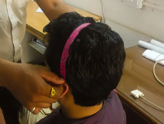
The study included measurements of arm features, circumference at specific points on arm, thumb & palm measurement. Features like circumference, nasion to inion distance, ear-to-ear distance above head were measured for study of the head anthropometry. 

The anthropometry data was classified based on 95th, 50th & 5th percentile male and female. For effective therapy it was imperative to have accurate locations of sensors for both arm & head gear. Sensor point variations were plotted both for arm & the head based on the profiles derived from this study. This helped the team to design the devices with adequate adjustability built in for the sensors that covered a larger part of the population.

Head shape profiles were studied to design the head gear to ensure positive contact of sensors with scalp. Arm gear profiles at elbow, mid and wrist location led to the design of common set of arm straps for 3 sizes of arm gear; small, medium & large.

Pain gain

Lack of data led the development team on an anthropometric hunt. A critical realization was the requirement of wearable data and its access while undertaking such development work. The design team acquired body part profiles & surfaces that helped design contact elements & affordances in the product system. This critical metric research led to numerous insights for innovative development work. After 4 stages of prototype testing, clinical trials of the beta version of this product system is underway in the US, India and Singapore.

Notes:

1.       Anthropometry is the scientific study of the measurements and proportions of the human body.

2.       Henry Dreyfuss Associates, LLC is one of the oldest & most esteemed industrial design consultancy firms in the      United States, known for their work in human Factors and a series of iconic products.

3.       Wearables is common reference to wearable technology.

4.       Dr. G. G. Ray, Professor, IDC, IIT-Powai, Mumbai & Ramakrishna Bajaj Chair, Honorary Professor, School of Biomedical Engineering, IIT Mumbai.

5.       Dr. Deb KumarChakraborty, Professor & Dean, IIT-Guwahati, author of Indian Anthropometric Dimensions For Ergonomic Design Practice.

6.       Elephant, is a design consulting practice operating in India & Singapore.

7.       SynPhNe, is a technology platform, incubated in Singapore, http://www.synphne.org

ANAND PALSODKAR is a mechanical engineer & post graduate Industrial Designer, Design Director, Product Innovation at Elephant. A post grad alumnus of IIT-Powai, Industrial Design Center, Mumbai, he leads the product development vertical. He has worked on several design programs, notably CEAT Tyres, Nirlep Appliances, Thermax Ltd., Symphony Coolers, Paperboat and works on medical & healthcare devices amongst others.  

<  Back to Blog

Ideation!

Ideation

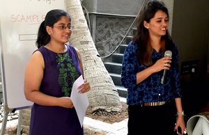
Life & work is full of challenges. How do we creatively tackle everyday challenges? One Monday Morning1, two young designers at Elephant2 share ideation as a tool to solve challenges.

I haven’t failed. I have found 10,000 ways that won’t work
— Thomas Edison
Ideation_Blog_Elephant Design.jpg

Innovators are supposed to think new. What do accountants do when they are faced with challenges?  Or, for that matter project managers or software coders? Is it possible to institutionalise creative thinking?

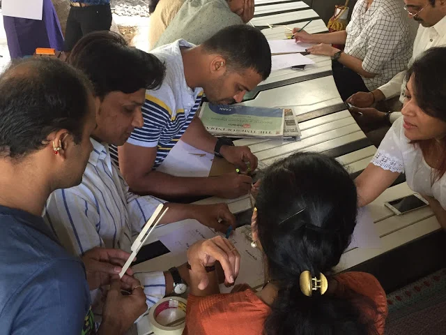
Tanmaya Rao & Shruti Jain, Designers at Elephant, conducted a workshop session that introduced ideation not just as a process but rather a tool to creatively look at problems. Given a set of constrains, individuals & teams were able to conjure solutions to unfamiliar challenges & constraints.

There were 3 main take-away from the Monday workshop;

#1

Working as co creative teams is an effective way to look at cracking a problem.

#2

Ideation cannot be a random process of simply starting to think at a given moment. It helps teams to arm themselves with a “Creative thinking technique” like SCAMPER6.

Such tools help look at challenges with a changing perspective. As with Thomas Edison, a technique can also help a team cover all angles and possible eliminate most ideas that don’t work. 

#3

Participating teams went beyond using the tools to note down ideas, choose a few promising ones, go beyond to execute a couple of ideas and most important, share.

“Ideation without execution is delusion”, say’s, Robin Sharma. When an idea is executed, it gets tested and there is feedback. It is feedback and subsequent evolution or rejection of ideas that leads a team on to a path of problem solving.

It may help to institutionalize the act of ideation first as a mile stone is the process of looking at challenges (just like say, Root Cause Analysis8 is one such milestone when looking at challenges). Teams must realize that an idea alone is not good enough and a whole lot more thinking, detailing, execution, testing is required before a problem gets creatively solved. Theodore Levitt, American economist & Professor at HBS9 had famously remarked, “ Ideation is not a synonym for innovation, conformity is not its simple antonym and innovation is not an automatic consequence of creative thinking.”, indicating that creative ideation alone is not sufficient to solve problems.

Having said this, the workshop did provide non-design & design teams with a mind tool & technique to keep handy when facing a challenge.

Notes

  1. Monday Morning Meeting, is a weekly feature at 10:00 am where the entire Elephant team gets on to a share & learn platform.
  2. Elephant, is India’s independently leading Design Consulting organization www.elephantdesign.com .
  3. Thomas Alva Edison, 1847-1931, was an American inventor & businessman.
  4. Tanmaya Rao, is an Environment Designer working at Elephant.
  5. Shruti Jain, is an Environment Designer working at Elephant.
  6. SCAMPER, is an acronym for 7 ideation & thinking techniques, (S) substitute, (C) combine, (A) adapt, (M) modify, (P) put to another use, (E) eliminate and (R) reverse, credited to Bob Eberle.
  7. Robin Sharma, is a Canadian writer and leadership speaker, best known for his The Monk Who Sold His Ferrari series.
  8. Root Cause Analysis, (RCA) is a method of problem solving used for identifying the root causes of faults or problems.
  9. HBS, is Harvard Business School.

<  Back to Blog

Entrapped!

Entrapped!

Glimpse of the ugly side of Design assignments professionals need to be wary of, while they quench their quest for the best.

By ASHISH DESHPANDE

Entrapped_Blog_Elephant Design.jpg

Mac: What's the job? 

Gin: Like the wise man said: first we try then we trust.

Catherine Zeta-Jones (Gin) in 1999 American film, Entrapment, lures Sean Connery (Mac) into a high profile robbery, building a mysterious appeal to the “Job”. Now, Designers are not con artists, but as a professional species, they do get lured now and then into assignments that seemingly appear exciting, but the full picture is never to be seen or shown.

One of the definitions about fresh Design is creating the “new” and for design professionals this is always an exciting proposition. As professionals itching to contribute with better design, we are always looking for challenges. While seeking opportunities to design is a fundamental trait of a good design professional, there are few situations that one must be on the look out to avoid.

Carpetbaggers

“We would like a full presentation,” said the corporate manager on the phone call, “Please submit your understanding, strategy & design creative. Our MD will personally select the Design agency. We have called 7 firms to present & pitch”.

Brand & Product managers do have a need to evaluate design firms, choose the best their business aligns with and it is their right to do so. However, it is difficult to understand full scope presentations that are not paid pitches. In their bid to garner projects many design firms fall prey to such requests.

The biggest resource in possession of a design team is “consulting time”. By participating in unpaid work, a design team takes huge risk with its most precious resource, “Time”. Beyond bleeding the firm of its earnable time, such risks end up providing opportunist clients with a bag full of free approach options and most importantly encourages a culture of free work, lowers respect for effort & intellectual property rights.    

Comatose Client

Any designer or Design team’s worth is the projects they have managed to successfully complete. Key to such successful execution of a design project is the quality of decision making from stakeholders.

Family feuds, multiple project ownerships, inter-department rivalry, not involving other teams, changing roles or business focus, financial woes and such other conditions can stall decision making at crucial junctions and simply hang seemingly good projects.

Though design effort may get compensated financially in such conditions, there is low satisfaction with design teams and usually it is a wasted design effort. Stalled projects disturb team schedules, lower morale and usher a general disinterest as time flies along. Since such projects see partial execution, there is little learning and takes a toll on meaningful design experience that one may have gained.  In the long run, such projects start bleeding finances.


It pays to evaluate & understand the decision maker while signing up for a project. How strong is the involvement of the decision maker? Which teams will contribute to the success of the project? What is the level of support the design team can expect? Are there any possible party poopers to be expected along the way? What is the level of control on the project to see the project through?  Commitment to time, budgets, approvals, business vision of the project itself needs to be evaluated right before the start. It is Ok for the designer to ask a few questions and spell out any emerging gaps or concerns.

Startup Hiccups

Last few years has seen a proliferation of startups. Most of the startups are design aware, are open to new ways of doing business and looking to differentiate. Designers do find startups as exciting opportunities to work and help them differentiate. Energy of a startup is contagious and working with smaller teams is always engaging & fun.

However, startups do display a few shortcomings especially with funds, resources and limitation of network. Major investments into a project are expected during product execution, launch & promotions. This is one area where most startups stutter to a stall, drying up reserves and most conceptual projects experience prolonged suspension periods. For young designers this is a moment of frustration & disillusionment and for an experienced team it is a loss of productive time & opportunity.

Any professional will tell that time is precious. Time adds to our learning as well as earning. When projects make a designer lose both, time & money, one hopes that the experience gained on the project was worth its while. When projects don’t see light of the day, when success does not surface at business level, in markets and with the user, experience remains on paper.

“It is your job to deliver the project”. This is a favorite punch line of most business managers or CEOs to design teams. It is equally important for designers & design teams to question the stakeholders if they have the wherewithal to support the project from concept to market. Any ambiguous answer to this question must raise a red flag.

As someone said that we must learn to choose our battles that we want to fight, those that are worthy for dying. Similarly, a designer must carefully choose the projects she should be betting design skill & time. And there will be times when on a time trap project, as designers, we must learn to say, thank you, but NO!

ASHISH DESHPANDE is an Industrial Designer, Co-founder & Director at Elephant. An alumnus of National Institute of Design, Ahmedabad, he is a keen Design Thinker, a member of The Design Alliance Asia & Jury for India Design Mark. He has worked on several design programs, notably, Titan Eye+, Ceat Tyres, Axis Bank, ICICI Bank, Symphony, Paperboat and works on medical & healthcare devices amongst others. Recently, Ashish spoke on Design with Context: Design for Real Needs, at the International Design Congress in Gwangju, Korea and is the Product Design Jury, Cannes Lions 2017.

<  Back to Blog

Mango

Mango

Come summer and we think Yellow! Ever wondered about the inspiration & meanings drawn from this king of fruits in the visual world?  

By Pratyancha Puri

Mango_Blog_Elephant Design.jpg

It’s summer and it’s hot like never before. The one thing that we really love about summers is mangoes1. Yes! mangoes found in different shapes, sizes, colours, and their significance in the vast culture of India and around the world. Well, wondering why I am giving all this gyan2 on a mango that which we already are aware? I am not going to talk about mangoes and its benefits or how good a fruit it is in reality. This article talks about its significance in different cultures and how one of the most familiar motifs that we see around us has a much deeper meaning.

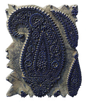
A mango look alike motif composed of two or three concentric compartments, embellished with flowers and other organic elements are called ‘Paisley’. Its name is derived from a town in west

Scotland, Paisley, hub for textiles where Paisley designs were first used, so much that there is a Paisley Museum3embellished with paisley’s first ever used artefacts & paintings.

The symbolic ‘kairi’4 shaped motif, known internationally as paisley continued its appearance in the Indian sub continent even during the fourth period culture or the age of foreign invasion 500 BC – 500 AD. People from west brought their diverse culture and with their culture came Paisley, which later became popular in Kashmir5 and wove its way into the Pashmina6 shawls. Inspired by Persian7 art, the Mughal8 emperor Humayun9 brought in Paisley as a vibrant piece of art & design, which is still seen embedded within different crafts around the Indian sub continent.

Paisley in Art & Design

Wood handstamp for textile printing traditional paisley designs, Isfahan, Iran.

Wood handstamp for textile printing traditional paisley designs, Isfahan, Iran.

Block printing

An ancient art still being practised in different parts of India witnesses the use of Paisley vividly.

Chikankari – Lucknow10

The word Chikankari has been derived from a Persian word Chakin or Chakeen, which means creating delicate patterns on a fabric and creating cloth, shaped with needlework. Paisley is common to block prints and Lucknow embroidery.

Kalamkari – Rajasthan11

Kalamkari is an ancient style of hand painting done on cotton or silk fabric with a tamarind12 pen, using natural dyes. The word Kalamkari is derived from a Persian word where ‘kalam‘ that means pen and ‘kari‘ refers to craftsmanship. Motifs used in Kalamkari vary from flowers, peacock, Paisleys to sacred characters of Hindu epics like Mahabharata13 & Ramayana14.

Kantha – Bangladesh

This type of embroidery is done on old saris stacked on each other and hand-stitched to make a thin piece of cushion & bed covers. Well I guess, that’s what inspired traditional handcraft artisans to come up with furnishing solutions with elegant mango shaped paisley patterns layered onto the fabric.

Handcraft in India is vast. The use of paisley is seen everywhere from Kashmiri Pashminas to Amritsiri Phulkari15 toJuttis16 in Punjab to Khandi17 printing in Nepal. If one notices it is clear that the extensive use of Paisley in Indian art & design is inspired by the Persian culture, and Mughal influence played a big role in introducing paisley to the Indian culture, so much so that we don’t even notice its presence in our day to day life. I am sure I have missed a few but you see, Paisley has so extensively proliferated across the Indian sub continent that it’s not easy to cover everything in one article. I just have one more fascinating story about Paisley to share.

Psy Paisley

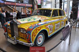
Paisley became popular with the gypsies & hippies in the mid and late 1960’s under overt influence of The Beatles18. The style was popular during the Summer of Love 1967. Also, Fender Guitars made a Pink Paisley version of their guitar. Prince19 paid tribute to the Rock & Roll history of Paisley when he fashioned Paisley Pack Records and established Paisley Park Studio, named after his song Paisley Park 1985. Paisley’s significance with growth, fertility and ‘ The Tree of Life’ is probably why it is associated with travel, spirituality & psy, made popular in the 1960’s. The decade moved culturally towards a Rock & Roll swag in terms of fashion and also music, sparking the love affair of Paisley with The Beatles travels during their travel to India with the Guru Maharishi Mahesh Yogi 20 - with John Lennon21 famously having his Rolls-Royce painted all over in Paisley.

Filming a sequence for “I Am the Walrus”

 
John Lennon’s 1965 Phanton v

elecaster in Pink Paisley

Cover art for the single Paisley Park by the artist Prince. 

The cover art copyright is believed to belong to the label, Paisley Park, or the graphic artist(s). Prince & The Revolution “Paisley Park” single 1985.

Filming a sequence for “I Am the Walrus”

John Lennon’s 1965 Phanton v

 
elecaster in Pink Paisley

Rock the Paisley

The famous 1986 revolution was an avalanche of this tremendous fashion trend and Hippies created their own counter culture founded on psychedelic rock and the Hippie dress, which they believed was part of the statement of who you were, included brightly colored, printed  ragged clothes, tie-dyed t-shirts, beads, sandals (or barefoot), and jewellery, all of which served to differentiate them from the “straight” or “square” mainstream segments of society.

So next time you see someone wearing this leaf-like ‘ambi’ as we all call it, decorative colorful pattern, take a moment and think about its rich symbolism and rebellious aura which has kept the charm of this mango look alike motif prevail through the generations and making a strong impact on the culture (more like counter- culture). But the secret behind Paisley s journey through the centuries is its rebellious attitude and its diverse interpretation in our culture and around the world.

References & Notes

1.     Mangoes is the plural for Mango, a tropical pulpy fruit
2.     Gyan, Indian, noun, meaning knowledge, esp. spiritual or religious knowledge
3.     Paisley Museum and Art Galleries, High St, Paisley PA1 2BA, UK (Renfrewshire)
       Kairi is unripe mango, Indian reference, https://en.wikipedia.org/wiki/Kairi
5.     Kashmir, Region in the northern part of India
6.     Pashmina is a shawl made from fine quality goats wool
7.     Persian, relating to ancient Persia or modern Iran or its people, culture or language
8.     Mughal, belonging to Muslim dynasty of Mongol origin founded by the successors of Tamerlane, which ruled much of India from the 16th to the 19th century
9.     Humayun was the second emperor of the Mughal empire
10.   Lucknow is the state capital of the state of Uttar Pradesh in India
11.   Rajasthan, a state in western part of India
12.   Tamarind, the tropical tree which yields tamarind pods, cultivated throughout the tropics and also grown as an ornamental and shade tree or used in Asian cooking
13.   Mahabharata, an India epic
14.   Ramayana, an Indian epic
15.   Amritsari Phulkari is embroidery technique from the Punjab region of India
16.   Juttis is a type of footwear common in North India and neighboring regions
17.   Khandi, coarse cloth from Nepal region
18.   The Beatle are an English Rock Band, 1960’s
19.   Prince, Rogers Nelson, American Singer, song writer, dancer
20.   Mahesh Yogi, the guru who introduced the Beatles to transcendental meditation
21.   John Lennon was an English singer and songwriter who co-founded the Beatles

·       Handemade In India- Aditi Ranjan/ M P Ranjan

·       https://en.wikipedia.org/wiki/Fender_Telecaster

·       https://en.wikipedia.org/wiki/Paisley_Park_(song)

·       https://en.wikipedia.org/wiki/Magical_Mystery_Tour

·       https://en.wikipedia.org/wiki/Rolls-Royce_Phantom_V

Acknowledgments

Ashwini Deshpande, Mayuri Nikumbh, Meenakshi aka menu, Nayantara aka billo, Book- Handmade In India- Aditi Ranjan/ M P Ranjan

PRATYANCHA PURI is an alumnus of Srishti Institute of Art, Design and Technology, Bangalore and is a Graphic Designer at Elephant, a multi disciplinary Design Consulting firm. The views expressed in this article are her own and supporting material provided by her for this blog article.

<  Back to Blog

Incident at a fort!

Incident at a fort!

A moonless midsummer night of 1990 when we had our own tryst with destiny.

By ASHISH DESHPANDE

The year was 1989 for certain. Yet, it is unclear when Elephant1 started. No one is sure. Perhaps it was that Design Management module in our fourth year. It could have been one of those countless discussions that excitedly took place on the stair leading to the auditorium or those precious wasted hours at NID2 gate over Chai3. Maybe, a hard date can be inscribed as April 16th. 1989, the day pioneers of the herd landed in Pune with their trunks, hold all & drawing boards. Another date that probably is hard coded is 02 May 1989, date the firm got itself registered as Elephant and a working deed was drawn out by a bemused CA4, who wondered the point of making the deed when Design itself was questionable in his mind.  

As fresh graduates, we saw the bleak landscape that Design in India presented as an opportunity. We were friendly, eager to learn, connect and people around were more than willing to help a fledging professional practice. Elephant survived, and a year later, excited, we plotted to celebrate our one-year of existence in the Indian design landscape. May, 01 1990 was pegged as Elephant Day, maybe it helped that 01st of May was a public holiday5 or in most probability, it was the most convenient average of various dates. 

We finished working late on the 30th. April. Yes, we worked hard those days as we continue the tradition even today. The plan was to pick up five Chicken Tandoori 6 portions, half a dozen bottles of Pilsner beer, hire a Fiat Premier 7(big deal those days, since we has 2 scooters between the five) and head to Sinhagad 8, a 1400AD fort that towers over the city about 30 km from Pune.

The herd started from Pune at about 10:30 in the night. It was a lonely drive up the hill to the base of the fort. There was no one around and we hiked up the fort to find a great spot overlooking the city in the distance. The plan was to see the sunrise from the fort ramparts and celebrate our first year as Elephant.

We celebrated nonetheless, consuming beer, the chicken tandoori, and talked our way through the night. There was no good shelter and we were lying in the open on the wild grass looking at stars.

That night, at that moment, life taught us one of our first lessons. Around 3 am., as breeze grew stronger and a chill set in. It was difficult to remain in the open. We had come unprepared, there was no torch or matchstick and we were in our light summer Tees. By 3:30am, we were shivering.  Rattling our way back to the parking lot, we woke up the cab driver and started our descent back to Pune. The driver, poor soul was obviously sleepy and lost control of the Fiat and the car scrapped against a Bund wall 9 over the valley below. The fiat lost its headlamp, side panel & trims and the driver lost his sleep. We were lucky to be alive.

We never saw the sunrise. I guess, Pune had acquired a new sun, for the next 28 years, all thanks to the lesson at the fort and our bone rattling experience. We got back and laughed. We laugh every year when this incident is remembered and how close we were to having no Elephant in any room at all.

The journey that began so carefree goes on and each year we remember the lessons learnt, adapt and shine on. The Design landscape has flowered and the herd has grown. However, what remain is that spirit, that took us on this carefree journey, and till this day, we get rattled, we learn, most importantly, we laugh and move on. 

Notes

1.     Elephant, is India’s premier design consulting firm

2.     NID, National Institute of Design, Ahmedabad, India

3.     "Chai" is a local term for Indian brewed tea

4.     CA is the short abbr. for Chartered Accountant

5.     01 May is celebrated as Labour day and also Maharashtra Day in India

6.     Chicken Tandoori is grilled Mughlai cuisine recipe made in a traditional open coal oven

7.     Fiat Premier “Padmini” is a version of Fiat 1100 Delight

8.     Sinhagad, a martial fort 30 km south west of Pune

9.     Bund Wall is a small retaining or edge wall


ASHISH DESHPANDE is an Industrial Designer, Co-founder & Director at Elephant. An alumnus of National Institute of Design, Ahmedabad, he is a keen Design Thinker, a past member of India Design Council & Jury for India Design Mark. He has worked on several design programs, notably, Titan Eye+, Ceat Tyres, Axis Bank, ICICI Bank, Symphony, Paperboat and works on medical & healthcare devices amongst others. Recently, Ashish spoke on Design with Context : Design for Real Needs, at the International Design Congress and is the Product Design Jury, Cannes Lions 2017.
<  Back to Blog

Design with Responsibility

Design for Responsibility_Blog_Elephant Design.jpg.jpg

Responding to local Needs

There are numerous challenges that emerging economies like India face today. Where do we find answers to these complex problems? What do we learn from our past, our present?

What is the role of a practicing designer? Are designers, architects waging a lone battle when it comes to Green Products & Practices? With Paris agreement looming large, it is a good time to do a reality check on how businesses should approach the problem. 

How do we apply our learning to the future of 1.3 billion people in India and how do we align it to the challenges facing our “One Earth”.

By ASHISH DESHPANDE, Co Founder Elephant, Member of India Design Council, Jury for India Design Mark & 

VP - Association of Designers of India

Man has always been a creator.

Be it for anthropological reasons or certain survival instincts, creation is not new to us. We have been creating objects for a few millennia's. From creating for survival and local day to day needs, we have moved towards a rampant phase of object creation, stocking, consumption and refuse generation. The question that creeps up is how much should man create. What led us go get into an overdrive mode of converting every possible resource that we could mine into not an object of survival but that of desire? It is question every environmentalist is up in arms with the powers that be in our world.

According to the author, economist & environmentalist, Ramchandra Guha, “there was no environmentalism before industrialisation”. The term did not exist and came into existence only in the post industrialization period. Industrialisation itself came to India 30 years after it engulfed Europe in a bid to produce more, consume more post the discovery of oil & especially after the proliferation of mass production factories and later the plastics1. Designers and their self-serving employers in their greed & enthusiasm to scale up slowly drew into the web of global consumerism, forgetting our immediate environment concerns & local needs.  

Design as sensible

Design as a profession in its modern definition came into existence almost in parallel to the Industrial and the post-material phase contributing significantly towards creating innumerable objects of desire. Design has been ever present in our society.

The question is and always has been if designers are focusing on needs that are most relevant to us? Not always. If we focus on local context and we can see how examples from our past and cultural heritage have been contributing in creating objects of daily use.

Lets us take a deeper look at a traditional container that is used as an everyday object of use. In India we call it LOTA. It is a simple container found commonly in Indian homes as a traditional object, many a times handed down for generations.

Amazingly, it took the great American Design couple, Charles & Ray Eames to look at this ubiquitous object, to so very eloquently describe it in their now famous India Design Report which laid the foundation of present design in India.

Lota is a product that is very simple in shape and can hold water, milk, grain. It can act as a measure of volume and weight. It is very comfortable to hold, ergonomic, can be carried in hand, affords being carried at waist, or on the head. It can be stored one on top of other. When poured it makes a nice sound. The shape counters fluid dynamics during motion and at the same time is simple & beautiful. It is truly multi purpose. It is locally produced and when made in clean copper, even purifies water. It has taken our society years to perfect this object into a very sensible product.

Lota, however traditional, establishes principles of good design. Good design is the one that addresses needs of our immediate surroundings, is multipurpose, made from local resources, lasts long and is adaptable over the period. As an object, Lota has not lost its relevance after centuries, nor has it contributed to our over growing refuse and land fill problems. It teaches us an ancient lesson of beingsensible in our approach to adding objects into our present day daily existence.

Design as emotionally durable

However, sensibility cannot be restricted to functions alone in the personal lives of people. Like in Korea, in India too, people love their food and cooking traditional recipes is a national passion. Traditional cooking is on a slow flame so as to retain flavors, ingredients and so on. However, the traditional pots presented a problem of reuse and cleaning. Additionally, such pots get soiled during cooking and are not useful for serving as tableware. This practice is getting lost over time.

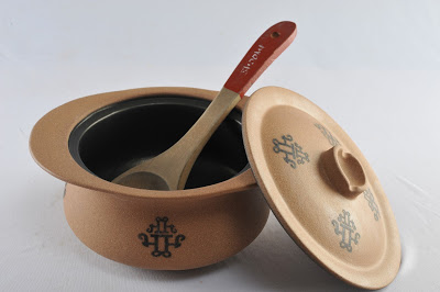
The Slow Cooking pot range was completely redesigned and recreated using organised process of Earthenware manufacture. This way the dimensions and stability of the product can be controlled. The new pot was design with a system of lid and pot. The unique feature of the new pot was that the exterior as well as the interior of the pot is coated with food grade teflon. This is interesting as it makes the pot reusable and very easy to clean. The pot draws from the traditional form of the pots but adds convenience of an integrated carry and serve handgrip. The shallow dome shaped lid traps the steam and the detail allows it to snugly sit over the pot improving efficiency of cooking over heat. The lid handle is actually a small container for water to help condense the steam. The knob handle becomes a convenient resting place for the spatula. The product is called Bhoomi , which means Earth. The motif, which is glazed on to the surface, is derived from the Devanagri2 script letter “Bhaa” of Bhoomi and is simply a calligraphic expression reinforcing the products connect with earth.

 Designer as a creator

As Designers, we usually tend to distance ourselves from taking responsibility for the negative impact of our creations to our society, economy and ecology. It is important that we introduce metrics that would guide us measure such an impact. It is also important to create an environment & team that is amiable and sensitive to being responsible.  

“Design, if it is to be ecologically responsible and socially responsive, must be revolutionary and radical – says Victor Papanek.3

Victor Papanek, an Austrian designer was rebel with a cause. He relentlessly campaigned for designers and product manufacturers to make their articles relevant, meaningful & sustainable. This father of responsible design was even critical of the design fraternity, beginning his seminal book, Design for the Real World with, "There are professions more harmful than industrial design, but only a few… following up with ... by creating whole species of permanent garbage to clutter up the landscape, and by choosing materials and processes that pollute the air we breath, designers have become a dangerous breed."


Though designers are crucial to the creation of products & environments, they do not constitute the sizeable decision making machinery in corporate juggernauts. Whipped into being morally responsible many designers have fallen into line, however do they have control?

The Paris Agreement on climate change saw 195 nations give it a nod. However, notably 5000 businesses from 90 countries have agreed to align and support the global agenda towards a properly sustainable & low carbon world. This is a recognizable outcome of COP21 and will call for a fair bit of transparency framework and practices to be adopted. Against this backdrop where do producers of products and services stand today? What is the degree of practice shown by business concerns today that is environment friendly and sustainable? As designers, it is important to take a hard look at the playing field.  

Who is thinking Green? 

One rarely comes across corporates & producers with genuine concern for sustainability. Corporate structure necessitates several point of views getting channelized into the decision making process. Designer’s concerns have a tendency to lose itself in a deluge of constrains from all stakeholders. Green concerns have always been secondary. Most producers are motivated by long term monetary savings, or operational benefits that green products bring to their business.

The “green & good for environment” part is a by-product of fiscal decisions. So, the priorities today can be stated as;

·       Operational expense savings

·       Company law regulations, environment policy mandates

·       Competitive advantage

First is the prime mover for “green decisions” in corporates. The second is a legal necessity and the third is the story. However, all require a Design Thinking approach to make the impact stick with people, deliver monetary & habit change and be good enough to bear the “green edge”. Design is one such asset capable of enabling a “green edge” within a production setup, provided design teams start dropping their blinkers and business leaders open their minds.

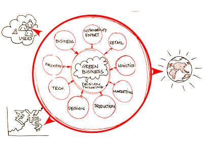
Stepping beyond singularity, design teams tend to stick around creative ideation as their strength. A large part of this creative energy goes towards focusing on the Product or Service, form, function & experience. Products or services are interaction cores of a larger engine that makes solutions happen. Design needs to enlarge focus beyond the fuzzy elements of product solutions. Rarely do Designers concern themselves with manufacturing processes, materials with reference to its impact on our environment. Most follow the producers set up as an overriding constraint to design. It is interesting to bear in mind that a product or service is not alone. It comes heavily loaded at one end with manufacturing systems and on the other end with logistics of market access, retail & consumption. A sum total of this value chain is the impact of a “Design” on environment. This value change can no longer afford to be linear in thought process and remain in isolated silos of excellence, rather play like a football team with a unified objective.

Creators & producers need to proactively look beyond ideas into product optimization, cleaner production, life cycle assessment, cradle to cradle, extended responsibility and environmental impact assessment as part of their design process & tools, both in development & route to markets. Green Innovation will happen, provided the thought is holistic and across the value chain. Newer practices will add up to the expenses, however, eliminating waste, sharing resources may be light weight methods of lowering costs and offsetting any new“green” expenses without business disruption.

It is sad to see that most “green energy” transport solutions today, are the most “expensive” transport solutions.  Herein lies an opportunity for “creative” approach towards ensuring both “green” (environ & monetary) returns on investment made. Many a times policies can be binding, like take the case of restrictions on use of thin plastic grocery bags. Prior to the bags coming in market through grocery chains and standalone shops, cloth & paper bags were prevalent. Years after restrictions were executed, the industry has not been able to promote alternatives. Paper bags are laborious to manufacture, not sturdy & have their own issues, cloth bags have not regained popularity. The industry has invested huge into plant, materials, machinery & markets that prevent it to see a linear solution in sight. Solutions at present are incremental or too expensive and need a creative thought from a different viewpoint. This calls for a mind & process shift by creating a new development process based on Design Thinking.

So, Industry focus must shift and businesses can start investing in co-creative development teams to make the future greener. New areas of focus for redevelopment can be one or all of the ones stated;

·       Power & Energy (Reduce consumption, Green source, increase efficiency)

·       Resource consumption and waste (localize, Reduce, Share, Reuse)

·       Production materials (low carbon rating, low pollutants)

·       Finishing substrates (Reduce, Remove, low carbon rating, low pollutants)

·       Logistics (Reduce distance, time, space)

·       Functions (merge, eliminate least desired)

·       Retail (Reduce touch points, strengthen story, share)


New development process based on Design Thinking leading to Radical impact within Resource limits. Illustration by the author.

Mahindra Reva’s e2o is a good example5. The design team went beyond the traditional indulgence of vehicle design into adapting efficient green production process, unconventional materials, solar charging and regenerative braking technologies and even new ownership programs to make buying affordable. The effort resonates of all round contribution at various levels & verticals. However, the car still leans on government policies & subsidies and has not yet managed to make the end price attractive for making box office hits. E2O and its predecessor REVA since inception has been a green focused business and so it is not surprising. That will be a remarkable example of “green impact” at an affordable price tag of US$6,000 compared to say a TESLA3 at US$35,000.

The way to do this is to work with cross-functional teams as a start point with Design Thinking as a primary enabling tool & framework for development. This presents a new challenge for designers as well as an opportunity to create more relevant, holistic & eco-friendly solutions. Moving focus away from traditional playgrounds for design development teams to new areas for innovation is a route with guaranteed success in the “Battle for the Greens”. Though, Design Thinking may “no longer be a competitive advantage” for companies, as questioned by Tim Brown, CEO, IDEO ( HBR Post )6, design & design thinking are still good enough to ensure a “greener” tomorrow.

Design for Larger impact

Let us look at another product from recent times. Like Republic of Korea, India is a large democracy and people voice is important. People express their voice & choice through voting. We are a country of 1.3 billion people and the numbers in India are staggering. We have 815 million registered voters. In our general elections we have 8000+ candidates in fray from 1600 political parties. People cast their votes from urban to remote corners of India through over 93 thousand polling stations. General elections used to consume more than 8000 tonnes of paper, accounting for over 200 thousand trees. This use to take days and days of laborious counting and bogus voting practices.

The design and introduction of the Electronic Voting Machines heralded a revolution in the voting process for the common people. Designed by Industrial Designers A G Rao & Ravi Pooviah from Industrial Design Center, IIT Mumbai7, along with Electronic Corporation of India8, they were first Tested first in 1989, the EVM’s have been used in total since 2004. The system is easily portable, takes less space to store, easy to use, makes the voting process quicker and results are available within a few hours. The communication and interface is highly simple and algorithms used are fool proof against erroneous voting and even frustrate bogus voting attempts.

This is another effective example of how sensible design can have a great impact on common people.

So, design must lead to a larger impact.  By sensibly addressing the needs of our people and by being relevant to the immediate social environment, it can bring about true improvement in life of a large number of population.

Design for community opportunities over luxury

India is changing. For people in an emerging economy to survive, local job creation is extremely important. About 800+ startups are set up every year. By 2020 there will be 12000 startups employing over 250,000 people. These start ups are looking at local business opportunities based on local needs. This is where design needs to focus.

Lets discuss the work of two enterprises working within local context. First example is work of Designer Laxmi Murthy and her organisation UGER9. UGER is a social enterprise. Lakshmi Murthy was very concerned with poor menstrual hygiene among socio-economically backward populations, women as they were not able to afford synthetic pads manufactured by Multi National Companies.

The existing pads were not friendly to the skin due to use of bleach and once thrown, due to synthetic materials, disposal was big issue contributing to land fill problems.

Eco friendly Pads being sold online, picture by Author of Uger online promotion

Uger has designed sanitary pads for women that are made entirely in cotton. They can be washed at home and hence can be reused. This makes use of sanitary pads affordable to low income group women. And improves hygiene amongst these women. The pads come in pleasant colours and patterns. The inner stuffing is cotton that does not add to disposal and landfill issues. Pad making has given employment and work to women from the region. Laxmi Murthy has created value for women who are socio economically backward while mitigating environmental risks.

The second project is by Promethean Power Systems10, a start up. This project was done for the benefit of milk farmers in rural India. It demonstrates as to how technology led solutions can be created for people with lower resources and means.

Operation flood that was launched in India by the government has ensured that milk production has substantially increased at rural levels. Over 100 million gallons of milk is produced each year in India. However, milk requires immediate chilling otherwise in hot, humid conditions in regions like India, the milk quality diminishes in less than 4 hours. In India 10 million US$ worth of agricultural produce is lost due to inadequate cooling. In rural areas there is power only for 10 – 12 hours.

This affects milk chilling and the quality of milk, which in-turn reduces the earning by the farmer.

The new solution by Promethean Power Systems uses a Thermal storage battery that uses a phase change material to store and transfer chill energy. The battery charges up whenever the power supply is present and is ready to chill even when there is no power. This system ensures that there is chilling charge available in the system 24 hours, even when there is no electrical supply. Costly diesel set and stocking of fuel is avoided. The components are Modular and hence they can be easily transported in a small commercial vehicle. The bodywork is Stainless Steel, is hygienic. The loader platform ensures ease in pouring milk. What has this product achieved? It has made Making milk chilling affordable at community level. The farmers do not loose milk produce. The dairies get better quality of milk and the consumer gets healthy milk product.

Empowering communities to add value to their produce helps local communities grow and prosper. When we provide more value using fewer resources for more people our design efforts can be said to be truly working.

Design that helps sustain

There is an emergent need to shift the focus of design from the top 1% of the world population to the needs of rest of the world. This majority portion of the world faces complex problems in healthcare, energy needs, education, basic food & sanitation. Design has the potential to connect people with technology, people with people and businesses with people to reach out appropriate solutions that not only make lives better but help our planet to breathe.

Remote health care has started gaining importance in emerging economies. In countries like India, which fall short on resources, modes of travel, presence of primary health care, design and technology can come together to reach solutions and care to people who till today do not have access to good healthcare and diagnostics services. SynPhNe11 and Healthcubed are two such examples of new companies that are employing cutting edge technology and design to provide low cost, portable healthcare and diagnostics solutions to common people. Their design & technology may be based on local context but the solutions can help bring access to cutting edge healthcare and diagnostics to any person on our planet.

Talking of our planet, it is important to highlight the work of Daily Dump12, a Bengaluru, India based design led enterprise that has been using design to create eco friendly compositing solutions for organic waste. Daily Dumps work has helped change mind set of urban citizens towards waste segregation through effective use of design, local solutions and in the end it is a big step towards helping sustain our planet.

There is enough to be done for our planet and its habitants. As designers, we need to keep asking where we stand. I believe, It is our responsibility as a designer to sensibly keep giving more, by look for opportunities and understand that we can help make a large impact with design to the lives of common people, while sustaining our precious eco system.

Notes:

1.      How much should a person consume? By Ramchandra Guha, 2010, Hachette India. Ramachandra Guha is an Indian historian and writer whose research interests include environmental, social, political and cricket history. For the year 2011–2012, he held a visiting position at the London School of Economics and Political Science (LSE), the Philippe Roman Chair in History and International Affairs. https://en.wikipedia.org/wiki/Ramachandra_Guha.

2.      Devanagari, a script based on ancient Bramhi script family that has forty seven primary characters and is used for over 120 languages, https://en.wikipedia.org/wiki/Devanagari

3.      Victor Papanek, Victor Joseph Papanek (22 November 1923 – 10 January 1998) was a designer, author and educator who became a strong advocate of the socially and ecologically responsible design of products, tools, and community infrastructures. http://papanek.org/about/victor-j-papanek/

4.      Design for the real world, Victor Papanek, Academy Chicago Publishers (Preface to the first edition)

5.      Mahindra & Mahindra is an automotive manufacturer, India, Reva & E2O, are all electric vehicles with zero tailpipe emission claims, http://mahindrareva.com

6.      Tim Brown, CEO & President, IDEO, https://www.ideo.com/people/tim-brown,  HBR Post, https://hbr.org/2015/08/when-everyone-is-doing-design-thinking-is-it-still-a-competitive-advantage

7.      IIIT, Mumbai, Industrial Design Center, is a premier design school established in 1969, http://www.idc.iitb.ac.in

8.      Electronics Corporation of India Limited (ECIL) is a Government of India Enterprise under the Department of Atomic Energy (India), established on April 11, 1967 by Dr A S Rao at Hyderabad, to create a strong indigenous base in electronics, http://www.ecil.co.in

9.      UGER, means “new beginning”, UGER is a movement about women's empowerment and menstrual issues, http://ugerpads.jimdo.com, a brain child of designer, Laxmi Murthy

10.    Promethean Power Systems, designs and manufactures refrigeration systems for cold-storage applications in off-grid and partially electrified areas of developing countries. http://www.coolectrica.com/#productsCoolectrica

11.    SynPhNe is a Singapore based bio medical initiative, http://www.synphne.org

12.    Daily Dump helps manage waste and garbage for home, http://www.dailydump.org

<  Back to Blog

Life of a Problem

 Life of a Problem

Extract of my talk this Monday at Elephant about Design thinking and its role in problem solving. Based on 3 stories from authors unknown, stitched together to highlight critical nuances in innovative problem solving.

By ASHISH DESHPANDE, Director, Elephant.

Life of a problem_Blog_Elephant Design.jpg

Ask a room full of Designers; if they thought themselves as problem solvers, almost all will raise their hands. However, quiz how many are problem creators? Some hands may go down. Then if one were to ask, how many are problem spotters, what would be the answer?

One day, a fox trundling along a jungle path came across a rabbit typing away on his laptop. Intrigued, the fox asked the rabbit, "What's up?"

"I am writing a thesis on how a rabbit eat foxes", said the rabbit.

"Obviously, you must be joking." said the fox with disbelief.

"Not at all" said the Rabbit and invited the Fox to his burrow to prove the point.

A while later, the Rabbit emerged from his burrow licking a piece of Fox bone.

The scene repeats itself with a wolf and then with a Bear.

The Bear rolled on the jungle floor laughing at the very thought behind Rabbits thesis. Rabbit again nonchalantly invites the Bear into his burrow to prove the point and introduces him to the Lion. *

(*The above story is a summary effort based on http://shortstories.co.in/corporate-lessons-part/.  Author unknown)

The genesis of any problem solving lies in problem spotting and for designers’ problem identification is the key to problem resolution. Many a times, like our fox, wolf and the bear, we fail to see the problem. We fail to generate empathy with the situation to spot the problem.

And what happens once you spot a problem, where does the solution lie? My math teacher would have said," Answer lies in the question itself!” However, sometimes the answer requires a catalyst from out side, to help bring the solution to surface, as became apparent to the herd of 17 camels awaiting their fate.

These 17 camels belonged to a successful tribesman from the sands of Arabia. Nearing completion of his life journey the tribesman wrote a will dividing his wealth of 17 camels amongst his 3 sons.

After their father’s demise, the 3 sons read the will. Their father had willed 1/2 of the 17 camels to the first born, 1/3 to the second son and 1/9 to the youngest. The sons wondered on how to meet this strange request by their father and not sure how the division would take place. Soon their bewilderment turned into arguments and quickly into quarrels. The village elders fearing more trouble referred the siblings to a local Saint.

The wise man thought for a while, then called the 3 brothers and told them that he would like to give them one additional camel. Now the 3 brothers had 18 camels. The eldest could take home his share of 9 camels, the middle one got 6 and the youngest was content with his 2 camels. Since 9+6+2=17, there was still one camel left which was promptly given back to the Saint.

Many a times, the solution to a problem lies outside. We need to add to be able to divide. In design, realigning existing set of elements may not solve all problems. Sometimes value needs to be added to bring about a workable solution.

The obvious solution is not always the best solution. Some one famously said , " Most problems are created by a solution". If Ratan Tata (past Chairman, Tata Motors) had focused on a better scooter his solution would have been different. Instead he chose to create a safer, comfortable transport solution and NANO was born. Most of the times, our restricted understanding forces a solution. If we change our perspective, our context changes and so does our solution.

Once a talented carpenter walked into a rich landowners farm. The landowner was in a dispute with his younger brother over share of their ancestral land. Seizing the opportunity of a good carpenter having walked his way, he was quickly hired to erect a strong fence between him and his brother’s land along the river that flowed between their properties.

"I never want to see my brother’s face. Build a fence that will isolate him from me." Saying this the landowner traveled away to a distant place on work. The carpenter was sharp to pick out the problem between the two brothers and set out making a fence. On his return, the elder brother was amazed to find an exquisitely carved fence waiting his sights. However, our carpenter had created small bridges inside  the fence stretching across the river.

The younger brother thought that his elder brother had created special bridges for connecting with him and eagerly walked across to embrace him and ask for forgiveness. The elder one though flustered, was moved by the event of his younger brother coming over. In short, the dispute dissolved as emotional bridges were enabled by a solution that was not the obvious. *

(*The above story is a summary effort based on wonderful stories shared on http://www.rajivbajaj.net/ Author, Unknown)

Design is all about feeling, thinking as well as doing. In a manner of process, design begins by sensing a problem or spotting an opportunity to inflict change.

Some solutions are apparent and common sense, but when dealing with issues like disruption, differentiation, wicked problems, part of solution may not lie inside the box. There is no end to the change a solution can bring about. There will be possibilities and spin offs. The way one changes the perspective of looking at a problem will always result in a different end to a problem solution.

Design effort is always towards being receptive to an emergent problem, adding positive value to the process leading to a solution and changing the context to look in a new light helps see new solution enabling a novel lifecycle of problem resolution.

Elephant is India’s Best Design Practice (ET-Brand Equity 2012-2014 ranking) with a multi-disciplinary experience of 27+ years having presence in India & Singapore and has been transforming brands, organizations & businesses using Design led Innovation.

ASHISH DESHPANDE is an Industrial Designer, Co-founder & Director at Elephant. An alumnus of National Institute of Design, Ahmedabad, he is a keen Design Thinker, a member of India Design Council & Jury for India Design Mark. He has worked on several design programs, notably, Titan Eye+, Ceat Tyres, Axis Bank, ICICI Bank, Symphony, Paperboat and works on medical & healthcare devices amongst others. Recently, Ashish spoke on Design with Context : Design for Real Needs, at the International Design Congress, 2015.

<  Back to Blog

Creating New Auto Brand

Creating new auto brand_Blog_Elephant Design.jpg.jpg

Automotive brand for India’s first Personal Utility Vehicle

While developing India’s first multi-purpose personal utility vehicle, Eicher Polaris approached Elephant to create the visual identity, it’s 3D avatar & livery.

The range of vehicles is named “Multix” after its extreme versatility and is being launched across 30 cities in India starting Jaipur this month.

As a ground-up innovation, Multix is designed as a concept that brings about a positive multiplier in the owner’s life, be it home, business or power.

Multix brand is inspired by the Indian concept of zindagi multiplied” aesthetics. The badge has been designed as a perfect geometry, and has layers to discover & identify with. At the first glance it is a happy bloom in cheery yellow, which is also the primary brand colour. But if you look again, it is an elegant enclosure to the multiplier symbol, which really is the essence of this brand. Multix is designed to be an enabler for unlocking & multiplying potential opportunities resulting in prosperity.

Typography is clean & contemporary, yet the lower case “m” starts the conversation on a friendly note with emphasis on technology & ending by reiterating the multiplier effect.

Colour palette is largely built around bright colours evident everywhere in India.

Elephant has helped build two significant automobile brands in its rich history of 25 years; rebranding of Bajaj Auto and then a distinction of being the only design consultancy outside Germany to have created a new brand for Daimler Group called Bharat Benz for their India-centric trucks. Multix by Eicher Polaris is the newest bloom and makes Elephant perhaps the only team in India to have three automobile brands on the road. 

MultiX4.png

Elephant is India’s Best Design Practice (ET-Brand Equity 2012-2014 ranking) with a multi-disciplinary experience of 25+ years having presence in India & Singapore and has been transforming brands, organization & businesses using Design led Innovation.

Design Thinking in Retail

Value of Good Design Thinking in Retail? Effective 'Point of Purchase' Displays

How does a designer ensure all the goodness and efficacy behind Point of Sale touch points across retail environments? 
A few principles at work.

By ASHISH DESHPANDE

“ Few years ago, when my son was still a toddler, I took him one day to a candy store. It was his first visit and he was thrilled & squealed with delight. He ran about the store for a while with the intension of grabbing every bit of the colour feast unfolding before him. Eventually when I mentioned to him that he had to make a choice, he was confused for a while. He could not let go all that he was seeing in front. Finally, he settled for the brightest, biggest and the most accessible jar of candy.”

Concerned by the state of the world, revered German Designer, Dieter Rams, Chief Designer for the brand, Braunonce stated, – “an impenetrable confusion of forms, colours and noises.” Any modern retail or even a corner high frequency store presents a marketing & retail nightmare for creating an effective sales pitch at the actual point of sale. Customer may have been drawn to a store for a product brand through an effective advertisement campaign. Advertisements many a times are dramatic visual aspirationswhich present the products in a utopian manner.  The same products inside stores are a different story. They are lost amongst myriad of other products, store environments and simply too many people in our country.  

Retail thinking at point of purchase must be smart & effective. Purchase aids get fleeting seconds to engage the customer about product benefits. These rare moments are the one’s that determine whether your point of purchase merchandise is successful or a waste of valuable time & resources.

Modern retail today is a jigsaw of shelves with piles & stacks of merchandise.  Each is bolder & brighter than the other. If you are lucky to spot the product brand of your choice, you may as well clap and give yourselves a pat on the back. It is in these conditions that effective purchase displays create a breathing space for your products.  A well conceived product purchase display can very easily focus entire attention towards the product it is displaying, engage the customer (not entice!). There is a thin line separating a successful point of purchase and the ones lost amongst the packs of time. Good design thinking and smart application is the base of the few lessons that I have learnt.

Be innovative.

Great Point of Purchase displays are always differentiated. They present a new solution to display the goodness of the product in a manner not seen every day. Wow! moment’s can be built within innovative displays yet they must never overstep the product. 

Right position.

Point of purchase element must present itself at the right moment in the customer journey through any retail environment. This is that moment in the journey of the customer when her mind should not be occupied by other engagements. Catching her attention at the right moment is crucial to creation of an engaging share in the customer's mind.

Product placement.

It always helps to present the product at a convenient eye level. The product must be approachable and within easy reach. The visual access to the entire product must never be blocked in the line of sight. View must be the best view of the product.


Clear message.

When a customer understands benefits and key differentiation presented by the product on display, it is an example of good Point of Purchase. Message is dispensed quickly & effectively. Key points of the message are boldly presented and secondary information is segregated to areas where it will be most effective.

Visible aesthetics.

Shopping is an experience and a good display must appeal to the customer senses. Well-designed & executed displays add to the customer delight and general well being. They help create a positive attitude towards the displayed merchandise. Yet a display designer must always make products stand out through their presence or absence. Choice of colour, form and material must take into account the environment, competing products, shelf colour and lighting conditions.  

Tipping point.

Display designers must be aware of the unique selling proposition of the product on display. An effective display is a culmination of a series of events that take place in a flash, the moment your display catches customer attention. All these events must lead to effectively closing the deal by clearly indicating the unique benefits of buying the product. It must provide sufficient inputs to the customer to make an informed decision based on conviction and assurance. The display must help close the sale.

Honest.

Point of Purchase must never attempt to manipulate a customer with promises that cannot be kept. Displays should never portray a product in a manner that makes it more innovative, more powerful and more valuable that it really is at present. Very quickly customers can lose trust built over years in the product or even worse, the mother brand.

Design is Detail.

Great modernist designer, Ludwig Mies van der Rohe, once said“God is in the details.” Execution of your Point of Purchase idea is as important as the idea itself. Don’t leave details in the display to chance. Good detailing shows respect towards the customer. A well placed screw or a tacky sticking attempt can spell disaster for a good product launch. Remember the quality of your display rubs directly on the quality of your product and brand.

Life and reuse.

Many times the displays can be reused to display products over a longer time period. Displaying other products from the range makes the display proposition cost effective. Make the display last even in today’s use & throw social norm. Be aware of the life cycle of the product display. Think if the structure can be reused or recycled.  Can it double as packaging? This way your rupee runs longer and so do the resources on our Earth. Don’t add to the waste already being created. Think environment ( No client or boss will tell you this ! )

Keep evolving.

Prototype. Prototype. And Prototype. Point of Purchase is not a onetime exercise where you fire & forget. Build in a step in your process of taking feedback from customers and field workers. A designer must understand what works and what does not work. This is critical to creating flawless displays, which relate to the customers.
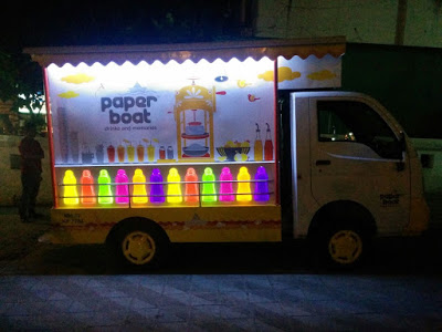
I have always enjoyed displays that interact with me, educate me and say, “Hey, the choice is yours.”   That is what I call, a great Point of Purchase display experience.

ASHISH DESHPANDE is an Industrial Designer, Co-founder & Director at Elephant. 
An alumnus of National Institute of Design, Ahmedabad, he is a keen Design Thinker, a member of India Design Council & Jury for India Design Mark. He has worked on several retail design programs, notably, Titan Eye+, Bajaj Auto, Probiking, Ceat Tyres, Axis Bank, ICICi Bank amongst others

<  Back to Blog

Need to gain disruptive insights

Changing consumer standpoint: Need to gain disruptive insights

Design research is gaining momentum for establishing good human factors. What are the trends that will impact the design research, how does new technology play a role in this new evolution and how does one reach out to the concerns of the new age end user.
By KRANTI VANJARI

‘Design Research’ is one kind of proficiency that uses an eclectic approach to understand deeper consumer needs. Empathy helps designers create products or services, which are best suitable for people needs.  It would be half a truth, if we consider Design Research as a tool used only by Designers. Consumer centric businesses also have the requirement to learn their user needs, which ultimately leads to a greater business opportunity.

There is a noticeable trend that more and more corporate brands are adopting Design is a tool to serve various business requirements whether it is about developing a new product or entering into a new consumer segment. This has also brought in more challenging opportunities to both designers & design researchers to create & refine methods to dig deeper and extract useful insights.

Buying is not just about buying

Working on a product, designers were looking out for a key question. Why does this consumer buy that product? A standard interview approach was not helping. We stepped back and realized that today buying is not about buying for a need, it is also about getting the best deal. Consumers are aware of the plethora of options available today. This is playing on their mind all the time.  We applied an interactive play tool for our research, which helped users to configure features that mattered the most, were willing to pay, why and what they valued as the best deal.

It is vital to make subjects think and reflect on their needs, a little play, story, a scene can open out people to a level of preparing prototype scenarios wherein consumers can make real time buying decisions based on their wishes.

Online vs. Offline

If we ask a present day consumer, how do they buy, they talk about online purchases, price & features comparison. People rate the best deal for them, and then they either buy online or offline. Today, consumers want a comparison between prices and products before they buy; but through a singular interaction, the way it happens online on a PC screen. In retail spaces, sales people help to compare but that is not always efficient. This learning was another eye opening trend that we observed.

People as consumers are changing. Online shopping has made them accustomed to make quick and sound decisions – purchase is just a click away. The greater responsibility for design research and designers is to explore these decision-making patterns used online and how it can be replicated in a brick and mortar scenario along with an enhanced experience.

Reassurance syndrome

If an alien were to visit a modern retail store, what will it see? People with their shopping carts, looking through numerous shelves and buying things for themselves. If one takes a closer look at this scenario, people are not only looking through the shelves, there is a lot of reading people do on and off the shelf.

One can imagine several hypotheses in such a scenario; like modern retail spaces are designed in such a way that products are more visible, readable even from a distance.

Clean up the space, make the product accessible to the consumer.

Another hypothesis could be people rely on their own subconscious thinking which keeps on alerting them while in a public space - “Am I getting judged because my shopping cart is looking less heavy than others”, “Am I picking the right pack or people around me are considering me an unhealthy junkie”, “I need to look smart so I must read carefully before any purchase”. Such thoughts are output of natural human behavior like; Mrs. Responsible, Mr. Righteous, neighbor’s envy, be no fool and so on. However, environments are also catalysts to evoking such reactions. And therefore, even while buying a regular brand, a shopper in a modern retail will not just look for a brand, but will read the Front or Back of pack to reassure herself about the content, health benefits, calorie contents etc. Yet another perception could be increased consciousness around health and appearance, which has led consumers to read a lot on the pack before buying. This is a trend; we cannot turn a blind eye towards. What is the story your product is telling, which will reflect reassuringly on the target consumer’s mind?

The new age consumer

Some of these consumer trends that we discussed, such as looking for best deal, online buying models or drivers to understand a product gives us a deep insight that the choices and preferences for buying have changed pragmatically. Influencers to these changes could be many like increased awareness, exposure, connectivity etc.

Here the interesting part is diversity and ambiguous patterns of consumer behaviors. Today’s consumers are loyal to brands at the same time, they are not afraid to express their opinions against it, if need arises. Even a basic experience about a product or service is shared or tweeted for increasing personal social quotient. Review based websites are flooded with feedbacks on minor inconveniences, not only for making use of the social platform but to express people opinion. It is the arrival of an aggressive age for consumers!

A consumer no longer is the unsung meek but rather a roaring warrior with multiple faces of expressions like the mythology figure, Ravana ( epic Ramayana ).

Marketers, researchers or business strategists have to become more sensible to understand the deeper grieve and eventually win people by addressing best solutions tailored for their needs but also value at affordable prices.

To understand today’s consumer and to dig more into their minds one has to take a diverse approach in the study. It might not be enough to make few handful people sit in a discussion and probe them for feedback. Such practice may or may not lead to unfeigned insights. One has to customize methods that are best suited to the intent of the study, right from clustering consumer cohorts by their behavioural patterns or to deploying interactive tools, which will help consumer express themselves freely. The social presence of the consumers cannot be ignored. Articulations based on people opinions on social media will provide added knowledge about people’s both offline and online life. A disruptive insight is a denouement, which is best achieved with help of tailored user centric approach and tools.

KRANTI VANJARI is an Asst. Manager, Subject Expert, Strategy & Design Research at Elephant. She has a graduate diploma in Mechanical Engineering, WCE and a Post Graduate Diploma in Strategic Design for Business, MIT Institute of Design, Pune, India.

<  Back to Blog

What works in Design consulting

What works in Design consulting? 

Ashish Deshpande takes a pause, to reflect upon the journey of 26 years at Elephant and describes the 3 parameters that keep Elephant to remain relevant & a value creator across years, for itself and its clients in Design Consulting.

Elephant over the past 26 years succeeded in establishing Design Consulting into an important element of business growth in India. It was not as though design practice did not exist in India before, but Elephant can be credited to put across one of the most professional & scaled up practices to emerge. The practice has over years inspired design entrepreneurship amongst a generation of designers. What is it that worked? Was it the brand play at work, polished over years, was it the caliber of people who tirelessly over years lent their effort & wisdom to the pachyderm of design or was it age, was it a moment of opportunity or pure destiny?

If I have to isolate one value that has been the hallmark of Elephant, it has been the quality of delivery. Our quality benchmark has remained consistent across projects, domains, years and clients. We consistently delivered quality projects as per customer expectations. This ability to consistency deliver projects has endeared us to clients as trusted design & innovation partners in their growth.

There are three key parameters that we use at Elephant to manage the consistent quality delivery of projects.

#1 Understand Empathise

#2 Craft = Life

#3 Time = Great Value

#1 Understand is to Empathise

Most designers, by the very nature of their talent tend to be self-focused when it comes to delivery of design concepts, solutions or ideas. Designers rely strongly on their intuitive ability, many a times loose sense of client objectives and even comfort. A professional practice needs to understand its stakeholders. They are one way or the other, users of design.    

Understanding comes through keen listening of what people have to say, summary of what that has been heard and then sharing for response.

During a boardroom presentation of concept for a medical analyzer, a junior service engineer made a remark that the service opening needs to happen from the top. Since, placing screw heads on the top was definitely an ugly proposition it was quickly shot down by the design team. Later one day, when the concept turned into prototype and it came up for testing. The Jr. Service Engineer promptly upturned the device to access the screws at the bottom. The top surface of the prototype was badly scratched by the time he finished test of the assembly. We had learnt an important lesson that day. The product was modified but we should have listened on day one.

People are always saying, giving clues, feedback and a design team must go beyond passive listening to critical & empathy based listening, write down the learning’s and share it back with the stakeholders.

Key here lies in empathizing in someone else’s shoes. Design action on these learning’s play a “flippant” role in creating relevant & acceptable solutions.   

#2 Craft is your Life

Delivery requires knowledge of a craft and skills need to be honed all the time. More important is the effort, designers or design teams put in a project, day after day. Design is about extreme sensitivity to small details. The continuity of a surface, the spacing between letterforms, fineness of the texture or be it the specific tone of a colour. There is nothing short of perfect. Perfectness is that very moment wherein a sensorial assembly gives you the goose bumps.

Robert Staples, Staples & Charles, while working on one of Eames projects narrated the meticulousness that went behind one of the Aluminum office chairs. He hand formed and filed the handle master, a good seven times, before the handle form got accepted.

As designers and professionals delivering the new, striving for excellence has to be integral to our soul. The quality of our craft has to be the essence of our life.

#3 Time is of Great Value

When clients commission projects, they believe that you are completely committed 8hrs a day for the period of the project. When projects are commissioned on the basis of time bound value, firms & professionals are expected to devote to thinking 24 x 7 period of the project. Yes, clients want you thinking about their concerns all through the period of engagement.

Professionals in design need to manage time, utilize the timeline in the most productive manner.

There are 86400 seconds in a day. As a professional in practice, it is important to understand how we distribute the time and what is the level of output that we generate in this period. This is true at individual level and also with teams.

Ask a student the value of time for the 1 year she missed, or value of 1 month to a mother who delivered premature or 1 week to the editor of a weekly or a commuter who missed his train by 1 min or a pilot who averted a disaster by a second.

At Elephant, much of our praise from clients is for meeting time targets. Breaking down tasks, aligning timelines, checkpoints, clarity in responsibilities during team activities is critical for reaching timeline milestones. However, these are basic principles of time management. How do they differ for a design consulting business? Design, as we know is an iterative activity. Any timeline can be described at best as approximation. Design managers need to be sensitive to nature of the project and extent of iterations than may come into play. Design as processes gains from failures and failure mode needs to be built into the design timeline.

UCT is the basic philosophy of design practice at Elephant and something that has withstood the passage of time. It is simple three point rule that will ensure that your talent is always supported by great service and business sense.

ASHISH DESHPANDE is an Industrial Designer, Co-founder & Director at Elephant. An alumnus of National Institute of Design, Ahmedabad, he is a keen Design Thinker, a member of India Design Council & Jury for India Design Mark.

<  Back to Blog