By Ashish Deshpande
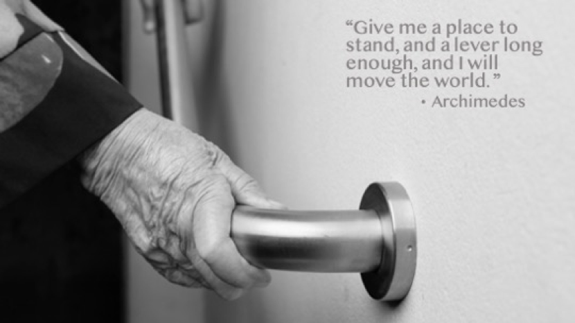
Many times, innovative problem-solving focuses on larger, game-changing solutions. Of course, there’s no problem with that — it works wonders when we consider the business & technology context. However, it is the tiny affordances in design that bring about the little joys of comfort that help build everlasting trust and acceptance.
Each one of us needs support. Well, most of us definitely do.
We’ve all perhaps had one elevator moment or another. Many times, I end up like a rabbit caught in the headlights as I fumble, trying to find my floor button on the elevator panel. It is such a grateful comfort to have a fellow commuter enquire about the floor and help me locate the button. A small help, nevertheless, goes a long way to release my stress with elevator panel buttons.
These are nothing but small mercies that sometimes come our way. On other occasions, they simply end up contributing to a poor experience. As we run through a plethora of objects and events, how many times can we actually accept this discomfort and simply get on with life?
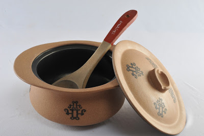
I am reminded of one of my first assignments as an Industrial Design professional at Elephant™, almost three decades ago. I was commissioned to design a cookware pan. And I was thinking to myself, what is there to design in a cooking pan? It is round, has a lid and a handle. This question took me to the kitchen and I began undertaking latent, behavioral observations during the cooking process. The lady I was shadowing stopped stirring her pot, wiped her spatula on the edge of the pot, and then interestingly, took out a bowl to park the soiled spatula. The domed surface of the pot lid prevented use as a parking space for spoons and ladles. Leaving the spoon in the pot was not an option for the fear of getting a smarting burn. Since most cooking needs the occasional stir, it was apparent that parking a spoon or a ladle was an underlying concern hitherto under-expressed. This led us to design the first Split handle lid that allowed any cook to park their spoon or spatula. This feature, however small, was much appreciated by cooks & chefs and this led to the introduction of a generic feature in each subsequent range designed for Nirlep™, all carry a feature to park spoons & spatulas. A feature that was emulated and copied by several other brands.
Paperboat™ memory drinks package is another story. Having watched a flyer on a flight struggle to open a beverage cap, a simple winged cap not only provided a distinct form but made the experience of beverage consumption a breeze. Getting rid of the little struggles, kinks, and streamlining the user’s experience goes a long way in building great brands that inspire trust and customer confidence.
Take a good look around and try and look at products that you like. It is worthwhile to ask — Why do we like those products? I’ve used a Lamy™ ink pen for over two decades. Apart from the many features that this pen possesses, there are two outstanding details that got me hooked. Just above the nib, the finger grip features twin symmetrical surface scoops that very elegantly park my fingers, making writing & sketching a comfortable experience. And then, on the cap of Lamy™ is a simple wire clip detail that subtly curves outwards to allow for easy insertion into a pocket or a sheaf of papers.
Ludwig Mies van der Rohe, the German Bauhaus architect, famously remarked, “God is in the details.” It is that little bump, that little trough, a groove, a bend that works to make a difference between pain and pleasure. It is that 1% attention to detail that makes a product work and be loved. It separates the chaff from the long-life winners, true tools of our age that really make our life simple.
The next time you find yourself designing a product or simply buying one, look out for those little hidden gems that provide relief and put a smile across your face. Your smile is a direct reflection of those small mercies, indicating good design at work.
“Many small people, who in many small places do many small things, can alter the face of the world.” African Proverb
Elephant Design is India’s Best Design Practice (ET-Brand Equity 2012–2020 ranking) with a multi-disciplinary experience of 32+ years having presence in India & Singapore and has been transforming brands, organizations & businesses using Design-led Innovation.
ASHISH DESHPANDE is an Industrial Designer, Co-founder & Director at Elephant™. An alumnus of the National Institute of Design, Ahmedabad, he is a keen Design Thinker, a member of the India Design Council & Jury for India Design Mark. He has worked on several design programs, notably, Titan Eye+, Ceat Tyres, Axis Bank, ICICI Bank, Asian Paints, Symphony, Paperboat, JAWA and works on medical & healthcare devices amongst others. Ashish is a certified Independent Director, Board of Directors, Symphony Limited, a public listed company.
* First picture is used for reference and the rights belong to its creator. All other pictures are by the author of this article.

