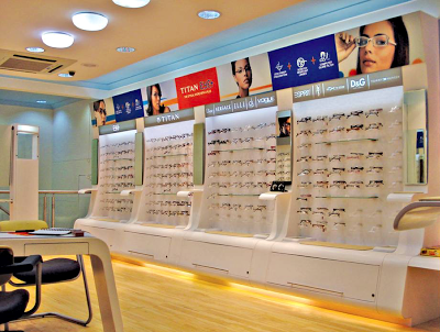
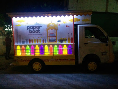
Value of Good Design Thinking in Retail? Effective 'Point of Purchase' Displays
How does a designer ensure all the goodness and efficacy behind Point of Sale touch points across retail environments?
A few principles at work.
By ASHISH DESHPANDE
“ Few years ago, when my son was still a toddler, I took him one day to a candy store. It was his first visit and he was thrilled & squealed with delight. He ran about the store for a while with the intension of grabbing every bit of the colour feast unfolding before him. Eventually when I mentioned to him that he had to make a choice, he was confused for a while. He could not let go all that he was seeing in front. Finally, he settled for the brightest, biggest and the most accessible jar of candy.”
Concerned by the state of the world, revered German Designer, Dieter Rams, Chief Designer for the brand, Braunonce stated, – “an impenetrable confusion of forms, colours and noises.” Any modern retail or even a corner high frequency store presents a marketing & retail nightmare for creating an effective sales pitch at the actual point of sale. Customer may have been drawn to a store for a product brand through an effective advertisement campaign. Advertisements many a times are dramatic visual aspirations, which present the products in a utopian manner. The same products inside stores are a different story. They are lost amongst myriad of other products, store environments and simply too many people in our country.
Retail thinking at point of purchase must be smart & effective. Purchase aids get fleeting seconds to engage the customer about product benefits. These rare moments are the one’s that determine whether your point of purchase merchandise is successful or a waste of valuable time & resources.
Modern retail today is a jigsaw of shelves with piles & stacks of merchandise. Each is bolder & brighter than the other. If you are lucky to spot the product brand of your choice, you may as well clap and give yourselves a pat on the back. It is in these conditions that effective purchase displays create a breathing space for your products. A well conceived product purchase display can very easily focus entire attention towards the product it is displaying, engage the customer (not entice!). There is a thin line separating a successful point of purchase and the ones lost amongst the packs of time. Good design thinking and smart application is the base of the few lessons that I have learnt.
Be innovative.
Great Point of Purchase displays are always differentiated. They present a new solution to display the goodness of the product in a manner not seen every day. Wow! moment’s can be built within innovative displays yet they must never overstep the product.
Right position.
Point of purchase element must present itself at the right moment in the customer journey through any retail environment. This is that moment in the journey of the customer when her mind should not be occupied by other engagements. Catching her attention at the right moment is crucial to creation of an engaging share in the customer's mind.
Product placement.
It always helps to present the product at a convenient eye level. The product must be approachable and within easy reach. The visual access to the entire product must never be blocked in the line of sight. View must be the best view of the product.
Clear message.
When a customer understands benefits and key differentiation presented by the product on display, it is an example of good Point of Purchase. Message is dispensed quickly & effectively. Key points of the message are boldly presented and secondary information is segregated to areas where it will be most effective.
Visible aesthetics.
Shopping is an experience and a good display must appeal to the customer senses. Well-designed & executed displays add to the customer delight and general well being. They help create a positive attitude towards the displayed merchandise. Yet a display designer must always make products stand out through their presence or absence. Choice of colour, form and material must take into account the environment, competing products, shelf colour and lighting conditions.
Tipping point.
Display designers must be aware of the unique selling proposition of the product on display. An effective display is a culmination of a series of events that take place in a flash, the moment your display catches customer attention. All these events must lead to effectively closing the deal by clearly indicating the unique benefits of buying the product. It must provide sufficient inputs to the customer to make an informed decision based on conviction and assurance. The display must help close the sale.
Honest.
Point of Purchase must never attempt to manipulate a customer with promises that cannot be kept. Displays should never portray a product in a manner that makes it more innovative, more powerful and more valuable that it really is at present. Very quickly customers can lose trust built over years in the product or even worse, the mother brand.
Design is Detail.
Great modernist designer, Ludwig Mies van der Rohe, once said, “God is in the details.” Execution of your Point of Purchase idea is as important as the idea itself. Don’t leave details in the display to chance. Good detailing shows respect towards the customer. A well placed screw or a tacky sticking attempt can spell disaster for a good product launch. Remember the quality of your display rubs directly on the quality of your product and brand.
Life and reuse.
Many times the displays can be reused to display products over a longer time period. Displaying other products from the range makes the display proposition cost effective. Make the display last even in today’s use & throw social norm. Be aware of the life cycle of the product display. Think if the structure can be reused or recycled. Can it double as packaging? This way your rupee runs longer and so do the resources on our Earth. Don’t add to the waste already being created. Think environment ( No client or boss will tell you this ! )
Keep evolving.
Prototype. Prototype. And Prototype. Point of Purchase is not a onetime exercise where you fire & forget. Build in a step in your process of taking feedback from customers and field workers. A designer must understand what works and what does not work. This is critical to creating flawless displays, which relate to the customers.
I have always enjoyed displays that interact with me, educate me and say, “Hey, the choice is yours.” That is what I call, a great Point of Purchase display experience.
ASHISH DESHPANDE is an Industrial Designer, Co-founder & Director at Elephant.
An alumnus of National Institute of Design, Ahmedabad, he is a keen Design Thinker, a member of India Design Council & Jury for India Design Mark. He has worked on several retail design programs, notably, Titan Eye+, Bajaj Auto, Probiking, Ceat Tyres, Axis Bank, ICICi Bank amongst others


