Tata Salt partnered with Elephant to reach out to over seven crore households across the nation with a limited edition packaging. This specially designed pack not only displays the athletes proudly on the tricolour background, but also has a call-to-action where consumers can give a missed call to register their wishes to support the Indian Olympics
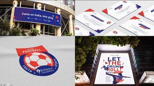
Grassroots Indian Football & Elephant
Proud to partner with RF Youth Sports that is set out to revolutionize grassroots sports in India
Inaugural football season has kicked off across 8 cities with 1000+ participating schools & colleges
BRITANNIA - partner of the month
And the award for "Partner Of The Month" goes to .... for featuring us in Britannia's in-house magazine.
Have you tried this best ever bread that tells you what it is made of, loud and clear, by design
FINGER LIX - Ready & Accessible
Highlighting food that is ready & accessible
Using design, adding enriching experience and communicating the delight. Check out our latest intervention with finger licking food Start Up !
yes. we are excited to work with start-ups. especially if they happen to be a crack team of marketing consultants we enjoy working with!
Here's to every success... from Team Elephant to Team FINGER LIX!
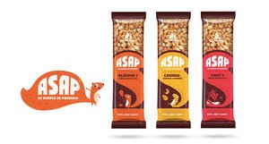
Nuts anyone?
Story, naming, packaging & visual assets for a start-up.
Can't wait to bite into it? Don't wait. BiteASAP.
Tata CLiQ - Branding in Ecommerce
And this is how a contemporary ecommerce brand gets launched!
Tata CLiQ selfie moment of Mr Cyrus Mistry, Mr Noel Tata & Mr Ashutosh Pandey.
Brand naming, brand identity, visual language, visual assets by Team Elephant!
Symphony partners with Elephant to makes ‘wall-mounted’ air cooler
Key function of design is to improve life for its user and CLOUD from Symphony does exactly that. Team Elephant designed CLOUD, world’s first Wall Mounted Evaporative Cooler that frees you from monstrous air cooler boxes that block windows.
CLOUD uses innovative details and clever packing that enables a fully functional, remote operated cooler including water tank right up there on the wall! In a red ocean cooler market, this design effort is a great example of “Human Centred” product innovation. The cooler draws hot air from top of the room and sends down cool air exactly as desired. The product is a power saver as it consumes about 10% of the power that air-conditioners require and is designed with robust construct in engineering plastics that are recycle grade.
Symphony has filed for a global patent for this unique product, making it the first air cooler company in the world to file for a global patent.
http://www.thehindubusinessline.com/companies/symphony-makes-worlds-first-wallmounted-air-cooler/article8556455.ece#comments
MTR foods - new identity, packaging & story
About the refreshed MTR visual identity:
MTR, the brand with the outstanding legacy, global outlook and millions of happy consumers was looking at realigning its visual identity to the core purpose of rooted transformation.
We decided to retain the basic visual equity of red roundel with white fence and worked on improving the typography for ease & clarity in reproduction across variety of substrates & sizes. We created a bold sans serif brand-mark for cleaner & contemporary presence. We also reduced the picket fence elements around the logotype to de-clutter the identity. Natural ingredients being the core of all MTR products, a fresh green was added to the roundel to announce meaning & mission of the brand.
About the packaging strategy & design:
With changing roles within new family structures and new working patterns, women are not burdened by the need to prove their expertise in kitchens. They see their role as a family manager & look for ways to keep the family happy & healthy. Buying ready to cook, ready to eat & even ordering-in food is seen as a great way to ensure quality time with family. They are open to experimentation & introduce their family to new cuisines with ease. But they want to do this with knowledge. They want to be aware. They want to know the source, the ingredients, quantities, accompaniments, consumption occasions? basically everything.
So when we were given the responsibility of designing packaging for the entire range of MTR products, we decided to dive deep into finding out what the changing consumer will be delighted with.
With a portfolio as large as 140+ products, first thing to do was to discover what works as an equity for MTR and preserve or even enhance that. Next step was to question & evaluate existing information architecture & remove redundancies to make way for cleaner, user-focused bytes. Though it sounds like the most obvious thing to do, we brought in a strong product nomenclature that would catch the eye and remove any ambiguity. We decided to retain the strong red associated with the brand and build upon that by devising a colour code for each category for ease of purchase. We created three strong visual pillars for the product portfolio ? pure authentic, confident contemporary and everyday celebrations. These moods were created within the master visual template to further accentuate the brand expertise and its involvement at every need and stage of the modern consumers' life. Since products like Sambar are available in multiple formats like masala powders, ready-to-cook mixes & ready-to-eat meals, we brought the category descriptor right up followed by the consumption occasion & announcements like time for cooking, whether anything needs to be added etc. A product shot is one of the most important factors for an impulse purchase in foods and our team planned each shot meticulously, keeping in mind time of the day, occasion and accompaniments. Authenticity was built through right serving sizes, ingredient depiction and serving bowls.
Since there is lot of curiosity about food from other regions, we have added a very interesting background of region of origin for every dish. It is a subtle addition, but one we hope will be discovered to the delight of consumers and strengthen the brand's expertise pan India.
http://www.campaignindia.in/Article/401709,mtr-foods-adopts-a-new-identity.aspx
Sanjay Sharma – CEO, MTR Foods, said, “Today’s consumers have evolved quite a bit – both in terms of their food preferences as well their consumption patterns. They prefer Indian food but perceive it to be cumbersome and time-consuming. Our brand is the flag bearer of innovative, easy-to-make, nutritious and authentic-tasting products that take away the time dimension from cooking and make Indian food more accessible to consumers."
He added, “However, as a brand we needed to change to reflect who our key consumers are today. While the new brand identity better represents where the company is today, our detailed growth strategy will make MTR ready for the future. This is the new beginning for MTR Foods and we are confident that the changes we have undertaken and our new brand identity will make us a part of our consumers’ everyday lives.”
Ashwini Deshpande, co-founder and director, Elephant Design, noted that the re-branding exercise involved defining renewed purpose, creating visual identity and packaging communication, evolving portfolio strategy and packaging design for over 120 products, sold as 350 SKUs.
Packed for the season
It feels good to see your products assembled, packed for the season, up there in the stores and most important people using them to make their lives better. Elephant team at manufacturing plant gets into the last mile.
How does Design affect business ?
How does Design affect business ?
"Design is as much craft as it is insightful thought."
Like we say at elephant, doing a cool design for "limited edition" is alright, but what can we do it for a mainstream product that sells in excess of a million every single day!
Britannia breads packaging needed to reflect the positive & healthy change in recipes. With misconceptions around brown, wheat, whole wheat & so on, we wanted to give each variant a distinct identity so that consumer is fully aware of what she/ he is picking up. With a conversational tone and cheerful illustrations, this sure is a welcome change for these loaves… about 1.5 million of them are selling like hot breads now...
Bready affair...
Centre of Excellence, Elephant, Team, Pune.
Trophy Design: Sublime interplay of craft & emotion
Trophy Design: Sublime interplay of craft & emotive sensibilities
What is the reason to give trophies at events? Some learnings from our past and a few examples from our present.
By ASHISH DESHPANDE
“When I won in 2003, never in my wildest dreams did I ever think I would win Wimbledon and have my kids seeing me lift the trophy, so this is pretty surreal.” – Roger Federer
I am sure it was the level of the game, the competitive spirit, ability to win that mattered the most to the world numero-uno tennis champion; however, the trophy represented a chiseled memory of all that effort in an iconized form.
The word trophy is derived from the Greek word Trapaion, which represented spoils of the battle collected by the victorious. TheseTrapaions were proudly displayed at the battle field and even back home to celebrate & etch into memory, defining moments of a battle or an event. The trophies in this period were battle arms, body parts, amphoras, columns and in later years, Chalices. Hunting trophies were animal heads adorned on plaques and hung on walls.
The word trophy coined in English in 1550, was derived from the French trophée in 1513, "a prize of war", from Old French trophee, from Latin trophaeum, monument to victory and many were dedicated to Gods. Chalices were given away since 1600’s as trophies at sporting events.
The Loving Cup at Wimbledon is a cup shaped trophy, a human figurine iconizes the Oscar awards. The FIFA World Cup is another famous trophy, designed by Italian Artist, Silvio Gazzaniga, who described the trophy thus, "The lines spring out from the base, rising in spirals, stretching out to receive the world. From the remarkable dynamic tensions of the compact body of the sculpture rise the figures of two athletes at the stirring moment of victory."
A trophy today, represents a miniaturized sculpture, an exclusively crafted, unique embodiment of emotions, brand values all brought out through immaculate craft work, materials and finishes. A trophy design represents the dual nature of design wherein, design as a craft, and design for emotive response takes precedence.
There are a few other themes under which trophies are designed for a variety of intentions;
Activity Icon
Overdrive Awards, celebrates excellence in the automotive world. The trophy iconized the gear-shift knob in an elegant poise. The shaft that bears the knob is more human in expression than mechanical. The trophy was originally conceived in brass but later versions have been created in aluminum investment casting, with shot blast finish. The crystal is polished, faceted glass.
Pursuit of Excellence
Nobel laureate and founder of the Grameen Bank, Dr. Muhammad Yunus was conferred the “Person of the Year” award by Sakaal Group. The award trophy embodied the prestige through a lotus, representing quest for knowledge in mud and a crystalline bloom that reached out for the sky as a symbol of excellence. The trophy was handcrafted in copper sheet and the glass crystal is hand polished.
Theme Building
Brand values and themes need to be distilled to celebrate those who strive hard to achieve the values through their work. Many of these are professional achievements or corporate motivators.
The Suzlon One Earth award represents sustainability concerns. The award encompasses a fragile Earth represented by a transparent globe surrounding by a hand-crafted universe of all that we stand for in this world. The trophy is crafted in copper with engravings representing a humanized effort.
Mobility Vision is a program to design a transportation solution for emerging economies. The trophy highlights the logo of the completion, a visionary eye. The trophy is machined using aluminium block, shot blasted and anodized for the final finish & effect.
The “C-Mission” Compliance Award is an annual recognition of those who excel in legal compliances by Legasis. The trophy form is indicative of excellence and precision towards 100% compliance while 3-dimensionaly projecting the “C-Mission” brand logo.
Form factor and materials play a key role in evoking the right response from the beholder of the trophy. Design plays a key role in establishing keen understanding of theme, brand play, materials, finishes & production processes.
ASHISH DESHPANDE is an Industrial Designer, Co-founder & Director at Elephant. An alumnus of National Institute of Design, Ahmedabad, he is a keen Design Thinker, a member of India Design Council & Jury for India Design Mark. He has worked on several design programs, notably, Titan Eye+, Ceat Tyres, Axis Bank, ICICI Bank, Symphony, Paperboat and works on medical & healthcare devices amongst others.
Smart City: Exploring the Myth
What is Smart City: Exploring the Myth
India PM, Narendra Modi, announced his vision of Smart Cities across India recently. There is also an announcement of 98 cities that will benefit under this initiative. Smart city concept explained through a series of info graphics
By ASHWINI DESHPANDE
Indian Government’s definition of Smart City focuses on improving the conditions of Indian cities to make them more livable and friendly. This also includes improving infrastructure facilities and creating better environment for investors. While there will be large budgets allocated for the development, public participation and citizen voice will form the backbone of this initiative.
Policies & government initiatives always mean well, however, it is very difficult to communicate the extent of an initiative to ordinary people. Government programs are mostly verbose with a healthy sprinkling of legally safe lexicon. People need to understand these programs, their benefits and extents to be able to participate. Communication needs to be broken down and abstract concepts iconised to put across simple & quicker understanding.
How does technology simplify our lives? Demystifying technology and applying to examples from our daily lives communicates the usefulness of its application.
Others have done it ! Why can’t we do it? Info graphics helps create a picture of key benefits of smarter living in other parts of the world.
And finally, how does all this smart thinking, smarter living in smart cities, change my life as a citizen. It is important to talk to people and put across their thoughts on how smart cities will affect various facets of their day to day living.
Elephant team worked with Sakal Media Group to create simple communication & infographics that explain the concept of Smart Cities along with a case study & voices of prominent personalities on their vision of Smart Pune City.
Elephant is India’s Best Design Practice (ET-Brand Equity 2012-2014 ranking) with a multi-disciplinary experience of 25+ years having presence in India & Singapore and has been transforming brands, organizations & businesses using Design led Innovation.
ASHWINI DESHPANDE is a Visual Communication Designer, Co-founder & Director at Elephant. An alumnus of National Institute of Design, Ahmedabad, she is a prolific speaker at several international conferences & workshops on design. Ashwini has been a jury on Spikes Asia, Design Lion Cannes and Design for Asia Awards. She is a subject expert on Brand Identity Programs & Package Design and known for her highly effective work for Britannia, Paperboat, Nirlep, Grandmaster, P&G and Piramal Industries.
Automotive brands in India : Matter of pride, passion & purpose
Automotive brands in India : Matter of pride, passion & purpose
By Ashwini Deshpande along with Ashish Deshpande
World over automotive brands have stood for finesse, luxury, hi end functions, if not more than often, for speed, power & vitality. In India, majority of transportation solutions serve the purpose of work commutation, people & goods transporters, and most importantly as a means of livelihood. Whether global or Indian, automobile brands get a cult following and people take pride in the badge of their choice.
It is important that brands are targeted towards the people who are going to be experiencing them as products & services. Brands need to reflect their aspirations, connect on an emotional level and build confidence by associating positively.
When a vehicle becomes your lively hood, people look for answers on more than one axis of their lives. The design team was faced with a challenge to create the visual identity with all its manifestations for Eicher Polaris, who recently launched India’s first multi-purpose personal utility vehicle. The answers lay in understanding people who would use these vehicles. The progressive Indian entrepreneur has no concept of boundaries as he is often multi-tasking personal chores with business needs. He is living every moment & making the most of it.
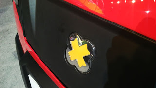
Multix brand is inspired by the local regional concept of “zindagimultiplied” (translates as life multiplied) as a visual language clue. The badge has been designed as a perfect geometry, and has layers to discover & identify with the person for who the vehicle will be a livelihood partner. At the first glance it is a happy bloom in cheery yellow, which is also the primary brand colour. It also serves as an elegant enclosure to the multiplier symbol, which really is the essence of this brand. Multix brand is designed to be an enabler for unlocking & multiplying potential opportunities resulting in prosperity for the target consumer.
Typography is clean emphasising high functionality & contemporary outlook. Yet the lower case “m” starts the conversation on a friendly note with emphasis on technology & ending by reiterating the multiplier effect. Colour palette is largely built around bright colours evident everywhere in India. They add to the noticeability & celebratory appearance of the brand.
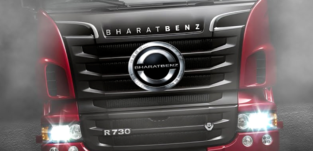
The answer again lay with the way people saw the brand highlight over a score of well-settled existing truck brands. The word, “Bharat” (India ) brought around a sense of pride with the commercial vehicle operators, made them feel special that a truck has been created for Indian needs. “Benz” infused that sense of technical expertise & confidence of a global brand.
Bharat Benz typestyle demonstrates expertise, and is contemporary with an emphasis on the word BENZ. The badging is a balance of legacy of shield & wreath from the older Benz identity and clean circular forms representing the global nature of the brand.
Adding to the Benz palette of black, grey & steel, the design team decided to bring in warmth to connect with people through a brilliant deep red. This also helped pushed the style & power quotient across retail & communication.
Next time you re-look at an automotive brand in India, look from the eyes of its users’, feel from their heart and understand how they see their future reflected in the brand of their choice.
ELEPHANT is India’s Best Design Practice (ET-Brand Equity 2012-2014 ranking) with a multi-disciplinary experience of 25+ years having presence in India & Singapore and has been transforming brands, organizations & businesses using Design led Innovation.
Elephant has helped build two significant automobile brands in its rich history of 25 years; rebranding of Bajaj Auto and then a distinction of being the only design consultancy outside Germany to have created a new brand for Daimler Group called Bharat Benz for their India-centric trucks. Multix by Eicher Polaris is the newest bloom and makes Elephant perhaps the only team in India to have three automobile brands on the road.
ASHWINI DESHPANDE is a Visual Communication Designer, Co-founder & Director at Elephant. An alumnus of National Institute of Design, Ahmedabad, she is a prolific speaker at several international conferences & workshops on design. Ashwini has been a jury on Spikes Asia, Design Lion Cannes and Design for Asia Awards. She is a subject expert on Brand Identity Programs & Package Design and known for her highly effective work for Britannia, Paperboat, Nirlep, Grandmaster, P&G and Piramal Industries.
ASHISH DESHPANDE is an Industrial Designer, Co-founder & Director at Elephant. An alumnus of National Institute of Design, Ahmedabad, he is a keen Design Thinker, a member of India Design Council & Jury for India Design Mark. He has worked on several design programs, notably, Titan Eye+, Bajaj Auto, Probiking, Ceat Tyres, Axis Bank, ICICI Bank, Krusty's, Symphony, Paperboat amongst others
Creating New Auto Brand
Automotive brand for India’s first Personal Utility Vehicle
While developing India’s first multi-purpose personal utility vehicle, Eicher Polaris approached Elephant to create the visual identity, it’s 3D avatar & livery.
The range of vehicles is named “Multix” after its extreme versatility and is being launched across 30 cities in India starting Jaipur this month.
As a ground-up innovation, Multix is designed as a concept that brings about a positive multiplier in the owner’s life, be it home, business or power.
Multix brand is inspired by the Indian concept of “zindagi multiplied” aesthetics. The badge has been designed as a perfect geometry, and has layers to discover & identify with. At the first glance it is a happy bloom in cheery yellow, which is also the primary brand colour. But if you look again, it is an elegant enclosure to the multiplier symbol, which really is the essence of this brand. Multix is designed to be an enabler for unlocking & multiplying potential opportunities resulting in prosperity.
Typography is clean & contemporary, yet the lower case “m” starts the conversation on a friendly note with emphasis on technology & ending by reiterating the multiplier effect.
Colour palette is largely built around bright colours evident everywhere in India.
Elephant has helped build two significant automobile brands in its rich history of 25 years; rebranding of Bajaj Auto and then a distinction of being the only design consultancy outside Germany to have created a new brand for Daimler Group called Bharat Benz for their India-centric trucks. Multix by Eicher Polaris is the newest bloom and makes Elephant perhaps the only team in India to have three automobile brands on the road.
Elephant is India’s Best Design Practice (ET-Brand Equity 2012-2014 ranking) with a multi-disciplinary experience of 25+ years having presence in India & Singapore and has been transforming brands, organization & businesses using Design led Innovation.
Design Thinking in Retail
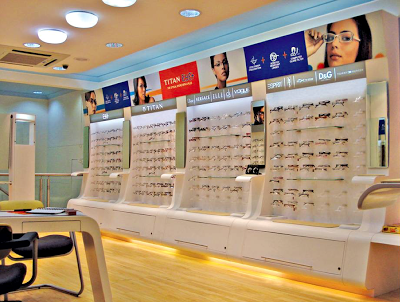
Value of Good Design Thinking in Retail? Effective 'Point of Purchase' Displays
How does a designer ensure all the goodness and efficacy behind Point of Sale touch points across retail environments?
A few principles at work.
By ASHISH DESHPANDE
“ Few years ago, when my son was still a toddler, I took him one day to a candy store. It was his first visit and he was thrilled & squealed with delight. He ran about the store for a while with the intension of grabbing every bit of the colour feast unfolding before him. Eventually when I mentioned to him that he had to make a choice, he was confused for a while. He could not let go all that he was seeing in front. Finally, he settled for the brightest, biggest and the most accessible jar of candy.”
Concerned by the state of the world, revered German Designer, Dieter Rams, Chief Designer for the brand, Braunonce stated, – “an impenetrable confusion of forms, colours and noises.” Any modern retail or even a corner high frequency store presents a marketing & retail nightmare for creating an effective sales pitch at the actual point of sale. Customer may have been drawn to a store for a product brand through an effective advertisement campaign. Advertisements many a times are dramatic visual aspirations, which present the products in a utopian manner. The same products inside stores are a different story. They are lost amongst myriad of other products, store environments and simply too many people in our country.
Retail thinking at point of purchase must be smart & effective. Purchase aids get fleeting seconds to engage the customer about product benefits. These rare moments are the one’s that determine whether your point of purchase merchandise is successful or a waste of valuable time & resources.
Modern retail today is a jigsaw of shelves with piles & stacks of merchandise. Each is bolder & brighter than the other. If you are lucky to spot the product brand of your choice, you may as well clap and give yourselves a pat on the back. It is in these conditions that effective purchase displays create a breathing space for your products. A well conceived product purchase display can very easily focus entire attention towards the product it is displaying, engage the customer (not entice!). There is a thin line separating a successful point of purchase and the ones lost amongst the packs of time. Good design thinking and smart application is the base of the few lessons that I have learnt.
Be innovative.
Great Point of Purchase displays are always differentiated. They present a new solution to display the goodness of the product in a manner not seen every day. Wow! moment’s can be built within innovative displays yet they must never overstep the product.
Right position.
Point of purchase element must present itself at the right moment in the customer journey through any retail environment. This is that moment in the journey of the customer when her mind should not be occupied by other engagements. Catching her attention at the right moment is crucial to creation of an engaging share in the customer's mind.
Product placement.
It always helps to present the product at a convenient eye level. The product must be approachable and within easy reach. The visual access to the entire product must never be blocked in the line of sight. View must be the best view of the product.
Clear message.
When a customer understands benefits and key differentiation presented by the product on display, it is an example of good Point of Purchase. Message is dispensed quickly & effectively. Key points of the message are boldly presented and secondary information is segregated to areas where it will be most effective.
Visible aesthetics.
Shopping is an experience and a good display must appeal to the customer senses. Well-designed & executed displays add to the customer delight and general well being. They help create a positive attitude towards the displayed merchandise. Yet a display designer must always make products stand out through their presence or absence. Choice of colour, form and material must take into account the environment, competing products, shelf colour and lighting conditions.
Tipping point.
Display designers must be aware of the unique selling proposition of the product on display. An effective display is a culmination of a series of events that take place in a flash, the moment your display catches customer attention. All these events must lead to effectively closing the deal by clearly indicating the unique benefits of buying the product. It must provide sufficient inputs to the customer to make an informed decision based on conviction and assurance. The display must help close the sale.
Honest.
Point of Purchase must never attempt to manipulate a customer with promises that cannot be kept. Displays should never portray a product in a manner that makes it more innovative, more powerful and more valuable that it really is at present. Very quickly customers can lose trust built over years in the product or even worse, the mother brand.
Design is Detail.
Great modernist designer, Ludwig Mies van der Rohe, once said, “God is in the details.” Execution of your Point of Purchase idea is as important as the idea itself. Don’t leave details in the display to chance. Good detailing shows respect towards the customer. A well placed screw or a tacky sticking attempt can spell disaster for a good product launch. Remember the quality of your display rubs directly on the quality of your product and brand.
Life and reuse.
Many times the displays can be reused to display products over a longer time period. Displaying other products from the range makes the display proposition cost effective. Make the display last even in today’s use & throw social norm. Be aware of the life cycle of the product display. Think if the structure can be reused or recycled. Can it double as packaging? This way your rupee runs longer and so do the resources on our Earth. Don’t add to the waste already being created. Think environment ( No client or boss will tell you this ! )
Keep evolving.
Prototype. Prototype. And Prototype. Point of Purchase is not a onetime exercise where you fire & forget. Build in a step in your process of taking feedback from customers and field workers. A designer must understand what works and what does not work. This is critical to creating flawless displays, which relate to the customers.
I have always enjoyed displays that interact with me, educate me and say, “Hey, the choice is yours.” That is what I call, a great Point of Purchase display experience.
ASHISH DESHPANDE is an Industrial Designer, Co-founder & Director at Elephant.
An alumnus of National Institute of Design, Ahmedabad, he is a keen Design Thinker, a member of India Design Council & Jury for India Design Mark. He has worked on several retail design programs, notably, Titan Eye+, Bajaj Auto, Probiking, Ceat Tyres, Axis Bank, ICICi Bank amongst others
Brands in 2k Crore club
Congratulations Britannia Good Day and Britannia Marie Gold on being part of the 2,000 cr club! Elephant has been a proud design partner to both these brands since 2007.
Watch out for more from them & from us.
http://www.business-standard.com/article/management/first-among-equals-115051901496_1.html
PM Modi 365 - Editorial concept
For detail in English
http://epaper.sakaaltimes.com/SakaalTimes/26May2015/Normal/index.htm
For detail in Marathi
http://epaper3.esakal.com/26May2015/Normal/PuneCity/index.htm
New university, legendary values
BACKGROUND:
Bennett University, an initiative by the Times Group plans to establish a world-class institution that will become the launch-pad for youth to be ‘future ready’. The university derives its name from Bennett, Coleman & Co Ltd (BCCL), the holding company for The Times Group. Elephant was invited to create the visual identity for this prestigious project.
CHALLENGE:
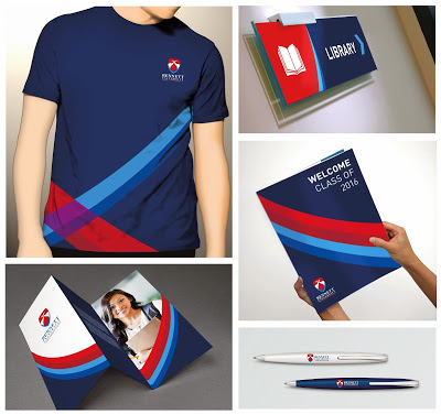
With the illustrious legacy of Times Group, the visual identity of the university needed to depict the gravitas and lineage of its mother brand, yet carve a fresh image for itself that would be relevant to various stakeholders that include faculty and students.
SOLUTION:
The visual identity has three clear mandates: 1. Establish global outlook, 2. Align with progressive, yet rooted philosophy of the group, 3. Be the beacon of knowledge-seeking
The starting point for the identity was the legendary crest of the Times Group, which is synonymous with the values the group upholds and that lend themselves to the university as well.
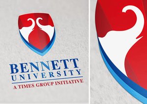
The elephants, shield and the classical symmetry of the crest were picked up for developing a simple yet powerful and contemporary visual expression.
The colour palette chosen was evolved to suit the brand persona.
Rich shades of red from the mother brand are complimented by shades of blue creating an elegant & timeless colour palette. While Blue stands for knowledge, expanse and technology, it also brings in the global appeal. Red symbolizes passion, warmth and celebration while retaining rootedness. Together they signify nobility, gravity and yet appear youthful and vibrant.
The typeface for Bennett University has been carried forward from the iconic Times of India identity, again to be synonymous with the legacy, which is trusted, progressive and pro-growth. An association the university will proudly and actively champion.
The final identity evolved as a meaningful abstraction of a legacy brand with many more layers to it. While the original crest had its elephants in a more static posture, its new interpretation is consciously that of interaction, action and pride. The elephant heads are depicted with their trunks dramatically raised that signify looking up, seeking & celebrating.
The form of a shield, again originating from the crest acts as a containing element and is depicted with subtle rays signifying radiance and positivity. The form evokes a regal and trustworthy sensibility while the multiple shifting shields reinforce growth and prosperity.
A second layer of discovery is the negative space between the elephants that form the top of a temple symbolizing the university to be a temple of wisdom and knowledge. The entire red portion in the shield also forms an elegant decorative ‘T’ subtly hinting at the legacy of the institution.
LAUNCH:
In April 2015, the foundation stone of the university was laid by Chief Minister of the state of Uttar Pradesh along with BCCL MD Vineet Jain.
Bennett University is slated to begin operations from July 2016. To begin with, Bennett University will offer undergraduate, post-graduate and doctoral courses in engineering, management and media. It will expand to offer courses in design, law, liberal arts and applied sciences.
Whatever Floats - Paper Boat
It (paper boat) could well be the “cola” of Indian ethnic drinks. - VT Bharadwaj, MD, Sequoia Capital
Packaging Emotions
Creative Gaga Magazine published by Open Bracket Publication celebrates good design. And is a great reference for techniques, insights and inspiration. Their latest issue is a "Packaging Design" special. And they invited Team Elephant to design the cover! (who else?)... with Mayuri Nikumbh, Suraja Acharekar, Rimpy Batra, Partho Guha


