Every cat parent knows: humans don't own cats – cats own us. So why do cat food brands keep missing this delightful dynamic?
For Allana Group's newest pet food venture Purrfeto, we embraced this truth. Drawing from Italy's rich cultural heritage, we created a brand world that celebrates cats as they truly are – sophisticated, unpredictable explorers who occasionally grace us with their presence. Our design system features a bespoke logotype with subtle feline elements, a distinctive royal purple palette, and a Bengal cat mascot that speaks to modern pet parents. We know you're not just feeding your cats – you're catering to your home's true decision makers! Head to our website to read more, link in the comments.
Thoughtful Design Transforms Millets into a Staple for Contemporary Audiences
Can packaging design help ancient grains find their place on modern shelves?
In a millet-fuelled market, where health meets heritage, design takes centre stage. Packaging isn't just about aesthetics; it's about storytelling—highlighting the nutritional, cultural, and ecological value of millets. From earthy textures to regional motifs, design can connect consumers to these grains in ways that are both meaningful and memorable.
Discover how thoughtful design transforms millets into a staple for contemporary audiences with our latest blogpost. Article Link in the comments below.
The image used in the post was created by our team for the packaging of Saffola Masala Millets by Marico Limited.
We ensured the packaging not only captures attention but also connects emotionally with consumers,
In a market as dynamic as Kerala during Onam, where every brand vies for consumer attention, Saffola Oats from Marico Limited aimed to strengthen its market leadership with a design that truly resonates with the spirit of the festival. The challenge was clear: create a special edition pack that not only stands out but also reinforces Saffola’s presence. The team took this challenge to heart, choosing the 'New Beginnings' theme, crafting a design that celebrates the optimism and renewal synonymous with Onam. By weaving in vibrant cultural elements—like the iconic Vellam Kali boat race and the communal joy of festive meals—we ensured the packaging not only captures attention but also connects emotionally with consumers, making Saffola Oats the preferred choice during the celebrations. This design isn't just festive; it’s an exercise in packtivation and cultural relevance.
we crafted a range that not only stands out on the shelf but also connects deeply with tradition and taste.
When Eastern Foods approached us to design the packaging for their Madhuram Range of dessert mixes, we knew it was an opportunity to create something truly special. Our challenge was to develop a festive yet premium look that would resonate year-round while subtly reflecting the cultural significance of these desserts. We focused on authentic depictions, from the serving spoon ("Uruli") to the specific garnishes used in each dish, ensuring that the packaging was as culturally rich as the desserts themselves. With a blend of earthy tones for Gothambu and Parippu, and vibrant hues for other variants, we crafted a range that not only stands out on the shelf but also connects deeply with tradition and taste.
Our team focused on streamlining and contemporizing the design while retaining Colin’s signature look and feel.
When Reckitt Benckiser Showcase- Benckiser entrusted us with the packaging revamp of their globally iconic brand Colin, we knew the significance of the task. Our team focused on streamlining and contemporizing the design while retaining Colin’s signature look and feel. By ensuring key propositions were clear and uncluttered, we balanced strong messaging with a clean, cohesive look that highlighted Colin's formula potency. The outcome? A refreshed packaging system that not only stands out against newer entrants but also seamlessly includes future variants, ensuring Colin continues to shine brightly on shelves around the world.
Our collaboration with Fonterra, the largest dairy producer in the Southern hemisphere, to revamp the packaging for PediaPro in Sri Lanka!
Excited to share our collaboration with Fonterra, the largest dairy producer in the Southern hemisphere, to revamp the packaging for PediaPro in Sri Lanka! Our task was to create a design that would boost consumer awareness and strengthen PediaPro's brand presence amongst their target audience - namely mothers, and irregular buyers.
Our team started by emphasizing PediaPro's scientific approach, reassuring new mothers of its nutritional reliability for their children. We highlighted the Iron and Omega-3 content, keeping these vital nutrients front and centre. We incorporated a vibrant palette and modernized fonts and blended emotional appeal with scientific elements, featuring a mascot and PediaPro's iconic imagery.
It's been a rewarding experience to help Fonterra connect with Sri Lankan mothers as the dairy giant becomes the go-to option for all-round baby nutrition!
Our work for Domino's Cheesiken in its full glory as their tasty
We're delighted to see our work for Domino's Cheesiken in its full glory as their tasty, juicy and cheesy chicken range hits the market.
We were thrilled to partner with Hedso Health and Wellness on their bold new venture, hoop.
We were thrilled to partner with Hedso Health and Wellness on their bold new venture, hoop. Hoop is designed for the modern millennial who prioritizes proactive healthcare and "being the best version of themselves." Inspired by the word "Hoop" itself, our brand identity is formed via overlapping "O"s, suggesting movement and flow, while the approachable font fosters connection. We ditched the tired "problem + solution" formula and focused on positive imagery, reflecting the brand's emphasis on proactive wellness. Deep teal is an unconventional, yet ownable color choice within the category, while metallic accents convey efficacy. Hoop has been met with incredible praise, proving that well-being can be stylish, engaging, and effective. We're proud to be a part of this innovative journey!
Creative Gaga invited Elephant Design to share work for Tata Consumer Products
"The Color n Care Revamp"
Global cosmetics giant Revlon entrusted us with the mission to refine their product-market fit in the Indian hair-colour landscape. The team delved deep into Indian hair colour habits, cultural beliefs, and functional requirements in this quest to help their brand adapt to the diverse-yet-saturated industry. The result was a revitalized 'COLOR n Care' range that emphasized on expertise and hair nourishment. The team integrated user-friendly information on usage and accurate color representation, while highlighting the nourishing ingredients with unique visual elements. Positive user reception across the board tells the success story we've been anticipating, with Revlon successfully adapting to Indian concerns, pain-points and needs.
Head to our website to read more! - https://elephantdesign.com/revlon
Elephant Design teamed up with this export powerhouse – introducing Bowlers Nutrimax and Nutrimax Club
Excited to unveil our collaboration with the Allana Group! Elephant Design teamed up with this export powerhouse for an exciting B2C venture – introducing Bowlers Nutrimax and Nutrimax Club. Our mission: to create a vibrant identity and packaging system that captures hearts. Inspired by active pets, we used playful elements that connect with pet parents. Being a pet parent himself, creative director Nikhil's insights added to our inventive packaging, which showcases heartwarming scenes of pets and owners enjoying the outdoors, carving a distinctive presence on the shelf and amidst competitors.
Head to our website to read the case study! - https://elephantdesign.com/bowlers
Elephant Design is thrilled to partner with Tata Raasa for an exceptional culinary journey that transcends boundaries!
Thrilled to partner with Tata Raasa for an exceptional culinary journey that transcends boundaries! Our collaboration redefines Indian RTE & RTC for the international market. From imagery that evokes India's rich heritage to carefully crafted typography, every detail captured the essence of the subcontinent's diverse regional flavours. Creative director Priyanka Karyekar's inner foodie was channelled into some drool-worthy visuals, and the team's use of earthy palettes and architectural cues resulted in packaging that invites you on a sensorial journey through each regional delight.
Our packaging design for Tata Sampann's Yumside
Our packaging design for Yumside focuses on four key ideas - Convenience, Deliciousness, Mood, and Occasion - to create a homogenous yet distinguished packaging system for an expanding portfolio of offerings. Yumside's packaging highlights the abundance of fresh, natural ingredients, conveying nutrition, freshness, and taste. The design also includes serving suggestions and prioritizes nutritional aspects such as the absence of preservatives or artificial colors + flavors. Here's to taste, nourishment, and wholesomeness coexisting with convenience and hassle-free cooking!
Yugandhara, invited as a packaging design expert at PrintWeek India
Yugandhara, invited as a packaging design expert to review various formats, deconstructs four new products based on the packaging's aesthetic appeal, tech specs, design aspects and sustainability in an interesting exercise for WhatPackaging by PrintWeek India. Titled "Packaging Power Personifed", we recommend it as it makes for some fun, engaging, behind-the-scenes reading!
Read here: https://www.whatpackaging.co.in/features/private-view-anti-hangover-shot-57249
Ashwini talked to Ramu Ramanathan of WhatPackaging by PrintWeek India on her observations & learnings.
The most sustainable packaging will be “no packaging”
interpack, the largest international packaging fair for food, beverages, pharmaceutics, cosmetics and non-foods took place at Dusseldorf after six long years and the focus was on #sustainability & #connected packaging. As we work on many #packagingdesign projects at Elephant Strategy + Design, it was a great exposure for us to see where the industry is heading and if there is hope, after all.
Ashwini talked to Ramu Ramanathan of WhatPackaging by PrintWeek India on her observations & learnings.
Link of the conversation - https://www.whatpackaging.co.in/features/ashwini-deshpande-the-most-sustainable-packaging-will-be-%E2%80%9Cno-packaging%E2%80%9D-57218
We secured two awards in collaboration with AZORTE and Floryo at afaqs! Marketers' Excellence Awards
We're proud to announce our wins at the prestigious afaqs! Marketers' Excellence Awards, where we secured two awards in collaboration with AZORTE and Floryo. Our partnership with Azorte resulted in the coveted 'Best Corporate Identity' award, where our vision for a malleable yet ownable identity that suits the biggest, latest entry in the Indian fast fashion universe appealed to many others - beyond the customers.
On the other hand, our work for Floryo landed us the 'Best Packaging' award, where their customized, lovingly milled flours found an apt package echoing all their promises and more. We sincerely thank the marketing teams of both Azorte and Floryo for elevating our work to newer heights across several mediums - and hope to continue setting the bar for excellence in the future in the spirit of creative collaboration.
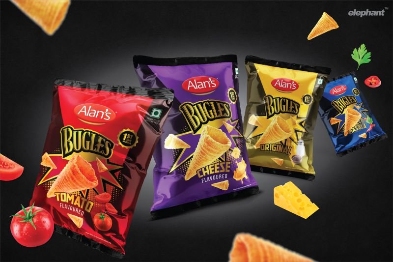
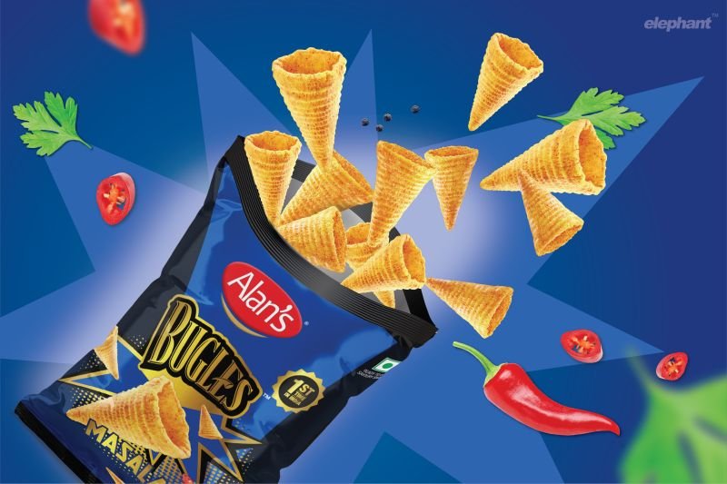
Our collaboration with Reliance Consumer Products to launch the global brand Alan's Bugles brings you a premium snacking experience.
"Sounding the Horn for Playful Snacking in India! Our collaboration with Reliance Consumer Products to launch the global brand Alan's Bugles brings you a premium snacking experience that goes beyond satisfying cravings. The packaging captures its iconic shape and international appeal, promising vivid flavours and playful moments. We used vibrant colours and metallics to create an otherworldly appeal - this fun snack's practically dropped on the shelf from outer space. Check out the case study, complete with appetizing details on our website!"
It is raining Gold and Silver for Team Elephant at the exchange4media India Design Excellence Awards!
It is raining #Gold and #Silver for #TeamElephant at the exchange4media India Design Excellence Awards! We took away FIVE awards across diverse categories for five distinct pieces.
We are incredibly proud of our team's consistency, dedication, and creativity that not only wins awards, but wins for the brands and their audience.
#Designleadership #DesignExcellence #DesignAward #ElephantDesign #DesignInIndia #e4mIDEA
Here is our packaging design for Epigamia's nutritious yogurt drink.
We have been design partners to epigamia and get the privilege to taste some delicious stuff that must look as good on the packaging!
Here is our packaging design for Epigamia's nutritious, yogurt drink in a fun, squeezy! Playful illustrations compliment the ingredient focus here, a clear reference to children's limitless imagination. Visuals and typography create a playful impact with a health-conscious edge. Not only is this snack a strong choice for busy parents, but it also contains calcium and vitamins, making it a healthy choice for kids. The potency of fruit, combined with an actually enjoyable nutritional snack? Yes please!
Rebranding an iconic brand CAMPA
Rebranding an iconic brand like #CAMPA... we were excited and also nervous.
But the #Reliance team is ambitious and supports unconventional ideas. So we went at this #rebranding exercise fearlessly.
Here is short piece in exchange4media - https://www.exchange4media.com/marketing-news/campas-new-avatar-sports-new-colours-126219.html
You can read more about it on our website soon...


